
- Best for
- Renter-friendly wall + vanity styling
- Cost
- $345 total (under $400)
- Time
- About 1–2 hours
- Renter-safe
- Yes (textiles + decor only)
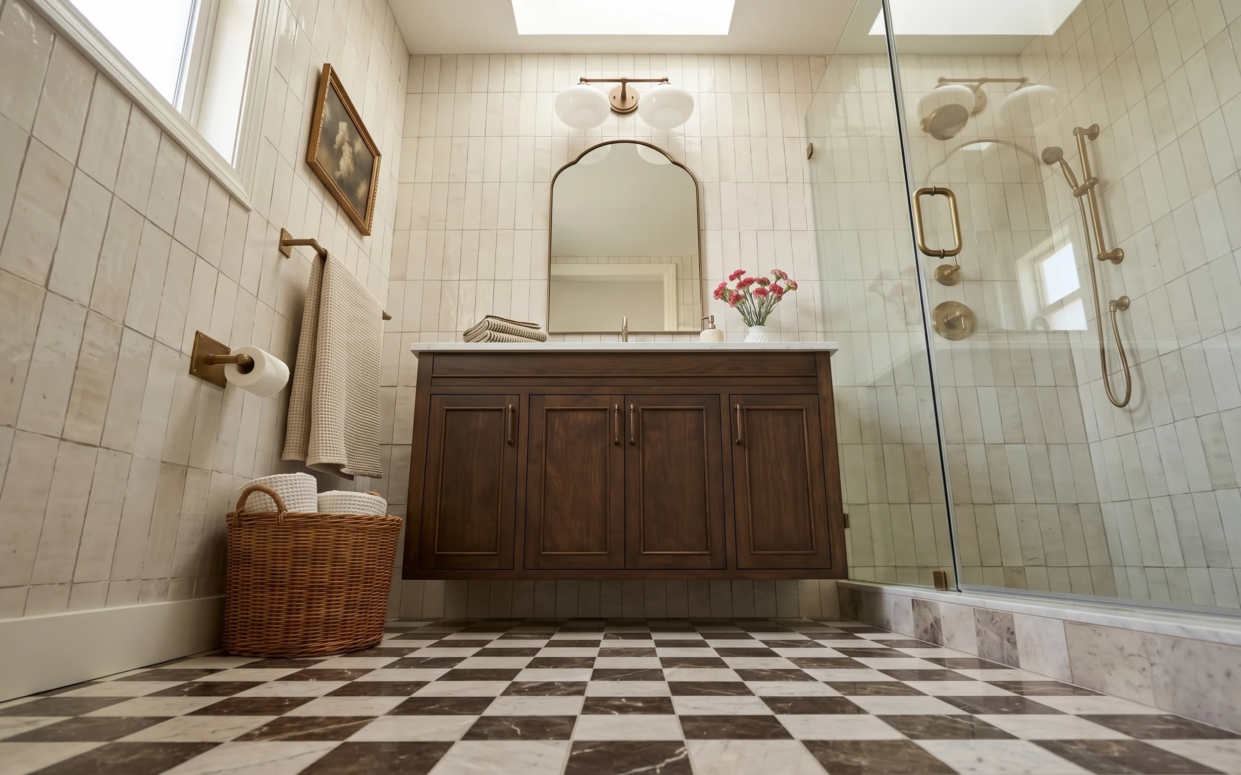
Why warm brass-and-walnut styling is the shower-and-vanity wall of 2026
That brassy hardware plus the deep walnut vanity already sets a classic mood, so the refresh is about adding softer texture and deliberate color. In the photo, the cream grid tile and checker floor do the background work, while the beige waffle towel, folded striped towels, and the pink flowers bring the “lived-in” part. The dark wood top also loves contrast—think off-white, warm sand, and small hits of blush. For renters, this look is achievable with removable decor that leaves no marks.
I used to over-plan bathroom styling and end up with random items that didn’t belong together. This time, I focused on one repeatable pattern: one hanging towel, one folded stack, and one countertop centerpiece. The mistake I caught myself making was adding another small object “just because”—it made the vanity feel busy. Keeping the objects grouped (flower vase + soap dispenser) makes the wall feel intentional without turning into a display shelf.
Layer 1 — framed wall art print ($80) botanical-inspired focal point
{{LAYER_1_FIGURE}}
The portrait framed wall art is the quickest way to make a plain tile wall feel finished. Because it’s already in the hero’s upper-left zone, you don’t need a big change to get impact—just pick a print with warm neutrals and a light botanical note that harmonizes with the pink flowers on the vanity. I’d rather swap this than chase a new paint color, since renters can’t repaint and tiled walls are the whole backdrop. The trade-off is scale: a tall portrait works better than a wide piece when the wall grid is busy.
Hang it at the same height as the mirror’s top edge
Aligning the art’s centerline with the mirror keeps the wall from feeling “tilted” even when the tiles are visually loud.
Layer 2 — arched wall mirror ($45) classic curve, brighter sightline
{{LAYER_2_FIGURE}}
The arched mirror shape echoes the vanity’s traditional hardware and softens the rectangle tile grid. Even though the mirror in the photo is already there, the key renter move is choosing a similarly arched silhouette (or a matching removable style) so your update doesn’t fight the room’s geometry. A curved mirror also bounces light across the vanity top, which matters in bathrooms where the hardwired lighting reads a little cooler. The trade-off: arched mirrors show fingerprints and water spots more than flat rounds, so wipe-down is part of the routine.
Pair warm metals with warm paper goods
Gold tones look best when towel colors and countertop items stay in cream, oat, and sand instead of icy whites.
Layer 3 — white vase with pink flowers ($40) one blush accent on the dark top
{{LAYER_3_FIGURE}}
That small white vase with pink flowers is doing more than decor—it adds a color bridge between the beige textiles and the brass hardware. On a dark vanity top, the white ceramic reads clean and the pink gives the room a gentle pop without feeling loud. If you’re shopping, go for “small bundle” scale like the photo: one focal vase is enough. The trade-off is maintenance: fresh flowers only last so long, so many renters keep a backup set of faux stems for weeks when the budget is tight.
Choose stems that sit just above the soap dispenser
That height keeps the flowers from blocking sightlines while still looking intentional.
Layer 4 — beige waffle bath towel ($30) texture for the hanging hook moment
{{LAYER_4_FIGURE}}
The beige waffle towel adds instant texture against the smooth tile and dark vanity. Waffle weave also looks “pretty” even when it’s slightly rumpled, which is realistic for bathrooms that get used every day. Hanging one towel gives you vertical rhythm in the left half of the wall, balancing the mirror curve on the right. If you’re choosing your own, stick to a warm neutral (oat, sand, or light camel) so it doesn’t clash with the walnut. The trade-off is absorbency: waffle towels dry faster than some thicker knits, but you still need airflow for daily use.
Skip overly bright beige
Very yellow towels can fight the cream tile grid and make the brass feel harsher.
Layer 5 — folded striped towels ($35) clean stacks that look styled, not cluttered
{{LAYER_5_FIGURE}}
The folded striped towels on the vanity top are what make the room feel “put together” instead of simply decorated. Folded textiles give you pattern without adding another color—those simple stripes echo the bathroom’s classic vibe and add visual movement on a dark surface. I like this over a single rolled towel because the fold reads intentional from across the room. The trade-off is choosing a stripe width that won’t look busy with the floor checker pattern; narrower stripes tend to blend better with the room’s existing geometry.
Use the fold to control how much texture shows
If the stripes start to compete with the flowers, fold a little tighter so only the top band is visible.
Layer 6 — woven basket on floor ($60) hidden storage that still looks warm
{{LAYER_6_FIGURE}}
The woven basket on the floor is a practical swap that keeps bath supplies from spilling into the open. In this photo, it also adds warmth because the tone sits between the cream tile and the walnut vanity. A basket is renter-friendly—no anchors, no drilling—and you can use it for towels, extras, or even spare toiletries while still looking styled. The trade-off: woven textures collect a little dust, so vacuuming around it (or doing a quick shake outdoors) is part of keeping it crisp.
Keep the basket at “one-height” visibility
If it’s too tall for the visual space, trim down what you store inside so the lid line doesn’t overwhelm the corner.
Layer 7 — small white soap dispenser ($55) clean counter spacing around the flowers
{{LAYER_7_FIGURE}}
A small white soap dispenser anchors the countertop styling and keeps the vase from feeling like it’s floating. The white color repeats the flowers vase and visually ties the hard lines of the vanity into softer layers. I’d choose a dispenser style with a simple silhouette—no elaborate metal tray—because the bathroom already has brass and wood detail competing for attention. The trade-off is practicality: if you want it to look neat, refill and wipe the pump after heavy use so water spots don’t collect near the base.
Style by grouping, not spreading
Keep the dispenser and the floral vase on one side of the vanity top so the other side stays calm.
The cost, layer by layer
| Layer | Item | Cost |
|---|---|---|
| 1 | Framed wall art print | $80 |
| 2 | Arched wall mirror | $45 |
| 3 | White vase with pink flowers | $40 |
| 4 | Beige waffle bath towel | $30 |
| 5 | Folded striped towels | $35 |
| 6 | Woven basket on floor | $60 |
| 7 | Small white soap dispenser | $55 |
| Total | $345 | |
If you need a cheaper version, swap the framed print for a smaller print or a less-expensive frame and choose a single-towel set instead of multiple folded pieces. You can also build the flower look with a seasonal bundle or a shorter-stem arrangement.
What worked, what didn't (across the whole room)
The strongest wins here are the textile layers and the single-blush countertop accent—small items that read clearly even against tile. The framed art also helps the left wall feel intentional, while the woven basket makes storage look warm instead of hidden in plastic. The only place this can go off track is when too many small objects compete on the vanity top.
What worked
- Beige waffle towel texture softens the cream tile grid without needing any wall changes.
- Folded striped towels create a structured “stack” look that reads styled from across the bathroom.
- White vase and pink flowers add color in a way that complements brass and walnut tones.
- Woven basket on the floor keeps supplies contained while adding warmth.
- Mirror’s arched curve balances the room’s square patterns and brightens the vanity area.
What didn't
- Adding extra small bottles next to the flowers makes the vanity top feel crowded fast.
- Very cool-toned towels can fight the room’s warm brass hardware.
- Choosing a wide wall print instead of a tall portrait makes the left wall feel awkward.
- A very tall basket can visually block the corner and compete with the towel.
What we'd skip if we did it again
Skip adding multiple countertop “mini-styling moments” (like separate candle jars and tiny trays). The vanity already has a dark wood top plus floral color, so one anchor (soap dispenser) and one accent (vase) is the sweet spot.
Skip changing anything that requires hardwired work or drilling. Bathrooms look best when changes are removable: towel swaps, framed decor, and floor baskets do the heavy lifting without risking security deposit drama.
Skip bright or gray-leaning neutrals for towels and baskets. Warm cream, sand, and oat tones keep the brass from looking harsh and make the whole shower-and-vanity wall feel cohesive.
Frequently asked
How long does this bathroom refresh take?
Most of the work is styling: swapping towels, setting the vase and soap dispenser, and positioning the framed art. Plan on 60–120 minutes depending on whether you’re sourcing new decor. If you already have the basics (towels, basket, a print), it can be closer to an hour. The styling part matters most—treat the vanity like a small grouping, not a random scatter of items.
What if my bathroom is smaller than the photo?
Lean into fewer, higher-impact pieces. Choose one portrait print sized for your wall and keep the countertop to two items: flowers plus one practical dispenser. For towels, hang only one and fold one smaller stack. Skip extra decorative bottles so the mirror and framed art do the visual work. In tight bathrooms, vertical balance usually reads better than adding more surface clutter.
Can I do this in a rental where I can’t change fixtures?
Yes—the whole plan relies on renters-safe swaps: textiles, removable decor, and freestanding storage. The tile and hardwired lighting stay as-is, and the “new look” comes from warm neutral towels, a styled countertop moment, and a coordinated framed print. If your lease restricts hanging anything, use removable picture hardware that doesn’t damage paint or grout.
Where should I shop for pieces like these?
You’ll get the best match by shopping in a few lanes: towel sets at home goods stores for color and texture, woven baskets from storage sections or discount home retailers, and framed art from print shops or poster retailers with classic portrait options. For the soap dispenser, look for simple white ceramic or glass styles that don’t add extra shine. A quick search using “arched mirror decor” plus your preferred finish helps too.
What’s the biggest mistake to avoid for this bathroom look?
The most common miss is adding too many small items on the vanity top. In a bathroom with checkered flooring and a patterned tile wall, the extra objects compete for attention and the styling feels accidental. Stick to one accent (pink flowers) and one anchor (soap dispenser), then let the towels and framed art handle the rest.
What if the colors don’t match my hardware?
The good news is the palette is flexible: if your hardware is silver instead of brass, swap the beige towel tone slightly cooler (oat still works) and choose a print with less warm brown. The white vase and pink accent remain a safe option because they read clean against almost any metal finish. The goal is to repeat warmth levels: don’t mix golden metals with icy-gray textiles.
More in Bathroom
Under $400: move-friendly shower-and-vanity wall refresh
A renter-safe bathroom shower-and-vanity wall refresh under $400 using swap-in decor: framed art, a framed botanical look, layered towels, …
Under $350: spa-style tub nook refresh for renters
A sage-plaster tub nook that feels like a spa doesn’t need permission or drilling. This renter-friendly refresh uses a simple wooden tray, …
Under $400: move-friendly toilet alcove refresh
A deep-green toilet alcove gets a softer, more rental-friendly look with seven easy swaps—starting with a jute bath mat, layered greenery, …