- Best for
- Warm neutral shelf styling
- Cost
- $500 total refresh
- Difficulty
- Easy (mostly textiles + styling)
- Time
- About 2 afternoons
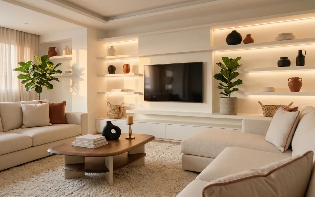
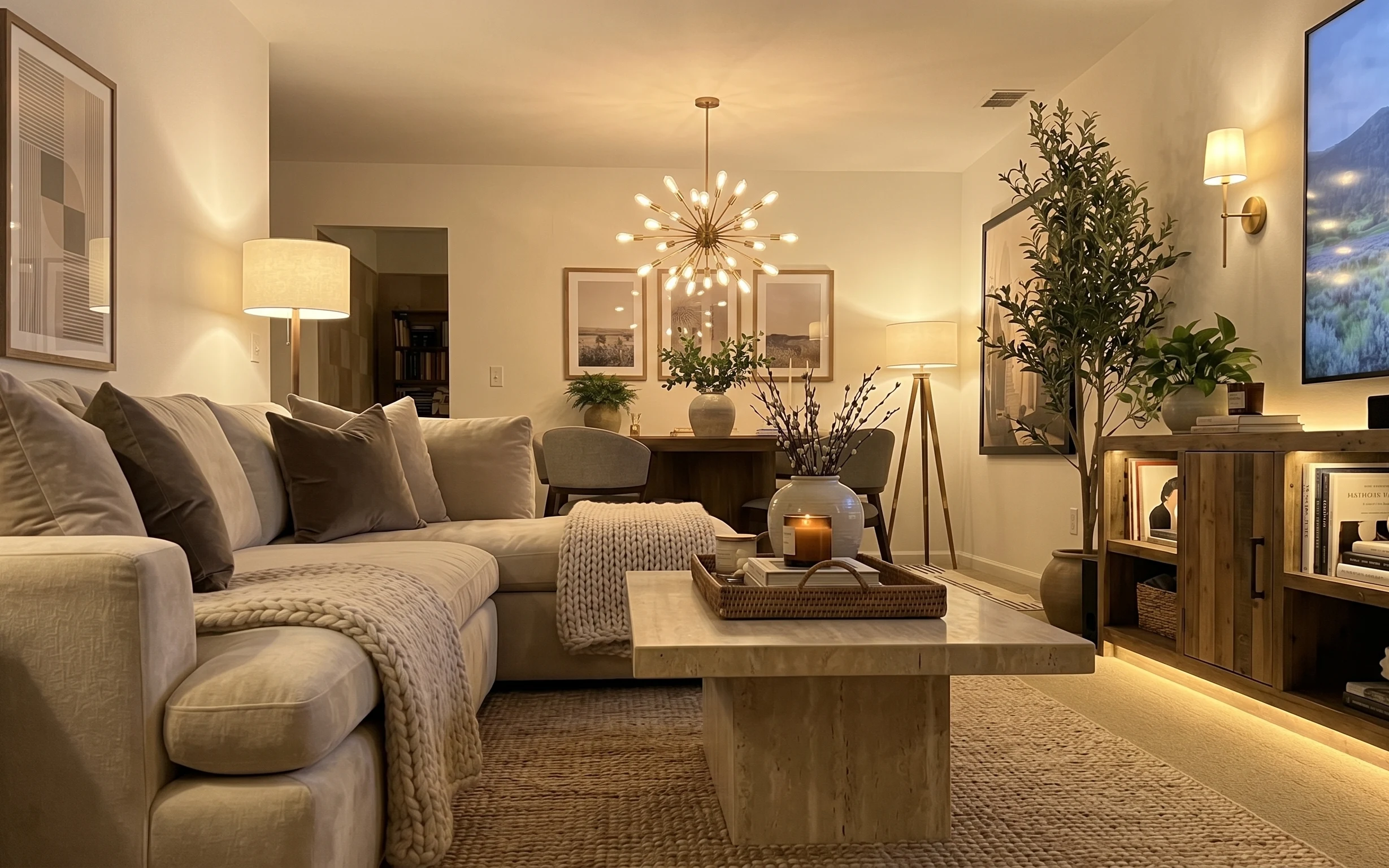
Why warm beige-and-black lighting scheme is the sofa-and-shelf lounge of 2026
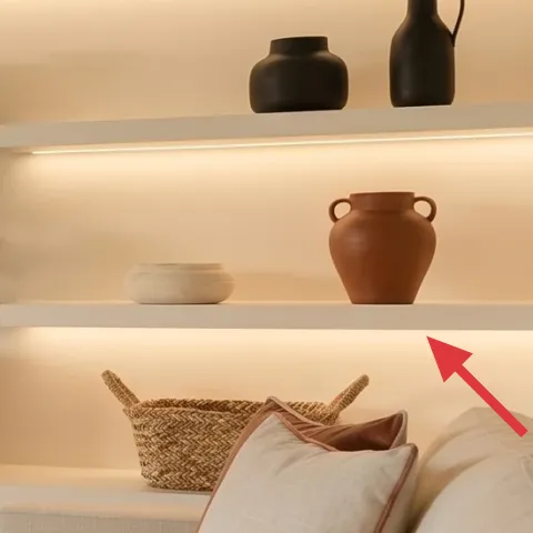
The starting point here is that warm glow built into the shelving—those thin light strips make every terracotta and black piece look sharper right away. To copy the look on a renter budget, the biggest moves are tactile: a soft, plush beige area rug under the coffee table, cream curtains that add vertical softness near the window, and throw pillows in light neutrals with one deeper accent. Once those textures are in place, even simple shelf styling—books, a candle, and one tall plant—looks curated instead of random.
I kept trying to “fix” the room with small decor first, and it wasn’t until I added a rug with real pile that everything finally stopped feeling flat. It’s the kind of mistake you make when you’re staring at shelves and forgetting the floor is taking up half the visual field. This layout is proof that textiles do a lot of heavy lifting before you buy anything decorative.
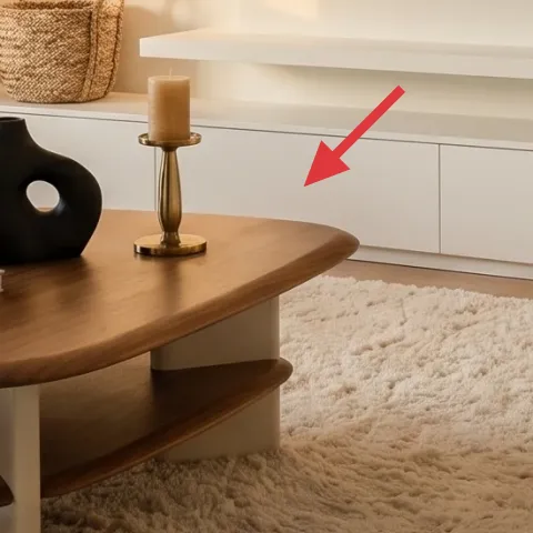
Layer 1 — beige area rug 5×7 ($200) Plush pile grounds the seating
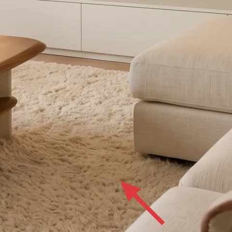
A beige area rug with a 5×7 footprint helps this sofa-and-shelf lounge feel like one connected zone instead of separate pieces. In the photo, the rug’s soft, high-pile texture is what makes the coffee table sit comfortably and keeps the light walls from feeling too clinical. I’d pick a rug with a thick-looking pile and a warm oatmeal/cream base so it matches the glow from the built-in shelves. The trade-off: plush rugs cost more than thinner flatweaves, but the softness is exactly what sells the look.
Rug placement check
Center the rug under the coffee table and make sure the front legs of the sofa and loveseat can sit on it for a “designed” feel.
Layer 2 — cream curtain panel pair ($80) Adds height and diffuses daylight
Cream curtain panel pairs give this corner the light, breathable look you see around the window. The panels in the hero are sheer-to-midweight and hang straight, which is why the room feels taller and more relaxed even with the dark decor accents on the shelves. When you swap in curtains, aim for a neutral cream with a soft drape rather than crisp, shiny fabric. The choice to prioritize drape over pattern matters here—this room’s palette is intentionally restrained, so the fabric texture has to do the work.
Choose fabric over color
If you can’t match the exact cream tone, match the fabric’s warmth (not bright white) and let the shelf lighting carry the rest.
Layer 3 — throw pillow covers (set of 2) ($60) Warm neutral accents without clutter
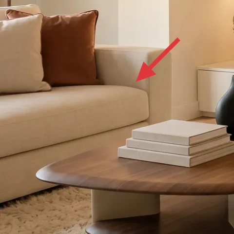
Throw pillow covers in light cream and a warmer brown/camel shade are what keep the seating from looking blank. In the hero, those pillows read as soft linen-like textiles, and they add just enough contrast to the beige rug and sofa upholstery. I’d choose covers that look matte and textured rather than silky, because matte fabric plays nicely with the warm shelf glow. The trade-off is that you’ll need to style fewer pillows than you think—three to five total is usually enough for this layout—so the shelves still feel like the main backdrop.
Limit the accent shade
Pick one deeper accent color (camel here) and keep everything else in cream to avoid turning the sofa into a color buffet.
Layer 4 — taper candle in brass holder ($25) A small glow moment on the table
A taper candle in a brass holder is a simple way to echo the warm light already happening on the shelves. On the coffee table, the candle’s vertical line adds height, so your eye doesn’t bounce only between the TV and the shelf niches. Brass details also connect the metal tone in the room without introducing a new color family. The trade-off: a candle is functional but not permanent decor, so for the “same-day” look, keep the holder clean and rotate the styling—books first, then candle—so it stays intentional.
Mind scents in shared spaces
If more than one person uses the room, go for a mild or unscented option so the candle doesn’t compete with everyone’s preferences.
Layer 5 — stack of decorative books on shelf ($15) Styling height without extra clutter
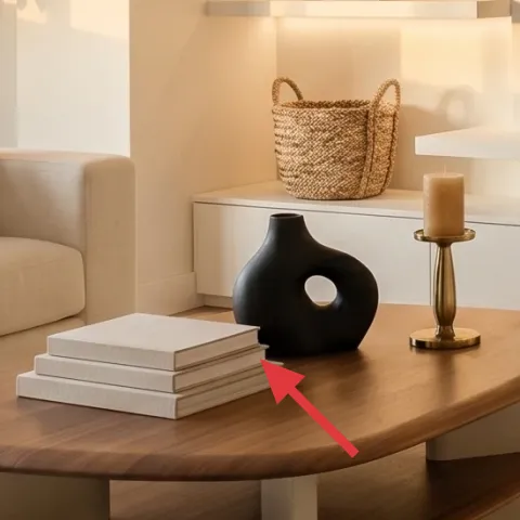
A stacked set of decorative books (or book-like boxes) is how you get that neat “collected” feel on open shelves. In the hero, the books sit on the console shelf and create a small elevation platform that makes the nearby candle and ceramics look more layered. I like this over a single tall object because stacks introduce width and break up visual lines from the shelf lighting. The trade-off is that books can look messy if they’re too chunky or too bright in color—choose neutral spines (cream, tan, or muted taupe) so they blend with the room’s beige-and-black palette.
Keep spines mostly neutral
Muted tones read like design, while strong graphic covers tend to look DIY.
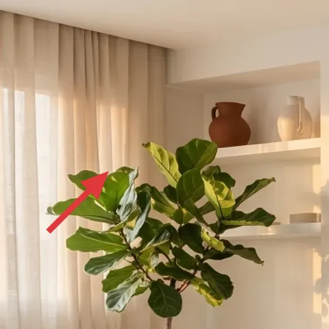
Layer 6 — large potted plant (4–6 ft) ($80) Brings the outside in near eye level
A large potted plant helps the shelves feel lived-in instead of staged. The hero has two tall plants, and that height is what balances the horizontal lines of the TV console niches and the straight curtain panels. When choosing a replacement, pick a plant with broad leaves and a full canopy—something that looks substantial from across the room. The trade-off: real plants can demand more care, so if the look matters more than maintenance, choose a high-quality faux plant or a low-maintenance real option. Either way, place it near the shelves so it “frames” the wall styling.
Use the plant to balance the TV
One tall plant on the opposite side of the main focal point keeps the composition symmetrical without matching sets.
Layer 7 — terracotta planter set (medium pots) ($40) Earthy color that matches the shelf ceramics
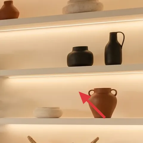
Terracotta planters (or small terra-cotta pots) are the easiest renter-friendly way to pull the room’s palette together. In the hero, the terracotta vessels repeat the same warm orange-red undertone that shows up on the shelf decor, so the space reads cohesive instead of “random shelf items.” I’d aim for medium pots with different neck shapes so they don’t look like clones. The trade-off is that terracotta can feel too orange if it’s the wrong shade, so the color choice matters—lean warm and muted, not neon.
Make it instead of buying it
DIY a painted terracotta planter set so the terracotta shade matches the warm tones already lighting your shelves.
Materials
- Terracotta pots (set of 3, medium) — 3 — local garden store — $10
- Acrylic craft paint (warm clay/tan mix) — 1 small bottle — craft store — $7
- Acrylic craft paint (deep warm brown/umber) — 1 small bottle — craft store — $6
- Painter’s tape — 1 roll — hardware store — $8
- Gloss or matte clear sealer (paint-safe, for crafts) — 1 small can — craft store — $4
Steps
- Wash and fully dry the terracotta pots so paint sticks evenly.
- Apply painter’s tape to block off a simple stripe or soft geometric shape.
- Paint the base layer with warm clay/tan, using thin coats.
- Remove tape after the paint is no longer wet but still tacky, for cleaner edges.
- Add a second color (deep warm brown/umber) as a partial glaze or narrow bands.
- Let the pots dry completely before handling, then apply the clear sealer to protect the finish.
- Once dry, style the set together on the shelf for a matched-but-not-identical trio.
- Touch up any edges with a tiny brush for a crisp, renter-friendly look.
Total DIY cost: $35 — saves about $5 over buying.
The cost, layer by layer
| Layer | Item | Cost |
|---|---|---|
| 1 | Area rug (5×7, beige plush) | $200 |
| 2 | Cream curtain panel pair | $80 |
| 3 | Throw pillow covers (set of 2) | $60 |
| 4 | Taper candle in brass holder | $25 |
| 5 | Decorative book stack | $15 |
| 6 | Large potted plant (4–6 ft) | $80 |
| 7 | Painted terracotta planter set (medium pots) | $40 |
| Total | $500 | |
If you want a cheaper variant, swap the 5×7 beige rug for a smaller size (under-coverage still works) and choose curtain panels in a basic textured weave instead of a more elevated drape. Keep the plant and candle, since those are the quickest ways to maintain the warm, styled feel.
What worked, what didn't (across the whole room)
The warm shelf lighting and the earth-toned decor are doing the heavy lifting, and the textiles make it feel intentional instead of staged. The biggest wins were the rug’s pile and the curtain drape, because they soften the TV-and-shelves geometry. The only part that’s easy to overdo is decorative stacking—less can look more here.
What worked
- The beige rug’s plush texture makes the coffee table and seating feel grounded.
- Cream curtains add vertical softness next to the straight lines of the shelf niches.
- Throw pillow covers in cream and camel keep the palette warm without adding new colors.
- A taper candle on the table gives a second warm “glow” point beyond the shelves.
- Stacked books create styling height that looks curated, not cluttered.
- A tall potted plant balances the TV and adds natural texture near eye level.
What didn't
- Too many accent pillows makes the sofa look crowded against the minimal shelf styling.
- Choosing a bright-white curtain can fight the warm shelf glow and look washed out.
- Terracotta items that are overly saturated read like decor, not like a cohesive set.
- If the candle holder is too small, it disappears on the coffee table’s wood surface.
- A plant with thin, sparse leaves doesn’t balance the wide shelf openings.
What we'd skip if we did it again
Skip changing the hardwired shelving lighting. Instead, build around it with warmer textiles—rug pile, curtain drape, and one repeat accent like terracotta—so the room stays cohesive.
Skip buying multiple small decor items at random. One book stack, one candle, and one tall plant on each side beats a cluttered middle every time in a sofa-and-shelf layout.
Skip matching everything exactly. The hero look works because the shapes vary (vessels, books, plant silhouette), while the palette stays tight—beige, black, and muted terracotta.
Frequently asked
How long does this kind of sofa-and-shelf refresh take?
Most of the time is spent on textiles and placement: rug unboxing, curtain hanging, and then adjusting pillow and shelf spacing. If you’re keeping to renter-safe swaps, plan about 2 afternoons. Styling is the last step—center the rug first, then add pillows, then finish with candle/plant/tall-shelf objects so nothing looks accidental.
What if I’m not allowed to change curtains or use a tension rod?
If curtains aren’t possible, keep the same visual strategy: add softness with a textured throw and more pillows instead of window fabric. You can also use a sheer fabric panel pinned to a non-damaging rod already installed by the landlord (if present). The key is maintaining vertical flow near the window so the room doesn’t feel blocky.
Can I do this in a smaller living room?
Yes—shrink the rug footprint and keep the plant slightly shorter. The shelf-and-TV wall is already a strong anchor, so don’t add more than one tall element on the far side. Choose two pillow covers instead of three, and consider a slimmer candle holder so the coffee table stays visually open.
What’s the best place to shop for renter-friendly items like these?
For the rug and curtains, look for simple neutral basics at big-box retailers or home sections with easy returns. For the plant and ceramics, try home decor stores with online shipping so you can compare leaf fullness. For the book stack, pick neutral spines first—store brand or thrifted works as long as the colors stay muted.
What if my shelves are already fully loaded—won’t this look too crowded?
The trick is repetition with restraint. Keep one “stack” element (books), one “glow” element (candle), and one “anchor” element (either a plant or a terracotta trio). If the shelf surfaces are packed, place the candle and books on the coffee table and keep shelf decor to 3–5 pieces total.
Biggest mistake to avoid with this look?
Over-adding accent colors. The hero palette stays tight—beige, black, and warm terracotta—so the room feels calm. If you add too many different neutrals or a bright curtain white, the warm LED glow can start to look harsh instead of flattering.
More in Living Room

Under $500: warm beige-and-black sofa-and-shelf lounge refresh
A warm neutral sofa-and-shelf lounge is all about soft layering: a plush beige rug, airy cream curtains, and a few earthy decor swaps that …
Under $400: renter-friendly living room layered refresh
A warm, layered living room look—built from renter-friendly swaps—comes in at under $400. This refresh leans on a textured rug, a cream kni…
Under $600: 7 move-friendly swaps for a warm living room refresh
A bright, warm sofa-and-gallery living room look—rebuilt with renter-safe swaps. This $600 refresh focuses on a patterned rug, terracotta-b…