
- Best for
- Weekend vanity-wall polish
- Cost
- About $640 total
- Difficulty
- Moderate
- Renter-safe
- Not required (homeowner paint DIY)
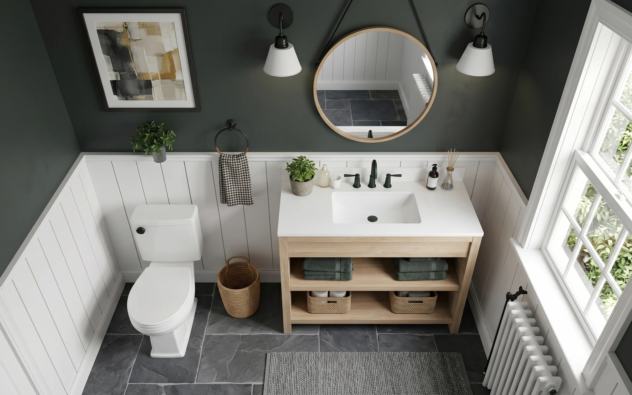
Why this gray-and-white bathroom vanity wall is the refresh spot of 2026
The starting point here is a crisp mix: dark slate tile, white wainscoting paneling, and a gray painted wall that frames the vanity. On top of that, there’s real texture in the room—woven storage, a checkered hanging towel, and a dark textured bath mat. When you focus on the vanity wall (art + mirror + lighting + color), the whole bathroom starts reading “finished,” even if the layout stays the same. For a weekend project, this is the fastest route to a calmer, more coordinated look.
I tried doing “one small change” once—just swapping a piece of decor—and the room still felt disjointed. This time around, the order matters: I’d rather tune the wall first (mirror height and art scale), then add one supporting texture (mat and basket) and one lighting decision. That way, every object has a job, instead of competing for attention. The gray paint touch is also what makes the black-and-white details feel intentional rather than random.
Layer 1 — Framed abstract wall art ($80) with a dark-light focal pattern
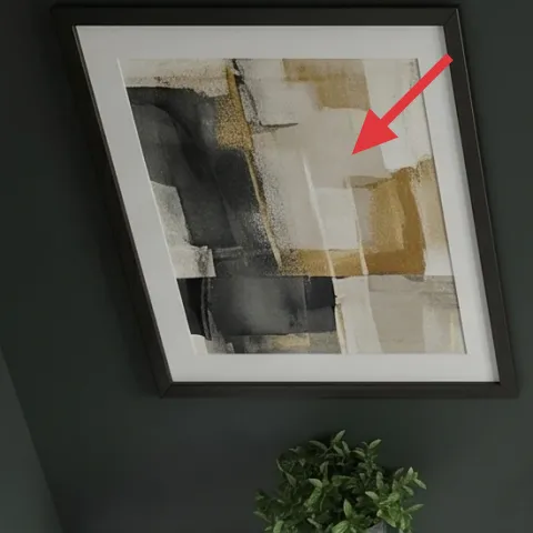
That framed abstract wall art on the left is the simplest way to set the room’s contrast: light matting and cool grays sit nicely against the deeper gray wall. I’d choose this over adding another small shelf because you don’t have to manage clutter—art anchors the wall and creates a clear “read” from the doorway. The frame also helps balance the round mirror on the opposite side so the vanity wall doesn’t feel lopsided. Trade-off: you’ll want to get the hanging height right, but it’s a quick job with measuring tape and a level.
Match the art to your wall value
If your wall is already medium gray, pick art with both light and dark sections so it won’t disappear.
Layer 2 — Black pendant light with white shade (left) ($120) for vertical balance
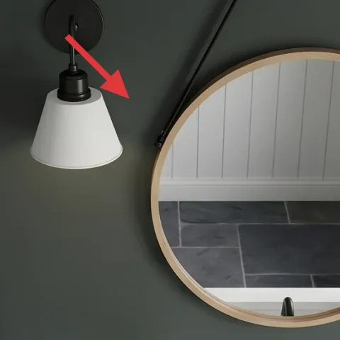
The black pendant light with a white shade adds a vertical rhythm between the framed art and the round mirror. That’s key in bathrooms, where you already have long straight lines from the wainscoting and vanity. I’d go with pendants (even if you could just add a brighter bulb) because the shade and metal color give you a built-in style decision. The trade-off is attention to finish: the black needs to echo other black details in the space so it doesn’t look like an afterthought.
Keep the shade bright against gray walls
A white shade prevents the pendant from adding extra darkness to the vanity zone.
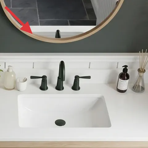
Layer 3 — Round wall mirror ($120) to soften the vanity wall geometry
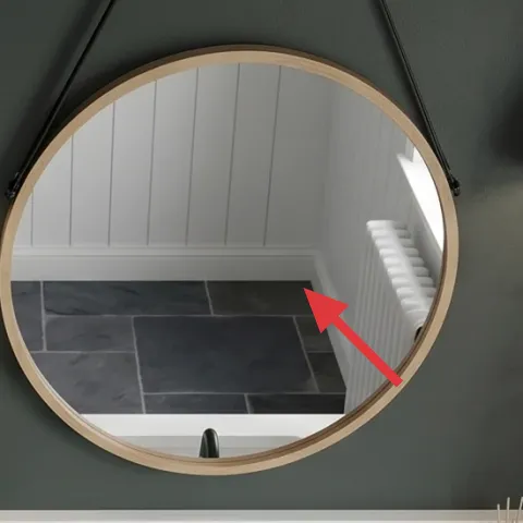
The round wall mirror is doing more than reflecting—it softens all the rectangles. With white paneling, a long vanity top, and a flat bath mat, the room already has strong angles. The mirror’s curve makes the whole vanity wall feel less rigid and helps the pendant shapes look intentional. I’d choose a round mirror over a rectangular one here because your lighting and art already bring enough straight-line structure. Trade-off: round mirrors can look off if they’re hung too low, so measure from the sink area and center it calmly.
Don’t hang it too low
If the mirror edge drops below eye level, the vanity wall can feel crowded instead of balanced.
Layer 4 — Bathroom faucet on vanity ($120) for a cleaner “read” on the sink
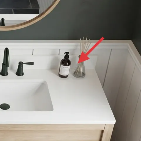
The faucet is small visually, but it’s a high-impact detail because it sits right where your eye lands when you look at the vanity. Picking a faucet that matches the room’s dark accents tightens the whole palette—black tones repeat near the pendants and the mirror frame. I’d rather update the faucet than add another decorative item because functional hardware makes the setup feel cohesive every single day. Trade-off: if your plumbing isn’t already set up for the exact style, keep the replacement simple and choose a similar mounting to avoid extra hassle.
Match finishes across the wall
When the faucet and light metal tones align, the vanity zone looks designed instead of assembled.
Layer 5 — Dark gray textured bath mat ($80) for comfort against slate tile
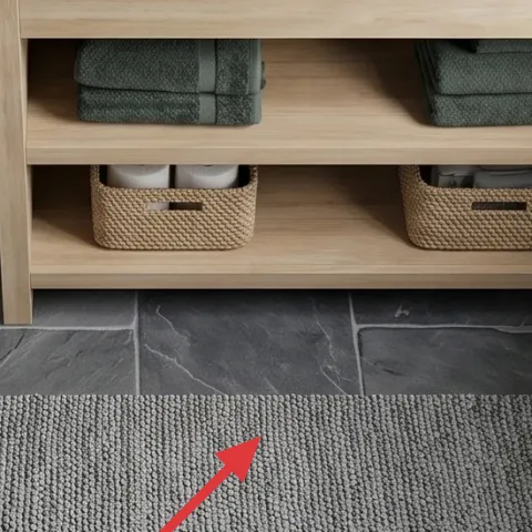
That dark gray textured bath mat brings softness where the floor is hard and cool. It also ties into the slate tile color so the room doesn’t feel like it’s constantly “floating” in gray-from-the-wall only. I’d choose a mat like this over a lighter option because darker tones hide the everyday chaos—damp footprints and small splashes don’t show as quickly. The trade-off is texture: if you go too thick, it can curl or look messy at the edges, so look for a mat that lays flat.
Texture matters more than pattern
A textured mat keeps the look interesting even when the rest of the palette is simple.
Layer 6 — Medium woven storage basket on floor ($50) for towel-and-clutter control
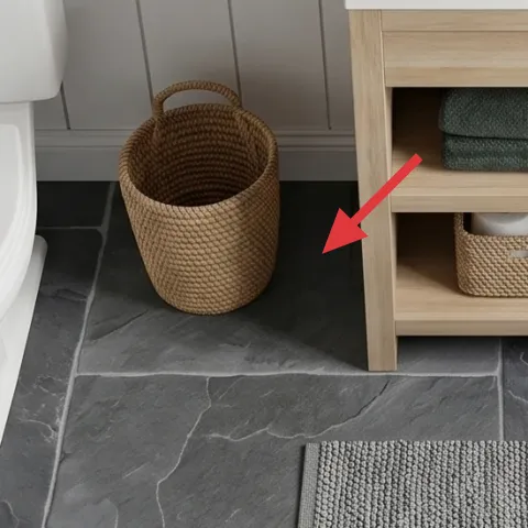
The medium woven storage basket on the floor adds warmth next to the cool tile and smooth white paneling. It’s also practical: instead of letting extras (extra towels or bathroom items) spread out on the vanity base, you give them a place that looks intentional. I’d prioritize this over adding more small decor because woven storage reads “lived-in” without turning into a visual mess. Trade-off: woven baskets can tip or deform if they’re overfilled, so keep it to what you actually use between laundry days.
Use one basket, not three
One visible woven container looks styled; multiple ones look cluttered fast.
Layer 7 — Gray paint for the wall above wainscoting ($70) for a clean, even backdrop
If you only make one DIY move here, make it paint—because the wall color affects every other decision (art contrast, mirror reflection, and how black fixtures read). The gray area above the white wainscoting already sets a modern foundation; the refresh is about making it even and intentionally toned. I’d rather repaint this section than replace the wainscoting, since paint is weekend-friendly and the result is immediately visible from across the room. Trade-off: you need steady prep time (taping and a clean edge), but you’ll save money and avoid bigger changes.
Make it instead of buying it
DIY the gray wall paint refresh above the wainscoting so the whole vanity wall looks crisp behind the mirror and art.
Materials
- Interior paint, 1 gallon — satin/eggshell finish — $40
- Roller cover (2-pack) — 3/8in nap — $7
- Painter’s tape — 1.41in x 60yd — $8
- Angle brush — 2in — $5
- Plastic drop cloth — 9x12 — $3
Steps
- Clean the wall and let it fully dry.
- Mask the wainscoting edges and trim with painter’s tape.
- Cut in around the mirror/art area with an angle brush.
- Roll the field in smooth sections, keeping a wet edge.
- Let the first coat dry to a uniform look.
- Apply a second coat for even coverage and color depth.
Total DIY cost: $63 — saves about $7 over buying.
Two coats beat one thick coat
Thin, even layers prevent streaks and make the gray look deliberate beside white paneling.
The cost, layer by layer
| Layer | Item | Cost |
|---|---|---|
| 1 | Framed abstract wall art (16×20) | $80 |
| 2 | Black pendant light with white shade | $120 |
| 3 | Round wall mirror (24–36 in) | $120 |
| 4 | Bathroom faucet | $120 |
| 5 | Area rug 5×7 (dark gray) | $80 |
| 6 | Medium woven storage basket | $50 |
| 7 | Paint, 1 gallon (gray wall above wainscoting) | $70 |
| Total | $640 | |
If you want a cheaper variant, focus on the wall-level styling first: framed art, a round mirror, and the bath mat. Skip the faucet and go with a lower-cost pendant option, since lighting and wall decor already carry most of the “new” feeling.
What worked, what didn't (across the whole room)
The strongest improvements came from updating the vanity wall in layers—mirror and art for structure, pendants for vertical balance, and textiles for comfort. The room feels more intentional because the gray backdrop and black accents now repeat cleanly. The only “wait, why doesn’t it look right?” moment was when trying to overstyle before anchoring the mirror height.
What worked
- The framed abstract print gives the gray wall a clear focal point and makes the mirror feel intentional.
- The round mirror softens all the straight lines from the vanity top and white wainscoting.
- The black pendant shapes repeat with the darker hardware so the vanity zone looks cohesive.
- The dark textured bath mat adds comfort against slate tile and hides everyday splash marks.
- The woven floor basket keeps extras contained without adding more visual clutter to the vanity.
- Painting the wall evenly makes the contrast between white paneling and gray look cleaner.
What didn't
- If the mirror sits too low, it crowds the sink area and makes the wall feel shorter.
- A lighter bath mat shade shows damp footprints faster on dark slate tile.
- Adding small decor before artwork placement made the wall look busy instead of balanced.
- A faucet finish that doesn’t echo the pendants makes the hardware feel like separate purchases.
What we'd skip if we did it again
Skip replacing multiple “small” items at once—faucet plus light plus decor—because the wall can’t absorb so many changes cleanly. When the mirror and art are dialed in first, everything else reads better and decisions get easier.
Skip a bath mat that’s too thin or too flat if your floor is slate tile. Thin mats move around and don’t feel good underfoot, and that’s the kind of mismatch you notice every day.
Skip painting the entire bathroom if only the vanity wall feels off. Sticking to the gray area above the wainscoting gives the highest payoff with the lowest time cost, and it keeps the rest of the room from turning into a bigger project.
Frequently asked
How long does this bathroom vanity wall refresh take?
Plan for about a weekend. Hanging and positioning the framed abstract wall art and the round wall mirror can be done in a couple of hours if you measure first. Swapping a pendant and faucet depends on your comfort level and whether power/plumbing work is needed. The gray paint DIY is the time trade-off—extra time comes from taping and waiting between coats.
What if I rent—can I still use this plan?
Yes, for most of the visual layers. You can replace framed art, add a round mirror using appropriate hanging hardware, and switch the bath mat and woven basket without permanent changes. For lighting and faucet updates, check your lease rules. If paint is the only permanent part, replace that layer with removable styling (a brighter mat, new art, and mirror repositioning) to keep things non-damaging.
My bathroom is smaller—should I change anything?
In a smaller bathroom, scale matters more than quantity. Choose a mirror size that doesn’t overpower the wall and keep the bath mat tight to the sink workflow rather than stretching across the whole floor. Stick to one woven basket so the visual weight stays low. If the pendant fixtures feel crowded, consider selecting one statement pendant instead of two.
My bathroom is larger—how do I adapt the look?
A larger bathroom can handle bolder spacing. If the vanity wall is wider, keep the same round mirror and framed art styles, but consider slightly larger sizes to maintain balance. You can also add a second woven basket on a shelf only if it doesn’t create a “storage wall” look. For paint, keep the gray tone consistent across the vanity wall so the scale feels intentional.
Where should I shop to keep the budget under control?
For the mirror and framed art, compare big-box and home decor retailers during sales, since these are often marked down seasonally. Pendant lights can jump in price, so look for a simpler black-and-white shade design in place of elaborate fixtures. Bath mats and woven baskets are usually easiest to budget—shopping for texture and color match beats brand name.
What’s the biggest mistake people make with a vanity wall refresh?
The most common miss is placing the mirror and art first, then trying to “make everything else fit.” Instead, decide the mirror height and art scale early, because they dictate how lighting and textiles will read. If the mirror placement is off, the room feels off even with perfect decor. Getting that structure right makes every smaller swap look smarter.
More in Bathroom
Under $700: bathroom vanity wall refresh with 7 layers
A 7-layer weekend refresh for a bathroom vanity wall—framed art, a round mirror, pendants, and softer textiles. Total project cost comes in…
Under $1500: modern spa bathroom vanity wall refresh
A modern spa bathroom refresh can feel expensive without being one—when the vanity, mirror, and lighting all match in tone. This $1500 week…
Under $350: bathroom vanity nook refresh with botanicals
A renter-friendly bathroom vanity nook refresh that leans into terracotta, brass, and botanical prints. Get the look with seven budget swap…