
- Square footage
- Best for a single shelf wall (about 3–6 ft wide)
- Cost
- Under $300
- Difficulty
- Easy (mostly shopping + stacking)
- Renter-safe
- Yes (move-ready, no drilling)
Why olive-and-amber accents are the shelf nook of 2026
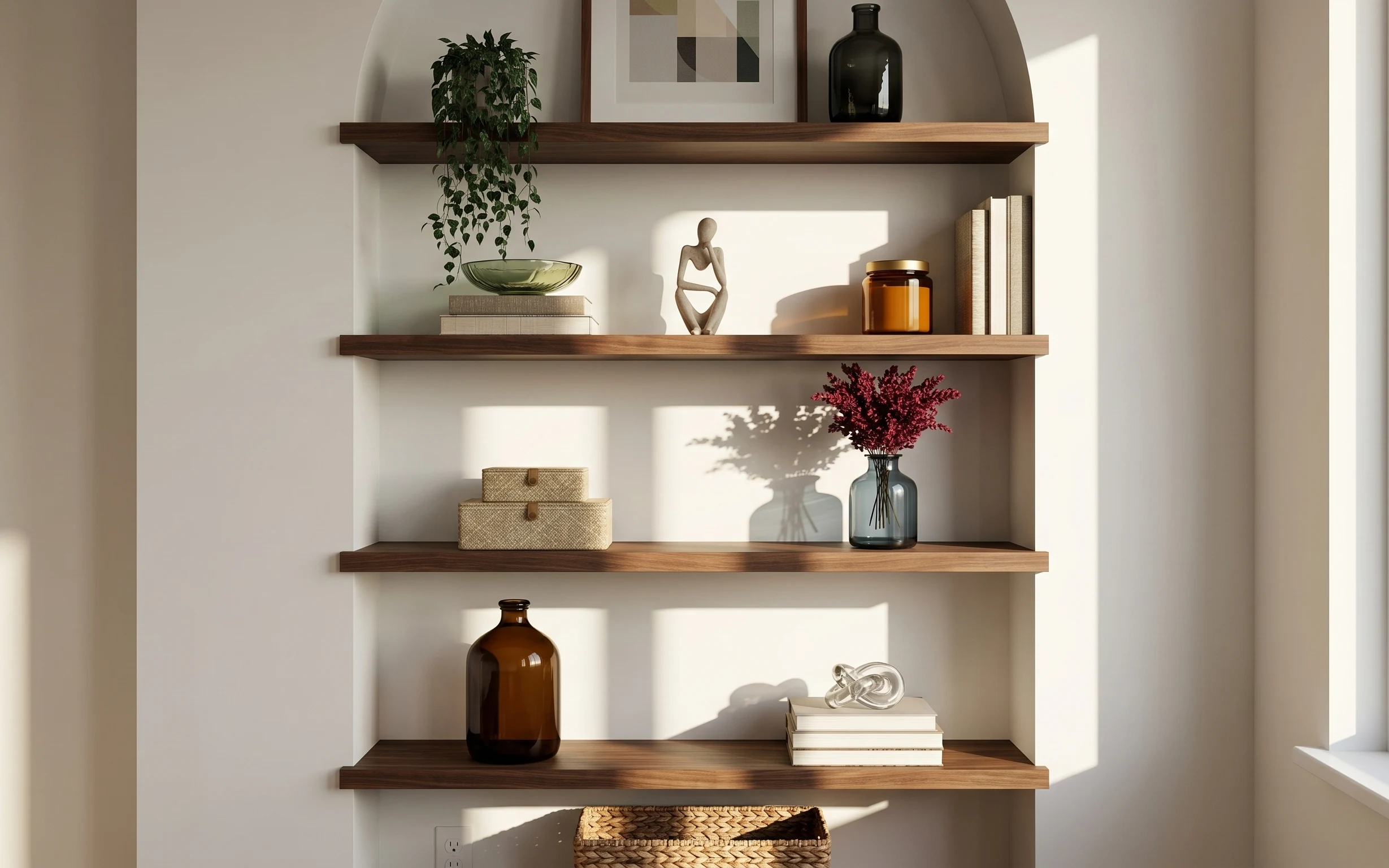
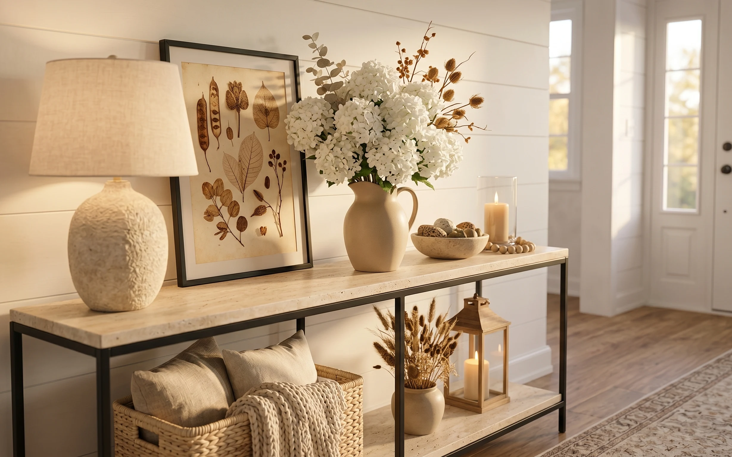
The fastest way to make a rental feel intentional is to style one “decision zone,” and your shelf nook is doing that job already. The warm walnut-toned shelves, the deep green plant leaves, and the amber glass jar create a rhythm without needing extra furniture. Notice the mix of textures too: glass that catches light, woven storage that softens edges, and a framed print that holds the whole arrangement. For shared housing, this approach is achievable because it’s mostly small objects, not installs, and everything can be packed into a few cardboard boxes.
I once tried to “complete” a rented room with big matching sets, and it was a nightmare to move. This time around, I kept my upgrades smaller and more interchangeable—one anchor piece per shelf, then accessories that can travel. The biggest shift was choosing a focal print and letting the shelves become a curated stack instead of a clutter pile.
Layer 1 — woven storage basket ($25) keeps the bottom shelf tidy
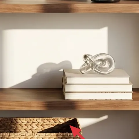
A woven storage basket on the lower shelf is the practical counterweight to all the glass and color up top. In the hero, the basket sits low and wide, so it visually grounds the arrangement and hides the “what-do-I-do-with-this?” stuff that always accumulates in shared apartments. The trade-off is that you’re choosing a texture over extra decor—less pretty, more useful. That’s the right call for impermanence, because baskets pack flat in a van and you can swap what goes inside without changing your whole look.
Load it by category, not by vibe
Use the basket for charging cables, notebooks, or spare chargers so the shelf still looks styled even when real life is messy.
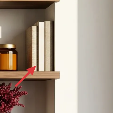
Layer 2 — books stack ($20) adds height without taking floor space
A stacked set of books works like instant risers: it gives you vertical structure between small objects, and it keeps everything from looking randomly placed. In the image, the books sit to the right of the shelf center line, creating an even “step” that makes the vase and jar feel intentional rather than scattered. I’d rather buy two slim stacks than one bulky display piece, because books move easily and you can reuse them for every place you rent next. The only downside is you have to keep the top spines readable-ish, which is why neutral covers tend to win here.
Keep covers in the same palette
Warm whites, tans, and muted grays blend with glass and plants without forcing a new color scheme every move.
Layer 3 — green glass bowl ($30) creates a reflective color echo
The green glass bowl is a small change that does big visual work. It echoes the deep green leaves of the plant, but it’s lighter and more flexible than a second plant would be. In the hero, it sits on the upper shelf and catches daylight, which makes the whole nook feel brighter even with no extra lighting added. I like this over a second vase because bowls are easier to pack (no awkward stems), and they can hold anything from wrapped notes to potpourri when you’re staging for friends. The trade-off is it’s one more fragile item, so wrapping it in a towel matters.
Wrap it like you’re moving
Use a dish towel or sheet as padding so the bowl arrives intact at the next address.
Layer 4 — brown glass bottle ($35) adds a tall, warm anchor
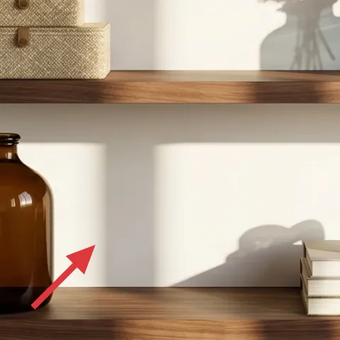
That brown glass bottle on the middle-lower shelf anchors the bottom half of the vignette. It’s tall enough to prevent the look from feeling “top-heavy” near the plant, and the amber tone connects it to the jar without matching perfectly. I’d skip a ceramic piece here because glass gives you that subtle shine under natural light, which reads more expensive than it is. The trade-off is that bottles take careful packing, but the win is vertical shape you can’t fake with flat decor. If a glass bottle feels risky, choose one with a wider base for stability.
Don’t skip a sturdy wrap
Glass-on-wood shelves can be unforgiving; protect both the bottle and the shelf finish during moves.
Layer 5 — blue-green vase with red flowers ($45) brings the one “pop” color
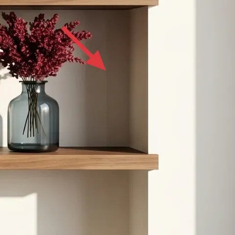
That blue-green vase and red flower bunch is the color punctuation mark. The vase tone pulls you toward the plant’s greenery, while the red blooms keep the palette from going too neutral and flat. In a small shelf nook, color needs to be intentional—one concentrated spot reads more styled than three separate splashes. I’d choose faux flowers only if you hate replacing stems, but real stems are easiest to swap with what’s available each season. The trade-off is the vase has to be a non-awkward shape for packing, which is why a stable glass silhouette is worth paying a bit more for.
Pick a vase color that already exists
Match the vibe to the plant/amber tones you see, then let the red carry the contrast.
Layer 6 — amber glass jar ($60) makes the shelf feel curated, not cluttered
The amber jar is the warm, glassy centerpiece that makes the nook feel cohesive. It’s not just color—it’s opacity plus shine, which balances the translucent bowl and keeps the shelf from looking washed out in daylight. In the hero, the jar sits above the line of the brown bottle, tying the warm spectrum together in both the upper and lower tiers. I’d rather buy one good-looking jar than several small mismatched containers because it reduces decision fatigue when you’re living with roommates. The trade-off: jars are visually dominant, so keep the surrounding pieces calmer—one bowl, one book stack, one plant, not five competing items.
Use the jar as a label-friendly catchall
Fill it with tea bags, cotton rounds, or matches so it always looks “on purpose,” even on busy weeks.
Layer 7 — pressed flower frame ($55) gives you a removable focal print
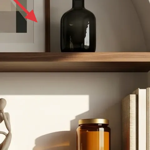
That framed print is what makes this shelf nook read like a designed vignette instead of a group of objects. For shared housing, a flat, lightweight frame is ideal because it travels easily and you can keep the rest of your shelf styling flexible. The pressed-flower angle is also specific: it adds delicate texture without competing with the bolder glass tones. I’d choose a DIY-friendly frame because it’s cheaper than buying the exact print and it’s easy to customize to the colors you already own. The trade-off is patience—pressed flowers need time—but you can still get a finished result in an afternoon once the flowers are ready.
Make it instead of buying it
Make a pressed flower frame with a simple cardstock backing and a clear top so the art stays flat and move-ready.
Materials
- Cardstock (neutral) — 1 sheet — craft store — $10
- Pre-pressed flowers — small assortment — craft store — $7
- Clear craft sheet or protective sleeve — 1 pack — craft store — $8
- Matte glue dots (or craft glue) — 1 roll — craft store — $5
- Small frame (used or thrifted) — 1 — thrift store — $0
Steps
- Cut a cardstock backing to fit the frame opening, leaving a thin border for a clean edge.
- Arrange flowers dry first, moving them until you get an even spread and a clear focal cluster.
- Secure flowers with tiny dots so petals don’t shift when the art is moved.
- Seal the arrangement under the clear craft sheet/sleeve, smoothing from the center outward.
- Snap or slide the protective layer and backing into the frame so everything stays flat.
- Check for dust, then wipe gently with a dry microfiber cloth before packing or hanging.
Total DIY cost: $30 — saves about $25 over buying.
The cost, layer by layer
| Layer | Item | Cost |
|---|---|---|
| 1 | Woven storage basket | $25 |
| 2 | Books stack | $20 |
| 3 | Green glass bowl | $30 |
| 4 | Brown glass bottle | $35 |
| 5 | Blue-green vase with red flowers | $45 |
| 6 | Amber glass jar | $60 |
| 7 | Pressed flower frame | $55 |
| Total | $270 | |
If the exact glass colors are tough to find, swap by tone instead of brand: choose any deep green plant + one amber-toned container + one red accent. The palette matching matters more than the specific item names for keeping the nook cohesive.
What worked, what didn't (across the whole room)
This shelf nook looks designed because it repeats tones (green + amber) and uses height control (books and a bottle) instead of piling on more objects. The few “statement” pieces—flowers and the framed print—stay movable, which is exactly what shared housing needs.
What worked
- The woven basket on the lower shelf keeps the vignette from feeling like open clutter.
- The book stack creates consistent height so small decor doesn’t look accidentally placed.
- The green glass bowl reflects daylight and echoes the plant without adding another plant pot.
- The amber jar ties warm tones together across shelves, even when the sunlight shifts.
- The vase plus red blooms adds contrast while staying confined to one focal spot.
- The framed print gives the arrangement a finishing layer without changing any fixed rental elements.
What didn't
- Glass pieces are pretty, but they’re higher-maintenance during moves unless wrapped carefully.
- If the flowers are too big, they overpower the shelves instead of acting as punctuation.
- Over-filling the books area makes the nook look busy, especially with the plant’s height.
- A too-bright accent color competes with amber tones and makes the palette feel mismatched.
- Skipping a grounding texture (basket or similar) can make lower shelves look floating.
What we'd skip if we did it again
Skip adding a bunch of matching containers “just because there’s space.” When the shelf is already working as a color rhythm, extra jars create clutter and make each move slower.
Skip large, wall-mounted décor that’s hard to take down in one afternoon. A flat framed print or a simple object arrangement keeps the look intentional while respecting lease turnover.
Skip using only one texture type (all glass, all ceramic, or all plastic). The reason this nook feels calm is the mix—wove + glass + pressed-paper detail—so pick one new texture per shelf instead of doubling up.
Frequently asked
How long does this shelf nook refresh take?
Shopping and placing the items is usually 1–2 hours, because you’re working with a ready-made shelf layout. The only time sink is the pressed flower work: if your flowers are already pre-pressed, the frame is quick. If you’re waiting on pressing, treat it as a weekend project—still worth it because the final frame packs flat and travels well.
Is this realistic for shared housing where you can’t stay long?
Yes—everything here is object-based, not an install. The basket, glass pieces, book stack, and framed print all fit into boxes, and the “system” (anchor tones + height control + one accent color) carries to the next apartment. Keep the arrangement rules and swap the exact objects when your new space has different shelf length.
What if my shelf nook is smaller or the shelves are shallower?
Use fewer items per shelf and lean into height control. Swap any wide vessel for a slimmer glass shape and keep the book stack low. The green plant can become a smaller tabletop version, but keep one focal piece per tier (either flowers or the framed print) so the nook doesn’t turn into a scattered mood board.
Where should I shop for the glass and woven pieces?
For glass jars and bottles, thrift stores and discount home sections often have the best color matches. For baskets, look for woven storage online or in home goods aisles—neutral textures blend with everything. Books and framed art are easiest to thrift too; the goal is palette matching, not brand matching.
What’s the biggest mistake people make with shelf styling?
Overfilling the shelves. The most common issue is too many competing colors or too many similar-height objects. Build the arrangement with one grounding base (basket), one height tool (books/bottle), one reflective accent (glass bowl), and one “pop” (red flowers). If those four are in place, anything extra should earn its spot.
Can I do this if I’m worried about fragility?
Absolutely—choose lower-risk versions. Wide-based glass, thick-walled ceramics, or sealed faux stems reduce stress, and you can wrap everything individually with towels before packing. If moving is frequent, start with the basket, books, and framed print first—those are the least fragile and they still create most of the designed look.
More in Small Spaces
Under $300: move-ready shelf nook styling for shared housing
A renter-friendly shelf nook refresh for shared housing: seven move-ready swaps that lean on earthy glass, woven storage, and a pressed-flo…
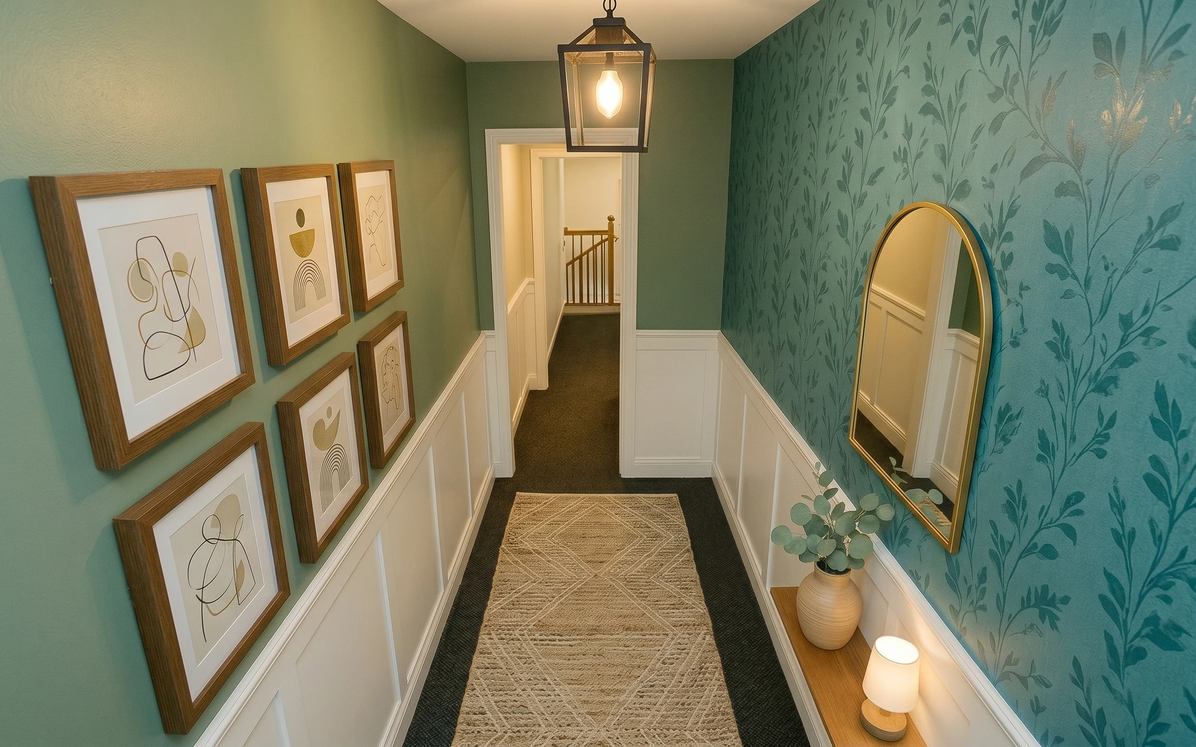
Under $1000: olive-and-gold hallway gallery nook refresh
A weekend refresh for an olive-green hallway gallery nook: update the runner rug, add a gold-tone oval mirror, and wrap one wall in botanic…
Under $400: console nook refresh with botanical neutrals
A console nook refresh for shared housing that uses move-ready swaps—rug, lamp shade styling, and a DIY abstract print. Built on a $400 tot…