
- Best for
- Color and texture on a kitchen island
- Time
- 1–2 afternoons
- Total cost
- Under $350
- Renter-safe
- Yes (move-ready swaps)
Why blue-and-brass coastal notes are the kitchen island of 2026
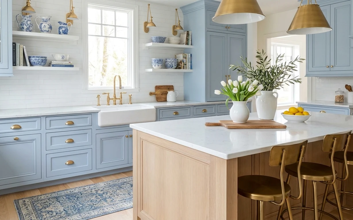
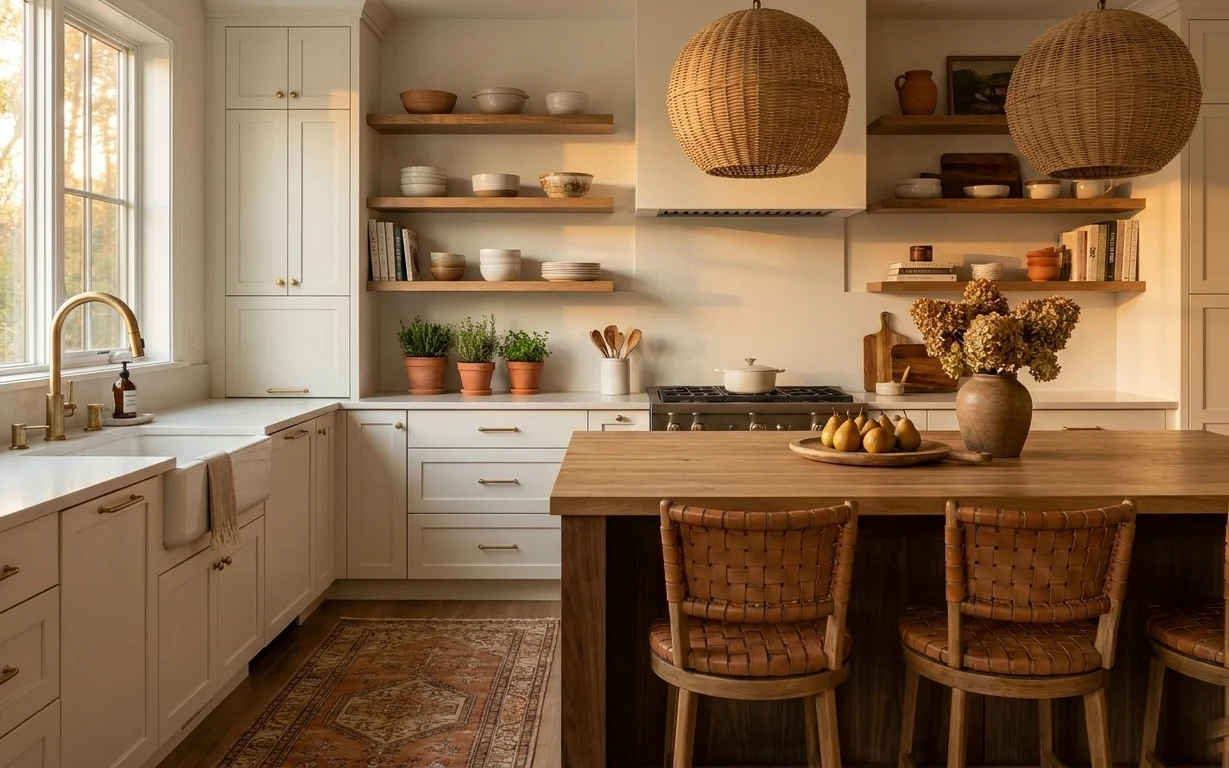
The hero photo has that “clean, light, and lived-in” feeling: white stone, brass-toned metal, and a blue patterned area rug that makes the whole island zone feel finished. You can also see the textures at play—the smooth countertop, the matte ceramic of the vases, and the woven look of the rug. What makes it doable for shared housing is that the heavy visual work comes from accessories you can pack: rugs, boards, and tabletop decor. No landlord approvals required, and everything can come with you.
I once tried to “fix” a rented kitchen with only wall decor, and it ended up looking floaty—like the island area was never actually anchored. This layout changed my mind: a grounding rug under the feet first, then a small cluster on the island (board, lemons, and white florals). I still catch myself wanting to add more objects, but the better move is editing the island until the pieces have breathing room.
Layer 1 — blue patterned area rug ($150) Grounds the island zone
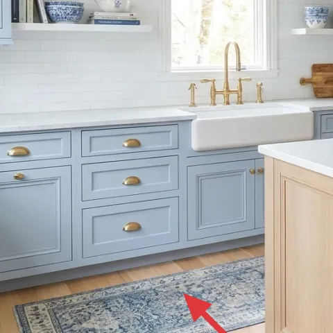
A blue patterned area rug brings the biggest “finished” change to a kitchen island because it visually defines where people stand and gather. In the hero, the rug sits right under the stool area, so it reduces the hard look of glossy flooring and ties together the blue accents scattered around the room. Choosing a washable or rug-pad friendly style matters here: kitchen traffic is real, even in shared housing. The trade-off is that you’ll need to treat it like an accessory with a home—roll it for moves instead of leaving it half-styled.
Rug pad for easier moves
If your rug doesn’t already include one, add a thin rug pad for less slipping and easier roll-up when you pack boxes.
Layer 2 — wood cutting board on kitchen island ($25) Adds warm grain beside white stone
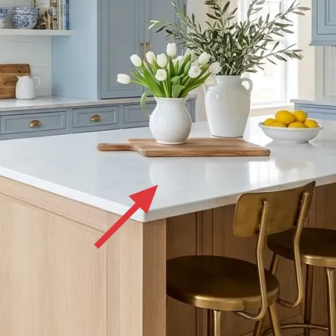
This wood cutting board is doing double duty: it reads warm and natural against the bright countertop, and it also functions as a real serving surface. The board in the hero sits on top of the island, so it looks styled without turning the island into a display shelf. If you’re tempted to use a big basket or tray, go smaller with a board like this—its edges frame the vignette and won’t overwhelm the space. The trade-off is more day-to-day wiping, but it’s worth it because you’re styling with something you’ll actually use.
Stick to one “wood tone”
Keep the board tone close to any existing light wood (like bar stool seats) so the warm color doesn’t fight the brass.
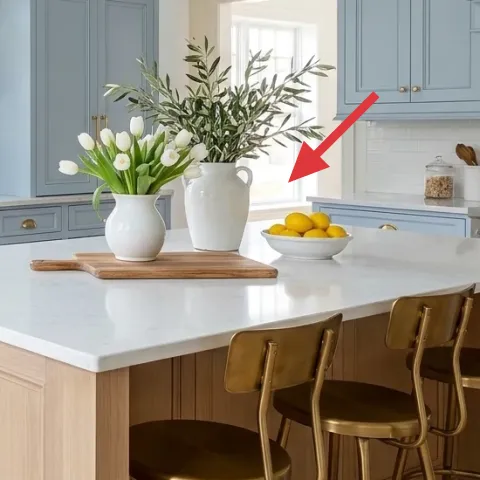
Layer 3 — lemon bowl with yellow lemons ($15) Brings instant color without wall changes
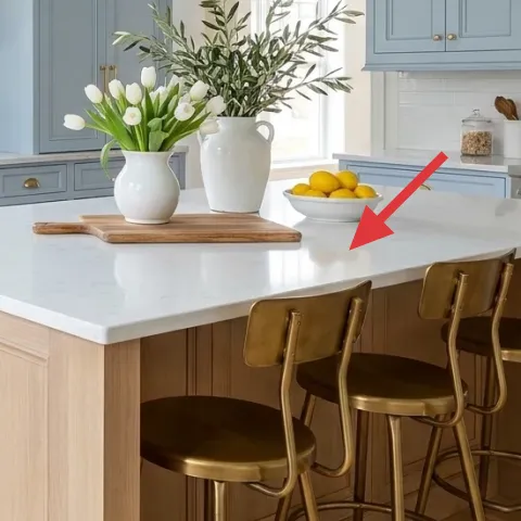
A ceramic lemon bowl is the easiest way to add cheerful color to a kitchen island without touching fixed features. In the hero, the yellow lemons brighten the white-and-blue palette and make the island feel “active,” not staged. For shared housing, this also wins because the swap is literal—you can trade seasonal fruit, or even use citrus-scented faux options when real lemons aren’t available. The main trade-off is that you’ll need to keep it fresh (or restyle often), since kitchens show clutter faster than bedrooms do.
Use a single-color fruit
Picking one dominant color (like yellow) keeps the island from turning into a random produce pile.
Layer 4 — large white vase with white tulips ($25) Makes the island feel calm and bright
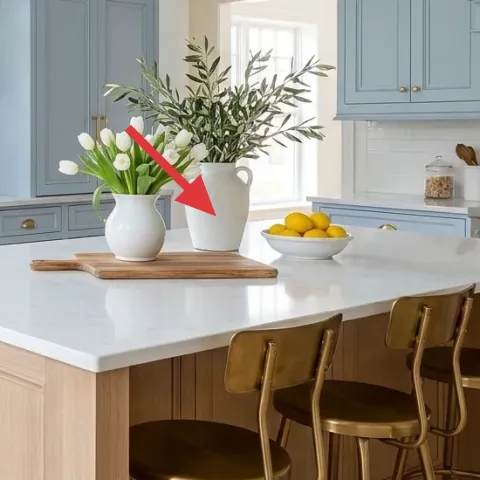
The large white vase plus white tulips soften the island and pull the whole palette toward light, airy whites. Because the hero’s flowers sit on the island surface, the visual impact is immediate even from across the kitchen. This works in shared housing because you can pack the stems and vase separately and rebuild the arrangement in the next apartment’s kitchen. The trade-off is water management—if you’re in and out all day, go for a vase shape that’s stable and easy to refill, not one with a wide lip that sloshes.
Don’t choose a fragile vase lip
If the vase has a thin rim, it’s more likely to chip during moves; opt for sturdy ceramic or glass.
Layer 5 — white pitcher/jug with greenery ($18) Adds height and texture around the flowers
The white pitcher/jug with greenery creates depth behind and beside the main vase, so the island vignette doesn’t look flat. In the hero, it also adds a second “white” shape that unifies the countertop styling without repeating the exact same object. If you only add one vase, you often end up with a single vertical line; adding greenery in a second container makes the arrangement look intentional. The trade-off is a bit of extra styling time, but it’s still move-friendly because the jug and stems are easy to wrap and box.
Keep greens slightly angled
A gentle, off-center angle makes greenery read more “natural arrangement” and less like it was placed for symmetry.
Layer 6 — brass pendant lights ($60) Ties the kitchen’s metal tones together
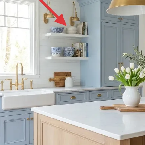
Brass pendant lights add warm metal contrast that makes the island feel styled even when the countertop is simple. In the hero, the pendants echo the brass bar hardware and keep the palette from leaning too cold with all that white. If your version of the kitchen has less warm lighting, this is the category that changes the mood fastest—especially in shared rentals where you can’t repaint. Trade-off: lighting is noticeable, so bulbs and shade shape matter; keep the scale similar so it doesn’t overwhelm the island clearance.
Choose warm bulbs for brass
Warm light helps brass read golden instead of dull, which makes the whole kitchen look more cohesive.
Layer 7 — bar stools at kitchen island ($35) Makes the seating feel intentional
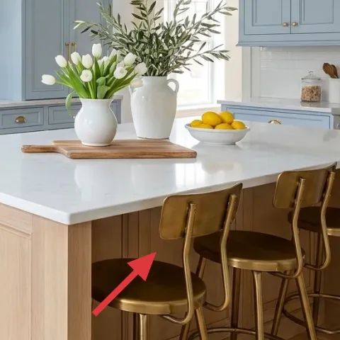
Even though bar stools are functional, they’re also part of the island’s “visual frame.” The stools in the hero pick up the brass tone and balance the cool blues and whites elsewhere, so the island area feels coordinated rather than assembled. For move-ready styling, consider swapping in seat cushions or simple removable accessories rather than changing the stool itself—seat textiles pack better than furniture. The trade-off is that stools can show crumbs and smudges quickly, but that’s also why a cohesive color story looks better longer between cleanings.
Keep seat textiles easy to wipe
If you add cushions, look for wipeable covers so you’re not stuck doing deep cleaning between moves.
The cost, layer by layer
| Layer | Item | Cost |
|---|---|---|
| 1 | Blue patterned area rug | $150 |
| 2 | Wood cutting board | $25 |
| 3 | Lemon bowl with yellow lemons | $15 |
| 4 | Large white vase with white tulips | $25 |
| 5 | White pitcher/jug with greenery | $18 |
| 6 | Brass pendant lights | $60 |
| 7 | Bar stools at kitchen island | $35 |
| Total | $328 | |
If you want a cheaper version, keep the rug and one centerpiece (the white vase) and swap the rest for lower-cost decor: a thrifted wood board, a smaller ceramic fruit bowl, and greenery from cuttings plus a simple white container. That keeps the look bright while dialing back the budget.
What worked, what didn't (across the whole room)
The strongest wins come from repeatable, movable items: the blue rug anchors the island area, and the white-and-brass objects keep the palette coherent. The only downside is that the more “styled” the island, the more it shows daily mess—so editing matters.
What worked
- The blue patterned area rug defines the island footprint and reduces the look of bare floor.
- Wood grain (cutting board) adds warmth next to glossy white surfaces.
- White tulips in a large vase keep the island light and airy.
- Yellow lemons add a single bold color cue without changing any fixed features.
- Layering two white containers (vase plus pitcher) adds depth without clutter.
- Brass lighting helps the metal tones feel intentional across the kitchen.
What didn't
- Over-stuffing the island with extra bowls makes it feel busy fast in a shared kitchen.
- Fragile-looking glass or thin-rim vases are stressful during packing and moving.
- Too much warm lighting can make whites look creamy instead of crisp.
- Stools without wipeable surfaces show scuffs and crumbs more obviously.
- Picking multiple unrelated colors for fruit can muddy the coastal blue palette.
What we'd skip if we did it again
Skip adding lots of small decor at the same height. On a kitchen island, tiny objects compete with daily use, and the photo-worthy look disappears fast. Instead, keep one “main” island item (the large vase) and one supporting object (the pitcher) so the arrangement has a clear reading from across the room.
Skip relying on lighting alone for warmth. Pendant fixtures help, but the kitchen already has bright white surfaces; without a rug and a few tabletop anchors, the space can still feel cold or unfinished. The better order is rug first, then countertop color cues, then lighting polish.
Skip swapping big fixed features you can’t take with you. Even in a student-friendly kitchen, permanent changes create move-day headaches. The move-friendly version keeps the island style portable: accessories, textiles, and a tight color story that reconstructs quickly in the next place.
Frequently asked
How long does this kind of kitchen island refresh take?
Plan on 1 to 2 afternoons. The rug goes down first, then the cutting board and serving bowl are styled, and the floral setup is added last. The only time sink is making sure everything stays spaced out so you’re not covering usable counter space.
What if I’m not allowed to change lighting or fixtures?
If lighting isn’t editable, keep the pendants out of your plan and focus on the movable anchors: the blue patterned area rug plus the island vignette (cutting board, lemons, white vase, and greenery). Brighter bulbs in a plug-in lamp you already own can also help, but the core “finished” look comes from texture and color.
Can I do this if my kitchen island is smaller or bigger?
Yes—scale the cluster. In a smaller space, use the same idea but reduce to one main container (the large vase) and one supporting element (a smaller greenery container) instead of multiple items. In a bigger kitchen, you can add a longer cutting board or a second fruit bowl, but keep the total object count edited so it stays calm.
Where should I shop for items like the rug, vase, and lemon bowl?
For the rug, look for a washable patterned option at home stores or rug retailers that offer rug pads. For the vase and pitcher, kitchenware sections and general decor stores are easiest because you can compare shapes. For the lemons/ceramic bowl, kitchen accessory aisles and seasonal displays are usually the fastest route.
What’s the biggest mistake people make in kitchens like this?
Over-styling the island. It’s tempting to add matching sets everywhere, but a kitchen island needs breathing room because it’s constantly in use. A better approach is to repeat one palette (white, blue, brass) and use two levels of height—one tall floral piece and one lower serving object.
Will this look survive a move to a new rental?
That’s the point. The rug rolls, the cutting board packs, and vases and bowls wrap easily. Rebuild the vignette in the next place by matching the same shapes and colors first, then adjusting scale to fit the new island countertop depth.
More in Kitchen & Dining
Under $350: coastal kitchen island refresh with move-ready swaps
A bright, coastal-leaning kitchen island setup starts with a blue patterned area rug and a few movable decor anchors—cutting board, lemons,…
Under $400: move-ready kitchen island refresh with warm textures
A sunlit kitchen island refresh that leans on warm wood, terracotta, and woven textures—no drilling, no permanent changes. This look is ach…