- Best for
- styling a small bar corner
- Cost
- $345 total
- Difficulty
- easy add-ons + DIY labels
- Renter-safe
- yes (no-drill styling)
Why copper-and-olive bottle styling is the home bar corner of 2026
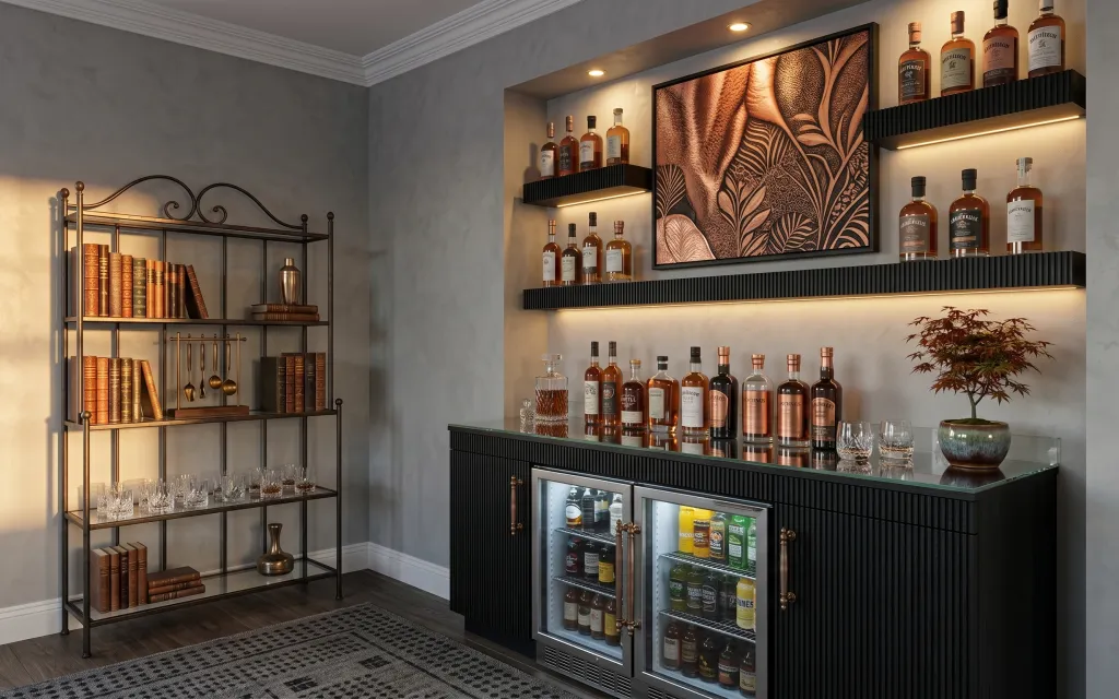
When I first tried to make my rentals feel “finished,” I over-bought random décor. This setup works because it keeps the palette tight: painted gray walls, a black frame artwork moment, and copper-toned details repeated across shelving and the bar countertop. You can see that layering in the patterned area rug underfoot, the black metal shelving vibe, and the warm, golden under-shelf lighting that makes everything read cozy. For renters, it’s also doable because the upgrades are all add-ons—no wall changes needed.
The moment I caught myself making a mistake was when I tried to match everything by color only. The shelves looked flat because the textures weren’t varied enough. Swapping to a mix—matte rug texture, a crisp black-framed art edge, and glossy glassware—made the corner feel intentional even with the existing layout. That’s the trade-off: fewer big purchases, but each one earns its place visually.
Layer 1 — patterned area rug 5×7 ($120) Anchor the bar corner
A patterned area rug in a 5×7 size grounds the entire bar corner and keeps the styling from floating above the wood floor. In the photo, the rug’s dark pattern adds movement while still holding the black-and-gray story together. The trade-off I’d accept versus a plain neutral rug? You get slightly busier visuals, but it hides small spills and scuffs better—especially useful in small-space rentals. Aim for a rug with enough dark contrast to echo the black metal shelving, then repeat copper tones in smaller styling items on top of the bar.
Pick contrast first, then pattern
If your shelving and cabinetry are dark, choose a rug where the pattern still reads from a few feet away—otherwise it disappears once the lights warm up the corner.
Layer 2 — large framed artwork print in black frame ($80) Adds a bold, rental-safe focal point
The large framed artwork print gives this bar corner its focal “anchor,” and the black frame helps it harmonize with the black metal shelving. Look at how the artwork sits high and wide: it fills the visual space above the bottles and countertop so the corner feels composed rather than crowded. The obvious alternative would be smaller prints, but they can get lost against the shelf lines. A single statement frame keeps the look cohesive and moves easily with you at lease end. Choose a print with warm, earthy tones so it plays nicely with copper-colored accents.
Keep the frame color consistent
A black frame echoes the shelving metal, which matters more than perfectly matching every warm tone in the room.
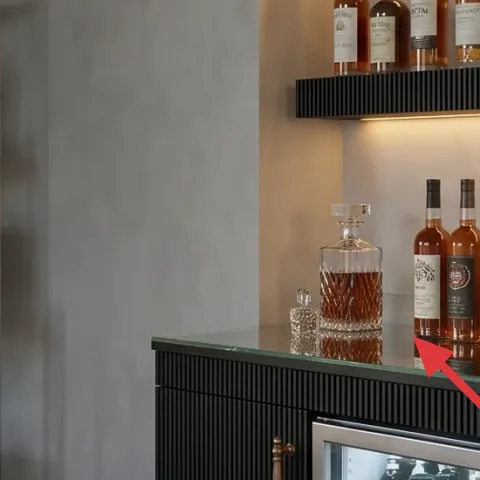
Layer 3 — green ceramic bowl on bar countertop ($30) Brings an earthy pop near the front edge
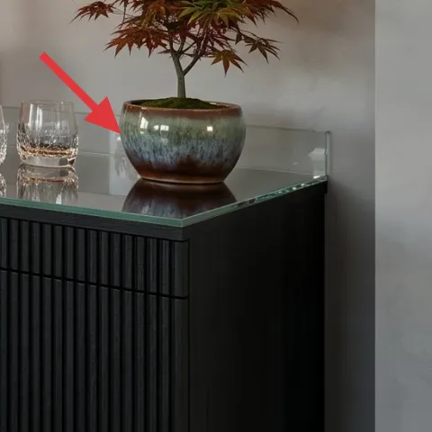
The green ceramic bowl on the bar countertop adds a color cue that keeps the whole corner from becoming “all browns and blacks.” In the hero, it’s positioned close to the foreground, which makes it do double duty: it looks good in the bottle-and-glass styling, and it gives the eye a place to land between the countertop items and the artwork. Compared to adding another bottle or glass, a ceramic vessel changes the texture—matte ceramic reads softer than glass. If your bar area feels cluttered, this is a good swap because it’s substantial without being busy.
Cluster it with height, not just more objects
Pair the bowl with a small plant or a taller bottle so the cluster has a visual top line.
Layer 4 — small potted tree/plant ($30) Adds warmth without taking over the space
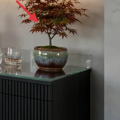
A small potted tree/plant gives life to the bar corner and softens the straight lines of shelving and countertop edges. In the photo, the plant sits to the right of the framed artwork area, balancing the visual weight of all the bottle labels and glassware. The trade-off versus a low single-stem plant is that it takes a bit more care, but it reads more “designed” in photos and adds a vertical shape that makes the corner feel taller. If you’re renting, pick a plant you can move easily—strong roots and a stable pot make future packing less stressful.
Go for shape over size
You’re after a layered silhouette that contrasts with the shelf grid, not an oversized plant that blocks sightlines.
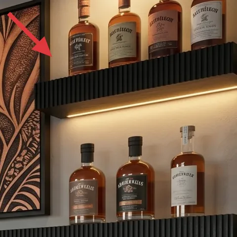
Layer 5 — decorative book stack on shelving ($15) Repeats warm tones like a stylist’s trick
The decorative book stack on the shelving unit is small but powerful—it repeats the warm, coppery tones already happening in the bottle labels. That repetition is what makes the corner feel curated instead of random. The alternative would be adding more small décor objects, but books give you controlled color blocks and consistent edges that align with the shelving grid. The trade-off is you’re committing to using the visible spines, so choose covers that look good even when you’re not thinking about them. Thrifted options work because the warm palette matters more than brand-new condition.
Choose spine colors that match your bottles
When labels have copper or amber tones, book spines in similar warmth keep everything reading as one story.
Layer 6 — copper/brass pitcher on shelving ($35) Adds shine where glass bottles can’t
The copper/brass pitcher on the shelving unit adds a metallic reflection that complements all the glass bottles without blending in. In the hero, the pitcher sits among the books and bottle rows, creating a “pause” in the repeating label pattern. The obvious alternative—more glassware—would add height but not the same dimensional contrast. Metallic décor changes how the warm lighting reads on surfaces, so even in the same corner it feels richer. The trade-off: it’s one more item to dust, but it’s worth it because it brings a different texture than ceramic or paper labels.
Don’t pick a metal shade that clashes
If you swap the copper look for a very shiny silver, the warm bottles can start to feel out of place under the same lighting.
Layer 7 — apothecary-style label set for bottles ($35) Makes your bottle lineup look intentionally curated
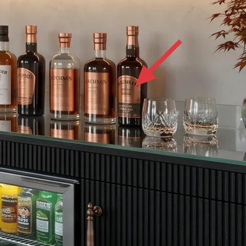
Even if you can’t change the bottles themselves, you can change the impression of the whole shelf by standardizing the labels. In the photo, the bottle area reads styled because the labeling feels cohesive against the warm amber glass. A label set is renter-friendly because it’s applied to the existing bottle look rather than any permanent fixtures. The trade-off versus buying pre-labeled bottles? You get more flexibility and can tailor the typography to your taste, but you’ll spend a little time printing and applying. That small effort pays off every time you glance over and see the corner feels “designed.”
Make it instead of buying it
DIY apothecary-style labels for the bottles using printable typography so the shelf looks cohesive while staying move-ready.
Materials
- Printable label sheets (sticker paper) — 1 pack — office supply store — $10
- Laser or inkjet printer ink (if needed) — 1 set — office supply store — $6
- Scissors or craft knife — 1 pair — craft store — $5
- Clear packing tape (to seal edges) — 1 roll — big-box store — $2
- Microfiber cloth for wiping bottles — 1 — home goods store — $1
Steps
- Measure one bottle’s label area and format your printable design to fit.
- Print the labels on sticker paper and let the sheet sit flat for 2 minutes.
- Wipe each bottle spot with a dry microfiber cloth to help labels stick smoothly.
- Apply the label centered on the bottle, pressing from the middle outward.
- Seal the label edges with a small strip of clear packing tape for extra staying power.
- Re-check alignment after 5 minutes, then gently smooth any lifted corners.
Total DIY cost: $24 — saves about $11 over buying.
The cost, layer by layer
| Layer | Item | Cost |
|---|---|---|
| 1 | patterned area rug 5×7 | $120 |
| 2 | large framed artwork print in black frame | $80 |
| 3 | green ceramic bowl on bar countertop | $30 |
| 4 | small potted tree/plant | $30 |
| 5 | decorative book stack on shelving | $15 |
| 6 | copper/brass pitcher on shelving | $35 |
| 7 | apothecary-style label set for bottles (DIY) | $35 |
| Total | $345 | |
If you want a cheaper variant, swap the large framed artwork print for a smaller 16×20 framed print and add one extra decorative tray or glassware cluster on the countertop. The color cue still lands, but you spend less where a big frame would cost the most.
What worked, what didn't (across the whole room)
The overall win here is repetition: warm copper tones show up across the rug contrast, framed print, ceramic accent, and metallic pitcher. The other big success is height planning—art and plant placement balance the dense bottle shelves so the corner feels intentional.
What worked
- The patterned area rug keeps small-floor scuffs from standing out next to the darker cabinetry lines.
- The black-framed artwork gives the bar corner a clear focal boundary above the shelves.
- The green ceramic bowl adds a color break that prevents everything from reading as only gray and brown.
- The potted tree introduces vertical softness that counters the horizontal shelf grid.
- The book stack provides controlled warm color blocks that look styled, not random.
- The copper/brass pitcher adds a metallic reflection that glass alone can’t replicate.
What didn't
- Overloading the countertop with extra glassware made the corner feel busy instead of curated.
- Using too many label colors at once removed the cohesive “set” feeling around the bottles.
- Choosing a plant with a flatter, round shape didn’t echo the corner’s vertical lines.
- Skipping the framed artwork left too much empty wall space above the bottles.
- Replacing metallic accents with plain matte décor made the warm lighting look less rich.
What we'd skip if we did it again
Skip buying matching décor sets from one retailer. This corner looks right because the pieces share color and texture cues, not because every item came in a coordinated bundle.
Skip a plain rug if your shelving is dark. Pattern and contrast are what help the floor read intentional, especially when warm under-shelf lighting is already doing the heavy lifting.
Skip labeling bottles with mismatched fonts. Choose one typography style for every bottle label so the shelf looks like a curated lineup instead of a craft project.
Frequently asked
How long does this home bar corner refresh take?
Most of the time is shopping and placing items, not installation. Plan for 30–45 minutes for rug placement and countertop/styling, 10–20 minutes to position the plant and pitcher, and about 1–2 hours for printing and applying DIY apothecary-style labels (including a little cleanup time). If you already have bottles and glassware, the label step becomes the longest part.
Is this renter-friendly if my lease doesn’t allow any wall changes?
Yes. The layers are all stand-alone décor: a patterned area rug, a framed artwork print, tabletop styling objects, and bottle label graphics. The framed piece can be mounted using renter-safe hanging methods like Command-style hooks (depending on what your frame supports). Nothing in the plan requires painting, drilling, or replacing landlord fixtures.
What if my bar corner is smaller than the photo?
Keep the same logic, just scale down. Use a smaller framed print or shift to a thinner frame, and consider a compact plant with a similar vertical silhouette. For the rug, prioritize contrast over size—getting the floor “anchor” right matters more than matching the exact measurements.
Where can I shop for the rug and the framed print on a budget?
Look for rugs and art prints at large-box home stores, online marketplaces with clear shipping/returns, and thrift shops that carry framed wall art in consistent sizes. For the rug, filter by 5×7 or similar and verify the pile type you want for easy cleaning. For the framed print, choose a black frame option so the frame color repeats what you already have.
What’s the biggest mistake people make with bar-shelf styling?
Mixing too many label styles or too many metal finishes at once. It can feel chaotic even if every item is “nice.” The fix is simple: standardize your bottle labels (same typography style), repeat one metal tone like copper/brass, and keep one bold focal point on the wall.
More in Small Spaces

Under $400: a home bar corner refresh with 7 renter swaps
A modern home bar corner makeover with a bold framed print, a grounding patterned rug, and easy renter-friendly styling swaps. Total budget…
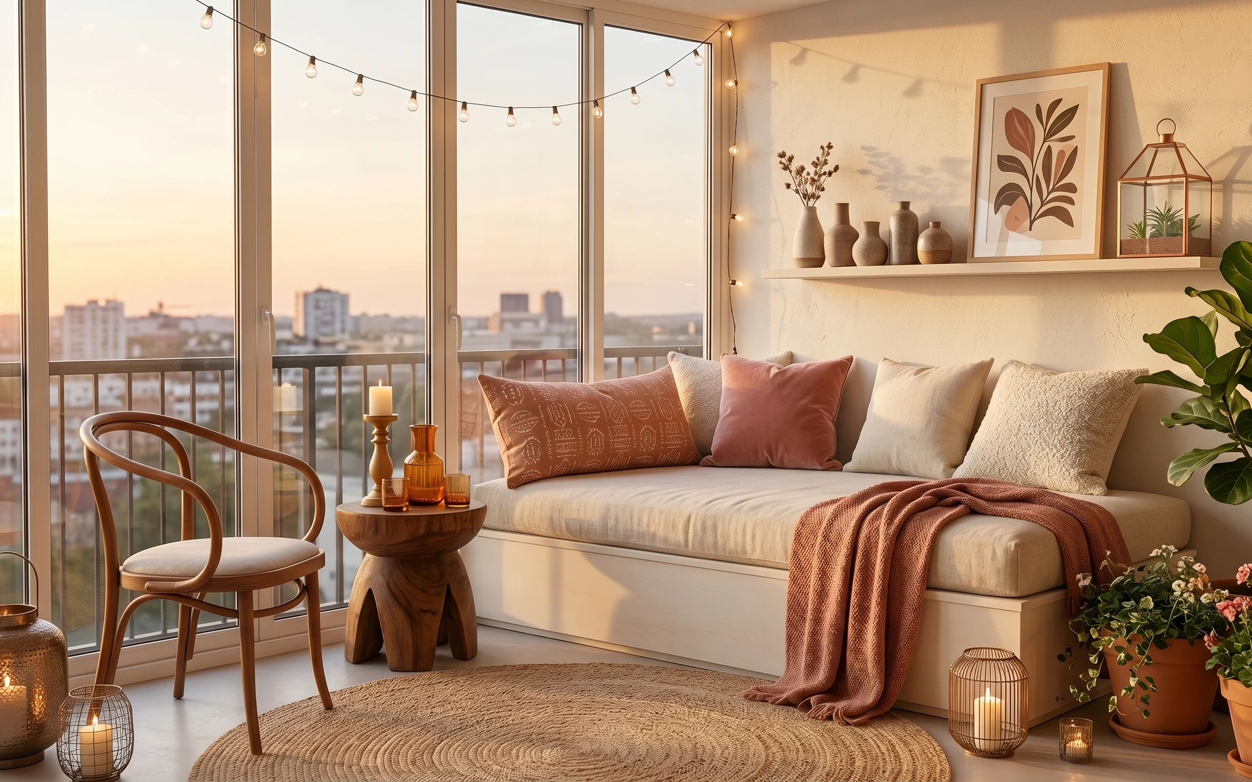
Under $600: sunroom daybed nook refresh
A sunroom daybed nook gets cozier with seven specific swaps and one DIY curtain upgrade, all aimed at under $600. You’ll end up with a laye…
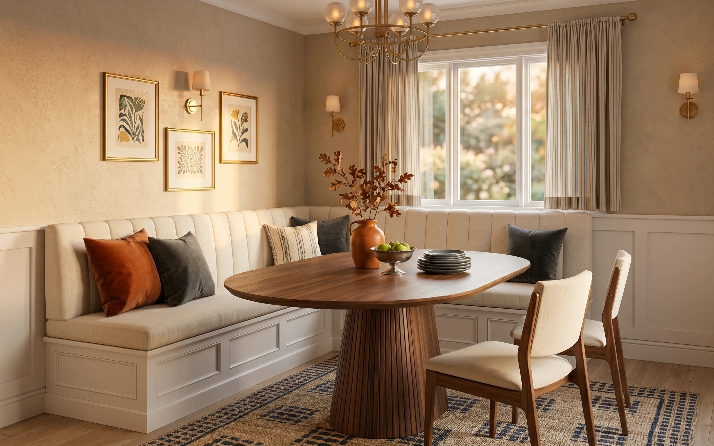
Under $500: corner banquette dining nook refresh
A move-ready corner banquette dining nook refresh under $500—built from rug, curtain, pillows, chair, and framed art swaps. This look keeps…