- Square footage
- Works best in 150–300 sq ft corners
- Cost
- Under $500 for the full look
- Difficulty
- Weekend-level (no-drill, box-packable)
- Renter-safe
- Textiles + art swaps only
Why warm-beige neutrals are the corner banquette dining nook of 2026
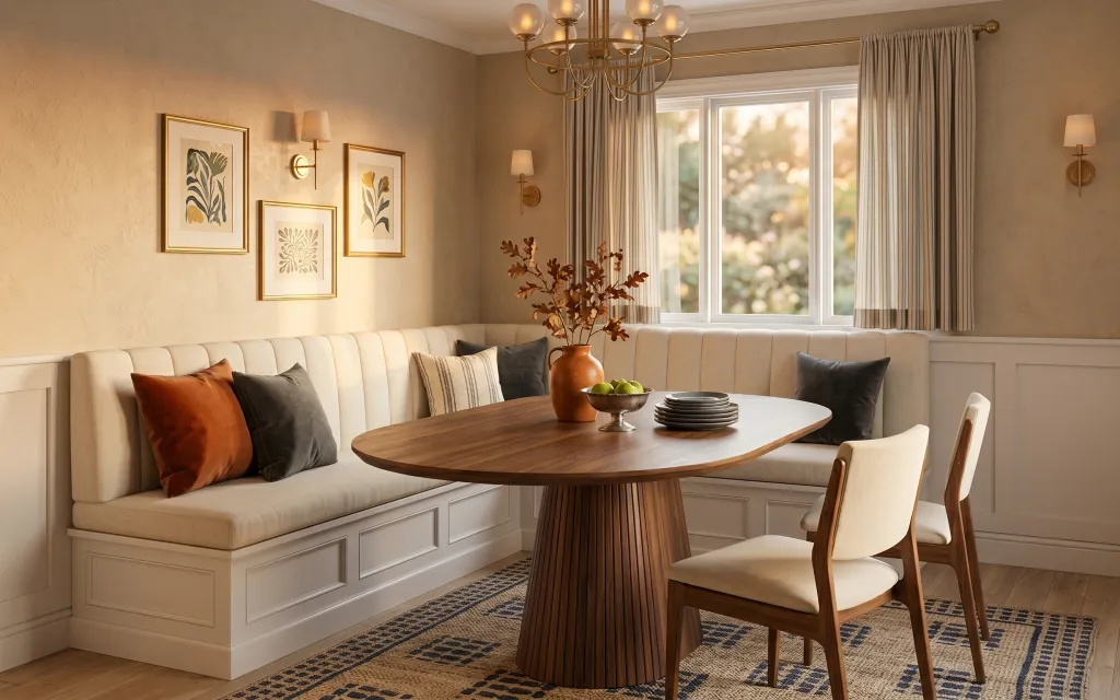
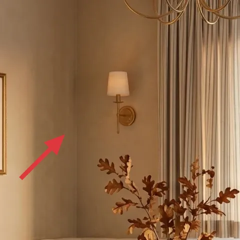
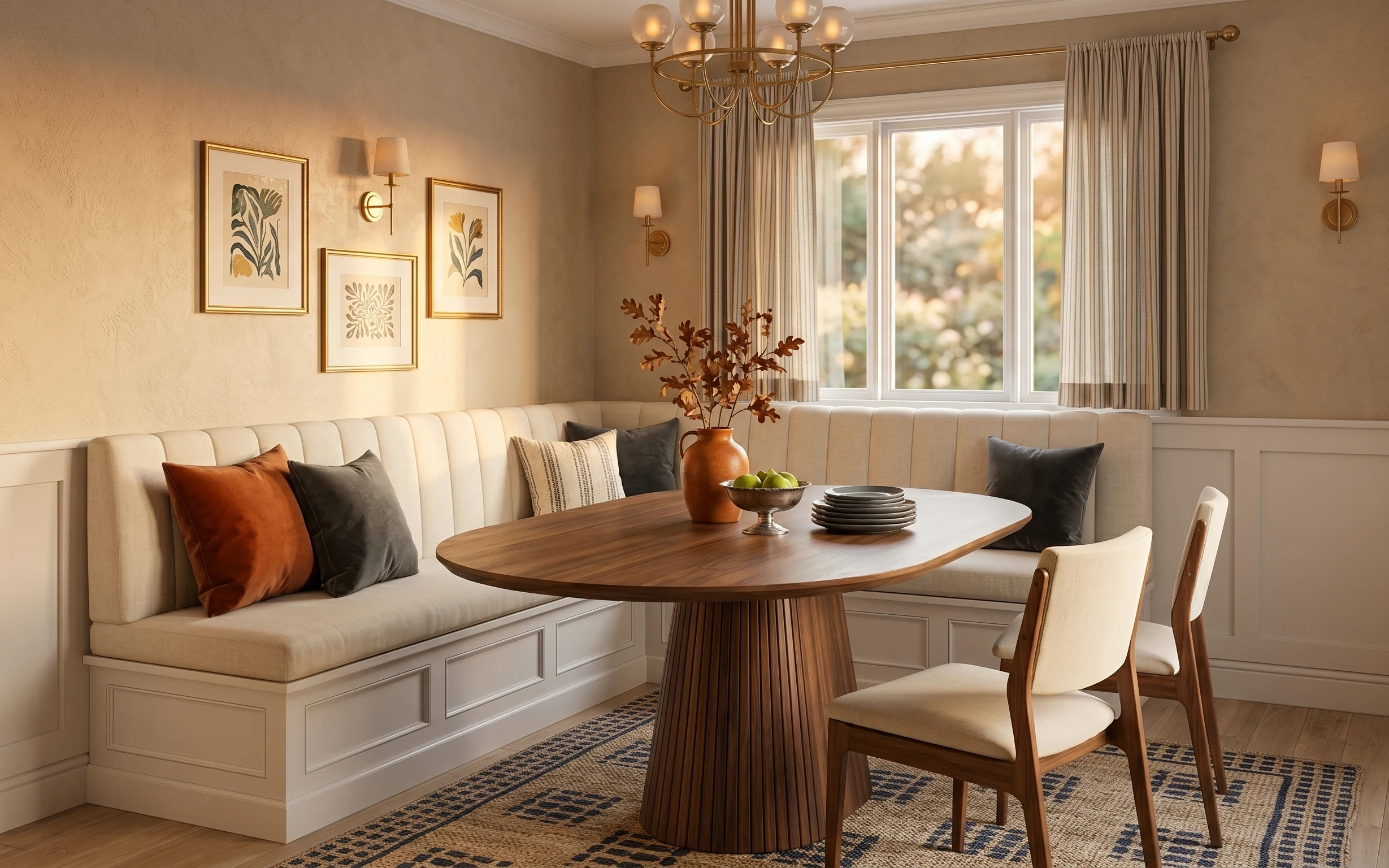
The hero scene leans on warm beige walls, a woven rug with a dark geometric pattern, and rust-and-gray accent pillows that actually show color instead of staying beige-only. The striped curtain panels add vertical calm next to the banquette’s upholstered shape. Even with a round wooden dining table and upholstered chair seats, the overall vibe stays cohesive because the textiles repeat the same earth tones. For shared housing, that matters: you can pack rugs, pillows, and frames, and leave the heavy stuff alone.
I used to overthink “matching sets” and ended up with everything looking like it came from the same store. What finally clicked was noticing the repeating palette: rust terracotta shows up on the pillows and the vase, while navy grounds the rug pattern. When I stopped trying to make every item match perfectly, the room started reading like a curated mix instead of a checklist.
Layer 1 — Woven area rug with dark geometric pattern ($150) anchors the pattern
A dark-geometric woven area rug is the easiest way to make a banquette dining nook feel intentional, not temporary. In the photo, the rug’s pattern gives the floor a “graphic” rhythm that keeps the beige walls from feeling flat, and it also visually ties the chair and table materials together. Buying a 5×7 rug size is more move-friendly than hauling floor-to-wall carpeting, and it rolls up into manageable tubes. The trade-off is that you’ll want a lint roller on hand, because woven textures catch fibers—but the payoff is a room that looks styled even before you add art.
Pick a rug pattern with one strong direction
That’s what keeps a small corner from looking chaotic; the geometric lines in the rug help the eye move around the table.
Layer 2 — Accent throw pillows ($30) brings back the rust note
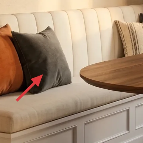
Those rust and gray accent throw pillows do a lot of work for a small physical footprint. They repeat the terracotta warmth that’s already in the vase, but they also add cooler neutrals so the space doesn’t tip fully orange. If you try to use only beige cushions, you lose the “designed” look and the banquette reads like furniture only. The move-friendly angle: pillow covers and inserts pack flat and can be swapped room to room. The trade-off is that pillow styling is fast to overdo, so aim for one warm accent (rust) and one grounded neutral (gray) rather than a full spectrum.
Choose covers that you can wash or swap quickly
Shared-housing life means spills and laundry cycles; cover fabrics with removable zippers make the next move easier.
Layer 3 — Striped curtain panels ($80) softens the window wall
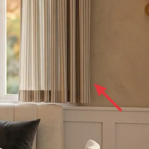
Striped curtain panels add texture and height without taking up floor space, which is why they’re such a strong small-nook move. In the photo, the stripes visually stretch the window area and balance the banquette’s upholstered mass. Buying panel pairs is also portable: fold them, bag them, and you’re done. The biggest “why this over blinds” advantage is softness—curtains make the whole corner feel warmer, especially at night when lighting shifts. The trade-off is that stripes can feel busy if the rest of the room is also highly patterned, so keep your rug pattern as the main graphic.
Match the curtain tone to the wall’s undertone
If your beige leans yellow, look for taupe-leaning stripes; if it’s cooler, pick greige stripes.
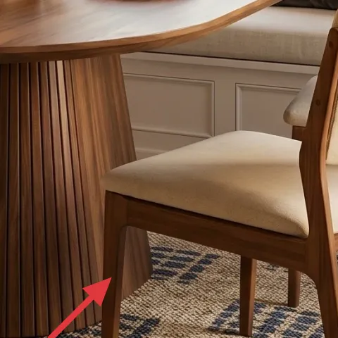
Layer 4 — Dining chair with upholstered seat ($80) adds comfort and wood warmth
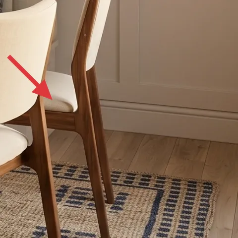
An upholstered dining chair helps this corner feel livable, not just “display furniture.” The chair in the photo repeats the warm wood color from the round table while the seat fabric blends into the beige banquette tones. When you’re sharing space, comfort matters—if a chair looks nice but feels stiff, you’ll avoid using the nook. The trade-off is cost and storage: chairs take more room than pillow covers or art prints. Still, compared to replacing bigger pieces, one chair swap is a manageable move because it still fits in a rental pickup for most campus schedules.
Don’t buy a chair fabric you can’t wipe
A dining corner gets spills; choose a performance weave or one with easy spot-clean care.
Layer 5 — Gold-framed botanical art print (DIY hand-painted abstract on cardstock) ($40) adds your personal layer
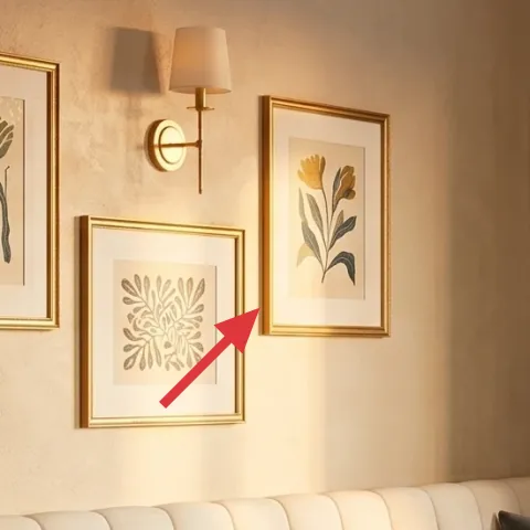
The framed botanical art sets the color language—green shapes and warm beige backgrounds—so swapping the print is the safest place to add personality without changing the room’s structure. For an impermanent setup, you can DIY the insert on cardstock and keep the same frame (or buy a matching frame and plan to reuse it later). This is the trade-off: you won’t get a perfect botanical illustration every time, but the imperfect, hand-painted look will read intentional because the room already lives in warm neutrals. The best part for shared housing is that cardstock is flat and lightweight, so the “art layer” is one of the easiest to pack.
Make it instead of buying it
DIY a hand-painted abstract insert on cardstock to sit behind the gold frame you already have (or to swap into a matching frame), so your nook feels personal without any wall changes.
Materials
- Cardstock sheet — 1 — art supply store — $3
- Acrylic craft paint set (small tubes) — 1 set — craft store — $12
- Sponge dauber — 1 — craft store — $2
- Command hook (for hanging the frame) — 1 — hardware store — $8
- Clear plastic sheet/sleeve — 1 — office store — $5
Steps
- Sketch loose shapes lightly on the cardstock (no detail—just big blocks for color).
- Dab in two to three colors (beige/tan, muted green, and a warm rust note) with the sponge dauber.
- Let the paint dry fully, then layer a second pass only where you want depth.
- Once dry, slide the finished cardstock into the clear sleeve to protect it during moving.
- Place the insert behind the frame’s backing, aligning edges neatly so it won’t shift.
- Hang the frame using a Command hook that matches your wall type and weight limit.
Total DIY cost: $30 — saves about $10 over buying.
Layer 6 — Gold-framed botanical art print (smaller) ($25) tightens the composition
Adding (or upgrading) a smaller framed print helps the gallery feel like a planned grouping rather than a scatter of prints. The smaller botanical frame in the photo works because it balances the larger print shapes with a slightly different scale, which makes the wall read as “composed” instead of random. If your corner feels too empty, a small frame is a better first investment than buying bigger decor. The trade-off is that smaller prints can look lost if the frame isn’t hung at eye level, so take a minute to line up the top edges before committing. In shared housing, frames are also easy to pack in flat boxes.
Use scale to control the eye
Smaller prints calm a wall that already has a window, curtains, and banquette upholstery.
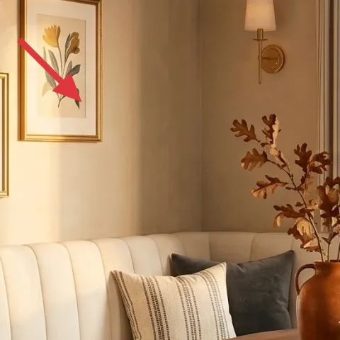
Layer 7 — Gold-framed botanical art print (medium) ($25) repeats the warm gold detail
That medium-sized gold-framed botanical art print is what keeps the wall story consistent—gold echoes the warm metal tones in the room and ties back to the dining table’s wood warmth. In a small corner nook, the goal is not filling every inch; it’s repeating a few key materials so the space looks collected. A medium frame is a sweet spot: big enough to read from across the table, small enough to pack without drama. The trade-off is that gold frames can look too shiny if your lighting is harsh, so choose prints with warm, muted backgrounds (like the beige tones visible here).
Keep the frame mat color within the same family
Even when you change the art, similar mat/beige backgrounds make the grouping look intentional.
The cost, layer by layer
| Layer | Item | Cost |
|---|---|---|
| 1 | Area rug 8×10 (woven geometric) | $150 |
| 2 | Throw pillow cover (rust/gray) | $30 |
| 3 | Curtain panel pair (striped) | $80 |
| 4 | Dining chair with upholstered seat | $80 |
| 5 | Gold-framed botanical art print (DIY ~$30 in materials) | $40 |
| 6 | Gold-framed botanical art print (smaller) | $25 |
| 7 | Gold-framed botanical art print (medium) | $25 |
| Total | $430 | |
If you want a cheaper variant, skip the dining chair swap and put that money into the rug and curtains. Keep pillows and framed art, but choose a budget rug in a simpler geometric layout and look for “curtain panel pair” multipacks.
What worked, what didn't (across the whole room)
This nook reads cohesive because the palette repeats across the rug, pillows, curtains, and framed art, so the corner feels styled instead of pieced together. The biggest win is how much softness the textiles add—especially at the window and on the banquette. The only element that can fight you is when patterned items multiply too quickly.
What worked
- The woven geometric rug adds structure to an otherwise beige-heavy corner floor.
- Rust-and-gray pillow colors make the banquette look intentionally styled, not empty.
- Striped curtains give vertical balance next to the upholstered bench back.
- Gold frames tie the wall grouping to the warm wood table tone.
- Upholstered chair seats keep the dining area comfortable for everyday use.
What didn't
- If the curtain stripe spacing is too small, it can feel busy with the rug pattern.
- Too many warm accents (rust pillows plus rust accessories plus rust art) pushes the palette orange.
- Small frames can look “random” if the hang height is off by more than an inch.
- A chair with only minimal upholstery can make the nook feel stiff, even with pretty decor.
What we'd skip if we did it again
Skip buying matched dining set pieces all at once. In a corner nook, the quickest way to look finished is to repeat materials (warm wood + warm neutrals) and let textiles do the heavy lifting with pillows, curtains, and the rug.
Skip replacing the banquette itself. Upholstered seating is expensive and not move-friendly; instead, focus on pillow covers, art scale, and window softness so the room updates without needing a moving day plan.
Skip frame chaos—choose one frame finish family (here, gold) and stick with it across the grouping. It keeps the wall cohesive and prevents the “too many new things” feeling when you’re packing up for a lease change.
Frequently asked
How long does a refresh like this usually take?
Most people can do the swap-and-style part in about 4–6 hours. Budget extra time for matching curtain lengths (if you’re swapping panels) and for getting the frame heights consistent above the banquette. If you DIY an art insert, plan another hour for drying and assembly.
Is this renter-friendly if my wall is textured or plaster?
Yes—stick to lightweight hanging methods like foam-core Command hooks and only use what’s rated for your frame weight. Avoid anything that pulls paint when removed. For extra caution, keep the weight low (smaller frames, lighter inserts) and test removal on a less visible spot.
What if my nook is smaller than the photo?
Use the same idea, just scale the pieces down: a 5×7 rug instead of 8×10, slightly fewer pillow covers, and either one or two frames instead of three. Keep curtains but choose panels that are lighter in color so the window wall doesn’t visually shrink.
What if my nook is bigger?
You can keep the same palette and add one “repeat” layer—like a second chair or an additional framed print in the same gold finish. For the curtains, use longer panels to preserve the vertical rhythm. A bigger rug size also helps the dining zone feel less floaty.
Where can I shop to keep this under $500?
Start with textiles and used pieces: thrift or discount stores for pillow covers and frames, then budget for the rug and curtains as the main investments. For framed botanicals, look for gold-finish frames at home stores and swap prints to match the warm beige/rust palette.
What’s the biggest mistake people make in small dining corners?
Over-patterning. When rug, curtains, and multiple accessories all compete with strong prints, the corner stops reading as calm and intentional. Keep one main graphic (the rug), use texture and stripes as soft structure, and let the art grouping bring color without adding another busy pattern.
More in Small Spaces
Under $500: corner banquette dining nook refresh
A move-ready corner banquette dining nook refresh under $500—built from rug, curtain, pillows, chair, and framed art swaps. This look keeps…
Under $800: 7 weekend upgrades for a banquette dining nook
Refresh a banquette dining nook with seven weekend-friendly upgrades—rug warmth, brass lighting, framed wall art, and earthy styling. The t…
Under $500: japandi entry console nook refresh for renters
Warm wood, cream, and black accents make this entry console nook feel intentional without any wall changes. This $500 renter-friendly refre…