- Square footage
- Small corner, fits most tight dining nooks
- Cost
- About $370 total for 7 swaps
- Difficulty
- Easy—mostly textiles and tabletop styling
- Renter-safe
- Yes—no drill, no painting, and everything packs up
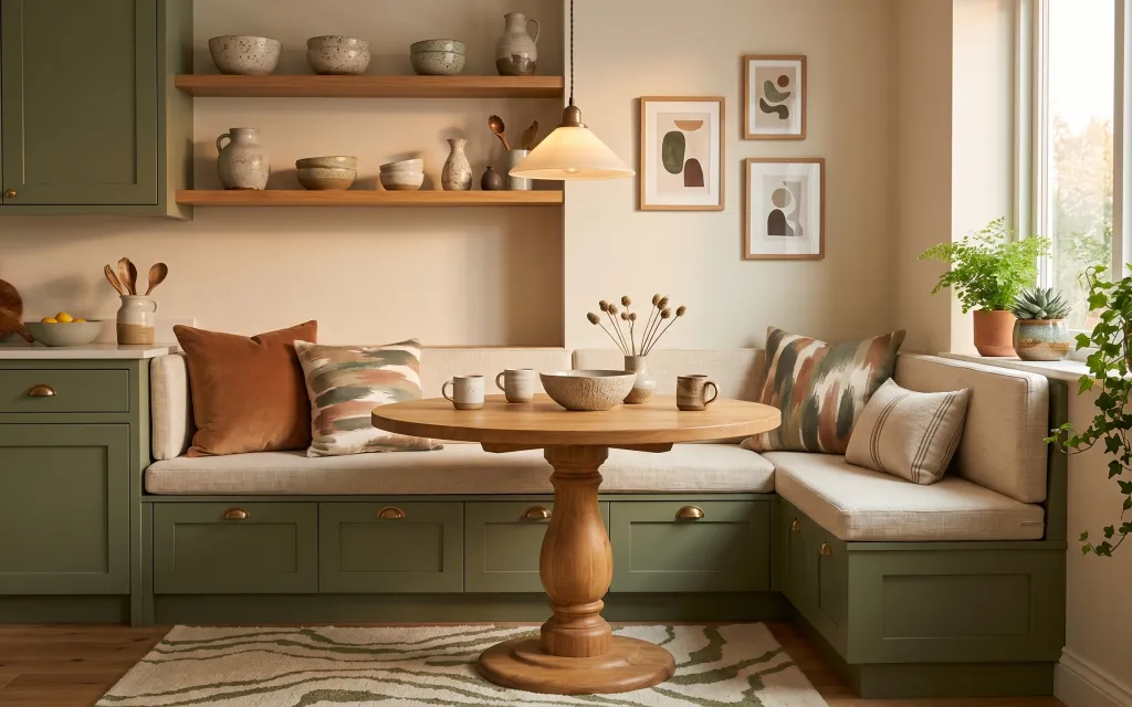
Why this earthy-neutrals banquette dining nook is the move-friendly little corner of 2026
The starting point in the photo is a built-in sage banquette area, and the magic is what’s added around it. A patterned area rug anchors the whole zone, while warm wood tones and ceramic details keep everything from feeling too “rental blank.” The soft fabric-shade hanging lamp adds that gentle, golden light you can’t fake with overheads. For this refresh, the textiles and decor do the heavy lifting—so it’s achievable on a renter budget and everything can pack up when the lease ends.
I almost bought a second “matching set” of throw pillows, and then I remembered how quickly those combos look one-note. Instead, I went for one solid warm brown pillow and one olive-and-cream striped pillow to echo the palette already in the space. That tiny mix makes the nook feel styled, not purchased as a kit, and it still works when you swap decor seasonally.
Layer 1 — patterned area rug ($140) anchors the nook underfoot
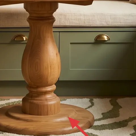
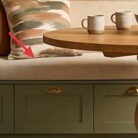
A patterned area rug grounds the banquette dining nook the way flooring can’t—especially when the built-ins and cabinets already pull visual weight. Choose a rug with a similar cream base and earthy greens so it blends with the sage while still adding movement. The trade-off is that busy patterns hide stains better, but they also show if the edges curl—so a good fit matters. In a small layout, a rug that sits mostly under the table and extends beyond the bench front helps the whole corner feel intentional.
Pick a cream-forward pattern
If the rug is mostly cream with sage undertones, it won’t fight your wall art colors or ceramic pieces.
Layer 2 — throw pillow with warm brown back ($30) brings warmth to the built-ins
This warm brown throw pillow is the easiest way to add depth to the banquette without changing anything permanent. It reads like a cozy “layer” against the lighter cream upholstery, and it also plays nicely with the warm wood pedestal table. The trade-off with a solid pillow is it won’t add pattern on its own, so it needs a second pillow with stripes or texture nearby (like Layer 3). If you’re worried about color mismatch, stick to a warm cocoa/brown tone rather than a cool gray-brown.
One solid beats two matchy solids
In a small corner, a single solid pillow keeps the look calm and lets the patterned rug do the busy work.
Layer 3 — striped throw pillow in olive and cream ($30) repeats the sage palette
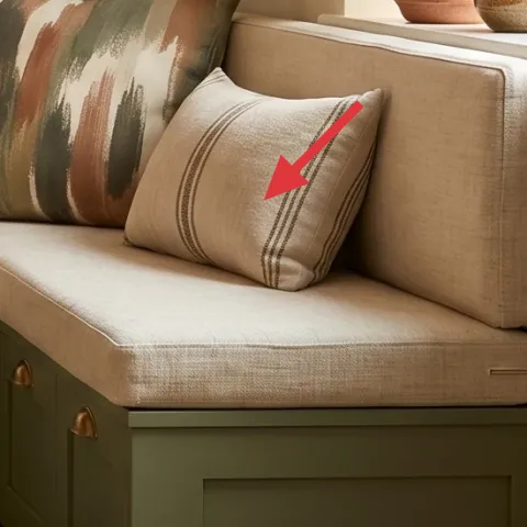
The olive-and-cream striped pillow adds the “designed” feeling because it repeats the room’s green tones and gives your eye an easy line to follow across the bench. Stripes also photograph well—folded corners and slight shifts don’t look messy, they look like styling. The trade-off: stripes can look too sharp if the fabric is glossy or thin, so look for a matte woven or canvas-like texture. Pairing it with the warm brown solid keeps the combo from feeling like a campground theme.
Use stripes to create rhythm
When your room has a lot of built-in symmetry, stripes give soft direction without extra hardware.
Layer 4 — hanging lamp with fabric shade ($60) softens the evening mood
The fabric shade on the hanging lamp is doing a lot of work: it makes the light warmer and more forgiving on textured surfaces like ceramics and pillow weaves. If you’re recreating the look in a rental, choose a renter-friendly option that plugs in or hangs without modifying fixtures. The trade-off is you may need to adjust placement (and the cord length) so the shade lands in the right visual zone over the table. Still, warm, diffused light beats bright overheads every time for a dining nook that doubles as a calm hangout spot.
Don’t assume your plug-in options will match the height
If the shade sits too low, it can crowd the table and make the corner feel smaller—check the drop length before buying.
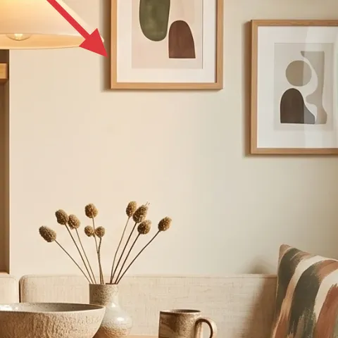
Layer 5 — framed wall art print (DIY abstract on cardstock) ($50) gives the wall a personal focal point
Framed art in the photo gives the nook a clear focal wall, and the earthy abstract shapes echo the terracotta-and-olive tones already happening in the room. Going DIY here is a smart renter move: it’s cheaper than buying multiple prints, and you can tailor the colors to whatever palette you like best. The trade-off with handmade paper art is it won’t have the crisp “studio print” finish, so choose acrylic and build gentle layers for clean edges. Once it’s framed, it reads polished from a normal standing distance.
Make it instead of buying it
This DIY turns cardstock into an earthy abstract you can frame, so the nook gets a coordinated wall focal point for less.
Materials
- Cardstock — 1 sheet (8.5×11 or bigger) — craft store — $2
- Acrylic paint set — small assorted colors — craft store — $10
- Painter’s tape — 1 roll — craft store — $3
- Simple picture frame (fits your paper) — 1 — thrift store or discount home store — $15
Steps
- Cut the cardstock to fit inside the frame and dry-fit it.
- Lightly tape off 2–3 organic shapes so the edges stay clean.
- Paint the background in a warm cream or beige, letting it fully dry.
- Layer olive and terracotta abstract forms using a sponge or flat brush, keeping strokes matte.
- Finish with a few darker strokes for contrast, then let everything dry completely.
- Slide the finished paper into the frame and tighten the back.
Total DIY cost: $30 — saves about $20 over buying.
Keep the shapes organic
Abstract doesn’t have to be perfect—wobbly curves look natural against the warm wood and ceramics.
Layer 6 — dried flower stems in vase on table ($25) adds movement without mess
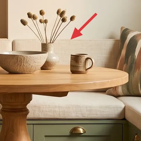
Dried flower stems in a ceramic vase bring vertical height and texture right into the center of the dining nook, so the table doesn’t look “empty” between meals. They also match the room’s earthy direction—strawy browns and muted greens sit well with terracotta-toned ceramics and olive accents. The trade-off is dried arrangements still look best when you fluff and re-position stems so they don’t collapse flat. A small bundle near the center of the pedestal table makes the room feel lived-in, not staged.
Concentrate height, not volume
In a small corner, a tall-but-slim arrangement keeps the table open for drinks and mugs.
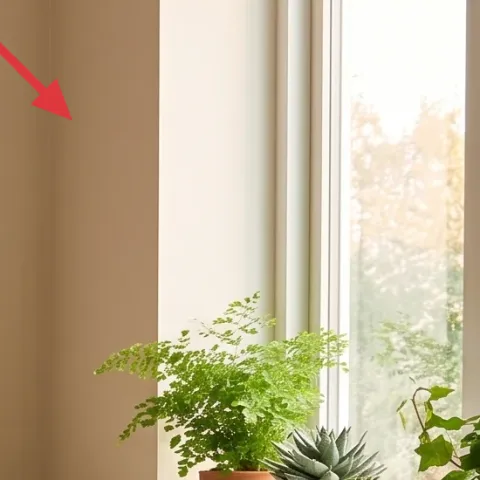
Layer 7 — indoor potted plant on windowsill ($35) brings fresh color near the light
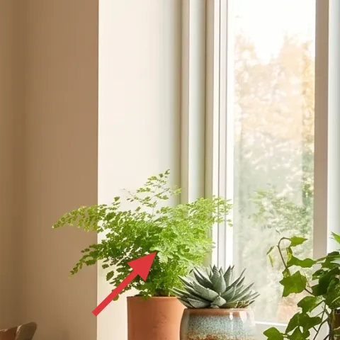
The indoor potted plant on the windowsill adds an organic “green note” that softens the sage cabinet lines and makes the nook feel brighter by association. Choose a plant with small-to-medium leaves so it looks full but doesn’t overwhelm the sill. The trade-off: plants need occasional light rotation, and if the window is uneven, one side can lean—rotate weekly to keep it looking intentional. This is also an easy rental win because it’s movable and doesn’t require any wall changes.
Match the pot tone to the ceramics
When the pot has warm clay or muted earth colors, it visually ties the plant to the tabletop pieces.
The cost, layer by layer
| Layer | Item | Cost |
|---|---|---|
| 1 | Patterned area rug (5×7) | $140 |
| 2 | Throw pillow cover (brown) | $30 |
| 3 | Throw pillow cover (olive-and-cream stripes) | $30 |
| 4 | Plug-in hanging lamp with fabric shade | $60 |
| 5 | Framed wall art print (DIY abstract on cardstock) | $50 |
| 6 | Dried flower stems in vase on table | $25 |
| 7 | Indoor potted plant (4–6 ft class) | $35 |
| Total | $370 | |
If you want a cheaper version, swap the hanging lamp for a plug-in table lamp and choose plain lumbar pillow covers in olive and brown. You can also use one framed print instead of multiple frames, keeping everything else the same.
What worked, what didn't (across the whole room)
The rug plus two different pillows made the banquette feel grounded and layered, which matters most in a small nook. The fabric shade light softened the ceramics and reduced harsh shadows, especially near the table. The framed art gave the wall a focal point, but only once the abstract colors echoed the olive and warm wood tones.
What worked
- The cream-forward rug pattern tied the sage cabinetry and warm wood pedestal table together.
- Mixing one solid warm brown pillow with one olive-and-cream striped pillow kept the look intentional.
- The fabric-shade hanging lamp created warm, diffused light over tabletop ceramics.
- Dried stems added vertical texture without needing frequent watering.
- The windowsill plant introduced fresh green that balanced the earthy neutral palette.
- DIY framed art let the wall match the nook’s specific terracotta-and-olive tones.
What didn't
- Buying two pillows that were both solid muted shades made the bench look flat.
- A glossy pillow fabric read too shiny next to the matte rug and ceramics.
- If the lamp shade hangs too low, it crowds the table and makes the corner feel smaller.
- Using a plant that’s too wide for the windowsill pushes greenery into the light line.
- Choosing wall art with colors that don’t repeat the olive tones made the wall feel disconnected.
What we'd skip if we did it again
Skip matching “set” decor—especially pillows bought as a bundle. In small banquette areas, matching sets often read flat because everything lands in the same visual weight. Instead, mix one solid cushion with one striped or textured case so the corner has depth without needing extra objects.
Skip replacing the lighting with anything harsh or high-contrast. In this nook, the fabric shade matters because it keeps shadows soft around ceramics and tabletop items. If a plug-in light looks too bright, the built-ins already provide enough structure—light should add warmth, not glare.
Skip wall art that doesn’t echo at least one existing color family. The photo works because the abstract prints and tabletop ceramics share warm neutrals and olive tones. If the wall art jumps into a totally different palette, the nook feels like separate pieces instead of a single styled zone.
Frequently asked
How long does this banquette nook refresh take?
Plan on about 2–3 hours total. Most of the time is spent finding a rug size that looks right under the table and arranging pillows so the stripes and solids balance. The DIY framed abstract is the slow part only if you take time to dry paint layers—once it’s framed, installation is just sliding it in.
Is this renter-safe if I can’t change built-in cabinetry or shelves?
Yes. This refresh avoids anything permanent and focuses on layers renters can swap: rugs, pillow covers, plug-in lighting, framed wall art, and tabletop/stem styling. The best part is that the same pieces can move with you to a new unit, so the “upgrade” doesn’t vanish at move-out.
What if my nook is smaller or the table doesn’t sit centered on the rug?
If your nook is tighter, choose a rug that still extends slightly beyond the bench front and sits directly under the table footprint. For pillow placement, use fewer cushions or keep them tucked against the bench back so they don’t swallow seating space. Wall art can also shift upward a bit so the visual focus stays compact.
What if I want to buy instead of DIYing the framed art?
Buy a single framed art print with an abstract shape and limit the palette to warm cream plus either olive or terracotta. That keeps the wall from competing with the rug and pillows. Stick to a simple wood or neutral frame so the print reads cohesive with the warm wood table.
Where should I shop for these pieces without overpaying?
Look for pillow covers and rugs at discount home stores or online marketplaces during promotions, and check thrift stores for frames. For dried stems and ceramics, craft stores and flower sellers are often the best bet. The lamp is usually the priciest item—compare options at big-box retailers, then add a coupon code.
Biggest styling mistake to avoid in a banquette dining nook?
Avoid buying matching sets that repeat the same color and texture at every height. The nook needs contrast across levels: rug on the floor, pillows on the bench back, art on the wall, and vertical interest on the table with dried stems. When each layer has a different job, the corner looks curated instead of crowded.
More in Small Spaces

Under $400: banquette dining nook refresh with 7 renter-friendly swaps
A banquette dining nook can look styled without landlord approval. This $400 refresh uses 7 renter-safe swaps—rug, pillows, lighting, frame…
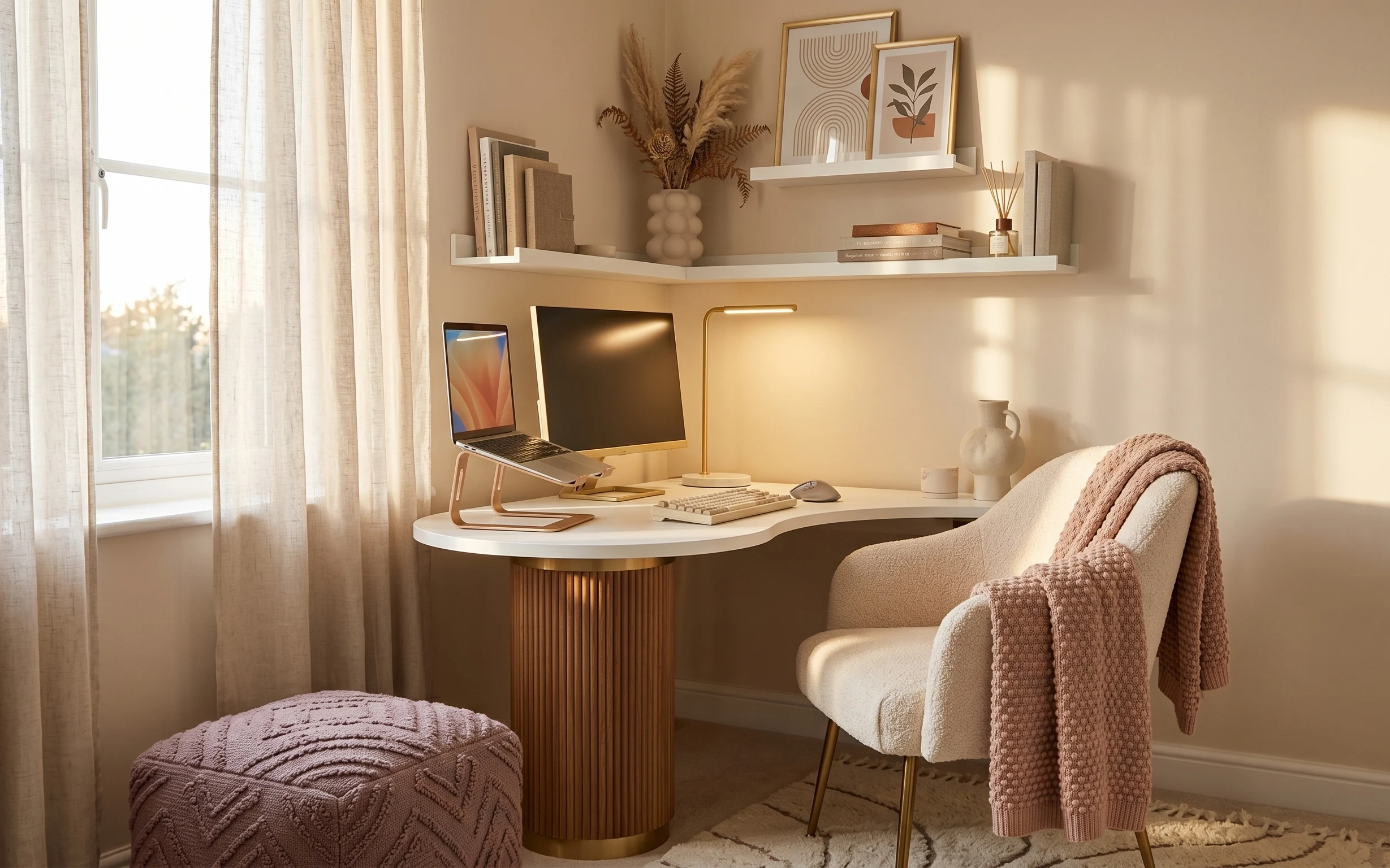
Under $500: 7 warm Japandi swaps for a home office desk nook
A light beige home office desk nook can feel calmer and more styled with seven practical upgrades. Budget stays under $500 using a layered …
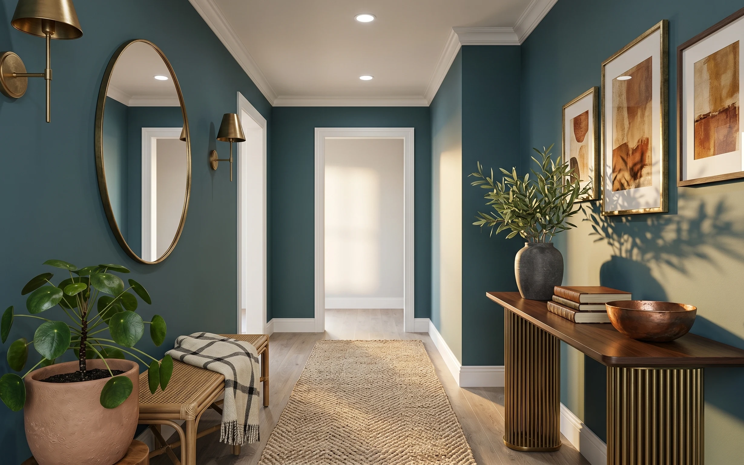
Under $350: teal-and-gold entry console nook refresh with 7 layers
A teal-and-gold entry console nook is already doing a lot—this refresh makes it look styled on purpose using 7 move-ready swaps. Total spen…