- Square footage
- Small entry console nook
- Cost
- Under $350
- Difficulty
- Easy
- Renter-safe
- No-drill styling
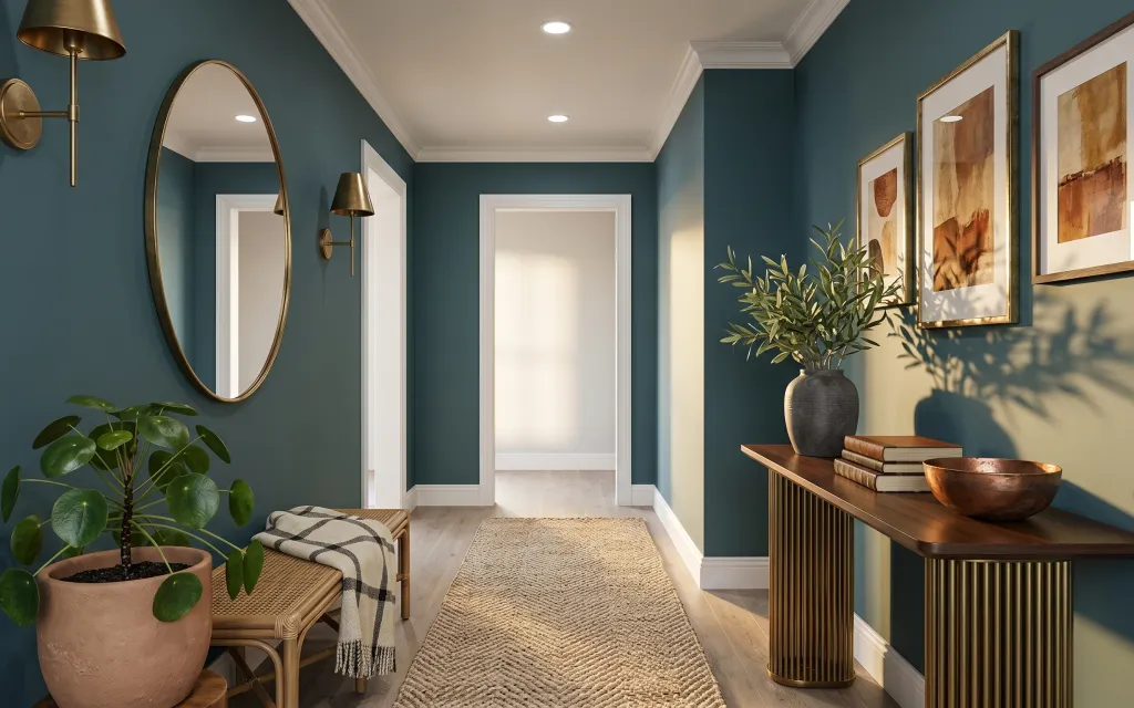
Why teal-and-gold modern details are the entry console nook of 2026
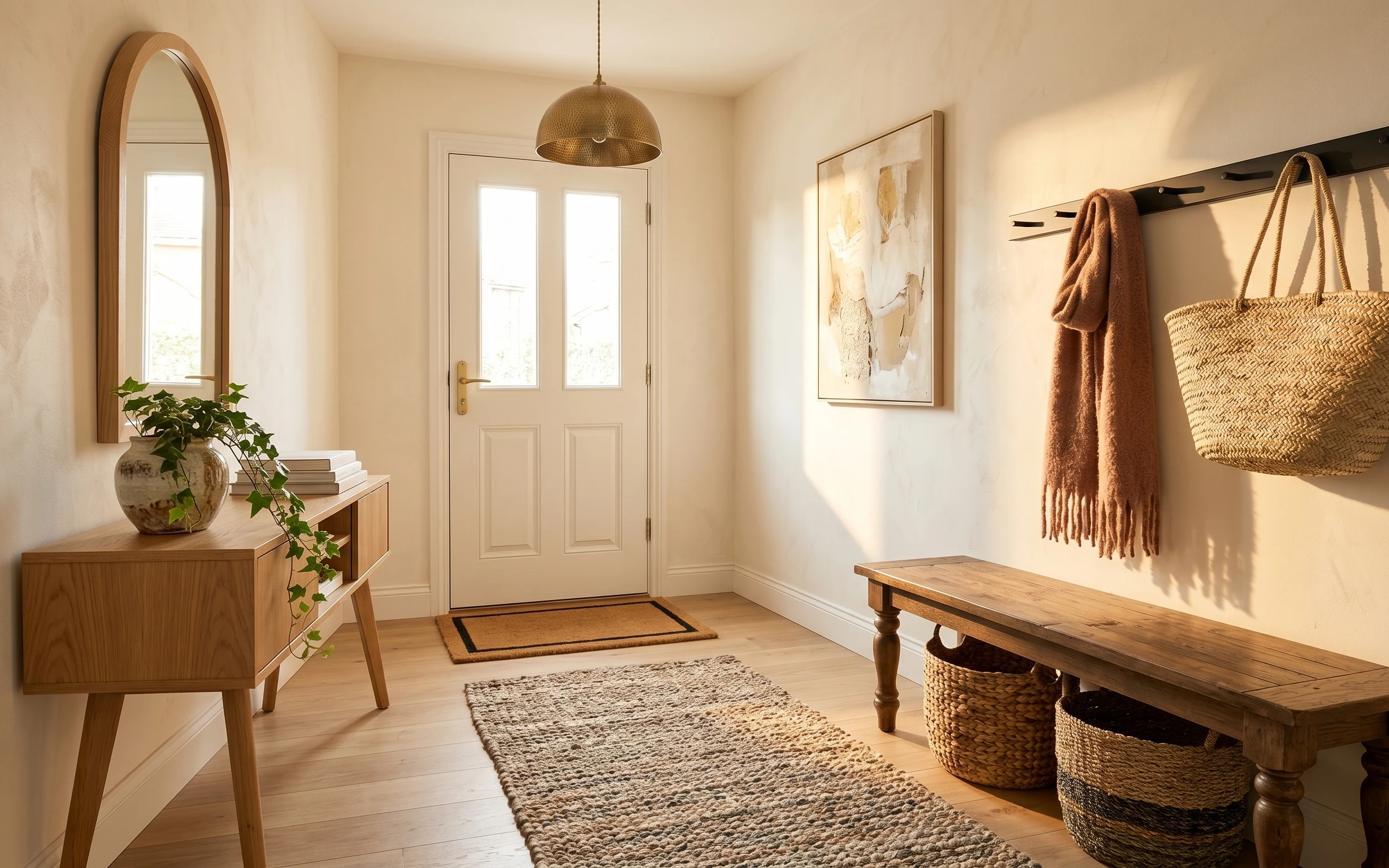
The first thing to notice here is the contrast: painted teal walls meet warm wood and brushed gold accents, so the palette feels intentional instead of random. In the photo you’ve got smooth ceramics (the dark gray vase and terracotta pot), a woven texture underfoot, and that graphic checkered throw draped over the wood bench. For shared housing, this combo is great because it’s mostly soft goods and freestanding styling—easy to box up and take with you. The goal of these layers is simple: keep the same modern lines, but add “finished” texture and cohesion.
My mistake in earlier shared apartments was treating the entry like a hallway overflow—one random lamp, one random print, done. It never looked settled. What changed my approach was paying attention to materials: woven rug under the console, one graphic textile, then two frames with warm tones to echo the ceramics. Once I did that, the nook stopped feeling like clutter and started feeling like a place I’d actually pause in.
Layer 1 — woven area rug ($80) anchors the foot traffic zone
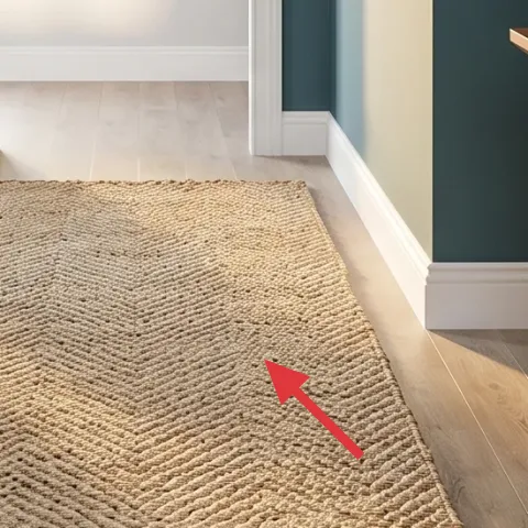
A woven area rug like the one in the photo turns the entry console nook from “hard floor + teal walls” into a place that feels grounded. Choose one in a natural neutral (oat, flax, or tan) so it plays nicely with both the warm wood and the gold-striped table legs. This is the layer people skip because the floor already looks nice—but rugs are what hide scuffs and make the whole setup feel finished. Trade-off: you’ll need a rug pad if your floor is slick, and you may vacuum more often than on bare wood.
Define the entry with rug edges
Even in a narrow space, keep the rug centered so the console and bench feel placed, not floating.
Layer 2 — checkered throw blanket ($25) adds one graphic pattern
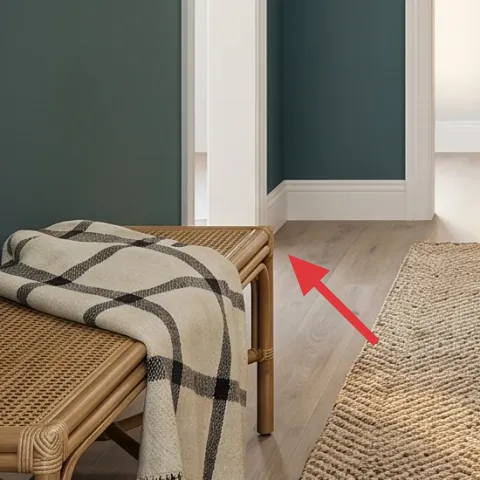
The checkered throw blanket is doing two jobs at once: it brings pattern without adding clutter, and it adds softness near a busy teal wall. Drape it over the wood bench in a way that shows a folded edge or a corner fold—so it reads as styling, not “extra fabric.” The trade-off with a graphic throw is scale: if the squares are too small, it turns busy; if too large, it can overpower the rug. This one works because it has enough contrast to stand out while still staying neutral enough to repeat in the wall art palette.
Keep the pattern to one star
If the throw is high-contrast, skip extra patterned pillows or a second busy textile elsewhere.
Layer 3 — large arched mirror ($60) reflects teal depth without shrinking the space
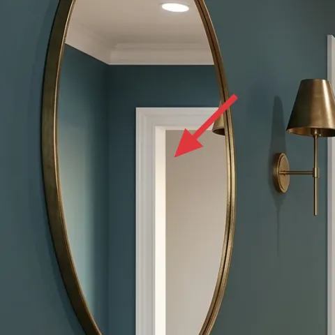
A large arched mirror is a smart move in a small entry console nook because it gives height and bounce while staying visually light. The arch shape echoes the room’s built-in curves (like the doorway lines) and balances the straight console table. Reflections also help teal feel richer instead of flat—you get depth without needing more decor pieces. Trade-off: mirrors show fingerprints and smudges, so plan on quick wipes during the first week after move-in. Still, this is one of the fastest ways to make an entry feel larger without any drilling.
Angle the reflection on purpose
Position the mirror so it catches the warm console objects (vase and bowl), not just empty wall.
Layer 4 — gold striped console table ($80) creates a long, modern “display rail”
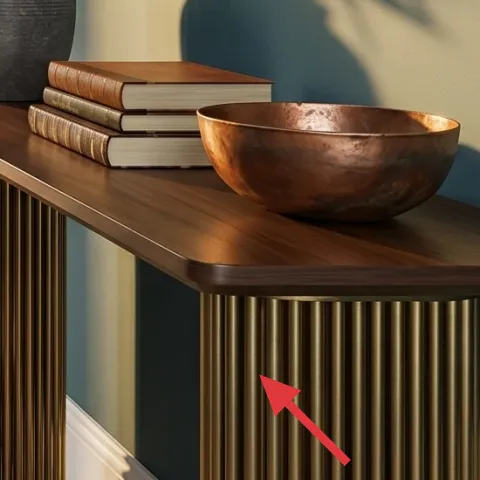
The gold striped console table works because it’s basically a styling platform: long enough to group objects, narrow enough to keep the walkway open. In the photo, the table’s warm wood top pairs with the gold tones, and the striped legs add movement without adding visual bulk. If you’re refreshing your own, choose a console with a slim footprint and a warm finish—cool gray metal can fight teal instead of supporting it. Trade-off: consoles collect “small stuff” fast, so use it like a tray area—limit it to a few high-impact pieces rather than filling every inch.
Don’t overload the top surface
With teal walls, extra objects read as clutter quickly—keep three to five items max.
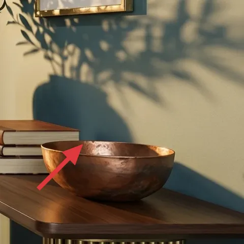
Layer 5 — dark gray ceramic vase with green leaves ($25) brings life to the warm-metal palette
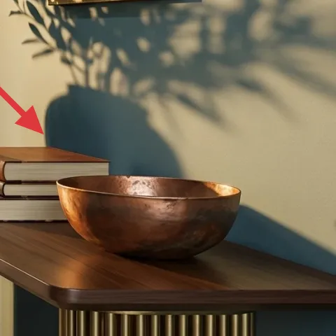
The dark gray ceramic vase with green leaves adds a grounding middle tone between teal and gold. It also introduces a different texture from the rug—smooth ceramic plus leafy movement—so the nook feels dimensional. This arrangement works particularly well in narrow entries because the plant mass creates a focal point near eye level, not just at floor height. If you swap anything here, prioritize either the vase color (charcoal/stone) or the leaf shape; losing both makes it look generic. Trade-off: if you use faux leaves, pick ones with varied leaf edges so they don’t look flat.
Repeat “warm + neutral” in small ways
Let the plant greens play off the terracotta pot’s warmth rather than chasing a totally different color family.
Layer 6 — framed abstract prints ($60) pull the teal palette toward warm earth tones
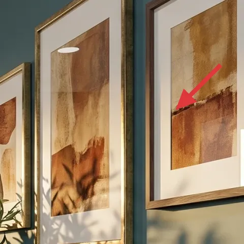
Framed abstract prints are what make the teal walls feel curated instead of like plain backdrop. In this photo, the art’s warm tan and rust tones echo the wood, the bowl, and the terracotta planter, which is why the whole entry looks cohesive. The trade-off with art in small spaces is scale: too small and it disappears, too large and it overwhelms the narrow wall. Choose frames that are similar in size and keep spacing consistent, so the pair reads as intentional—even when you’re only displaying a couple prints.
Make it instead of buying it
This DIY replaces one framed abstract print with a hand-painted design on cardstock that matches the warm tan-and-rust tones in the photo.
Materials
- Cardstock — 1 pack (8.5×11) — Michaels — $8
- Acrylic paint set — 1 small set — craft store — $12
- Painters tape — 1 roll — craft store — $6
- Small frame (for 8×10 print) — 1 — thrift store — $20
- Foam brush — 2-pack — craft store — $4
Steps
- Cut cardstock to an 8×10 insert size.
- Mask geometric shapes with painters tape.
- Paint two to three warm layers (tan base, rust accent, a touch of dark brown).
- Peel tape once paint is dry to keep crisp edges.
- Let the whole piece dry fully, then add a few light texture strokes with the foam brush.
- Slide the finished cardstock into the thrifted frame.
Total DIY cost: $50 — saves about $10 over buying.
Layer 7 — book stack on console table ($15) adds the “lived-in” styling cue
The book stack on the console top gives the nook that lived-in, reader-ready feeling without adding another decorative object. Pick books that look good spine-out or stack them horizontally so the pages create a soft highlight against the warm wood tabletop. The trade-off is color control: if the spines are too bright or loud, the teal wall will amplify that contrast. In this photo, the stack stays neutral, which is why the ceramic bowl and vase still lead. Keep the stack small—one tidy pile—so it feels styled, not like a storage spot.
Use height, not quantity
Stack two books instead of adding five small decor pieces to keep the silhouette clean.
The cost, layer by layer
| Layer | Item | Cost |
|---|---|---|
| 1 | Area rug (5×7 woven style) | $80 |
| 2 | Throw blanket (checkered) | $25 |
| 3 | Arched mirror (24–36 inch) | $60 |
| 4 | Console table (gold striped, slim profile) | $80 |
| 5 | Medium planter / pot (ceramic vase with leaves) | $25 |
| 6 | Framed abstract print (DIY equivalent) | $60 |
| 7 | Decorative book stack | $15 |
| Total | $345 | |
If you want a cheaper variant, prioritize the rug and the throw, then go smaller on the wall art: one framed print instead of two and a simpler frame finish. Swap the book stack for a single large hardcover and keep the ceramic vase as your only “statement” object on the console.
What worked, what didn't (across the whole room)
Overall, this nook works because it balances teal’s boldness with warm, tactile materials: woven underfoot, soft textiles, and ceramic shapes. The styling feels intentional when the mirror, console grouping, and warm-toned prints all repeat the same color family.
What worked
- The woven area rug makes the entry feel grounded instead of slippery against hard flooring.
- The checkered throw adds a single graphic pattern near seating without introducing more clutter.
- The arched mirror gives height and reflectivity, keeping the teal wall from feeling heavy.
- The gold striped console table functions like a clean display rail for a small object grouping.
- The dark gray vase breaks up teal with a grounded neutral while the leaves add organic movement.
- The warm-toned framed prints connect the ceramics to the wood palette for a cohesive look.
What didn't
- Overfilling the console top makes teal feel busy fast, especially in a narrow entry.
- Using a mirror that’s too small loses the height effect and the “expanded” reflection benefit.
- Pairing multiple patterned textiles at once competes with the framed art instead of supporting it.
- Bright-colored frames or art can fight the teal and pull focus away from the warm materials.
What we'd skip if we did it again
Skip a second patterned textile in the same zone. In this nook, the rug already brings texture and the throw brings pattern; adding more prints makes teal feel louder instead of richer.
Skip oversized framed art that crowds the doorway line. In a small entry console nook, the right-sized frames create a focal point without blocking how the room “breathes” around the console.
Skip a heavy, low-contrast decor scheme. If everything is the same shade of tan, the gold and teal lose their contrast—one warm statement object (the vase or the bowl) keeps the look sharp.
Frequently asked
How long does this kind of entry refresh take?
Plan on about 2 to 3 hours total. The woven rug and throw are the fastest wins, then it’s just centering the mirror and grouping the console objects. Hanging wall art can take extra time depending on what you use to mount it, so budgeting an extra 30 to 45 minutes for setup (and a quick step-back check) is realistic.
Is this doable in shared housing where I need to move within a year or two?
That’s the whole point. The layers here are mostly textiles, freestanding styling, and a framed print you can pack safely into a moving box. If you’re unsure about wall mounting, choose renter-safe mounting methods that don’t damage paint and keep the frame removable. Everything in the plan can dismantle and reassemble quickly at the next place.
What if my entry is narrower than the photo?
Use the same structure but scale down the width of the rug’s visual footprint. Center the rug under the console and keep the console objects minimal—one plant-like moment and one textural element (vase or bowl). For wall art, stick to consistent frame sizes and avoid adding extra prints beyond the pair/cluster you need for balance.
Where should I shop if I want the same warm-modern look on a budget?
For the rug and throw, check discount home stores and major retailers’ seasonal clearances, then use thrift stores for the mirror frame and book stack. For the vase, look for neutral-toned ceramics at discount marketplaces or home goods aisles. The framed art DIY is best handled with a small thrifted frame so you control the warm palette without paying full retail for wall art.
What’s the biggest mistake people make with teal walls?
They either ignore warm tones entirely or add too many competing accents at once. Teal already reads bold, so the room needs texture (woven rug, ceramic) and one or two warm anchor elements (wood, rust-tan art, terracotta). Keep the number of categories limited: one graphic textile, one plant moment, and a coordinated art pair.
More in Small Spaces

Under $350: teal-and-gold entry console nook refresh with 7 layers
A teal-and-gold entry console nook is already doing a lot—this refresh makes it look styled on purpose using 7 move-ready swaps. Total spen…
Under $300: warm earthy entryway bench nook refresh
A warm, earthy entryway bench nook refresh for shared housing—built around two rugs, a mirror, and easy styling swaps. This plan keeps ever…
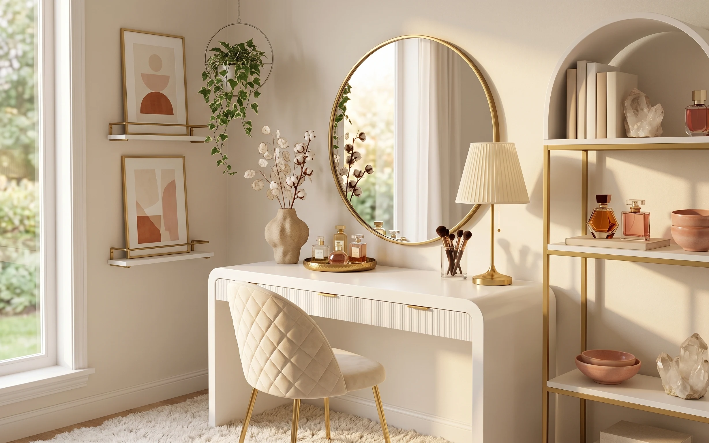
Under $600: warm terracotta-and-brass small-space refresh
A warm, japandi-leaning vanity shelf nook makeover using 7 move-ready swaps, all renter-safe and no-drill. The look centers a round gold mi…