- Best for
- textiles + art upgrades
- Cost
- $352 total
- Difficulty
- easy (no installs)
- Time
- a weekend afternoon
Why olive-and-cream textile layering is the living room look of 2026
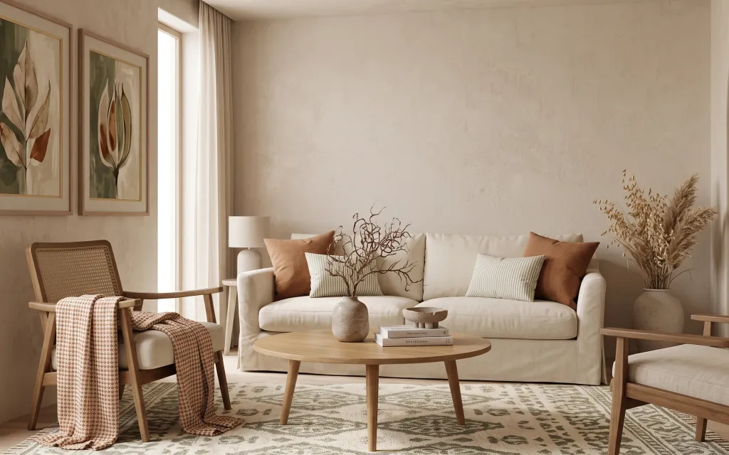
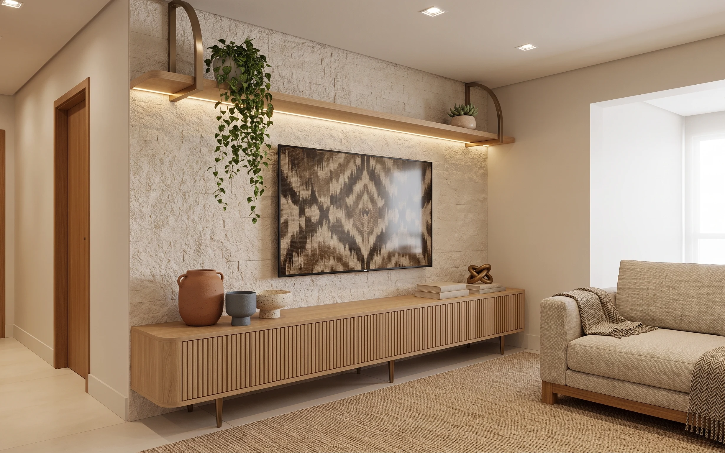
Start with an anchoring neutral—this rug’s muted olive pattern keeps the floor from feeling blank while still matching off-white walls. Next, soften the sightlines with curtain panels and one patterned throw that repeats the same earthy undertone. The sofa reads warm because the pillows mix texture (striped + solid) instead of leaning on color alone. I’m borrowing the “layer first, accessorize second” logic you see in places like Apartment Therapy and Scandinavian styling: build cohesion with fabrics, then let the art and plant bring the character. Everything here is doable for shared housing because it packs into a few boxes and carry-ons.
I used to overbuy small décor—tiny vases, random candles, a new “centerpiece” every weekend. In my last place, that habit made my living room feel like I was constantly unpacking, not actually living. This time I’m choosing fewer, bigger-texture items: one rug, one framed set, and one dried-branch moment. The trade-off is you have to commit to the color story (olive + cream), but the payoff is a calmer room that still looks intentional when you’re half done.
Layer 1 — patterned area rug ($150) Ground the room with muted olive pattern
A patterned area rug is doing the heavy lifting here because it repeats olive tones without turning the space into a green room. The rug sits under the coffee table and extends toward the chairs, so it visually “connects” seating even in a shared setup where everyone uses the room differently. Going patterned is the right move versus a plain cream rug because the texture hides everyday chaos—shoes, crumbs, and that one mystery spill that always happens on move-in day. The trade-off is you’ll want the rest of the palette to stay neutral so the pattern looks collected, not busy.
Pick a pattern with one repeated undertone
Look for a rug that includes a single repeating color (olive here) and keep pillows and art in off-white or light wood so the room reads cohesive.
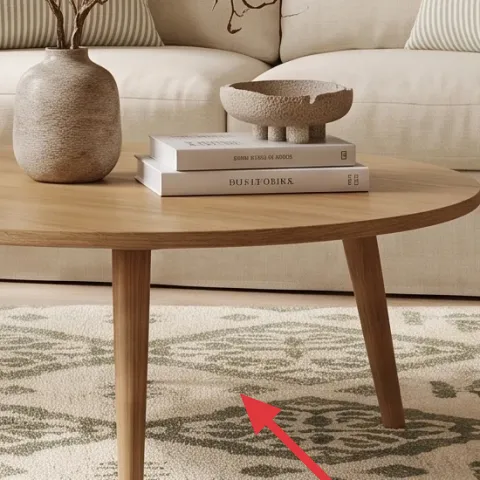
Layer 2 — light-wood round coffee table ($60) Add warmth without committing to bulky furniture
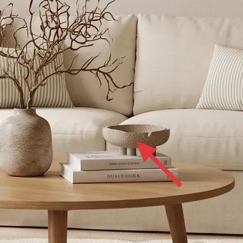
This round coffee table matters because the light wood tone keeps the room from feeling heavy, especially with an off-white sofa backdrop. The rounded shape is also more forgiving in small living-room layouts common in shared housing—corners feel safer when you’re weaving past roommates carrying laundry or groceries. The “why this over the obvious” choice: I’d rather swap table tops than build shelving, because you can disassemble and move a lightweight table faster than you can redesign a wall system. Trade-off: you’ll need a styling surface that doesn’t look cluttered, since a round top can feel visually busy if you over-stack items.
Use a smaller centerpiece than you think
On a round table, one vase or one tray reads intentional; two separate décor piles start fighting for attention fast.
Layer 3 — patterned throw blanket ($25) Bring back texture when the sofa is all one tone
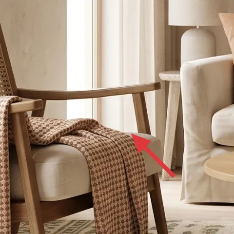
The patterned throw blanket on the left chair adds movement and warmth, especially against the cream upholstery and off-white walls. It’s the kind of detail that looks expensive because the pattern repeats the room’s earthy palette instead of introducing a brand-new color. The reason I’m choosing a throw over “just adding more pillows” is that fabric drape changes the shape of the furniture—so the chair doesn’t look stiff or untouched. Trade-off: a blanket is another item to store, but it folds flat and packs easily, which makes it a smart swap for people who know they’ll move again soon.
Choose a throw with a similar value range
If your sofa is light, pick a throw that also stays in the lighter-to-mid value range so it doesn’t look like a stark contrast.
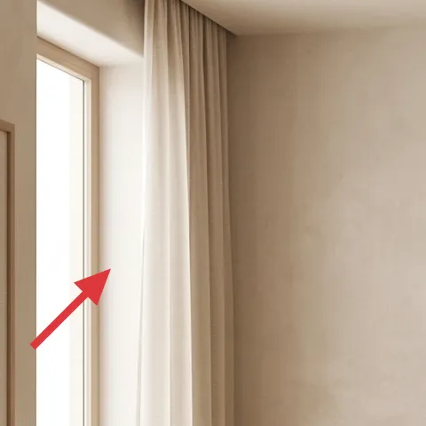
Layer 4 — curtain panels ($30) Soften the window wall without renter hassles
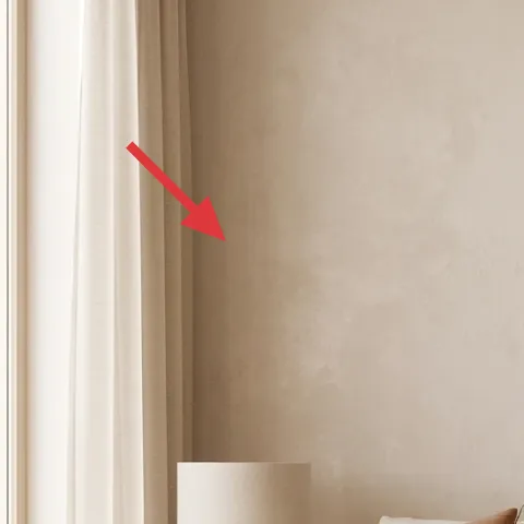
Curtain panels make this room feel finished because they add vertical softness right where the eye wants something “tall.” In a shared housing living room, curtains also do double duty: they dampen the echo a little and create privacy without touching fixed fixtures. I’m keeping the change move-friendly—use clip-on or tension methods depending on what your rental allows, because hard installs aren’t the goal. The trade-off is that curtains will show wrinkles if you cram-roll them, so fold them neatly and store them in a bin for the best next-lease results.
Don’t rely on plastic clip damage
If your rental has delicate trim, avoid clips that scratch; use gentle clip setups or hang methods that distribute pressure.
Layer 5 — striped throw pillow ($12) Add the “pattern echo” that makes neutrals feel styled
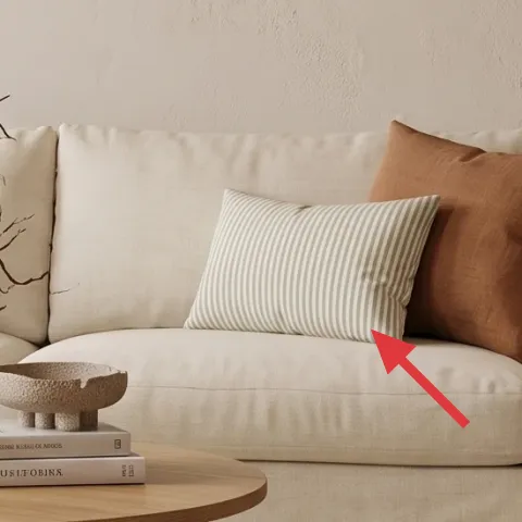
A striped throw pillow gives this seating area a graphic rhythm, which is why the room doesn’t feel flat even though the palette stays calm. The stripes also echo the way the rug pattern repeats itself—small lines meet larger shapes—so the décor feels intentional instead of random. I’m selecting one striped pillow as the counterpoint to solid pillows; if you do stripes plus three other patterns, you lose the peaceful look and it starts to feel chaotic fast. Trade-off: a single pillow means you can’t lean on “variety,” so the color story has to stay consistent with the rug and art.
Balance stripe size with your rug scale
When the rug has bold shapes, go for stripes that are slimmer so the two patterns don’t compete.
Layer 6 — two framed botanical prints ($60) Replace the art with something you can re-frame later
These framed botanical prints anchor the wall with natural shapes—leaf silhouettes against cream tones—and they give your living room a focal point that doesn’t require any furniture rearranging. The trade-off with framed art is cost, which is why DIY is a great move here: you can keep the frames you already have (or thrift frames) and swap in the artwork when you move. This is also a renter-friendly way to control the color story. If your current landlord-installed wall looks bare, art does the job fast without any permanent changes. The goal is consistency—repeat the olive/earth tones you already used in the rug and textiles.
Make it instead of buying it
DIY a hand-painted abstract on cardstock to swap into your existing botanical frames, so the wall matches your rug’s olive tones without paying for a new art set.
Materials
- Cardstock sheet (for 2 prints) — 2 sheets — craft store — $5
- Acrylic paint set (earthy green + tan + cream) — 1 small set — craft store — $12
- Small paintbrush — 1 — craft store — $4
- Pencil + eraser — 1 pack — craft store — $2
- Painter’s tape — 1 roll — hardware store — $1
Steps
- Sketch two loose abstract compositions on the cardstock using light pencil lines.
- Use painter’s tape to mask a couple of soft edge shapes so the look stays intentional.
- Paint the background in cream/tan and let it dry.
- Layer earthy green marks and thin lines on top, keeping a few areas unpainted for breathing room.
- Remove tape once the paint is dry to reveal crisp edges.
- Let the cardstock fully dry, then trim if needed to fit behind the frame’s backing.
Total DIY cost: $24 — saves about $36 over buying.
Layer 7 — ceramic vase with dried branches and pampas grass ($15) Bring in the “found natural” moment
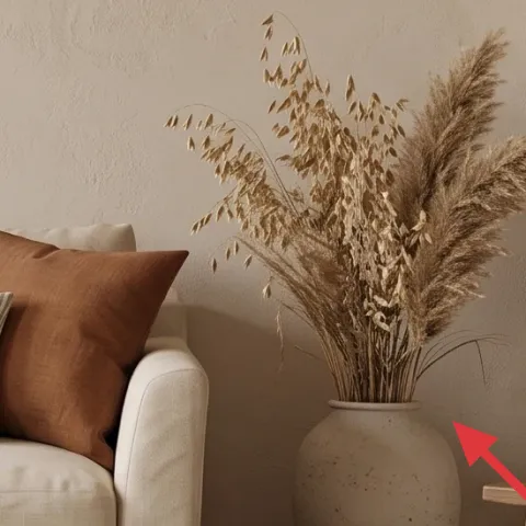
A ceramic vase with dried branches and pampas grass adds movement and an organic texture contrast against the clean lines of the sofa and table. This kind of arrangement reads like “collector décor” because the airy stems create height without making the room feel heavy. I’m choosing this over a fresh-flower substitute because dried stems are low-maintenance and pack better for moves; you can wrap the stems and keep the vase separately. Trade-off: dried décor can shed a little at first, so you’ll want a quick shake outside before placing it in the living room. The styling stays simple—one vase, one focal cluster, done.
Start with height, then trim for shape
Keep the tallest stem near the back third of the vase and trim only if the arrangement starts to look lopsided.
The cost, layer by layer
| Layer | Item | Cost |
|---|---|---|
| 1 | Area rug 8×10 | $150 |
| 2 | Coffee table (thrifted-style) | $60 |
| 3 | Throw blanket | $25 |
| 4 | Curtain panel pair (84") | $30 |
| 5 | Throw pillow cover | $12 |
| 6 | Two framed botanical prints (DIY-swappable art) | $60 |
| 7 | Vase (dried-branch vessel) | $15 |
| Total | $352 | |
If the total is still too high, swap the area rug for a smaller (5×7) version and keep the same olive pattern idea. That single change usually saves the most money while preserving the “anchored” look.
What worked, what didn't (across the whole room)
This palette works because everything shares the same off-white base with a muted olive accent, so the room feels cohesive without needing bold color. The layering of one pattern (rug) plus one second pattern (striped pillow) makes the neutrals look intentional rather than plain.
What worked
- The patterned area rug hides everyday scuffs and keeps the room grounded under seating.
- Curtain panels soften the window wall and make the space feel finished without permanent changes.
- A striped throw pillow adds graphic rhythm while staying inside the same neutral family.
- The throw blanket introduces drape and texture so the chair looks “used,” not empty.
- Framed botanical prints give a true focal point that you can swap later for a move.
- Dried branches in a ceramic vase add height and organic texture without fresh-wilt upkeep.
What didn't
- Trying to match too many tiny accessories made the coffee table feel cluttered instead of styled.
- Using multiple pattern-heavy textiles at once overwhelmed the calm olive-and-cream palette.
- Overly contrasty throw colors looked “separate” from the rug and made the room feel less cohesive.
- If the curtain panels are too short, the window wall reads unfinished and less intentional.
- Dried stems placed too close together can look flat—spacing them creates the airy effect.
What we'd skip if we did it again
Skip replacing large fixed pieces with “similar but new” versions. In shared housing, you’ll move again, so the biggest wins come from portable textiles and décor—rug, curtains, pillows, and framed art.
Skip adding a second full-size patterned item. One strong pattern (like the rug) plus one smaller pattern (like stripes) keeps the look cohesive and prevents “everything at once” energy.
Skip spending on fresh floral arrangements for this exact vibe. Dried branches in a ceramic vase match the earthy palette, last longer, and pack more easily than week-to-week replacements.
Frequently asked
How long does this living room refresh take?
Plan for about 3–5 hours if you already own basic hooks or can use tension/clip methods for the curtain panels. The rug swap and pillow/throw styling usually take less than an hour. The framed botanical art DIY depends on drying time, but it’s still easiest when you treat it like a single craft session.
Is this realistic for shared housing (roommates + frequent moves)?
Yes, because the core changes are moveable: a patterned area rug, curtain panels, throw textiles, and framed art. Even the DIY cardstock art is designed to stay compatible with frames you can keep or thrift. The only “organizational” challenge is storing rolled rugs and folded curtains so they don’t end up wrinkled or stained.
What if my room is smaller than the photo?
Use a smaller rug size (often 5×7) and keep the palette the same: cream base with muted olive. In tighter rooms, avoid adding extra pattern-heavy pillows—stick with one striped throw pillow and one patterned throw. For the framed prints, choose either two matching frames or one larger botanical print to reduce visual crowding.
What if my room is bigger and feels plain?
Go bigger on the rug footprint first, so the coffee table and chair legs still feel “grouped” on the same surface. You can also enlarge the art impact by using wider frames or spacing two framed botanical prints more evenly across the wall. Keep the texture rule: add height with the dried branches and texture with one throw.
Where should I shop for the rug and curtains without overpaying?
For rugs, look at discount home retailers or marketplace listings that let you sort by size and tone (olive + cream). Curtains are often easiest to buy in pairs through big-box stores or online, then hem only if your rental setup requires it. The framed botanical prints can be thrifted as frames, with the DIY cardstock art swapped in.
What’s the biggest mistake people make with this olive-and-cream look?
The most common miss is introducing too many unrelated colors—bright blues, vivid reds, or strong blacks—because the olive tones already do the “accent work.” Another frequent problem is pattern overload: if the rug is busy, keep pillows and throws simpler and repeat the same earthy undertone.
More in Living Room

Under $400: move-ready living room refresh with rug, art, and textiles
A move-friendly living room refresh that leans into off-white + olive tones using a patterned rug, curtain panels, and framed botanical art…
Under $1000: modern living room weekend refresh
A modern living room refresh that leans warm wood-and-gold: swap in a plush light gray rug, add airy white sheer curtains, and update the g…
Under $500: renter-friendly earthy-neutral living room refresh
Earthy neutrals meet warm modern styling in a sofa-and-console living room nook. This move-friendly refresh uses 7 renter-safe swaps (no dr…