- Best for
- Warm modern, earthy-neutral refresh
- Cost
- Under $500
- Difficulty
- Easy (styling + wall-safe swaps)
- Time
- 2–4 hours
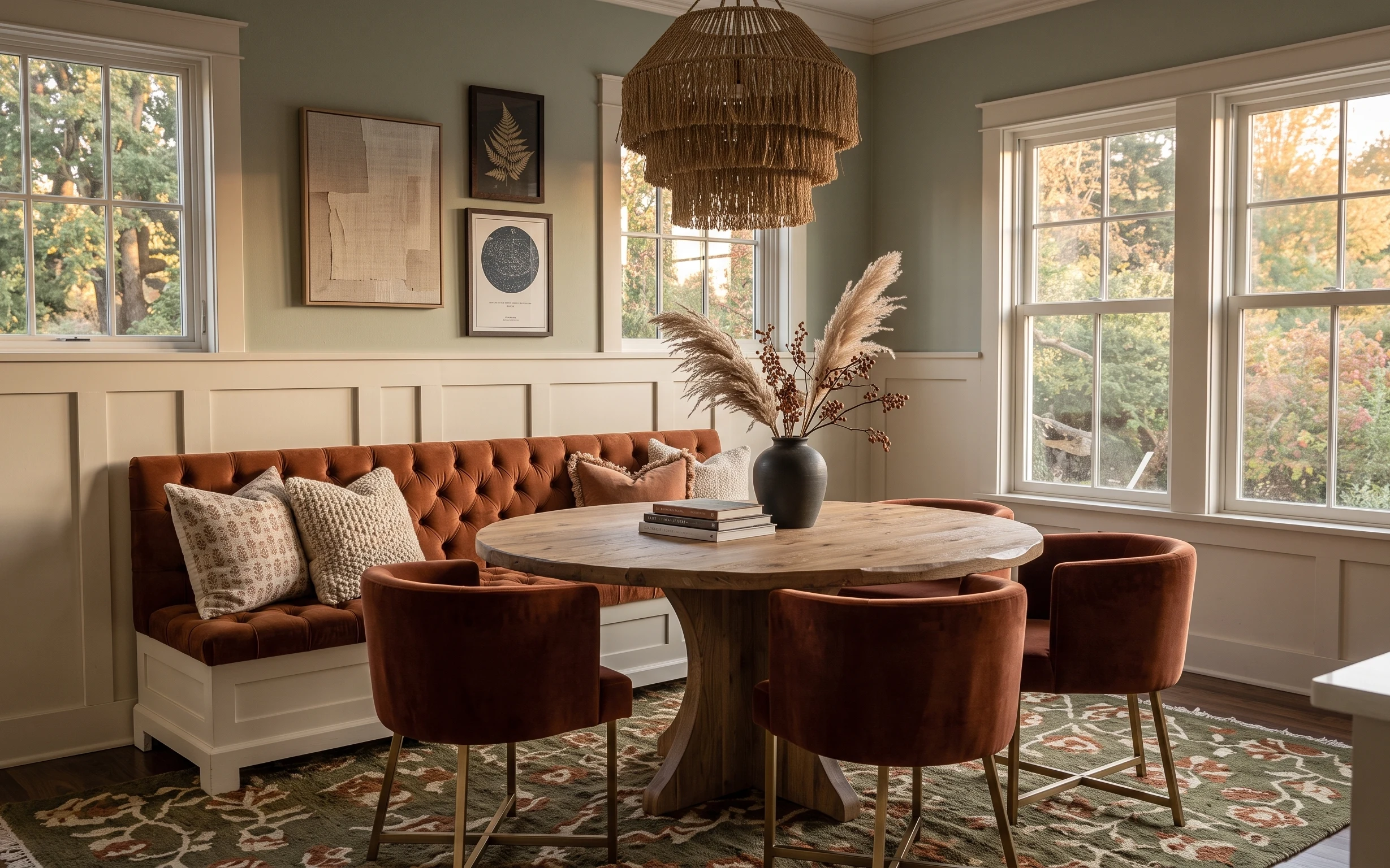
Why warm beige-and-terracotta accents are the sofa-and-console living room nook of 2026
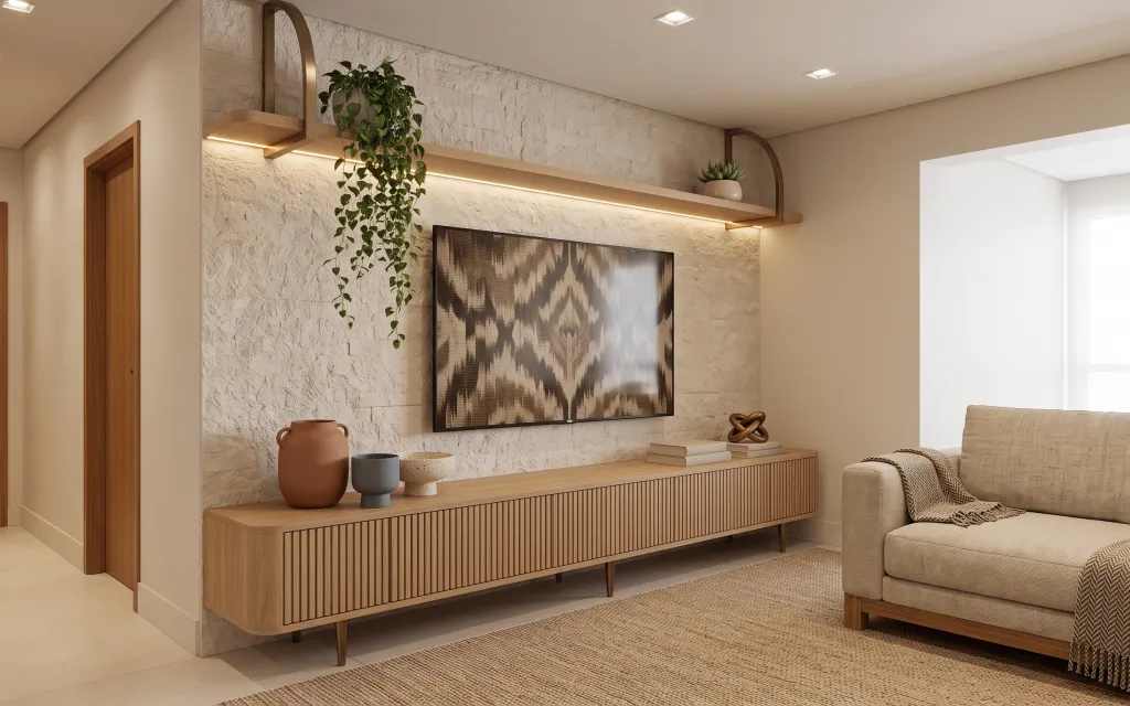
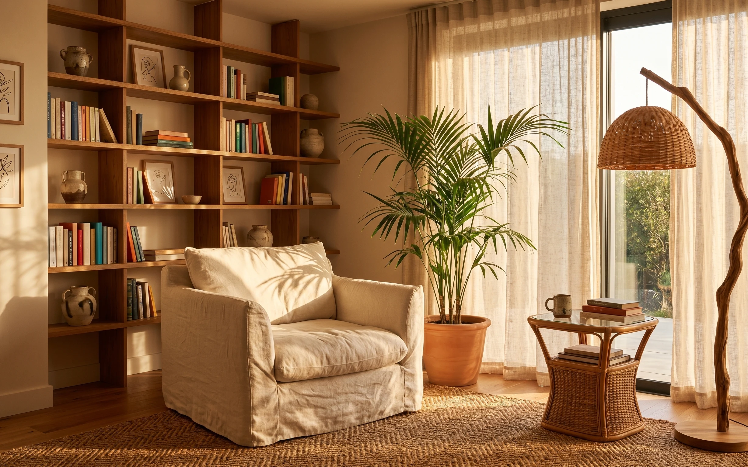
The fastest way to get this layered, warm look is to copy the texture rhythm: a beige area rug under everything, a chunky throw folded over the sofa, and one oversized framed print that holds the whole wall color story. In the photo, you can also see how light wood surfaces (console and shelves) make terracotta ceramics feel intentional, not random. For renters, this palette is especially doable because it’s built from swap-friendly decor—no wall changes required—so it stays move-out friendly.
I almost overcommitted to “matching” the wall art with the ceramics, then I remembered how often that reads flat in small rentals. The fix was choosing one hero image (the framed print) and then echoing just two materials—light wood and terracotta clay—through the console styling. Once I used a tray to group the smaller objects, the whole shelf-and-sofa zone looked curated instead of scattered.
Layer 1 — 8×10 area rug ($200) grounds the whole color palette
A beige 8×10 area rug is the foundation here because it softens the light floors and keeps the space from feeling stark next to the pale stone-textured wall. In the photo, the rug reaches far enough under the sofa so the coffee/bench area visually “sits” inside it, which is what makes the room feel finished. Choosing a neutral woven texture (rather than a shiny, low-pile look) also matches the warm-modern/japandi vibe without needing wall paint. The trade-off is that you’ll want a rug pad for comfort, but the look pays off immediately.
Pick size first, then pattern
If the rug stops short of the front sofa legs, the room can look like it’s “missing” one layer.
Layer 2 — Throw blanket for the sofa ($30) adds visible knit texture
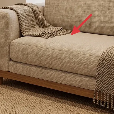
This throw blanket belongs exactly where it’s placed in the photo: draped over the sofa arm so it reads even from across the room. The best version is a chunky knit or waffle-texture in a warm beige, because it visually connects the rug (woven) and the ceramics (clay, matte). A softer fabric also makes the earth-tone palette look lived-in instead of styled-to-perfection. The trade-off is that blankets show wear faster, so stick to neutral colors you’ll still like after a few seasons of everyday use.
Fold for “intentional mess”
A casual fold with one end slightly tucked reads more natural than a perfectly flat drape.
Layer 3 — Framed wall art print ($80) anchors the stone-textured wall
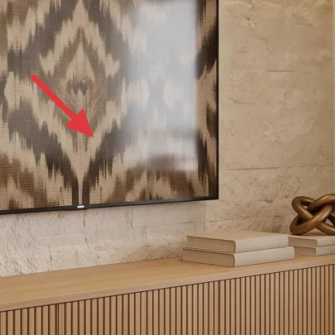
The large framed print is the focal point because it carries the same warm greige and brown tones as the terracotta ceramics and light wood console. Since the wall is visually busy (textured stone), the art needs enough contrast to hold attention without looking loud—think earthy abstract shapes with a muted palette. Oversized matters here: a smaller print would get swallowed by the wall scale. The trade-off is spacing—this kind of art needs a little room breathing space around it, which is why it looks so right centered on the wall niche.
Make it instead of buying it
DIY a hand-painted abstract on cardstock so you can match the warm greige + brown palette without paying for a new specialty print.
Materials
- Acrylic craft paint set — 1 small set — store craft aisle — $12
- Cardstock sheets (heavy) — 2–3 sheets — art supply store — $6
- Matte medium (optional) — 1 small bottle — craft aisle — $10
- Frame (16×20 or your chosen size) — 1 frame — big-box store — $18
- Painter’s tape + mixing tray — set — big-box store — $8
Steps
- Plan a simple 3-color abstract layout on paper (background, mid-tone shapes, dark accents).
- Tape off soft blocks on cardstock so the edges stay clean.
- Paint the largest background area in the lightest greige tone.
- Layer in mid-tone shapes using a small flat brush; rinse and dry between colors.
- Finish with the darkest brush strokes for texture-like contrast.
- Let the paint fully dry, then remove tape and check the balance from a few feet away.
- Trim any cardstock edges so they sit neatly inside the frame mat.
- Insert into the frame and hang with renter-safe methods.
Total DIY cost: $54 — saves about $26 over buying.
Keep margins consistent
If your frame has a mat, center the art with the same amount of border on all sides.
Layer 4 — Arched wall mirror frame ($100) reflects light and softens straight lines
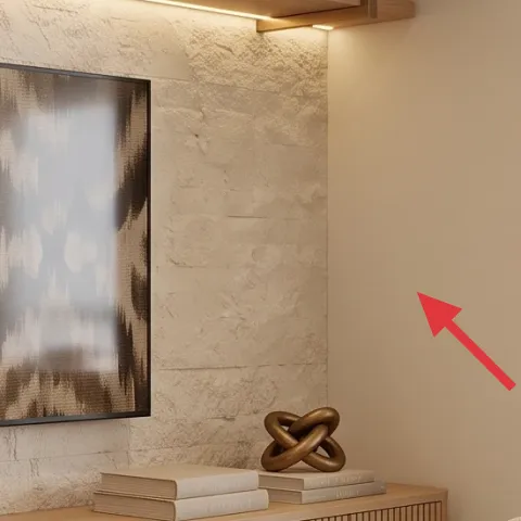
An arched mirror works here because it echoes the gentle curves of the ceramics and keeps the wall from feeling all angles and rectangles. The photo’s mirror shape also brightens the stone-textured wall by bouncing warm light around the console area, which is especially helpful in rentals where you can’t change ceiling fixtures. Choose a mirror with a warm wood or faux-wood frame so it doesn’t clash with the light wood console. The trade-off is weight and handling—go for a size that feels sturdy and use renter-safe hanging so removal at move-out is painless.
Don’t go too oversized
A mirror that’s wider than the console can visually crowd the framed art.
Layer 5 — Decorative tray on console ($20) creates a tidy styling “landing zone”
A decorative tray is what makes the console styling look intentional instead of like objects happened to land there. In the photo, the small grouping of ceramics and books reads cohesive because they’re staged on a single base surface with clear edges. Pick a tray that matches the warm modern vibe—wood, woven, or ceramic in a muted beige/brown—so it doesn’t compete with the big framed art. The trade-off: trays take up surface area, so keep the number of items low and leave a little empty space to keep the look airy.
Use the tray to control height
Stack one book and one small jar on the tray so the skyline stays consistent.
Layer 6 — Candle jar on console ($15) adds a warm, matte focal point
A candle jar works best when it’s styled like a small sculpture: near the front edge of the tray, but not so close that it blocks the view of the other objects. The candle jar in the photo sits next to the grey ceramic cup and terracotta vessel, and the neutral glass color keeps everything in the same “warm greige + clay” family. The trade-off is fragrance preference—pick something mild or unscented if the room is shared, since strong scents can become a hassle fast.
Vary textures, not colors
If you already have terracotta and greige, let one jar be matte and another piece be glazed.
Layer 7 — Small potted succulent ($25) brings the wall shelf styling down to earth
The small potted succulent adds “living” texture without pulling focus from the framed art. It’s also scaled right for the shelf—small enough to sit comfortably beside the light wood ledge, but noticeable enough to break up the pale stone background. Go for a compact pot in a neutral clay or cement-like finish so it doesn’t fight the terracotta ceramics already on the console. The trade-off is water rhythm: succulents need less attention, but they still need a quick check, especially if the integrated light strip or nearby warmth dries the shelf area.
Let the pot be the color anchor
When the plant is small, the pot matters as much as the leaves for palette continuity.
The cost, layer by layer
| Layer | Item | Cost |
|---|---|---|
| 1 | 8×10 area rug | $200 |
| 2 | Throw blanket | $30 |
| 3 | Framed art print | $80 |
| 4 | Arched mirror (24–36") | $100 |
| 5 | Decorative tray | $20 |
| 6 | Candle jar | $15 |
| 7 | Small potted succulent | $25 |
| Total | $470 | |
If you want an even cheaper version, swap the mirror for a simpler round style (still in warm wood tones) and choose a smaller framed print size while keeping the same rug + throw foundation.
What worked, what didn't (across the whole room)
The earthy neutrals landed because the styling follows a simple structure: one large rug base, one oversized wall focal point, and a small set of matte ceramic objects grouped on a tray. The result feels calm instead of “matchy,” since materials do the heavy lifting rather than exact color matching.
What worked
- The beige rug created a soft landing under the sofa, so the wall texture didn’t feel visually harsh.
- The throw blanket added knit texture at sofa height, which made the space look used day to day.
- The framed wall art’s muted greige and brown tones echoed the terracotta ceramics without extra clutter.
- The arched mirror softened the room’s straight lines and bounced light back toward the console.
- The decorative tray grouped small objects so the console read styled, not random.
- The small potted succulent made the shelves feel intentional while staying in scale.
What didn't
- Adding too many console items at once made the wall focal point feel less strong.
- Choosing a glossy ceramic or shiny tray would fight the matte rug texture.
- A mirror shape with a cool black frame would have pulled the palette away from warm wood.
- Trying to match every ceramic color exactly created a flat, overly coordinated look.
- Using a smaller art size would have looked swallowed by the stone-textured wall scale.
What we'd skip if we did it again
Skip the “perfect set” look. When the console and wall art match down to the exact shade, the room can feel staged instead of lived-in. Keep the shared thread to two materials (light wood + terracotta clay) and let everything else stay neutral.
Skip going too small on the framed print. This wall reads like a feature zone, so a tiny print will feel lost. Choose an oversized framed art print and center it so it can carry the color story.
Skip adding extra wall décor around the art and mirror. Between the textured wall and the large focal pieces, more objects make the space feel busy fast—save extra styling for the tray and the sofa texture layer.
Frequently asked
How long does this living room refresh take?
Plan on about 2–4 hours total. Rug unboxing and placement usually takes the most time, then you’ll style the console in 15–30 minute bursts until it looks balanced. The framed print swap can be quick if the frame is already the right size, and the DIY abstract takes the longest part of the timeline only because you’re waiting for paint to dry.
Is this renter-friendly if I can’t drill or add anchors?
Yes—most of the layers are freestanding (rug, throw, tray objects, candle jar, potted succulent). For the framed art and arched mirror, use renter-safe hanging methods like Command Strips or other removable wall-hanging systems that are appropriate for the frame weight.
What if my room is smaller than this one?
Keep the rug size as large as you can. For a smaller living room, choose a rug that still fits under the front sofa legs. For wall art, use the same warm abstract palette but scale down—just don’t go so small that the art looks swallowed by the textured wall.
What if my space is larger and needs more coverage?
Go bigger rather than adding extra items: size up the rug within reason and keep the console styling tight on a tray. For the wall focal point, consider a taller arched mirror or a wider framed print so it competes with the wall scale instead of blending into it.
Where should I shop for these exact pieces?
Look for the rug and throw in big-box home stores for fast shipping and clear sizing. For the mirror and framed print, shop for warm wood-toned finishes and muted greige/brown artwork. Console styling items—trays, candle jars, and ceramic cups—are usually easiest to find at home decor sections and craft retailers.
What’s the most common mistake people make with this look?
The biggest mistake is over-styling the console. When too many small objects are added, the rug and wall art stop being the focal points. Limit small items to a tray grouping, repeat only two materials, and leave a bit of empty surface so everything can breathe.
More in Living Room

Under $500: renter-friendly earthy-neutral living room refresh
Earthy neutrals meet warm modern styling in a sofa-and-console living room nook. This move-friendly refresh uses 7 renter-safe swaps (no dr…
Under $400: boho-earthy living room refresh with move-friendly swaps
A caramel sofa, a round wood table, and framed art already give this living room its vibe. This move-friendly refresh adds a patterned rug,…
Under $600: boho reading corner refresh with move-ready swaps
A warm, boho reading corner is achievable on a renter budget using rug, pillows, a rattan floor lamp, two botanical prints, and a leafy pla…