- Best for
- Textiles + renter-safe wall art
- Cost
- Under $400
- Difficulty
- Beginner-friendly
- Time
- 1 weekend
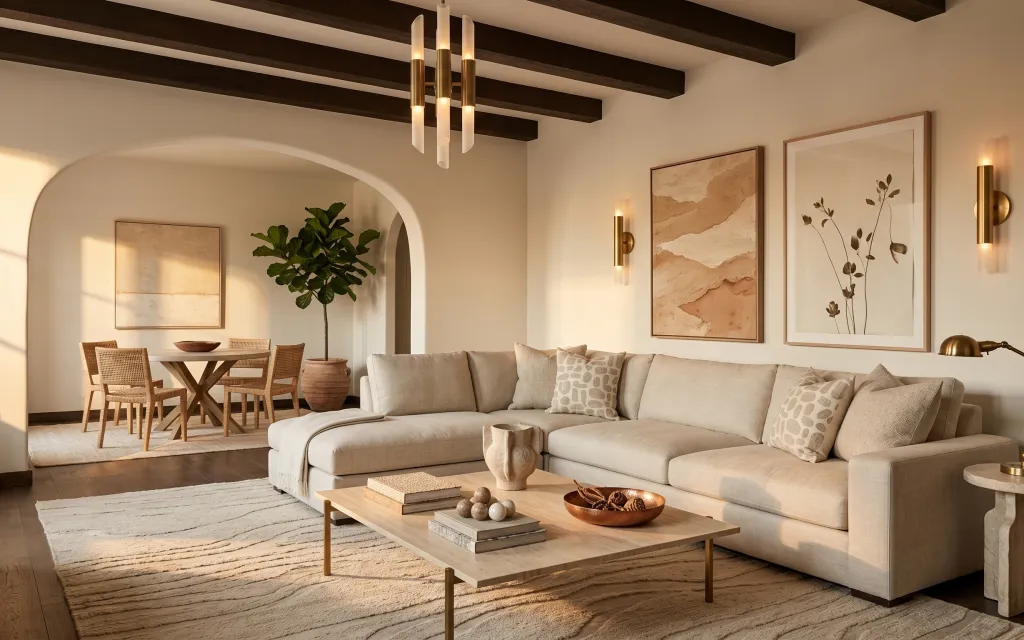
Why warm neutrals and gold accents are the sofa-and-art living room of 2026
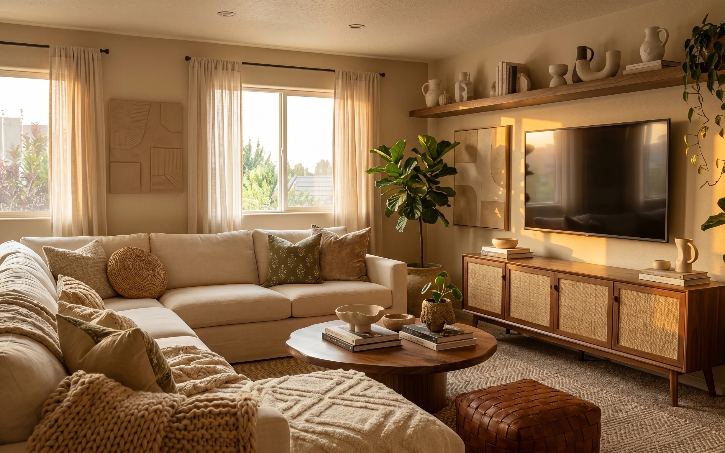
Start with what the space already offers: that creamy sofa color and the warm gold lighting make a strong base even in a rental. In the photo, the textures do most of the work—soft rug pile underfoot, a loosely draped throw blanket over the seat edge, and crisp woven patterns on the pillows. The layered art adds structure too, with two framed prints that feel like a curated set rather than singles. This is achievable for renters because every change below packs up at move-out, no drilling or permanent installs required.
I used to overthink wall styling and tried to match every frame size perfectly. Then I realized the room doesn’t need symmetry—it needs balance. Looking at this layout, I’d copy the warm-neutral palette, but keep the frames slightly different in vibe so the botanical print still looks intentional next to the abstract piece. The biggest shift for me was treating the coffee table like a mini vignette: tray first, then books and small objects, instead of scattering decor around.
Layer 1 — area rug ($100) Soft pile that hides wood-floor cold spots
A rug does the heavy lifting here because the room reads calm and grounded. Choose a light-beige 5×7 area rug with a textured, woven look so it softens the dark wood flooring and gives the sofa a defined footprint. The trade-off is you’ll want to vacuum regularly—lighter colors show lint faster—but the reward is that seamless “everything belongs together” feeling. If your rental floor runs glossy or uneven, a textured rug also makes the room feel more even. This is the first layer I’d buy because it sets the baseline for how warm or bright the rest of the palette should feel.
Choose the rug before the pillows
Pick your rug tone first, then match pillow fabrics to it—otherwise you end up fighting undertones.
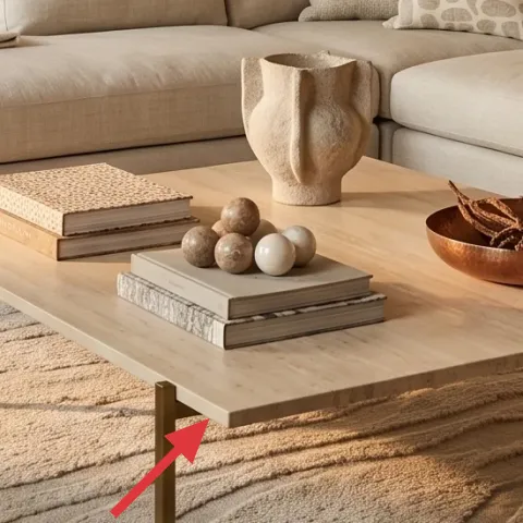
Layer 2 — rectangular coffee table ($100) Wood-top anchoring for your vignette
This coffee table is the visual anchor between the sofa and the rug, and its light wood keeps the room from feeling too dark. If you’re starting from scratch, look for a rectangular table with a simple silhouette and a natural wood or wood-look finish. That makes the styled objects on top feel intentional instead of cluttered. The downside of a lighter top is it can show water rings and crumbs, so use coasters if you’ll eat there. I’d rather live with that than deal with a table that’s visually heavy, because the goal in this look is airy warmth, not visual weight.
Keep table lines simple
Clean edges make the framed art and lamps look more curated, not crowded.
Layer 3 — throw blanket ($25) A drape that repeats the rug’s texture
The throw blanket softens the sofa without committing to new upholstery. Go for a neutral throw with a woven or lightly textured surface in cream or warm beige, then drape it over the seat edge so one corner hangs naturally. That placement is key: too neatly folded reads styled; too messy reads random. The trade-off is you’ll need to adjust it after vacuuming or moving pillows around, but it’s fast and totally renter-friendly. This choice also connects the rug and the pillows so the whole palette feels unified instead of “one pretty thing, then another.”
Drape one edge, not the whole blanket
Let one section fall to create rhythm; fully covering the cushion top flattens the look.
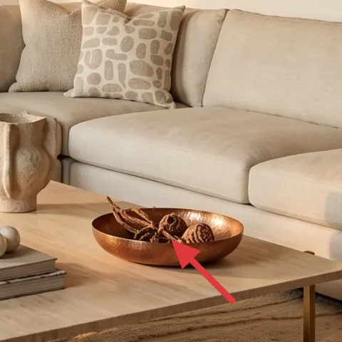
Layer 4 — decorative tray on coffee table ($20) A catchall that makes small objects look collected
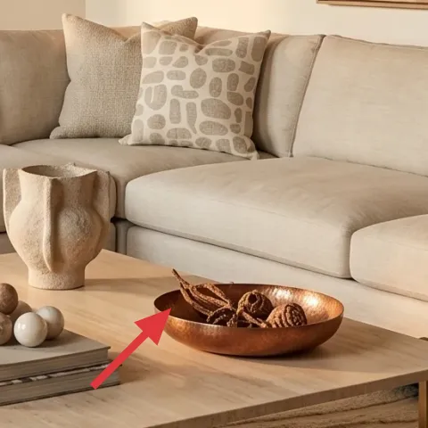
A decorative tray turns scattered coffee-table items into a composed vignette. Use a shallow tray in a warm material—wood-look or a natural finish—then group a small stack of books and one decorative object like a bowl or ceramic spheres inside the tray area. This is what lets the coffee table look intentional even when you’re not hiding every item. The trade-off: a tray limits how “freeform” you can be, but that’s exactly why this room looks polished. If you have a smaller rental, the tray also helps keep cords, remotes, and daily clutter off the tabletop.
Don’t let the tray block lamp light
Keep the tray centered or slightly toward the sofa side so the lamp glow still hits the table surface.
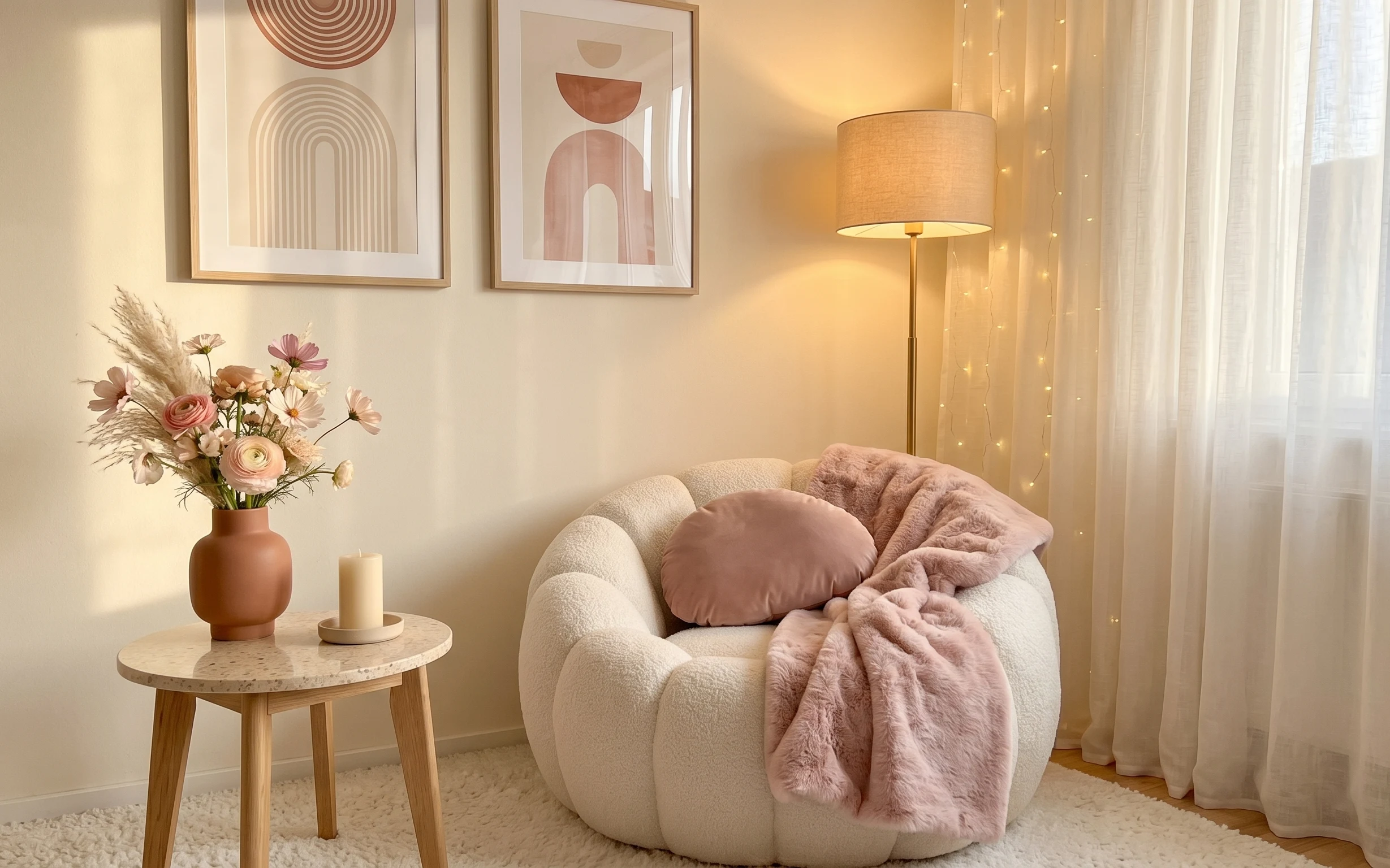
Layer 5 — plug-in floor lamp with arched pole ($40) A warm pool of light beside the sofa
Lighting is what makes this look feel expensive without renovating anything. A plug-in floor lamp with an arched pole gives you that vertical line beside the sofa, echoing the tall stems in the wall art. Choose a warm bulb tone and a simple, gold-toned metal frame so the hardware matches the gold accents in the room. The trade-off is you’ll be using an outlet, so position it where cord management is easiest. If your rental outlets are scarce, consider a short extension cord that you can pack away later. This lamp is also an easy “good night” swap when you don’t want ceiling lighting.
Warm bulbs matter more than wattage
Look for a warm color temperature so the neutral fabrics read cozy instead of gray.
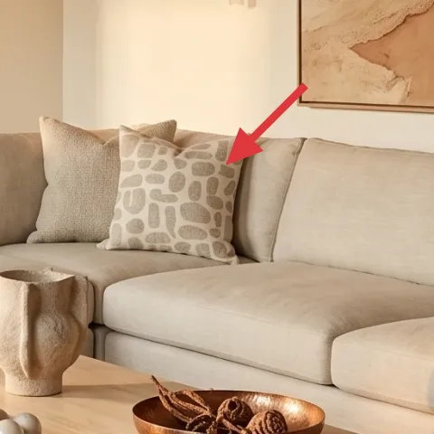
Layer 6 — framed botanical wall art print ($80) Replace one print with a DIY version on cardstock
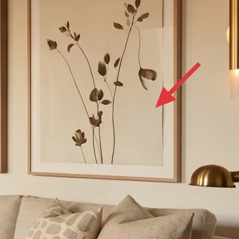
The botanical print is framed and placed high enough to balance the sofa back, which helps the room feel “styled,” not staged. For renters, framed art on Command hooks or picture-rail hooks (if a rail already exists) is one of the safest wall methods, but you still get a gallery-ready look. This is the layer I’d DIY: it’s cheaper than buying a pre-made print, and you can match the warm neutrals in the rug and throw. The trade-off is you’ll spend a little time painting, but the end result looks crisp and intentional when it’s inside a simple frame.
Make it instead of buying it
DIY a hand-painted botanical-inspired abstract on cardstock, then slide it into a matching frame so it looks like the framed wall art in the photo.
Materials
- Cardstock (11×14 or A4) — 1 sheet — craft store — $5
- Acrylic paint set (neutrals) — small set — craft store — $20
- Painters tape — 1 roll — hardware aisle — $3
- Simple 11×14 frame — 1 frame — thrift or craft store — $25
- Clear gel medium (optional for sheen) — 1 small bottle — craft store — $10
Steps
- Sketch a loose abstract layout with light pencil lines (keep it simple).
- Mask soft shapes with painters tape to create layered warm blocks.
- Paint in thin acrylic layers, letting each layer dry before adding the next.
- If using gel medium, brush a light top coat for a slightly more polished finish.
- Remove tape once the paint is fully dry.
- Trim cardstock if needed, then insert into the frame.
Total DIY cost: $63 — saves about $17 over buying.
Layer 7 — potted leafy tree ($30) Height and softness in the arched alcove
The potted leafy tree adds height and organic movement, which is why it works in that arched alcove behind the sofa. Go for a small-to-medium indoor tree in a terracotta-toned pot, then keep the trunk slightly off-center so the silhouette feels natural. The biggest win is how it bridges the structured framing on the walls with the softer textures of textiles. The trade-off is maintenance: real plants need light and occasional watering, while the pot may need wiping. If you go the rental-safe route, choose a plant you can wrap or bag for transport, and keep the pot stable so it doesn’t topple when you move furniture.
Match pot warmth to your decor
Terracotta and warm beige pull the gold and cream together without clashing.
The cost, layer by layer
| Layer | Item | Cost |
|---|---|---|
| 1 | Area rug 5×7, light beige | $100 |
| 2 | Rectangular coffee table, light wood-look | $100 |
| 3 | Throw blanket in cream/warm beige | $25 |
| 4 | Decorative tray for coffee table | $20 |
| 5 | Plug-in floor lamp with arched pole | $40 |
| 6 | Framed botanical wall art print (DIY equivalent) | $80 |
| 7 | Indoor potted leafy tree | $30 |
| Total | $395 | |
If you want it cheaper, swap the framed botanical print for a smaller frame size and use the DIY cardstock method only—then pick a rug from a thinner woven category. You can usually bring the total down by replacing the tray and blanket with simpler neutrals.
What worked, what didn't (across the whole room)
This palette works because it repeats a warm neutral base across rug, textiles, and wall art while keeping lighting golden and soft. The room also benefits from object-level styling: a tray, a draped throw, and one main plant that adds height. The only place it can slip is when one element is too cool-toned or too busy, which makes the prints feel mismatched.
What worked
- The light-beige rug anchors the sofa and makes the wood floors look intentional.
- Layered textiles (rug texture plus throw drape) keep the cream sofa from reading flat.
- A decorative tray concentrates small objects into one organized “zone.”
- The plug-in floor lamp adds warm directionality without changing any landlord fixtures.
- Framed botanical art brings calm vertical shape that pairs well with the arched alcove.
- The potted leafy tree adds softness and height so the room doesn’t feel purely horizontal.
What didn't
- Cool gray accents would fight the gold tones and make the neutrals feel less cohesive.
- Over-styling the coffee table (too many separate items) blurs the composed look.
- If the throw blanket is too thick or too patterned, it competes with the wall prints.
- A floor lamp placed too far forward can block sightlines and make the sofa area feel tight.
- A too-small framed print doesn’t balance the sofa back height in this layout.
What we'd skip if we did it again
Skip replacing large fixtures or the sofa itself. In a rental, the quickest payoff comes from textiles, framed art, and lighting that you can pack away later—those changes shift the whole read without committing to big-ticket items.
Skip buying matching sets “because they coordinate.” In this room, the framed botanical print works next to an abstract print because the colors match even when the artwork isn’t identical.
Skip going too dark with wall art or lamps. Keeping the frames in warm neutrals and choosing gold-toned lighting keeps the cream sofa from looking washed out and preserves that airy, lived-in balance.
Frequently asked
How long does this living room refresh take?
Plan for about a weekend. The rug and lamp placement can be done in a few hours, then you’ll spend the rest of the time styling the coffee table tray, draping the throw blanket, and hanging the framed artwork. If you DIY the cardstock art, add a few extra hours for painting and drying, plus a little time to insert it into the frame.
Is this look renter-safe if I move soon?
Yes—every element here is designed to be swapped without drilling into walls. Choose plug-in lighting, a free-standing potted leafy tree, and framed wall art hung with renter-safe hooks (or picture-rail hooks if that rail already exists). The rug and coffee table also pack up easily. The key is to avoid permanent installs and stick to removable mounting methods.
What if my living room is smaller than the photo?
Go smaller with the rug footprint (still aiming for a warm neutral) and keep the coffee table vignette minimal—use the tray plus a couple of objects, not a full collection. For wall art, keep frames similar in size to maintain balance with the sofa back height. A taller potted leafy tree can help fill vertical space without taking up more floor width.
Can I make it work with a bigger living room?
Yes. If you have more space, extend the styling outward: add a second framed print to the left side of the sofa area, and consider a larger rug if your budget allows. For the coffee table tray, you can increase object variety slightly, but keep the grouping inside the tray so the composition stays tidy. The floor lamp also helps define the conversation area.
Where should I shop for these swap-friendly items?
For the rug and throw, look at big-box home stores or online marketplaces that offer clear rug sizing. Frames and art prints are easiest to find at craft stores and discount home shops, and the DIY cardstock option works with any simple frame. For the plug-in floor lamp, search for “arched floor lamp” and confirm it’s plug-in (not hardwired) before buying.
What’s the biggest mistake people make with this style?
Using too many competing textures or too many cool-toned accessories. If the tray, throw, and wall art don’t share the same warm neutral undertone, the room can look busy even if each piece is individually attractive. Keep it to one main rug tone, one warm metal finish, and framed art with warm beige or cream backgrounds.
More in Living Room

Under $400: warm neutrals sofa-and-art living room refresh
A warm-neutral sofa-and-art living room refresh that renters can build without drilling, all under $400. The look hinges on a soft area rug…
Under $800: cozy living room refresh with rug, curtains, and plants
A warm, lived-in living room refresh for under $800—centered on a plush beige rug, tall cream curtains, and layered decor. You’ll also get …
Under $700: blush-and-cream boucle seating nook refresh
A warm, blush-and-cream boucle seating nook using a cream area rug, sheer curtains, a drum-shade floor lamp, framed abstract art, and warm …