- Best for
- Cozy, lived-in updates that look intentional
- Cost
- Under $800
- Difficulty
- Easy-to-moderate weekend projects
- Time
- About a half-day to a weekend
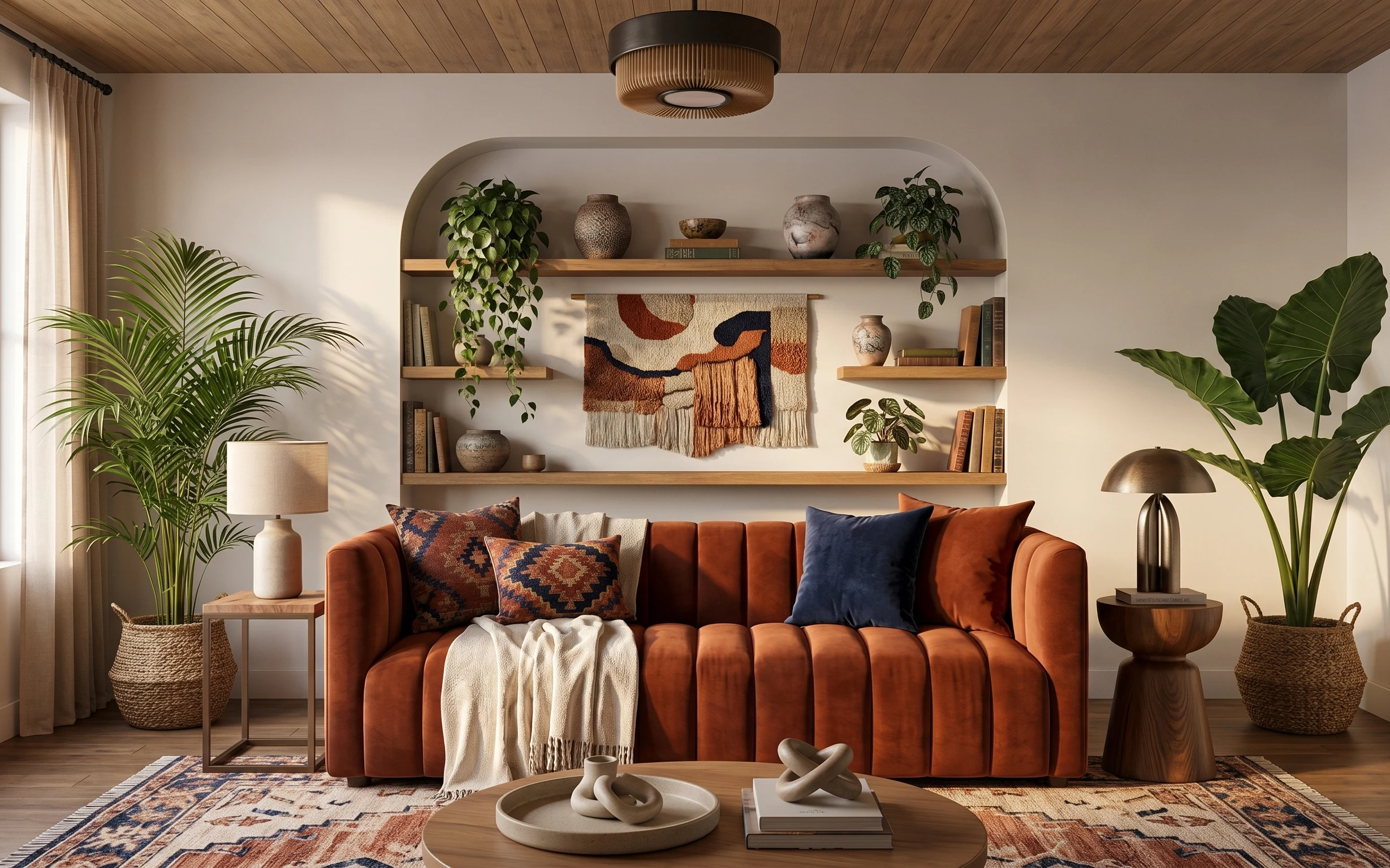
Why beige-and-olive depth is the living room of 2026
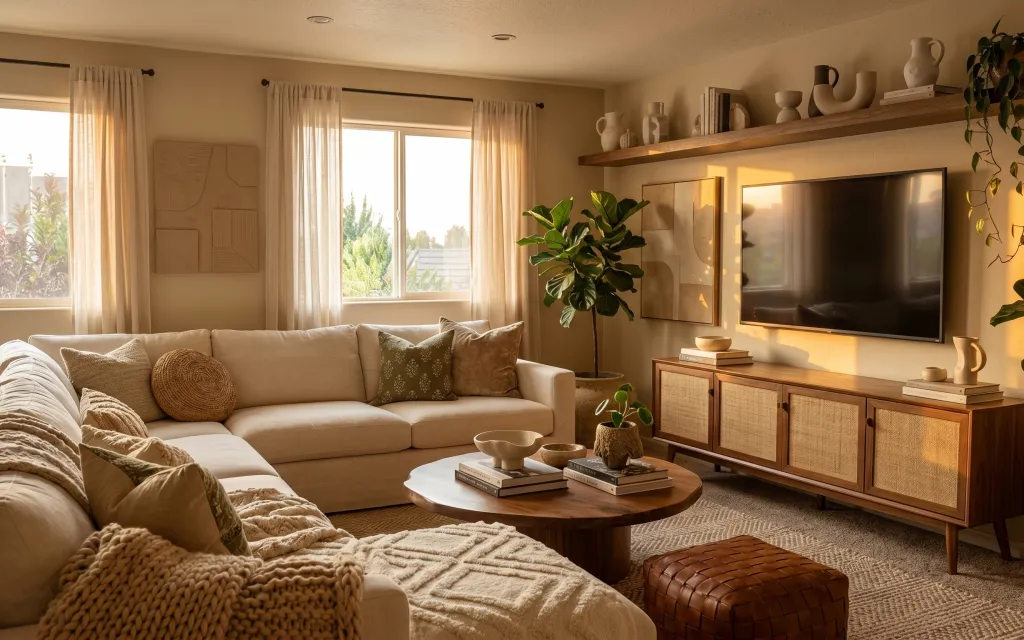
Start with the already-soft foundation here: a light beige sofa, cream curtains, and that warm beige rug give you instant texture. The design trick is to keep repeating the same “warm neutral + olive green” language—then let the materials do the work. Look closely at the woven throw blanket, the textured pillow covers, and the natural-looking wood coffee table. This is absolutely achievable on a homeowner refresh timeline because none of the changes require demolition, and most can be sourced in week-by-week waves.
I almost over-bought decor the first time I tried to copy this vibe. My mistake was adding too many small things at once, so everything blurred together. What fixed it for me: picking one hero fabric (the curtains), one grounding surface (the rug), then building out with plants and framed art. The result feels styled, not cluttered.
Layer 1 — Beige area rug ($200) for hiding everyday mess
A beige area rug is what makes the sofa-and-coffee-table zone feel cohesive and soft underfoot. In this photo it reads as warm, low-contrast, and slightly textured, which is exactly what helps with foot traffic and the occasional dropped snack. A lighter rug also keeps the room from feeling heavy against the light walls and cream curtains. The trade-off is that you’ll want a rug pad for grip and easier vacuuming, especially if you have wood floors. If you’ve only ever used “easy-to-see” rugs before, this one is the more forgiving option.
Choose texture, not just color
Go for a low-sheen woven or lightly patterned beige rug so it hides dust and blends small spills.
Layer 2 — Cream curtain panel pair ($80) for taller-looking windows
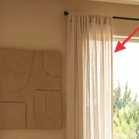
These cream curtains do two jobs at once: they soften the wall of daylight, and they visually raise the window height. Hanging curtain panels close to the ceiling (or at least a little higher than the casing) makes the whole living room feel longer and calmer, especially when your sofa is already light beige. The fabric weight matters—too sheer can look flimsy, and too thick can block the airy feel. The trade-off is cost vs. coverage: panel pairs are usually easier than custom, and you can still get that full look with the right width. This also helps anchor all the framed pieces on the wall.
Keep folds consistent
Use the curtain width to create soft gathers; even spacing looks intentional next to the textured sofa pillows.
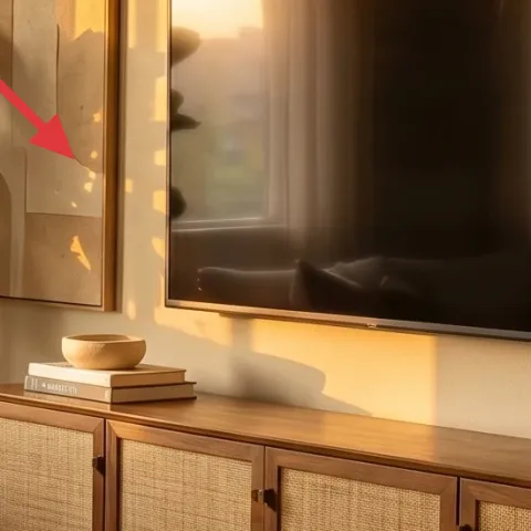
Layer 3 — Framed wall art prints ($80) for grounding the TV wall
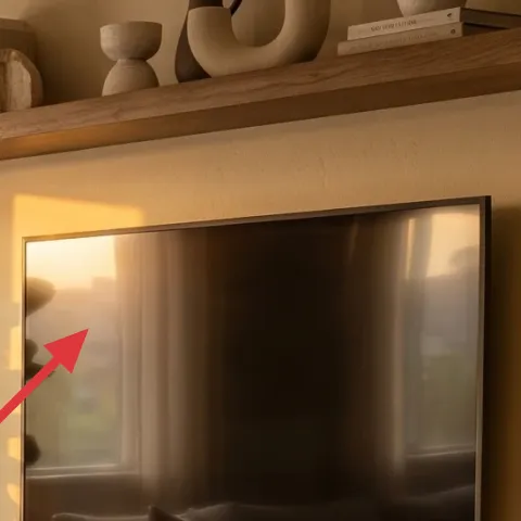
The framed wall art prints near the TV area are a visual counterweight to all that straight tech and cabinet hardware. In this room, the frames sit in a warm-toned cluster, which makes the wall feel “finished” even when you’re not looking at the screen. This is the layer you choose if your room feels like it’s missing an anchor point—because the rug and curtains give softness, but the wall art gives direction. The trade-off is scale: picking prints that are too small makes the TV look even bigger. If you’re replacing prints, measure the wall zone first so the composition reads as one balanced group.
Don’t eyeball spacing
If the frames are uneven, your eye will keep fixing on it every time you walk past the TV.
Layer 4 — Medium terracotta planter (on media console) ($40) for a matching earthy accent
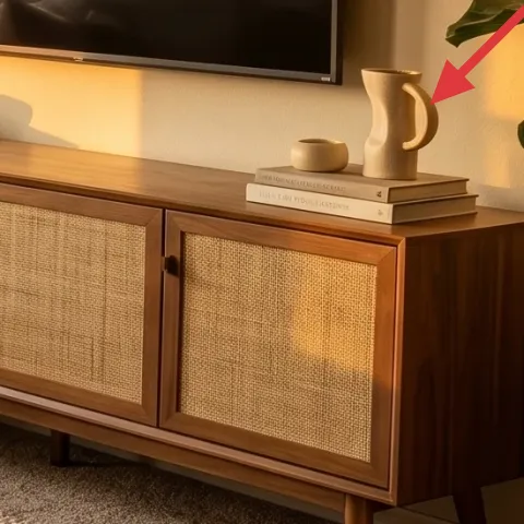
Make it instead of buying it
Paint a terracotta planter pot to better match the room’s warm beige tones, so it looks intentional on the media console instead of “leftover decor.”
Materials
- All-purpose primer (spray or small can) — ~1 can — hardware store — $10
- Acrylic paint (warm beige) — 1 small bottle — craft store — $6
- Water-based clear sealer (matte) — ~1 small can — craft store — $8
- Foam brush (for touch-ups) — 1 — craft store — $4
- Painter’s tape + drop cloth — 1 set — hardware store — $2
Steps
- Wash the pot with warm water and let it fully dry.
- Tape off any areas you want to keep unpainted.
- Prime the entire surface in a thin, even coat.
- Wait for the primer to dry completely.
- Apply the warm beige paint in two light coats, letting each coat dry.
- Let the final paint coat dry fully.
- Seal the planter with a matte clear sealer.
- Wait for the sealer to cure fully before styling it.
- Set the painted pot back on the media console and adjust the plant height for balance.
Total DIY cost: $30 — saves about $10 over buying.
Layer 5 — Large leafy indoor plant ($80) for the olive-green repetition
A large leafy indoor plant is the fastest way to echo the room’s olive green without adding more “stuff.” In the photo, the plant sits beside the TV zone and creates a soft vertical line, which helps the horizontal media console and the TV feel less blocky. You’re not just buying greenery—you’re buying movement. The trade-off is space and watering reality: a larger plant needs consistent care and enough light to keep leaves looking full. If you don’t have the bright window situation, choose a plant that tolerates lower light, but still aim for a similar height so it performs the same visual role.
Match height to your framed art
Set the plant so the top of the leaves lands around the same vertical “band” as the art frames.
Layer 6 — Decorative pillow (soft cream textured) ($30) for making the sofa look dressed
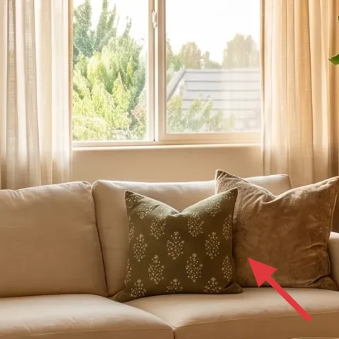
That cream textured pillow is what turns a basic light-sofa into a lived-in seat. The key detail is the texture—woven or lightly nubby fabrics read cozy even in warm neutral schemes. This layer matters because your curtains and rug already provide broad softness, so pillows are the small-scale place to add pattern and depth without changing the whole room. The trade-off is that pillow styling can tip into clutter if you go overboard; stick to two or three pillows with different textures. In this room, one rounder decorative shape and one more textured cover are enough to look styled every day.
Mix by texture, not by theme
Keep the colors warm and let the textiles vary: woven + smooth + subtly patterned.
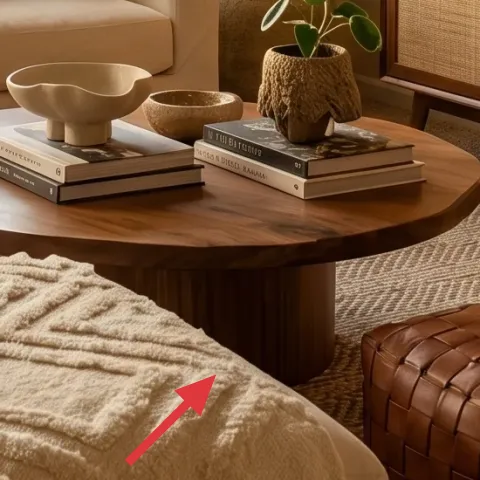
Layer 7 — Round wooden coffee table ($180) for softer lines than a rectangle
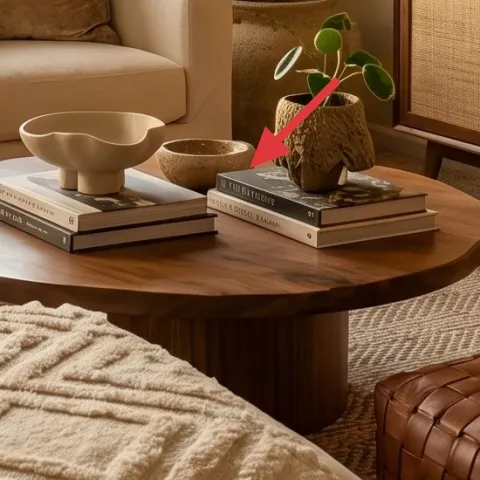
A round wooden coffee table is one of those quiet upgrades that makes the whole layout feel less harsh. In this photo, the table’s shape softens the edges between the sofa and the ottoman, and the wood tone ties into the media console and the floating shelf. It also makes styling easier: you can park books and small ceramics without the “left corner/right corner” feeling that square tables can create. The trade-off is storage—round tables often feel more open visually, so you’ll want a clear styling rhythm and a tray when you’re not using it. If you’re comparing alternatives, a round top beats a sharp-edged table for this airy, earthy look.
Use a tray to keep it intentional
Stack books and place small ceramics on a tray so styling stays neat between guests.
The cost, layer by layer
| Layer | Item | Cost |
|---|---|---|
| 1 | Beige area rug 5×7 with textured weave | $200 |
| 2 | Cream curtain panel pair (84") | $80 |
| 3 | Framed wall art prints (single large print) | $80 |
| 4 | Medium terracotta planter pot (paintable) | $40 |
| 5 | Large leafy indoor plant (4–6 ft) | $80 |
| 6 | Decorative pillow cover (cream textured) | $30 |
| 7 | Round wooden coffee table | $180 |
| Total | $690 | |
If you want a cheaper version, swap the round wood coffee table for a smaller thrifted table or a $60–$90 farmhouse-style round top. Keep the curtain height trick, choose a similarly textured beige rug, and save the budget by painting the planter instead of buying new decor.
What worked, what didn't (across the whole room)
This refresh plan works because it repeats the same warm-neutral and olive-green language across three “anchor zones”: floor, window, and wall. The biggest improvements come from rug texture and curtain height, which make the rest of the styling look intentional.
What worked
- The beige rug calms the whole seating area and hides everyday dust better than cooler whites.
- Cream curtains add height and softness, so the window doesn’t overpower the sofa.
- Warm-framed art gives the TV wall a focal point that still reads when the screen is off.
- Painting the terracotta planter ties it into the beige palette without needing new decor.
- The large leafy plant adds vertical softness and repeats the olive-green note in a natural way.
- Textured pillow styling makes the sofa look finished without adding more visual “busy.”
What didn't
- Mixing multiple bold patterns across pillows can make the room feel louder than the calm palette.
- Choosing prints that are too small next to a large TV makes everything look off-balance.
- Skipping a rug pad can cause shifting, which ruins how the rug “settles” visually.
- If the plant height doesn’t match the framed art band, the composition starts to look bottom-heavy.
- Styling the coffee table without a tray turns into scattered decor fast.
What we'd skip if we did it again
Skip replacing the sofa first. In this room, the sofa already has the correct light-beige foundation, and you’ll get more return by upgrading the rug, curtains, and styling details around it.
Skip buying multiple small “fillers” for shelves. The warm neutral vibe holds up best when plants, one terracotta accent, and framed art are the only repeated visual stories.
Skip going for a rug that’s too white or too shiny. Beige texture is what makes the room feel lived-in, and it’s also what keeps daily life from showing through.
Frequently asked
How long does this living room refresh usually take?
Most homeowners can do it in one weekend. Curtains and rug placement are the fastest wins, especially if your window measurements are already known. The DIY planter paint is the only part that needs drying time, so it’s smart to paint it first and style it the next day. If you’re buying framed art, budget an extra trip for matching sizes and frame finishes.
What if I rent and can’t change window hardware or hang anything?
This look still works without hardware changes. Use a tension rod for curtains, and rely on frame placement on existing wall surfaces if you can’t mount new pieces. For the TV wall, keep the framed art already present or place smaller frames on the media console/bookshelf ledge. The rug, pillow textures, and plant placement carry most of the visual weight anyway.
My room is smaller—will the beige rug and curtains overwhelm it?
If the room is smaller, go for a slightly smaller rug size but keep the same rule: choose texture in the beige family. For curtains, hang them high and keep them long enough to reach close to the floor so the window still stretches upward. Avoid adding extra patterned pillows; stick to two textured pillows plus one accent so the room stays breathable.
What if my room has darker floors or less natural light?
You can still keep the same palette, but lean into the warm-neutral side more. Beige rugs and cream curtains brighten the room by reflecting light rather than absorbing it. For greenery, choose a plant that stays full in your light conditions, since sparse leaves will make the corner look unfinished. A matte finish on painted decor helps avoid glare.
Where should I shop for these specific items without blowing the budget?
For the rug and curtains, look for mid-range brands with multiple beige textures—woven patterns and low-sheen fabrics hide wear well. Frames and art prints are often cheaper when purchased as singles with a coordinated mat. For plants, check local nurseries for 4–6 ft options, since the price difference between a big-box plant and a nursery plant can be significant.
What’s the biggest mistake people make when trying this look?
Over-patterning. When people copy the vibe, they add too many prints across pillows, wall art, and accessories, and the palette stops feeling calm. Another common mistake is choosing curtains that are too short, which kills the “taller window” effect. Pick one hero fabric (curtains), one grounding texture (rug), and then keep the rest to solid textures and one plant.
More in Living Room

Under $800: cozy living room refresh with rug, curtains, and plants
A warm, lived-in living room refresh for under $800—centered on a plush beige rug, tall cream curtains, and layered decor. You’ll also get …
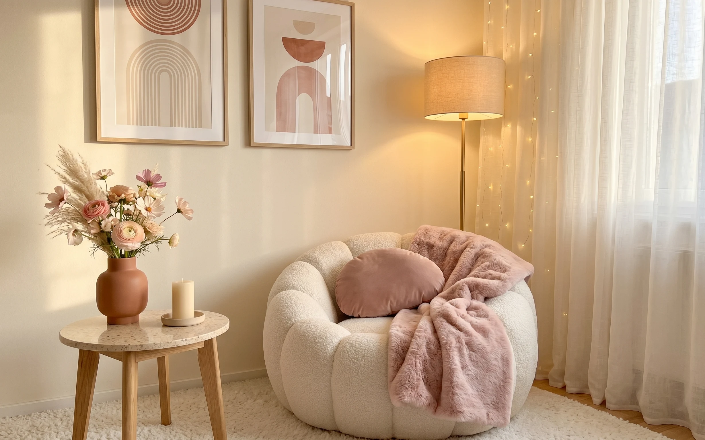
Under $700: blush-and-cream boucle seating nook refresh
A warm, blush-and-cream boucle seating nook using a cream area rug, sheer curtains, a drum-shade floor lamp, framed abstract art, and warm …
Under $500: earthy boho living room refresh with 7 renter swaps
A renter-friendly, no-drill living room refresh inspired by an earthy rust-and-cream boho setup. This move-ready plan uses 7 swaps (rug, te…