- Best for
- textile-led rental refresh
- Time
- 1 afternoon (plus dry time for DIY art)
- Total cost
- under $500
- Renter-safe
- yes—no permanent installs
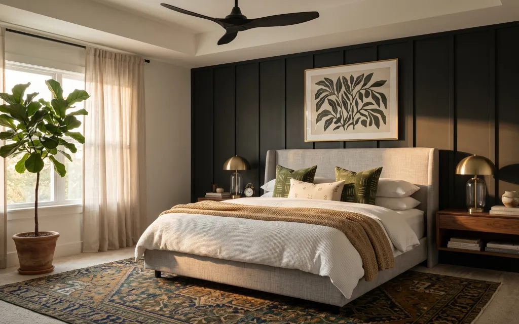
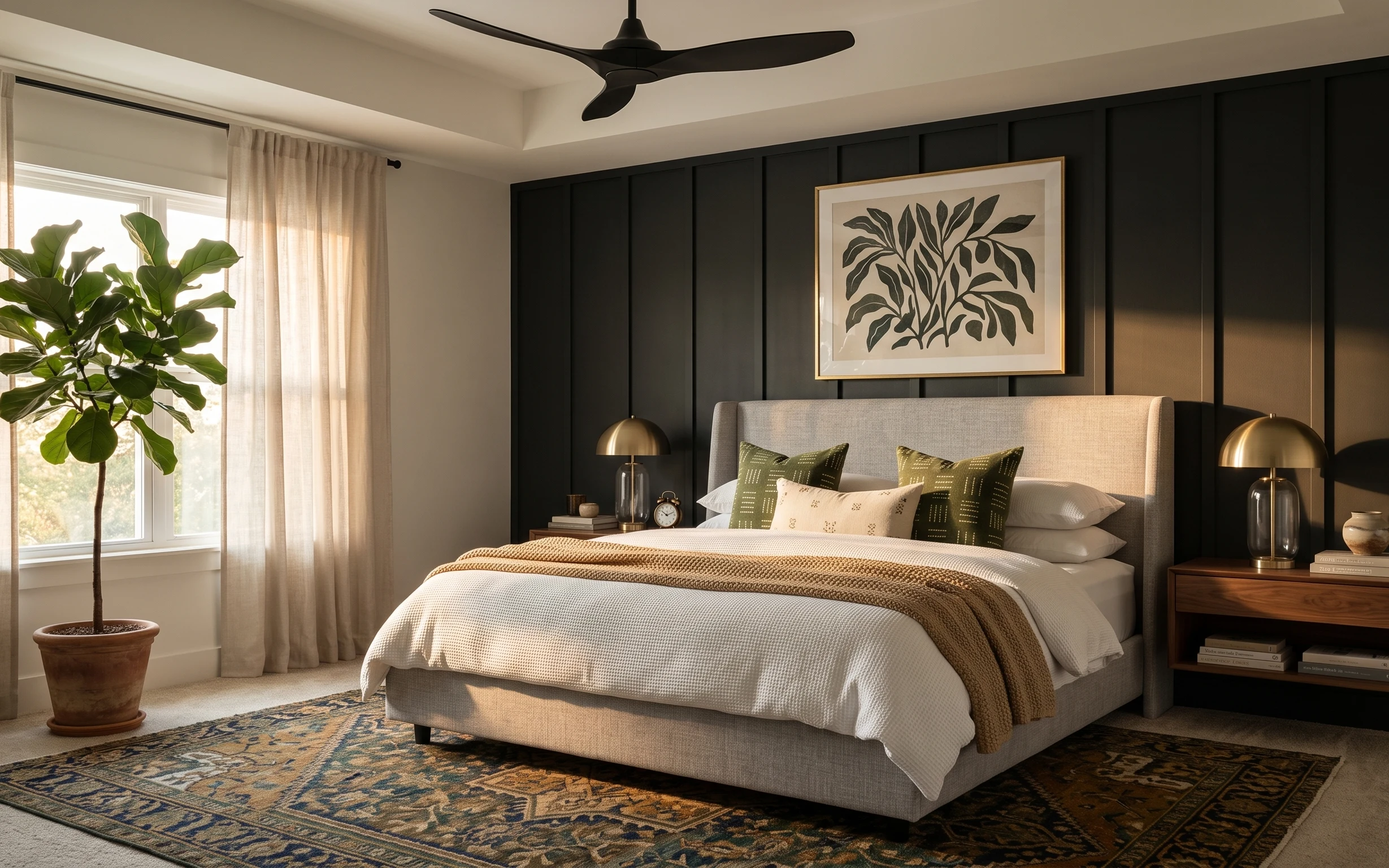
Why olive-and-brass palette is the bedroom of 2026
That dark-paneled backdrop plus warm brass is doing the heavy lifting here, and the rest is mostly texture. You’ve got cream bedding that reads crisp, a tan knit throw that adds weight, and that blue-tan-olive rug pattern that keeps the floor from feeling flat. The framed botanical art gives you one “grown-up” focal point without needing any permanent changes. This is a good match for shared housing because the wins are mostly removable textiles and freestanding decor, not anything you’d have to leave behind at move-out.
I nearly overcomplicated mine the first time I tried this look—adding more small items on the bedside surfaces—until I realized the space already has enough busy: the rug pattern and the pillows. What changed everything was choosing fewer, bigger texture moments (rug + art) and letting the plant and lamps do their quiet work. That’s how you get the same calm, layered feel without turning your bedroom into a storage unit.
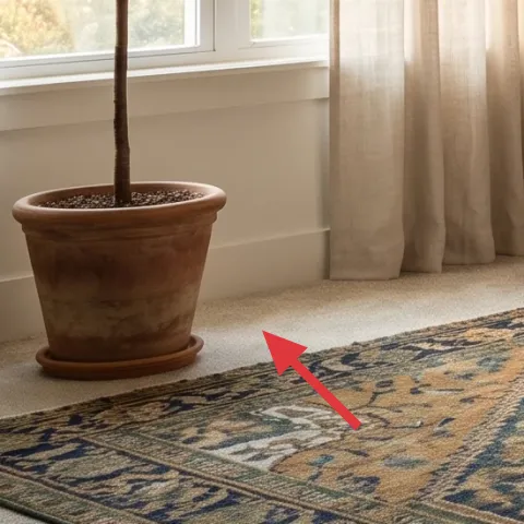
Layer 1 — area rug with blue, tan, and olive patterns ($200) Pattern that grounds the bed
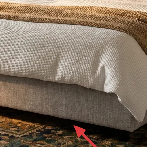
A patterned area rug like this is the foundation for an olive-and-cream bedroom because it “connects” the green pillows, the tan throw, and the warm lamp glow. The specific blue/tan/olive mix matters: it keeps cream from looking too stark and it gives the room movement even when the bedding is simple. For shared housing, a rug is also one of the easiest things to pack—roll, secure, and slide into a van. The trade-off is size: if the rug is too small under the bed, the room can feel chopped up fast.
Rug edge placement
Let the rug extend under the front of the bed so the visual weight sits “in” the sleeping zone, not in the hallway.
Layer 2 — knit throw blanket (tan) on the bed ($25) Adds casual texture over cream
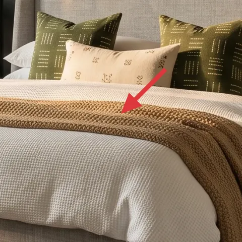
That tan knit throw is doing exactly what throws should do: it adds a thicker, slightly nubby texture on top of crisp cream bedding. Visually, it bridges the darker wall and the warmer brass lamp bases, which is why the whole palette reads cohesive. If you only buy one soft accessory, this is the one—because a throw is cheap, replaceable, and it packs flat. The main trade-off is keeping it neutral: too much contrast or bright color would fight the green pillows instead of supporting them.
Fold, don’t scrunch
A neat fold makes the throw look intentional; a loose pile can read accidental on camera and in person.
Layer 3 — green patterned throw pillows ($30) Repeats the olive accent color
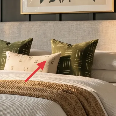
These green patterned pillows are the easiest way to bring the olive note into the bed without changing anything permanent. The pattern detail also adds interest even when the duvet stays plain, so the bedroom doesn’t feel like a “one-color” rental. Choosing pillows over a larger fabric swap keeps your packing simple: pillow covers go in a box, no weird bulky shapes. The trade-off is scale—oversized pillow covers can overwhelm a smaller bed and make the room feel tighter, so aim for proportions that match the bed width.
Repeat the palette
If you’re already using olive in pillows, keep other accents in brass or tan so you don’t get competing green shades.
Layer 4 — brass-based table lamp on the right bedside table ($60) Warm light that flatters skin tones
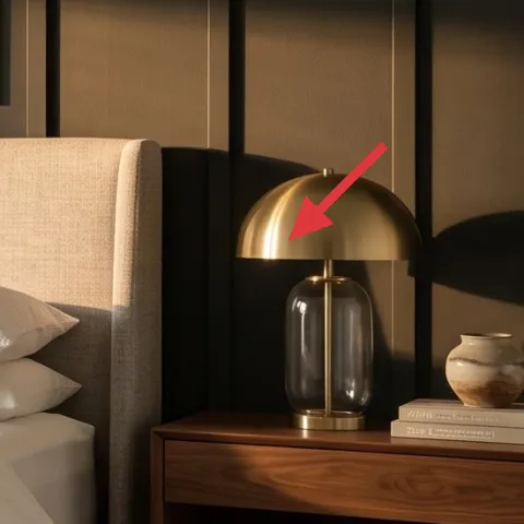
Warm plug-in table lamps make the bedroom feel lived-in after dark, and that brass base pushes the look toward “designed” without any wall work. Here, the lamp sits on the right bedside table, so its glow balances the heavier dark wall behind the bed and keeps the center area from feeling too dramatic. A single statement lamp is usually enough for shared housing—two lamps can be a luxury. The trade-off is bulb color: a cool white bulb will fight the tan and olive textiles, so stick to a warm bulb for the same mood.
Don’t pick cool-white bulbs
Cool bulbs make brass look dull and can make your cream bedding read yellow-ish.
Layer 5 — terracotta plant pot with tall leafy plant ($25) Brings “grown” height without built-ins
That tall leafy plant adds height and softness, and the terracotta pot echoes the tan throw so the palette stays cohesive. For shared housing, a plant is ideal because it’s a freestanding swap: it comes with you, and it doesn’t require changing hardware, paint, or outlets. The main thing to watch is weight—if you go too large or too tall, moving day becomes harder. Keeping the pot simple and medium-sized is a practical compromise that still reads high-end.
Choose a medium pot for easy moves
A smaller pot is easier to lift and less likely to spill soil during transit.
Layer 6 — large framed botanical art print ($80) One focal piece that reads “finished”
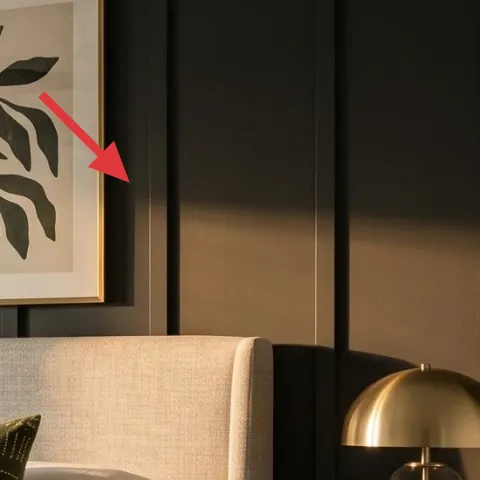
A large framed botanical art print is the fastest way to make a rental bedroom feel intentional, especially when the wall behind the bed already has contrast. The artwork here brings organic shape (leafy lines) that plays nicely with the plant and with the irregular texture of the knit throw. For move-ready living, you can swap the paper insert even if you can’t change the wall. The trade-off is that you’ll want the print to be simple and readable from bed height—fine details can disappear once you’re lying down.
Make it instead of buying it
Make a hand-painted abstract artwork on cardstock to slip into this same frame, so you get the same focal-size look for much less.
Materials
- Thick cardstock (9×12 sheets, ~2) — craft store — $10
- Set of acrylic craft paint (small tubes) — craft store — $22
- Small foam brushes/paint sponges — craft store — $8
- Painters tape (for clean edges) — hardware store — $6
- Matte clear spray (for sealing) — hardware store — $4
Steps
- Tear or cut the cardstock to the exact insert size.
- Lightly tape off 2–3 sections with painters tape.
- Layer paint in olive, cream-tan, and deep green, leaving some unpainted cardstock for contrast.
- Use foam brushes to make leaf-like marks or branch lines without worrying about realism.
- Let the paint dry fully.
- Remove tape slowly to keep edges crisp.
- Quickly touch up any thin lines with a sponge.
- Let everything dry, then apply a light matte clear coat to protect the surface.
- Slide your dried cardstock insert back into the frame.
Total DIY cost: $50 — saves about $30 over buying.
Layer 7 — curtain panels (light beige/cream) across the window ($80) Softens the whole silhouette
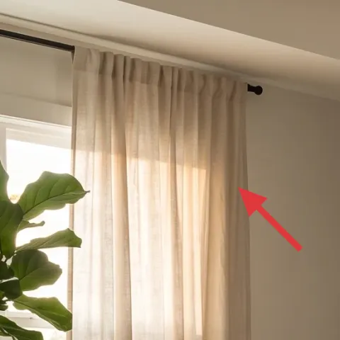
Light beige/cream curtain panels make a rental bedroom feel calmer and more expensive because they soften the big vertical lines of windows. They also work like a color mixer: the cream pulls together the duvet and pillows, while the sheer-ish tone keeps the room from feeling heavy next to the dark wall. Curtains are also one of the easiest “take it with you” swaps—no measuring for furniture movers, just fold and pack. The trade-off is that you’ll need the right length for your window: curtains that puddle too much can overwhelm a small room, while ones that are too short can make the bed area look less cohesive.
Hang for visual height
If your system allows, mount the curtain rod closer to the ceiling for a taller, more elegant frame.
The cost, layer by layer
| Layer | Item | Cost |
|---|---|---|
| 1 | Area rug (5×7 look) in blue/tan/olive pattern | $200 |
| 2 | Tan knit throw blanket | $25 |
| 3 | Green patterned throw pillow covers | $30 |
| 4 | Plug-in table lamp with brass base and warm shade | $60 |
| 5 | Terracotta plant pot with tall leafy plant | $25 |
| 6 | Large framed botanical art print (DIY insert in same frame) | $80 |
| 7 | Curtain panels (light beige/cream) pair | $80 |
| Total | $500 | |
If you want a cheaper version, skip the framed art and go for a simpler framed print replacement later—then put that money into a bigger rug or a second pillow cover set. Keeping the rug + throw + lamps is what keeps the look from feeling “unfinished.”
What worked, what didn't (across the whole room)
The biggest win is how the palette repeats itself: olive shows up in pillows, tan shows up in throws, and brass shows up in the lamps. The other strong choice is that the focus pieces are movable, so the room stays rental-friendly. The only place this plan can wobble is when the rug or art scale is off.
What worked
- The blue/tan/olive rug pattern keeps cream bedding from looking flat or sterile.
- Tan knit throw texture makes the bed feel layered instead of one big sheet.
- Green patterned pillows repeat the same accent color as the plant for cohesion.
- Brass-based table lamps add warm tone and make the room feel intentional at night.
- Framed botanical art gives one clear focal point behind the bed without wall changes.
- Curtain panels soften the window lines and make the whole room read calmer.
What didn't
- If the rug is too small, the bed looks like it’s “floating” on hard floor space.
- If bulb color runs cool, brass lamp bases look dull and the cream shifts warmer.
- Too many small decor objects on the bedside surfaces can fight the rug pattern.
- Cutting DIY art too small makes it feel like a placeholder instead of focal art.
- Curtain panels that are short can make the window feel boxed in.
What we'd skip if we did it again
Skip a matching “bedroom set” approach where nightstand, lamp, and art come in the same style package. In shared housing, that usually creates the wrong kind of uniformity and makes it harder to refresh later without replacing everything.
Skip trendy wall decor that requires hardware or leaves residue. Even a small, temporary-looking thing can become a move-out problem when the next lease has different walls.
Skip going bigger on pillows and smaller on the rug. A well-scaled rug does more for the overall look than stacking extra cushions, especially when you’re packing everything into boxes at the end of the term.
Frequently asked
How long does this bedroom refresh take for shared housing?
The swap-out portion (rug, pillows, throw, lamps, curtains) is usually an afternoon. The only time sink is the DIY art insert: you’ll need drying time between paint layers and then the clear coat. If you keep the design simple—2–3 color blocks plus botanical-like marks—you can still finish everything in one day plus drying time.
What if I can’t change the wall or existing frame setup?
No problem—this plan is built around move-ready textiles and freestanding decor. If the frame can’t be changed, you can still do the DIY insert concept if the frame is movable. If not, swap the focus elsewhere with a large freestanding mirror or another framed print replacement that doesn’t require wall drilling.
What’s the easiest upgrade if my room is smaller than the photo?
For a smaller bedroom, prioritize rug scale and window softness first. Choose a rug that reaches under the front of the bed and keeps a clear border around it, then use curtain panels that hang near the ceiling for height. Keep pillows to two to four total so the bed doesn’t eat up visual space.
Where should I shop for these exact moves?
For the rug, look for easy-to-roll sizes from large retailers or discount home stores. Throws, pillow covers, and curtain panels are easiest to find in mainstream home brands and thrift-friendly markets. For lighting, stick to plug-in table lamps with warm bulbs. Botanical art inserts can come from thrift frames or DIY paper you slip into an existing frame.
What’s the biggest mistake people make in a color scheme like this?
The most common mistake is adding too many competing patterns at once—like patterned bedding plus patterned curtains plus patterned art. Here, the pattern is concentrated: the rug carries the floor pattern, pillows add the olive cue, and the art stays the single focal moment. Keeping the rest neutral lets the look read intentional.
More in Bedroom
Under $500: olive-and-brass bedroom refresh with 7 move-ready swaps
This bedroom refresh leans olive green, cream textiles, and warm brass for a lived-in look. With 7 move-ready swaps, the whole update lands…
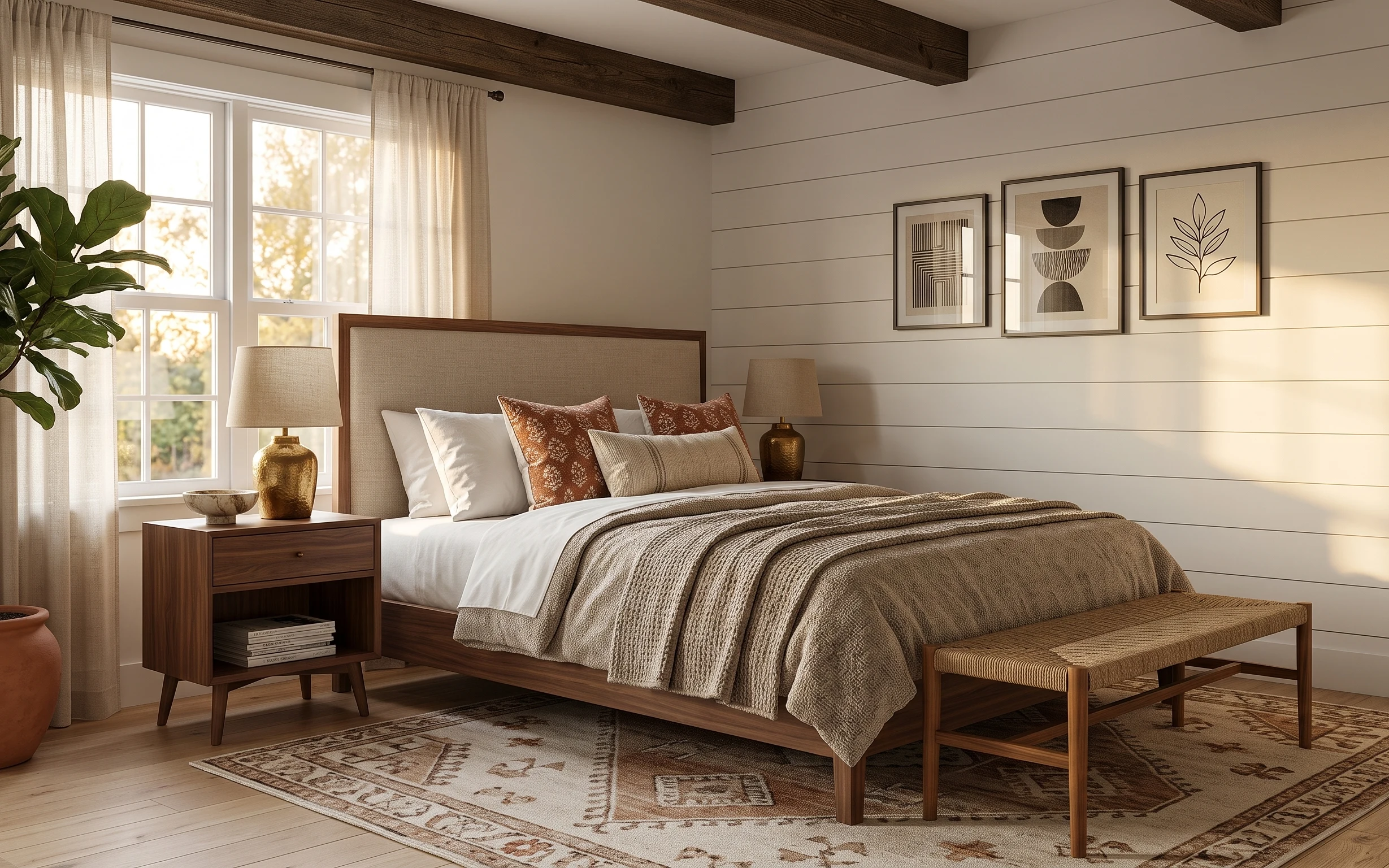
Under $400: move-ready bedroom refresh with warm earth tones
A warm earth-tone bedroom refresh for shared housing—built from move-friendly swaps that pack into boxes. This plan hits the look with curt…
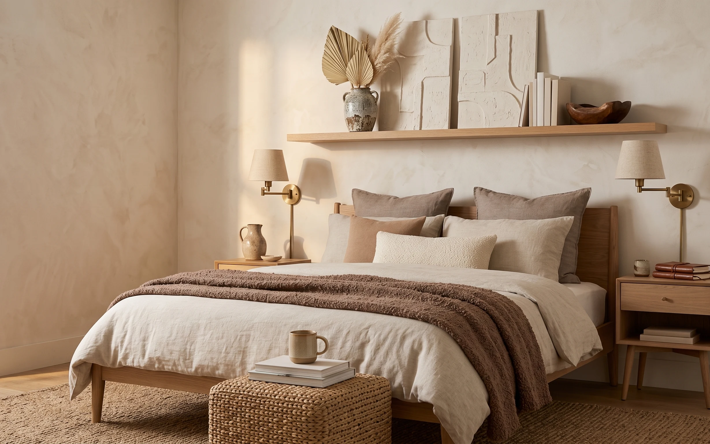
Under $800: modern farmhouse bedroom refresh with 7 easy swaps
A soft, modern farmhouse bedroom refresh built on 7 weekend swaps—starting with a flat-weave area rug, cozy throw texture, and warm brass s…