- Square footage
- works best in 80–200 sq ft corners
- Cost
- under $500 for the full look
- Difficulty
- easy to moderate (weekend refresh)
- Renter-safe
- yes—no-drill swaps and removable hanging
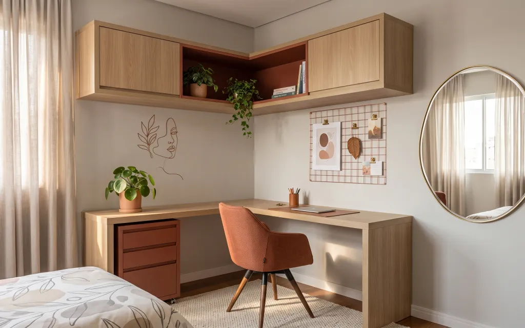
Why terra-cotta-and-wood corner styling is the home office nook of 2026
If you’ve ever tried to make a tiny corner feel “finished,” you already know it’s mostly about texture and sight lines. In this setup, the warm wood cabinetry and the terracotta accents do the hard work, while the rug, light curtains, and brass-framed round mirror bring softness without adding visual clutter. The desk-area plant gives the space movement, and the grid organizer keeps your wall art at working height. For renters, this is one of those looks you can build in weekends—then pack away when the lease ends.
I used to think I needed one big statement piece (a giant canvas, always). Then I caught myself—my real problem was that every surface was busy, but nothing tied together. This time, I copied the logic from Japanese minimal styling: repeat the same warm tones, vary the textures (linen-like curtains, woven rug, terracotta pot), and let the mirror add depth so the corner doesn’t feel boxed in.
Layer 1 — area rug in beige/cream tones ($150) Wraps the desk in a softer “zone”
The beige/cream rug anchors the whole desk area and keeps the warm wood from feeling too stern. In the photo it sits under the chair and extends toward the desk edge, which helps your eye treat the nook like one intentional spot. I’m choosing a rug in this neutral family instead of a bolder pattern because the wall art grid already adds structure, and too much pattern fights at this small scale. The trade-off: you’ll want to spot-clean quickly, since light tones show foot traffic faster.
Rug placement that works
Try to keep the chair legs and the front half of the desk landing area on the rug—partial coverage makes the chair feel like it “floats.”
Layer 2 — light beige curtain panels (pair) ($60) Softens the corner and blurs harsh edges
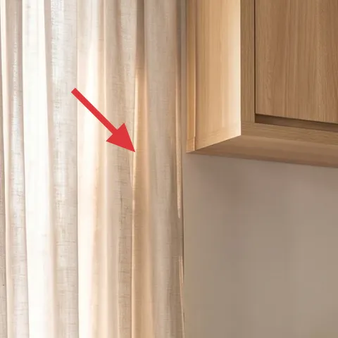
Those light beige curtain panels add a gentle, linen-like layer that makes the nook feel airy instead of boxed in. They’re doing double duty: filtering daylight near the bed edge and providing a calm backdrop for the brass mirror. If you went with heavier drapes or dark colors, the corner would read smaller because the contrast would be stronger. The trade-off here is maintenance—light curtains show dust—so a quick shake or gentle wash cycle becomes part of the routine. This is the kind of renter swap that makes the whole photo look “styled” fast.
Why sheer-ish panels help small spaces
Less opacity means the light still bounces around the room, which is exactly what a compact office nook needs.
Layer 3 — rounded wall mirror with brass-colored frame ($120) Adds depth where the wall feels tight
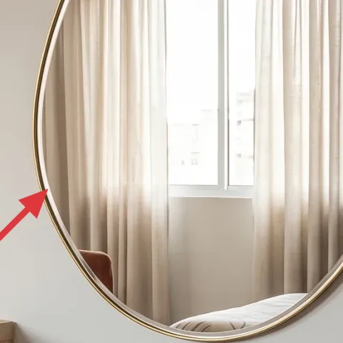
The rounded mirror with a brass-colored frame is one of the easiest ways to make a small desk area feel bigger. It reflects the window light, then echoes the warm metals from the grid display without making the space look cold. I’m picking a rounded shape on purpose—straight-edged frames can make a nook feel more rigid, especially when you already have a rectangular desk built-in. The trade-off is that mirrors can show smudges, so wiping it down becomes the trade-in for that crisp reflective glow.
Don’t assume Command-safe mounting is universal
Follow the weight and surface guidance on the package, and consider using multiple strips so the mirror doesn’t sag over time.
Layer 4 — pressed flower frame artwork (to replace the face/plant line art) ($25) DIY botanical art for the wall
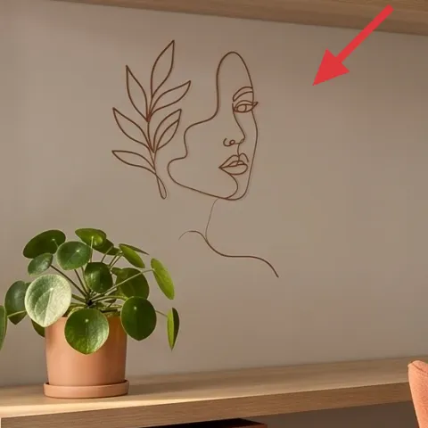
Instead of hanging another store-bought print, this slot is perfect for a pressed flower frame look—small, organic, and totally on-theme with the plant-forward vibe in the photo. It replaces the face/plant line art with something that still reads “natural” next to the terracotta pot and green leaves. The reason this works in a small office nook: it’s visually light compared to a larger framed piece, so it won’t crowd the mirror and grid organizer. The trade-off is delicacy—you’ll treat it like paper art, not like something you toss in a bag.
Make it instead of buying it
DIY a pressed flower frame artwork to swap into the wall spot, keeping the corner botanical and renter-friendly.
Materials
- Foraged pressed flowers/botanicals — small assortment — $2
- Small glass-front frame (no wall fixture) — 5×7 or similar — $3
- Archival backing paper or cardstock — 1 sheet — $8
- Clear tape or museum gel adhesive dots — small pack — $1
- Thin ribbon for hanging (optional) — 1 spool — $0
Steps
- Press botanicals between book pages for a flat, dry layer.
- Cut cardstock/backing to match the frame backing.
- Arrange flowers on the backing until the layout feels balanced.
- Secure botanicals with small dots of tape/adhesive dots (no wet glue).
- Assemble the frame with the backing inside.
- Hang using removable hanging hardware rated for your frame’s weight.
Total DIY cost: $14 — saves about $11 over buying.
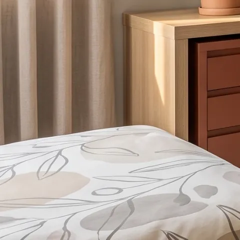
Layer 5 — potted green plant in terracotta pot on the desk ($30) Brings movement and warmth at eye level
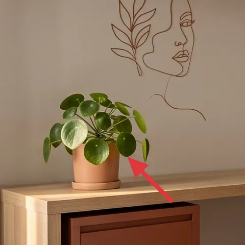
The terracotta pot with a green plant on the desk adds a grounded, earthy note right where your eyes land while working. In the photo, it sits low against the built-in surface, which makes it feel like part of the styling, not an afterthought. I’m keeping the plant as a single, compact accent instead of adding multiple small pots—too many containers makes a small nook look cluttered. The terracotta color also ties to the warm wood tones, so you get cohesion without needing to match every item perfectly. Trade-off: live plants need light and occasional watering, but that’s also how they stay fresh-looking.
Match the pot color, not the plant species
Look for terracotta pots in any size you can manage—then choose an easy-care green for your light level.
Layer 6 — grid wall organizer with hanging art ($60) Keeps inspiration visible without a full gallery wall
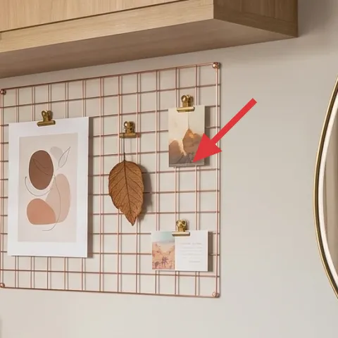
The grid wall organizer with hanging art gives structure to the whole nook. It organizes prints at a similar “visual height,” so the desk feels intentional even when you’re using it daily. This is the renter-friendly alternative to a traditional gallery wall because you can swap prints by clipping them on and off, rather than committing to permanent holes. I’m not adding more wall shelves here—the look already has built-in shelving above—so this keeps the visual rhythm consistent. The trade-off is that the grid can look busy if you hang too many pieces, so edit to a small set that repeats your warm palette.
What to hang on a grid
Choose two to three prints and repeat the same color family so the grid reads curated, not crowded.
Layer 7 — pencil cup with pens on the desk ($20) Makes the desk feel used (on purpose)
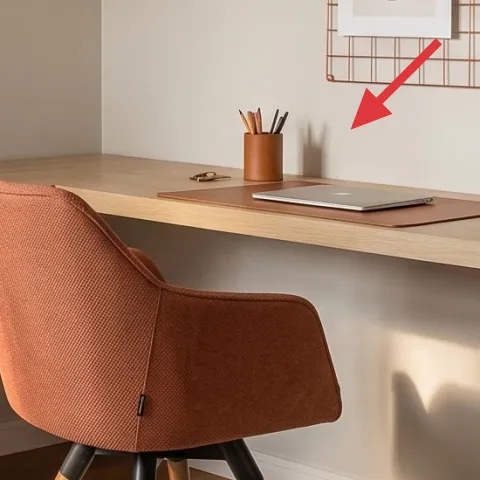
A simple pencil cup with pens turns the desk from “staging” into “daily life.” In the photo it’s small, warm, and placed near the notebook/laptop area—perfect for that lived-in look without adding more clutter. I’m choosing an intentionally basic container instead of matching desk accessories because the grid organizer and mirror already provide the decorative framework. The trade-off: if the pens are messy or mismatched, the cup can exaggerate visual chaos, so keep only what you actually use. When the nook looks lived-in, you’ll enjoy the space more, and your work routine will feel calmer.
Quick desk-edit rule
Only keep the items you touch weekly inside the cup; everything else goes in a drawer or small tray.
The cost, layer by layer
| Layer | Item | Cost |
|---|---|---|
| 1 | Area rug in beige/cream tones | $150 |
| 2 | Light beige curtain panels (pair) | $60 |
| 3 | Rounded wall mirror with brass-colored frame | $120 |
| 4 | Pressed flower frame artwork (DIY retail-equivalent) | $25 |
| 5 | Potted green plant in terracotta pot | $30 |
| 6 | Grid wall organizer with hanging art | $60 |
| 7 | Pencil cup with pens/pencils | $20 |
| Total | $465 | |
If you want a cheaper variant, swap the rug for a smaller 5×7 neutral and choose a simpler mirror frame in brushed metal. Keep the plant and grid organizer, since those create the same “worked-on daily” feeling even with a lower spend.
What worked, what didn't (across the whole room)
The strongest wins here are the soft-textile choices: the light beige curtains and the neutral rug make the nook feel calmer around the built-in desk. The mirror and grid organizer also work together—one adds depth, the other adds structure—so the wall never feels empty.
What worked
- The beige/cream rug grounds the chair so the office corner feels intentional, not accidental.
- Light curtains soften daylight and make the mirror reflection look flattering instead of harsh.
- The rounded brass mirror adds depth and helps a compact layout feel more open.
- Terracotta + green plant repeat the warm palette and keep the desk from looking sterile.
- The grid organizer gives “display” space without the commitment of a full gallery wall.
- A basic pencil cup adds lived-in texture that matches the minimalist desk styling.
What didn't
- Too many prints on the grid turns it into visual noise in a small nook.
- Mirrors show fingerprints quickly, so expect a periodic wipe-down.
- Light curtains can collect dust, especially if the window area gets airflow from outside.
- Using a bright, patterned rug would compete with the warm wood and the grid’s geometry.
- If the plant pot is the wrong color family, the terracotta palette falls apart.
What we'd skip if we did it again
Skip replacing the built-in wood pieces with “new” matching furniture. The room already has warm wood cabinetry that anchors the style, so spending money on look-alikes usually wastes the budget that could go to renterswaps like curtains and a rug.
Skip going heavy on permanent-looking wall art. A grid organizer plus a small number of framed pieces keeps the wall flexible and easy to pack away—whereas a full multi-frame gallery often turns into a bigger rental hassle.
Skip pattern overload. In this corner, the grid has strong geometry and the mirror has a bold shape, so the safest “third” layer is a neutral rug and soft, light curtains that let the terracotta accents read clearly.
Frequently asked
How long does this renter-friendly nook refresh take?
Plan for a long weekend. Rug + curtains usually take the most time (measuring and final positioning), then mirror placement and wall swaps are quick if you already have removable hanging hardware. The DIY pressed-flower frame is the variable—pressing botanicals takes time—so the frame itself can be built in an hour, but prep depends on your flowers.
Is this look realistic if my rental won’t allow anything permanent?
Yes, because the biggest changes here are textiles (rug, curtains), tabletop styling (pencil cup and plant), and removable wall decor (mirror and framed art). The grid organizer style is also easier to keep move-ready than a traditional wall shelf setup. As long as you use removable hanging methods rated for the weight, you can pack it up at move-out.
My space is smaller than the photo—what would you scale down?
Start with the rug size and the number of prints on the grid. In a smaller nook, a rug that fits the chair footprint matters more than a larger rug that covers extra floor you don’t use. Then hang fewer pieces on the grid—two to three prints—so the wall stays readable at a glance.
What if my space is bigger—can I make it feel less bare?
Keep the same palette but add scale through one element at a time. Go up one rug size, swap to slightly wider curtain panels, or add a second framed piece to the grid instead of multiplying everything. The mirror already adds depth, so it’s usually the rug and curtain width that change the “finished” feel.
Where should I shop for the mirror and curtain panels?
Look for the mirror at retailers that carry brass-toned frames and use a rounded profile to match the photo. For curtains, search for “light linen look” or “sheer beige panels” in a pair option, then match the length so they just kiss the floor or hover slightly above it. A neutral curtain is the anchor—store the receipt so you can swap lengths easily.
What’s the biggest mistake people make in small home office corners?
They add too many focal points at once—an overly patterned rug, multiple competing prints, and a mirror that’s the wrong size. This photo’s winning combination is: one geometry element (grid), one reflective depth element (mirror), and soft textures (rug and curtains). When you keep those roles clear, everything looks intentional.
More in Small Spaces

Under $500: terra-cotta desk nook refresh for renters
A renter-friendly home office nook refresh you can build for under $500. Swap in a soft beige rug and curtains, hang a brass-framed mirror,…
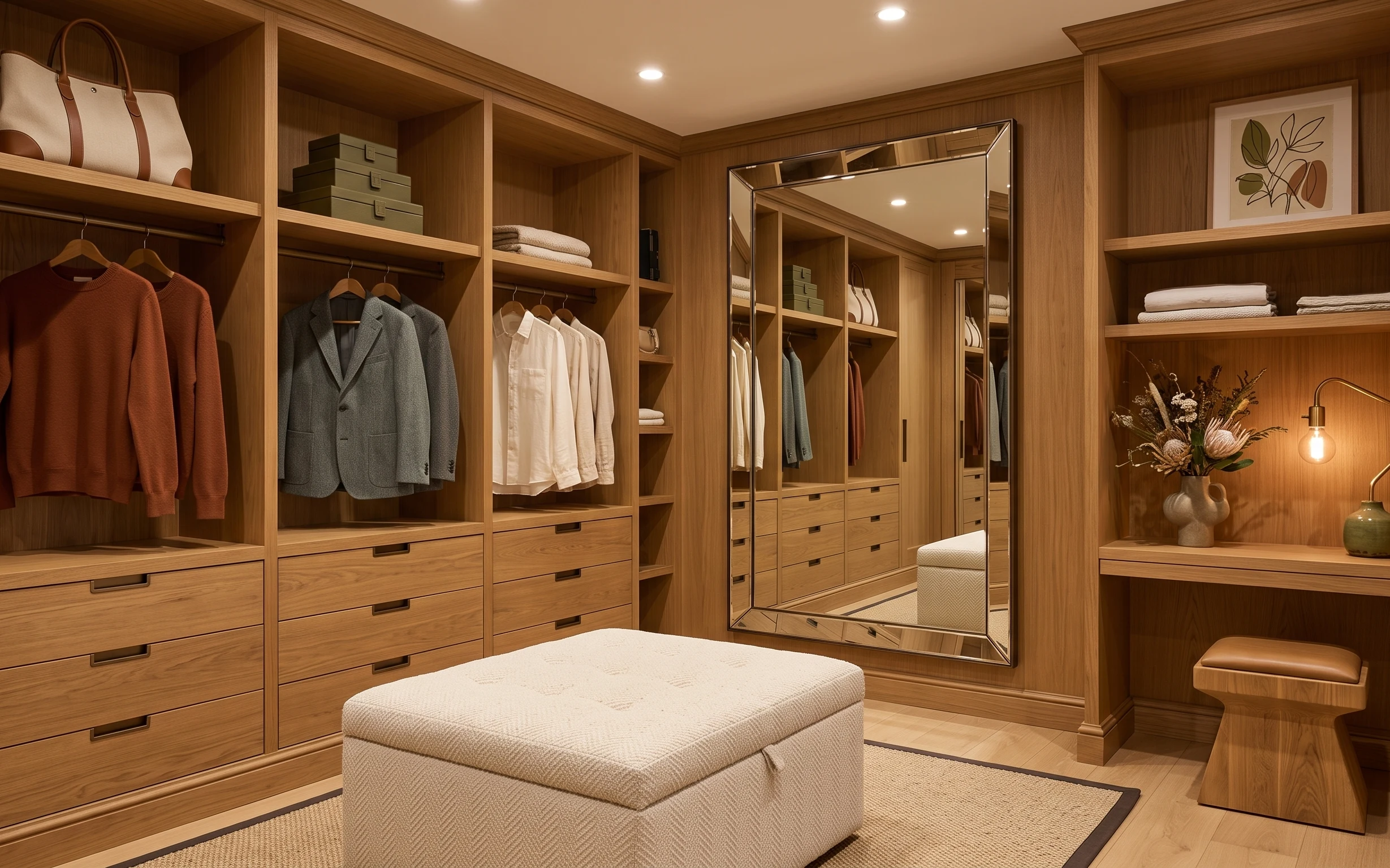
Under $700: 7 budget upgrades for a walk-in closet nook
A warm wood walk-in closet nook gets noticeably better with 7 weekend-friendly upgrades—rug, lighting, mirror, and a calmer wall-art moment…
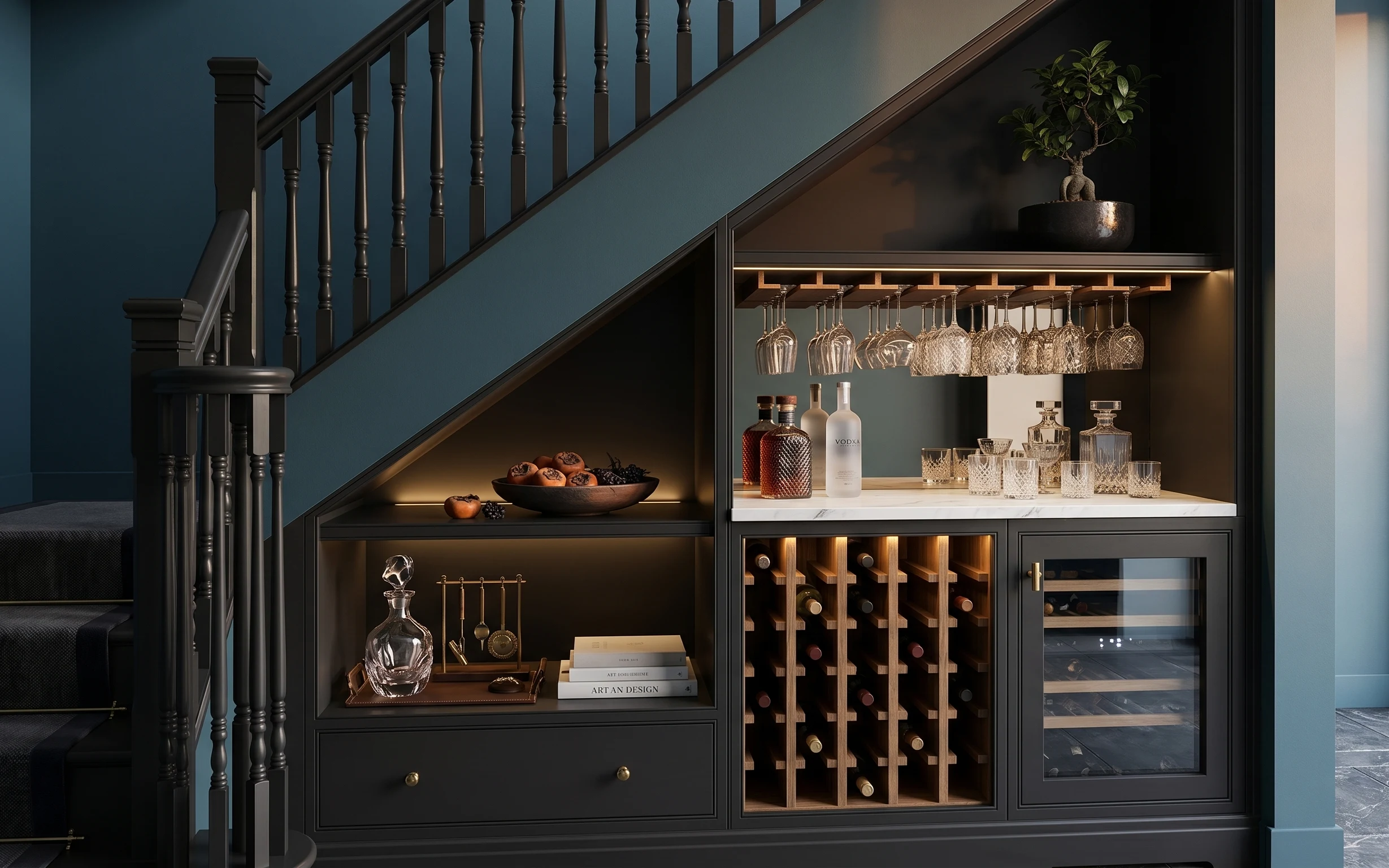
Under $400: move-friendly bar alcove refresh with 7 swaps
A moody, blue-and-charcoal bar alcove look—made renter-friendly with seven move-ready swaps. Total spend stays under $400, with the biggest…