
- Best for
- small hosting moments
- Cost
- under $400
- Difficulty
- easy swaps
- Renter-safe
- no-drill styling
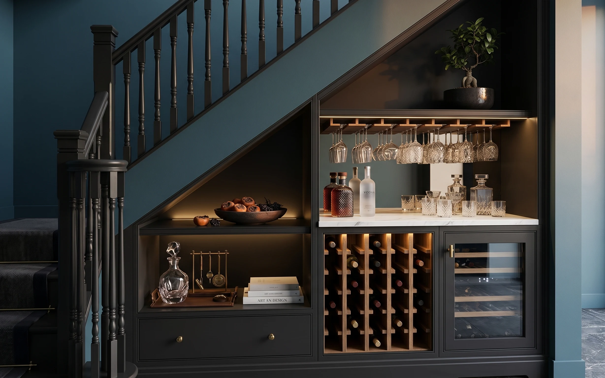
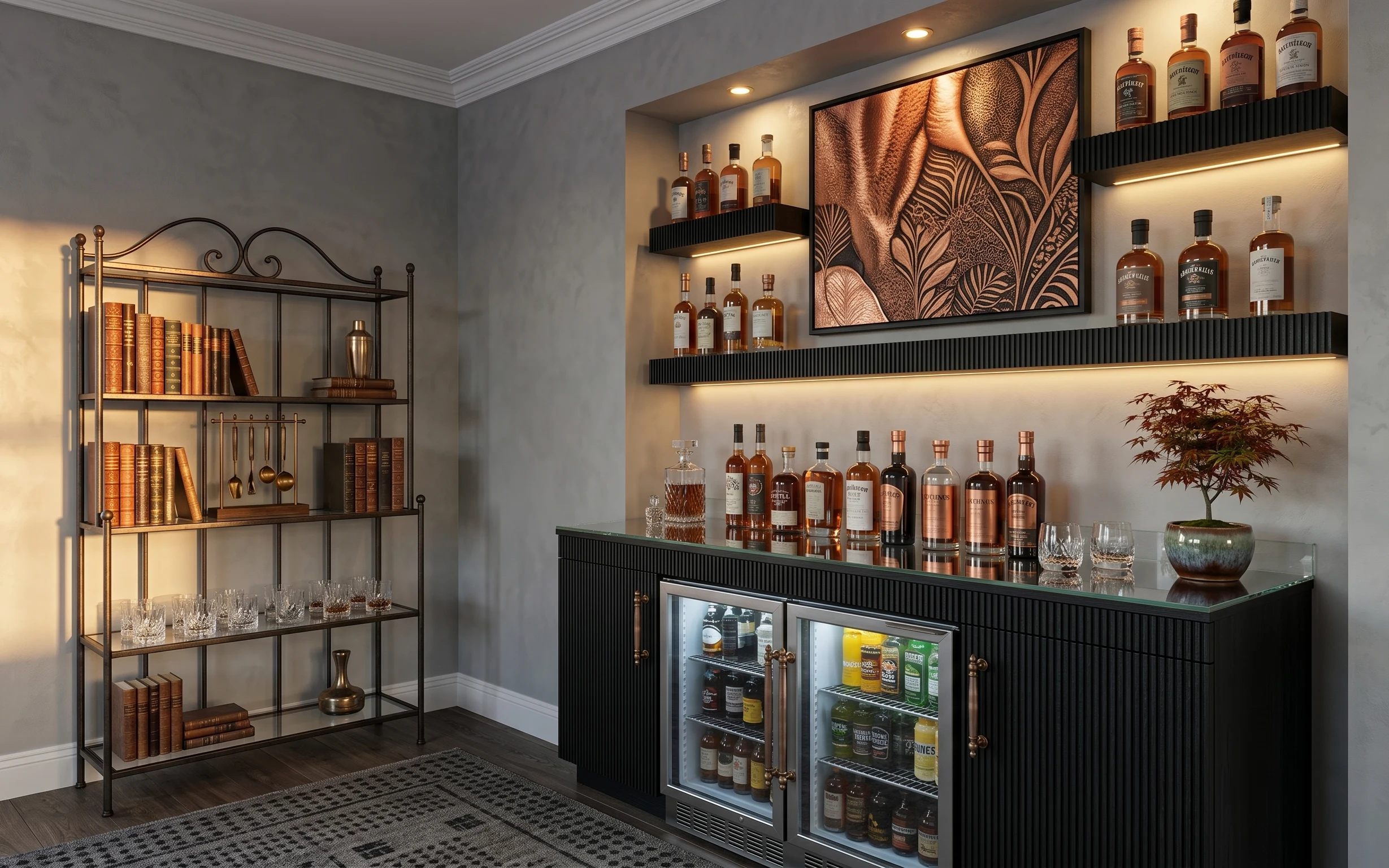
Why blue-and-charcoal styling is the bar alcove of 2026
That warm glow inside the built-in bar makes the whole corner feel intentional, even when the rest of the place is still “temp.” The recipe here is simple: a moody rug anchor, one living element (the potted plant), and a few reflective glass pieces that catch light. The textures are doing heavy lifting—dark wood, cool blue paint, and the shine of glass plus brass-toned accents. For shared housing, the best part is that the look comes from movable objects, not permanent changes.
I once tried to copy a similar bar setup by buying matchy décor sets, and it looked like I’d staged a showroom instead of living in a rental. The shift was realizing this corner only needed three job types: something soft (rug), something fresh (plant), and something “glass and shine” to bounce the warm lighting. After that, the styling felt calmer and much easier to pack for the next lease.
Layer 1 — area rug ($80) anchors the whole corner
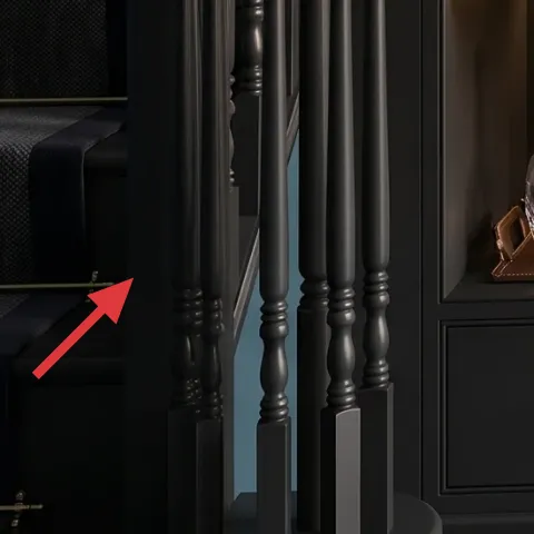
Start with the area rug, since it’s the only part of the floor that can visually soften a dark, built-in-feeling alcove. In the hero it sits under the sofa edge, grounding the whole scene and keeping the rest of the décor from looking like it’s floating. Choose a rug in a dark neutral (charcoal/near-black) with a subtle texture so it reads “intentional” in daytime and doesn’t get lost at night. The trade-off is that high-contrast patterns can fight the cabinet’s structured wood, so darker and calmer wins here.
Choose texture over pattern
A low-contrast weave hides everyday scuffs and still looks good under warm lighting.
Layer 2 — potted plant in dark planter ($40) adds a living focal point
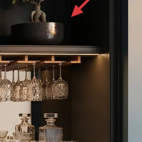
The potted plant on the bar top is doing more than “green.” It breaks up all the straight lines from the cabinet and railing, and it also adds a little vertical shape that makes the corner feel taller. To match the hero’s mood, keep the planter dark and the leaves compact—then you can move the whole thing room to room. The biggest win for shared housing: it’s instantly packable in a medium box, and it won’t require any wall changes. The trade-off is you’ll need a light rotation schedule so it doesn’t lean after a few weeks.
Make it instead of buying it
This painted terracotta planter set recreates the same dark-pot-on-a-bar-top look using simple paint and a few small terracotta pots.
Materials
- Small terracotta planter set (2–3 pots) — small assortment — $16
- Acrylic craft paint (black/charcoal) — 2 small bottles — $9
- Paintbrushes (1 angled + 1 small round) — set — $6
- Painter’s tape — 1 roll — $4
- Disposable gloves + paper towels — basic supplies — $0
Steps
- Wash and dry the terracotta completely so paint grabs evenly.
- Mask any rim edges with painter’s tape for a cleaner, darker top.
- Apply 2 thin coats of black/charcoal paint, letting each coat dry fully.
- Use the smaller brush to get into any texture grooves.
- Peel tape carefully once the paint is dry to the touch.
- Set planters aside until completely dry, then style one on top and one as a spare.
Total DIY cost: $35 — saves about $5 over buying.
Layer 3 — decorative tray on cabinet shelf ($25) gives you a “styled surface”
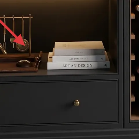
A decorative tray (like the fruit bowl/tray area on the cabinet shelf) is what makes the shelf look curated instead of accidental. In the hero, the oranges and berries create warm color, but they’re also contained in a tray-like surface, which keeps the area neat. Use a tray in a dark wood tone or warm metal finish so it doesn’t fight the cabinet. The trade-off is that it adds one more “thing” to dust—so pick one with a wipeable surface and a low lip so it’s easy to reset for parties or weeknight use.
Repeat one warm tone
If the cabinet reads warm brass, choose a tray that echoes that warmth with small accents.
Layer 4 — decorative book stack ($15) adds height without bulk
The book stack under the glass decanter helps the bar-top zone read like a vignette, not just storage. Books are also one of the easiest shared-housing wins: they move in standard boxes and don’t require special hardware. Go for a compact “coffee-table book” size or stack two thinner ones so you’re building height for the décor above. The trade-off is that stacks can look messy if the spines are all different colors—so choose books with similar neutrals or muted patterns that won’t clash with the blue wall.
Angle one book slightly
A small tilt makes the stack look styled instead of perfectly aligned.
Layer 5 — glass decanter ($25) brings the light-bounce effect
That glass decanter is doing exactly what glass should do in a moody corner: it catches the warm lighting and adds sparkle without adding color clutter. The hero’s shape is tall and rounded, which balances the cabinet’s geometry. For a renter-friendly version, look for a clear decanter or a similar glass vessel that’s heavy enough to feel “real” but still easy to lift into a box. The trade-off is practical: glass needs careful packing, so bubble wrap and a dedicated box are part of the process.
Don’t pick a thin-walled glass
Thin glass chips more easily during moves, especially when it’s wedged between bottles.
Layer 6 — wine glass set display ($30) adds shine above the shelf line
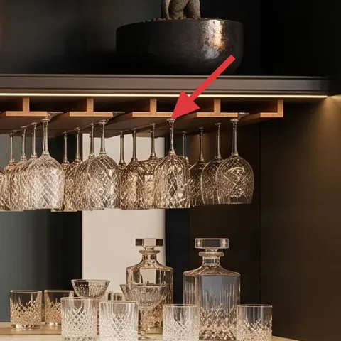
The wine-glass display in the hero creates a “ceiling of glass” effect, which makes the alcove feel fancy without adding more furniture. For shared housing, the move-friendly version is a portable display solution—think a freestanding rack or an included hanging rack that doesn’t require drilling. Choose clear glasses with similar silhouettes so the visual rhythm matches the structured cabinet. The trade-off is that glass can look busy if too many styles are mixed, so keep to one or two matching sets.
Match the glass silhouette
Consistent shapes read intentional next to the wood cubbies.
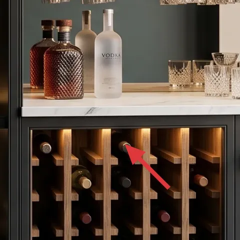
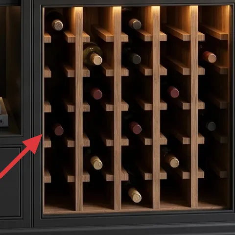
Layer 7 — wood wine display cubbies ($120) replaces the “built-in” feeling
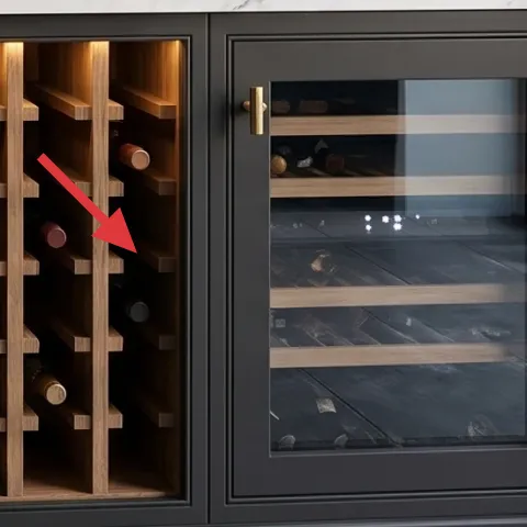
The wood wine display cubbies give the whole corner its signature warmth and organization. In a rental, you can’t rely on changing fixed cabinetry, but you can bring the same “grid” feel with a freestanding wood-style wine rack or organizer that’s designed to hold bottles in repeat rows. That keeps the look cohesive even when the alcove is temporary. The trade-off is size: measure first so the unit fits the space you actually have (and so the sofa edge still feels open).
Plan for bottle height
Check bottle size so the cubby spacing works for the bottles you actually buy.
The cost, layer by layer
| Layer | Item | Cost |
|---|---|---|
| 1 | Area rug 5×7 (dark, textured) | $80 |
| 2 | Painted terracotta planter set (DIY) | $40 |
| 3 | Decorative tray on cabinet shelf | $25 |
| 4 | Decorative book stack | $15 |
| 5 | Glass decanter / clear vessel | $25 |
| 6 | Wine glass set display | $30 |
| 7 | Wood wine display cubbies (freestanding organizer) | $120 |
| Total | $335 | |
If a wine display cubbies unit feels too tall, swap it for a lower bottle rack and use the same tray + glass decanter approach. You’ll still keep the grid-and-glass look, just with a shorter silhouette and easier moving.
What worked, what didn't (across the whole room)
The biggest wins are the layered rug base and the mix of one living element plus clear glass—those two choices make the alcove feel finished fast. The look also stays coherent because the décor repeats warm tones near the wood display.
What worked
- The dark textured rug kept the blue wall from reading “flat,” especially under warm lighting.
- The potted plant softened the cabinet’s straight lines while staying easy to pack.
- The tray contained the fruit-color moment so it looked curated, not scattered.
- The glass decanter echoed the cabinet’s reflective vibe without adding new color.
- A matching wine-glass set created that stacked sparkle above the shelf line.
- The wood wine display cubbies repeated a grid pattern that made the corner feel intentional.
What didn't
- Overloading the shelf with too many small glass pieces made the alcove feel visually crowded.
- Using a patterned tray with busy textures distracted from the cabinet’s wood rhythm.
- Mixing warm and cool metals (brass and silver) reduced the polished look.
- Choosing very tall décor without a grounding rug made the sofa area feel unbalanced.
- Adding multiple plant sizes at once can tilt the balance—one plant reads best here.
What we'd skip if we did it again
Skip the “everything matches” approach—coordinated sets can look staged in a lived-in rental. The hero works because only a few items repeat the warm tone while the rest stays simple and textured (rug, wood, plant, glass). Instead, build around one dark base plus one warm metallic direction.
Skip buying a large, heavy wine unit if the alcove feels tight. Even if it looks right in the photo, the move logistics matter for shared housing. A smaller freestanding rack or lower organizer gives most of the same grid vibe with less effort in a next-lease afternoon.
Skip high-maintenance décor that can’t be boxed carefully. Glass needs packing space, and porous planters need dry time between moves. Choosing wipeable trays and durable clear vessels prevents “pretty but fragile” from becoming “pretty but stressful.”
Frequently asked
How long does this bar alcove refresh take?
Plan for about 2–4 hours total. Rug placement and leveling is usually quick, then it’s mostly styling time—plant placement, tray grouping, and glass arrangement. If the DIY planter is new to you, add a full drying window the same day so you’re not rushing. For moves, the set-up is usually faster the second time because you’re repeating the same “job types”: soft base, living element, and reflective pieces.
Is this renter-friendly for shared housing where I move again soon?
Yes—the main items are meant to be packed into standard boxes and small bins. The rug folds or rolls, the plant and tray go into separate boxes to avoid chips, and the book stack fits in a flat book box. The only “system” piece is the freestanding wood wine display, which should be chosen for easy disassembly or at least manageable carry size for the way you move.
What if my bar alcove is smaller than the photo?
Scale the freestanding wood wine display first: go shorter or fewer cubbies while keeping the grid feel. Then keep décor spacing bigger—fewer items on top usually reads more polished in tight corners. A rug size like 5×7 often works even in smaller layouts, but if space is limited, prioritize the rug over the runner-like pieces. One plant and one glass focal point are enough.
What if I have brighter, cooler lighting or less warm glow?
If your light is cooler, use warmer-toned glass moments to bring back the “golden” sparkle. Choose clear glass with rounded shapes, and keep the plant in a dark planter so it anchors the palette. The rug should be darker rather than light-gray to avoid the corner looking washed out. If you’re using warm light bulbs in a plug-in lamp, stick to consistent warmth so the glass reflections don’t look mismatched.
Where should I shop for move-ready versions of these items?
Look for move-friendly décor basics at home stores and thrift spots: dark planters, trays, and book stacks are easy to find locally. For the wine display look, shop for freestanding wine racks or organizers that don’t require drilling. Rugs can be found at discount retailers and online marketplaces, and you can prioritize texture over brand. Glass decanters are often available at kitchen stores and secondhand shops with good packaging options.
What’s the biggest mistake people make with this kind of bar corner?
Overstyling the shelves with too many matching small items. The hero stays readable because it groups objects into a few “zones” and repeats one warm direction. Aim for one tray moment, one book height, one plant, and one glass focal piece. If you add anything extra, remove something else—especially extra glass—so the corner stays calm instead of cluttered.
More in Small Spaces
Under $400: move-friendly bar alcove refresh with 7 swaps
A moody, blue-and-charcoal bar alcove look—made renter-friendly with seven move-ready swaps. Total spend stays under $400, with the biggest…
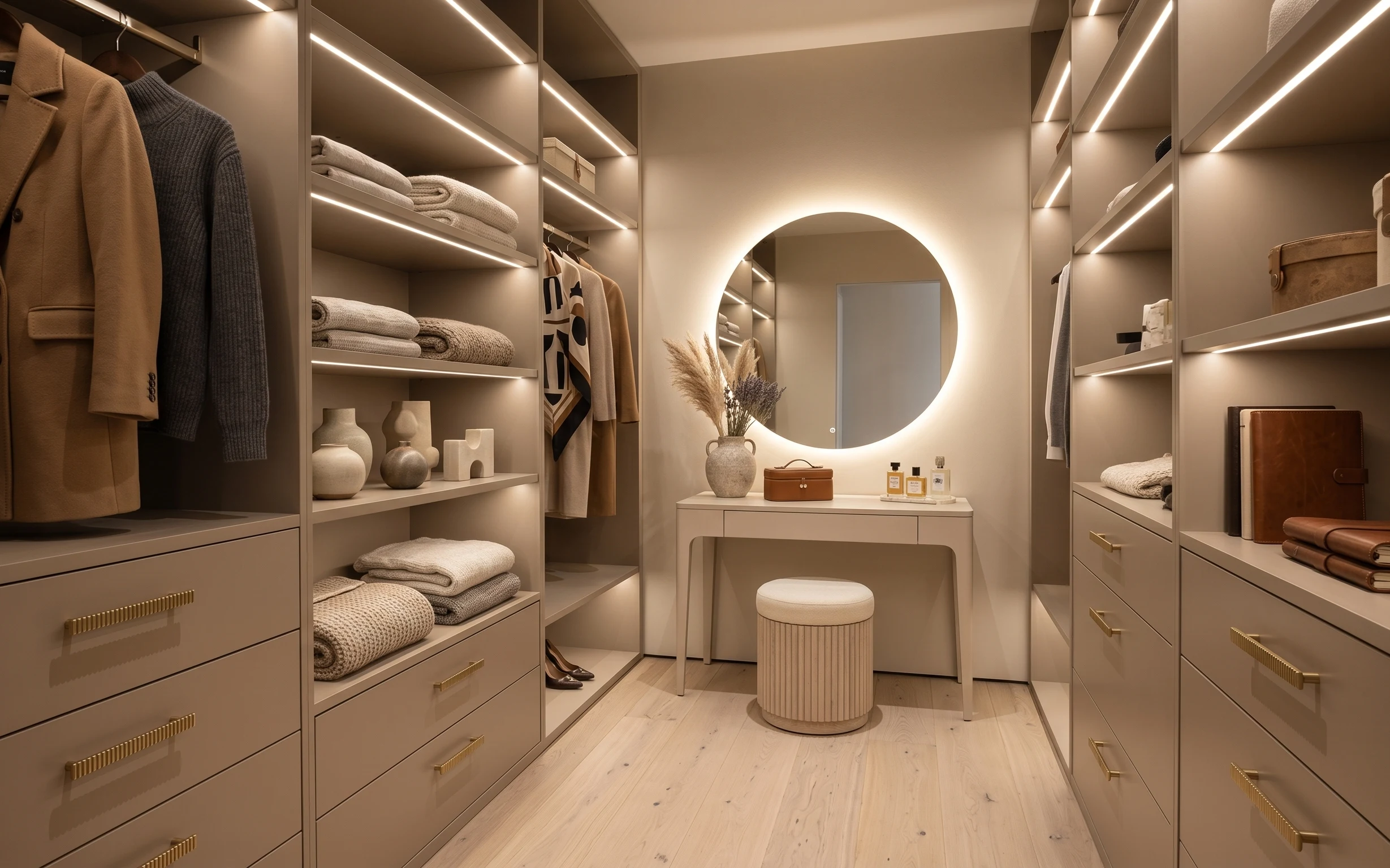
Under $250: 7 move-ready swaps for a vanity dressing nook
A warm, japandi-leaning vanity dressing nook can look intentional without permanent changes. This $250 refresh focuses on move-ready swaps—…
Under $400: a home bar corner refresh with 7 renter swaps
A modern home bar corner makeover with a bold framed print, a grounding patterned rug, and easy renter-friendly styling swaps. Total budget…