- Best for
- Texture layering + earthy color continuity
- Cost
- Under $600
- Difficulty
- Beginner-friendly
- Time
- 1 weekend
Why green-and-terracotta textiles are the bed nook of 2026
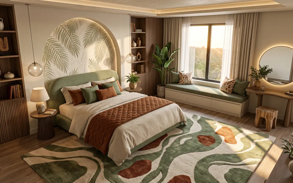
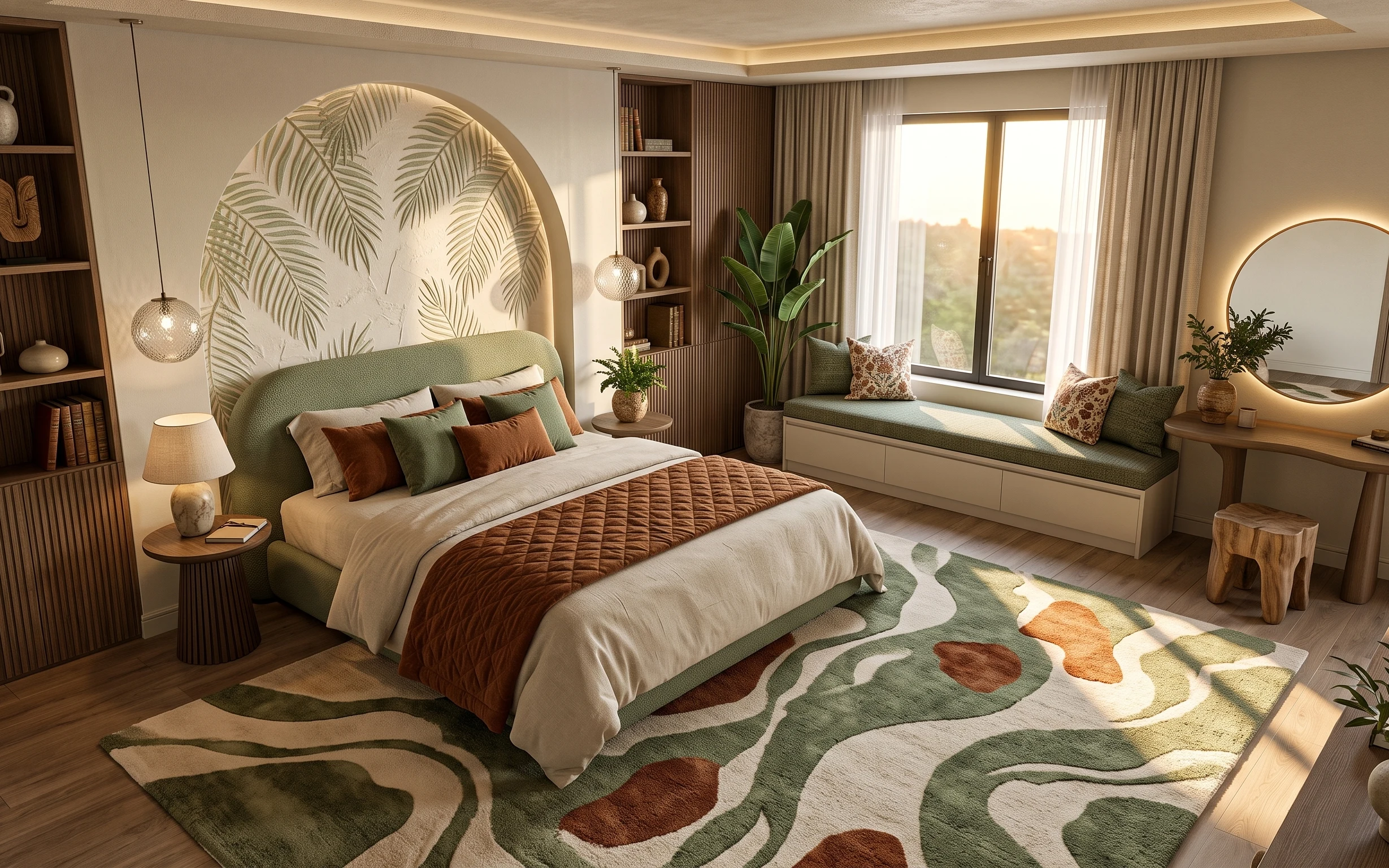
Start with the textures you can actually change: green pillow covers, a brown quilted throw, and curtains that fall in warm taupe. The room’s palette leans on earthy neutrals, so mixing matte fabrics with one bold pattern (the abstract leaf rug) keeps it from looking flat. On the lighting side, a plug-in table lamp with a beige drum shade adds a calmer glow next to the warm round mirror. The best part for renters is that none of these choices require painting walls, drilling, or replacing fixed fixtures.
I used to think a room like this needed wall art to “finish it,” and I’d waste money trying to match prints to the vibe. This time, the move was simpler: I added shape and contrast with textiles and a few high-impact objects—the rug and the round mirror. When the layers started stacking at different heights (floor rug, sofa-level pillows, and eye-level mirror), the whole corner looked intentional without touching anything built in.
Layer 1 — green throw pillow covers set ($30) Cushiony green without committing to one pattern
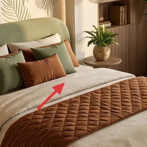
Swap in a set of green throw pillow covers that mimics the tones already happening in the bed nook—think deep sage and medium green. This layer works because pillows read up-close, and your brain connects the color to the rest of the room faster than it would with a single, large décor item. The trade-off: you’re choosing covers instead of a matching full set of pillows, so you’ll want to vary textures (one solid, one small pattern) to avoid “all the same.” In the photo, the green pillows sit at the center of the bed’s top surface, so they’re visible every time you walk in.
Mix two greens, not three
Keeping the pillow set to two green shades keeps the bed from competing with the rug’s leaf pattern.
Layer 2 — brown quilted throw blanket ($50) Adds warmth where the light hits
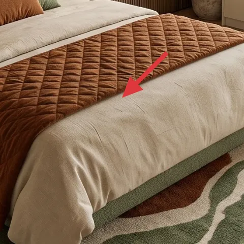
A brown quilted throw blanket is the quickest way to bring that lived-in texture to the bed without changing the underlying bedding. In this nook, the throw drapes across the front edge of the bed, so it benefits from natural light and reads as a cozy layer rather than an afterthought. The quilted surface matters because it catches shadow, which makes the room feel deeper even when the wall color stays the same. The trade-off is that throws show wear faster than pillows, so choose a fabric that you don’t mind washing.
Match undertones, not exact colors
Look for a brown with warm orange or terracotta undertones so it harmonizes with the plant pots.
Layer 3 — painted terracotta planter set (for small pots) ($40) DIY color for the terracotta moment
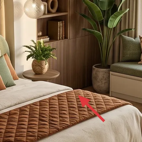
This painted terracotta planter set targets the small-pot styling on the window bench—right where the room looks most curated. Instead of buying new pots in a “perfect” color, you can buy inexpensive terracotta and add a thin layer of acrylic paint to make the tones blend with the green textiles and the warm taupe curtains. The trade-off is that hand-painted planters take a little planning: paint may wear if the soil gets on the rim, so keep a little extra paint on hand for touch-ups. Still, the look is worth it because these are the accents you’ll notice every day.
Make it instead of buying it
DIY painted terracotta planters for the small pots on the bench so the terracotta ties into the green-and-taupe palette.
Materials
- Small terracotta pots (set of 3) — 3 — craft store — $15
- Acrylic craft paint (sage/cream mix) — 1 small bottle — craft store — $10
- Gloves + drop cloth — 1 set — household — $0
Steps
- Wash and dry terracotta pots so paint bonds cleanly.
- Lay down a drop cloth and put on gloves.
- Paint a thin first coat, focusing on the outside and rim edges.
- Let dry fully, then add a second coat for even coverage.
- Touch up any thin spots with a small brush.
- Keep pots dry while they cure before placing soil.
Total DIY cost: $25 — saves about $15 over buying.
Layer 4 — plug-in table lamp with beige drum shade ($60) Warm light that doesn’t demand ceiling changes
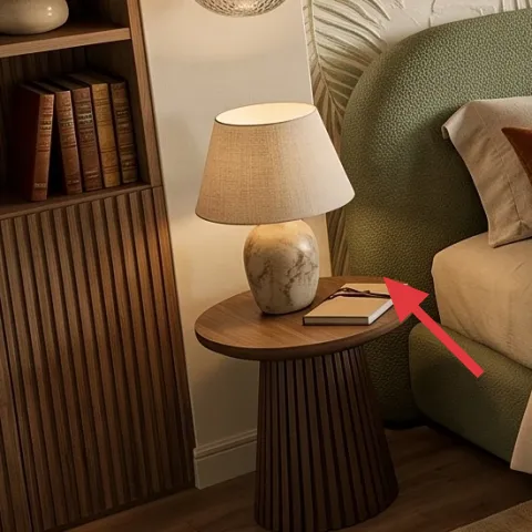
A plug-in table lamp with a beige drum shade gives you controlled, warm light without relying on built-in fixtures. In the photo, the lamp sits on a small round side table, so the shade color matters: the beige keeps the glow soft and neutral, which balances the bold green and the deeper brown throw. Choose a lamp with a fabric shade for that diffuse look; a metal shade would reflect light too sharply. The trade-off is you’ll need an outlet nearby, but that’s usually doable in bedrooms with a small side table setup.
Don’t pick a shade that’s too white
Very bright whites can make green tones look dull; beige keeps everything warm.
Layer 5 — curtain panel pair in warm taupe ($80) Makes the window area feel finished
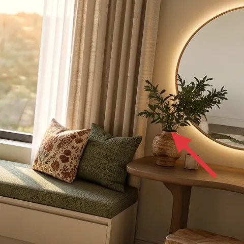
Swap to curtain panels in warm taupe (and keep sheers if you already have them) to create that “framed window” effect. Curtains are a visual anchor here: they soften the edges of the window and echo the room’s neutral backbone so the rug and pillows can stay the stars. The warm taupe also helps the terracotta and browns look cohesive instead of separately “decorated.” The trade-off is bulk—drapes can look like extra fabric in small rooms—so aim for panels that skim the floor without puddling.
Hang for height, not just width
Mount the rod higher so the curtains pull the ceiling up and avoid a boxy window look.
Layer 6 — round wall mirror with warm backlight ($120) One shape that repeats the room’s curves
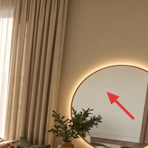
A round wall mirror with warm backlight (or a mirror you can pair with warm bulbs on a similar fixture) adds instant softness because the circle breaks the room’s mostly straight lines. In this bed nook, the mirror sits on the right wall near the vanity/console surface, so it pulls focus and makes the window light feel more intentional. The trade-off is placement: you want it at eye level for everyday use, and you’ll want to keep décor on the console minimal so the mirror doesn’t feel busy. This is the “structure” layer that makes textiles look styled instead of scattered.
Keep console decor low and varied
Short vases and a small tray prevent the mirror area from looking top-heavy.
Layer 7 — area rug 8×10 with abstract leaf pattern ($200) Grounds the whole bed nook
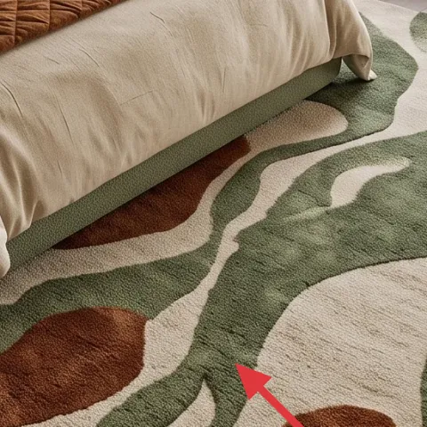
An 8×10 area rug with an abstract leaf pattern is the foundation piece because it repeats the room’s natural theme—green leaves, warm earth tones, and organic shapes. The rug sits under the bed and extends outward enough to frame the floor zone, which is why the space looks complete instead of like “furniture sitting on bare plank.” Choose a pattern with both greens and warm browns so it connects to the pillows and quilted throw. The trade-off is size: going too small makes the bed feel disconnected from the floor.
Center the rug to your bed, not the room
Rug alignment with the bed keeps the whole nook from drifting visually.
The cost, layer by layer
| Layer | Item | Cost |
|---|---|---|
| 1 | Green throw pillow covers set | $30 |
| 2 | Brown quilted throw blanket | $50 |
| 3 | Painted terracotta planter set (DIY) | $40 |
| 4 | Plug-in table lamp with beige drum shade | $60 |
| 5 | Curtain panel pair in warm taupe | $80 |
| 6 | Round wall mirror with warm backlight | $120 |
| 7 | Area rug 8×10 with abstract leaf pattern | $200 |
| Total | $580 | |
If you want a cheaper variant, choose a smaller 5×7 area rug (or a simpler solid rug) and put the savings into extra pillow covers. The bed still looks layered, but the leaf pattern becomes a supporting background instead of the main anchor.
What worked, what didn't (across the whole room)
The biggest wins here are pattern control and height variety: the rug carries the leaf motif, while pillows and throws deliver texture at bed level. The mirror’s round shape adds softness even when everything else is earthy-neutral. The few misses are easy fixes—lighting placement and fabric weight choices.
What worked
- The abstract leaf rug gives the room a natural theme without needing wall changes.
- Quilted throw texture shows up in daylight and makes the bed look styled from across the room.
- Warm taupe curtains soften window lines and prevent the palette from feeling too saturated.
- Green pillow covers pull the color through at eye level, where it matters most.
- The round mirror adds curve contrast against the bed and bench geometry.
- Terracotta accents create warmth that matches the brown throw instead of fighting it.
What didn't
- Too many pillow patterns at once makes the bed look busy instead of curated.
- A cool-toned lamp shade would dull the greens; beige keeps it cohesive.
- Oversized curtains that puddle can shrink the visual height of the window.
- A rug that’s too small leaves bare floor visible and weakens the bed’s “anchor” effect.
- Terracotta pots without paint can look mismatched next to the warm taupe fabric.
What we'd skip if we did it again
Skip buying matching sets that repeat the same print across pillows, throws, and décor. Instead, keep one bold pattern (the leaf rug) and let the rest add texture or solids in the same two-to-three color family.
Skip a bright white lamp shade. The room already has warm taupe drapes and terracotta tones, and a too-cool shade can make green read harsh instead of earthy.
Skip curtains that don’t skim the floor. Heavy puddling tends to make a bed nook look smaller, while properly hung panels add height and frame the window light.
Frequently asked
How long does it take to get this bed nook look?
Plan for about a weekend. Most of the time goes into styling: setting the rug position, choosing pillow cover combinations, and tucking the throw so it falls where you want. Curtains can be the next biggest step if you’re swapping hardware. Painting terracotta planters (DIY) is quick, but drying time means you’ll likely finish them alongside your styling.
Will this work in a smaller bedroom?
Yes—just scale the rug and keep patterns intentional. A 5×7 can still work if it reaches under the front edge of the bed and continues far enough that your feet land on it. For pillows, reduce to two greens plus one accent pillow to keep the bed from feeling crowded. Curtain panels should still be hung higher than the window for vertical lift.
What if my lease doesn’t allow new curtains?
If you can’t swap the fabric, you can still mimic the effect with styling: choose a rug with warmer tones to counterbalance bare window light, and add a throw blanket and pillow covers in taupe-adjacent neutrals. You can also use sheer-only layering if that’s what’s already there, focusing your budget on the lamp, rug, and mirror shape.
Where should I place the round mirror so it looks right?
Aim for eye level when you’re standing or using the vanity/console area. The mirror works best when it reflects a bright part of the room (window light) and gives you enough console surface to style a small tray and one or two objects. If you don’t have a similar console, use the mirror as the main focal point and keep nearby décor low.
What’s the biggest mistake to avoid in a green-and-terracotta palette?
Overdoing the number of “busy” patterns. In this look, the rug carries the leaf motif, while pillows and the throw focus on color and texture rather than repeating multiple loud prints. If a pillow pattern feels too similar to the rug, swap it for a solid cover or a tighter-scale texture.
Can I make this renter-safe at the end of my lease?
That’s the point of the plan. The rug rolls up, pillow covers swap out, curtains pack away, and the plug-in lamp and mirror can come with you. The DIY painted planters can be transported too—just keep them dry and handle them gently. Any built-in look in the photo should be treated as existing background, not something you’re trying to replicate permanently.
More in Bedroom
Under $600: earthy bed nook refresh with 7 renter-friendly swaps
Earthy-green and terracotta tones make this bed nook feel pulled-together without landlord changes. This renter-friendly refresh uses 7 swa…
Under $800: layered neutrals bedside vignette refresh
A warm, neutral bedroom bedside vignette made over in a satisfying weekend refresh. This plan targets the rug, curtains, statement wall art…
Under $600: plant-filled bedroom refresh with 7 upgrades
A plant-filled bedroom refresh for under $600—using curtains, framed art, and warm brass lighting to make the space feel calmer and more el…