- Best for
- earthy-neutrals living rooms
- Cost
- about $535 total
- Difficulty
- easy (mostly textiles + tabletop)
- Time
- one weekend
Why beige-and-gold layering is the living room of 2026
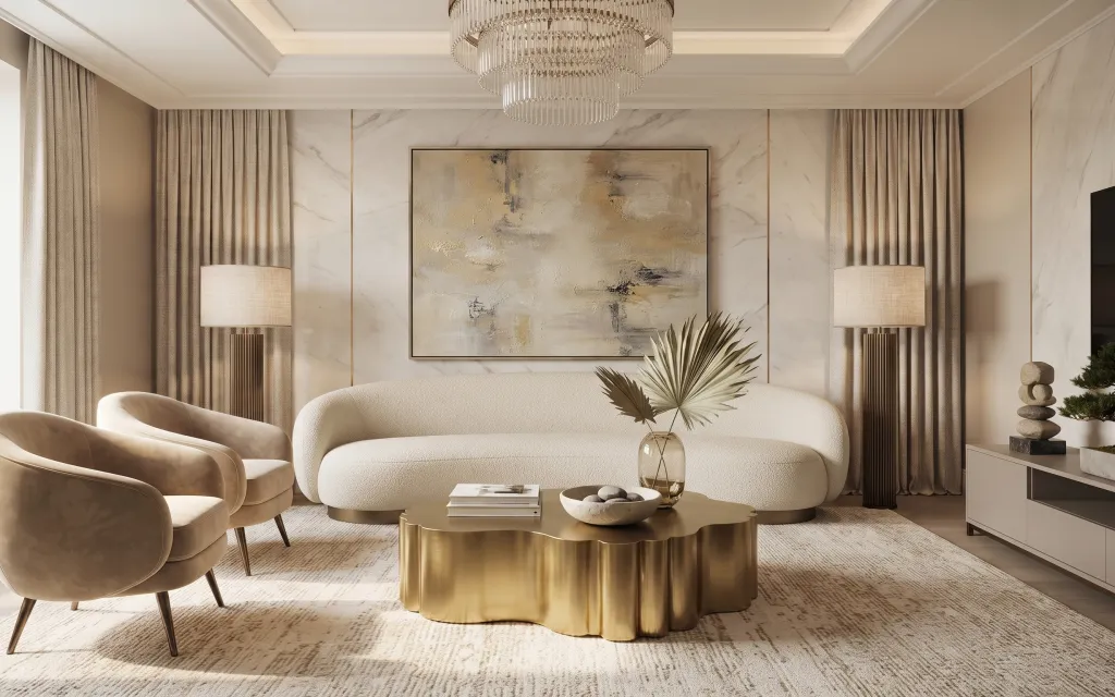
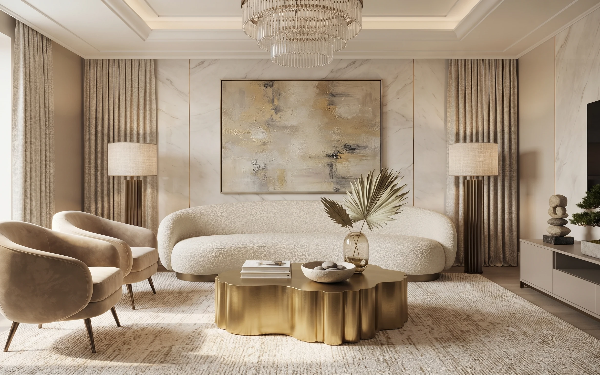
The best part of this room is how the palette behaves: cream upholstery, tan curtains, and brass-gold accents repeat across big surfaces and small objects. The textures do the heavy lifting, too—soft boucle-like sofa fabric, a low-sheen gold tray, and a grounded area rug with muted pattern lines. Even the wall stays calm because the framed abstract art sits in the same creamy, dusty-gold family. For renters, this is achievable because you can rebuild the look with freestanding furniture, removable textiles, plug-in lamps, and wall art on Command hooks.
I used to think “neutral” meant “blank,” but this setup proves neutral can still feel styled. My first apartment refresh got washed out because I skipped the gold-toned accessories and relied only on beige pillows. The change here is repetition: the gold shows up on the tray, the lamp base vibe, and the glass-and-frond centerpiece, so the room reads intentional instead of accidental.
Layer 1 — area rug 5×7 ($200) grounds the seating in one color story
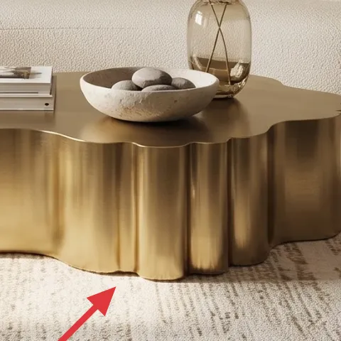
This 5×7 area rug is what turns the sofa-and-chair zone into one cohesive “room within a room.” The pattern is subtle enough to keep the cream upholstery from looking flat, but it still breaks up the light floor so everything doesn’t blend into the background. I’d rather spend here than on a second statement print, because rugs are what you walk on and see in every angle of the living room. The trade-off: a neutral rug means you need to add contrast elsewhere (like gold styling and a deeper-toned abstract). In this layout, the rug also helps the coffee table read centered.
Pick a low-contrast pattern
When your furniture is already creamy, choose a rug with muted variation so it supports the palette instead of competing with it.
Layer 2 — framed abstract wall art (DIY) ($80) echoes the dusty-gold paint texture
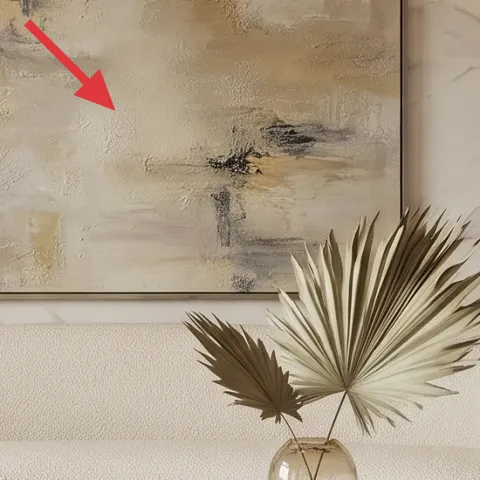
The framed abstract artwork is the room’s visual anchor: it carries the pale marble-like whites and the brushed, dusty-gold marks you see throughout the space. That’s why the rest of the decor can stay simple—this piece provides the “movement” without adding busy pattern everywhere else. For renters, buying a similar print can get pricey, so the better move is making your own on cardstock and framing it with a lightweight frame you can take down at move-out. The trade-off is that handmade texture isn’t perfectly uniform, but that’s actually what keeps the look close to the original brushed effect.
Make it instead of buying it
DIY an abstract on cardstock with acrylics, then put it in a simple frame so it delivers the same dusty-gold, brushy look.
Materials
- Cardstock (thick, ~8.5×11 or size to fit) — 1 sheet — craft store — $6
- Assorted acrylic paint (cream, warm gray, metallic gold) — small set — craft store — $15
- Paintbrushes (flat + small detail) — 2 brushes — craft store — $12
- Matting or backing paper (if your frame needs it) — 1 sheet — craft store — $18
- Lightweight frame — 1 — thrift or discount retailer — $10
Steps
- Cut cardstock to the exact inner dimensions of your frame opening.
- Lightly sketch 2–3 “lanes” (diagonal smears or cloudy blocks) with a pencil so you don’t overthink.
- Paint broad cream and warm-gray background shapes, leaving some white areas visible.
- Dry-brush metallic gold over select sections for a broken, brushed-metal effect.
- Layer a couple of darker gray smudges in small clusters to mimic the abstract depth.
- Let the paint dry fully, then test-fit before you close up the frame.
Total DIY cost: $61 — saves about $19 over buying.
Layer 3 — plug-in table lamp (cream shade) ($60) brings warm light without swapping fixtures
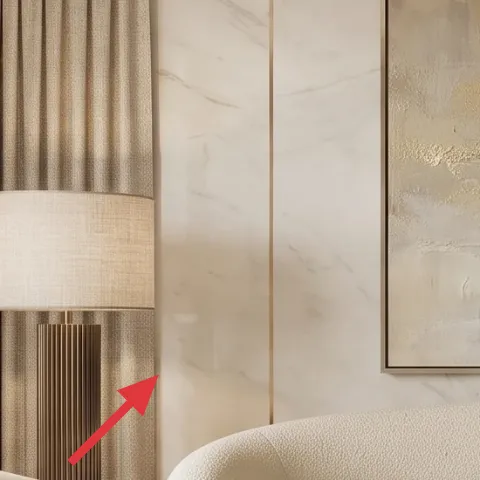
This plug-in lamp with a cream shade is what makes the room feel expensive after dark without needing any electrical work. The shade keeps the light soft, and the lamp’s warm metal tones harmonize with the gold tray and the glass centerpiece. I’d choose this over a second overhead fixture, because table lighting changes the room more dramatically at night and reads “styled” from the couch. The trade-off is you’ll need to place it near an outlet (or use a safely routed extension cord), but that’s a small logistics win compared to wall modifications. In the photo, the lamp’s height also balances the tall curtains.
Match warmth, not brightness
Look for a warm bulb temperature so the lamp stays in the cream-and-gold family instead of turning the room yellow-green.
Layer 4 — curtain panel pair (tan) ($80) adds softness and frames the wall art
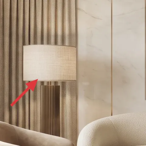
The tan curtains do two jobs: they soften the strong marble-patterned wall and they visually “frame” the large abstract piece by creating symmetrical vertical lines. That framing effect is what makes the art feel intentional instead of floating. If you’re renting, curtain panels are one of the easiest upgrades because tension-rod mounting or existing hardware can keep things removable. The trade-off is that you need enough width to avoid gaps at the edges, which means buying panels wide enough for a full drape. Here, the warm neutral curtain color also ties into the rug pattern and the cream sofa.
Don’t buy panels that are too narrow
Narrow curtains leave daylight gaps and the whole look turns patchy—aim for fuller width so the vertical lines stay clean.
Layer 5 — gold decorative tray on coffee table ($35) organizes small styling without clutter
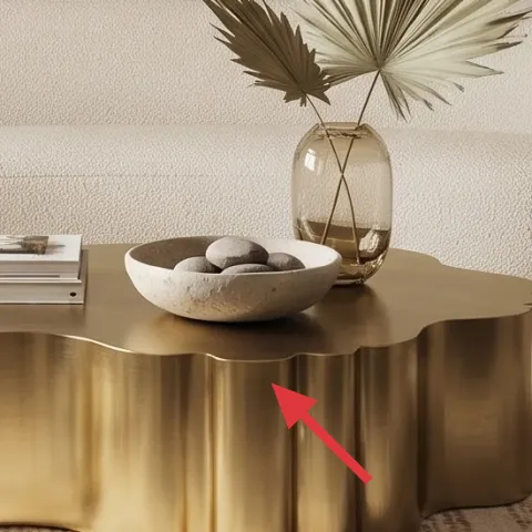
The gold tray is doing quiet work: it makes the coffee table styling look collected, not scattered. By giving the glass vase, small bowl, and book stack one “stage,” the table reads polished even though the items are different materials. I like using a tray here instead of a matching set of decor pieces because it lets you mix textures—glass, stone tones, and paper spines—while still keeping the shape controlled. The trade-off is you have to edit: too many objects on the tray starts to feel busy. In this room, the tray also echoes the gold feel of the lighting metals and the warm hardware vibe.
Keep everything in one footprint
If objects don’t fit neatly on the tray, remove one until the table looks breathable.
Layer 6 — glass vase on coffee table ($20) adds shine that matches the room’s gold accents
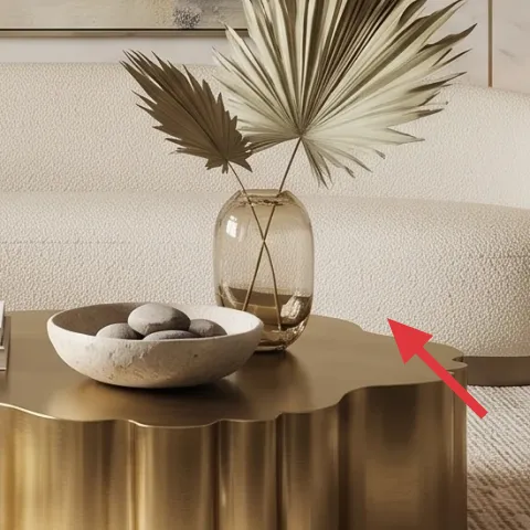
A clear glass vase with a light reflection is the bridge between the room’s soft neutrals and its metallic notes. It keeps the centerpiece airy instead of heavy, especially in front of a creamy sofa where darker glass would feel too contrasty. I’d pick glass over ceramic here because the reflection helps the gold tray and lamp tones “talk” to each other without adding more color. The trade-off is that glass shows fingerprints, so it’s best to wipe it quickly before guests arrive. Placed near the center of the coffee table, the vase also creates a focal point that balances the large abstract artwork on the wall.
Use the vase shape to set height
Taller glass gives you vertical interest without needing extra items on the table.
Layer 7 — palm-like fronds in vase ($60) brings movement while staying neutral
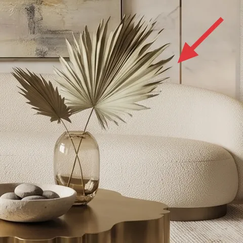
The palm-like fronds are the “alive” element in an otherwise beige, brass, and cream palette. They add movement and a natural silhouette that keeps the room from looking too symmetrical or overly polished. I’d choose greenery with a similar tone—warm green or strawy-beige—because it matches the dusty-gold mood instead of introducing an obvious fresh green. The trade-off is that real stems may need trimming and water changes, but faux fronds are easy too if you want a low-maintenance version for rentals. Either way, the centerpiece works because it sits on the coffee table and visually connects to the curved shapes in the sofa and ottoman-style seat.
Cut stems to fit your vase mouth
Shorten the fronds so they spread naturally instead of leaning or looking sparse.
The cost, layer by layer
| Layer | Item | Cost |
|---|---|---|
| 1 | Area rug 5×7 | $200 |
| 2 | Framed abstract wall art (DIY ~$61 in materials) | $80 |
| 3 | Plug-in table lamp with cream shade | $60 |
| 4 | Curtain panel pair (tan) | $80 |
| 5 | Gold decorative tray | $35 |
| 6 | Glass vase | $20 |
| 7 | Palm-like fronds in vase | $60 |
| Total | $535 | |
A cheaper variant keeps the same formula: swap the 5×7 rug for a smaller 5×6.7 or simpler flatweave, choose one plug-in lamp instead of two, and replace the framed abstract with a single matte print for the same palette.
What worked, what didn't (across the whole room)
This look works because it repeats the same color temperature across big and small pieces—cream, tan, and brass-gold—so the room feels designed instead of random. The rug and curtains handle the “soft structure,” while the art and centerpiece provide movement.
What worked
- The 5×7 rug pattern is quiet enough to let the sofa’s texture stay the focus.
- Dusty-gold abstract art keeps the wall interesting without adding extra colors.
- Tan curtains frame the artwork and soften the marble-patterned wall feel.
- The plug-in lamp shade makes warm light look intentional, not harsh.
- A gold tray makes the coffee table styling look edited and balanced.
- Neutral fronds add movement while staying in the same earth-and-cream family.
What didn't
- Without enough curtain width, the vertical lines break and the symmetry looks off.
- Too many small objects on the tray makes the coffee table feel cluttered quickly.
- If the bulbs run cool, the gold tones shift and the palette stops reading cohesive.
- A glass vase that’s too short doesn’t create a strong centerpiece height line.
What we'd skip if we did it again
Skip adding another wall print on top of the large framed abstract. When one artwork already carries the dusty-gold movement, extra small prints tend to compete—especially against marble-patterned walls where texture is already doing a lot.
Skip buying matching “decor sets” for the coffee table. In this palette, the best look comes from mixing materials—glass, paper spines, and stone-toned accents—then using the gold tray to corral everything.
Skip going heavy on cool white lighting. A warm bulb temperature keeps cream and tan from looking gray, and it makes the brass-gold details look like part of the same family.
Frequently asked
How long will this living room refresh take?
Most of the work is “putting things in place”: rug positioning, curtain mounting, and arranging the coffee table centerpiece. Budget about 2–4 hours for the basics and 30–60 minutes for final styling. If you DIY the abstract art, add another 1–2 hours for painting and drying time, plus framing.
Will this work in a rental where I can’t drill or add permanent hardware?
Yes. The layers here are move-friendly: rug, curtains, plug-in lamps, and framed wall art you can hang with removable methods. The gold tray and glass vase are fully portable. For the curtains, tension-rod setups or existing hardware keep everything without wall damage.
What if my living room is smaller than the photo?
Choose a rug size that still fits under the front legs of the sofa and chair, then scale down the accessory footprint on the coffee table (fewer items on the tray). Keep the curtain panels wide enough to drape well, but shorten the overall curtain height if needed so the fabric doesn’t overwhelm the room.
What if my space is larger and feels empty?
Lean into width: pick a wider curtain pair and a larger rug if your layout allows. Keep the same palette rules—cream and tan textiles plus one gold accent surface—so the room still reads cohesive. For the wall, use the same “one anchor artwork” idea rather than adding several competing prints.
Where should I shop for the rug, lamps, and curtains?
Look for rugs and curtains where you can easily filter by neutral tones and return policies. For plug-in lamps, prioritize a stable base and a cream shade. If you’re DIYing the abstract, craft stores and discount retailers are the most budget-friendly places to source acrylic paints and a lightweight frame.
More in Living Room
Under $600: modern beige living room refresh with 7 renter swaps
A modern beige living room refresh that stacks high-impact neutrals—rug, art, lamps, curtains, and tabletop styling—using move-friendly swa…
Under $500: warm neutral living room refresh with renter-safe swaps
A warm neutral living room refresh that fits under $500 using renter-safe swaps: rug, pillows, a plug-in floor lamp, framed art, and stylin…
Under $500: warm taupe console living room refresh
A bright, warm-neutrals console living room look is achievable on a renter budget. This makeover uses seven move-friendly swaps—rug, pillow…