- Best for
- warm neutrals bedroom refresh
- Cost
- under $700
- Time
- 2–4 hours for styling and hanging
- Renter-safe
- yes (no drill, unplug)
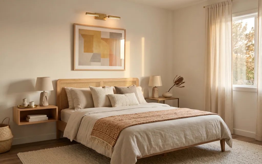
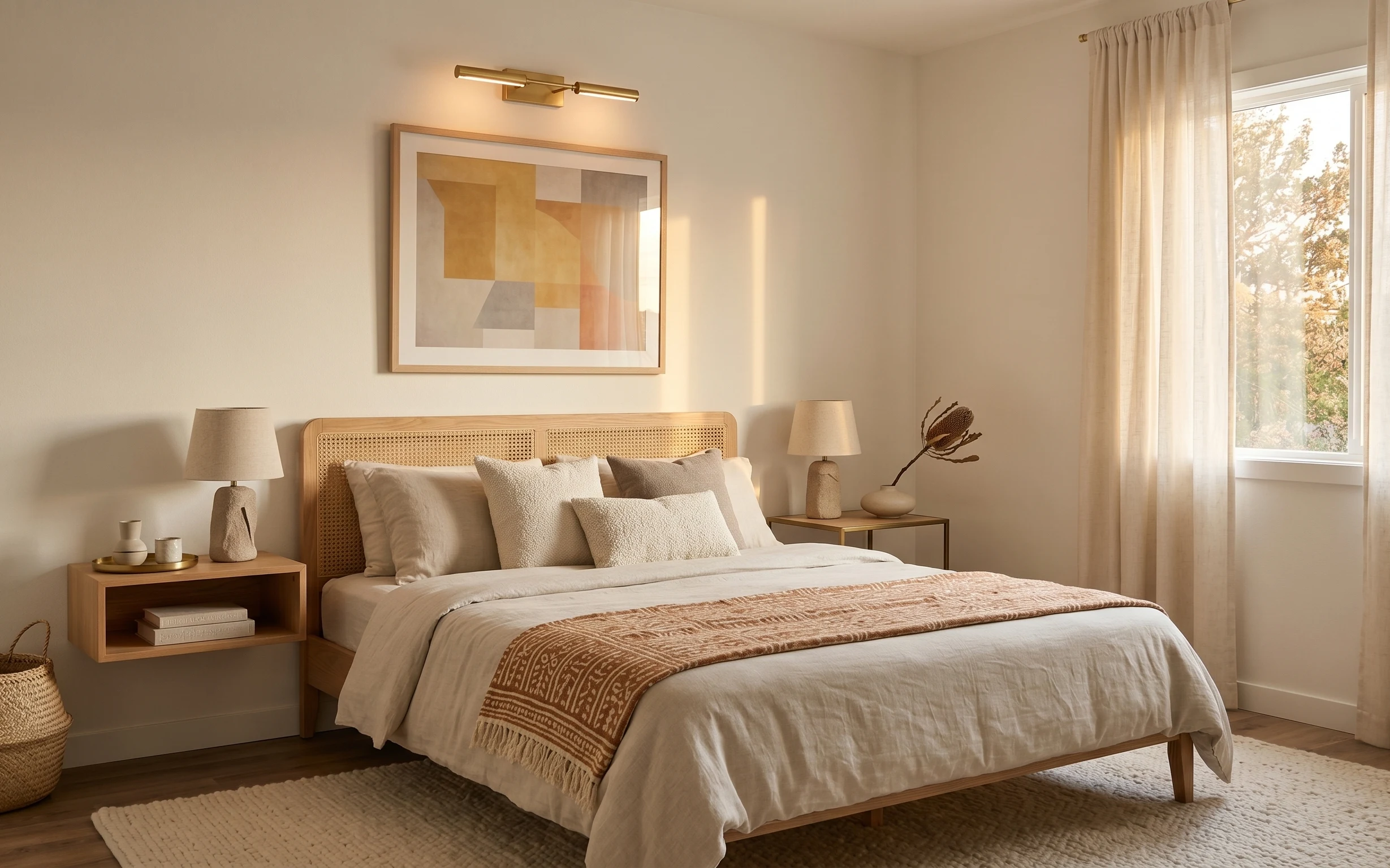
Why this warm-neutral bedroom is the bedroom of 2026
The first thing I notice is how the palette stays calm: cream textiles, light wood, and that rust terracotta throw that adds a single punch of color. The layered textures help too—soft pillow covers, a woven-like throw, and the gentle movement of sheer beige curtains. This is also a “rent-friendly” style because it relies on items you can lift, unplug, and re-pack. For a renter, it’s the quickest way to get a magazine look without asking permission for paint or fixture changes.
I’ve tried to fake this vibe with just one big rug and one wall print, and it never read the way I wanted. The change happened the year I stopped chasing matchy-matchy and started repeating only two materials: light wood and cream fabric. Once I added a warm-toned textile and a framed print above the bed area, everything looked intentional instead of accidental.
Layer 1 — cream throw pillow covers ($30) Texture on the bed without commitment
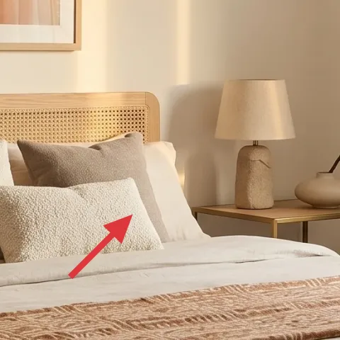
These cream throw pillow covers sit right where your eye lands when you’re tucked under the white bed cover. Choose covers in a similar off-white tone, but vary the texture—one can be boucle-like, another more nubby—so the bed doesn’t look flat. The obvious alternative is buying a full matching pillow set, but that often feels too uniform for this look. By keeping the color family consistent and changing the surface details, you get depth that looks expensive in daylight. If you’re swapping at lease end, pillow covers also make the cleanest “pack and go” move.
Layering for depth
Use three textures (smooth, nubby, and boucle-style) so the bed reads full even when you’re not fluffing constantly.
Layer 2 — beige-shade table lamp ($60) Warm light that doesn’t need rewiring
The beige-shade table lamp adds the warm glow that makes this bedroom feel calm instead of stark. Place it on the side of the bed (as shown) so the light lands across the pillow area, not only on the floor. The trade-off is that you’ll want a true warm bulb (2700K range) because cool daylight temperatures can make beige look a little gray. If you’re tempted to go for a trendy lamp base, don’t—here the shade shape and color are the job. With a plug-in lamp, you get the same effect without touching landlord wiring.
Where the light lands matters
In this setup, the lamp sits slightly behind the pillow cluster, so it softens the bed area instead of throwing glare.
Layer 3 — framed abstract wall art print (DIY) ($80) One warm-toned print above the bed area
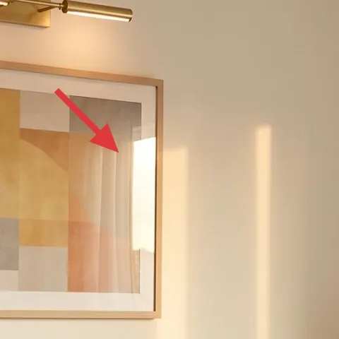
The framed abstract wall art print is the visual anchor—its soft blocks in tan and cream echo the textiles, while the blocky layout keeps it modern. I picked this DIY route because it’s the most “look-like the photo” swap you can make quickly, and it’s renter-safe: a lightweight framed piece goes up with Command hooks (or existing wall hardware if your rental already has it). The alternative is buying a print, but mass-produced abstracts often don’t match the warm neutrals in your linens. Making your own lets you dial the same warm range so the bed, curtains, and wall feel like one mood.
Make it instead of buying it
DIY a warm abstract on cardstock, then frame it to mimic the soft tan-and-cream blocks in the photo.
Materials
- Cardstock (pack, 11x17 or similar) — 1 pack — craft store — $8
- Acrylic craft paint set (warm beiges/tans + cream) — 1 set — craft store — $18
- Paintbrushes (small flat + round) — 2 brushes — craft store — $6
- Matte frame (8x10 or 11x14, whichever fits your space) — 1 — thrift or craft store — $25
- Painter’s tape — 1 roll — hardware store — $8
Steps
- Tear or cut the cardstock to your frame’s opening size, then test-fit it.
- Lightly tape off block shapes with painter’s tape (focus on tan, cream, and one muted rust-beige accent).
- Paint the first layer of tan shapes, keeping edges slightly soft so they match the abstract look.
- Let the paint dry completely, then add cream layers to brighten a few blocks.
- Peel the tape carefully to reveal clean lines between blocks.
- Touch up any thin gaps with a small brush, then fully dry before inserting into the frame.
Total DIY cost: $65 — saves about $15 over buying.
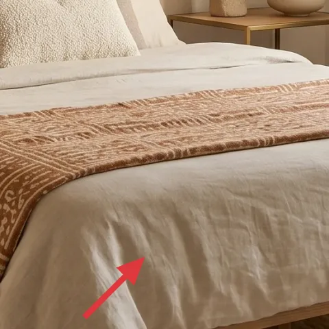
Layer 4 — rust terracotta patterned throw blanket ($60) The single color note that keeps it warm
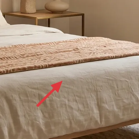
This rust terracotta patterned throw is the accent that keeps the entire palette from reading too neutral. Drape it across the front edge of the bed cover so it’s visible when you walk in, but not so high that it crowds the pillows. The key trade-off is choosing pattern placement: a large, bold motif can look busy if it sits beside highly textured pillows, so scale it to “present, not overpowering.” In the photo, the throw has a woven look and a repeating motif, which makes it feel tactile instead of decorative-only. If you want the same vibe in a rental, throws are also the easiest thing to swap seasonally.
Match one undertone, not the whole color
Keep your rust in the warm-brown family (terracotta) so it harmonizes with beige and light wood.
Layer 5 — wood nightstand (left) ($80) Storage that looks light, not bulky
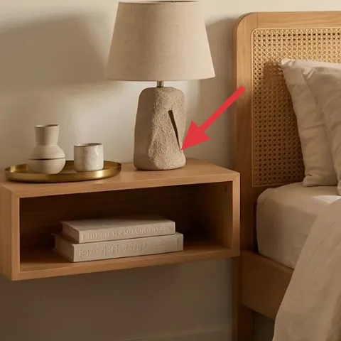
The wood nightstand gives you a natural platform for styling and practical storage without visually adding bulk. It’s the right choice here because the bedroom already has warm wood tones, and the open shelf helps you layer books and small ceramics without clutter. The obvious alternative is a full-on dresser-style nightstand, but that usually reads heavier in a bright, neutral room. With a lighter piece like this, you can style on top, hide extra items in the shelf, and still keep sightlines clean. Since it’s freestanding, it’s fully renter-safe and moves with you.
Style on one surface, not everywhere
Concentrate items on the nightstand top so the bed stays the main “rest zone.”
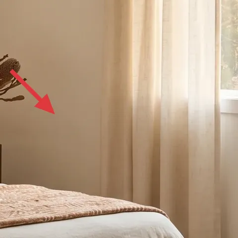
Layer 6 — sheer beige curtain panels (pair) ($80) Soft framing for the window
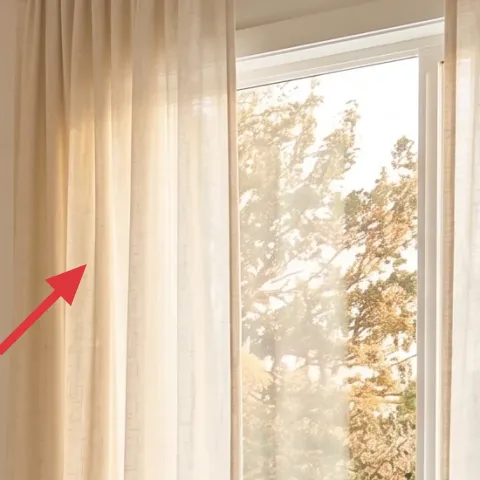
Sheer beige curtain panels frame the window with movement and diffuse light, which is a big part of this airy feel. Hang them higher than you think you need (near the rod height), and let them fall in long, gentle folds to visually lengthen the wall. The trade-off is privacy: sheers won’t fully block visibility, so this works best when you can pair them with basic blinds already in the rental. For renters, the advantage is that curtains are purely textile changes—no drilling, no permanent changes. If you’re trying to chase the same warmth, choose a beige that leans creamy rather than yellow.
Watch the “too white” sheer
If the panels look icy in daylight, they’ll fight the warm wood and cream fabrics instead of blending in.
Layer 7 — light beige area rug (8×10) ($200) Anchors the whole bedroom palette
A larger light beige area rug grounds the space and makes everything feel connected—bed, nightstand, and textiles all sit on the same visual surface. In this photo, the rug is pale enough to keep the room bright, while the texture adds softness underfoot. The alternative is a smaller rug under only the bed, but then you get disconnected zones where the floor shows through around the edges. If you’re renting, choose a washable or easy-to-vacuum fiber and keep the pile low so it doesn’t snag during moves. A properly sized rug also helps your styling look intentional, even when your rental is otherwise plain.
Size up if you can
When the rug reaches toward the room edges, the room reads calmer and more “designed.”
The cost, layer by layer
| Layer | Item | Cost |
|---|---|---|
| 1 | Cream throw pillow covers | $30 |
| 2 | Beige-shade table lamp (plug-in) | $60 |
| 3 | Framed abstract wall art print (DIY) | $80 |
| 4 | Rust terracotta patterned throw blanket | $60 |
| 5 | Wood nightstand | $80 |
| 6 | Sheer beige curtain panels (pair) | $80 |
| 7 | Light beige area rug 8×10 | $200 |
| Total | $590 | |
If you want a cheaper variant, swap the 8×10 rug for a smaller 5×7 in the same light beige, and use one pair of pillows in one texture instead of three. You’ll keep the warm, neutral read while reducing the biggest-ticket item.
What worked, what didn't (across the whole room)
This setup works because it repeats warm neutrals in more than one category—fabric, wood, and wall art—so nothing feels random. The room also benefits from soft light diffusion from the sheer curtains and a single rust-toned accent. Where it can go wrong is going too uniform or too stark, which makes beige look flat.
What worked
- Multiple cream pillow textures keep the bed looking full without adding loud color.
- The plug-in beige-shade lamps bring warm light near eye level, not just overhead brightness.
- The warm-toned framed abstract print ties the palette to the textiles.
- The rust patterned throw adds a grounded accent instead of another beige layer.
- Freestanding nightstand styling makes storage feel intentional, not cluttered.
- Sheer curtains soften daylight and make the window feel taller.
What didn't
- A smaller rug made the floor feel broken up, even with matching pillow covers.
- Cool-toned “white” sheer panels turned the room slightly gray beside the warm wood.
- Skipping the throw blanket left the bed visually monotone and harder to style.
- Too-clean, single-texture pillows looked tidy but less inviting.
What we'd skip if we did it again
Skip a highly matchy set where every fabric and accessory is the exact same shade. In this palette, the magic is repetition with variation—same warmth, different texture. If everything is identical, the room reads more like a catalog staging than a lived-in rental.
Skip buying a second lamp on the “same-but-cheaper” track. If one lamp shade is too stark or too small, it changes the light temperature and scale. Put your money into the shade color and proportions so both lamp locations feel like they belong.
Skip a print that’s too busy or too high-contrast. Abstract is forgiving, but when the wall art competes with the patterned throw, the room stops looking calm. Keep the wall print in warm neutrals and let the throw carry the strongest pattern.
Frequently asked
How long does this bedroom refresh take?
Plan for about 2–4 hours depending on your shopping day and how quickly you decide on sizes. Most of the time is spent choosing pillow textures, draping the throw the “right” way, and positioning the rug. Hanging the framed abstract is quick if you use Command hooks and you’ve already found a level spot above the bed area. Once everything is placed, styling takes another 20–30 minutes.
Is this renter-safe if I can’t change fixtures or drill into walls?
Yes. The swaps here are all textiles and freestanding items: pillow covers, a plug-in table lamp, a rug, sheer curtain panels, and a lightweight framed abstract print. The only “wall” step is hanging the frame using removable methods such as Command hooks (if the rental allows). There’s no paint, no drilling, and no hardware replacement.
What if my room is smaller than the photo?
If your bedroom is tight, prioritize rug size and curtain height. Go for the largest rug that still leaves a comfortable border of floor, and hang sheers as high as your rod placement allows to elongate the wall. Keep pillow counts the same but reduce the number of decorative pieces on nightstands to avoid visual clutter. Choose one warm rust textile and keep the rest in cream and tan.
What if my room has higher ceilings or feels empty?
For higher ceilings, use longer curtain panels and let them fall farther from the floor if your space allows. Swap to a larger framed abstract print size so it fills the wall proportion above the bed area. You can also layer a second rug pad-style solution if your rug feels thin, but avoid going too dark—this look depends on brightness.
Where should I shop for these items on a budget?
For the rug and curtains, department stores and big-box retailers often have the best value when you compare sizes. Look for plug-in table lamps at home stores or marketplace listings, but check shade color in daylight. For pillow covers and throws, fabric retailers and online home brands make it easy to match textures without committing to a full bedding set.
What’s the biggest styling mistake in a warm-neutral bedroom?
Overmatching. When every fabric and accessory is the exact same shade and texture, beige can look flat or even slightly dull. Aim for repetition in color family (cream and tan) while varying texture (bumpy, woven, and soft). Add one warm accent—here, rust terracotta—to keep the room from feeling like “only beige.”
More in Bedroom
Under $700: warm neutral bedroom refresh with renter-safe swaps
A warm neutral bedroom makeover you can do without painting or drilling: pillows, a plug-in lamp, a DIY abstract print, a throw blanket, re…
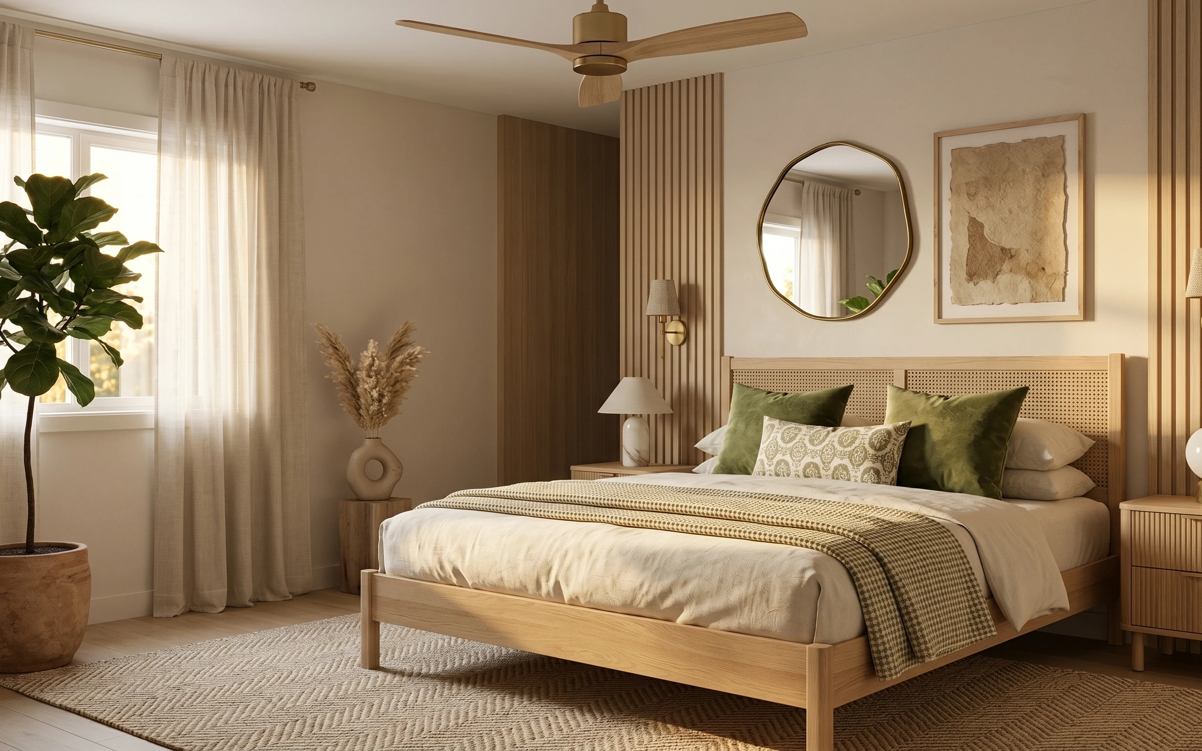
Under $800: japandi wood-paneled bedroom refresh with 7 layers
A wood-paneled bedroom looks calmer and more expensive with 7 weekend-friendly changes. This refresh targets $800 total by swapping textile…
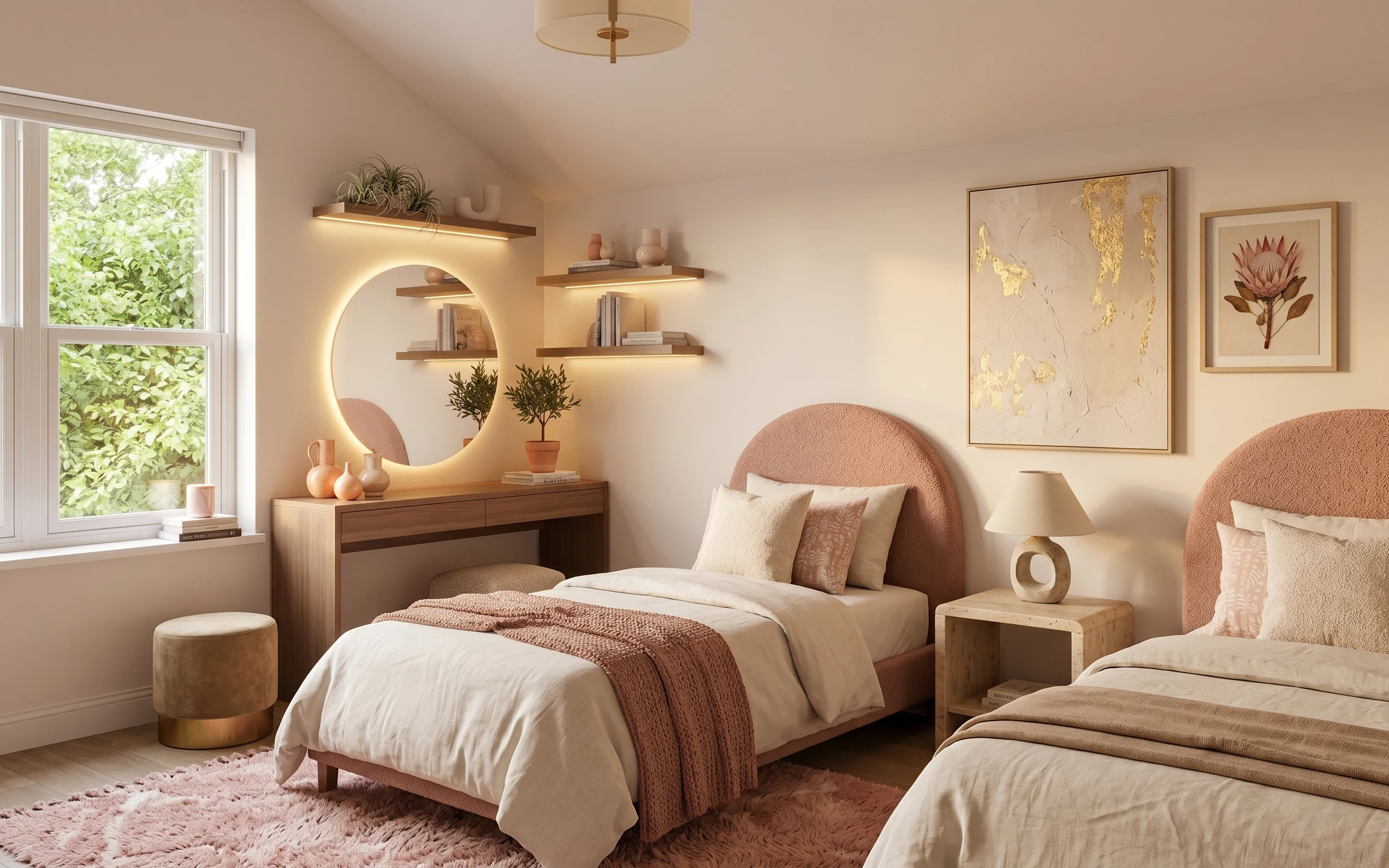
Under $600: warm earthy boho bedroom refresh with 7 move-ready swaps
A warm earthy boho bedroom refresh built from renter-friendly swaps: rug, throw blanket, pillow covers, plug-in lamp, arched mirror, framed…