- Best for
- a calm, warm bedroom focal wall
- Cost
- $680 total (under $800)
- Difficulty
- Moderate (measuring + styling)
- Renter-safe
- Yes (swap items + drill where allowed)
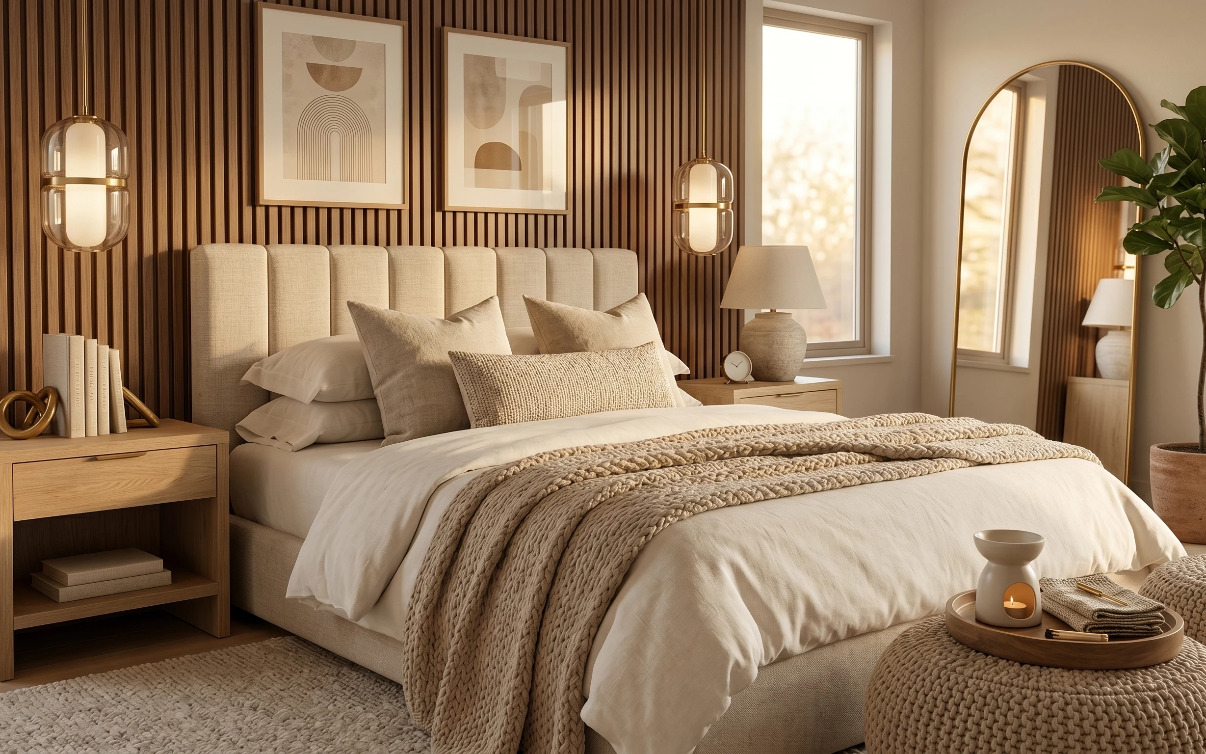
Why cream-and-brass details is the wood-paneled bedroom of 2026
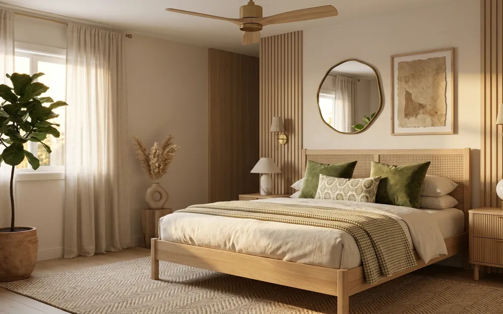
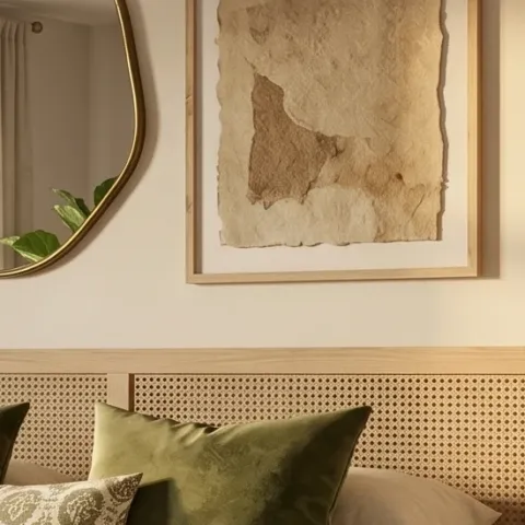
Start with the big surfaces: that cream curtain paneling softness and the grounded rug make the vertical wall texture feel intentional instead of busy. The bed styling leans into repetition—green pillows plus a patterned throw blanket—so the whole palette stays calm. The brass-toned mirror and wall sconce pull the room toward “warm modern” instead of cool minimal. It’s the kind of layered japandi look you can build quickly by choosing fewer colors and letting texture do the work.
I used to overdo bedrooms with matching sets—same shade, same shape, same fabric. This time, I caught myself reaching for “everything beige” and stopped when I remembered how repetition still needs contrast. Here, the contrast is in the materials: soft linen-like curtains, a textured rug, and that warm wood wall paneling that shows straight-grain detail. Once I leaned on textures, the room started looking finished even with just a handful of buys.
Layer 1 — area rug ($200) anchors the room’s warm wood
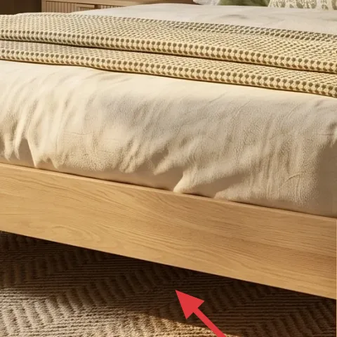
The area rug is doing heavy lifting by visually lowering the room and giving the bed zone a clear boundary. A 5×7 rug with a subtle pattern (not loud, not high-shine) keeps the floor from looking too stark next to the wood wall paneling and dresser. The trade-off is that a rug this light still needs routine vacuuming, but it’s worth it for how it softens the whole palette. If you only change one thing, make it this: without the rug, the bed can feel like it’s floating above the floor.
Pick a rug pattern you can repeat with throws
A small repeating texture lets your throw blanket and pillows feel “coordinated,” without needing them to match exactly.
Layer 2 — cream curtain panels ($80) makes the windows look taller
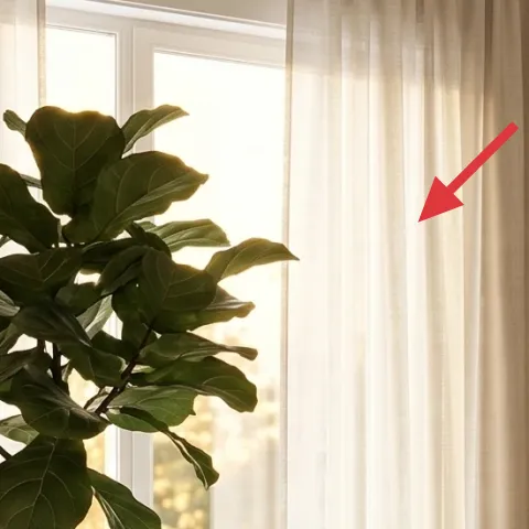
Those cream curtain panels add softness at eye level and bring the lightest color into the room—perfect against the warm wood vertical slats. Because the panels hang long and wide, they visually stretch the window area upward, which matters in bedrooms where ceiling height is your biggest asset. The trade-off is that sheerer curtains can show dust more than heavier drapes, so quick vacuuming and occasional gentle washing become part of the routine. If you’re on a tight timeline, aim for length first: the “taller” effect comes from how the panels fall.
Use the rod height as your cheat code
Mounting close to the ceiling line (instead of inside the trim) gives that tall, calm frame around the bed zone.
Layer 3 — patterned throw blanket ($60) adds texture without more colors
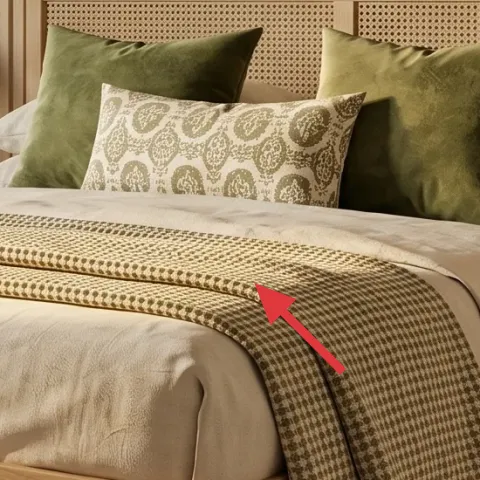
The patterned throw blanket folded across the bed reads like a finishing layer instead of extra clutter. The key is that the pattern is restrained—earthy tones that echo the rug and stay compatible with the olive green pillows already in the scene. This is a better first move than buying a whole new bedding set because it changes the “surface read” instantly. The trade-off: a throw blanket shows wrinkles, so keep it neatly folded and don’t go for anything that feels too slippery on top of a quilted cover. Texture beats color every time in a japandi palette.
Match undertones, not exact colors
If your rug is warm beige, pick a throw pattern that includes that same warm base—even if the green isn’t identical.
Layer 4 — framed abstract artwork print ($80) gives the right-wall wall a focal beat
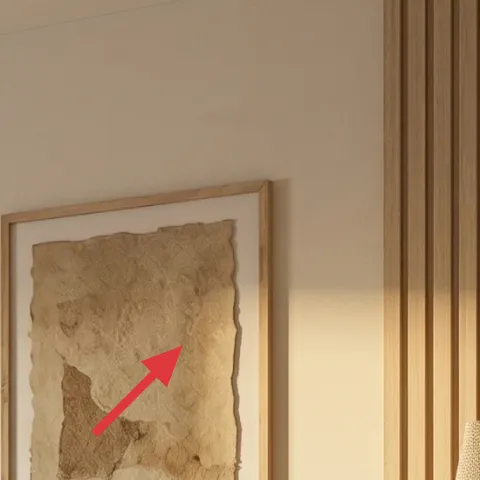
The framed abstract artwork print on the right side keeps the room from feeling like “just wood and textiles.” Its muted earth tone works with the cream curtains and the warm grain in the bed frame, so it doesn’t fight the vertical paneling. I like abstract here because it adds movement without turning the room into a busy gallery. The trade-off is scale: a print that’s too small will look like an afterthought next to the mirror and sconce, so choose one with a confident, framed footprint. For this layout, a tall-ish vertical print balances the room’s height.
Don’t place art too low on a tall wall
With this kind of vertical paneling, low placement makes the wall feel cramped—keep the artwork’s center at a comfortable eye-level height.
Layer 5 — oval mirror with brass-toned frame ($120) brightens the window side
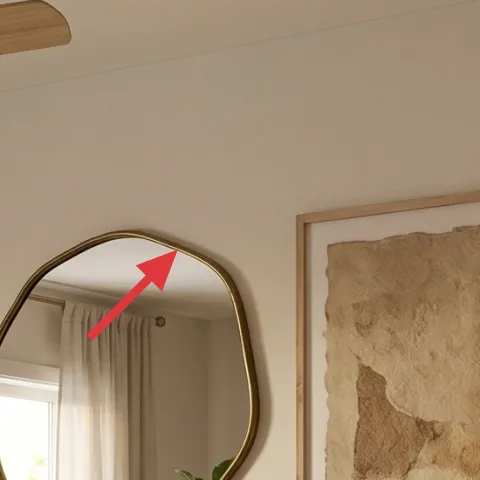
The oval mirror with a brass-toned frame is the “functional jewelry” of this bedroom. Positioned across from the light source, it bounces brightness and adds a gentle curve that softens all the straight lines in the wall paneling. The brass finish also ties into the brass wall sconce so the lighting feels intentional, not random. The trade-off is that shiny brass can look too yellow if paired with cool undertone creams—so keep the rest of the palette warm, like the curtain color and rug tone. An oval shape also plays nicer than a sharp rectangle when you’re layering pillows and textiles.
Choose a warm metal, then repeat it once
One brass element (sconce or lamp) plus the mirror is enough to look designed without going overboard.
Layer 6 — brass wall sconce ($100) adds warm light at night
That brass wall sconce gives the room a layered lighting moment—warm, directional, and perfect for nighttime reading without overpowering the window area. Because it sits at a mid height, it also helps the bed zone feel “framed,” especially alongside the mirror. The trade-off is placement and spacing: if you mount sconces too close together or too high, the room loses balance against the vertical slats. When refreshing a weekend, it’s often easier to choose sconces that include a plug option rather than making wiring changes. Either way, keep the shade fabric color warm to match the cream curtains.
Keep the glow warm, not icy
Choose a warm bulb temperature so the wood paneling and brass keep their honey tone.
Layer 7 — terracotta planter pot ($40) turns a plain clay base into a palette match
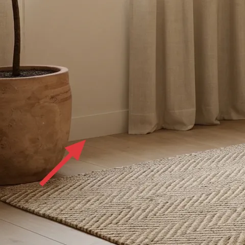
Make it instead of buying it
Paint the terracotta planter pot so it matches the cream-and-warm-wood palette, without buying a new container.
Materials
- Spray paint (chalky/porous-safe) — 1 can — hardware store — $12
- Sandpaper (medium grit) — 1 pack — hardware store — $5
- Painter’s tape — 1 roll — craft store — $3
- Clear matte sealer (optional but recommended for durability) — 1 can — hardware store — $6
- Gloves + drop cloth — 1 set — hardware store — $4
Steps
- Wash and fully dry the pot so paint sticks evenly.
- Lightly sand the surface to roughen the glaze/texture for better adhesion.
- Tape off any rim areas you want to keep natural (or tape label spots if the pot has them).
- Apply 2–3 thin coats of spray paint, letting each coat dry to the touch.
- Let the paint cure overnight, then sand any tiny rough spots very lightly.
- Finish with 1 clear matte coat if you want scuff resistance, then let it cure fully before repotting.
Total DIY cost: $30 — saves about $10 over buying.
When the pot matches the room’s warm neutrals, the plant looks built into the design instead of “an item by the door.” A simple painted finish also helps the terracotta blend with the rug’s beige tones and the cream curtains, so the plant becomes texture rather than color competition. The trade-off: painted terracotta can chip if it’s bumped a lot, so a quick matte sealer is worth the extra step. The goal isn’t perfection—it’s a calmer base color that keeps attention on the vertical wall paneling and the bed.
Dry time matters more than coats
Thin coats + full cure prevent that chalky tackiness that can happen when the pot gets handled too soon.
The cost, layer by layer
| Layer | Item | Cost |
|---|---|---|
| 1 | Area rug 5×7 | $200 |
| 2 | Curtain panel pair (84") | $80 |
| 3 | Patterned throw blanket | $60 |
| 4 | Framed art print 16×20 | $80 |
| 5 | Oval wall mirror (brass-toned frame) | $120 |
| 6 | Brass wall sconce | $100 |
| 7 | Terracotta planter pot (DIY painted) | $40 |
| Total | $680 | |
If you want a cheaper variant, scale down the rug to a simpler low-pile solid pattern and choose curtains in a basic neutral weave. Keep the mirror and wall sconce, but pick a smaller framed print to stay within a tighter spend.
What worked, what didn't (across the whole room)
The room’s best improvements were the items that change the “surface read” first: curtains, rug, and the layered throw. Brass at the wall and mirror placement made the warm wood paneling feel curated instead of accidental.
What worked
- The 5×7 rug visually contains the bed zone and keeps the floor from looking too busy next to slats.
- Cream curtain panels add softness and make the window wall feel taller without any demolition.
- The patterned throw blanket adds texture without pushing in a new, competing color family.
- The oval mirror shape softens straight lines and adds brightness toward the window side.
- The framed abstract print gives the right wall a focal moment that balances the mirror and sconce.
- Brass wall sconces bring warm nighttime light at a height that flatters the bed.
What didn't
- Skipping the rug makes the bed feel disconnected from the room, even when everything else is neutral.
- Too-cool cream curtains can make the brass look more yellow and the wood look darker.
- Overly large art next to the mirror can crowd the wall paneling instead of balancing it.
- Wall sconces mounted too high read as decorative only; the light doesn’t land where you need it.
- Unpainted terracotta stands out more than the rest of the palette, pulling attention away from the focal wall.
What we'd skip if we did it again
Skip buying a second “matching” pillow set. In this palette, variety comes from texture—quilted cover, patterned throw, and solid green—so buying duplicates wastes money and makes the bed look flat.
Skip going too large with the framed print. With a tall wall and an oval mirror already nearby, a smaller print keeps the wall from feeling cluttered and preserves that calm, japandi balance.
Skip choosing cool undertone neutrals. When creams lean gray instead of warm, the brass wall sconce and mirror can look off together, even if the colors seem close in the store.
Frequently asked
How long does this wood-paneled bedroom refresh take on a weekend?
Plan for about 6–10 hours depending on how many items you already have. Curtain hanging and art placement are usually the fastest, while rug smoothing and bed styling take the most “live-in” time. If you’re DIY-painting the terracotta pot, add curing time overnight so it’s ready the next day.
What if I rent and can’t drill for the mirror or wall sconce?
Choose mirror mounting options that match your lease rules—many oval mirrors can be hung with appropriate hardware rated for your wall type. For lighting, look for plug-in wall sconces or use a table lamp on a dresser instead. The overall look still works because the plan is about warm brass repetition and layered texture, not any one hardwired component.
My room is smaller—should I still do a rug in this size?
If your bedroom is tight, drop to a smaller area rug but keep the rug’s job the same: anchor the bed zone. Ideally, at least the front legs of the bed sit on the rug. With curtains, keep the same “hang high” strategy so windows feel taller even in a compact footprint.
What if my walls are already a bold color?
This scheme is designed to calm down strong wall colors. Use cream curtain panels and a warm neutral rug to soften the overall contrast, then keep artwork and brass in muted earth tones. If the wall color pulls cool, avoid icy white fabrics—choose cream curtains with a warm undertone so the brass doesn’t fight the paint.
Where’s the best place to shop if I want these parts on a budget?
For curtains and framed art, look for home sales and clearance at big-box retailers, then compare against online staples for fabric length options. Rugs are often cheaper during seasonal promotions, and wall sconces can be found less expensively in plug-in styles. The DIY planter cost is usually the easiest win—basic spray paint plus a matte sealer does the trick.
What’s the biggest mistake people make in bedrooms like this?
The most common misstep is buying matching “set” pieces that remove texture variety. The japandi look here depends on mixing tactile surfaces—curtains, quilted bed cover, patterned throw, and a rug texture—while keeping the color palette limited. If everything is the same sheen and the same neutral, the room can feel flat.
More in Bedroom

Under $800: japandi wood-paneled bedroom refresh with 7 layers
A wood-paneled bedroom looks calmer and more expensive with 7 weekend-friendly changes. This refresh targets $800 total by swapping textile…
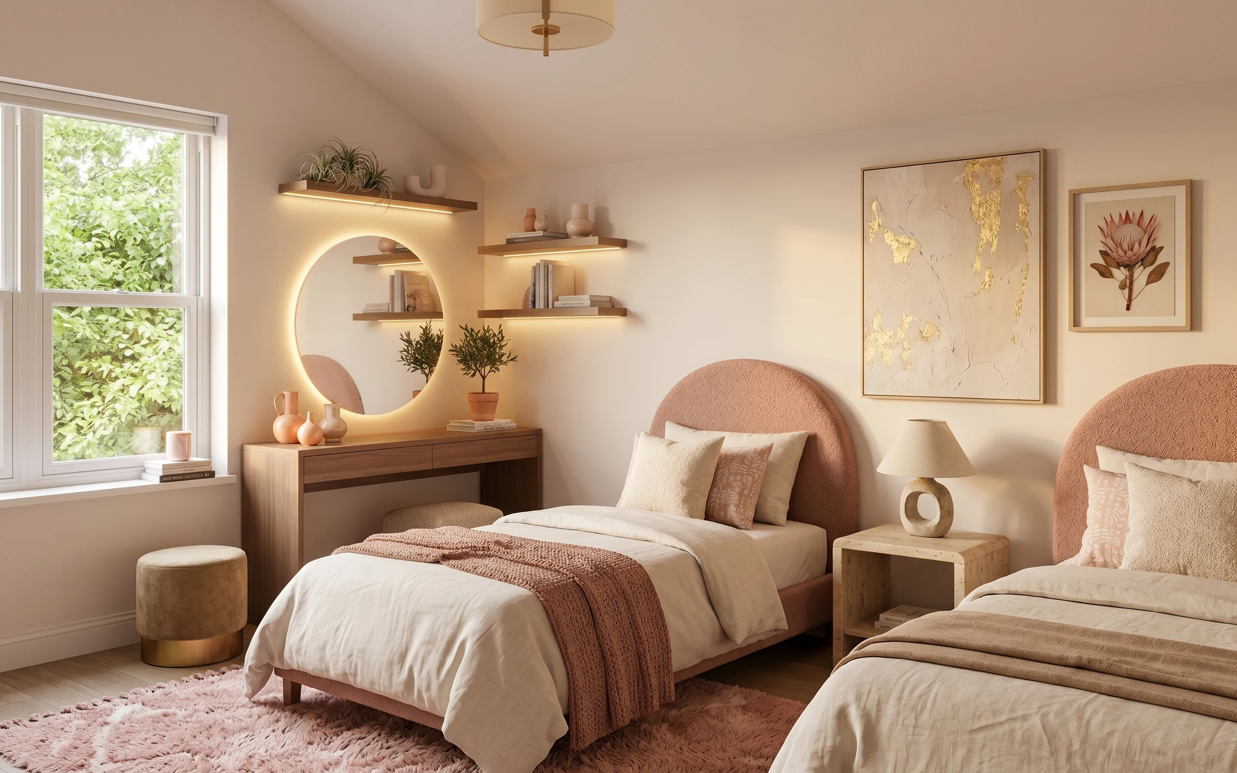
Under $600: warm earthy boho bedroom refresh with 7 move-ready swaps
A warm earthy boho bedroom refresh built from renter-friendly swaps: rug, throw blanket, pillow covers, plug-in lamp, arched mirror, framed…
Under $700: neutral bedroom refresh with 7 weekend upgrades
A neutral bedroom refresh that feels more intentional—without a renovation. This weekend plan uses 7 budget-friendly upgrades (rug, framed …