- Best for
- Budget bedroom styling with big texture + lighting changes
- Cost
- About $635 total for 7 layers
- Difficulty
- Moderate (DIY paint + measured placements)
- Time
- 1 weekend to start looking “done”
Why warm taupe-and-cream palette is the bedroom of 2026
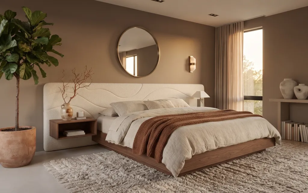
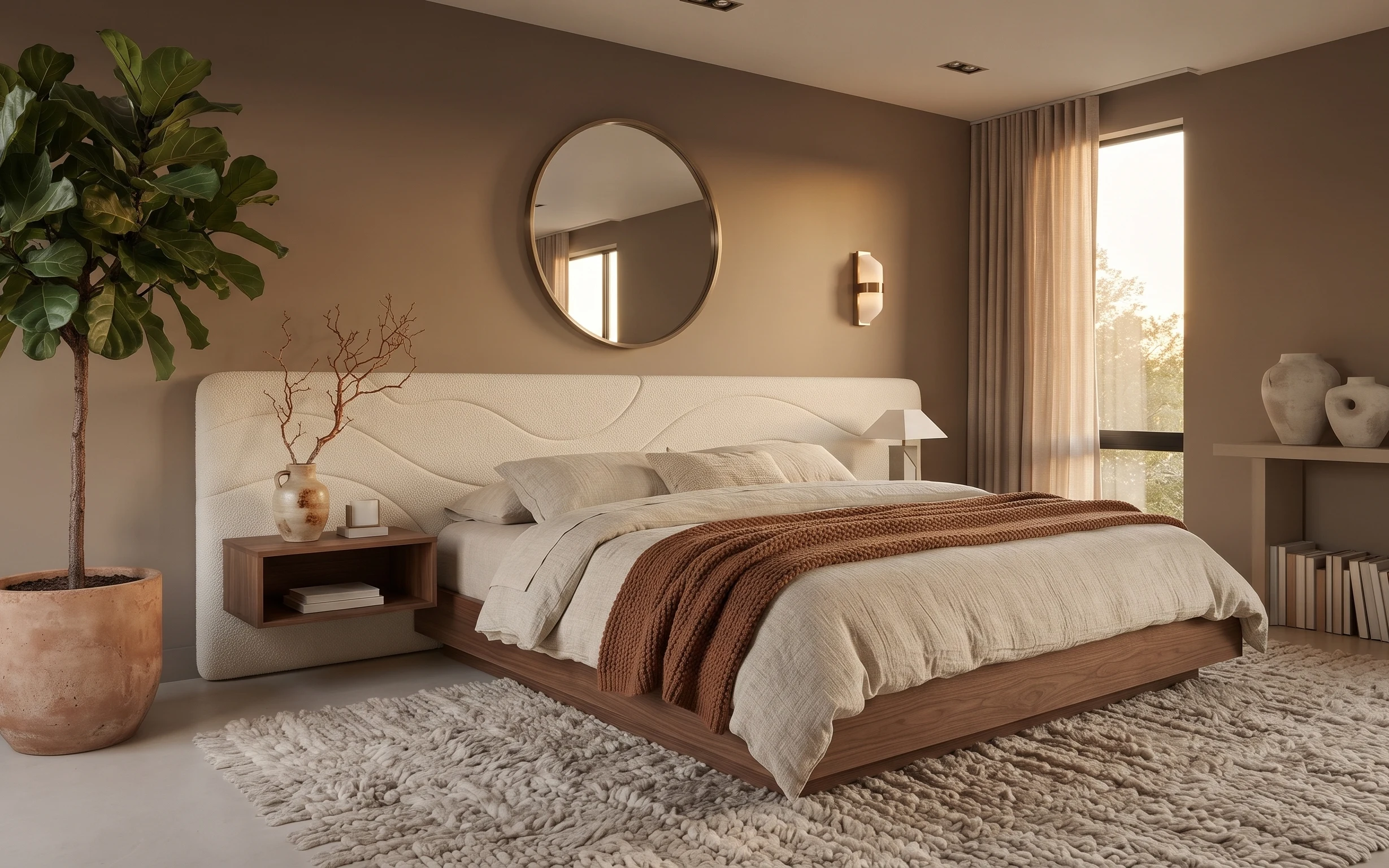
Start with the big sensory pieces you can feel before you fix anything you can’t. In this photo, the cream headboard texture and the shag area rug do the heavy lifting, while the beige curtain panels soften the line from wall to window. The walnut-toned accents—the nightstand and round mirror frame—keep the whole look grounded instead of washed out. For homeowners refreshing their own place, this is a satisfying weekend mix: swap the “hard” visual anchors (mirror, curtains, rug) and then align small details like planter color and bed throws.
I used to overthink small decor and under-spend on window and floor—until I realized the room needed fewer focal points, not more. My turning point was stopping the “random plant + random blanket” combo and matching the undertones: warm terracotta, warm cream, and a little walnut. After that, the bed styling stopped feeling fussy and started looking intentional.
Layer 1 — terracotta planter (DIY paint refresh) ($40) Brush-match the plant to the rug
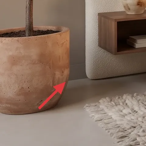
This terracotta planter anchors the left side of the bed area, so a quick paint refresh is an easy way to make the whole room feel edited, not assembled. The goal isn’t hiding it—it’s nudging the color so it sits closer to the rug and headboard warmth. A matte finish also keeps it from looking glossy next to the knit throw and the softly textured walls. The trade-off: painted terracotta won’t look “antique” right away, but it will look cohesive immediately, especially once the dried branch picks up the same warm tone.
Make it instead of buying it
DIY a toned-down terracotta planter by sanding, priming, and painting it to match the rug and bed neutrals.
Materials
- Sandpaper (medium grit) — 1 sheet — hardware store — $4
- Spray paint (warm neutral, matte) — 1 can — home improvement store — $12
- Primer (for porous surfaces) — 1 small can — hardware store — $6
- Matte clear coat — 1 can/1 small can — hardware store — $10
- Foam brush (for touch-ups) — 1 — craft store — $2
Steps
- Lightly sand the planter so paint grips the porous surface.
- Wipe dust away with a dry cloth.
- Apply a thin coat of primer and let it dry fully.
- Spray 2–3 light coats of warm neutral paint, letting each coat dry.
- Touch up edges with a foam brush if needed.
- Finish with a matte clear coat and let it cure.
Total DIY cost: $34 — saves about $6 over buying.
Surface prep is the whole job
If the planter still feels dusty or chalky after sanding, the paint will look patchy—wipe it again before you prime.
Layer 2 — large shag area rug (5×7 feel) ($200) Go bigger than the bed’s visual footprint
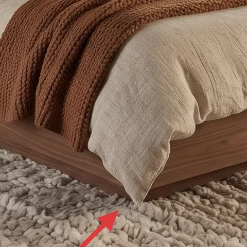
The rug is doing more than warming up your feet—it’s shaping the bedroom’s “quiet zone.” In the photo, the shag texture reads plush against the clean lines of the upholstered headboard, and the neutral beige keeps the room from going visually heavy. Choosing an area rug that extends under the front part of the bed makes the whole scene feel collected. The trade-off is price: a larger shag takes more budget than a flat-weave, but it pays back in comfort and sound dampening. A rug in a warm cream tone also makes the wood and terracotta feel like they belong together.
Why the warm cream matters
Cool beige can make terracotta look orange; warm cream keeps the color family cohesive.
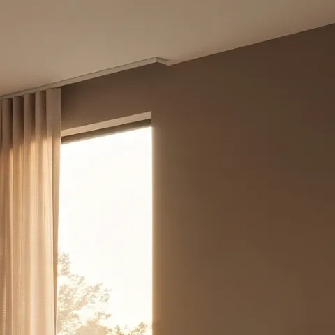
Layer 3 — curtain panels (beige/cream pair) ($80) Frame daylight with soft vertical lines
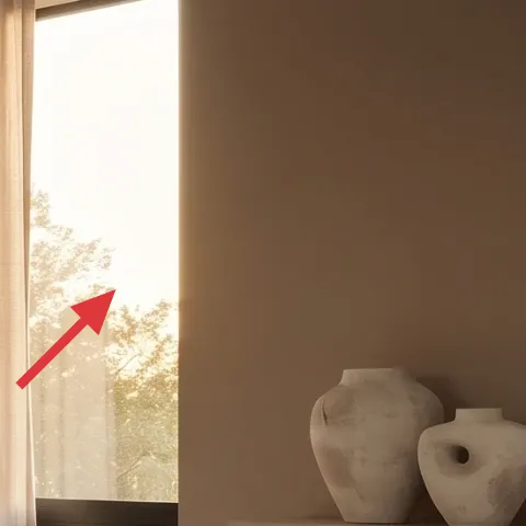
These beige/cream curtain panels soften the window area so the bedroom doesn’t rely only on the headboard and rug for coziness. The fabric’s light texture and warm neutral tone echo the bed linens, while the vertical fall helps balance the round mirror overhead. For a weekend refresh, buying a matching pair gives you the same “pulled-together” look without altering anything structural. The trade-off: curtains that puddle too much can visually shorten the wall, so plan for a clean hover above the floor or a gentle break. Hanging them high—closer to ceiling height—also makes the room feel taller.
Hang them higher than you think
Installing the rod near the ceiling gives you that lifted look and makes the mirror feel more intentional.
Layer 4 — round wall mirror (wood-framed) ($120) Use a curve to soften the bed wall
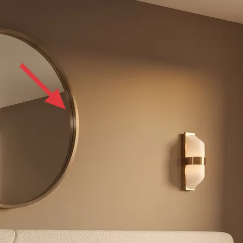
The round mirror is the visual “breather” between the tall headboard and the straight lines of the window wall. Its warm wood frame ties directly into the nightstand and the right-side shelf, while the circle shape keeps the room from feeling too rectilinear. This is one of those changes that reads instantly: you’ll notice it the first time you walk into the room, even before you spot details like the knit throw. The trade-off is glare—any mirror can reflect light you don’t want—so position it so reflections land on the window area rather than directly into the bed.
Don’t center it by eye alone
Measure from the bed’s centerline—if the mirror drifts, the whole “balanced” feeling disappears.
Layer 5 — wall sconce with fabric shade (right side) ($90) Add warmth after dark without replacing wiring
A wall sconce gives the bedroom that layered-light look, and in the photo the fabric shade creates a gentler glow than a bare bulb. Even with daylight streaming through the window, the sconce is what makes the wall feel styled rather than blank. This choice is a better alternative than adding yet another table lamp when you want a calm, uncluttered bedside footprint. The trade-off is that you’ll want to make sure the light level matches the bed’s height—too high and it feels decorative, too low and it can be harsh. Keeping the sconce warm-toned also keeps the whole palette cohesive.
Same-warmbulb rule
Choose a warm bulb (not daylight white) so it doesn’t fight the rug’s beige warmth.
Layer 6 — knit throw blanket (brown/tan) draped on bed ($25) Repeat the rug undertone in one textile
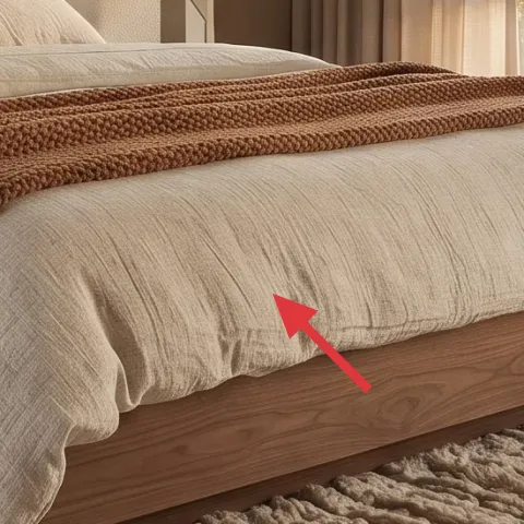
This brown/tan knit throw adds depth without changing the color system. It sits on the bed where your eye naturally lands, and the chunky knit texture echoes the shag rug’s tactile comfort. If everything in the room is too “smooth,” it can feel staged; this throw fixes that by introducing a different texture scale. The trade-off: knit throws shed a little more than tightly woven blankets, so plan to brush it off now and then. Still, the payoff is big—one throw is enough to make the bed look styled even if the pillows stay simple.
Let it drape, don’t fold flat
Over a duvet edge, a relaxed drape looks intentional and avoids that “thrown on” look.
Layer 7 — wood nightstand with open shelf ($80) Keep the bedside functional and warm
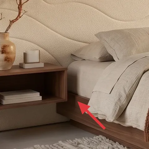
The wood nightstand does two jobs: it gives you a place for the vase with dried branches and it repeats the room’s walnut warmth near the bed. The open shelf adds a built-in spot for a couple of stacked books, so the surface doesn’t become cluttered with random items. This is the better move than a sleek, all-closed nightstand when the goal is to keep the room feeling airy and curated. The trade-off: an open shelf needs quick organizing, because what’s stored there becomes part of the decor. In this palette, keeping items in cream, terracotta, and warm wood tones makes everything look “collected” instead of accidental.
Curate for height
Mix one taller element (branches) with one low stack (books) so the shelf reads balanced.
The cost, layer by layer
| Layer | Item | Cost |
|---|---|---|
| 1 | Terracotta planter (DIY paint refresh) ($34 materials) | $40 |
| 2 | Large shag area rug (5×7 feel) | $200 |
| 3 | Curtain panels (beige/cream pair) | $80 |
| 4 | Round wall mirror (wood-framed) | $120 |
| 5 | Wall sconce with fabric shade (right side) | $90 |
| 6 | Knit throw blanket (brown/tan) draped on bed | $25 |
| 7 | Wood nightstand with open shelf | $80 |
| Total | $635 | |
If the shag rug feels like the budget stretch, switch to a similar warm-neutral rug with shorter pile (or a textured weave) and spend the saved money on upgraded curtain length and a better-fitting mirror frame.
What worked, what didn't (across the whole room)
The room’s comfort comes from texture layering: shag rug, knit throw, and upholstered headboard all play nicely together. The warm mirror and wood nightstand keep the palette grounded, while the curtains soften the window wall so it doesn’t look bare.
What worked
- The cream headboard texture makes the bed look finished even with minimal pillow styling.
- The large shag rug improves comfort and visually cushions the entire bed zone.
- Beige curtain panels add soft vertical rhythm that balances the round mirror.
- The warm wood mirror frame repeats the nightstand tone and unifies the palette.
- The fabric-shade wall sconce creates a gentler evening glow than a harsh overhead.
- The knit throw brings a second texture scale so the bed doesn’t feel flat.
What didn't
- If the mirror height is off, the bed-wall balance looks slightly “tilted” even when everything else matches.
- Curtains hung too low can make the room feel shorter and more closed-in.
- Too-cool beige accents can clash with terracotta, turning warm neutrals into muddy neutrals.
- A throw that’s too small visually disappears, so the bed reads less styled.
- Open shelves can look messy if the book stack and vase heights aren’t varied.
What we'd skip if we did it again
Skip buying lots of small decor at the start. The photo’s look works because the big anchor pieces (rug, curtains, mirror, bed textile) are doing most of the work, then small items just support that palette.
Skip a mirror shape that repeats the bed’s rectangle. A round mirror softens the wall above the upholstered headboard and adds that gentle organic contrast you can’t fake with a “different frame color.”
Skip curtains that don’t reach high enough. It’s a small measurement detail that changes everything—high hanging makes the ceiling feel taller and keeps the whole room from reading cramped.
Frequently asked
How long does this kind of bedroom refresh usually take?
Most of the work is quick if the pieces are already on hand. Plan a few hours for measuring and placing the mirror, then another chunk for hanging curtains and setting up the bed textures. The DIY planter paint refresh is the slow part only because of drying/curing time—otherwise it’s mostly sanding and multiple thin coats.
If I’m renting, what parts can I still do?
This refresh leans homeowner-friendly, but renters can still copy most of the visual moves: swap in curtain panels with a proper curtain rod and hang high, replace lightweight decor like throws, and refresh styling around an existing mirror. For lighting, choose a plug-in option only if the fixture can be safely used without rewiring. For plants, paint the planter only if it’s something you can take with you.
What if my room is smaller than this one?
Go smaller on the rug only if you still keep it under the front edge of the bed. If the room is tight, use the mirror to reflect window light and keep the wall uncluttered—limit yourself to one shelf zone for books and vases. Curtains should still hang high; that vertical move makes bedrooms feel larger even when the floor area is limited.
What if my room has higher ceilings or a wider window?
Lean into height. Hang curtains near the ceiling and consider longer panel lengths so they skim the floor with a gentle break. Choose a mirror diameter that doesn’t feel tiny above the headboard—circles can look delicate if underscaled. Finally, raise the visual “anchors” on the nightstand (branches + books) so the composition stays balanced from floor to mirror.
Where should I shop to keep this under budget?
Start with the big baseline items: look for rug deals and curtain panel pairs during seasonal sales, and use home improvement stores for paint and clear coat materials. For the mirror, set a price ceiling and search by frame color first—wood-toned rounds are easier to match. For wall lighting, compare plug-in or swappable options at big-box stores before paying for specialty fixtures.
What’s the biggest mistake people make in warm-neutral bedrooms?
Mixing warm and cool neutrals without checking undertones. Terracotta and warm woods can look dull if the beige rug or curtains lean too gray. To avoid that, pick one “anchor” warmth (like the rug beige) and then choose everything else in a matching temperature—cream, warm taupe, and walnut—so nothing competes.
More in Bedroom
Under $700: warm taupe-and-cream bedroom refresh with 7 layers
A warm taupe-and-cream bedroom refresh with 7 budget-friendly upgrades: a cleaner mirror placement, softer window curtains, and a cozier ru…

Under $600: warm modern bedroom swaps with 7 move-ready layers
A warm modern bedroom refresh built for shared-housing moves: 7 renter-safe swaps using textiles, plug-in lighting, and wall art. Target to…
Under $400: earthy-beige bedroom swaps with 7 renter moves
Earthy-beige bedroom refresh for renters: warm rug, wood nightstand, cozy lamp, and easy art. This 7-layer look lands under $400 with rente…