- Best for
- Texture-heavy bed styling
- Cost
- Under $400
- Time
- About a weekend
- Renter-safe
- Yes—no-drill swaps
Why warm beige-and-olive is the move-friendly bedroom of 2026
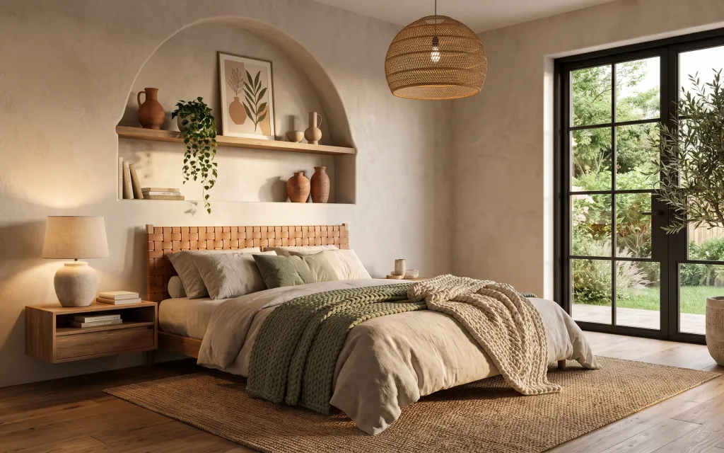
Start with a warm neutral base—this bed-on-a-texture setup is really about contrast: creamy plaster walls, tan wood, and sage-green bedding. The chunky knitted throw and the rug do double duty by softening the lines of the wood slat headboard. For lighting, the table lamp on the nightstand keeps the room from feeling too bright or too cool. The framed botanical print adds an organic, plant-inspired note, and the woven floor plant pot brings the same earthy mood right up near the windows.
I used to overthink “cohesion” and end up matching everything too literally—same beige, same tone, same scale. This time, I leaned into texture instead: knit, woven, matte terracotta, and soft fabric. Once I saw how the rug and the throw blanket warmed up the whole bed area, I stopped hunting for the perfect color match and started styling for depth.
Layer 1 — area rug 8×10 ($150) Texture-first base underfoot
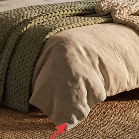
Pick an 8×10 rug in a natural tan weave so it acts like a visual “ground” under the bed. In the photo, the rug sits large enough that the bed reads intentional, not floating, and it also hides everyday footprints near the entry. A woven-look rug is the right call over a thin flatweave because the texture makes the headboard’s wood slats feel softer and warmer. The trade-off is that deep-pile rugs can shed; a woven flat weave is usually easier to live with in rentals.
Rug placement trick
Let the rug extend past the bed’s sides so both nightstand legs land on the rug area.
Layer 2 — nightstand ($80) Wood for heat beside the bed
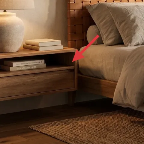
Choose a simple wood nightstand with a clean top and an open or solid front panel—this is the practical anchor that makes the whole bed vignette feel styled. The nightstand here balances the vertical wood slat headboard with a flatter horizontal surface, which is why the lamp and small decor look “placed,” not scattered. Going for matching furniture would be the obvious alternative, but mixing one wood piece is the renter-friendly version of that same idea. The trade-off: avoid super glossy finishes, since they reflect window light and can feel harsher against matte walls.
Why it works with the headboard
A warm, mid-tone wood mirrors the bed’s slats so the bed and nightstand read as one zone.
Layer 3 — table lamp on nightstand ($40) Warm, shaded light instead of overhead
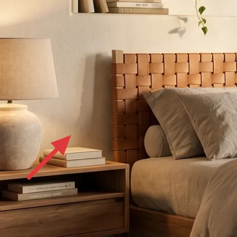
Use a plug-in table lamp with a neutral shade on the nightstand to keep the lighting layered. In the hero, the lamp’s warm tone helps the bedding look creamy instead of grey, especially with the sun coming through the sliding doors. The trade-off versus chasing an identical look is bulb choice: a daylight bulb can wash the palette out, while a warmer bulb makes terracotta and sage feel richer. A plug-in lamp is also the renter’s win—no hardwired fixtures, and the lamp relocates with you when the lease ends.
Don’t pair a cool bulb with beige walls
If your bulb runs blue, the rug and bedding can start looking dull instead of warm.
Layer 4 — framed botanical print ($25) DIY art that fits the plant palette
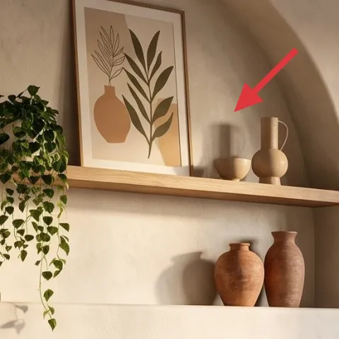
Swap the framed botanical print for a renter-safe version you can hang with removable hooks. The key detail is scale: the print sits centered over the bed head zone and visually “pulls” the shelves and vases together. A framed art print is the obvious buy, but DIY keeps it budget-friendly and lets you match the beige/terracotta/green tones exactly. The trade-off is time: the finished result looks best when you keep the background light and let the shapes (leaf-like strokes, stems, seed pods) do the work.
Make it instead of buying it
Make a hand-painted abstract on cardstock, then frame it to mimic the botanical vibe without relying on landlord art.
Materials
- Acrylic paint set (assorted greens + terracotta) — small palette — $6
- Cardstock (cream) — 1 sheet — $4
- Frame (clip-in or inexpensive 8×10) — 1 — $5
- Painter’s tape — a few strips — $0
- Matte clear gel medium (optional) — small amount — $0
Steps
- Tape off a few soft shapes on the cardstock (leaf bases, a stem, or a seedpod outline).
- Paint the light background first in thin layers so the texture shows through.
- Add one green family (sage tones) for the “leaf” shapes; let it dry between sections.
- Paint a terracotta accent shape last, keeping edges imperfect on purpose.
- Remove tape, then touch up any lines with a small brush.
- Let the paint fully dry before placing it into the frame.
Total DIY cost: $15 — saves about $10 over buying.
Layer 5 — indoor plant in woven pot (floor) ($20) A live shadow near the windows
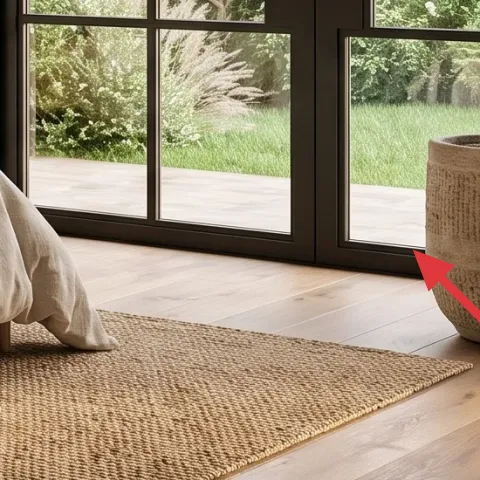
Bring the outdoors in with a taller indoor plant in a woven or textured pot near the sliding door. In the hero, the plant’s height balances the pendant and makes the window area feel anchored rather than empty. Go for a plant that doesn’t need constant attention if you’re in a rental rhythm—something that tolerates occasional missed watering will keep the look consistent. This is also where you can lean budget: instead of a huge premium pot, pick a simpler woven container and choose the plant you’ll actually maintain. The trade-off is that plants vary by season, so expect slight changes in fullness.
Match the pot texture, not the exact species
A woven pot keeps the earthy mood even if the plant form changes.
Layer 6 — large knitted throw blanket ($25) Chunky warmth at the foot of the bed
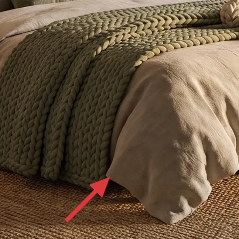
Drape a chunky knitted throw across the bottom third of the bed so it reads as a deliberate styling layer, not extra bedding. The hero’s throw adds thick, looped texture that contrasts with the smoother duvet and makes the bed look lived-in. If you bought only one “textile upgrade,” this is the one—texture is what makes neutrals feel intentional. The trade-off is weight: a thicker knit is warmer, but it can take up space in a small closet. Keep it folded at the end of the bed when you need storage, and pull it back out for the look.
Let it peek, not swallow
A throw that shows a clear edge line looks styled; one that drapes too far can hide the duvet.
Layer 7 — sage green accent pillows ($18) One color pop, kept muted
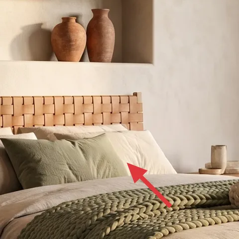
Use sage-green accent pillows (covers are the renter-friendly move) to tie into the plant-inspired palette without turning the room into a color project. In the photo, the sage tones sit between the cream bedding and the terracotta decor, creating that soft, natural gradient effect. The obvious alternative is buying more beige pillows, but that flattens the bed—green is what gives it depth. The trade-off is choosing the right undertone: too bright or too blue-toned, and it clashes with warm beige walls.
Repeat the undertone
If your pillows are sage, pick one small terracotta item somewhere nearby so the room feels connected.
The cost, layer by layer
| Layer | Item | Cost |
|---|---|---|
| 1 | Area rug 8×10 in tan woven style | $150 |
| 2 | Wood nightstand with simple top | $80 |
| 3 | Plug-in table lamp with neutral shade | $40 |
| 4 | Framed botanical-style print (DIY ~$15 materials) | $25 |
| 5 | Indoor plant in woven pot (small/medium) | $20 |
| 6 | Chunky knitted throw blanket | $25 |
| 7 | Sage accent pillow covers | $18 |
| Total | $358 | |
A cheaper variant is swapping the 8×10 rug for a smaller 5×7 placed under the front half of the bed, then adding one extra texture piece (either a second throw or a second pillow cover). It keeps the warm palette but reduces the total spend.
What worked, what didn't (across the whole room)
The warm beige base plus one muted color (sage) made the room feel calm instead of busy. The knitted throw and rug did most of the heavy lifting for texture, so everything else could stay simple. The only thing that can go wrong is lighting color and overly glossy finishes—those can flatten the earthy tones.
What worked
- The tan woven rug anchors the bed and visually connects the nightstand and the window area.
- A plug-in lamp on the nightstand keeps the vibe warm at night without hardwired changes.
- Chunky knit throw texture makes neutral bedding look intentional, not plain.
- Sage accent pillows add color depth while staying muted enough for a rental palette.
- A framed botanical-style print ties the plants and terracotta decor into one theme.
- A taller plant in a woven pot fills the window-side corner so the room feels complete.
What didn't
- Too many matching beige textiles can make the bed look flat against the cream walls.
- Cool-toned bulbs can turn terracotta and sage grey and make everything feel washed out.
- Oversized wall art can overpower the bed zone if the frame isn’t centered and scaled well.
- A glossy nightstand finish can reflect window light and interrupt the soft texture look.
What we'd skip if we did it again
Skip a full “matching set” approach. One wood nightstand and one textured rug are enough; repeating exact furniture tones can make the room feel staged instead of lived-in.
Skip buying a premium floor lamp or pendant replacement for this vibe. A simple plug-in table lamp does the same job in a renter-safe way, and it’s easier to move when you switch neighborhoods.
Skip bright, saturated pillow colors. If the room is warm beige and terracotta, muted sage reads natural—too much contrast forces the rest of the styling to work harder.
Frequently asked
How long does this bedroom refresh take?
Plan for a half-day to assemble the shopping list, then about 1–2 hours to style the rug/bed layers and set up the lamp and plant. The DIY framed print is the only time-heavy part; give yourself an extra block for paint dry time and framing.
Is this renter-safe if I have a strict landlord?
Yes. Everything in the layers is moveable: rug, nightstand, lamp, pillows, throw, plant, and a framed art print hung with removable methods. Avoid hardwired lighting changes or anything that requires wall anchors.
What if my bedroom is smaller than the photo?
Use a smaller rug (like 5×7) but center it so the front legs of the bed land on it. Keep the bed textile layers to two pillows plus one throw, and choose a slightly smaller plant so it doesn’t overwhelm the window-side corner.
What if my bedroom is larger and feels empty?
Go up one step in rug size or add a second small tray-style decor object on the nightstand to create a stronger bedside “surface.” You can also size the framed print slightly larger while keeping the same beige/terracotta/green palette.
Where should I shop for these items without overspending?
Start with a woven-look rug and a plug-in table lamp from big-box home stores, then fill in the textiles (throw + pillow covers) with online fabric retailers. For the plant, local nurseries are often cheaper than decorative plant shops, especially for woven pots.
What’s the biggest mistake people make with this look?
Using the wrong undertone. Sage pillows that lean too blue or a lamp bulb that’s too cool will fight the warm beige walls. Stick to muted, earthy greens and choose a warmer bulb so terracotta and tan look cohesive.
More in Bedroom
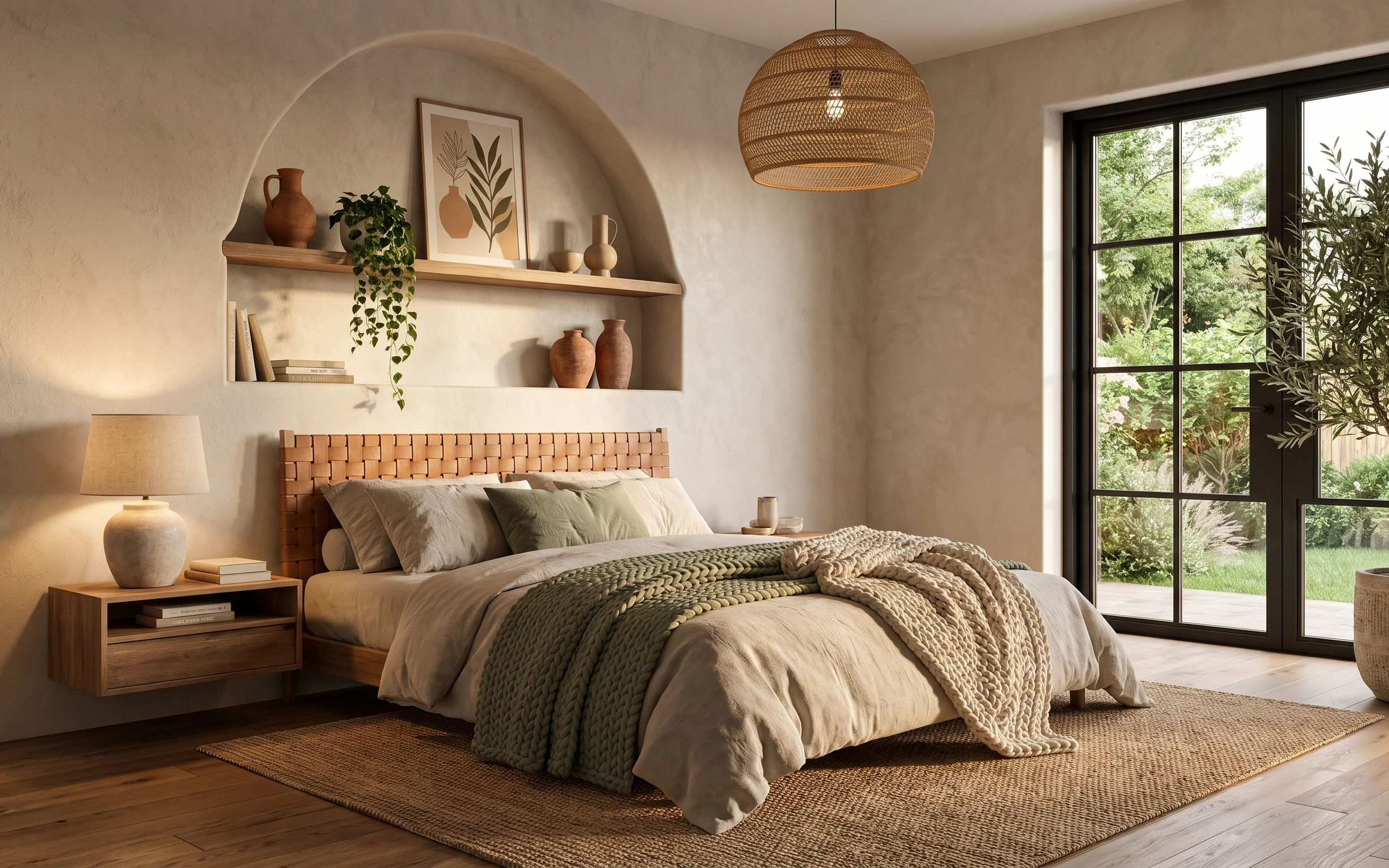
Under $400: earthy-beige bedroom swaps with 7 renter moves
Earthy-beige bedroom refresh for renters: warm rug, wood nightstand, cozy lamp, and easy art. This 7-layer look lands under $400 with rente…
Under $600: earthy bed nook refresh with 7 renter-friendly swaps
Earthy-green and terracotta tones make this bed nook feel pulled-together without landlord changes. This renter-friendly refresh uses 7 swa…
Under $800: layered neutrals bedside vignette refresh
A warm, neutral bedroom bedside vignette made over in a satisfying weekend refresh. This plan targets the rug, curtains, statement wall art…