- Best for
- Weekend shelf refresh
- Cost
- Under $700
- Difficulty
- Moderate
- Time
- 2–5 hours + dry time
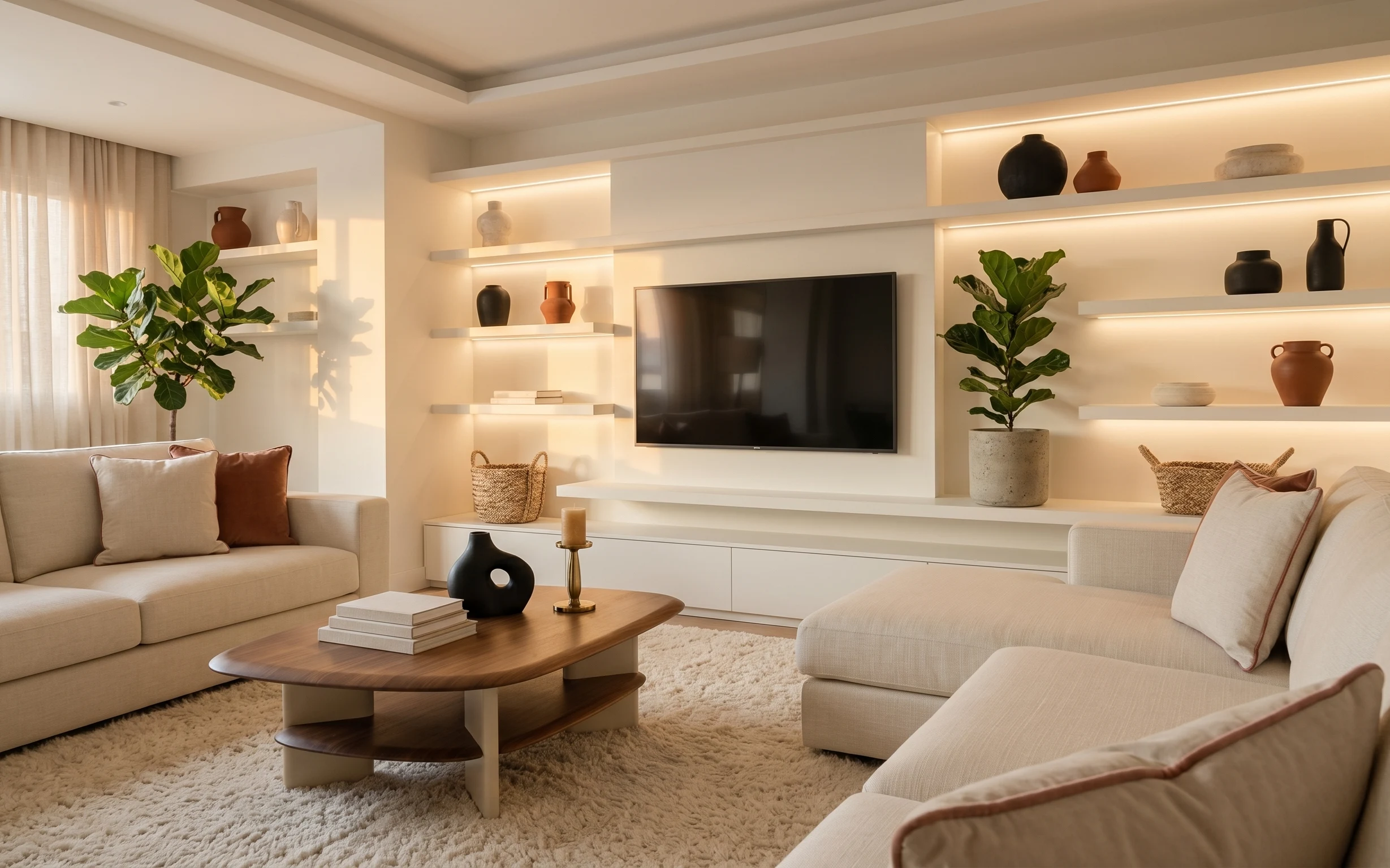
Why walnut-and-linen shelf styling is the shelf reading corner of 2026
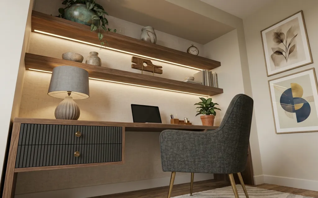
What makes this corner work isn’t just the warm wood shelving—it’s the way the light, textures, and plant styling share the same muted palette. You’ve got that charcoal-gray armchair texture, a gray textured rug anchoring the floor, and a fabric-shaded table lamp softening everything after dark. Even the small decor choices (like the teal ceramic vase) add contrast without going loud. For US homeowners, this kind of refresh is satisfying because you can choose the highest-impact upgrades and still keep it weekend-doable.
I caught myself wanting to add “more stuff” to the shelves right away—more little objects, more height, more everything. Then I stepped back and realized the shelves already have strong lines from the wood and the gentle plant shapes. Once I focused on fewer hero items—rug first, then lamp, then art—the whole corner looked calmer, not emptier. That’s the moment the room clicked for me.
Layer 1 — gray textured area rug ($150) grounds the chair-and-shelf zone
A gray textured area rug in this size range is what keeps the armchair from floating in front of the shelves. In the photo, the rug’s muted tone repeats the charcoal element of the chair while the texture echoes the woven feel of the lamp shade. The obvious alternative is a flat, low-pile rug, but it won’t catch visual crumbs the way texture does. The trade-off with choosing texture: it can hide some light debris better, but you still need a quick vacuum pass to keep it from looking dull.
Pick the rug before the lamp
Rug tone sets the neutrals—then the lamp shade and art can match instead of fighting.
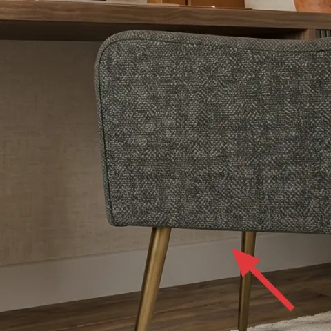
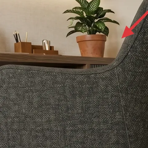
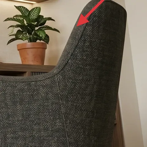
Layer 2 — gray upholstered armchair ($250) adds readable comfort and contrast
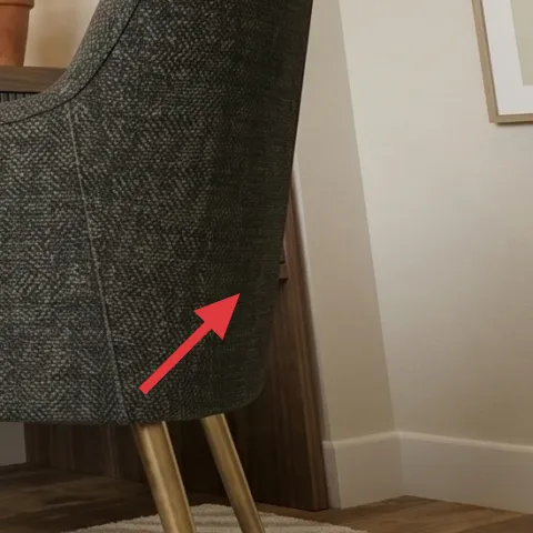
This gray upholstered armchair is the anchor piece because its shape balances the straight-line look of the shelving. You can see how the chair’s textured fabric ties back to the rug’s surface, creating a consistent “soft” layer even with all the wood. If you go the obvious route and choose a smooth fabric chair, it can feel formal against the natural wood, especially in warm light. The trade-off here is that textured upholstery can show lint less than you fear, but you’ll still want to brush it once in a while to keep the weave looking fresh.
Let the chair be the main dark
Keeping one consistent dark element prevents the corner from looking cluttered.
Layer 3 — plug-in table lamp with fabric shade ($60) makes the corner livable at night
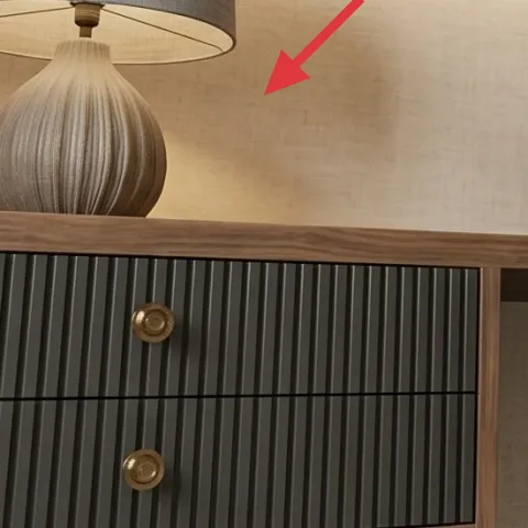
A plug-in table lamp with a fabric shade is what turns this from “pretty photo” to “I could read here.” The shade in the hero image creates a softer pool of light than a bare bulb, and it keeps the wood shelving from looking too harsh. The obvious alternative is an LED spotlight or a lamp with a glossy shade, but those often create glare and hot spots on art and glass. With this choice, you’re trading maximum brightness for comfort—exactly what a reading corner needs.
Avoid cool-white bulbs
If the lamp reads too blue, the warm wood tones start to look gray instead of cozy.
Layer 4 — teal ceramic vase on upper shelf ($35) adds one bold color note
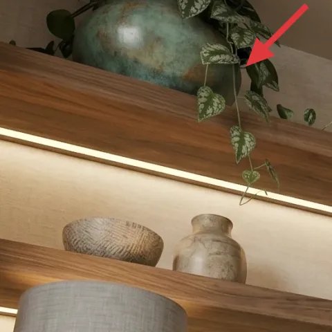
That teal ceramic vase is the color punctuation mark. It’s small enough to feel curated, but bold enough to stop the shelves from becoming one-note “warm wood + beige wall.” The hero also uses natural greens nearby, so the teal sits comfortably between the plant and the walnut tones. The tempting alternative is another neutral vessel, but neutrals blend and the shelf styling loses contrast. The trade-off with using a statement color: you’ll want just one (maybe two) color hits total, so the rest of the decor stays quiet.
Repeat the color once elsewhere
Use the teal again (even lightly) so it feels intentional, not accidental.
Layer 5 — terracotta planter pot ($40) gets a fresh finish
Make it instead of buying it
This terracotta planter pot gets a painted update so the plant looks styled even when the shelf decor changes around it.
Materials
- Sandpaper (medium grit) — 1 sheet — $6
- Spray primer — 1 small can — $8
- Interior/exterior acrylic paint — 1 small can — $10
- Foam brush or small angled brush — 1 — $4
- Clear matte sealer — 1 small can — $5
Steps
- Scuff the planter lightly with medium-grit sandpaper to rough up the surface.
- Wipe off dust with a dry cloth, then spot-clean any fingerprints.
- Spray primer in thin, even coats; let it dry fully.
- Paint the base color with 2–3 thin coats, letting each coat dry to the touch.
- Use the foam brush to refine edges around the rim and any raised texture.
- Finish with a clear matte sealer for durability and wipe-ability.
Total DIY cost: $33 — saves about $7 over buying.
Match the planter to the room’s undertone
When the finish echoes the wall’s warm beige and the lamp’s shade, everything looks calmer together.
Layer 6 — green indoor plant in terracotta pot ($50) brings movement and height
Plants are doing double duty in the hero: they soften the hard lines of the shelving and they add a second texture rhythm next to the rug and lamp shade. The green leaves also help the teal vase and warm wood read as a cohesive palette rather than separate “items.” The obvious alternative is skipping a plant entirely, but then the shelves can feel staged and a little too symmetrical. The trade-off: real plants mean watering, but if the light is limited, choosing a hardy indoor variety prevents the corner from looking sad.
Angle the leaves toward the light
Rotate the pot occasionally so the plant keeps its shape.
Layer 7 — framed botanical wall art print (right) ($80) seals the wall with calm contrast
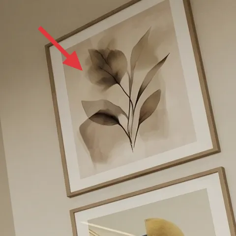
The framed botanical wall art print on the right does what great wall decor should: it adds movement without adding noise. The hero’s botanical shapes echo the plant’s organic forms, while the off-white mat keeps everything aligned with the light beige wall. The alternative is bold abstract art, but in a corner with wood, lamp glow, and textured upholstery, a bold print can tip the whole room into “too much.” The trade-off with botanical art is scale—go slightly larger than you think you need so it reads from the armchair, not just up close.
Keep frames consistent
A matching frame finish makes the two right-side prints feel like one collection.
The cost, layer by layer
| Layer | Item | Cost |
|---|---|---|
| 1 | gray textured area rug | $150 |
| 2 | gray upholstered armchair | $250 |
| 3 | plug-in table lamp with fabric shade | $60 |
| 4 | teal ceramic vase on upper shelf | $35 |
| 5 | terracotta planter pot (DIY) | $40 |
| 6 | green indoor plant in terracotta pot | $50 |
| 7 | framed botanical wall art print (right) | $80 |
| Total | $665 | |
If you want a cheaper version, swap the upholstered armchair and rug for thrifted or off-season deals, then focus budget on the lamp shade and one framed botanical print. Even keeping the plant and teal vase, the corner still reads cohesive when the big visual pieces are priced reasonably.
What worked, what didn't (across the whole room)
The best results came from repeating textures (rug weave, upholstery, fabric shade) and keeping the color palette tight: warm wood, light beige, charcoal gray, and a single teal accent. The corner also looked more “real-life” once the plant and wall art both echoed organic shapes.
What worked
- The gray textured rug made the chair feel anchored instead of visually floating in front of shelves.
- The fabric-shade lamp softened the wall area and made the reading corner usable after dark.
- The teal ceramic vase added contrast without overpowering the warm walnut and beige backdrop.
- The indoor plant added movement and a second texture layer near the teal and wood.
- The botanical framed print echoed the plant’s organic shapes for a calmer wall composition.
- The charcoal-gray chair delivered clear contrast against the warm wood shelving.
What didn't
- Over-styling the shelves with multiple small objects made the corner feel busy fast.
- A cooler, whiter light bulb would have pulled the warm wood toward gray, fighting the palette.
- If the botanical print were too small, it would read as decoration instead of a finished wall element.
- A glossy shade or hard, reflective finish on decor would create glare near the art.
- Skipping rug texture would make the chair look heavier and less intentional against the light wall.
What we'd skip if we did it again
Skip replacing the chair with something too smooth. The textured upholstery is part of the visual language here, and smooth fabric can make the whole corner feel more formal than intended against warm wood shelves.
Skip adding more than one statement color on the shelves. Teal already gives you contrast with the plant greens; if you add another bold color, the corner starts to compete instead of calm down.
Skip a small framed print that doesn’t read from the armchair. This is the kind of wall that needs scale—botanical lines look best when they’re big enough to feel like a designed moment, not a quick afterthought.
Frequently asked
How long does this shelf reading corner refresh take on a weekend?
Most homeowners can finish the non-DIY swaps in about 2–3 hours: rug placement, lamp positioning, plant styling, and framing tweaks. The painted terracotta planter is the only piece with extra waiting—expect dry time between primer, paint, and the clear sealer. Plan a little buffer so you’re not rushing the final coat; it’s the difference between “good” and “clean-looking.”
If I rent, can I do the same look?
Yes—just keep everything removable. Swap the rug and lamp freely, and choose wall art that hangs with picture hooks or existing anchors rather than new hardware. For the painted planter, you can do it even while renting because it’s a small object. If your shelving is built-in, focus on decor placement and lighting bulb temperature instead of changing the structure.
What if my corner is smaller or my chair won’t fit the same way?
If the space is tighter, keep the same recipe but scale down the rug size and choose a narrower chair. The key is still the relationship between the chair and the rug edge—so the chair “lands” on the rug when you pull it in. For wall art, go closer to large/medium rather than tiny; small prints can make a small corner feel even smaller.
Where should I shop to keep costs under control?
For the lamp, look at big-box home lighting plus thrift shops for shades or complete bases. Rugs and framed prints are often cheaper at end-of-season sales, and plants can be found at grocery stores on clearance. If you’re pricing an armchair, set a target first, then check resale platforms for textured upholstery—texture is hard to recreate cheaply.
What’s the biggest mistake people make in this room type?
The most common mistake is over-styling shelves with too many small objects. When you have warm wood, a fabric lamp, and an upholstered chair all in the mix, the room needs a calmer visual hierarchy: one anchor texture, one contrast color, one plant moment, and one wall focal point.
More in Living Room

Under $700: warm walnut shelf corner refresh with 7 layers
A warm walnut shelf reading corner refresh that leans japandi: soft light, grounded neutrals, and plant styling. This makeover uses 7 budge…
Under $500: warm beige-and-black sofa-and-shelf lounge refresh
A warm neutral sofa-and-shelf lounge is all about soft layering: a plush beige rug, airy cream curtains, and a few earthy decor swaps that …
Under $400: renter-friendly living room layered refresh
A warm, layered living room look—built from renter-friendly swaps—comes in at under $400. This refresh leans on a textured rug, a cream kni…