
- Best for
- bathtub nook styling
- Cost
- $800 max plan
- Time
- 2 weekend days
- Difficulty
- Moderate
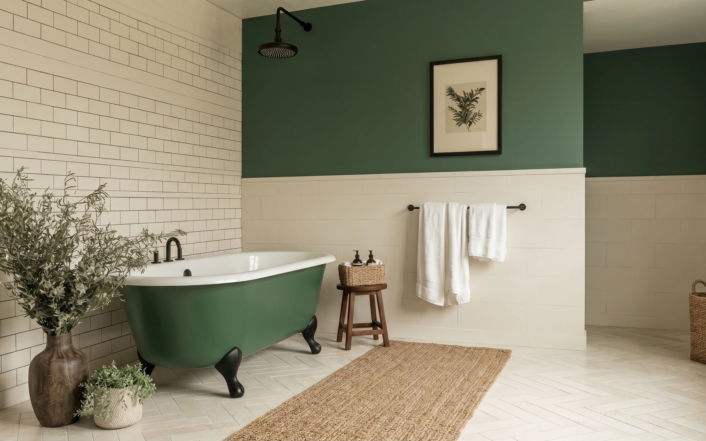
Why sage-green tile and black hardware is the bathtub nook of 2026
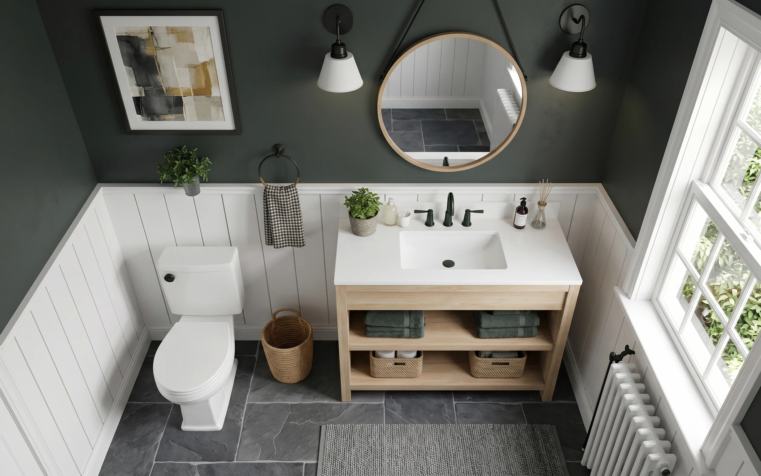
The look starts with the same two textures your eye keeps traveling across: crisp white subway tile and the soft, matte sweep of sage-green paint above it. Then the bath itself (that green tub) becomes the color anchor, while warm materials—like a brown area rug and a wood stool—stop everything from feeling too crisp. The framed botanical wall art adds vertical calm, and the greenery keeps the whole corner from going sterile. For homeowners, the best part is choosing one permanent-feeling change (paint) and supporting it with swaps you can do this weekend.
I almost made the classic mistake of treating “bathroom decor” like a straight-line checklist: towels here, art there, done. But once I started building layers around the tub silhouette, the room finally looked finished instead of staged. The stool is the unsaid organizer, the rug is the boundary underfoot, and the wall art is what makes the painted section feel deliberate. That’s the order that changed how I shop—less random matching, more purpose per item.
Layer 1 — brown area rug 5×7 ($200) Softens the tile underfoot
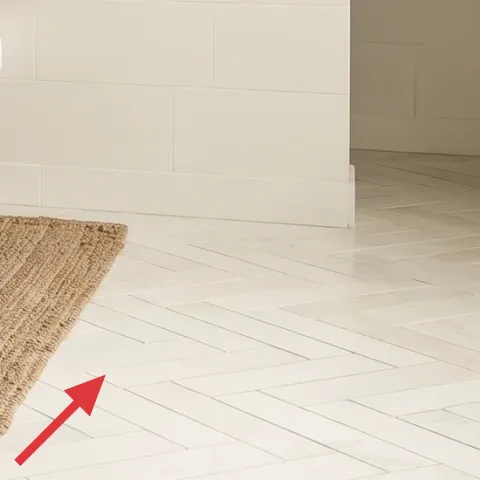
That brown area rug does three jobs at once: it warms up the white tiled floor, it visually grounds the bathtub, and it gives the stool-and-towels moment a “landing pad.” Jute-leaning texture also works especially well with tile because it creates contrast—smooth grout lines vs. woven fibers. The trade-off is practical: a natural-fiber look means you’ll want to blot spills quickly, not soak and scrub. Still, it’s the quickest way to make a tile-heavy bathroom feel lived-in rather than showroom-clean.
Choose a rug that reaches the tub’s “foot” zone
If the rug stops short of the tub footprint, the corner reads disconnected. Aim for at least the front third of the tub length to sit over warm rug color.
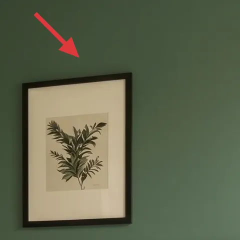
Layer 2 — framed botanical wall art ($80) Brings vertical calm to the sage wall
The framed botanical wall art is the visual punctuation on the green painted upper wall—positioned high enough to feel intentional, but still close to the eye’s path when you’re standing near the tub. Botanicals also pair nicely with earthy-neutrals styling because the leaf shapes echo greenery without competing with it. A bigger alternative would be a gallery wall, but that can overwhelm smaller bathroom sightlines. I like this single-print approach because it gives you one clear focal point and keeps the tile pattern from feeling busy.
Keep the frame size in scale with the wall paneling
Here, the art sits inside the painted field above the tile. That spacing makes the print look “built in,” even when it’s just hanging with a couple of screws.
Layer 3 — wooden stool ($80) Creates a mini display surface
A wooden stool is doing quiet, practical work: it gives you a stable surface for small bathroom items and it adds warmth between white tile and the darker hardware. Visually, the stool bridges the tub color and the rug color, so the corner doesn’t look like separate pieces. The obvious alternative is a small wall shelf, but shelves can feel cramped in a narrow nook and they often look clutter-prone. This stool reads like furniture, not storage, and that matters in a bathroom because it’s where “stuff” naturally collects.
Use the stool like a styled vignette, not a catchall
Keep the top to two elements (a basket plus a small grouping) so the corner stays airy instead of piled.
Layer 4 — woven basket ($50) Adds texture you can reuse
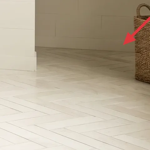
The woven basket is an easy texture boost that also solves the “where does it go?” problem. In this corner, it reads like a natural-material accessory that belongs next to the rug and the greenery, and it helps break up the straight lines of the tile and painted sections. I’d skip anything too glossy here—matte woven reads more intentional with sage paint and white tile. If you want the styling flexibility, this is the kind of piece you can empty, refill, and restyle without buying new decor every time.
Match the basket tone to the rug, not the towels
When the basket and rug share the same warm undertone, the whole corner feels cohesive even with white textiles.
Layer 5 — large vase with greenery ($30) Makes the tile feel less sterile
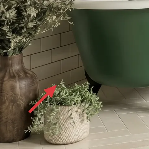
The large vase with greenery acts like a softening filter between the hard lines of subway tile and the crisp tub edge. Its muted, earthy color and leafy texture keep the palette calm, and it also makes the botanicals on the wall feel connected instead of random. The trade-off is upkeep: real greenery means trimming and occasional refresh, while faux greenery still needs fluffing to look realistic. Either way, this is the kind of accessory that photographs well and, more importantly, makes the bathroom feel lived-in during the day.
Cluster greenery with one smaller pot for depth
That second, smaller planter beside it adds dimension. Even if you swap plants later, the “two-scale” look stays consistent.
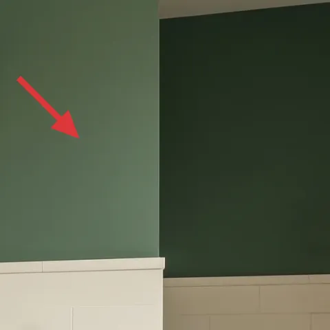
Layer 6 — sage green paint on upper wall ($70) Tie the whole nook to one color story
Painting the upper wall a sage green shade is what turns a basic tile-and-tub setup into a cohesive nook. It’s also the move that makes everything else look curated—your rug’s warmth and the botanical print’s leaf tones suddenly belong to the same palette. A cheaper alternative is peel-and-stick wallpaper, but it rarely looks as smooth and permanent as paint on a large painted field. The trade-off is time: you’ll need to tape, cut in, and apply a clean second coat for an even, matte finish.
Don’t skip wall prep on tiled-adjacent surfaces
Even small dust or moisture near tile edges can cause uneven paint coverage. Clean the area and let it fully dry before you roll.
Layer 7 — green bathtub ($250) Color anchor for the corner
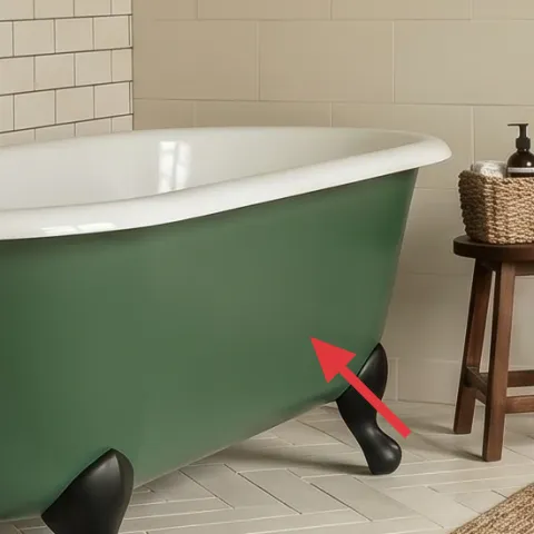
That green bathtub is the anchor color, and it’s what gives the whole corner its personality. Because it’s a confident color in a tile-heavy room, everything else can stay simple: warm brown textiles, cream whites, and dark hardware. The obvious alternative would be to pick a neutral tub, but this color-forward choice is exactly what makes the nook feel styled instead of generic. The trade-off is that you need repeat accents—like sage paint and botanical art—so the tub doesn’t feel isolated.
Use small repeats, not full matches
Repeat “sage” through paint and leafy art shapes, but keep towels and accessories more neutral to avoid a one-note look.
The cost, layer by layer
| Layer | Item | Cost |
|---|---|---|
| 1 | Brown area rug 5×7 | $200 |
| 2 | Framed botanical wall art | $80 |
| 3 | Wooden stool | $80 |
| 4 | Woven basket | $50 |
| 5 | Large vase with greenery | $30 |
| 6 | Sage green paint on upper wall | $70 |
| 7 | Green bathtub | $250 |
| Total | $760 | |
If you want a cheaper version, prioritize the rug and framed print, then scale down accessories (a smaller vase or simpler basket). Skip the most expensive anchor swap and keep the tub and hardware unchanged while you refinish with paint and textiles.
What worked, what didn't (across the whole room)
This corner works because the color and texture are repeated: sage paint supports the green tub, while the rug and woven basket add warmth against white tile. The single framed print keeps the wall from feeling busy, and the stool gives you a practical surface that also reads as decor.
What worked
- The brown rug hides tile chill and makes the tub zone feel “finished” instead of temporary.
- The framed botanical print matches the greenery palette without requiring a full gallery wall.
- The wooden stool adds warm material contrast to the white subway tile.
- The woven basket repeats texture so the corner looks styled, not cluttered.
- The sage-green upper wall pulls the tub color into the rest of the room.
- Greenery softens hard lines and keeps the bathroom from reading sterile.
What didn't
- Too many small items on the stool turns the nook into a visual mess fast.
- Glossy decor finishes fight the matte look of painted sage and make the tile feel sharper.
- A rug that stops short of the tub footprint makes the space feel like separate zones.
- Trying to match towels exactly to the tub shade can flatten the palette instead of layering it.
- Skipping wall prep near tile edges can lead to uneven paint coverage.
What we'd skip if we did it again
Skip a matching “set” look—coordinated baskets, matching towel containers, and identical-toned decor tend to make bathrooms feel staged. In a tile room, the better move is mixing one anchor texture (woven) with one hero color (sage) and leaving the rest neutrals.
Skip the impulse to go bigger with wall decor. In this bathtub nook, a single framed botanical print reads calm and intentional, while extra pieces compete with the tile pattern. Keep the wall choice simple so the painted field can breathe.
Skip a rug with a very high-contrast pattern. When the floor has a lot of lines, a calmer rug surface supports the corner better and makes daily life easier—less “spot every speck” energy, more lived-in ease.
Frequently asked
How long does a refresh like this usually take?
A realistic timeline is about 6–10 hours across two weekends. Rug and accessories (stool, basket, vase) are quick—usually 2–3 hours total. The biggest time block is painting prep and drying time, plus careful cutting in along the tile line.
If I rent, can I still get this look?
Yes, focus on the renter-friendly layers: the rug, framed botanical wall art, stool styling, and the greenery/vase. For the wall color, you can use removable wallpaper on one painted field or rely on a temporary paint alternative like a removable color wash panel (if your landlord allows). Keep permanent changes minimal.
What if my bathroom is smaller than this one?
Lean into scale. Choose a smaller rug (or a runner-length rug) so it doesn’t overwhelm the floor plan, and keep to one framed print rather than multiple pieces. A compact stool footprint matters, too—aim for enough surface to style towels and one small container without creating tight walking clearance.
What if my bathroom has brighter or darker tile?
Adjust the sage paint undertone rather than abandoning the concept. Warmer tiles often pair better with a slightly more yellow-leaning sage, while cooler white tile can handle a greener sage. The botanical art and greenery should echo the undertone, not fight it.
Where’s the best place to shop for the rug, stool, and art?
For the rug, look for natural-fiber or jute-look options at home goods stores and online marketplaces with clear rug-size listings. Wooden stools are widely available in basic heights—choose one that matches towel-bar height visually. For art, search for a single framed botanical print in a simple dark frame.
What’s the biggest mistake people make in this kind of bathtub nook?
Overstuffing. In small tile rooms, it’s easy to turn the stool into a junk shelf and accidentally compete with the tile pattern. Keep the styling surface limited—one basket plus one small set of items—so the rug, wall art, and sage color do the decorating.
More in Bathroom
Under $800: budget bathtub nook refresh with 7 layers
A weekend bathroom refresh that leans on sage-green upper-wall color, warm textiles, and a framed botanical print. This bathtub nook makeov…
Under $250: vanity wall refresh with spa-green details
A spa-green vanity wall makeover for shared housing, done with move-safe swaps: a refreshed framed print, arched mirror styling, textured t…
Under $700: bathroom vanity wall refresh with 7 layers
A 7-layer weekend refresh for a bathroom vanity wall—framed art, a round mirror, pendants, and softer textiles. Total project cost comes in…