- Best for
- Warm neutrals that still feel lived-in
- Time
- One weekend (about 4–7 hours)
- Total cost
- $750
- Renter-safe
- Mostly yes (shelf install may need anchors)
Why warm beige-and-terracotta palette is the bedroom refresh of 2026
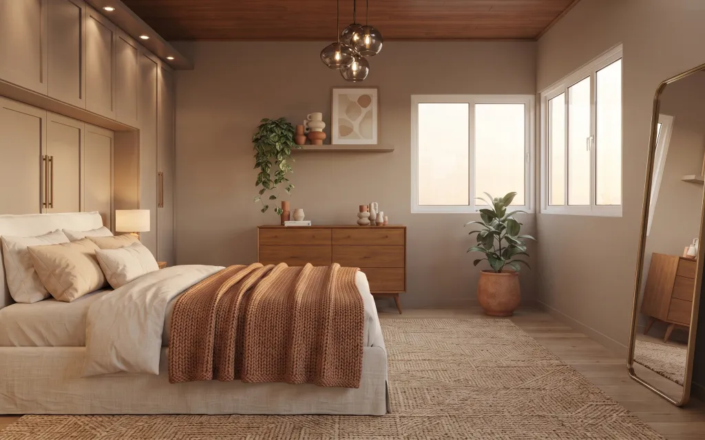
A bedroom can look “done” fast when the textures speak the same language. Here, warm beige walls and light wood floors keep things calm, while a textured beige rug anchors the bed in one visual footprint. The rust-brown knit throw adds depth without pulling the palette in a new direction, and the framed abstract print gives your eye a focal point above the floating shelf. For a weekend project mindset, this combination is achievable because it relies on swap-and-style moves (rug + textiles + one curated wall moment) rather than big structural work.
I almost bought a whole new nightstand lamp because the existing one looked “fine,” but it didn’t match the rest of the room’s warmth. What changed my mind was seeing how much the lamp and the shelf vignette affect the mid-height zone—where your eyes land when you’re sitting up. Once the rug and throw were in place, everything else suddenly had an actual job: repeat the warm tones, add height, and keep the bed looking intentional.
Layer 1 — textured beige area rug 5×7 ($200) Texture under the bed
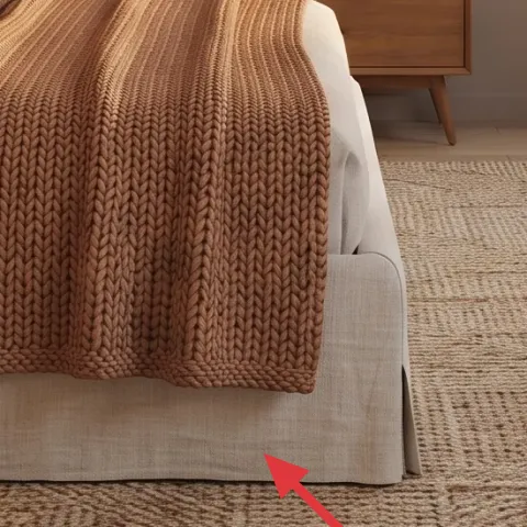
A textured beige 5×7 area rug does most of the heavy lifting for a bedroom that feels unfinished. In this photo, it shows a woven, slightly varied surface that makes the light wood flooring feel more “finished” and gives the bed a grounded base. The reason to choose textured over flat is simple: it hides wear and looks good even when you’re not perfectly vacuuming day-to-day. A common alternative is a smooth, low-pile rug, but that tends to look dull next to knit and wood grain. This one also makes the rust throw read richer instead of harsher.
Use rug size to control the bed’s footprint
Let the front edge of the rug sit under the bed’s front third so the whole setup looks anchored, not floating.
Layer 2 — rust-brown knit throw blanket ($60) Warm depth over the white pillows
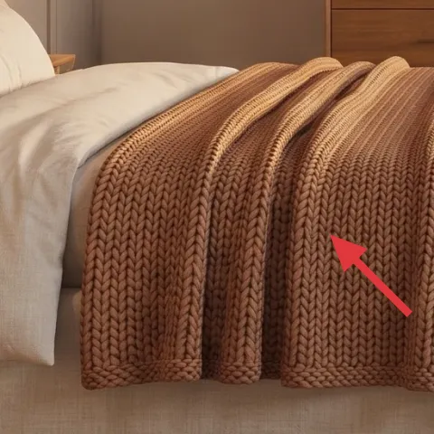
The rust-brown knit throw blanket is the quickest way to add depth without changing the room’s palette. In the hero image, it drapes over the edge of the bed and introduces a chunky texture that echoes the rug’s woven surface. That matters because bedrooms usually look “flat” when everything is either smooth (pillows) or only one texture shows up (like the rug). The trade-off with throws is it can look “too styled” if the color is loud—so staying in rust/terracotta keeps it grounded with the wood tones. This is also easier than repainting, and it looks finished right away.
Keep knit folds loose, not perfectly fanned
Random drape beats rigid spacing—knits already create visual movement.
Layer 3 — framed abstract wall art print ($80) A calm focal point above the shelf
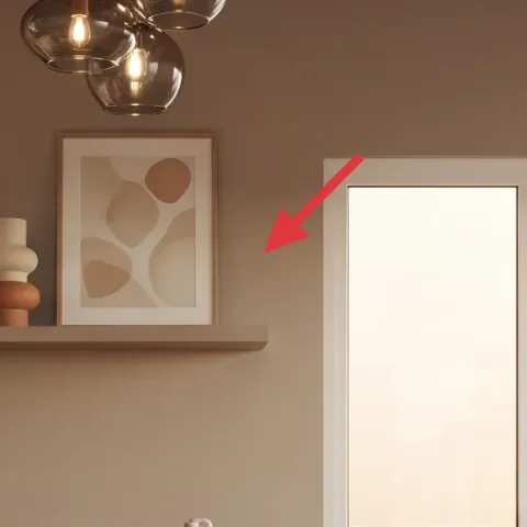
The framed abstract wall art print above the floating shelf gives the room a focal point at eye level, which is why the space feels intentional instead of just “decorated.” The print’s warm neutral shapes match the beige walls and the terracotta accents, so it supports the palette instead of competing with it. Choosing a framed print over a shelf-only moment is a smart trade-off: shelves are great for styling, but art makes the whole wall feel designed. If the obvious alternative is a bold poster or a landscape, it can skew the room cooler or louder than the wood tones. Keep it simple and warm for a more cohesive bedroom refresh.
Measure the wall zone, then center the art
Center the print above the shelf line so it visually “lands” where your eyes naturally rest.
Layer 4 — terracotta pot with potted plant ($40) DIY paint for a calmer look
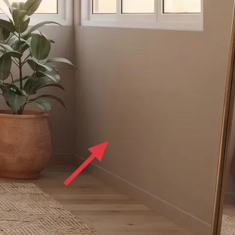
The terracotta pot with a potted plant adds life, but the pot color has to play nice with everything else. In the photo, the pot’s warm tone ties into the rust knit throw and the wood cabinetry, which is exactly the relationship you want when you’re building a cohesive bedroom refresh. If your pot reads too orange (or too brown), it can pull focus away from the bed. The DIY move here is painting a pot you already have (or grabbing a basic unglazed one) so the color lands closer to the room’s warm-beige palette. You keep the greenery while making the overall tone feel smoother.
Make it instead of buying it
Chalk-paint a plain terracotta planter pot so it matches the room’s warm beige and rust tones.
Materials
- Unglazed terracotta pot (medium) — 1 — craft store — $16
- Chalk paint (warm neutral/greige shade) — 1 small jar — craft store — $9
- Clear matte wax or sealer — 1 — craft store — $8
Steps
- Clean the terracotta pot with a damp cloth and let it dry fully.
- Lightly sand the surface for better paint grip, then wipe off dust.
- Apply the first thin coat of chalk paint, covering evenly.
- Let the coat cure until dry to the touch, then apply a second coat.
- After the final coat cures, buff gently for a smooth, velvety finish.
- Seal with matte wax/sealer and allow it to cure per the product directions.
Total DIY cost: $33 — saves about $7 over buying.
Layer 5 — floating wood shelf plank ($10) Height that makes the wall feel taller
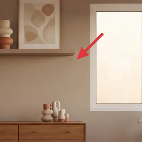
That floating shelf plank above the dresser is small in scale, but it changes the whole wall rhythm by adding a mid-to-high styling zone. In this bedroom image, the shelf creates space for decor that repeats the room’s warm materials—ceramics, books, and the plant—without requiring more furniture. The reason it works over a second picture frame is that shelves give you layering options: tall items, short objects, and a natural “staging” surface. The trade-off is installation: you do need a basic measurement-and-level moment, but a simple shelf plank is a quick, weekend-friendly fix. It also stops the wall from feeling like it’s all bed height and no vertical interest.
Don’t skip leveling
If the shelf is even slightly off, the ceramics and frames will look crooked the whole time you’re standing there.
Layer 6 — dresser with multiple drawers ($300) Storage that looks like styling
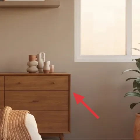
A dresser with multiple drawers grounds the bedroom and gives the styling objects a proper home. Here, the dresser’s warm wood tone works like a “middle anchor” between the beige textiles and the warmer terracotta notes. The reason to keep this piece instead of chasing another matching furniture set is that the wood color already aligns with the lamp and the bed’s overall warmth. You can refresh the look with how you style the top—books, ceramics, and a few intentional objects—so it reads designed rather than cluttered. The alternative is a clutter-prone surface with too many small things, which makes the shelf and art feel busy instead of curated.
Style the top in height groups
Cluster taller items behind shorter ones so the shelf and dresser tops don’t compete visually.
Layer 7 — beige-shaded table lamp on nightstand ($60) One warm light source near the bed
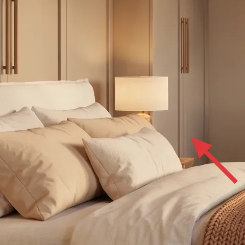
The beige-shaded table lamp on the nightstand is doing quiet work even in a daylight photo. Its shade color keeps the light warm and soft, which matters in bedrooms where you’re typically relaxing and winding down. In this setup, the lamp also balances the vertical lines of the headboard area and helps the whole scene feel cohesive with the beige rug and cream pillows. The trade-off with changing lamp styles is that cheap lamp shades can look oddly thin or yellow once lit, so keeping the shade neutral is safer. This is also more impactful than buying tiny decorative items—lighting changes how the textures read when the room is dim.
Match shade color to your textiles, not your floor
A cream or beige shade keeps the room warm without making wood tones look too orange.
The cost, layer by layer
| Layer | Item | Cost |
|---|---|---|
| 1 | Textured beige area rug 5×7 | $200 |
| 2 | Rust-brown knit throw blanket | $60 |
| 3 | Framed abstract wall art print | $80 |
| 4 | Terracotta pot with potted plant (DIY) | $40 |
| 5 | Floating wood shelf plank | $10 |
| 6 | Dresser with multiple drawers | $300 |
| 7 | Beige-shaded table lamp on nightstand | $60 |
| Total | $750 | |
A cheaper variant is to swap the dresser styling upgrade for a simpler budget dresser look, and choose a smaller 5×7 rug with a similar woven texture. Keep the same rust knit throw and framed abstract print, because those are the visual “anchors” that stop the room from looking accidental.
What worked, what didn't (across the whole room)
Warm neutrals and layered texture made the bedroom feel calmer and more intentional, especially once the rug and throw were placed. The wall moments (art + shelf) created eye-level structure, so the decor didn’t look random.
What worked
- The beige woven rug made the bed zone look anchored instead of visually floating above the flooring.
- The rust-brown knit throw added texture depth that matched the rug’s weave.
- The framed abstract print gave the floating shelf a cohesive focal point at eye height.
- The terracotta planter tone echoed the throw, keeping the palette consistent.
- The floating shelf added vertical interest without overcrowding the dresser top.
- The beige-shaded lamp softened the room’s contrast when lighting shifted from daylight to night.
What didn't
- If the plant pot is too bright orange, it competes with the rust throw instead of blending.
- A too-smooth rug texture made the room feel flat next to knit and wood grain.
- Overstyling the dresser top with tiny items made the shelf and art feel busy together.
- Skipping lamp placement (too far from the bed) reduces the “cozy” effect of warm shade light.
- An off-center framed print pulls focus away from the shelf vignette.
What we'd skip if we did it again
Skip the matching set approach where everything comes from the same collection. In this room, the mix of textures (woven rug, knit throw, warm ceramics) is what makes it look lived-in, not showroom-matched.
Skip replacing furniture first. The dresser and nightstand can stay, and the room still looks updated because the rug, textiles, and one art moment change the visual hierarchy fast.
Skip a high-contrast accent color unless it already appears in the art or ceramics. With warm beige walls and wood tones, sticking to terracotta and rust keeps the bedroom reading cohesive.
Frequently asked
How long does this bedroom refresh take on a weekend?
Most of the time is hands-on styling: putting down the rug, draping the knit throw, and positioning the lamp and decor. Expect about 1–2 hours for a careful shelf setup and art placement, plus time to style the dresser top in height groups. If you DIY the planter paint, budget an extra block for dry/cure time—then you’re back to styling the next day if needed.
If I rent, what parts are safest to change?
Textiles and plug-in lighting are the easiest changes because they don’t require major alterations. A rug, throw, and framed print can all come with you. For the floating shelf, the safest version uses proper wall anchors or command-style options if they’re appropriate for your wall type; otherwise, swap to a freestanding shelf option. The plant pot DIY is also fully renter-friendly.
My bedroom is smaller—should I downsize the rug or the art?
For smaller bedrooms, go one step down in rug size while keeping the bed anchored on top. The key is the front edge of the rug should still sit under the bed’s front third so the bed reads grounded. For wall art, keep the print centered above the shelf and avoid going too large—if the art overpowers the shelf area, the whole wall starts to feel cramped.
What if my walls aren’t beige or my wood tones are cooler?
Warm neutrals still work, but you may need to shift one direction: choose the throw and planter tones slightly deeper (more rust than pinky terracotta) and pick art with warm-beige undertones. A lamp with a beige shade helps unify the color temperature. If your wood reads very cool, lean on the rug texture and knit to bring warmth through material, not paint.
Where should I shop for the most similar look without overspending?
For the rug, focus on texture first—woven beige options are often cheaper than matching “sets.” For the framed abstract print, look for 16×20-style sizes to keep it easy to center. Lamps and planters can be found in home stores and discount home sections; the DIY planter update is the budget-friendly move that keeps the palette cohesive.
Biggest mistake to avoid in a bedroom refresh like this?
Overstyling the dresser and shelf. When there are too many small objects, the shelf vignette competes with the framed print and makes the whole wall feel busy. Instead, keep a simple stack of 3–5 items total and arrange by height—tall behind, short in front—so the warm materials look intentional.
More in Bedroom
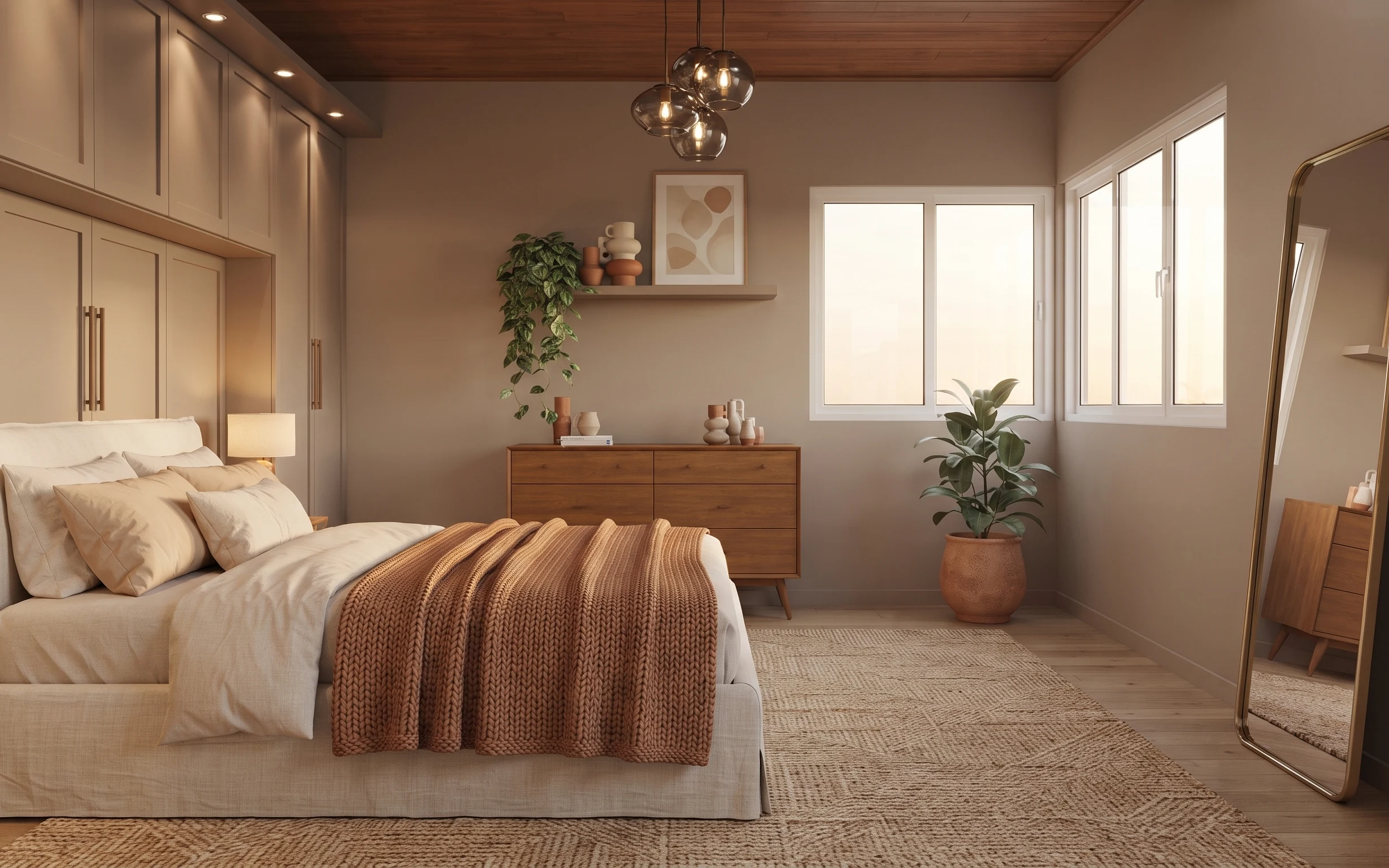
Under $800: weekend bedroom refresh with warm neutrals
A warm beige-and-rust bedroom refresh that reads calmer and more intentional in one weekend. This $800 plan focuses on a textured 5×7 rug, …
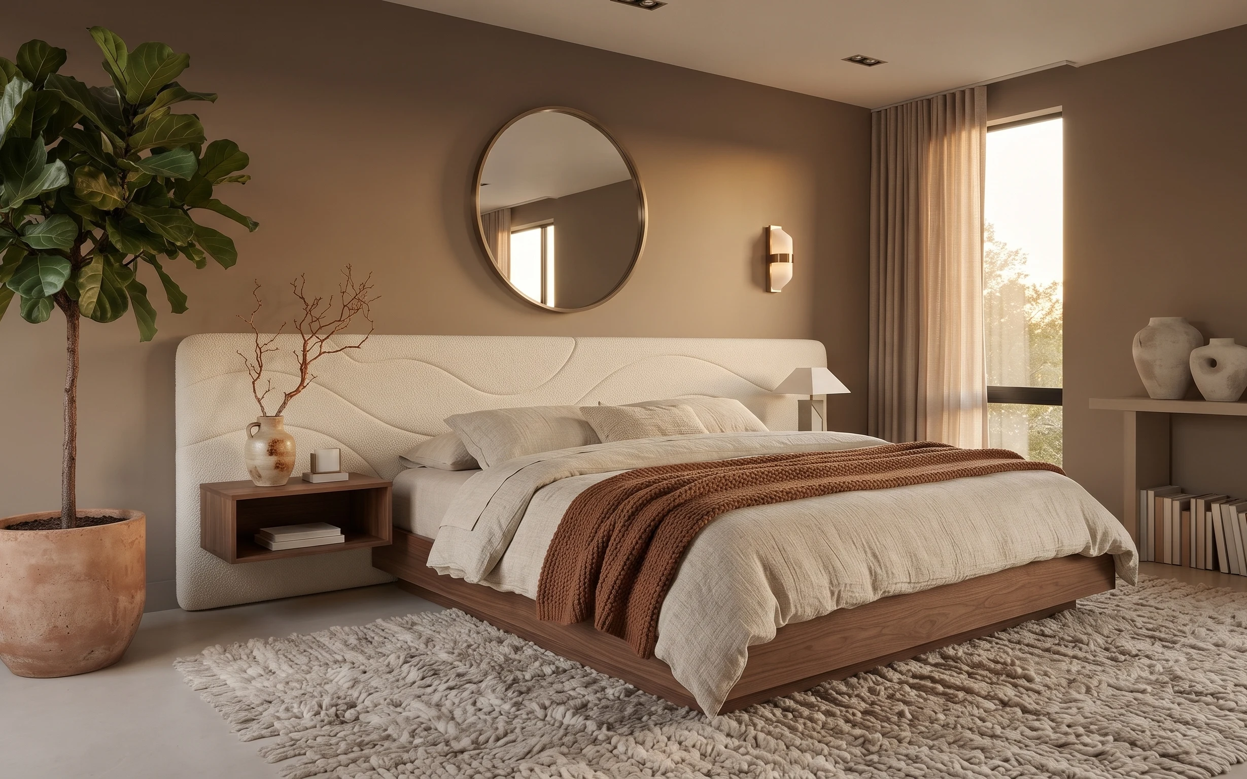
Under $700: warm taupe-and-cream bedroom refresh with 7 layers
A warm taupe-and-cream bedroom refresh with 7 budget-friendly upgrades: a cleaner mirror placement, softer window curtains, and a cozier ru…
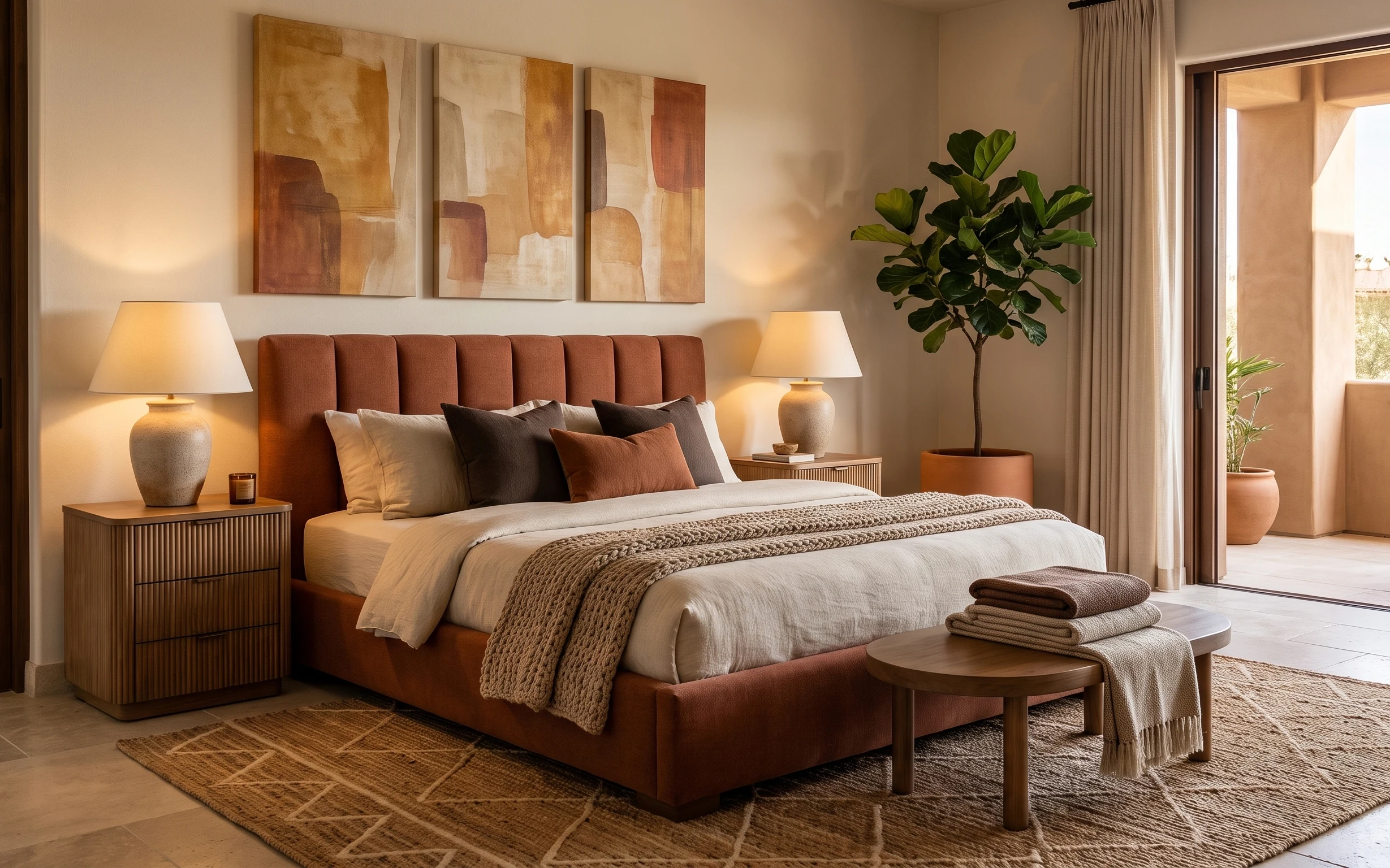
Under $600: warm modern bedroom swaps with 7 move-ready layers
A warm modern bedroom refresh built for shared-housing moves: 7 renter-safe swaps using textiles, plug-in lighting, and wall art. Target to…