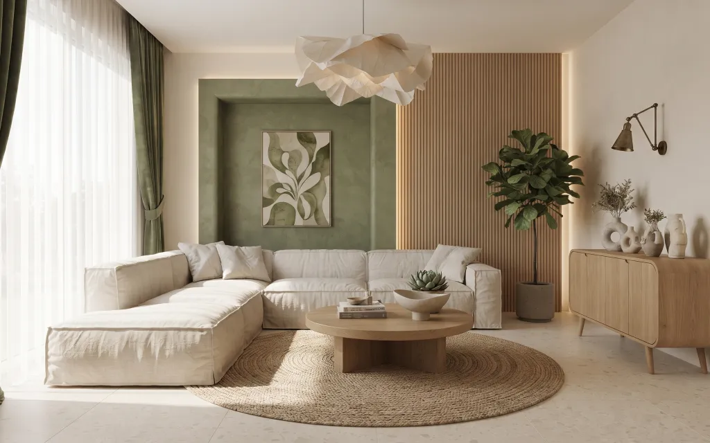
- Best for
- A calm japandi sofa corner
- Cost
- Under $1000
- Difficulty
- Moderate
- Time
- One weekend
Why olive-and-cream palette is the sofa corner of 2026
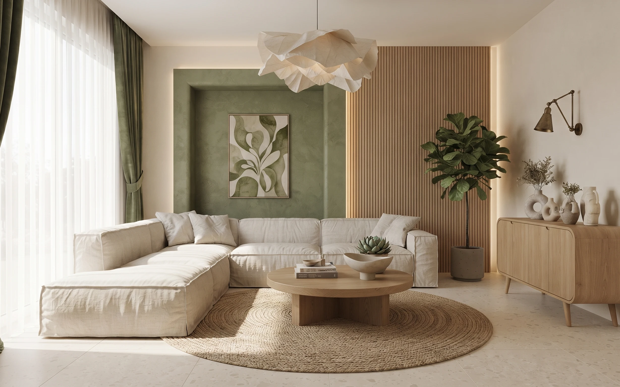
The easiest way to make a living room feel “put together” is to choose one family of materials and repeat it in a few places. In this photo, the light tile floor and pale sofa give you a clean base, then the round jute rug adds texture you can feel with your eyes. Olive curtain panels bring weight and a little drama near the windows, while the framed botanical print pulls the greenery theme forward. This mix works for homeowners who want high impact without demolition—swap a few key pieces and the whole corner reads styled.
I’ve made the mistake of buying cute decor first and then realizing nothing matched the wall color. What changed everything for me was repeating the same tones in bigger items—curtains and art framing—before adding small accents like vases and a succulent. That’s why this corner leans on textiles and one framed focal point. When the big pieces agree, the “little stuff” suddenly looks intentional instead of random.
Layer 1 — round jute area rug ($200) Ground texture under the sofa
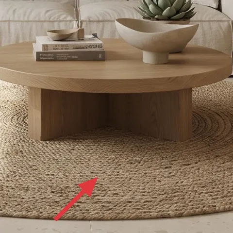
A round jute area rug anchors the whole seating circle, and it’s doing double duty here: it softens the light tile floor and it makes the coffee table feel like it belongs. The key is scale—jute is naturally textured and visually busy, so you want it large enough that it sits under the front edge of the sofa and the coffee table base. The trade-off is shedding (jute loves a good initial vacuum). If you go this route, treat it like the foundation: keep the rest of the palette calm so the rug reads warm, not chaotic.
Keep it anchored with rug placement
Center the rug so the coffee table sits comfortably inside the circle, not teetering on the edge.
Layer 2 — green curtain panels ($80) Add weight to the window
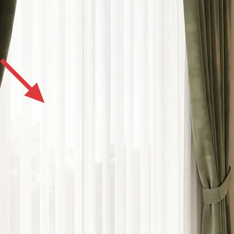
The green curtain panels are what give this corner depth, even though the sofa is neutral and the wall art is light. Hanging heavier panels beside (and slightly overlapping) the airy sheers creates a layered window moment that reads intentional day and night. The reason this works better than “just add sheers” is simple: color shows up at eye level, and the curtain falls frame the sofa niche. My only warning: measure width like you mean it—too-narrow panels look strung up instead of draped. Go for fullness so the folds land naturally.
Plan for fullness, not just length
More fabric per window makes deeper folds that look styled instead of accidental.
Layer 3 — round light wood coffee table ($180) Connect the seating with one curve
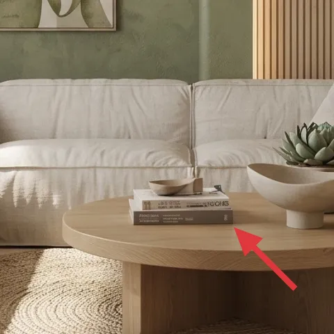
This round light wood coffee table is the “shape repeat” that keeps the corner from feeling too rectangular. With a sofa that’s all straight lines and square cushions, the curve under your hands adds softness without changing the palette. It also gives you a practical styling surface: you can arrange books, a bowl, or a small succulent without the pieces feeling cramped. The trade-off is that round tables can be a little more limiting for storage, so keep the top curated and let your credenza handle bulk. If space is tight, choose a size that leaves a clear walkway around the rug.
Style with a simple height stack
Place one taller item (plant or vase) plus one low piece (bowl/books) so the top looks balanced.
Layer 4 — bronze wall sconce with fabric shade ($120) Add warm light right where you need it
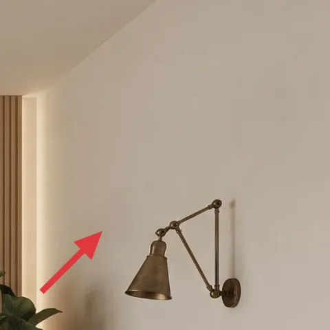
The bronze wall sconce with a fabric shade adds a warm, directional glow that matches the room’s earthy tone. Lighting matters because neutral walls and a light sofa can otherwise read flat, especially once the sun goes down. A wall-mounted option also keeps floor space open—helpful when you’re trying to keep a sofa corner feeling spacious. The trade-off is that you’re committing to a specific mounting height and placement, so measure before drilling. If your current setup is different, this is a weekend-friendly swap with a “call an electrician” caveat for any wiring changes.
Don’t pick the bulb first
Start with shade color and placement, then choose a warm temperature (about 2700K) so it flatters the olive and wood.
Layer 5 — framed botanical art print ($80) Make the frame match the palette
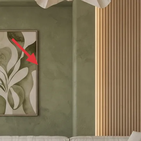
Make it instead of buying it
Repaint the framed border of the botanical art print so it ties into the olive-and-wood tones already in the sofa corner.
Materials
- Spray primer for metal/wood frames — 1 can — hardware store — $12
- Spray paint in warm olive or muted bronze — 1 can — hardware store — $8
- Sandpaper assortment (120/220 grit) — 1 pack — hardware store — $6
- Painter’s tape + drop cloth — 1 kit — hardware store — $5
- Clear topcoat (matte) — 1 can — hardware store — $12
Steps
- Remove the frame from the art and take off any hanging hardware.
- Scuff-sand the frame surface until it feels slightly rough to the touch.
- Tape off any edges you want to protect, then wipe away dust.
- Spray on a thin, even coat of primer and let it dry fully.
- Lightly sand the primer with 220 grit, then wipe clean.
- Spray paint in short passes, building coverage without drips, then let it cure.
- Check for thin spots and spot-touch as needed.
- Finish with a clear matte topcoat, allow to dry fully, then reassemble.
- Hang the framed botanical print back on the wall and step back to confirm alignment.
Total DIY cost: $43 — saves about $37 over buying.
In this corner, the framed botanical print is the visual “green handshake” between the plant and the olive curtains. The artwork is already the right subject, but the frame finish is where you can make it feel curated instead of random. By repainting the border to echo warm bronze or muted olive, you match the room’s materials—wood, soft neutrals, and botanical greens. The trade-off is that frames with glass need careful handling, and you’ll want good drying time between coats to avoid fingerprints or tacky spots. Once it’s done, the art looks like it was chosen for this wall from day one.
Let the frame do the color work
If your walls are muted, a frame refresh keeps the artwork from looking like an afterthought.
Layer 6 — large leafy indoor plant in pot ($80) Bring the room’s greens alive
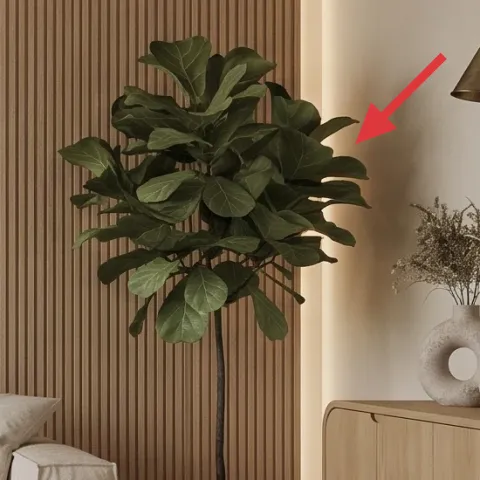
A large leafy indoor plant in a simple pot balances the straight lines of the wood slat accent wall and gives the corner motion. It also makes the botanical print feel less “decor” and more like part of a living scene. In this photo, the plant sits near the credenza area, so it becomes a visual divider: it softens the wood verticals and makes the wall surface feel deeper. The trade-off is placement—too close to the sconce or credenza clutter and it can look crowded. Choose a spot where the leaves can spread, and keep the pot simple so the greenery is the focus, not the container.
Use the plant as the height anchor
Pair a tall plant with one mid-height object (vase) so the wall doesn’t feel top-heavy.
Layer 7 — light wood credenza with low cabinet doors ($300) Store small decor without adding visual clutter
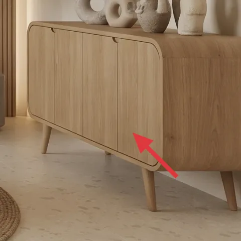
The light wood credenza gives you a place to stage decor without turning every flat surface into a staging area. You can see the payoff in the photo: the credenza holds decorative vases, ceramics, and stacked books, but the doors and clean silhouette keep the corner from looking messy. Because the coffee table is small and the sofa is bulky, this storage piece is the practical balancing act that makes the styling last longer than a “for the photo” moment. The trade-off is you’re committing to a longer footprint, so keep the layout open around the rug and don’t over-style the top—choose three categories: vessel, texture, and one book stack.
Style the top in groups of three
Vary heights (tall vase, mid jar, low ceramic) to keep the credenza from looking flat.
The cost, layer by layer
| Layer | Item | Cost |
|---|---|---|
| 1 | Area rug 5×7 (jute look) | $200 |
| 2 | Curtain panel pair (84") | $80 |
| 3 | Coffee table (round) | $180 |
| 4 | Plug-in table lamp (bronze shade) | $120 |
| 5 | Framed art print (16×20) | $80 |
| 6 | Indoor plant (4–6 ft) | $80 |
| 7 | Dresser/credenza (light wood, low cabinet) | $300 |
| Total | $940 | |
If you want to spend less, swap the rug for a flatweave cotton rug in a similar warm neutral and choose curtain panels in a darker oatmeal than olive. Keep the coffee table and framed print—those are the components that hold the “designed” look even when the rest is budget.
What worked, what didn't (across the whole room)
The biggest win was repeating warm wood + earthy neutrals across large items—rug, curtains, art framing, and plant height. That repetition makes the sofa corner look intentional in both daylight and at night. Styling stayed simple because the credenza provides “off-screen storage” for the small stuff.
What worked
- The round jute rug softened the light tile floor and made the coffee table area feel cohesive.
- Olive curtain panels added depth at eye level, so the neutral sofa didn’t look blank.
- The round coffee table brought curve balance to the straight-lined sofa and wall niche.
- The bronze lamp finish matched the wood tones and kept the room warm after dark.
- The botanical print created a clear focal point that echoed the plant without extra patterns.
- The credenza kept vases and ceramics contained, so styling reads curated instead of cluttered.
What didn't
- If the curtains aren’t wide enough, the folds look thin and the window loses its framed feel.
- A plant placed too close to the credenza top can look cramped and block the wall art visually.
- Over-styling the coffee table makes the rug and sofa feel visually busier instead of calmer.
- If the art frame finish doesn’t echo wood or bronze, the botanical print can feel “tacked on.”
- A rug that’s too small lets the room break into zones, especially under the sofa front legs.
What we'd skip if we did it again
Skip adding more patterns. This corner already has botanical energy through the plant and print, so extra prints tend to fight the calm olive-and-cream palette. If you want variety, change texture instead—like swapping in a ribbed ceramic or a woven basket shape.
Skip “almost the right” rug size. A jute rug that doesn’t sit far enough under the sofa front makes the room feel unfinished, even if everything else matches. Go bigger than you think you need, then keep the coffee table styling minimal.
Skip a mismatched frame finish. If the art border doesn’t relate to your wood or lamp metal, it becomes the loudest element in the room. Repainting the frame is one of the cheapest ways to make the focal point look intentional.
Frequently asked
How long does a refresh like this usually take?
Most homeowners can finish it in one weekend when the biggest items are already in place (rug, curtains, table, art). Plan for drying/curing time if you repaint a frame and for adjusting curtain hang height. If you’re swapping wiring or adding a new light that needs power changes, build in extra time for getting help—finishing the rest of the styling on day one keeps momentum.
If I rent, can I still copy this sofa corner look?
Yes—focus on reversible moves first: rug sizing, curtain panels with a proper rod, and styling on the coffee table and credenza. For lighting, choose plug-in options or bulbs/shades that don’t require new wiring. For the artwork, you can repaint a frame only if you keep the original finish safe for later, and use picture hooks or picture-rail style hangers rather than wall damage.
What if my room is smaller than the photo?
Downsize everything in the same direction: a smaller rug, curtains that still get full width for good folds, and a coffee table that leaves a clear walking path. Keep the plant to one statement piece but avoid overcrowding the credenza top—use fewer vases and rely on negative space. The framed botanical print should stay your focal point; scale it appropriately so it isn’t lost above the sofa.
Where should the rug sit in relation to the sofa and coffee table?
Aim for the rug to land under the front legs of the sofa so the seating zone feels connected. Center the coffee table inside the rug’s circle so it doesn’t hover near the border. If you can’t fit it fully, prioritize the sofa front area first—under the sofa reads more intentional than adding more rug only under the coffee table.
What’s the most budget-friendly swap for the biggest visual impact?
The framed botanical print finish (or the rug) is usually the best bang-for-buck. Repainting a frame can make the art look custom and tied to the room’s metals and wood in under a day. If you’d rather buy than DIY, a correctly sized rug and full curtains can still create that “designed” feeling without adding new furniture.
What’s the most common mistake people make on a sofa corner?
The most common mistake is buying small pieces that look cute individually but don’t anchor the layout together. The rug is the usual culprit, followed by curtains that aren’t wide enough to drape. Another frequent miss is over-styling every surface—use the credenza as the organizer and keep the coffee table to a simple stack plus one low object.
More in Living Room
Under $1000: 7 budget-friendly swaps for a japandi sofa corner
A bright japandi sofa corner refresh you can finish in a weekend, built around an olive-and-cream palette. With 7 buy-or-build upgrades tot…
Under $500: botanical neutral living room swaps for renters
Warm, sunlit living room styling you can copy without paint or drilling. This renter-friendly refresh uses 7 mix-and-match layers—rug, text…
Under $600: warm stone-and-linen living room refresh
This warm stone-and-linen living room look is built with renter-friendly swaps for under $600—think a grounding rug, woven-shade floor lamp…