- Best for
- living room refresh with renter-safe swaps
- Cost
- under $500 total
- Difficulty
- easy (textiles + removable decor)
- Time
- about a weekend
Why warm neutral botanical touches is the sunlit living room of 2026
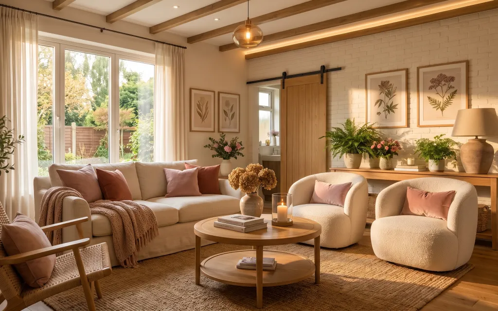
Start with the big, grounded base: a beige area rug that softens the light wood floor and makes the whole seating area feel intentional. In photos like this, the texture contrast is doing the work—think cream knit throw texture against smooth upholstery, plus plush throw pillows in terracotta and cream. The wall stays calm because the framed botanical prints repeat similar leaf shapes, rather than adding new colors. This approach is budget-friendly for renters because the changes are all removable items that look great next to window light.
I used to overdo “decor” by buying matching sets, and it made my place feel staged instead of lived-in. The turning point was switching to one repeat theme (botanical prints) and building the rest with materials—knit, linen-like tones, and ceramic planters. Now I pay attention to scale: the pillows should sit wide enough to look full, and the rug needs to reach under the coffee-table zone so nothing looks floating.
Layer 1 — beige area rug ($200) Textures the seating zone
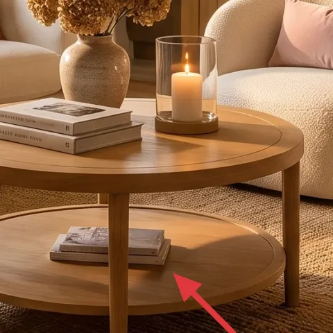
A beige area rug anchors the whole layout, especially in rooms with lots of daylight like this one. The key is staying in the same warm-family palette so the rug doesn’t fight the cream upholstery and the light wood floor. I like choosing a rug that has visible weave (not a perfectly flat shag), because it adds dimension without needing wall paint or hardware. The trade-off: you’ll want a rug with edges that can handle foot traffic, since renters don’t control entryway grit. If you’re between sizes, size up so the rug sits fully under the coffee-table legs and the front chair feet.
Let rug edges land under seating
When at least the front legs of the sofa or chairs sit on the rug, the room reads as one cohesive seating area.
Layer 2 — beige knit throw blanket ($25) Adds cozy texture without clutter
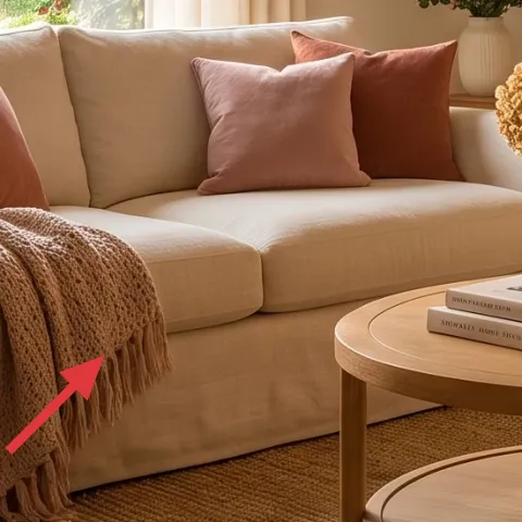
This beige knit throw blanket is the texture layer that keeps the room from looking too “clean.” Drape it over the sofa arm where it catches window light, or fold it once and let the knit pattern show instead of hiding. The neutral color matters: it blends with the cream upholstery while still looking distinct thanks to the weave. The obvious alternative is adding a colorful throw, but that can overpower the botanical prints and terracotta pillows. I’d rather accept a slightly quieter palette and let the material do the talking. In a rental, this is also the easiest item to pack up—just fold and go.
Texture beats matching
Picking a knit texture in the same warm range looks more layered than “perfectly color-matched” throws.
Layer 3 — terracotta and cream throw pillows ($36) Brings the room’s warm tone
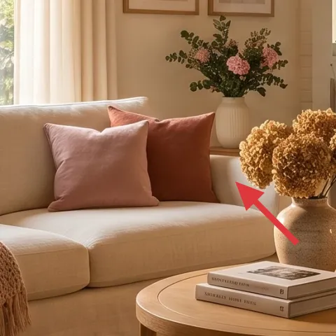
These throw pillows are how the room gets its warmth without changing the walls. Look closely and you’ll see the mix: cream pillows for brightness, plus terracotta tones that echo the warm lamp glow. Choose covers (not just inserts) so you can swap seasonally while keeping the same base look. The trade-off is comfort and fluff—you’ll want an insert that holds shape, otherwise the covers start to look flat. If the room feels too neutral, add more terracotta pillows rather than bringing in new colors. This is also an easy move-out win: pillows stay with you even when the rest of the apartment changes.
Don’t over-plan a “set”
If every pillow is the same exact fabric and pattern, the sofa can look like it came from one catalog page.
Layer 4 — plug-in-style table lamp ($45) Makes the corner usable after dark
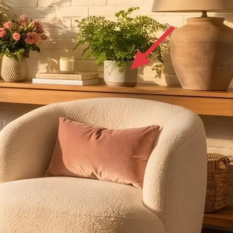
A plug-in table lamp is the simplest way to recreate this warm evening glow without touching the landlord’s hardwired lighting. Place it on the console or side surface so the light spills onto the wall area with the framed botanical prints. The shade texture and warm bulb color are what keep the lamp from looking harsh next to daylight. The trade-off is that you may need an extension solution if outlets are far—plan placement before you buy. I’d rather spend on a lamp that gives a soft pool of light than chase trendy shapes. In photos like this, the lamp is what makes the botanical shelf area feel intentional instead of decorative.
Match the lamp to the room’s warmth
A warm bulb color keeps the cream and terracotta tones cohesive with window light.
Layer 5 — framed botanical print (DIY pressed-flower frame) ($80) Repeats the leaf theme
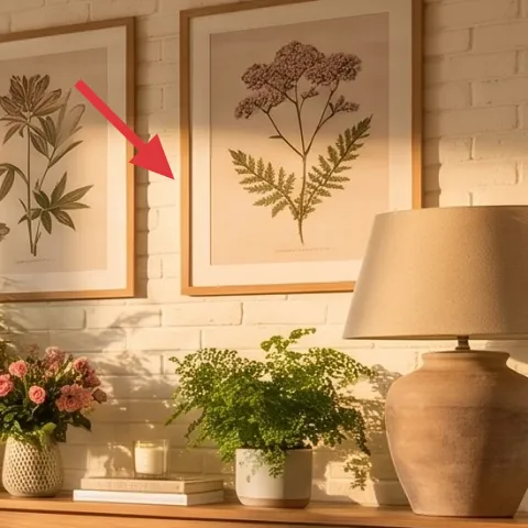
These framed botanical prints are the visual rhythm of the whole room—similar leaf shapes, different compositions. To get the same vibe on a renter budget, make one print yourself with a pressed-flower frame and keep the palette tight (greens, soft browns, and gentle earth tones). The big advantage is you aren’t limited to store art that only comes in “generic” prints; you can repeat the same plant shapes across multiple frames for cohesion. The trade-off is time: pressed botanicals take a little preparation, but once you have your materials, the cost per frame stays low. This DIY also helps the wall look personal instead of generic.
Make it instead of buying it
DIY a pressed-flower frame so the wall repeats the botanical theme without needing new paint or hardware.
Materials
- Pressed botanicals (collect + press beforehand) — assortment — foraged/pressed — $10
- Archival craft paper (for backing) — sheet — craft store — $12
- Matte adhesive photo corners — 1 pack — craft store — $18
- Simple frame with clear backing (8×10-ish) — 1 — thrift/discount store — $25
Steps
- Pick and prep leaves/flowers that already feel dry and flat from pressing.
- Arrange botanicals on your backing paper to match the frame opening size.
- Lift each piece and place small adhesive photo corners at contact points.
- Re-check spacing from the viewing distance so the center looks balanced.
- Close the clear backing and secure the frame edges.
- Hang using removable picture methods already allowed for renters (no drilling).
Total DIY cost: $65 — saves about $15 over buying.
Layer 6 — glass candle jar ($15) Adds warm “flicker” to the console
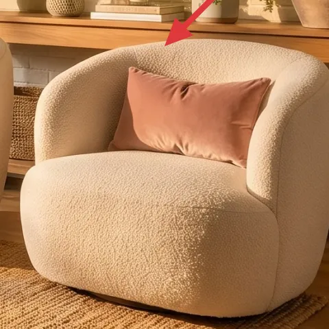
A glass candle jar gives you that golden, lived-in moment you see in the photo—without replacing fixtures or installing anything permanent. Set it on the console near the books and planters so it looks like part of the styling rather than an afterthought. The trade-off is that candles need tending (and move-out storage), so it’s worth choosing a jar that’s stable and easy to pack. If you’re matching this look, keep the candle in the same warm-neutral family as the room—think creamy glass and a warm flame. Even when it’s off, the jar silhouette reads as a decor object. Plus, it’s one of the cheapest layers to refresh seasonally.
Use candle placement to create layers
Put it between taller greenery and flat books so the height changes read instantly.
Layer 7 — potted fern on console ($30) Brings in a fresh botanical pop
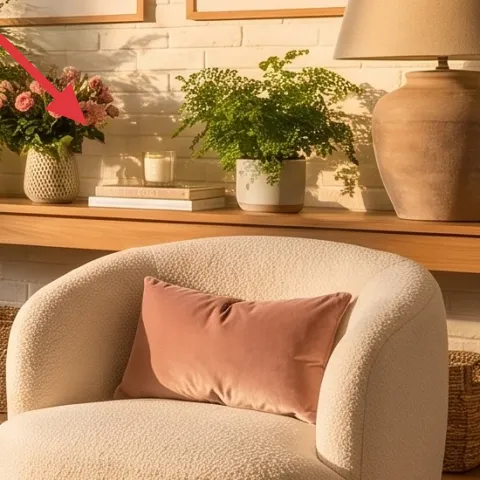
Potted fern greenery keeps the botanical theme from feeling like “just wall art.” In this setup, the plant sits on the console near the framed prints, creating a natural link between wall and tabletop styling. Choose a plant with lots of fine leaves so it fills space without looking bulky, and keep the pot color warm and neutral so it blends with ceramic planters. The alternative is a single stem, but that often looks too small for the visual weight of the console. The trade-off is shelf stability—plants can tip, so keep the pot centered and avoid overhanging. This is also easy to move at lease end because plants are already portable.
Group plants with ceramics
Plants plus a couple small ceramic planters look intentional even if you don’t add more wall decor.
The cost, layer by layer
| Layer | Item | Cost |
|---|---|---|
| 1 | Area rug (5×7 beige, woven look) | $200 |
| 2 | Knit throw blanket (beige) | $25 |
| 3 | Throw pillow covers (2-pack, terracotta + cream) | $36 |
| 4 | Plug-in table lamp (warm bulb, shade included) | $45 |
| 5 | Pressed-flower framed botanical print (DIY) | $80 |
| 6 | Glass candle jar | $15 |
| 7 | Indoor plant (fern, small tabletop/console size) | $30 |
| Total | $431 | |
If you want a cheaper variant, start with a smaller rug, fewer pillows, and swap the framed botanical for one larger print instead of two. Keep the lamp and greenery, since those do the most for day-to-night comfort.
What worked, what didn't (across the whole room)
The strongest wins here are the repeat botanical theme (prints + greenery) and the mix of textures (rug weave, knit throw, and upholstered cushions). The lamp glow also matters because it makes the console styling readable after dark.
What worked
- The beige rug anchors both seating areas and keeps the coffee-table zone from looking “floating.”
- Terracotta throw pillows add warmth without introducing a bunch of unrelated colors.
- Knit throw texture makes the sofa look softer in daylight and cozy at night.
- Framed botanical prints create visual repetition on the wall instead of random art placement.
- Console styling (lamp, candle, ceramics) turns a flat surface into a layered vignette.
What didn't
- When I tried to match every pillow exactly, the sofa looked more staged than lived-in.
- If a fern is too sparse or too small, it doesn’t carry the visual weight of the console.
- Placing a lamp too far from the framed prints makes the wall area feel disconnected.
What we'd skip if we did it again
Skip buying a full matching furniture “set.” The room reads best when the upholstery is cohesive but the textiles and decor pieces vary in texture and tone.
Skip adding a second, competing color story (like bold blue or bright patterned throws). With botanical prints already present, extra color can make the wall and console feel busy.
Skip oversized art frames that crowd the brick wall section. Choose one size you can center comfortably so the prints still feel airy in front of the window light.
Frequently asked
How long does it take to pull this look together?
Plan for about a weekend. Rug + textiles are fastest, and framing can take a bit longer if you’re doing a DIY pressed-flower frame. Once everything is staged, final touch-ups (lamp angle, pillow proportions, console spacing) usually take 45–60 minutes.
Can I recreate this in a rental without changing wall fixtures?
Yes—everything in this refresh is removable. Swap in your own rug, throws, pillows, and a plug-in table lamp, then use renter-safe methods for framed botanical prints. The console styling (candle, ceramics, greenery) doesn’t require drilling and packs away easily at lease end.
What if my living room is smaller?
Use the same formula but scale down: choose a slightly smaller rug and go with fewer pillows (two patterned or two terracotta accents instead of four). Keep one botanical print as the anchor and reduce the console items to three objects (lamp, candle, plant) so the wall doesn’t feel crowded.
What if my living room is larger and needs more impact?
Stick with the warm-neutral base, then add presence through size: one larger framed botanical print or two matching prints instead of three small ones. You can also use two plants—one on each side of the console—so the height variation matches the room’s scale.
Where should I shop to keep it renter-friendly and budget under control?
Rug, pillows, and throws are easiest to find at big-box retailers during sales, then look for the botanical frames secondhand to keep prices down. For the lamp and greenery, check discount home stores and local thrift options—just confirm they’re plug-in and that plants are healthy before buying.
What’s the biggest styling mistake people make with this kind of look?
Overmatching. When every pillow, frame, and decorative item matches perfectly, it starts to look like staging. The better approach is repeating one theme (botanical leaves) while varying textures (knit throw, rug weave, ceramics) and keeping the color family warm and cohesive.
More in Living Room
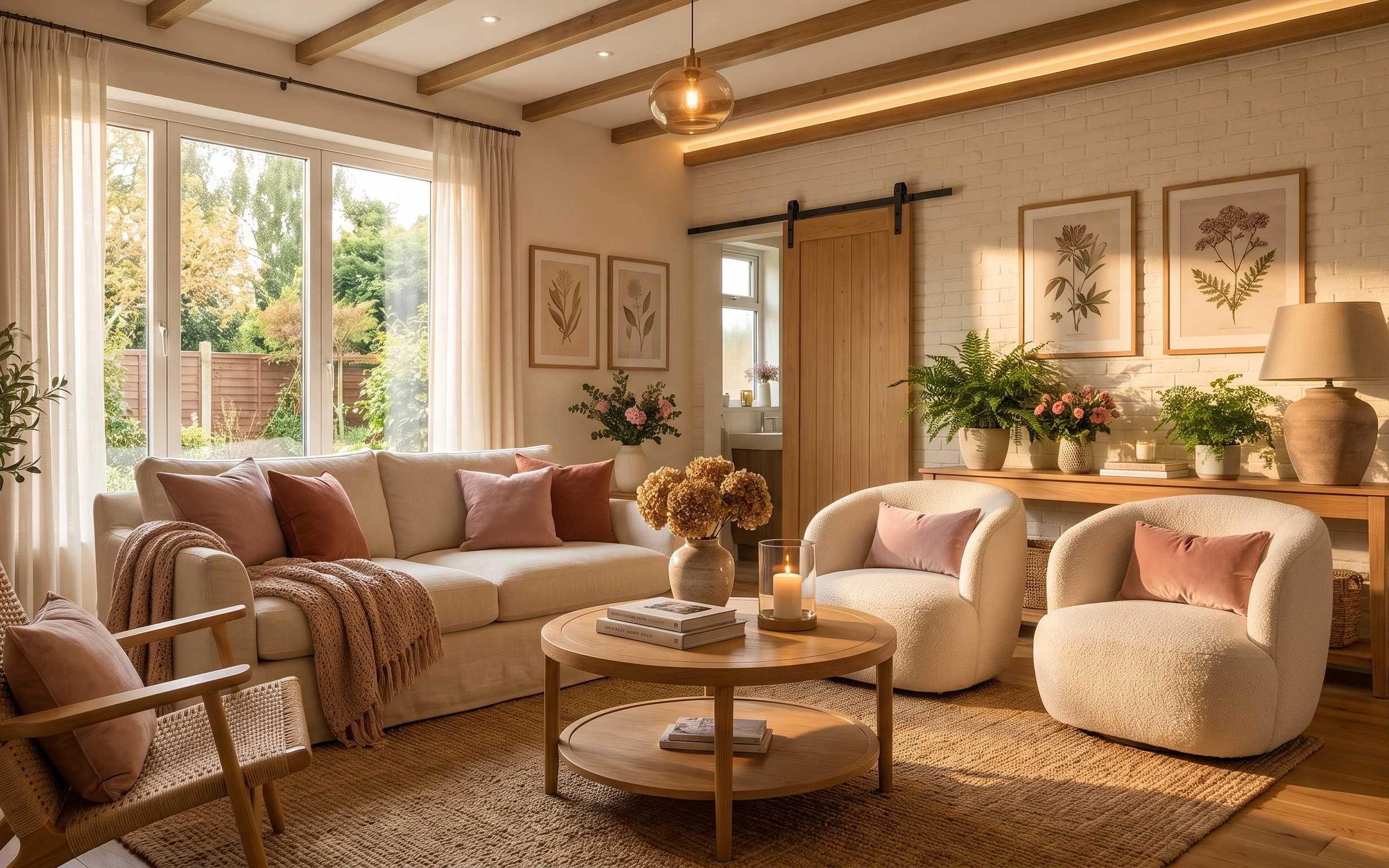
Under $500: botanical neutral living room swaps for renters
Warm, sunlit living room styling you can copy without paint or drilling. This renter-friendly refresh uses 7 mix-and-match layers—rug, text…
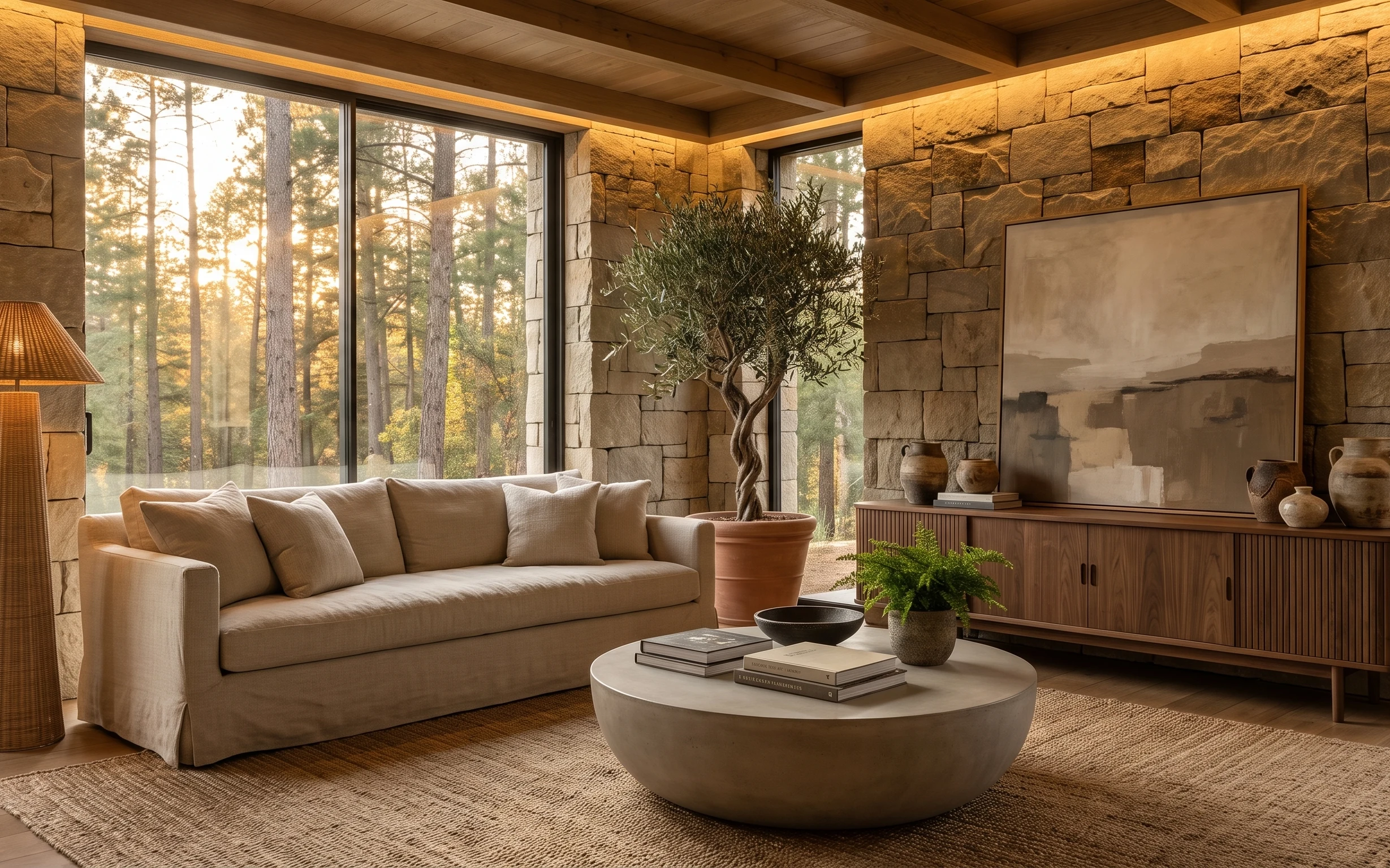
Under $600: warm stone-and-linen living room refresh
This warm stone-and-linen living room look is built with renter-friendly swaps for under $600—think a grounding rug, woven-shade floor lamp…
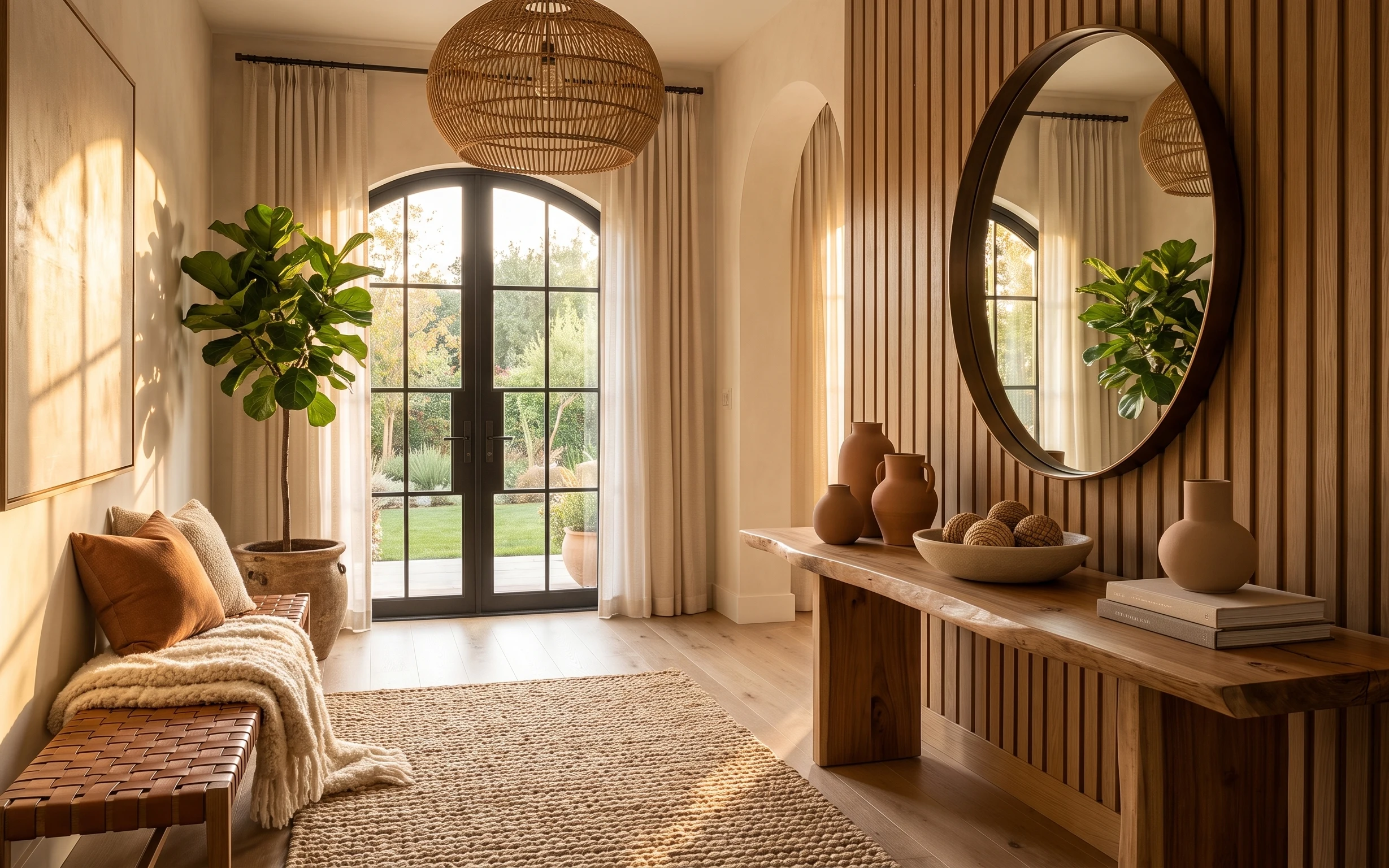
Under $600: boho daybed corner refresh for shared housing
A warm boho daybed corner look—made move-friendly for roommates—using 7 swap-and-style layers under $600. The biggest lift comes from an ea…