
- Best for
- warm texture in a dining nook
- Cost
- $830 total for 7 layers
- Difficulty
- Confident DIY
- Time
- one weekend + styling
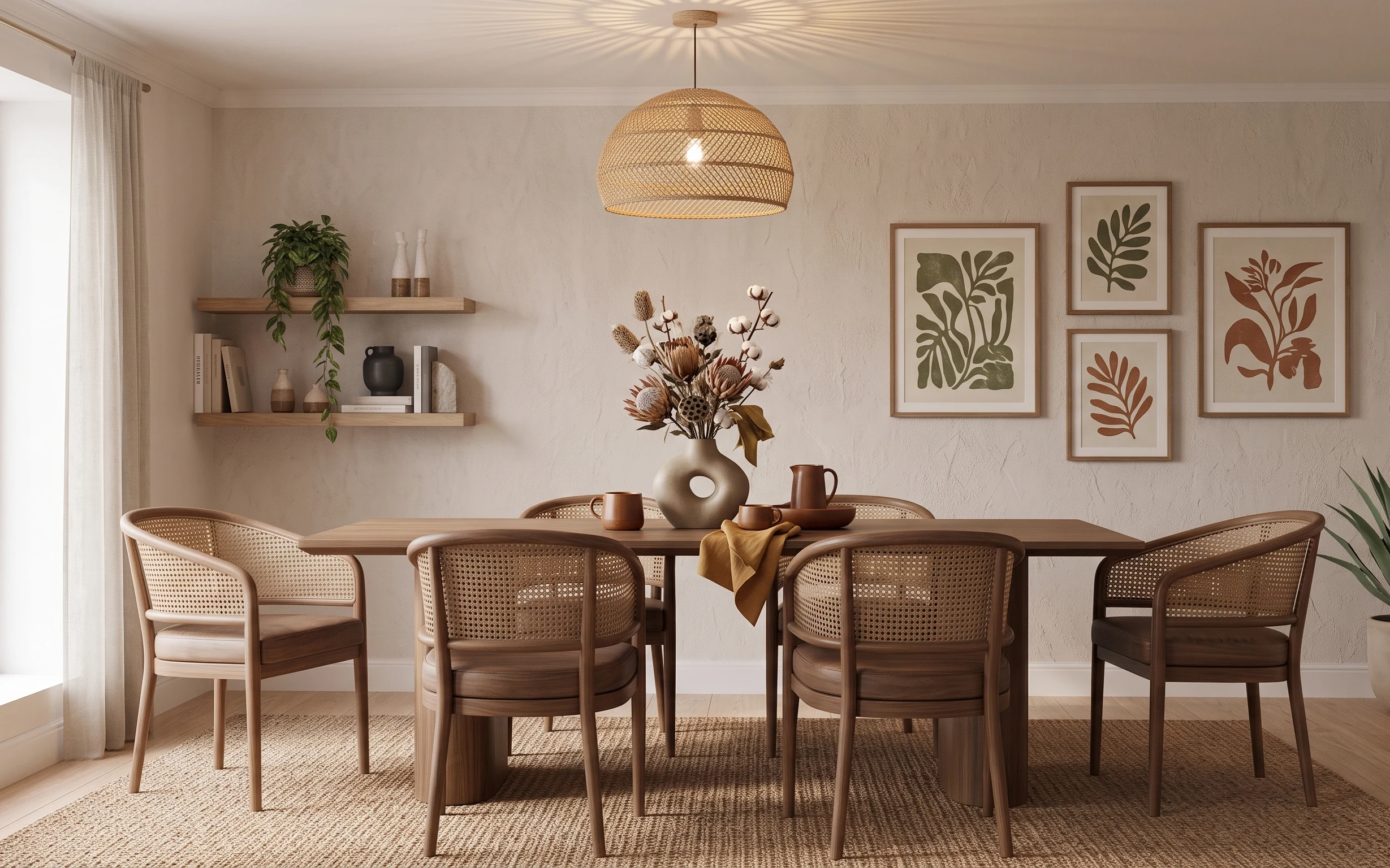
Why cream-and-rattan dinner setup is the dining nook of 2026
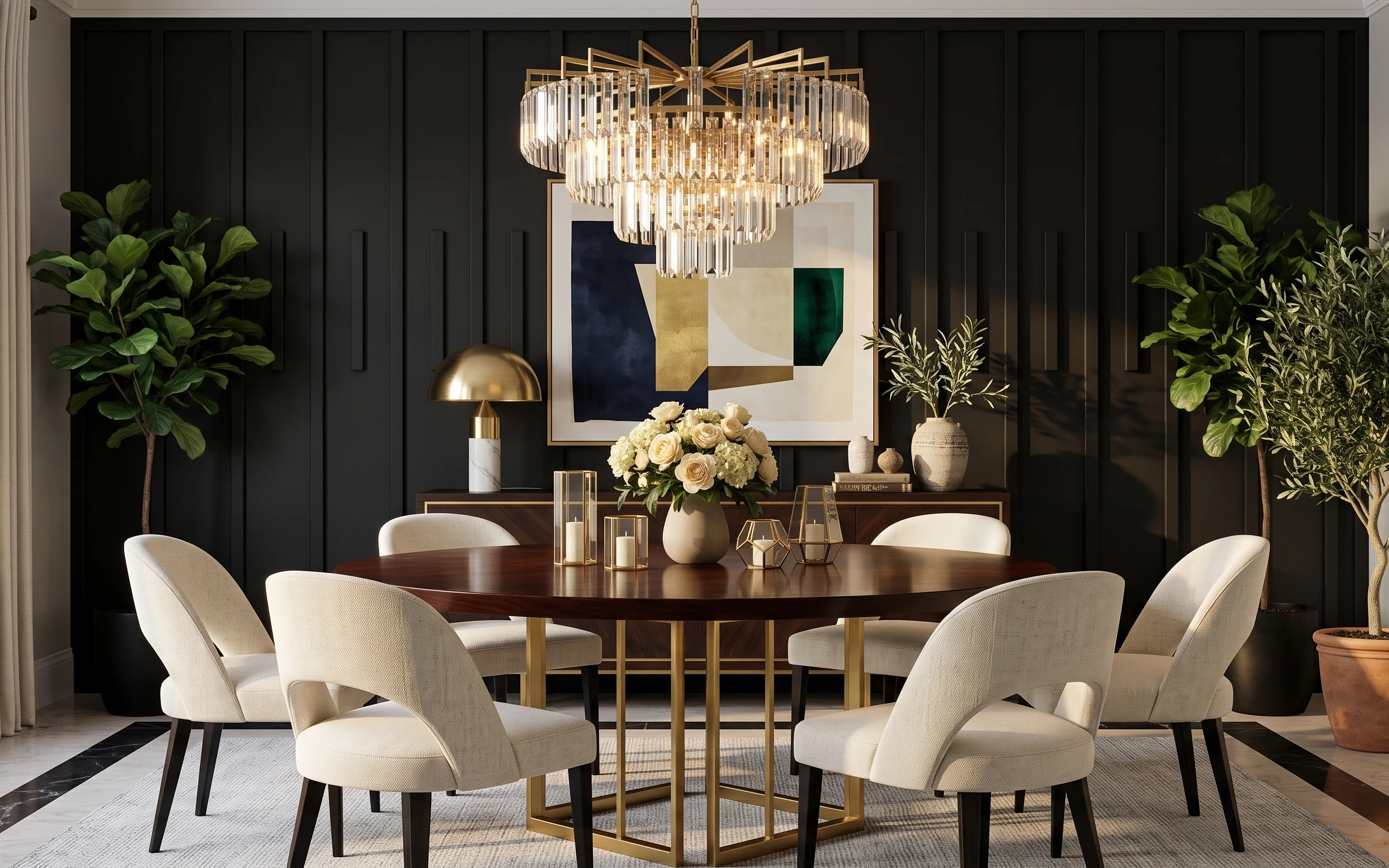
Start with the foundation: a woven area rug (that warm tan braid) grounds the dining table, while light beige curtain panels soften the big window wall. Then layer in texture overhead with the woven pendant light, whose domed shade throws that gentle glow. On the walls, floating wood shelves and framed botanical prints bring in warm wood and sage-green color without looking busy. All of it is achievable for homeowners because you can commit to the best-impact pieces—rug, curtains, and lighting—then style with what you already have.
One mistake I made on my first “cozy dining” attempt: I bought matching-looking decor and somehow made the room feel flat. Here, the trick is that nothing is perfectly matched—rattan chairs, warm wood shelving, cream plaster, and botanical art all play together because they share a similar color temperature. The result feels curated instead of overdone, and it reads well even from across the room.
Layer 1 — woven area rug ($200) Anchors the dining zone without going dark
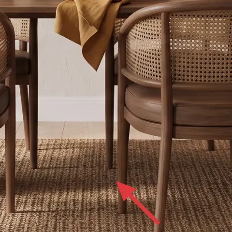
A woven area rug in a neutral tan tone does more than protect the floor—it visually locks the dining table to the space. In the photo, the rug’s texture matches the chair material and makes the room feel warmer even under a light ceiling. The obvious alternative is a smooth, low-texture rug, but that choice makes the chairs look like they’re floating on bare flooring. A woven pattern also helps disguise small spills (coffee, crumbs, the occasional “oops”). If your dining space is open to a living area, pick a rug large enough that the chair legs still sit on it.
Size it so chairs land on the rug
When chairs pull back, the front legs should stay within the rug’s footprint. It’s the fastest way to make a dining nook feel intentionally planned.
Layer 2 — light beige curtain panels (window side) ($80) Adds softness and keeps daylight flattering
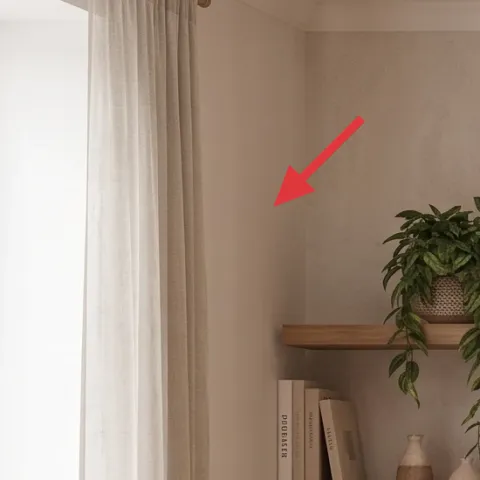
These light beige curtain panels bring that airy, calm backdrop that makes wood tones look richer. They’re doing double duty: filtering bright light so the wall doesn’t look too stark, and softening the vertical lines from window to ceiling. The alternative—skipping curtains—usually reads “temporary,” especially in rooms with plaster-textured walls. Full-height panels also create a taller visual frame, which matters when the dining table is the main focal point. Keep the fabric sheer-to-medium weight so you still get daylight bounce across the rug and chairs.
Hang high for a longer look
Even in a simple setup, higher curtain placement (closer to the ceiling) makes the whole nook feel more generous.
Layer 3 — woven pendant light shade ($120) Makes the ceiling feel styled (not blank)
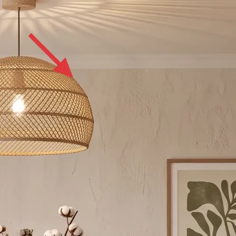
The woven pendant light shade is the “texture from above” move that keeps a dining nook from feeling one-note. Its dome shape sits centered over the table, so it reads as the focal point, not just another fixture. A flush-mount ceiling light is the obvious alternative, but it tends to flatten shadows and make the room feel more utilitarian. With a woven shade, the bulb glow becomes softer and more directional, especially at night. This also matches the chair material, so the room feels cohesive without needing everything to match in color exactly.
Use a warm bulb to match the rug
A warmer light temperature keeps cream walls from looking greenish or washed out.
Layer 4 — floating wood shelves ($180) Builds “gallery energy” without heavy furniture
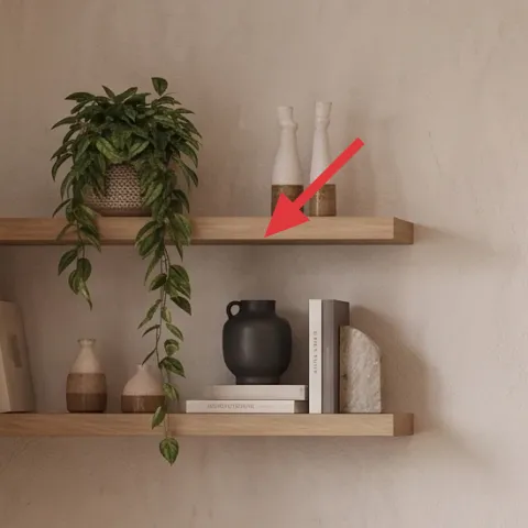
Floating wood shelves create storage and styling space while keeping the room visually open. In the photo, they hold a potted plant, books, and small ceramic pieces, which gives the wall depth behind the dining chairs. The obvious alternative is a tall cabinet, but it usually dominates a dining nook and blocks sightlines. Shelves are also easier to refresh over time: swap in seasonal decor or new book stacks without moving bulky furniture. Keep the shelf wood tone warm (walnut or light oak) so it harmonizes with the chairs and the framed botanical art.
Don’t overload every surface at once
Leave small gaps between objects on the shelves. Tight clustering looks messy fast, especially with framed art on the same wall.
Layer 5 — framed botanical print set ($180) Adds color you can repeat across the room
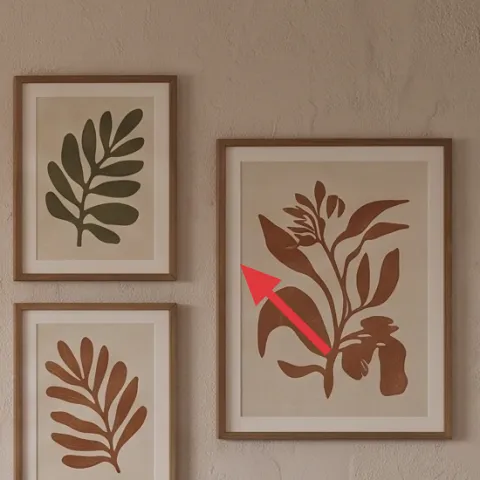
A framed botanical print set gives the wall a curated rhythm—leaf shapes, muted colors, and matching frames—without turning the dining nook into a cluttered gallery. In this setup, the art adds sage green and warm terracotta tones that already show up in the styling on the table and plant elements. The alternative is single large art, but that can feel off-center when the dining table sits below and you still need a “wall story” to balance the room. Choose frames in a warm wood or light natural finish so they echo the shelves. Spacing matters too: keep even gaps so the wall reads intentional.
Match frame finish, not every print color
Keeping the frame style consistent lets the botanicals vary while still feeling coordinated.
Layer 6 — stoneware-style vase with dried stems ($30) Gives the table a focal point
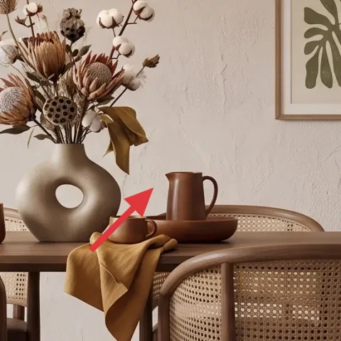
On the table, the stoneware-style vase with dried stems creates height and texture where you want a focal point. The neutral beige ceramic (and the airy stems inside) blends with the woven rug and rattan chair backs, so the centerpiece looks intentional rather than “random decor.” A fruit bowl or simple glass vase is the easy alternative, but it often lacks vertical interest, and the dining table can look flat from across the room. Dried stems are also a practical choice: they don’t require watering, and they stay looking good for longer than fresh arrangements. Just keep the scale proportional to the table width.
Anchor the vase with a simple cloth
The mustard/tan cloth on the table adds warmth and color without competing with the botanicals on the wall.
Layer 7 — large floor plant pot ($40) Adds natural weight near the corner
Make it instead of buying it
This is for the large planter pot: paint it to pick up the room’s warm neutrals so the floor plant looks styled, not accidental.
Materials
- Exterior acrylic paint — 1 small can — hardware/lumber store — $12
- Mini foam roller or paint sponge — 1 pack — hardware store — $6
- Painters tape — 1 roll — hardware store — $4
- Clear matte spray sealant — 1 can — hardware store — $10
- Disposable tray/liner or mixing sticks — 1 set — dollar store — $2
Steps
- Clean the pot thoroughly, then let it dry completely.
- Mask any areas you want to stay natural with painters tape.
- Apply the first thin coat of paint and allow it to dry.
- Sand lightly for grip, then wipe away dust.
- Apply a second thin coat, keeping the finish even.
- Let the painted pot dry fully before sealing.
- Spray on a matte clear sealant in light passes.
- Let it cure overnight before moving it back into the room.
Total DIY cost: $34 — saves about $6 over buying.
The cost, layer by layer
| Layer | Item | Cost |
|---|---|---|
| 1 | Area rug 8×10 (woven neutral) | $200 |
| 2 | Curtain panel pair (light beige, ~84") | $80 |
| 3 | Woven pendant light shade | $120 |
| 4 | Floating wood shelves (set of two) | $180 |
| 5 | Framed botanical print set (5 frames) | $180 |
| 6 | Stoneware-style vase with dried stems | $30 |
| 7 | Large floor plant pot (DIY painted) | $40 |
| Total | $830 | |
If you want it cheaper, keep the rug but choose a single curtain pair budget fabric, then swap the framed botanical set for two larger prints in matching warm frames. The pendant and shelves are the only items worth keeping as “real purchases,” since they carry most of the texture.
What worked, what didn't (across the whole room)
The wins in this dining nook are all texture-and-light decisions: the woven rug and pendant create warmth, while the shelves and botanicals give the wall a clear focal pattern. The overall palette stays calm because the materials repeat—rattan/woven, warm wood, and cream plaster—without requiring exact color matching.
What worked
- The woven rug ties chairs, wall tones, and the centerpiece into one warm dining zone.
- Light beige curtains keep daylight soft, so the cream walls don’t feel too stark.
- The woven pendant adds texture overhead and makes night lighting look intentional.
- Floating shelves add storage and visual depth without bulky furniture.
- Framed botanicals repeat sage and terracotta tones already present in table styling.
- The stoneware-style vase brings vertical interest so the table never looks flat.
What didn't
- Using too many colors in small objects on shelves can fight the botanical prints.
- Skipping a larger rug size can make the dining chairs feel like they’re sitting on bare flooring.
- A cool-toned light bulb would make cream walls look slightly gray compared to the warm wood.
- If curtains are hung low, the window wall looks shorter and the pendant feels less centered.
- A vase that’s too small for the table makes the centerpiece disappear from across the room.
What we'd skip if we did it again
Skip buying “matched dining decor” sets. The room reads best when textures repeat (woven, warm wood, ceramic) but shapes vary—chairs, shelves, frames, and the vase. A perfectly coordinated set usually looks like it came from one store, not one taste.
Skip replacing the lighting last. If the pendant shade is wrong for your palette, everything underneath looks off—especially curtains and wall art. Pick the pendant early, then choose a rug and curtain tone that match its warmth.
Skip overfilling the floating shelves. Leave negative space between the potted plant, books, and ceramics so the botanical print set can stand out on the adjacent wall. A few carefully placed items will read more intentional than a “catch-all” clutter moment.
Frequently asked
How long does a project like this usually take?
Most of the work is weekend-friendly if the shelves and curtain hardware are already planned. Expect about 2–4 hours for shelves (measuring and anchoring), 1–2 hours for hanging curtains, 1–2 hours for art placement, and another hour or two for the rug layout and table styling. The pendant timing depends on whether you’re swapping an existing fixture or just installing a new one—figure an extra block for setup.
Can renters get the same look?
Yes, with a few substitutions. Swap floating shelves for temporary wall shelves that use proper mounting instructions for your lease rules, or go with freestanding shelving. Curtains can be tension-rod mounted if needed, and framed prints can use removable picture-hanging hardware. For the pendant, renters usually choose a plug-in version or keep the existing fixture and focus on rug, curtains, and art.
What if my dining nook is smaller or larger than the photo?
Smaller: keep the rug large enough that chair front legs land on it, then reduce shelf styling items to 3–5 objects total. Larger: extend the rug so the table stays fully anchored, and consider wider curtain panels or longer lengths so the window wall doesn’t feel “cut off.” In both cases, center the pendant over the table and use even spacing for the framed prints.
Where should I shop for woven and neutral pieces on a budget?
For the rug and curtains, look for sales on woven neutrals and curtain panels with consistent fiber texture. Floating shelves and framed botanical sets are often best at midrange home stores or online marketplaces—check frame size first so you don’t end up with mismatched mats. The easiest savings usually come from choosing simpler ceramic vases and then leaning into styling (dried stems, cloth, and repetition).
What’s the biggest mistake people make with a dining nook like this?
The most common issue is texture without scale. People pick pretty items, but the rug is too small, the pendant sits too far from the table, or the centerpiece vase is undersized. Any one of those can make the room feel unfinished. Measure your rug size against chair positions, keep the pendant centered, and use a vase that reads from across the room.
Is painting a planter pot realistic for a weekend project?
Yes, as long as you prep and seal. Clean the pot well, use thin coats, and let each coat dry fully before sealing. Matte clear spray is especially helpful on pots that might get handled while moving plants around seasonally. If the pot is porous or very textured, expect two paint coats for an even finish.
More in Living Room
Under $1000: cream-and-rattan dining nook refresh
A cream-and-rattan dining nook makeover with seven weekend upgrades, priced to stay under $1000. The biggest wins are a woven rug, soft cur…
Under $700: modern glam dining room refresh with 7 upgrades
Turn a dark-paneled dining space into a modern glam moment with 7 budget-friendly upgrades, totaling $700 or less. This plan leans on warm …
Under $400: earthy-neutrals living room refresh with move-ready swaps
A warm, golden-hour living room look built from renter-safe swaps: rug, throw, framed prints, and a few small stand-out pieces. This refres…