- Best for
- modern glam dining room refresh
- Cost
- $630 total
- Difficulty
- weekend DIY, mostly easy
- Time
- about 6–8 hours
Why the brass-and-cream dining room is the easy weekend refresh of 2026
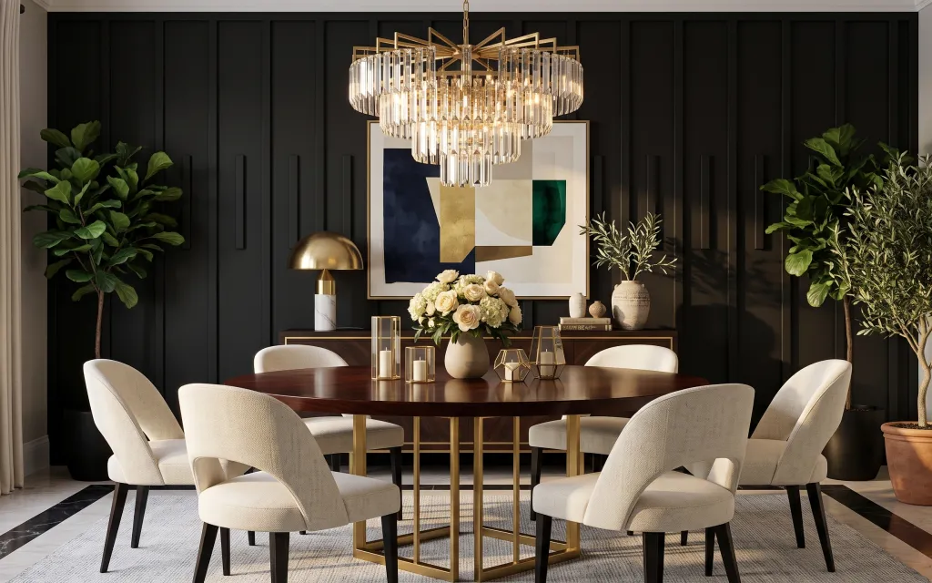
The dark paneled wall and warm gold lighting set the mood first, but the “finished” feeling comes from soft textiles and curated sparkle. In the photo, cream curtains frame the left window, a light gray patterned rug grounds the dining table, and the large framed abstract artwork gives the room a clear focal point. The sideboard styling—plus brass-toned details and white flowers—reads elevated without requiring expensive furniture. For US homeowners working on a weekend, you can copy this by focusing on surfaces you actually touch: fabric, art, and lighting-related styling.
My biggest mistake the first time I tried this vibe was buying only one “statement” thing—like a nice frame—then leaving everything else too bare. The room felt flat against the dark wall. What changed for me: I started layering in curtains, then added a rug with enough pattern to hide daily life, and finally matched the metal tone across small accents. Once the brass repeats, the whole dining area looks intentional.
Layer 1 — cream curtain panel pair ($80) Soft fabric framing on the left window
Cream floor-length curtains do the heavy lifting here because they soften the high-contrast dark panels. They also help the gold lighting feel warmer, since the fabric reflects light instead of absorbing it. In this photo, the curtains fall along the left edge and visually balance the weight of the big hanging light fixture above the table. The trade-off is that you do need proper length—too short makes the whole room look unfinished—but that’s a weekend fix. If you’re debating sheers vs. thicker panels, pick the fabric that still lets daylight through during the day.
Hang height matters more than fabric
Mount the rod close to the ceiling line so the cream panels create tall visual “walls,” not short window trim.
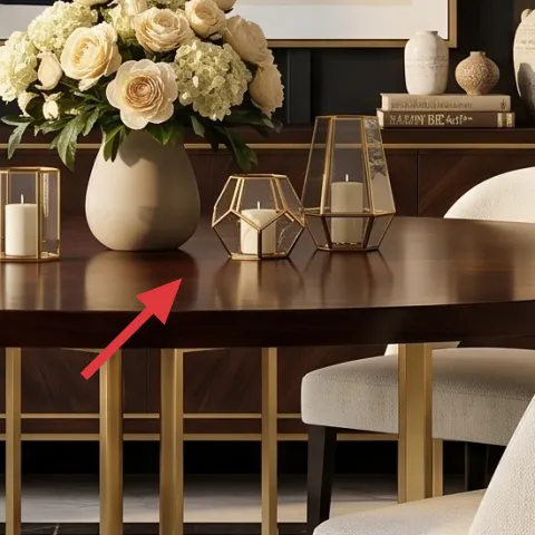
Layer 2 — light gray patterned area rug ($200) Pattern that hides the dinner aftermath
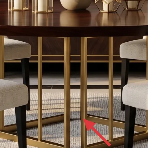
The patterned area rug under the dining table keeps the room from feeling too stark against the dark floor. In the photo, the rug’s light gray tone coordinates with the cream upholstery, while the subtle pattern helps with real-life spills and dust. Compared with a solid rug, the pattern is the practical choice when you eat in the room most days—especially near chair legs. The other win: rug texture gives the gold table base and brass accents somewhere to “sit” visually. If you’re choosing size, aim for front chair legs to land on the rug so the dining set feels anchored.
Go slightly bigger than you think
Dining rooms look most intentional when at least the front two chair legs stay on the rug.
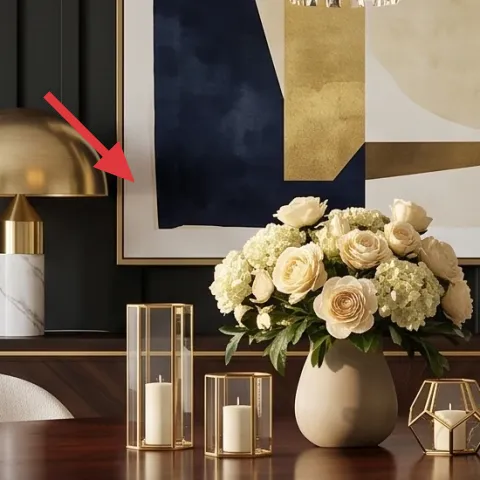
Layer 3 — large framed abstract artwork ($80) A focal point that works with dark paneling
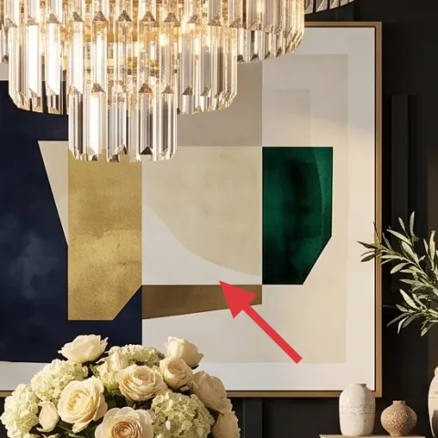
That large framed abstract artwork is the room’s anchor, especially because the wall behind it is busy with vertical panels. A smaller piece would get swallowed by the panel lines; a bigger frame gives your eyes a place to rest. The artwork also adds softer color blocks that echo the cream flowers and the brass tone, so everything feels connected instead of competing. The trade-off with going larger is that you may need to adjust your hanging height and measuring, but that’s an easy weekend step. If you’re reusing an existing frame, make sure the artwork still has enough contrast against the dark wall.
Center it by the wall, not the table
Use a level and measure from panel edges so the artwork reads perfectly aligned from the doorway view.
Layer 4 — brass table lamp with white shade ($120) Warm glow at chair height
The brass table lamp with a white fabric shade adds a second layer of light that feels flattering and “lived-in,” not just decorative. In the photo, the shade sits on the sideboard area, which means the warm light lands across the bouquet and the artwork instead of only illuminating the ceiling area. Compared with relying only on the hanging light fixture, adding lamp light lets the room stay warm after dinner, when the overhead glare isn’t as flattering. The trade-off is bulb choice: cool bulbs can wash out the cream tones and make brass look dull. Choose a warm bulb so the whole palette stays cohesive.
Don’t use daylight-bright bulbs
Very cool white bulbs can make the cream upholstery look gray and flatten the gold finish.
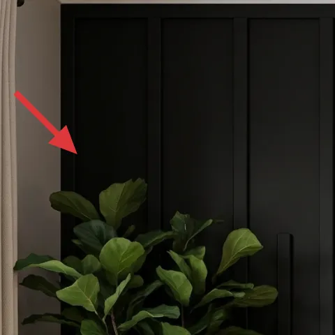
Layer 5 — tall leafy potted plant ($80) Fresh green to balance the dark
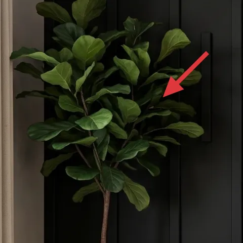
Tall leafy potted plants keep the dining room from feeling like a monochrome set. Here, the green on both sides visually “opens” the dark panel wall and gives the brass and cream details breathing room. The placement also matters: the plants flank the large artwork, which makes the wall feature feel intentional and symmetrical. If you’re replacing one plant, consider going taller than you think you need—because you want the foliage to rise high enough to echo the vertical panel lines. The trade-off is maintenance: make sure you can get to the pot to rotate it and keep leaves facing the room.
Match pot color to your metal tone
Even if the plant is planted elsewhere, choose a pot finish that doesn’t fight the brass accents.
Layer 6 — brass candle lantern set ($35) Brass sparkle you can DIY for less
This brass candle lantern set gives the sideboard that “small moments” look—little facets that catch warm light and repeat the gold tone from the fixtures and table base. In the photo, the lanterns sit near the bouquet and framed art, so they’re close enough to feel like part of the focal styling. Buying a full matching décor set can get expensive fast, which is why this is a perfect DIY candidate: you only need the right base finish and a consistent metallic sheen. The trade-off is prep time—cleaning and sanding so paint sticks—but the end result reads cohesive without paying for a premium styling package.
Make it instead of buying it
This weekend DIY turns plain lantern frames into the same warm brass tone so they match the sideboard styling.
Materials
- Metal cleaner + degreaser (enough for several pieces) — $12
- Primer for metal (spray) — $8
- Sandpaper (medium + fine) — $6
- Drop cloth or cardboard — $4
Steps
- Degrease the lanterns with cleaner so the surface paint can bond evenly.
- Lightly scuff-sand with medium grit to remove gloss.
- Wipe away dust and let the lanterns fully dry.
- Spray on a thin coat of metal primer and let it cure per the can.
- Lightly scuff again with fine grit for smooth coverage.
- Spray the brass-toned topcoat in light passes, then let it cure fully before styling.
Total DIY cost: $30 — saves about $5 over buying.
Layer 7 — brass decorative tray ($35) One tidy platform for tall-and-small styling
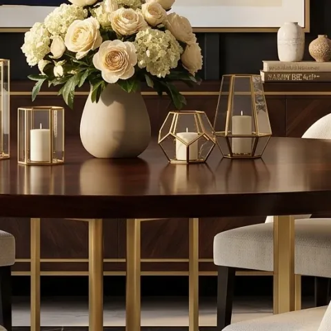
A brass decorative tray is what makes the sideboard feel organized instead of randomly styled. In the photo, the bouquet and small metallic pieces are grouped together on the tabletop styling area, and that single tray shape visually “collects” everything into one decision. This is the practical alternative to buying matching décor everywhere: you can use your existing white flowers, books, and small candle holders, then let the tray unify the arrangement. The trade-off is that trays show fingerprints and smudges, but that also makes them feel intentional—quick wipe before guests helps. Look for a tray with straight edges so it matches the room’s clean lines.
Build height in the tray, not around it
Cluster the tallest items in the center so the edges stay visually clean.
The cost, layer by layer
| Layer | Item | Cost |
|---|---|---|
| 1 | Cream curtain panel pair | $80 |
| 2 | Light gray patterned area rug | $200 |
| 3 | Large framed abstract artwork | $80 |
| 4 | Brass table lamp with white shade | $120 |
| 5 | Tall leafy potted plant | $80 |
| 6 | Brass candle lantern set (DIY at retail price) | $35 |
| 7 | Brass decorative tray | $35 |
| Total | $630 | |
If the rug budget is tight, choose a simpler weave in the same light-gray family and keep the pattern subtle. For artwork, use a larger print from a poster-size frame if you already own a frame you like.
What worked, what didn't (across the whole room)
This recipe works because it repeats three ideas: warm light, cream softness, and gold accents that show up in multiple places. The rug and curtains are especially important because they prevent the dark paneling from feeling heavy. The only time the look can go off is when the metals don’t match or when the lighting color temperature turns too cool.
What worked
- Cream curtains soften the dark paneled wall and make the gold lighting look warmer.
- The light gray patterned rug anchors the dining set and hides daily marks better than a solid.
- The large framed abstract artwork gives the vertical panels a true focal point.
- Brass lamp light at chair height makes evening dinners feel flattering, not harsh.
- Tall leafy plants balance the dark wall and create a clean frame around the art.
- Small metallic accents, like a tray and lanterns, make the sideboard feel intentionally styled.
What didn't
- Over-relying on only overhead light can flatten shadows and make the room feel cold at night.
- Using a rug that’s too small makes the chair legs look like they’re floating over dark flooring.
- Skipping curtain length cues can make the window look short against the ceiling molding.
- Mixing too many gold finishes can make the brass look accidental instead of coordinated.
- Choosing artwork with low contrast against the dark paneling makes it harder to read from the doorway.
What we'd skip if we did it again
Skip buying a matching set of small décor pieces first. It’s usually better to buy one unifying item—like a tray—and then style with what you already have (white flowers, books, lanterns). Matching everything from one retailer often duplicates shapes instead of creating a layered look.
Skip a rug that’s the right color but the wrong size. In dining rooms, scale changes the entire “finished” feeling. If the front chair legs aren’t on the rug, the room will look pulled together only at a glance, not from everyday angles.
Skip cool white lighting bulbs even if the fixture is gorgeous. Warm brass and cream textures read best under warm bulbs; cool bulbs make cream look gray and dull the gold tone. Swap bulbs before spending on new fixtures.
Frequently asked
How long does this dining room refresh take?
Plan for about 6–8 hours total if you already have basic tools (level, tape measure) and you’re not doing any major demolition. Curtains and rug sizing tend to be the longest practical pieces. The DIY lantern update adds prep and cure time, so do that earlier in the weekend and keep the rest of the layout flexible until everything’s dry.
If I rent, can I still get this look?
Yes—focus on curtains, rugs, and wall art placement, which are removable and don’t require changing the structure. For metallic accents, choose plug-in lighting or freestanding décor like the brass tray and lanterns. If hanging art is allowed, use the lightest anchor option you can. The overall style comes from layering and warm tones more than permanent changes.
What if my dining space is smaller than in the photo?
In a smaller dining room, keep the same principles but reduce only one variable: either go slightly smaller on the rug or choose curtains with a simpler pattern. The framed abstract piece should still be large enough to act as the focal point, but you can shorten the frame size while keeping it centered on the wall’s busiest area.
What if my room is bigger and feels empty?
Go bigger on rug coverage and curtain height before adding more décor. Bigger spaces can handle wider artwork and larger plants because they need visual anchors. Add a second warm light source (like a lamp) before buying more knickknacks; the goal is layered light, not just more objects.
Where should I shop for these items on a budget?
For curtains, start with big-box brands and look for machine-washable fabric in cream. Rugs and rug pads are often best from online retailers with size filters. For wall art, consider print + frame combos or poster-size prints in a larger frame. Brass accents like trays and lanterns can be found at home décor stores and thrift shops if you’re willing to paint-match.
Biggest mistake people make when copying this style?
Most people underestimate how much the light color temperature matters. Warm brass and cream textures read best under warm bulbs; cooler bulbs make the whole palette look dingy. The second common mistake is undersizing the rug—if the rug doesn’t ground the chair legs, the room feels unfinished even if the art and lamps are perfect.
More in Living Room

Under $700: modern glam dining room refresh with 7 upgrades
Turn a dark-paneled dining space into a modern glam moment with 7 budget-friendly upgrades, totaling $700 or less. This plan leans on warm …
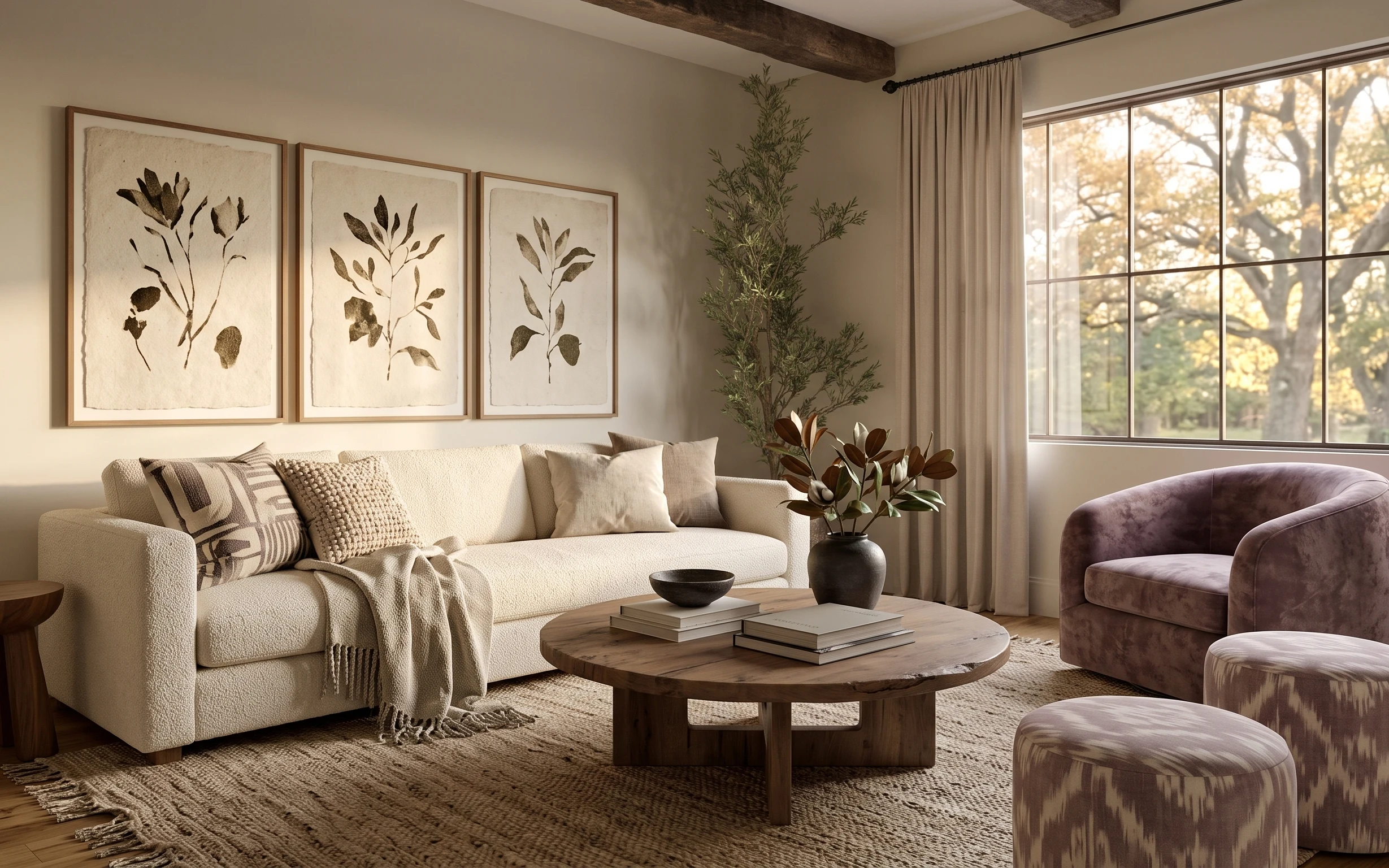
Under $400: earthy-neutrals living room refresh with move-ready swaps
A warm, golden-hour living room look built from renter-safe swaps: rug, throw, framed prints, and a few small stand-out pieces. This refres…
Under $700: 7 weekend upgrades for a living room seating area
A bright, earthy living room seating area can look pulled-together with simple weekend swaps. This refresh uses 7 budget-friendly layers (r…