- Best for
- one focused sofa-corner update
- Cost
- $880 total (under $1,000)
- Difficulty
- Confident DIY (frames + paint)
- Time
- 1 weekend (plus cure time)
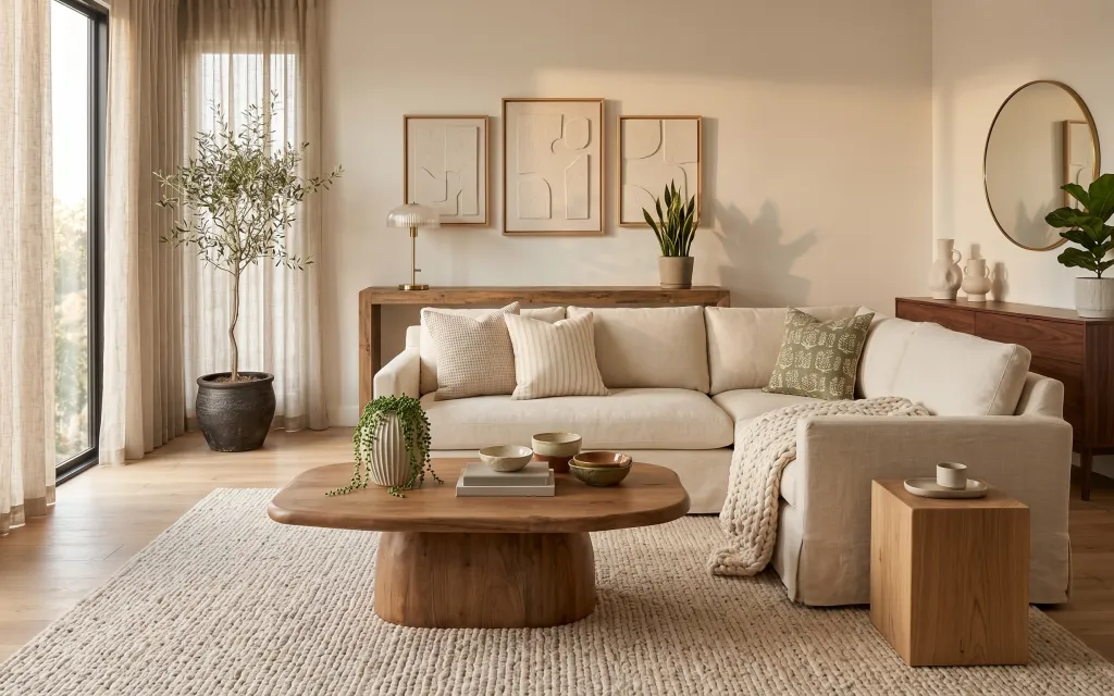
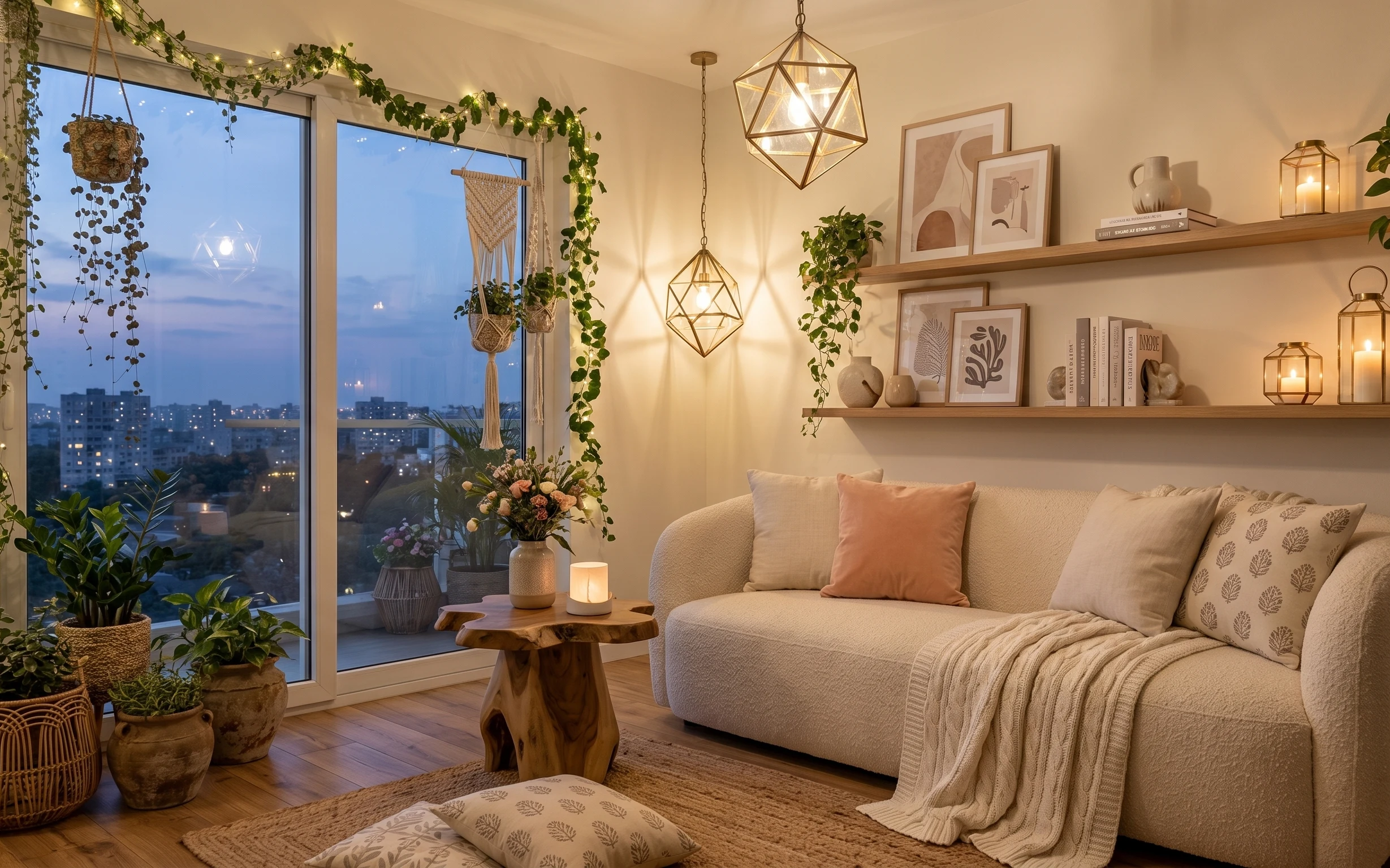
Why this olive-and-oak sofa corner is the sofa corner of 2026
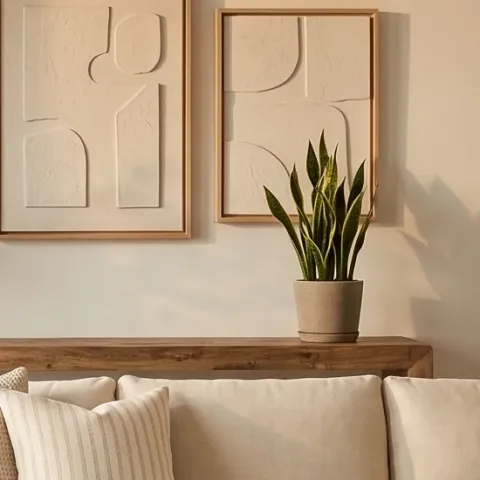
The look starts with texture: a thick, woven area rug under a rounded coffee table, plus a cream throw draped over the right arm. The curtain panels on the left hang long and soft, giving the room height even without any wall work. On the wall, three framed abstract prints create a calm focal point, while a warm white drum-shade table lamp adds a cozy pool of light. It’s achievable on a real budget because the palette stays tight—cream, light oak, and olive green—so each piece can be simple.
I almost made the classic mistake of “matching everything,” like buying one more beige accessory and calling it done. What changed my mind was noticing how this style relies on contrast in materials, not color chaos: wood grain against linen texture, and matte ceramics beside a smooth mirror. Once you see that, it’s easier to shop with intention instead of chasing the same item in five different shades.
Layer 1 — area rug ($200) Texture that anchors everything
This area rug is the foundation because it brings both softness and visual grounding to the light wood floor. The neutral tone keeps the sofa and coffee table from feeling like they’re floating, while the woven pattern adds depth you don’t need to “decorate around.” I’d rather put money here than in another throw pillow, because a rug changes how your whole room reads from every angle. The trade-off is that you’ll want a little space planning—an undersized rug makes the sofa look accidental. If your room is tighter, prioritize getting the rug’s front edge to land under the sofa’s leading area.
Pick a rug that runs under the front legs
In a sofa corner, the most convincing placement is having the rug extend far enough that the sofa feels “caught” by it instead of sitting on top.
Layer 2 — curtain panels (pair) ($80) Taller windows with less effort
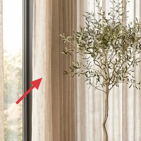
The curtain panels are doing quiet heavy lifting: they add height and soften the left side so the wall doesn’t feel bare. This style works because the fabric looks airy and matte, not shiny, which keeps the light wood and cream sofa from feeling too crisp. I’d skip decorative valances and spend on length instead—long panels visually lengthen the wall. The trade-off is you’ll need a rod height plan so the panels actually clear the window area and still puddle slightly at the bottom. That’s how you get the “intentional drape” effect without any renovation work.
Hang for height, not just coverage
Even standard panels look more expensive when the rod sits higher than the window frame.
Layer 3 — throw blanket ($60) Adds comfort without changing the palette
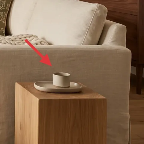
This throw blanket draped over the right arm does two jobs at once: it adds warmth and it creates a softer silhouette against the sofa’s clean lines. The color stays in the cream family, so it doesn’t compete with the olive-green details or the framed art. If you’re trying to choose between “more pillows” and “one good textile,” go textile—throws photograph better and feel more lived-in. The trade-off is that placement matters: too neat looks stiff, too messy looks random. Aim for a relaxed fold that lands where your eye naturally rests in the sofa corner.
Use one big fold, not lots of tiny tucks
A single drape reads intentional and keeps the rest of the styling calm.
Layer 4 — three framed abstract prints ($180) DIY the frames for a custom look
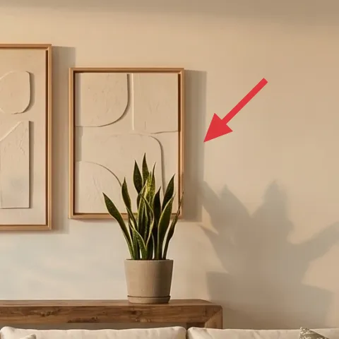
The three framed abstract prints form the room’s main wall rhythm, and they’re why the corner doesn’t feel like “just furniture.” Here, the frames look light and minimal, letting the off-white wall and pale art keep things airy. The advantage of this trio layout is that it fills space without a full gallery wall that can overwhelm a small corner. I’d rather DIY the frames than replace all the art, because you can keep the prints you already like and make the frames match your wood-and-cream vibe. The trade-off is patience: paint needs prep time for a clean, even finish.
Make it instead of buying it
DIY-friendly: repaint a set of similar frames so your existing or thrifted abstract prints look cohesive on an off-white wall.
Materials
- Painter’s tape — 1 roll — hardware store — $18
- Bonding primer — 1 can — home improvement store — $28
- Sandpaper (120/220 grit) — 1 pack — hardware store — $8
- Acrylic paint (cream or warm white) — 1 quart — home improvement store — $9
- Clear matte topcoat — 1 can — home improvement store — $12
Steps
- Remove prints from frames and scuff the frame with 120-grit until glossy spots dull.
- Wipe with a tack cloth (or damp cloth) and let fully dry.
- Tape off any areas you want to keep paint-free, then apply bonding primer.
- Wait for primer to dry completely, then sand lightly with 220-grit for a smooth finish.
- Apply 2 thin coats of cream/warm-white acrylic paint, letting each coat dry.
- After the final coat cures, spray or brush a thin clear matte topcoat and let cure.
Total DIY cost: $75 — saves about $105 over buying.
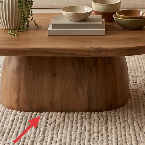
Layer 5 — round coffee table ($180) Smooth curves that soften the whole corner
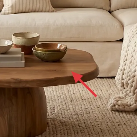
This round coffee table keeps the corner from looking boxy, especially with the straight lines of the console behind it and the sofa’s rectangular cushions. The light wood finish also ties into the floor, so the room feels connected instead of “decorated in layers.” I’d choose this over adding another small side surface, because a coffee table is where styling lives and where the eye lands first. The trade-off is that round shapes can look oversized if the table is too big—measure your clearance so chairs and the sofa still feel easy to access. When it’s the right scale, it makes everything else look intentional.
Measure the walkway clearance first
Round tables are forgiving, but if the edge sits too close to the sofa, the corner will feel cramped fast.
Layer 6 — table lamp with white drum shade ($60) Warmth after dark
This table lamp is the finishing touch that makes the room feel lived-in, not staged. The white drum shade softens the light and pairs naturally with cream textiles and off-white walls, while the warm base tone echoes wood elements in the coffee table and console. I’d rather buy a lamp with a light-shade look than rely only on overhead lighting, because lamp light creates depth at seated height. The trade-off is bulb choice: a cool bulb can flatten the whole palette, so stick to a warm white tone. Even if you’re short on time, swapping the bulb can make the lamp match the rest of the corner’s warmth.
Warm bulbs keep olive green from going dull
White-on-white can read gray if the bulb runs cool.
Layer 7 — round wall mirror with arched top ($120) Light bounce without extra clutter
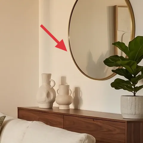
The mirror is a smart “space-expander” because it reflects the window light and adds a second focal point opposite the sofa. The arched top detail keeps it softer than a simple oval or rectangle, which fits the rounded coffee table and relaxed textiles. I’d prioritize a mirror here instead of extra wall art because it gives you brightness and depth without adding more objects to style. The trade-off is that mirrors show what’s in front of them—so keep the console styling tidy and cohesive. Once that’s dialed, it makes the whole room feel bigger and more breathable.
Keep the mirror centered at eye height
Mounting around the middle of the reflected sofa line keeps it flattering and not too high.
The cost, layer by layer
| Layer | Item | Cost |
|---|---|---|
| 1 | Area rug (5×7 neutral woven look) | $200 |
| 2 | Curtain panels (84\" pair) | $80 |
| 3 | Throw blanket (cream knit/waffle style) | $60 |
| 4 | Three framed abstract prints (DIY-painted frames) | $180 |
| 5 | Round coffee table (light wood) | $180 |
| 6 | Table lamp with white drum shade | $60 |
| 7 | Round wall mirror with arched top | $120 |
| Total | $880 | |
If you want a cheaper variant, skip the triple-framed wall and go with one larger framed abstract print, then put the savings into longer curtain panels. You can also choose a simpler lamp base (still with a white shade) so the palette stays cohesive while you keep the wall focal point simpler.
What worked, what didn't (across the whole room)
This sofa corner works because it relies on a tight cream-and-wood palette, then adds interest through texture (rug + throw) and shape (round table + arched mirror). The wall setup feels calm and intentional, and the lamp makes it usable at night.
What worked
- The neutral rug anchors the sofa and makes the coffee table feel properly scaled.
- Tall curtain panels soften the left side and visually lift the ceiling line.
- The throw blanket adds depth without changing the color story.
- Three framed abstract prints create a steady focal point without needing a crowded layout.
- The round coffee table breaks up straight furniture lines and improves circulation.
- The arched-top mirror bounces daylight and adds dimension to an off-white wall.
What didn't
- If the framed trio is spaced too widely, it stops reading as one unit and starts looking random.
- A cool bulb in the table lamp can make the cream palette look gray against the off-white walls.
- If curtains hang too low, the room loses that airy height effect and feels boxed in.
- Styling the coffee table with too many small items competes with the mirror and framed wall.
What we'd skip if we did it again
Skip the “matching set” instinct on the coffee table and console. This look works because ceramics and plants vary—same palette, different shapes—so sticking to one uniform line usually feels flatter.
Skip short curtain panels. If your rod sits near the window trim, the whole corner loses its height and the room reads smaller than it needs to.
Skip replacing the art unless the prints truly don’t work. Repainting frames is a faster, cheaper way to get cohesion while keeping the wall calm and letting the textures do the talking.
Frequently asked
How long does this sofa corner refresh take?
Most of the changes—rug placement, curtain hanging, lamp and mirror setup, and coffee-table styling—can fit into one weekend if the items are already in hand. The only time you truly “lose” is paint curing for the DIY frame refresh. Plan for a day of prep and primer, then another for painted coats, and a final topcoat day, with drying between coats. If you keep coats thin, everything stays manageable.
I rent—can I still do this look?
Yes, with substitutions. Choose peel-and-stick options for the wall art layout if needed, and rely on a tension rod for curtains. For the mirror, use renter-safe hanging methods (like removable hardware) if your lease is strict. The rug and lamp changes are fully renter-friendly, and you can DIY the styling by swapping textiles and ceramics without touching the walls.
What if my living room is smaller than the photo?
Prioritize the rug size and curtain length. A slightly smaller rug can still work if it sits under the sofa’s front legs, and longer curtains will help the room feel taller even in tight spaces. Consider keeping the framed trio, but tighten the spacing between frames so the wall doesn’t feel like it’s taking over. For the coffee table, aim for clearance so you can walk around the edge without bumping furniture.
Where should I shop for these specific pieces?
For the fastest wins, shop rugs and curtains at retailers with lots of neutral options, then build outward from the palette. Lamps and mirrors are easiest to match by browsing by “white drum shade” and “arched top” look. For the framed abstract prints, thrift can be great—then DIY paint the frames to lock in the cream/wood vibe.
What’s the biggest mistake people make in a sofa-corner refresh?
Buying items that match in color but not in texture and shape. Cream-on-cream can look flat unless you add contrast—woven rug fibers, knit throw texture, matte ceramics, and a wood grain surface. Another common mistake is placing curtains too low or choosing a rug that’s too small, because both shrink the room visually.
More in Living Room

Under $1000: olive-and-oak sofa corner refresh
A Japandi sofa corner refresh that reads warm and pulled-together without demolition. You’ll swap in a cozy rug, height-boosting curtains, …
Under $400: living room corner swaps for a renter-friendly glow
A move-ready living room corner refresh built from 7 renter-friendly swaps: rug, knit throw, pillow covers, botanical art, string lights, c…
Under $400: move-friendly console table corner refresh
A move-friendly console table corner refresh under $400, built from 7 swappable, packable upgrades: rug, table decor, a brass lamp, and a r…