- Best for
- making a kitchen island zone feel finished
- Cost
- $1410 (7 layers total)
- Difficulty
- Confident DIY
- Time
- One long weekend + drying time
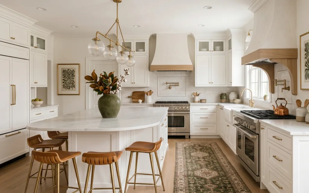
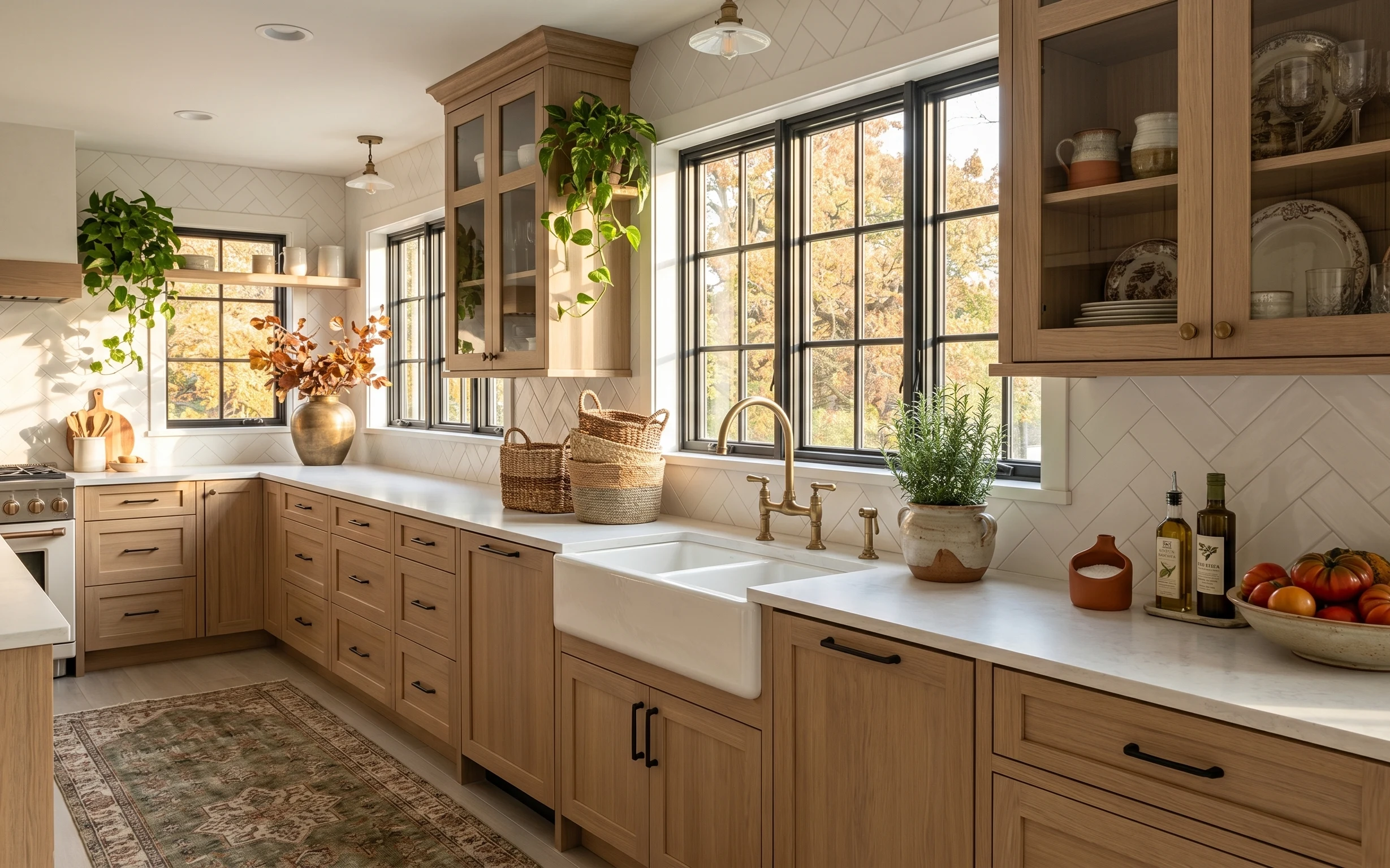
Why this brass-and-green kitchen island breakfast bar is the kitchen island breakfast bar of 2026
Bright, brass-forward lighting is doing a lot of heavy lifting here, and it’s paired with warm wood and crisp white cabinetry. The green patterned area rug anchors the island zone, while the three brown bar stools keep the breakfast-bar spacing feeling open instead of crowded. A large green ceramic vase adds height and color right where your eye lands when you walk in. Because this is a homeowner refresh (not a tenant makeover), you can pick the one change that gives the biggest visual payoff: a paint refresh that makes everything around it look cleaner.
I almost went straight to swapping hardware, then caught myself staring at how much the wall tone affects the whole palette. In my own places, the fastest “everything looks more put-together” moment usually comes from paint first—before I spend on accessories. Here, the goal is a warm off-white that plays nicely with brass and doesn’t fight the green rug. Once that’s right, the chandelier, art, and plants all feel like they belong together.
Layer 1 — green patterned area rug ($400) Brings the island zone down to earth
The green patterned area rug sits under the island and spills color into the wood-floor space, which is why it works better than a plain cream rug. Its distressed, vintage-style pattern makes fingerprints and daily wear less obvious—especially with a stove area just beyond it. A larger rug also keeps the breakfast bar from looking like it floats on hard flooring. The trade-off is that patterns do take over a little visually, so everything above (cabinetry and walls) stays bright and simple. If this rug feels bold, it’s exactly the kind of “choose one thing” move that prevents the room from going too beige.
Let the rug pattern guide the accessories
Pull one repeating color from the rug (here, the olive-green) and echo it in the vase or plant pot so the palette reads intentional.
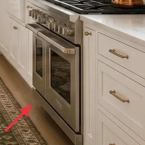
Layer 2 — set of 3 brown bar stools ($300) Frames the breakfast bar without crowding
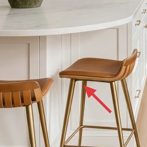
These three brown bar stools bring warm tone and texture to the island, balancing the white cabinetry and keeping the brass lighting from feeling too shiny. Because they’re on the slimmer side and visually “light,” they don’t overpower the space the way chunky dining chairs can. I also love the slatted backs; they add interest at a height that’s easy to see when you’re standing at the counter. The trade-off is practical: bar stools need a wipedown schedule, since upholstery fabric and darker finishes both show crumbs faster than you’d think. Choosing a cohesive finish (all three the same) makes the island area look designed, not temporary.
Count your seats like you’re planning a schedule
With three stools here, the island stays usable without forcing everyone into one tight corner.
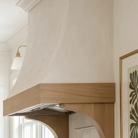
Layer 3 — brass chandelier with clear glass globes ($400) Adds warmth at the top
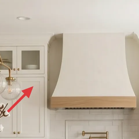
The brass chandelier with clear glass globes adds a warm metal glow overhead, and the glass keeps it from feeling heavy against the white ceiling. This is the kind of change that reads from across the kitchen, even when you’re focused on cooking. Compared to swapping just a single lamp, a chandelier “colors” the whole room because it affects the reflections on cabinet fronts and the brightness in the center zone. The trade-off is that hanging height matters—too low and it blocks sightlines from the window; too high and it stops feeling anchored. Keep the bulbs warm and the chandelier centered so it feels intentional above the island.
Measure before you commit to a new hanging height
If the chandelier drops too close to the island work zone, it will feel awkward daily—even if it photographs well.
Layer 4 — framed botanical print on the left wall ($80) Introduces pattern without adding clutter
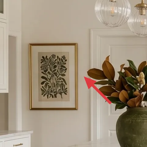
The framed botanical print gives the left wall a focal point, and the botanical lines echo the plant materials on the counter and near the window. Choosing framed art instead of a shelf full of decor keeps the wall calmer, especially in a kitchen where you already have cabinets, tile, and countertop styling competing for attention. I’d rather do one strong print than three small prints here, because kitchen walls tend to look busy fast. The trade-off is cost: art can get pricey quickly, so staying at a realistic framed size keeps this layer within weekend-refresh territory. If the print feels too themed, leaning into neutral frames and a green-forward palette keeps it wearable.
Match frame metal to your lighting hardware
Brass accents in the chandelier and sconce help a gold-toned frame look built-in instead of random.
Layer 5 — brass wall sconce with white shade ($120) Makes the right side feel finished after dark
The brass wall sconce with a white shade adds a second light height beyond the ceiling fixture, which is why the right side reads more layered and “lived in.” It also helps the window wall feel intentional, since light from the sconce fills the space even when the main chandelier is off. Compared to another pendant or another ceiling bulb, a wall sconce keeps the center open and gives you a calmer glow that’s better for evening cooking. The trade-off is that it’s visually noticeable, so the finish should match your other metals—brass here plays nicely with the chandelier. If you love the look, keeping the shade white prevents the sconce from competing with the green rug.
Use warm bulbs for a softer kitchen palette
Warm light keeps white cabinetry from looking blue and helps the green tones look rich.
Layer 6 — large green ceramic vase on the island ($40) Turns countertop styling into a focal moment
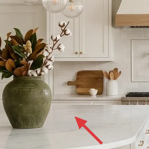
The large green ceramic vase on the island is doing a lot of design work: it brings color, adds vertical height, and creates a clear “center story” between the chandelier and rug. A single statement vessel is usually easier than stacking multiple small items, and it’s easier to live with day to day. This vase also pairs naturally with the existing plants, so the island feels connected to the rest of the kitchen rather than like it’s decorated in isolation. The trade-off is that a big vase demands occasional cleaning—water spots and dust show up faster than you’d hope on glossy ceramics. Still, the payoff is consistent: it anchors the whole counter whenever you walk by.
Group your greenery by height, not by type
Let tall stems come from the back of the vase and keep shorter bits in front for a balanced silhouette.
Layer 7 — paint, 1 gallon (kitchen wall color match) ($70) Makes white cabinetry look cleaner
Make it instead of buying it
This weekend, freshen the kitchen walls with a warm off-white roller finish so the brass, green rug, and botanical art look crisp together.
Materials
- Warm off-white wall paint, 1 quart (enough for touch-ups/one coat) — home improvement store — $35
- 2" angled brush — home improvement store — $8
- 9" roller covers + tray supplies — home improvement store — $12
- Painters tape (1.5 in) — home improvement store — $5
Steps
- Clear the wall area and tape the edges around trim, cabinet sides, and outlets.
- Stir paint thoroughly and pour into a tray to keep coverage consistent.
- Cut in along the top edges first with the angled brush for clean lines.
- Roll the main field in smooth, even passes, working in small sections.
- Check for missed spots with the lights on, then spot-roll where needed.
- Let the coat dry fully before deciding whether a second coat is necessary.
- Remove tape while the paint is slightly tacky for sharper edges.
- Let everything cure/dry fully overnight before touching up small areas.
Total DIY cost: $60 — saves about $10 over buying.
The paint layer matters because it changes how every other material reads—brass looks warmer, green looks deeper, and white cabinets look intentional instead of slightly dingy. In a kitchen with lots of bright surfaces (cabinet doors and tile), even a minor tone shift can make the whole space feel more polished. The biggest alternative would be buying more decor, but paint gives a cleaner baseline that decor can build on. I picked a warm off-white approach because it matches the existing cabinetry softness instead of going stark. The trade-off is time: good paint work needs clean prep and drying time, so plan for a full day plus overnight dry.
Stick to cut-in first, roll second
Cutting edges before rolling prevents heavy roller marks on trim lines and reduces the number of touch-ups.
The cost, layer by layer
| Layer | Item | Cost |
|---|---|---|
| 1 | Green patterned area rug (8×10) | $400 |
| 2 | Set of 3 brown bar stools | $300 |
| 3 | Brass chandelier with clear glass globes | $400 |
| 4 | Framed botanical print (16×20, left wall) | $80 |
| 5 | Brass wall sconce with white shade | $120 |
| 6 | Large green ceramic vase | $40 |
| 7 | Warm off-white paint, 1 gallon | $70 |
| Total | $1,410 | |
If you want a cheaper route, keep the brass chandelier and sconce if they’re already in good shape, then spend less on seating by choosing bar stools with simpler legs and a basic seat cushion. Swap in a mid-range rug with a closer color match and choose one framed print instead of repeating artwork.
What worked, what didn't (across the whole room)
This kitchen island breakfast bar layout succeeds because the palette stays bright while the details add warmth—brass metals, a green rug, and plant styling. The ceiling light and wall sconce create depth at multiple heights, and the island seating keeps the zone practical. The only parts that can easily go off-track are lighting scale and art density.
What worked
- The green patterned rug grounds the island zone and hides everyday scuffs better than a solid cream.
- Three matching bar stools keep circulation open while still giving guests a clear seating spot.
- The brass chandelier’s clear globes reflect light without making the ceiling feel crowded.
- The botanical art adds pattern to blank wall space without competing with cabinet-and-tile lines.
- The brass wall sconce adds a second lighting layer that feels finished after dark.
- The large green ceramic vase creates an anchor for countertop styling and ties in the plant tones.
What didn't
- If bar stools are too bulky, the island area starts to feel tight and harder to walk through daily.
- A rug that’s too small will make the island zone look detached from the rest of the kitchen.
- Adding too many small decor items near the vase can make the counter feel busy fast.
- If the art frame metal doesn’t match the brass lighting, the palette can look mismatched.
- Cool-toned wall paint can make brass look harsher and flatten the green tones.
What we'd skip if we did it again
Skip the urge to add a second “main” focal point on the island after the chandelier is already centered. With the chandelier overhead and the rug anchoring below, another oversized centerpiece tends to crowd sightlines. Keeping the island story to one tall element (like the large green vase) is what keeps the kitchen feeling airy.
Skip changing multiple metals at once. If the chandelier and sconce are brass, switching cabinet pulls, faucet finishes, or hardware on top of that usually makes the room look in-between. When the metal family stays consistent, it reads designed even if the pieces are budget-friendly.
Skip a rug with a high-contrast, modern pattern if the walls and cabinets are traditional. This kitchen’s balance comes from warm whites and botanical texture, so the rug pattern needs to look slightly aged or softened. That’s the difference between “farmhouse” and “competing styles” in a busy kitchen.
Frequently asked
How long will this kind of kitchen refresh take on a weekend?
The fastest part is styling: rug placement, bar stool arrangement, and swapping decor takes a few hours. The longest piece is the paint work because it requires careful edges and full drying time. If the lighting needs only a swap (not rewiring), you can usually plan one half-day for installation and cleanup. Add an extra day if you’re waiting on paint to dry between coats.
Can I do this refresh if I rent?
Some layers translate well, like the framed botanical print, vase styling, and a rug swap. For lighting, renter-friendly options usually mean adding plug-in lamps or using a ceiling-rated plug-in pendant where allowed (without rewiring). Paint and any wall changes should be off-limits for renters unless you’re doing removable peel-and-stick wallpaper or using washable coverings. The core idea—anchor with a rug and add warm metals—still works.
What if my kitchen island is smaller or the rug won’t fit the same size?
If your island is narrower, size down the rug but keep the rule of thumb: the front legs of your bar stools (or all of them, if space allows) should remain supported on the rug. A smaller rug can still work if it visually reaches beyond the stool footprint. The biggest mistake is choosing a rug that stops too early, which makes the island area look like separate furniture instead of one zone.
Where should I shop for the brass lighting and botanical art?
For brass lighting, look at mainstream home retailers and lighting chains first for comparable glass globe styles, then check secondhand marketplaces for the metal finish if you’re comfortable verifying compatibility. For art, framed botanical prints are easy to find in consistent sizes; keep the frames matching your brass so the wall art looks intentional. Buying a single strong print usually beats collecting several tiny ones that don’t match.
What’s the biggest mistake people make in kitchens with lots of white cabinets?
The biggest mistake is picking accessories that are either too cool-toned or too many at once. White cabinets are already bright, so you want warmth from metals and greenery, and you want one clear “anchor” item at a time—rug, vase, or art—rather than five competing focal points. If everything tries to be decorative, nothing feels finished.
Do I need to change the chandelier for this look to work?
Not necessarily. If you already have a ceiling fixture you like, the cheaper route is to focus on the rug, the bar stools, and the wall art, then layer in a warm sconce for depth. If your current chandelier is very dark or too modern, swapping to a brass + glass style helps the room feel cohesive with the farmhouse palette. The key is getting warm reflections without visual heaviness.
More in Kitchen & Dining

Under $1500: kitchen island breakfast bar refresh with 7 layers
A kitchen island breakfast bar can feel brand-new with small, owned-apartment style swaps. This $1500 weekend refresh uses seven layers—rug…
Under $350: renter-friendly kitchen swaps for an island
A warm, wood-heavy kitchen with an island can still feel fresh on a renter budget. This $350 plan uses peel-and-stick backsplash, a removab…
Under $600: sunny kitchen refresh with 7 satisfying upgrades
A sunny kitchen starts with a few high-impact swaps: an updated area rug, brighter counter styling, and a brass faucet moment. This $600 we…