
- Best for
- Budget-friendly kitchen surface refresh
- Time
- 1–3 weekends
- Difficulty
- Easy to moderate
- Cost
- $350-ish total
Why warm wood-and-beige kitchen details are the kitchen with island of 2026
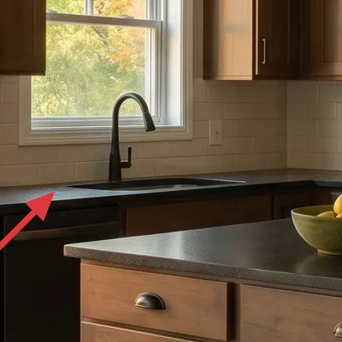
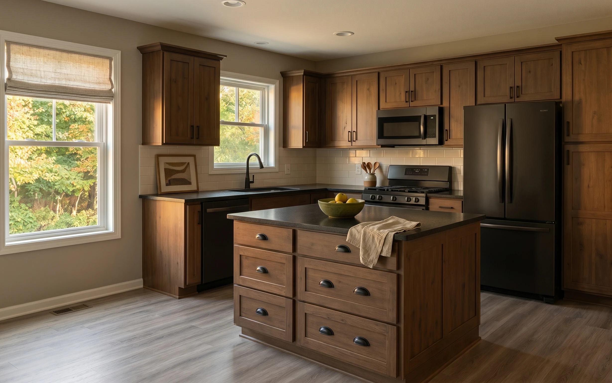
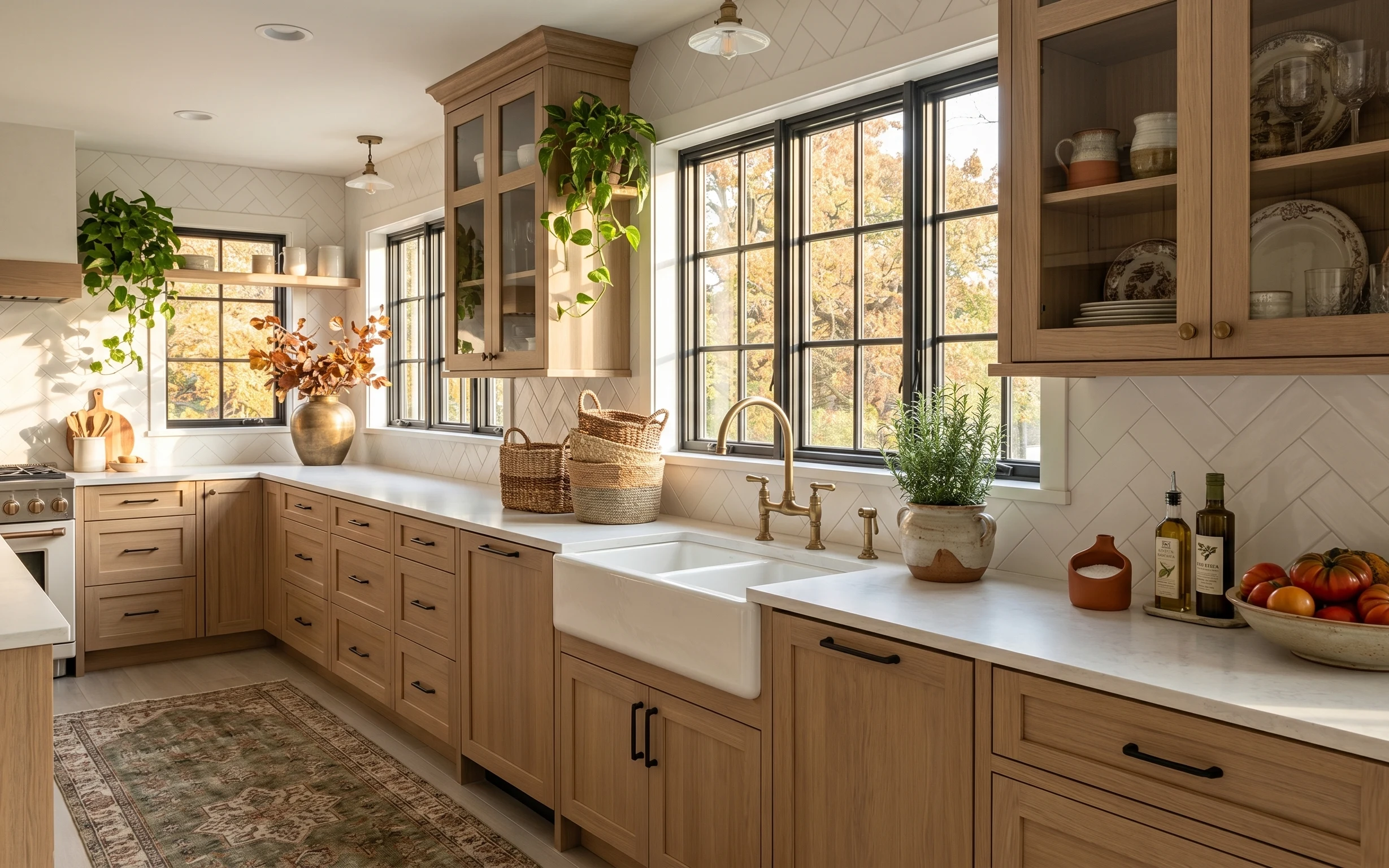
The easiest way to make a wood-heavy kitchen feel current is to repeat the same materials in smaller doses: a textured backsplash, a framed print, and a single pop on the counter. In this photo you’ve already got warm brown cabinetry, beige walls, and gray countertop surfaces working together—so the refresh leans on those textures instead of fighting them. I’m especially into the way the framed artwork sits between the windows and how a rolled dish towel adds a soft, folded note. For renters, everything here is swap-and-pack, not permanent.
I used to overdo kitchens by adding decor in random spots, then wondering why it still looked “staged.” One mistake I made was buying a bunch of small items that didn’t share a color or material, so they fought the backsplash. This time the choice was simpler: keep the palette tight (warm brown, beige, gray) and let one visual anchor—like the print—do the heavy lifting. After that, the lemon bowl and towel read as intentional styling instead of clutter.
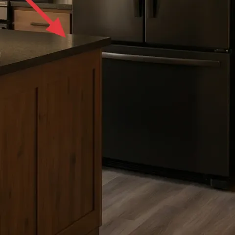
Layer 1 — peel-and-stick backsplash sheet ($80) Patterned tile, no-mess install
Swap the dated tile look with a peel-and-stick backsplash sheet so your eye lands on a clean, updated surface right where people look while cooking. This works especially well over the island cooking zone because the backsplash repeats horizontally and frames the window light. The trade-off is that you’re not redoing the whole kitchen—just the backsplash area—so you’ll want to keep your counter styling calm. Pick a pattern that echoes the warm undertones in the cabinets, not stark cool whites. The result is a “real renovation” feeling without touching grout.
Choose a warm undertone
Look for cream, greige, or soft beige in the backsplash so it sits comfortably next to wood tones.
Layer 2 — framed wall art print (Command hook add) ($35) Removable print that matches the palette
Re-style the wall art by choosing a framed print with the same warm neutrals already in the room (beige, gray, and wood-brown). In this photo, the framed piece sits between two windows, which means it naturally becomes the kitchen’s focal point. The key is to keep the frame size similar so the spacing looks balanced against the window trim. The trade-off: art can’t fix clutter, so countertop styling still matters. If the original print feels too busy, swapping to a quieter design makes the whole kitchen feel more deliberate. Use a removable hanging method so you can take it with you.
Why removable hanging matters
Command-hook hanging keeps the wall in the same condition when the lease ends.
Layer 3 — bowl with lemons on island ($15) Small color pop for the island
Add or restyle a bowl with lemons on the island to bring in that bright yellow note you already see in the photo. This type of accessory works because it’s both decorative and functional—your kitchen still feels usable, not museum-like. The trade-off is that citrus needs occasional refresh, so plan for a quick swap when the color dulls. Keep the rest of the counter relatively plain so the bowl doesn’t compete with the backsplash pattern. If you want a cheaper look, use seasonal fruit you can eat, then reuse the bowl for other countertop arrangements later.
Use the same bowl shape all year
Keep the container and rotate what’s inside (lemons, oranges, or even a few branches).
Layer 4 — wood utensil holder with utensils ($25) Warm material that fits the cabinets
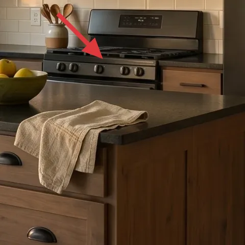
Keep the utensil storage looking intentional with a wood utensil holder that matches the cabinet warmth. In the hero image, the utensils create vertical rhythm against the backsplash, so the holder becomes a subtle design element rather than just storage. The trade-off is you’ll want to control what’s “on display,” since a cluttered utensil mix can look messy fast. Stick to matching utensil finishes when possible and wipe the holder regularly so it stays the same tone. This choice is renter-friendly because it’s fully movable—you can pack it up with your basics when the lease ends.
Match the finish, not the exact color
Look for a similar wood grain family so the holder reads as part of the same warm scheme.
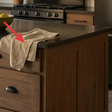
Layer 5 — rolled dish towel on island ($18) Folded texture instead of extra objects
A rolled dish towel on the island adds soft, fabric texture without taking up counter space the way bigger decor would. In this photo, the towel’s neutral tone works like a visual “breather” between the gray countertop and the warm wood cabinetry. The trade-off is that towels need a quick shake-out and re-fold now and then, especially in kitchens with frequent use. Keep it to one towel styling moment—either rolled on the counter or draped neatly—so it doesn’t look like you forgot to put it away. Choose a fabric that looks slightly textured, not glossy, for a more relaxed look.
Roll with the edge facing out
A tight roll makes the towel look styled even when it’s clearly functional.
Layer 6 — window shade on left window (linen-style cover) ($30) Soft window texture that echoes beige walls
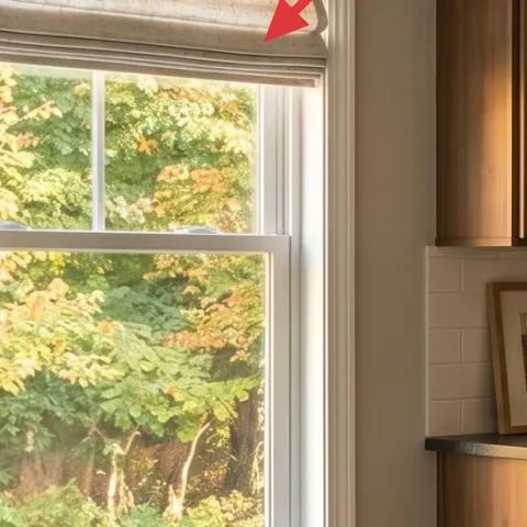
Window shades already provide coverage in this kitchen, so the easiest renter move is updating the look with a linen-style cover in a warm neutral. That brings in texture that matches the fabric softness of the dish towel, creating a consistent material story. The trade-off is that this won’t change the light direction or the window layout—your goal is visual warmth, not a lighting upgrade. Keep the tone close to the beige walls so it doesn’t fight the warm brown cabinetry. When you remove it at move-out, the window hardware stays untouched and you can reuse the fabric cover elsewhere.
Avoid permanent window changes
Don’t drill into frames or install anything that can’t be removed cleanly with the lease.
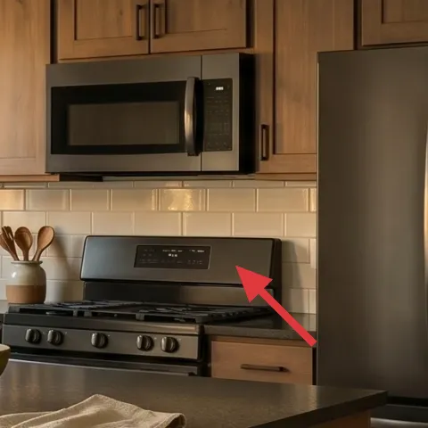
Layer 7 — plug-in LED under-cabinet strip light ($110) Extra task light without hardwiring
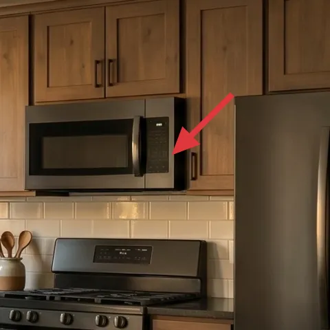
Add plug-in under-cabinet strip lighting to brighten the backsplash area where the photo looks naturally warm but a bit dim at counter level. This makes meal prep feel easier and also highlights your new backsplash pattern and framed art during evening hours. The trade-off is power-plug planning: you’ll need a location that lets the cord route neatly without looking messy. Pick a warm-white setting so the light doesn’t turn the countertops gray-green. Under-cabinet light is also renter-friendly because it removes completely, taking your upgrades with you instead of leaving installation marks behind.
Warm white keeps wood tones natural
Choose about 2700K so the kitchen stays golden, not bluish.
The cost, layer by layer
| Layer | Item | Cost |
|---|---|---|
| 1 | Peel-and-stick backsplash sheet | $80 |
| 2 | Framed wall art print add | $35 |
| 3 | Bowl with lemons (styling bowl) | $15 |
| 4 | Wood utensil holder with utensils | $25 |
| 5 | Rolled dish towel | $18 |
| 6 | Linen-style window shade cover | $30 |
| 7 | Plug-in LED under-cabinet strip light | $110 |
| Total | $313 | |
If you want it cheaper, prioritize the peel-and-stick backsplash and one countertop textile change, then skip the window cover and go with a single warm bulb in an existing plug-in lamp.
What worked, what didn't (across the whole room)
The strongest wins here come from surface + focal-point swaps: backsplash and framed art do the visual heavy lifting, while textiles keep everything soft. The rest is about small, move-ready details that don’t require landlord permission. The one thing that can derail this look is adding too many competing accents across the island and windows.
What worked
- The backsplash change creates a modern backdrop that makes wood cabinetry look intentional instead of dated.
- Warm-toned framed art mirrors the beige walls and gives the island area a clear focal point.
- Counter accessories like the lemon bowl add color without needing additional bulky furniture.
- Matching wood storage pieces keep the countertop from feeling like separate “piles.”
- One rolled dish towel adds texture and looks styled even in a working kitchen.
- Plug-in under-cabinet light improves evening visibility where you actually need it.
What didn't
- A too-busy backsplash pattern can compete with window brightness and make the kitchen feel visually louder.
- Adding multiple decorative bowls and utensil holders makes the island look cluttered fast.
- Cool-white lighting can make countertops look gray-green next to warm wood tones.
- Choosing a window cover tone that’s too pale can wash out the beige wall warmth.
- Skipping a consistent palette makes framed art and counter styling feel mismatched.
What we'd skip if we did it again
Skip a high-contrast backsplash pattern. In a kitchen with warm wood and plenty of window light, bold contrast tends to feel busy instead of finished, and it also makes countertop styling harder to keep calm.
Skip adding more than one countertop “hero” object. If the lemon bowl is the focal point, keep the utensil holder and towel simpler so the island reads cohesive rather than crowded.
Skip cool lighting choices. Warm-white plug-in strips keep wood tones looking natural and make your new backsplash and framed art look correct at night.
Frequently asked
How long does this kitchen refresh take?
Most of the changes are quick: peel-and-stick backsplash prep and application is the longest step, usually a few hours plus trimming time. Swapping framed art and styling the island can be done in under an afternoon. If you’re adding plug-in under-cabinet light, plan a bit of time for cord placement so it looks tidy and safe.
Is this renter-friendly if I can’t drill or replace fixtures?
Yes—everything in this plan is meant to be removable or add-on. The backsplash is peel-and-stick, the framed art can be rehung with removable hardware, and the lighting is plug-in instead of hardwired. Counter accessories and textiles pack up easily, so the kitchen can return to its original state without patching or repairs.
What if my kitchen is smaller than this one?
If your kitchen has less wall space, scale the backsplash area to match the most visible stretch between windows and the range line of sight. Choose smaller framed art and keep one countertop color pop (like the lemon bowl) instead of multiple accents. Under-cabinet lighting is still worth it because it improves how the counter and backsplash look at night.
What if my kitchen feels too dark at night?
Add warm under-cabinet lighting and keep the rest of the palette in warm neutrals. A cool bulb can make wood and countertops look dull, even when the room is bright during the day. Also keep one fabric texture on the island—like a towel—so the light bounces off something soft.
Where should I shop for the key swaps?
Peel-and-stick backsplash sheets and removable wall art are widely available from home decor retailers and marketplaces that carry peel-and-stick products in multiple finishes. For textiles, look for warm beige and textured neutrals in kitchen towel sets. For lighting, shop plug-in under-cabinet LED strips labeled for renters and safe cord use.
Biggest mistake to avoid in a warm-wood kitchen refresh?
The most common miss is adding too many separate accent styles at once—different metals, different warm tones, and too many patterns. That makes the island look less intentional. Pick one anchor (backsplash or framed art), then repeat the same warm neutrals through textiles and countertop accessories.
More in Kitchen & Dining
Under $350: renter-friendly kitchen swaps for an island
A warm, wood-heavy kitchen with an island can still feel fresh on a renter budget. This $350 plan uses peel-and-stick backsplash, a removab…
Under $600: sunny kitchen refresh with 7 satisfying upgrades
A sunny kitchen starts with a few high-impact swaps: an updated area rug, brighter counter styling, and a brass faucet moment. This $600 we…
Under $700: a brass-and-white dining nook refresh
A brass-and-white dining nook refresh for homeowners, built on a $700 weekend budget. Swap in warm textures (rug, mirror, lamp) and sharpen…