
- Best for
- Warm brass-and-wood kitchen refreshes
- Time
- 1 weekend (about 6–10 hours)
- Difficulty
- Moderate
- Cost
- Under $600
Why brass-and-oak daylight is the sunny kitchen of 2026
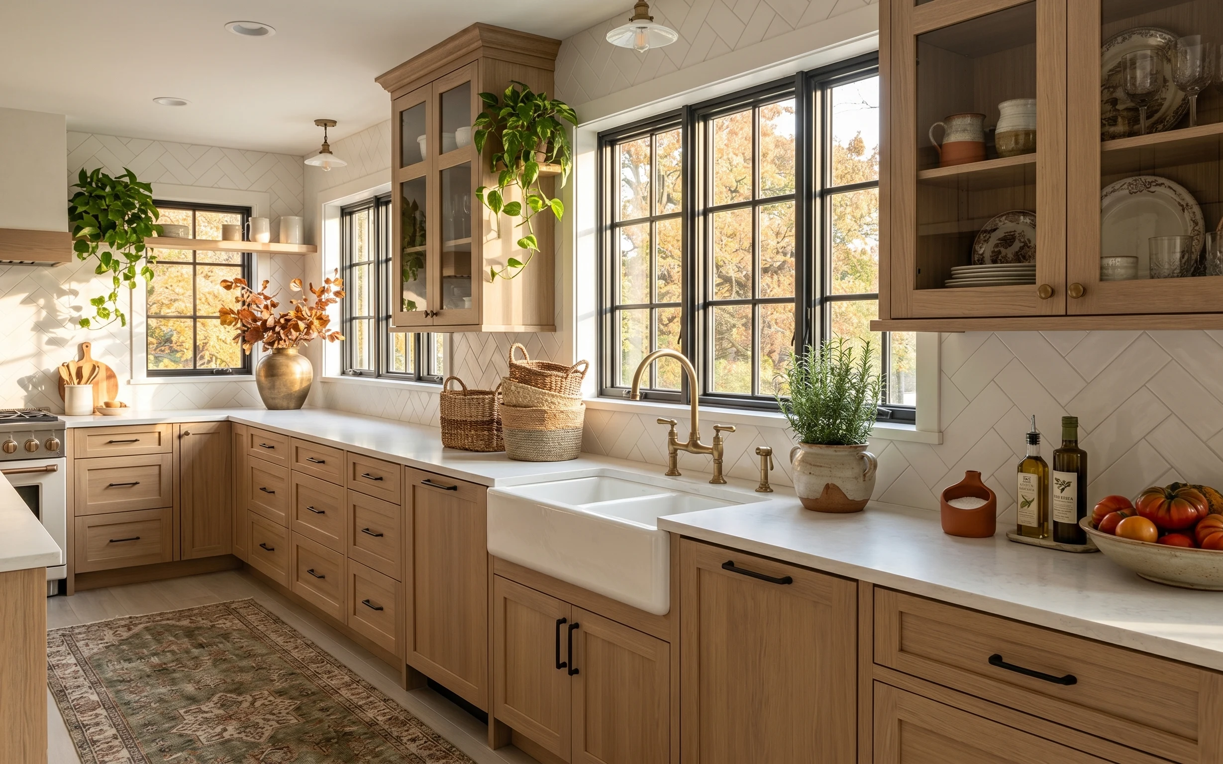
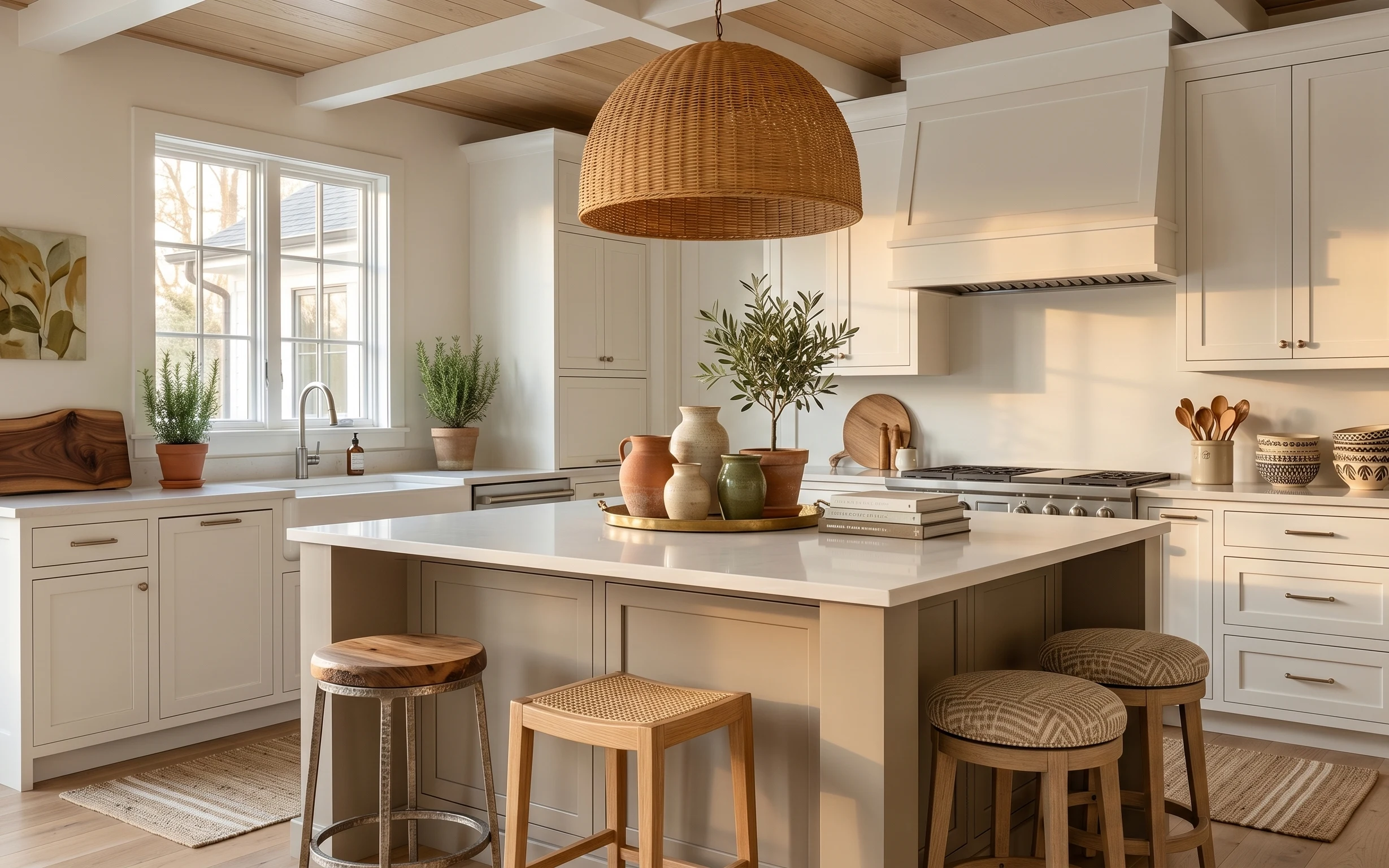
The fastest way to make a kitchen feel “finished” is to focus on the surfaces your hands touch and your eyes scan—counter, faucet, and the little styling moments between. In this photo, the white herringbone tile backsplashes, light wood cabinetry, and brass-toned hardware set a warm base, while the rug anchors the whole zone. Those woven baskets and the leafy plant make the room feel lived-in, not staged. Best of all, this kind of refresh is realistic for homeowners because you can choose the most impactful option (like paint or hardware) instead of hunting for reversible-only fixes.
One mistake I used to make: I’d buy pretty decor first and worry about the rug later, which meant the whole color palette kept shifting. This time, the rug mattered first—it gives the countertop styling somewhere to “sit.” Also, I used to choose a matching set and end up with everything the same height, same texture, same vibe. Here, the plant height, the pendant placement, and the basket shapes create a natural rhythm that feels intentional without being precious.
Layer 1 — area rug ($200) grounds the sink-and-counter zone
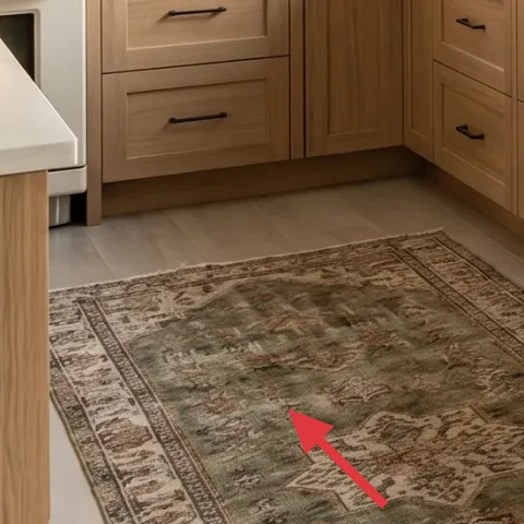
This area rug is doing quiet work underfoot: it adds pattern and warms up the cool look of white tile and bright daylight. Because it sits right in the kitchen’s walking lane, you want something with enough texture to hide everyday scuffs and cooking-day messes. The darker tones also make the brass faucet look richer instead of washed out. A common alternative is a smaller runner, but that can leave the counter area feeling disconnected. This one covers enough floor to unify cabinets, countertop, and the island end, even when the room is otherwise minimal.
Choose rug pile that’s easy to live with
A slightly flatter texture or low-to-medium pile tends to vacuum better in kitchens and doesn’t fight the rug pad.
Layer 2 — woven countertop baskets ($55) keeps small clutter out of sight
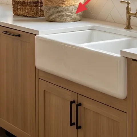
These woven countertop baskets add instant texture and solve a real problem: kitchens collect “in-between” items—sponges, tea towels, takeout menus, or random produce runs. The baskets in the photo also echo the light wood cabinetry, so the look stays cohesive instead of turning into a mismatched shelf moment. Buying a flat organizer tray is the obvious alternative, but baskets are more forgiving when they’re slightly messy (and you’ll get messy in a kitchen). The trade-off is that woven pieces need an occasional dusting, but the payoff is a warmer, more natural countertop.
Style rule: let them touch the countertop edge
If the baskets float in the middle of the counter, they read like decor; tucked near the edge, they read like storage.
Layer 3 — glass vase with dried floral stems ($30) adds vertical interest without blocking light
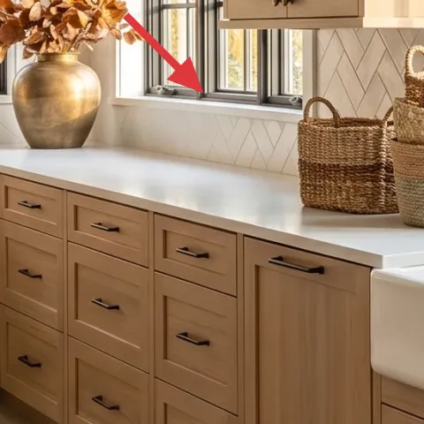
The glass vase with dried floral stems brings height to the counter styling and creates a focal point between the plant and the faucet. The clear glass keeps the visual weight light, which matters here because the windows bring in so much brightness. The dried stems also hold their shape, so the look doesn’t require watering or constant rearranging. The “buy flowers every week” alternative can be expensive and unpredictable. This is the steadier option: a simple base you can repaint and refresh seasonally while keeping the same silhouette.
Make it instead of buying it
Paint the glass vase so it matches the room’s brass-and-oak palette and looks intentional with the dried stems.
Materials
- Glass-specific spray primer (small can) — 1 — store pickup — $7
- Craft acrylic paint (brushed-on color) — 1 small jar — hobby store — $10
- Foam craft sponge — 1 pack — craft aisle — $3
- Painter’s tape — 1 roll — hardware store — $2
- Disposable gloves — 1 pair — pharmacy — $1
Steps
- Clean the vase thoroughly with soap and water, then let it dry fully.
- Use painter’s tape to mask any areas you want clear (like the rim).
- Spray a thin layer of glass-specific primer and let it dry completely.
- Tap-paint color on with a foam sponge for a subtle, even finish.
- Build a second light coat where the glass shows through.
- Remove tape after the paint is dry to the touch, then let it cure before styling.
Total DIY cost: $23 — saves about $7 over buying.
Skip heavy paint drips on glass
Thick runs show through fast on glass. Use thin coats and let drying happen between layers.
Layer 4 — large leafy indoor plant ($45) makes the kitchen feel lived-in
The large leafy indoor plant is the visual “breathing room” between hard surfaces—tile, countertops, and cabinet lines. It sits up high enough to soften the top third of the kitchen, which is why it reads so calming even in a bright space. If you went with a smaller tabletop plant, the effect would be cut off at counter height and the windows would do all the work. Here, the taller greenery balances the pendant and the window framing. The trade-off is choosing a plant size you can realistically maintain; this one works because it’s positioned to catch daylight without needing constant repositioning.
Pick a pot diameter that matches the shelf/window ledge
Too small looks top-heavy; too large blocks light. Aim for a snug fit where leaves spill naturally.
Layer 5 — brass kitchen faucet ($120) adds the warm metallic focal point
The brass kitchen faucet is a small detail with big influence because it reflects light and ties into the kitchen’s warm wood tones. In this photo, the warm metal pops against the white countertop and clean tile, which is exactly what you want near your daily tasks. The alternative is a cooler chrome/silver finish, but it often makes bright kitchens feel a little too clinical once the daylight fades. If you’re doing a refresh without major demolition, swapping faucet finishes (or even adding coordinating accessories) is one of the most direct ways to change the room’s “temperature.” The trade-off is you’ll want to wipe it down so it stays looking crisp.
Match metal tones, not every single item
Pick one hero metal (like brass) and echo it with a couple of accessories instead of trying to match everything.
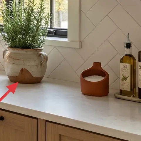
Layer 6 — terra-cotta planter pot on countertop ($40) brings earthy color to the white base
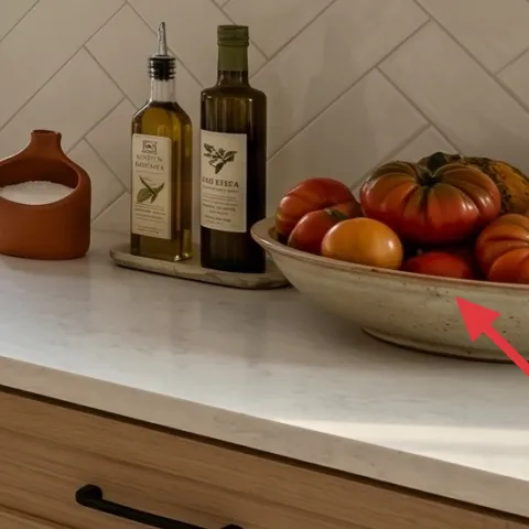
This terra-cotta planter pot adds a grounded, earthy note that makes the room feel warmer than “all white.” It’s placed where the eye travels—near the right-side counter styling—so it’s part of the color story rather than an afterthought. A painted pot could look fresher for a moment, but terra-cotta also ages in a way that blends with everyday kitchen life. The texture matters too: the matte surface reads softer than glossy ceramic. The trade-off is that unsealed terracotta can get dusty-looking, so a quick wipe keeps it looking intentional.
Use pot color as your palette anchor
When the base is white and wood, one warm clay tone keeps styling cohesive.
Layer 7 — glass pendant light ($80) frames the room with soft, centered glow
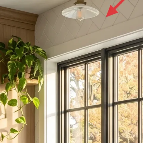
The glass pendant light softens the kitchen’s geometry by adding a rounded, translucent focal point near the bright windows. Because it’s centered and elevated, it supports the vertical styling—plant height and vase height—and it prevents the kitchen from feeling flat. Swapping to a very bold fixture is tempting, but in a room already working hard with tile pattern, bold fixtures can steal attention from your counters. This pendant keeps the look clean while still adding personality. The trade-off is bulb choice: a warmer bulb will make the brass and wood feel richer once the daylight shifts.
Use a warm bulb to keep metals looking golden
A warmer color temperature makes brass read like brass instead of dull beige.
The cost, layer by layer
| Layer | Item | Cost |
|---|---|---|
| 1 | Area rug | $200 |
| 2 | Woven countertop baskets | $55 |
| 3 | Glass vase with dried floral stems | $30 |
| 4 | Large leafy indoor plant | $45 |
| 5 | Brass kitchen faucet | $120 |
| 6 | Terra-cotta planter pot on countertop | $40 |
| 7 | Glass pendant light | $80 |
| Total | $570 | |
If you want a cheaper variant, prioritize the rug and faucet finish (or faucet accessories) and scale back on décor pieces—choose one basket instead of two, and pick a smaller plant size that still reaches the same visual height.
What worked, what didn't (across the whole room)
Most of the wins come from placing texture and warm tones exactly where your eye lands: underfoot with the rug, mid-height with baskets and stems, and at the metal focal point with the faucet. The room stays bright because the glass and light wood keep things visually airy. The styling is believable because it mixes storage and décor instead of feeling like an end table display.
What worked
- The area rug pattern makes the kitchen feel intentional instead of “temporary and white.”
- The woven baskets solve countertop clutter while adding natural texture next to tile.
- The dried stems in a glass vase add vertical interest without needing watering.
- The tall leafy plant softens cabinet and window lines and balances the pendant’s height.
- The brass faucet reads warm against the white countertop, especially in daylight.
- The terra-cotta planter brings an earthy color note that keeps styling from going monochrome.
What didn't
- If the plant pot is too shiny, it can fight the matte tile and make the look feel busy.
- Too much matching décor (same color and height) flattens the room instead of adding rhythm.
- A very dark rug can overpower the white tile backsplash and shrink the feel of the kitchen.
- Using a cool-toned bulb in the pendant makes brass read dull once the sun drops.
- Skipping storage baskets leads to quick countertop “drop zones,” which breaks the tidy look.
What we'd skip if we did it again
Skip buying a matching décor set for the counters. In a kitchen with strong texture (herringbone tile) and warm wood, matching sets look staged fast. Instead, reuse the same shapes you already see here—one tall element, one storage element, one earthy accent—so the room feels collected rather than coordinated.
Skip a very tall rug pad that causes the rug to shift. A kitchen rug takes constant foot traffic, and the wrong pad turns “cozy” into “trip hazard.” If you’re unsure, pick a rug pad sized for a kitchen traffic lane and confirm it stays flat after a few vacuum passes.
Skip cool metal finishes near the sink. If brass isn’t your metal, at least keep the faucet finish and nearby hardware in the same family. Otherwise the kitchen looks a little split—like the backsplash is warm and the sink area is colder.
Frequently asked
How long does this kind of kitchen refresh take?
Most of the look comes together in a weekend: rug unboxing, basket placement, plant repositioning, and swapping small lighting or faucet-related items. If you do the DIY-painted glass vase, that adds a bit of drying time but not much active labor. Plan for about 6–10 hours total depending on whether any hardware swaps require extra trips to the store.
What if I rent—can I still get this look?
Yes, with the same layering mindset. Focus on renter-safe pieces: rugs, woven baskets, plants, and countertop styling. For lighting, choose plug-in options or swaps that don’t require major rewiring. If your faucet finish can’t change, bring the brass feeling through accessories near the sink (like a brass-toned tray or soap pump) so the “warm metal” cue stays consistent.
My kitchen is smaller—should I scale everything down?
Scale by height and coverage, not by getting rid of texture. Keep one vertical element (the plant or vase), one storage element (a basket), and one anchored base (a rug that reaches far enough underfoot). In tighter kitchens, a smaller rug is fine as long as it still reaches the walking path and doesn’t stop too early at cabinet fronts.
What if my kitchen has darker cabinets or less daylight?
Go lighter on contrast: choose a rug pattern with some white/cream tones and keep your “metal focal point” warm (brass or gold-toned). Add one extra reflective or translucent element, like glass, to catch what light you do have. You can also place the plant closer to the window so its leaves catch daylight instead of sitting in shadow.
Where can I shop to stay close to this $600 budget?
Start with the rug, since it sets the palette, then build around it with baskets and plant pots from home stores or discount décor sections. For faucet and lighting updates, compare prices locally and online, and check for open-box items. The DIY-painted vase is the easiest way to save without cutting visual impact.
What’s the biggest mistake people make in kitchens like this?
Over-styling with items that don’t serve a purpose. Counters fill up fast, and a fully decorative surface becomes annoying. The baskets-and-stems approach works because it combines storage and décor. Another common miss is choosing a cool bulb or mismatched metals, which makes brass feel off and makes the whole room look less cohesive.
More in Kitchen & Dining
Under $600: sunny kitchen refresh with 7 satisfying upgrades
A sunny kitchen starts with a few high-impact swaps: an updated area rug, brighter counter styling, and a brass faucet moment. This $600 we…
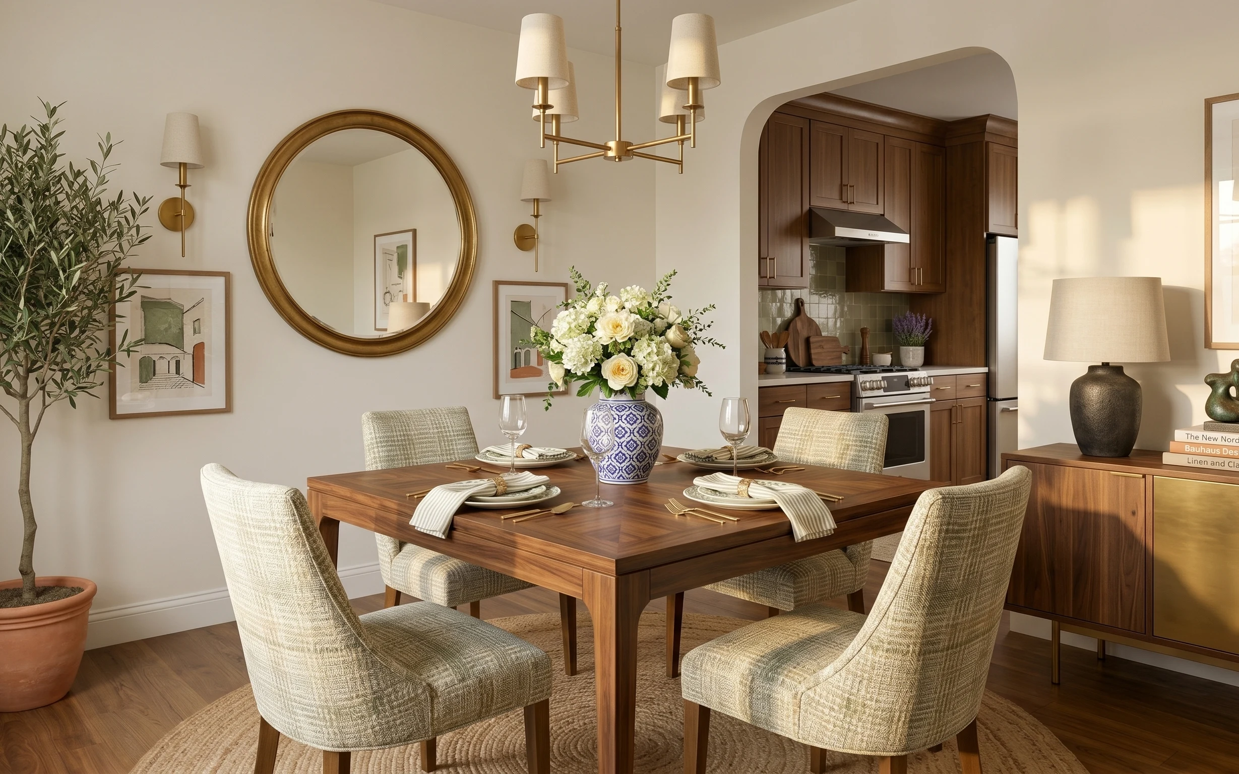
Under $700: a brass-and-white dining nook refresh
A brass-and-white dining nook refresh for homeowners, built on a $700 weekend budget. Swap in warm textures (rug, mirror, lamp) and sharpen…
Under $600: 7 weekend swaps for a kitchen island nook refresh
Bright, airy kitchens don’t need a renovation to feel finished. This weekend-friendly island nook refresh uses 7 visible swaps—rug, art, li…