
- Best for
- textiles-free counter styling
- Cost
- $250 total
- Difficulty
- Easy
- Time
- 1–2 hours
Why terracotta-and-graphite counter styling is the kitchen counter of 2026
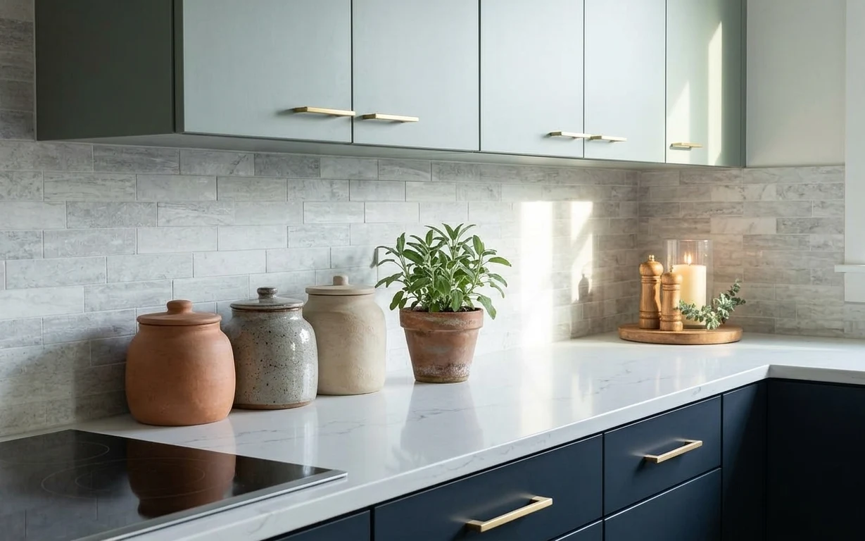
Gray tile backsplash and a white marble countertop do a lot of heavy lifting here, but the warmth comes from small repeatable objects: lidded canisters, a speckled jar, and a terracotta planter. The contrast is intentional—matte clay next to smooth stone, plus a darker candle vignette for depth. This is a very shared-housing-friendly approach because it avoids touching cabinets or lighting fixtures. For a quick move, the whole look fits into a few boxes: ceramics wrap well, and the plant can travel in its own pot.
One mistake I’ve made in past shared places is overbuying matching sets, then losing the plot once the shelf space got tight. In this setup, the pieces aren’t identical—they’re coordinated by finish: terracotta on one end, speckled gray in the middle, and a beige canister to soften the lineup. That mix is what makes it feel styled instead of cluttered. The other change I’d copy: keep your tallest element centered (the plant) and build the rest around it like a loose still life.
Layer 1 — terracotta lidded canister ($45) matte clay storage that reads warm
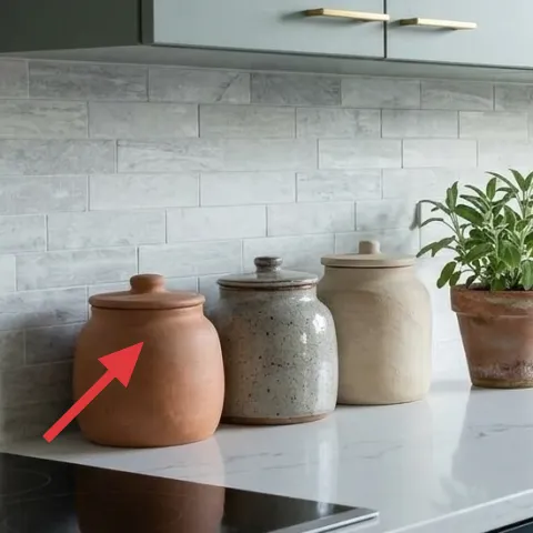
A terracotta lidded canister gives the counter an earthy anchor and visually breaks up the white stone. In the hero, it sits on the left side near the backsplash, where its rounded silhouette echoes the softer curves of ceramic. The clay’s matte texture is the point: glossy jars can look slippery against marble, while terracotta holds light in a way that feels calmer. Buying a single canister instead of a full matching set is the trade-off—less symmetry, but more realism for lived-in rentals. It’s also one of the easiest items to wrap and move.
Match by finish, not by label
Use terra-cotta matte on at least one piece so the whole vignette stays cohesive against the smooth countertop.
Layer 2 — speckled gray jar ($35) adds “stone-like” texture without going monochrome
The speckled gray jar works like a bridge between the cool backsplash and the warmer clay canister. You can see it in the middle grouping: its mottled surface reads like aged concrete, so it doesn’t feel flat beside white stone. This layer is about texture variety—smooth ceramic lines up nicely with the marble’s sheen, while speckles keep the eye moving. A simple upgrade is choosing one jar with a speckled finish rather than adding more items. The trade-off is fewer pieces overall, but the arrangement looks intentional instead of crowded, especially in a narrow counter zone.
Keep the jar height similar to the canister
That “stacked-but-not-towering” relationship is what keeps the counter from feeling top-heavy.
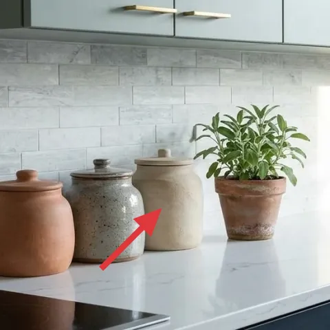
Layer 3 — beige ceramic canister ($35) softens the lineup between gray and terracotta
A beige ceramic canister adds a third tone that stops the vignette from being only gray and clay. In the hero, it sits behind the terracotta canister, creating depth: the beige reads lighter than the gray jar, so it brightens the middle of the counter group. The texture matters here too—ceramic with a slightly warm, dry look feels more “collected” than plastic storage. The biggest decision is choosing a canister with a clean shape so it doesn’t compete with the planter below. Trade-off: fewer decorative details, but it makes the plant-and-candle area feel like the real focal point.
Leave a small gap between canisters
A finger-width of space helps each piece read separately, especially when the backsplash is busy.
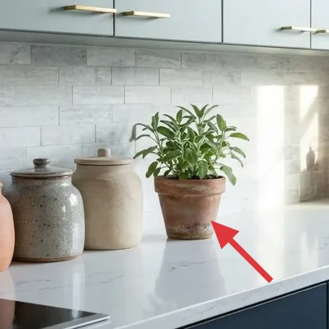
Layer 4 — terracotta planter pot with plant ($40) DIY-painted clay that matches on move-day
The terracotta planter pot is the warmth you can’t fake with color alone—it brings matte, porous texture into a mostly cool palette. In the hero, it sits slightly above the countertop line, right where the window light hits, which makes the plant look crisp even in daylight. For shared housing, the planter is also practical: it’s freestanding, easy to pack, and the pot shape stays consistent even when plant species change. This is a perfect DIY layer because the visible result is the pot color and finish, not anything permanent. The trade-off is doing the prep carefully so paint stays even and doesn’t look streaky.
Make it instead of buying it
DIY a painted terracotta planter set by coating a terracotta pot with acrylic paint for the same warm, matte clay look.
Materials
- Terracotta pot (6–7 in) — 1 — craft store — $15
- Acrylic craft paint (warm terracotta) — 1 jar — craft store — $12
- Foam brush — 1 — craft store — $4
- Painter’s tape — 1 roll — hardware aisle — $3
Steps
- Wipe the pot with a dry cloth to remove dust and let it fully dry.
- Mask any area you want to keep unpainted using painter’s tape.
- Stir the acrylic paint thoroughly until the color looks uniform.
- Use a foam brush to apply a thin first coat, working around the pot in smooth passes.
- Let the first coat dry completely, then add a second coat for even coverage.
- Remove the tape carefully and allow the paint to cure until it feels firm to the touch.
Total DIY cost: $34 — saves about $6 over buying.
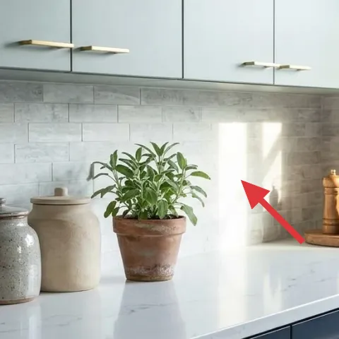
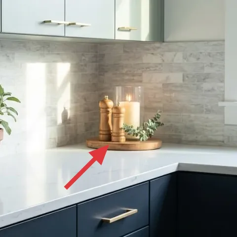
Layer 5 — wooden tray ($45) groups candles and pepper for a “still life” feel
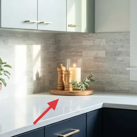
A wooden tray turns scattered objects into a single, intentional zone. In the hero, the tray sits on the right half of the counter and holds the candle area, plus small elements that otherwise could look random. Wood adds a warmer undertone that connects to the terracotta and keeps the scene from feeling too clinical against gray tile. This layer works because it gives the candle vignette a boundary—without one, it’s easy for renters to place items wherever there’s space. The trade-off is needing a tray that’s not too bulky, since it has to live in a box later. A flat tray also slides around easily for cleaning.
Don’t pick a tray that bleeds stain if it gets wet
Use coasters or place a folded liner under the candle area to prevent condensation from dulling the finish.
Layer 6 — pepper mill ($25) adds vertical rhythm and a darker accent
The pepper mill adds vertical interest and a deeper tone that balances the light countertop. In the photo, it’s grouped near the candle setup, where its shape and darker color keep the right side from looking too pale. This layer is all about silhouette: tall, simple forms read well next to lower ceramics and a broad tray. The obvious alternative is a wide, flat jar, but that usually makes a counter vignette look wider than tall. The pepper mill keeps the composition lifted, which is especially helpful when cabinets stay visually heavy. It’s also easy to wipe clean and easy to pack without special tools.
Keep the mill accessible
If it’s decorative only, it won’t get used and will disappear into a drawer during busy weeks.
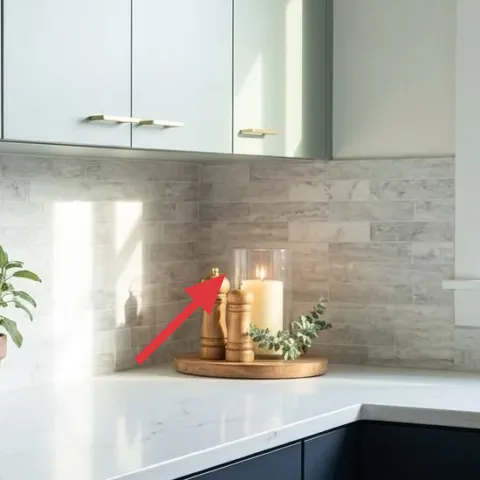
Layer 7 — glass candle jar ($30) warm glow for evenings without permanent changes
A glass candle jar is the quickest way to make a kitchen counter feel intentional after dark. The hero shows a jar-style candle on the tray near the pepper mill, and that’s a smart placement: the glass reflects light while the tray keeps wax-adjacent mess contained. Choose a candle jar you can use safely on a tray, then keep the rest of the counter styling minimal so the flame reads clearly. The trade-off is that candles are seasonal and should be stored when not in use, but that’s true for renters anyway. This swap is move-friendly because the jar stacks neatly and doesn’t rely on walls, hooks, or power.
Pair one flame with two matte ceramics
That mix keeps the warmth from feeling “theme-y” and lets terracotta and speckle do the design work.
The cost, layer by layer
| Layer | Item | Cost |
|---|---|---|
| 1 | Terracotta lidded canister | $45 |
| 2 | Speckled gray jar | $35 |
| 3 | Beige ceramic canister | $35 |
| 4 | Terracotta planter pot with plant (DIY) | $40 |
| 5 | Wooden tray | $45 |
| 6 | Pepper mill | $25 |
| 7 | Glass candle jar | $30 |
| Total | $245 | |
If a terracotta canister feels too specific, swap in a neutral ceramic jar or a simple glass cloche container—then keep the same three-tone rule: terracotta, speckled gray, and warm beige.
What worked, what didn't (across the whole room)
This counter scheme works because it balances cool stone textures with matte terracotta and warm wood. Keeping the objects grouped (instead of scattered) makes the backsplash feel like part of the design rather than a noisy backdrop. The main risk is overstacking—too many small pieces can quickly blur into countertop clutter.
What worked
- Terracotta jars add warm matte texture against the bright white countertop.
- Speckled gray surfaces echo the tile, so the palette stays calm instead of mismatching.
- A wooden tray creates a clear “zone” for candle and pepper, even on a narrow counter.
- The planter’s terracotta finish ties the whole vignette together with consistent warmth.
- Using a tall pepper mill improves vertical rhythm so the counter doesn’t feel flat.
- A glass candle jar adds evening light without needing any fixture changes.
What didn't
- Adding more items than the backsplash can “hold” turns the grouping into visual clutter.
- Using glossy containers instead of matte can make the counter look too slick and cold.
- Skipping the tray boundary makes small objects feel randomly placed during weeknights.
- Choosing a planter without terracotta warmth can flatten the color story against gray tile.
What we'd skip if we did it again
Skip swapping fixed kitchen hardware or trying to “upgrade” the cabinetry look. In shared housing, those changes don’t pack well, and they usually break the renter-safe rules. The hero proves the style is built with small freestanding objects: jars, a tray, a planter, and candle glow.
Skip adding a second decorative tray on the same counter. Two trays often create competing rectangles and make the counter feel like a display shelf. One tray with a single candle moment keeps the arrangement readable and easier to reset before packing.
Skip buying fully matching ceramic sets. Matching can look staged, and it’s harder to move without replacing everything later. Instead, keep the same finish family—matte terracotta, speckled gray, and warm beige—then let the shapes vary slightly for a collected, lived-in look.
Frequently asked
How long does this counter refresh take?
Plan for about 60–90 minutes for the styling portion, plus extra time if the planter DIY needs drying and curing between coats. Wrapping ceramics for move-day is usually quick because the pieces are freestanding and small. If the plant needs repotting or pruning, add 30–45 minutes. The good news: nothing requires curing, drilling, or permanent changes.
Is this renter-friendly for shared housing?
Yes—everything here is freestanding and packs in cardboard boxes. The look doesn’t rely on installing shelves, changing grout, or replacing fixed kitchen items. Ceramics and candle jars are easy to bubble-wrap, and the plant can travel in its pot. Even if the next kitchen has different counter space, the “three-tone” grouping still holds.
What if my counter is smaller or crowded already?
Use fewer items but keep the same finish logic. For a smaller counter, aim for one canister, one speckled jar, and the planter; swap the pepper mill and candle jar for only one of them. The tray is still worth keeping because it creates a visual zone, but its job is boundary, not storage overload. Keeping small gaps between pieces helps everything stay readable.
What if I can’t find terracotta items in the same color?
Go one step more neutral: use warm clay, tan, or muted rust terracotta. The key is warmth, not exact hue—terracotta should read “brown-orange” rather than pink. You can also DIY the pot (the layer suggested here) so the most prominent color matches. Pair it with speckled gray and warm beige to keep the palette consistent.
Where should the items be placed for the same effect?
Build a grouping first—left-side ceramics for calm symmetry, then a right-side tray vignette for depth. Keep the tallest piece (the plant) near the center of the grouping so the counter doesn’t feel top-heavy on one edge. Leave small gaps between the canisters so the backsplash patterns don’t swallow the details.
What’s the biggest mistake people make with kitchen counter styling?
Overfilling the surface with too many small objects. Counters already have visual competition from the backsplash and any shadow lines under cabinets. When there are more than 5–7 decorative items, the grouping stops looking intentional and starts looking accidental. A simple rule: one anchor (plant), one texture bridge (speckled jar), and one boundary (tray).
More in Kitchen & Dining
Under $250: terracotta-and-graphite kitchen counter refresh
This kitchen-counter refresh uses 7 move-ready swaps focused on ceramics, greenery, and candle styling. The look keeps a gray-and-black kit…
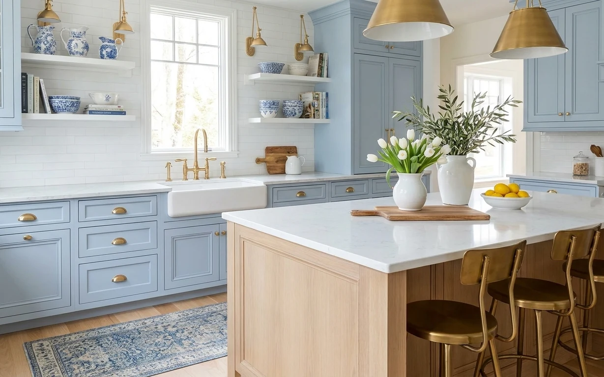
Under $350: coastal kitchen island refresh with move-ready swaps
A bright, coastal-leaning kitchen island setup starts with a blue patterned area rug and a few movable decor anchors—cutting board, lemons,…
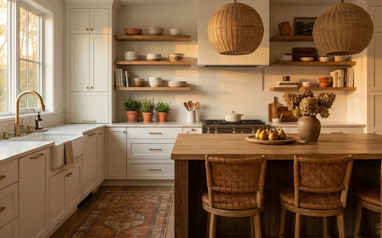
Under $400: move-ready kitchen island refresh with warm textures
A sunlit kitchen island refresh that leans on warm wood, terracotta, and woven textures—no drilling, no permanent changes. This look is ach…