- Best for
- renter-friendly bedroom refresh
- Cost
- under $300
- Difficulty
- weekend-friendly (no drilling)
- Time
- 3–6 hours total
Why olive-and-cream textiles are the bedroom of 2026
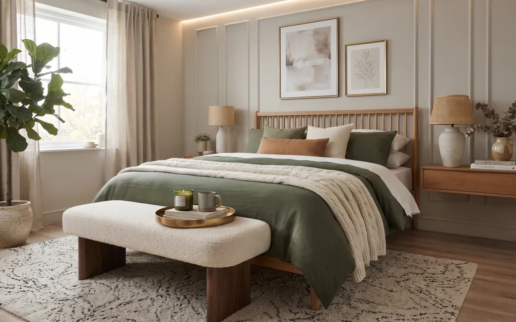
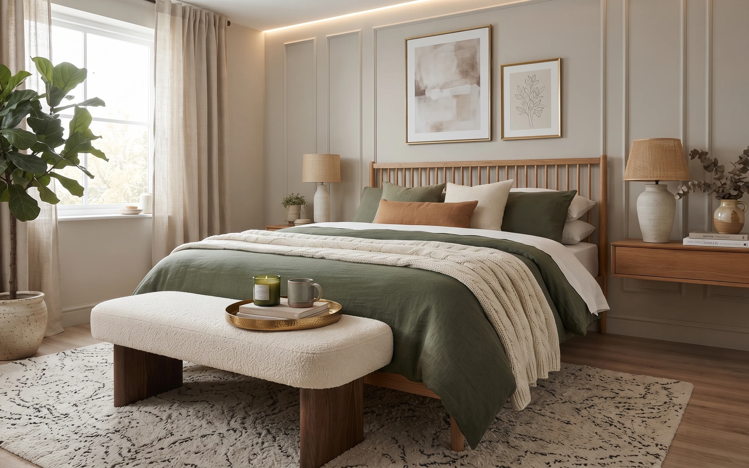
Start with the neutral base the room already gives you, then add texture where your eye lands first: the cream knit throw on the bed, the olive blanket layer, and a black-speckled area rug that anchors the whole scene. This is the same stacking idea you see in modern Scandinavian bedrooms—soft materials, minimal color count, and natural shapes. The frames bring an airy, gallery-like calm without needing anything permanent on the walls. For renters, the best part is that every change below is plug-in or freestanding.
I used to overthink wall art and buy matching sets. In this room, that impulse gets too matchy fast—so I went for one larger abstract print and one smaller botanical print to create a rhythm instead. The other thing I corrected was styling height: the tray stays low on the bench, while the lamp and frames handle the “upward” pull. That small shift made the whole bed area feel intentional instead of crowded.
Layer 1 — green pillow ($12) softens the olive blanket
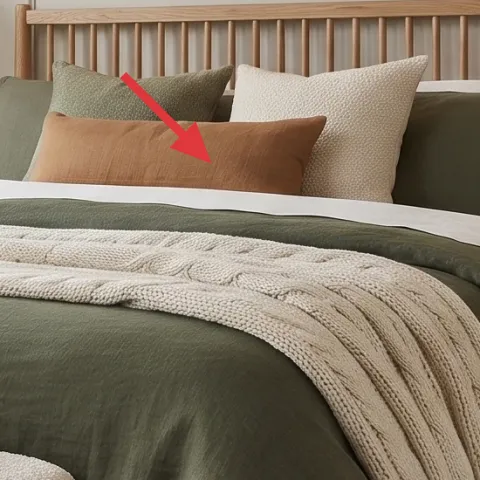
A single green pillow cover is the easiest way to echo the olive throw blanket without buying a whole new bedding set. In the photo, that green pops against cream pillows and keeps the color story from feeling flat. Choosing a cover (not a whole insert system) also helps you swap it later for another season. The trade-off: you’re adding just one color “note,” so the pillow cover has to be readable from bed height—too small or too close to gray won’t carry the look.
Match undertones, not just the color name
Look for olive that leans slightly warm (more muted khaki than neon green) so it blends with the room’s cream and light wood.
Layer 2 — candle jar on tray ($15) adds a warm focal point
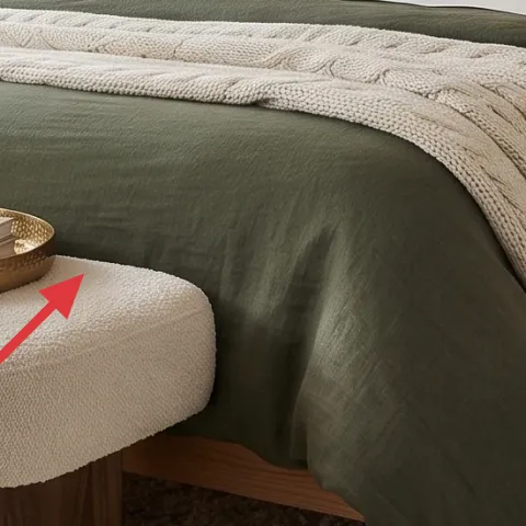
The candle jar on the round wood tray makes the bench-and-bed zone feel styled, not accidental. Because it sits in front of the bed, it reads immediately when you enter the room—especially next to a mug in similar warm tones. This is an easy alternative to buying a side-table centerpiece: you get height and texture without extra furniture or drilling. The trade-off is timing—if the room stays in a dark corner all day, you may need more “daylight-friendly” styling nearby, like the lamp and framed prints.
Keep labels subtle
Choose a jar with a neutral label so the visual focus stays on the shapes and colors, not the print on the candle.
Layer 3 — beige drum-shade table lamp ($25) makes the bedside glow renter-safe
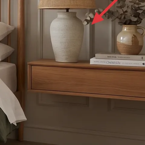
A beige drum-shade table lamp is a plug-in way to get the warm lamp glow seen in the photo. The shade material matters: linen-look or softly textured fabric turns the light into a softer pool that flatters bedding and wood. This is a better renter option than replacing any hardwired lighting because you don’t need permission or permanent changes. The trade-off is placement—you’ll want to keep the cord route tidy on the nightstand so it doesn’t compete visually with the framed art behind.
Avoid super-sheer shades
If the shade is too translucent, you’ll get harsh hotspots that make the neutrals feel washed out.
Layer 4 — small framed botanical print ($25) balances the larger artwork
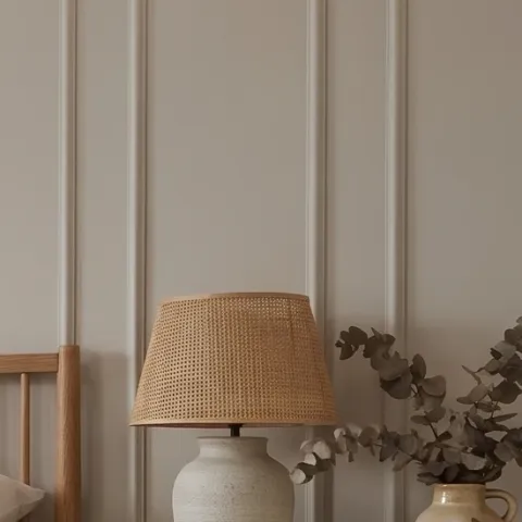
The smaller framed botanical print adds a gentle, plant-based motif that complements the live greenery and keeps the wall from feeling purely abstract. In the photo, it sits to the right of the larger abstract frame, which creates an intentional pairing without forming a dense grid. This works especially well for renters because framed art can be hung and rehung with removable mounting methods (no drilling). The trade-off: if you go too small or too dark, the botanical details won’t read; aim for a frame size that holds its own from across the room.
Let one piece be the “main”
Keep the larger print dominant and use the smaller botanical one as a supporting note, not a second headline.
Layer 5 — large framed abstract print ($25) DIY the soft shapes for the main wall spot
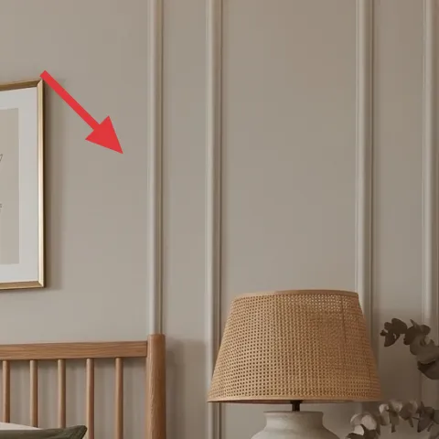
This large abstract print is what gives the bedroom its calm, curated feel. DIY-ing it keeps the look high-impact while staying budget-friendly, and the open composition works with olive and cream because you can pull your palette directly from the pillows and throw. If you’ve ever bought “abstract” art that felt too high-contrast, this is the fix—choose muted creams and soft grays, then add a barely-there olive brushstroke for cohesion. The trade-off is time: you’re making it by hand, so it won’t be perfectly uniform, and that’s actually the point.
Make it instead of buying it
Paint a muted abstract on cardstock, then frame it—so you get the large wall piece for the same visual role as the store-bought print.
Materials
- Cardstock (thick) — 1 sheet — craft store — $8
- Acrylic craft paint (cream/gray) — 1 small set — craft store — $6
- Blue/olive acrylic paint — 1 small bottle — craft store — $4
- Frame (fits your cardstock size) — 1 — thrift store or discount frame rack — $2
Steps
- Sketch a few soft rectangles and swipes in pencil, keeping edges intentionally imperfect.
- Block in the biggest cream and gray shapes with wide brush strokes.
- Layer a thin gray wash over one section so the print looks airy, not flat.
- Add one olive stroke sparingly so it ties to the pillow and throw.
- Let the acrylic dry fully, then check the balance from across the room.
- Trim any rough edges and insert into the frame.
Total DIY cost: $20 — saves about $5 over buying.
Layer 6 — potted indoor plant in speckled pot ($30) brings life without clutter
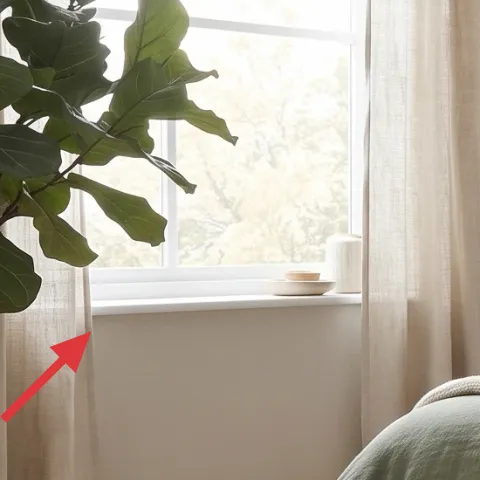
A tall potted indoor plant in a speckled ceramic pot gives you the “green lift” seen on the left side of the photo. The pot texture matters because it echoes the rug’s speckled pattern—so even when you’re not watering or moving anything, the room stays visually connected. This layer is also an easy renter swap compared to changing wall decor: you can relocate the plant if you rearrange the bed later. The trade-off is scale—choose a plant that’s tall enough to show leaves above the bench line, or it’ll disappear against the curtains and wall.
Repot-free styling works best
If you buy from a nursery, keep it in its pot and place that pot into your speckled container for an instant cohesive look.
Layer 7 — black-speckled area rug ($150) anchors the bed-and-bench zone
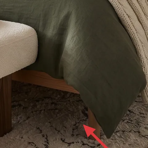
A black-speckled area rug anchors the whole bedroom and makes the bed styling feel grounded. In the photo, it brings contrast under the light wood floor and hides everyday dust better than a fully solid light rug. This is the smarter alternative to adding multiple small mats that don’t quite connect the furniture zones. The trade-off: larger rugs take up visual “real estate,” so be sure your chosen rug color story still matches the cream-and-olive palette—otherwise the black speckle can feel too loud.
Size it so the bench sits comfortably on top
When the rug covers the bench footprint, the bed area reads as one cohesive layout.
The cost, layer by layer
| Layer | Item | Cost |
|---|---|---|
| 1 | Green pillow cover | $12 |
| 2 | Candle jar | $15 |
| 3 | Plug-in table lamp with beige drum shade | $25 |
| 4 | Small framed botanical print | $25 |
| 5 | Large framed abstract print (DIY equivalent) | $25 |
| 6 | Potted indoor plant in speckled ceramic pot | $30 |
| 7 | Black-speckled area rug (8×10) | $150 |
| Total | $282 | |
A cheaper variant keeps the same layout but swaps in a solid-cream rug and a smaller lamp shade. The framed prints can be replaced with prints on canvas boards, and the plant can be a shorter tabletop version tucked near the window ledge.
What worked, what didn't (across the whole room)
The olive-and-cream palette works because it stays consistent across textiles, decor, and one plant element. Layered frames also help: the large abstract print sets the tone, and the botanical one adds a gentle counterpoint. The only miss would be trying to copy the look with too many matching “sets” at once.
What worked
- The green pillow repeats the olive throw so the bed feels styled instead of random.
- The candle jar on the bench reads at a glance and adds warm atmosphere in the evening.
- The beige drum-shade lamp softens the wall colors and flatters the framed prints.
- Two differently sized frames create balance without turning the wall into a busy grid.
- The speckled pot echoes the rug pattern, which makes the palette feel intentional.
- The rug keeps the bed-and-bench zone grounded on light wood flooring.
What didn't
- A single-note color approach (only creams, no olive repeat) made the bed look flat.
- Too-sheer lamp shades created hotspots that fought the neutral bedding texture.
- Using two large prints of the same size made the wall feel symmetrical in a harsh way.
- Skipping a tall plant left the left side visually empty next to the curtains.
What we'd skip if we did it again
Skip matching the furniture and decor to the exact same wood tone. In rooms like this, warm walnut plus light wood plus textured ceramics look more natural than a strict “all from one collection” match.
Skip going too small on the frames. If the large abstract doesn’t hold wall presence, the whole composition loses its calm center and starts looking like leftover pieces.
Skip choosing an all-light rug. A cream-only rug shows stains fast, and the black-speckled pattern is doing real work by hiding everyday wear while still keeping the look bright.
Frequently asked
How long does this bedroom refresh take?
Most of the time is spent on styling: placing the rug so the bench sits comfortably, setting the lamp and tray, and getting pillow heights right. The framing part is usually quick if you already have removable hanging hardware. Budget about 3–6 hours total, plus extra drying time only for the DIY abstract print if you’re painting it the day of.
Is this doable for renters who can’t drill?
Yes. The upgrades here are plug-in lighting, freestanding textiles (pillow covers and rug), and framed wall art that can be mounted with renter-safe methods. Nothing requires wall painting, drilling, or replacing landlord fixtures, so everything can come with you at move-out.
What if my bedroom is smaller than the photo?
Use the same palette, but scale the rug first. If an 8×10 rug feels too large, go for the biggest size that still lets furniture sit partly on top, especially the bench area. Keep the lamp and plant a similar height so the room still feels balanced, and swap the bench to a narrower shape if needed.
What if my ceiling or wall is taller/bolder than this room?
Lean into the wall art scale by using one dominant large print and one smaller supporting piece, but don’t add a third frame. For height, a taller lamp base shade or plant height helps fill vertical space. The trick is to keep the number of focal points the same so it still reads calm.
Where should I shop differently if I’m on a tight timeline?
If you need speed, start with the rug and lamp, since they set the room’s “base.” Then look for framed prints at discount frame counters, thrift stores, or print marketplaces. For the DIY layer, buy a pre-cut cardstock size and acrylic set so you’re not waiting on specialty materials.
Biggest mistake to avoid in a bedroom like this?
Avoid copying the look by buying too many coordinated pieces at once. When everything matches perfectly, the room can feel staged instead of lived-in. Keep the palette consistent (olive, cream, warm wood), but vary textures: knit throw, ceramic pots, and linen-look shade keep it interesting.
More in Bedroom
Under $300: olive-and-cream bedroom refresh with 7 move-ready swaps
This olive-and-cream bedroom refresh is achievable for renters under $300 using seven swaps: a textured rug, a warm lamp, layered pillows, …
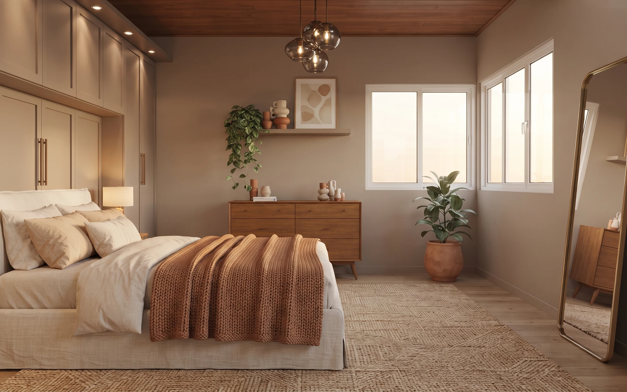
Under $800: weekend bedroom refresh with warm neutrals
A warm beige-and-rust bedroom refresh that reads calmer and more intentional in one weekend. This $800 plan focuses on a textured 5×7 rug, …
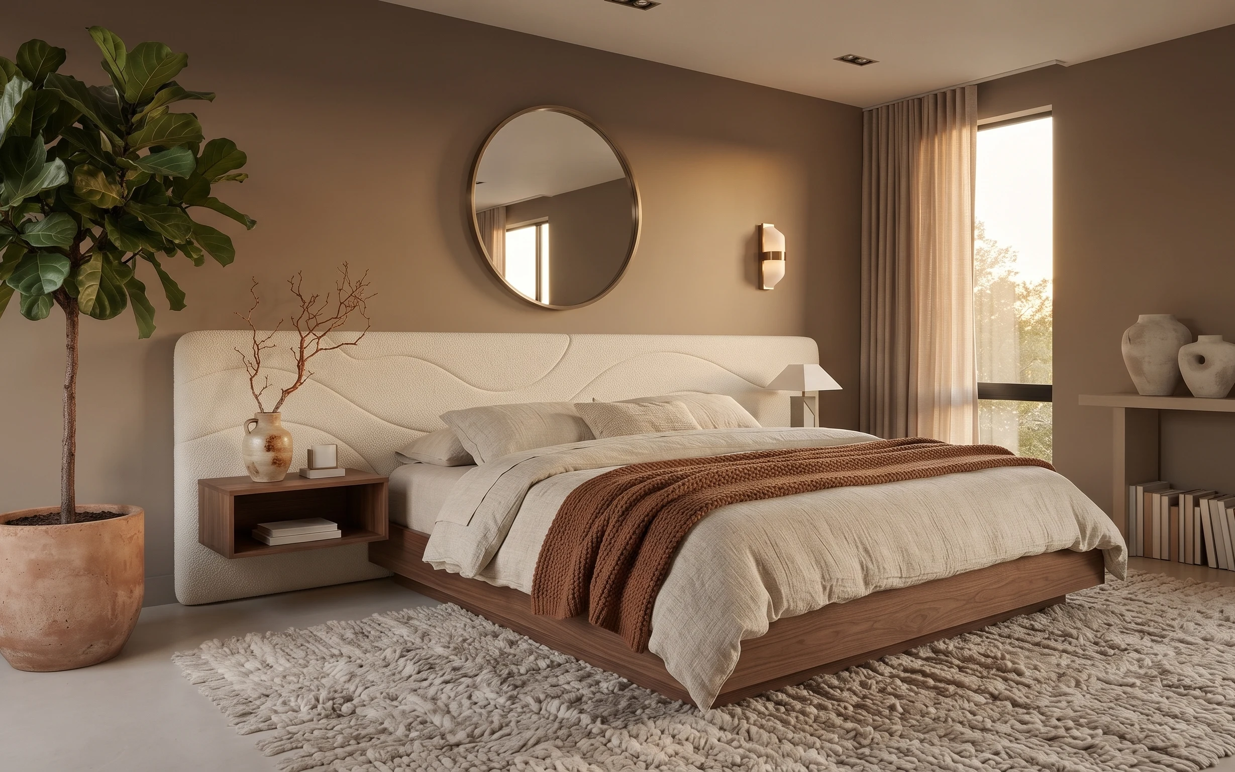
Under $700: warm taupe-and-cream bedroom refresh with 7 layers
A warm taupe-and-cream bedroom refresh with 7 budget-friendly upgrades: a cleaner mirror placement, softer window curtains, and a cozier ru…