
- Best for
- Renter-friendly shelf styling
- Cost
- $308 for the full list
- Difficulty
- Beginner (no-drill swaps)
- Time
- About 1 weekend
Why warm brass coffee bar styling is the coffee bar nook of 2026
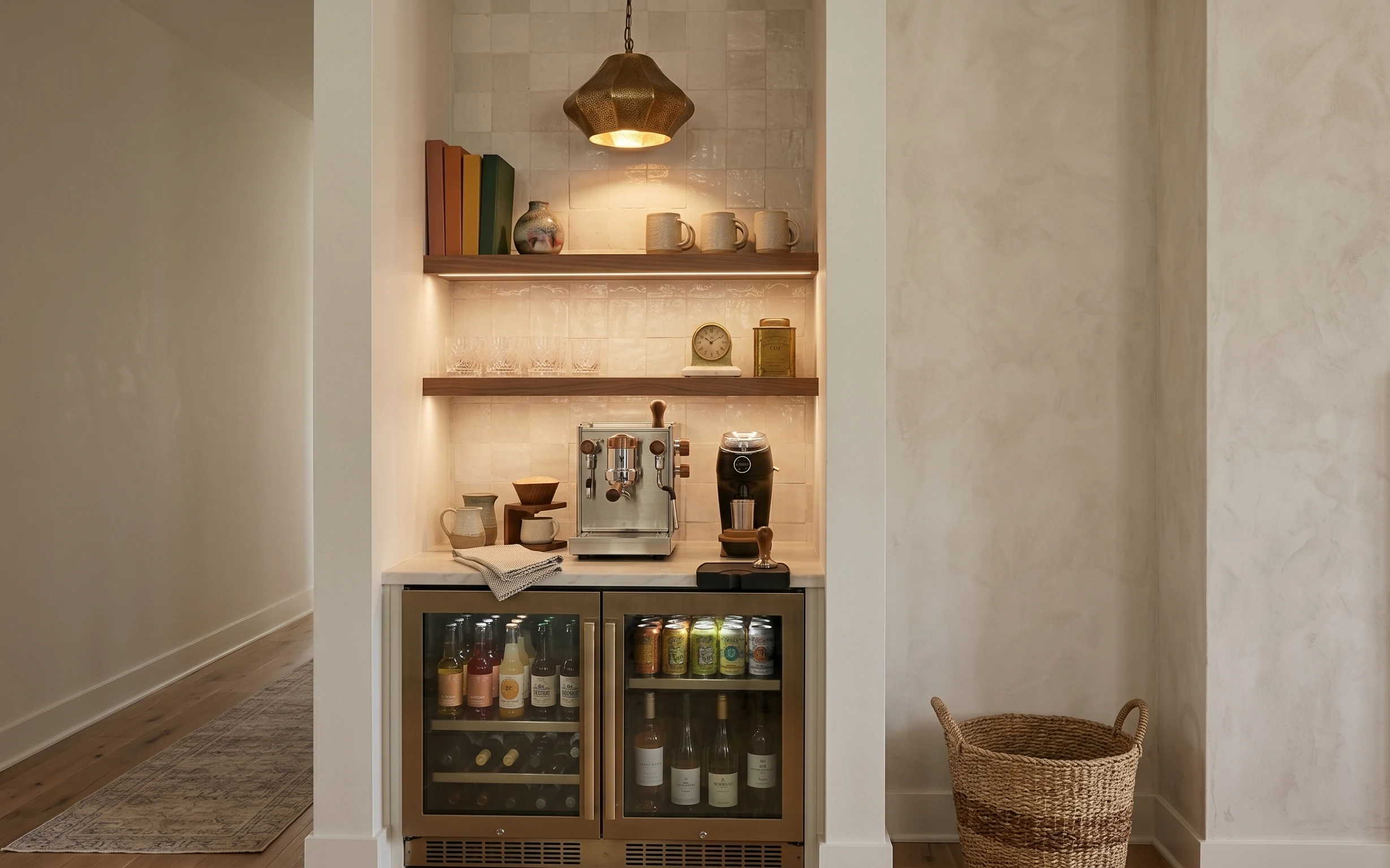
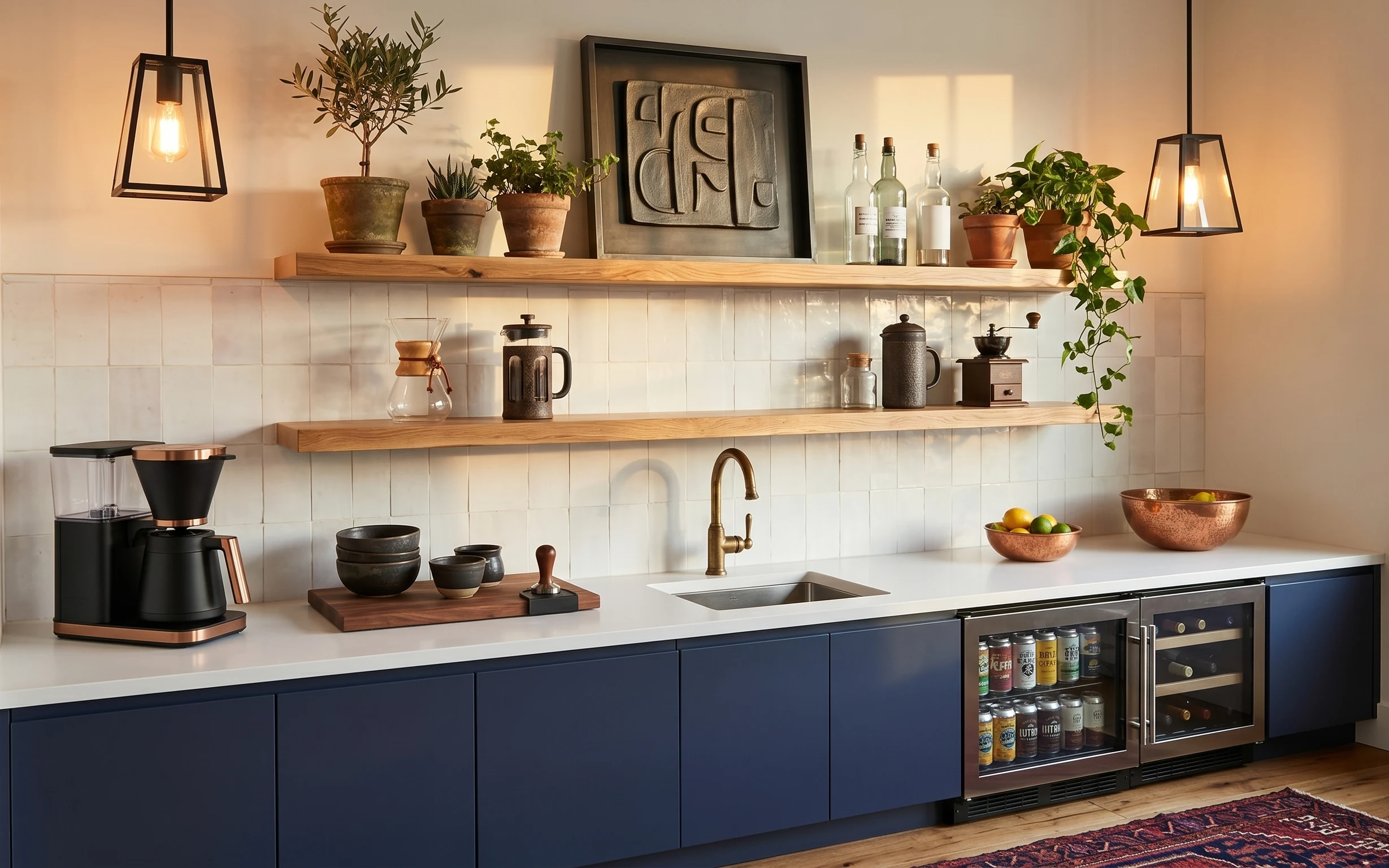
The warm pendant glow and the creamy tile niche make this kitchen feel like a mini cafe, and you can lean into that with renter-safe styling. In the photo, the countertop looks calm under a gray-and-white dish towel, while the small ceramic vase and the brass canister give the shelf depth without feeling crowded. The patterned area rug grounds the whole corner, and the wicker basket adds texture at floor level near the cabinetry. This is achievable on a rental budget because the changes are mostly removable objects, not anything that needs drilling or painting.
I used to overbuy decor for coffee stations and end up with a countertop that felt “done” but not lived-in. The moment I noticed how this nook keeps objects in a few repeating materials—ceramic, brass, and woven—I stopped chasing variety and started repeating what already looked good here. Swapping in a tight rug + a single styling towel did more than any extra knickknack. The shelves still feel curated, but they’re functional enough for daily mugs.
Layer 1 — patterned area rug ($80) defines the nook underfoot
A patterned area rug is the anchor piece here, and it’s doing the work of making the coffee station feel like a “zone” even in a smaller kitchen layout. Choose something with a neutral base so it doesn’t compete with the marble-look wall paneling and creamy tile. The visible rug has enough contrast to hide everyday scuffs and the occasional splash you get while filling a mug. I like rugs like this over a plain option because the pattern forgives small messes and keeps the warm lighting from washing everything out.
Layer for grip, not just looks
If the rug slides at all, add a thin non-slip pad so it stays put while you move between the counter and the fridge drawers.
Layer 2 — wicker basket on floor ($25) brings storage texture at ankle height
The wicker basket on the floor is one of those “quiet” elements that makes the nook feel lived-in instead of staged. It’s sitting near the right side, so it adds texture where bare flooring can look a little too sleek under warm light. Use it for extra mugs, takeout napkins, or the things that usually get shoved into a cabinet—then you can tuck it away at move-out. I’d rather do one good basket than scatter multiple small bins, because it keeps the corner visually calm.
Keep the contents consistent
Even when it’s functional, the basket looks best when it holds items in one category, like linens or coffee tools.
Layer 3 — gray-and-white dish towel on countertop ($18) softens the coffee-machine zone
This gray-and-white dish towel is doing double duty: it adds softness next to the hard surfaces, and it gives the countertop a “ready to use” moment. Because it’s neutral, it doesn’t fight the tile niche, the brass tone, or the espresso machine’s metal finish. If you’ve ever had a coffee setup that looks cold, it’s usually because everything is glossy and upright. A towel is an easy fix—swap the styling position (fold it once, lay it flat, or drape it slightly) until it matches the line of the machine.
Fold it like you mean it
A single, crisp fold looks cleaner than a bunched towel, and it reads intentional in photos.
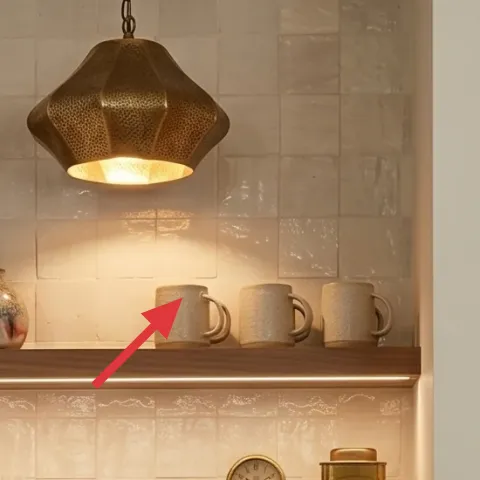
Layer 4 — decorative book stack on shelf ($15) adds height without extra clutter

The color-spined book stack on the shelf is one of the most renter-friendly ways to add structure in a tile niche. It creates a vertical block that breaks up the line between the ceramic items and the backsplash, so the shelf doesn’t feel like it’s only “objects” sitting out. This is a better alternative than stacking too many small ceramics because books give you natural layers and spacing. The trade-off is that you’ll want to swap them occasionally—stale covers can make the nook feel dated.
Don’t hide the spines
Book stacks work best when the spine color is visible; if you cover them, you lose the whole visual height trick.
Layer 5 — small ceramic vase on shelf ($20) adds a sculptural pause
That small ceramic vase on the shelf adds a sculptural shape that complements the straight lines of the niche and the espresso machine below. It has a dark, earthy tone that plays nicely against the warm brass and cream tile, and its curved silhouette keeps the shelf from looking too boxy. A vase is also practical: you can keep it filled with a few stems on weekends and leave it empty on busier days. If you go for a similar piece, prioritize texture (matte glaze or speckling) so the pendant light adds depth instead of glare.
Match the finish, not the exact color
You don’t need the exact same hue—just aim for a matte or lightly textured ceramic so the warm lamp reads evenly.
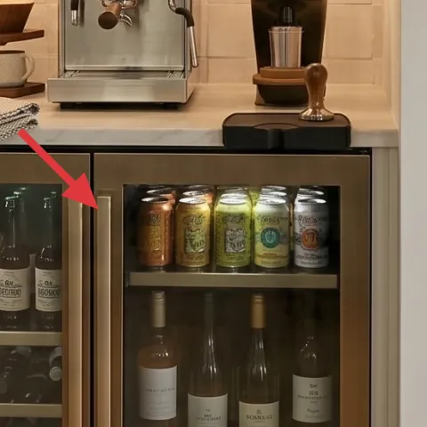
Layer 6 — wheeled espresso machine on countertop ($115) keeps the centerpiece feeling “finished”
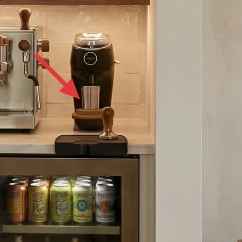
The espresso machine is the countertop centerpiece, so it’s worth styling everything around it rather than adding random accessories. In the photo, the machine’s brushed metal and warm-toned details coordinate with the brass canister above, which is why the whole nook feels cohesive. This choice matters because a coffee station only looks intentional when the main object ties into the shelf palette. The trade-off is counter space—so keep only a few supporting items close by (mug area, towel, one small vase) and store the rest elsewhere.
Clear a “working zone”
Leave a narrow strip in front of the machine for grabbing cups and moving the towel, so the counter stays functional.
Layer 7 — apothecary jar labels on brass canister ($35) makes the shelf read custom
Make it instead of buying it
This nook already has a brass canister with printed-style labeling—DIY matching apothecary jar labels so it looks tailored while staying renter-safe.
Materials
- Printable label sheets — 1 pack — craft store — $12
- Small jar labels (or label-size cardstock inserts if needed) — 1 sheet set — craft store — $10
- Scissors or a craft knife (if you have one) — 1 tool — from home — $7
Steps
- Measure the visible label area on the brass canister so your text lines up and stays centered.
- Choose a font style that feels “apothecary” and type one ingredient name per label.
- Print the labels at the measured scale on the printable label sheets.
- Let the ink sit a minute so it doesn’t smear when you handle the sheets.
- Cut each label cleanly, following the border closely for a crisp edge.
- Apply the labels to the canister surface, smoothing from the center outward.
Total DIY cost: $29 — saves about $6 over buying.
The cost, layer by layer
| Layer | Item | Cost |
|---|---|---|
| 1 | Patterned area rug | $80 |
| 2 | Wicker basket on floor | $25 |
| 3 | Gray-and-white dish towel | $18 |
| 4 | Decorative book stack on shelf | $15 |
| 5 | Small ceramic vase | $20 |
| 6 | Espresso machine | $115 |
| 7 | Apothecary-style jar labels for brass canister | $35 |
| Total | $308 | |
If you want a cheaper variant, swap the espresso machine layer for a simpler coffee counter setup you already have, then reallocate that budget to a larger rug size and a second towel.
What worked, what didn't (across the whole room)
The standout wins are the layers you can move and swap—rug, basket, towel, and the repeated ceramic-and-brass palette on the shelf. The result reads more “cafe nook” and less “random items on a counter.” The only thing that can derail this look is adding too many small decor objects, which makes the tile niche feel busy under warm light.
What worked
- The patterned rug grounds the coffee bar nook and hides minor scuffs from daily foot traffic.
- The wicker basket adds woven texture where the floor would otherwise look too smooth and blank.
- The gray-and-white dish towel softens the metallic espresso machine area without taking up storage.
- The book stack creates vertical structure in the shelf niche so the ceramics don’t feel randomly placed.
- The small ceramic vase adds sculptural balance against the tile grid and warm pendant glow.
- Matching apothecary-style labels make the brass canister look curated instead of like a leftover bin.
What didn't
- Too many tiny items on the shelf made the niche look crowded and reduced the calm, cafe feel.
- Highly reflective decor near the pendant light caused glare, which made the shelf look flatter.
- Leaving the counter bare next to the machine made the setup feel unfinished, even with good tiles.
- Mixing too many colors in the towel and mug area fought the warm brass tone instead of supporting it.
What we'd skip if we did it again
Skip buying more small shelf objects just because the niche looks empty. This nook already has tile patterning and strong warm light—keeping the shelf to a vase, a book stack, and one labeled canister reads more intentional.
Skip plain rug runner substitutes with the same beige base. The pattern is what disguises everyday wear and keeps the warm, creamy palette from looking washed out.
Skip labels that don’t match the style you’re aiming for. If the font or spacing feels random, it’s better to use fewer words on each jar label and keep everything consistent across the canister.
Frequently asked
How long does this coffee bar nook refresh take?
For most renters, plan on a 4–6 hour first pass: rug unroll, basket placement, towel styling, and shelf objects arranged in the same “3-item” structure. Then add labels afterward for a polished finish. If you’re doing the DIY label part, budget another 30–60 minutes for printing and trimming. The key is to stop when the shelf looks balanced—no need to keep adding more pieces.
Is this renter-safe if I’m not allowed to drill or change fixtures?
Yes. The layers here are all removable: a patterned area rug, a wicker basket, a countertop towel, decor books, ceramics, and printed jar labels. You’re not touching the tile niche, the pendant lamp, or any landlord-installed hardware. At move-out, you can box everything up and take the look with you without leaving holes or adhesive marks.
What if my kitchen layout is smaller or the rug can’t fit?
If the rug space is tighter, choose the largest rug size that still lets you open doors and reach the counter comfortably. You can also use the same pattern principle with a runner: the goal is contrast under the coffee station, not covering the entire kitchen. For the shelf, keep the “tall + medium + small” grouping so it doesn’t feel visually stretched.
Where should I shop for the rug, basket, and shelf pieces?
For renter budgets, focus on places with lots of removable decor: big-box retailers for rugs, home-goods sections for baskets and towels, and craft stores for label supplies. For ceramics and book stacks, thrift stores and discount home shops are great for finding pieces that already look aged and warm under brass-toned lighting.
What’s the biggest mistake people make with coffee bar corners?
Over-styling. It’s tempting to fill every inch of the shelf niche, but warm tile and lighting already create interest. When there are too many small items, everything looks busy and less “cafe.” A tighter grouping—one vase, one book stack, one labeled canister—looks custom even with fewer pieces.
More in Kitchen & Dining
Under $350: coffee bar nook renter refresh with 7 swaps
Warm brass coffee bar nook refresh for US renters: a patterned rug, a wicker storage basket, a dish towel styling moment, and shelf swaps t…
Under $800: breakfast bar nook refresh with light-wood calm
A bright breakfast bar nook makeover using light-wood warmth, two glass pendants, and a softer rug under the stools. This weekend-friendly …
Under $400: warm terracotta kitchen countertop refresh
A kitchen countertop coffee corner gets a warm, modern farmhouse look using move-friendly swaps—rug, framed art, a plug-in lantern-style la…