- Best for
- Weekend kitchen refresh
- Cost
- $735 total
- Difficulty
- Moderate
- Time
- 1 weekend
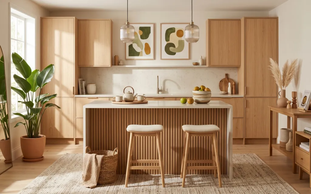
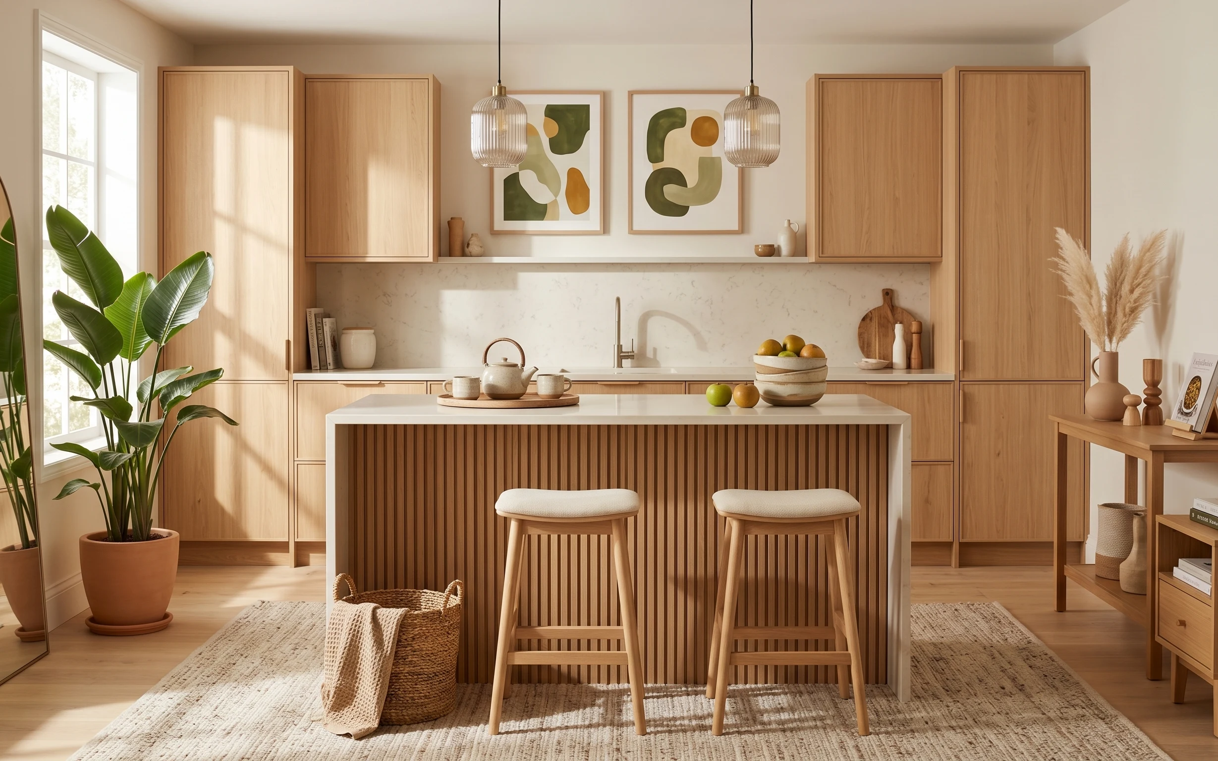
Why warm light-wood and green decor is the breakfast bar nook of 2026
The easiest way to make a kitchen feel finished (without a full remodel) is to treat the breakfast bar like a mini living area. In this photo, the light wood cabinetry, cream backsplash, and sage-green abstract prints create a calm baseline, while the area rug and bar stool cushions make the zone feel softer than “just counters.” My favorite detail is how the two glass pendant lights echo that airy, modern Japandi vibe—nothing heavy, nothing too matchy. Best of all, all of these pieces are either swappable or DIY-able for an owner who can choose the highest impact.
I almost went down the slippery slope of “matching everything” in my own kitchen refresh—same wood tone, same frame color, same vibe everywhere. Then I noticed the real magic: the materials repeat, but the shapes stay varied (ribbed island panel, smooth mugs, rounded pendant glass). That’s what keeps the nook feeling collected instead of themed. Once I accepted that idea, the choices got way easier.
Layer 1 — area rug 5×7 ($120) warms up the barstool zone
This area rug sits under the two stools and anchors the breakfast bar so it reads like a deliberate seating spot, not an accident of furniture placement. The texture matters here: the woven look adds “handmade” grit next to the clean, marble-look backsplash and the ribbed island front. If the kitchen floor is light wood, a rug like this also prevents the space from feeling too echo-y. I picked a 5×7 size because it tucks neatly under both stools without forcing the whole room to shift. The trade-off is that you’ll want to vacuum and spot-clean quickly, since natural fibers show foot traffic faster than synthetic blends.
Vacuum direction makes a difference
For woven rugs, vacuum with the pile so you don’t pull up texture loops around the edges of the stool legs.
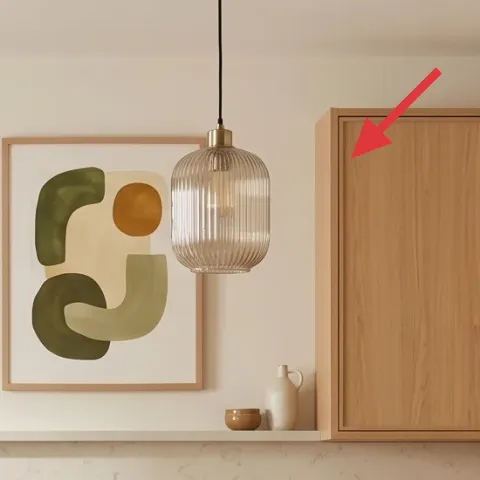
Layer 2 — wood frame for abstract wall art ($80) gets DIY-painted to match the calm
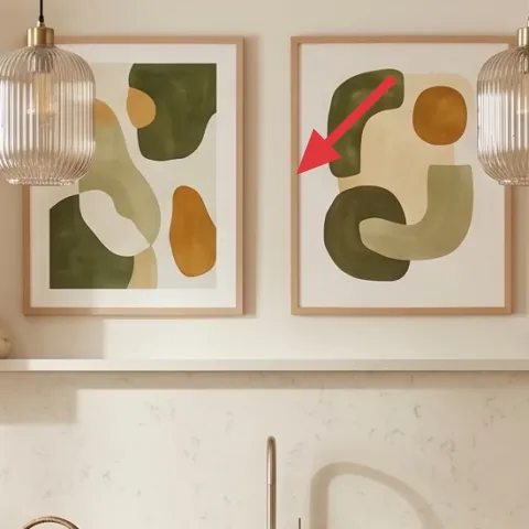
The two framed abstract prints are what give the kitchen its personality, and the frame color decides whether that personality feels intentional or random. Keeping the art but updating the frame is the smart move—because the composition (sage-green shapes) stays the same, while the frame can better echo the light-wood cabinetry. Painting the wood frames also lets you land on the exact “cream-warm” tone you see in the countertop and backsplash rather than settling for whatever factory finish comes on the print. The trade-off is you have to prep a little (light sanding, good coverage) so the paint doesn’t chip around corners. It’s still a weekend job, not a renovation.
Make it instead of buying it
DIY paint the wood frames around the abstract prints so they blend with the light-wood cabinetry instead of fighting the marble-look backsplash.
Materials
- Chalk paint or furniture paint (small can) — 1 pint — hardware store — $25
- Primer for wood (stain-blocking) — 1 quart — home improvement store — $12
- 220-grit sandpaper — 1 pack — hardware store — $7
- Painter’s tape — 1 roll — craft store — $6
- Drop cloth or cardboard sheets — 1 set — hardware store — $4
Steps
- Sand the frame lightly so paint can grip; wipe dust off with a dry cloth.
- Mask the glass and edges of the print with painter’s tape.
- Brush or roll on stain-blocking primer, focusing on corners and edges.
- Let primer fully dry, then lightly sand again for a smoother finish.
- Apply 2 even coats of paint, keeping a wet edge to avoid lap marks.
- Remove tape once paint is set-to-touch, then let the frames cure fully before rehanging.
Total DIY cost: $54 — saves about $26 over buying.
Layer 3 — leaning floor mirror ($100) doubles the daylight on the left side
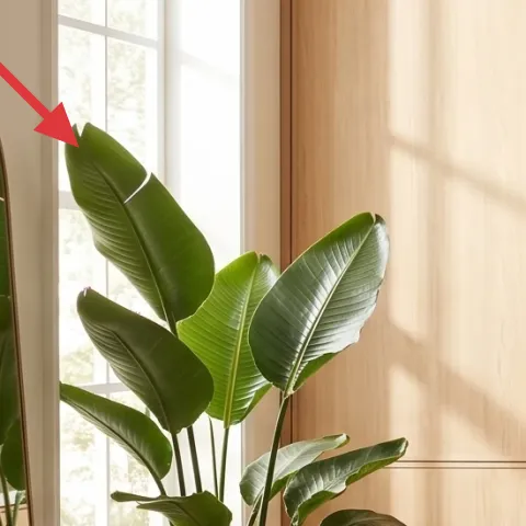
A leaning mirror on the left side lifts the whole nook by reflecting window light and visually expanding the cabinet wall behind it. The shape also matters: an oval-leaning silhouette softens the straight cabinet lines and balances the more geometric look of the ribbed island front. If you’re working with a bright kitchen that still feels a little flat, a mirror like this is a fast fix that doesn’t require changing the layout. I’d choose a mirror size that shows plenty of cabinet reflection rather than hovering too small in the corner. The trade-off is cleaning—mirrors show smudges—so quick glass wipes are part of the routine.
Place it for reflection, not decoration
Angle the mirror to bounce light toward the bar stools so it brightens the seating zone, not just the wall.
Layer 4 — pair of glass pendant lights ($130) adds glow without clutter
These two glass pendant lights bring that “see-through” softness you want in a Japandi-style kitchen. Because the glass is open and vertical, it doesn’t visually block the cabinet wall the way a bulky shade would. Positioning them over the countertop also frames the workspace visually, which is a big deal when the backsplash is busy with subtle veining. The best alternative is usually a single pendant, but two hanging at once better signals the breakfast bar as its own zone—especially with two stools. Trade-off: glass requires a little extra care to keep the finish streak-free, and you’ll want consistent bulb color temperature for a uniform look.
Match bulb temperature for calm
Use the same warm-but-not-yellow bulb temperature in both pendants so the light reads cohesive.
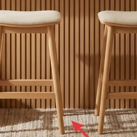
Layer 5 — two bar stools ($200) make the counter feel like seating
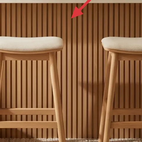
Two bar stools convert the breakfast bar from “where you eat” into a real seating area, and their light wood frames keep the nook airy instead of heavy. The cushions also matter—those pale, neutral tops add comfort and texture right where your eye lands between the rug and the island. The trade-off between style and practicality is real: you’ll want upholstery that’s easy to vacuum and wipe because kitchen stools get crumbs. I also like that the stool height visually aligns with the countertop line, so it doesn’t feel like the stools are floating too high or too low. If the alternative is skipping stools or using mismatched chairs, you lose the whole anchored look.
Don’t undersize the rug under stools
If the rug barely reaches the stool bases, the barstool area will still feel separate from the rest of the kitchen.
Layer 6 — decorative counter tray ($25) organizes small items into one look
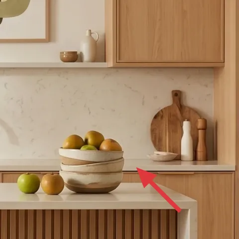
A decorative tray gives you a “container moment” on the white countertop, which is why the counter doesn’t look busy even with fruit and ceramics out. It also makes styling easier: instead of scattering a fruit bowl, mugs, and a teapot across the whole surface, everything lands on the tray and reads as one curated cluster. The trade-off is that you’ll want a tray size that works with your daily routine—big enough to hold your usual pieces, but not so big it hogs every inch of counter space. This is the kind of detail people notice only after the fact, because the counter looks cleaner and more intentional.
Keep the tray to one “height level”
When most items sit on the tray at similar heights, the countertop looks calmer and more cohesive.
Layer 7 — side console table ($80) creates a second styling surface
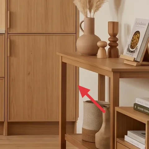
The side console table on the right adds storage-adjacent function and gives you a second place to style—so the kitchen doesn’t rely only on the countertop. In this photo, it holds a stack of books and a vase with pampas grass, which adds height contrast next to the low island and the tall potted plant. That height contrast is what keeps the nook from reading “one level.” I’d choose a console with simple lines and a lower shelf because it helps you organize extras without making the room feel cluttered. Trade-off: console surfaces collect dust and fingerprints faster than cabinets, so plan on a quick wipe-down during weekly cleaning.
Use one tall element, one flat one
A vase or pampas for height plus books for texture keeps the styling balanced without overstuffing.
The cost, layer by layer
| Layer | Item | Cost |
|---|---|---|
| 1 | Area rug 5×7 | $120 |
| 2 | Wood frame for abstract wall art (DIY-painted equivalent) | $80 |
| 3 | Leaning floor mirror | $100 |
| 4 | Pair of glass pendant lights | $130 |
| 5 | Two bar stools | $200 |
| 6 | Decorative counter tray | $25 |
| 7 | Side console table | $80 |
| Total | $735 | |
If you want a cheaper version, swap the rug for a smaller reversible flatweave, choose one pendant instead of two, and use thrifted frames repainted in the same cream-warm tone. Keep the mirror and tray—those two are the easiest “big visual payoff” details.
What worked, what didn't (across the whole room)
The best wins here were the ones that change how the nook feels at a glance: the rug anchors the stool zone, the pendant pair frames the counter, and the glass keeps it light. Painting the picture frames also helped the wall art look like it belongs with the cabinetry rather than competing with it. The one area that needs attention is keeping small counter items contained so the countertop stays crisp.
What worked
- The 5×7 rug creates a soft landing under both stools, which makes the breakfast bar feel intentional.
- Painted wood frames keep the abstract prints tied to the light cabinetry without changing the art itself.
- The leaning mirror bounces daylight into the seating zone, making the left side look brighter.
- Two glass pendants add definition over the counter while keeping the kitchen visually uncluttered.
- The tray organizes fruit and ceramics into one composed cluster instead of scattered countertop clutter.
- The console table adds height and a second styling surface, balancing the island’s horizontal lines.
What didn't
- Skipping the tray means small ceramics and fruit spread out and the counter starts to look messy.
- Using only one pendant can make the bar feel less “zoned,” especially with two stools.
- Choosing an overly dark rug would fight the cream backsplash and make the nook feel heavier.
- Frames that are too glossy show glare from daylight and reduce the calm, matte look.
- Console styling with only flat items looks one-note next to the tall potted plant and pendants.
What we'd skip if we did it again
Skip the urge to match every wood tone exactly. The cabinetry reads warm, but the real look comes from repeating materials (light wood, cream, sage shapes) while letting shapes—like the ribbed island front and glass pendants—stay varied.
Skip a thin rug that doesn’t extend under the front stool legs. When the rug edge sits behind the stools, the barstool area looks temporary, even if the decor is good.
Skip counter styling that doesn’t have a “home base” like a tray. Without that container, the countertop becomes a catch-all, and the whole Japandi calm evaporates.
Frequently asked
How long does this kind of breakfast bar nook refresh take?
Plan for one weekend if the pieces are already on hand. Rug placement and stool adjustments are quick; mirror positioning and pendant setup take the bulk of the time. The DIY-painted frame work is usually the slow part only because you’re waiting between coats. If you keep the paint schedule tight (sand, prime, paint, then let cure fully), the whole update still fits comfortably into two days.
If I rent, can I still do this look?
You can get very close. Rug, tray styling, stools, and mirror placement are no-issue. For lighting, look for plug-in solutions or removable hardware options. For the art, use painter’s tape for any temporary positioning and stick to removable methods. The one DIY-painted element would be the part to skip unless your lease allows painting picture frames.
What if my breakfast bar is smaller or wider than the photo?
For smaller spaces, scale down the rug first—aim for at least the front stool legs to sit on the rug. If your bar is wider, keep the stool count the same but extend the rug so the stools don’t feel like they’re floating. The pendants should still land over the countertop work zone; if you can’t place two, choose one pendant centered over the main seating gap.
Where should I shop for the key pieces?
Start with the rug and mirror because they set the texture and light behavior. For pendants, prioritize glass and a warm bulb option so the glow matches the daylight vibe. Stools are easier to buy in a matched pair, which helps keep the breakfast bar looking “intentional.” For the frames, shop for affordable wood frames (or keep your art frames and paint them).
What’s the biggest mistake people make in kitchen nooks like this?
Over-styling the countertop without a landing spot. When fruit, mugs, and ceramics spread out across the whole surface, it looks chaotic instead of curated. A tray fixes this instantly, and it also helps you rotate items seasonally while keeping the same visual structure.
More in Kitchen & Dining
Under $800: breakfast bar nook refresh with light-wood calm
A bright breakfast bar nook makeover using light-wood warmth, two glass pendants, and a softer rug under the stools. This weekend-friendly …
Under $400: warm terracotta kitchen countertop refresh
A kitchen countertop coffee corner gets a warm, modern farmhouse look using move-friendly swaps—rug, framed art, a plug-in lantern-style la…
Under $600: renter-friendly coffee nook refresh
A warm wood-and-tile coffee nook can look styled (not stuck together) with a $600 renter-friendly refresh. This plan uses a cozy rug, swap-…