- Best for
- Countertop styling and shelf cohesion
- Cost
- $400 total (7 renter-safe layers)
- Difficulty
- Easy to moderate
- Time
- 2–4 hours total
Why warm terracotta-and-brass accents are the countertop coffee corner of 2026
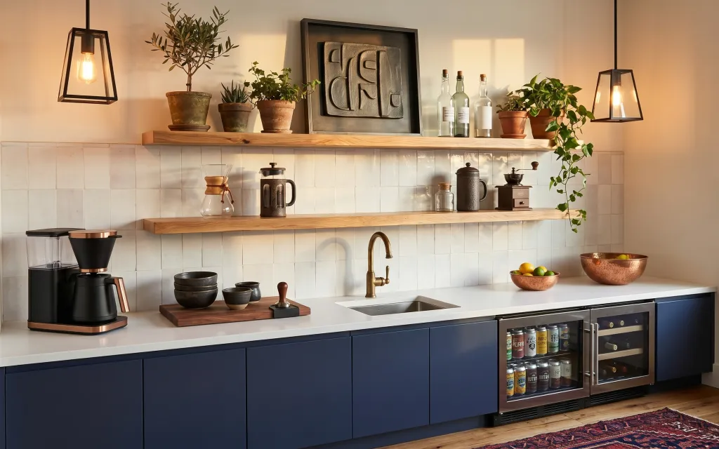
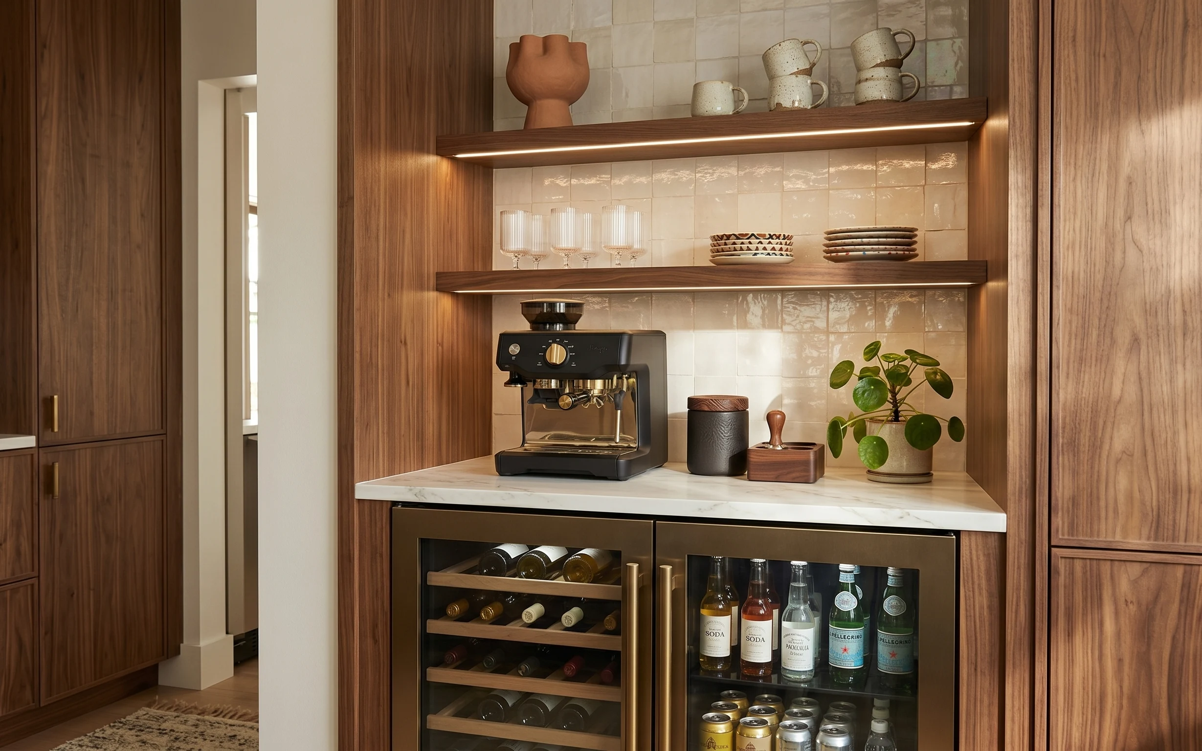
The base kitchen is already doing a lot: crisp white subway tile, wood shelves, and a dark-blue cabinet line that frames everything below. The “finished” feeling comes from repeat materials—terracotta planters, copper-toned bowls, and warm lamp light—plus a grounded pattern under the coffee setup. That’s exactly how modern farmhouse styling works in real magazine spreads: mix warm metals with matte ceramics, then anchor the floor with a textured rug. The best part is that every swap here is renter-friendly and can come with you.
I used to over-style like my shelves were a countertop ad—more items, more levels, more height. In this photo, the spacing is what sells it: the framed abstract wall art sits centered, plants get a clear grouping, and the bowls stay on one side so the tile line stays visible. I also learned to pick one “warm light” moment (that black lantern) instead of trying to match every surface. Same cabinet bones, calmer styling, way easier to pack.
Layer 1 — patterned area rug ($80) Builds a grounded base under the coffee setup
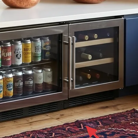
Choose the patterned area rug shown here in a size that lands fully in front of the coffee zone. In the hero photo, the rug’s warm, textured pattern keeps the white tile from feeling too crisp and cold, especially near the lower cabinet kick. The trade-off is that you’re committing to cleaning (vacuum regularly, spot-clean quickly), but the payoff is instant warmth where you actually stand and pour coffee. A solid rug could work, yet pattern helps hide minor scuffs from daily traffic in a rental kitchen, and it pairs naturally with matte ceramics on the shelf.
Anchor the rug to the work zone
When the rug sits under the coffee area—not just loosely nearby—the whole countertop vignette looks intentional.
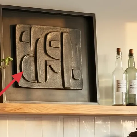
Layer 2 — framed abstract wall art ($80) Adds scale above the shelf line
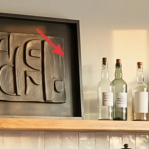
The framed abstract wall art is big enough to read as wall structure, not just decoration. It’s centered over the wood shelves, which makes the shelf styling feel like a curated display instead of random “stuff on a ledge.” In a kitchen, that vertical anchor matters because the backsplash already creates a strong grid, so the art’s softer shapes give your eye a break. The obvious alternative would be smaller prints, but they don’t balance the shelf length well. Bigger framing also photographs better, which is helpful for renters trying to get a “designed” result fast.
Keep it centered to match the shelf rhythm
A centered piece makes the plants and jars look placed, even if you’re styling them each week.
Layer 3 — black lantern pendant lamp ($60) Brings warm light without ceiling work
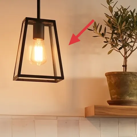
This black lantern pendant lamp gives the countertop coffee corner its glow. You get a warm, caged-light feel that complements the terracotta planters and copper-toned bowls, while the black frame ties into the kitchen’s darker hardware and coffee appliance. The trade-off is that lantern-style shades can cast a slightly directional light, so placement matters—aim it toward the shelf and coffee zone. If you went with a plain white shade, the warmth would still show, but it wouldn’t echo the mixed-metal look. For renters, the key is choosing a lamp that plugs in with a cord you can remove at move-out.
Watch for cord placement around the kitchen aisle
If the cord runs where you walk, it becomes a tripping hazard fast—plan a clean route before you commit.
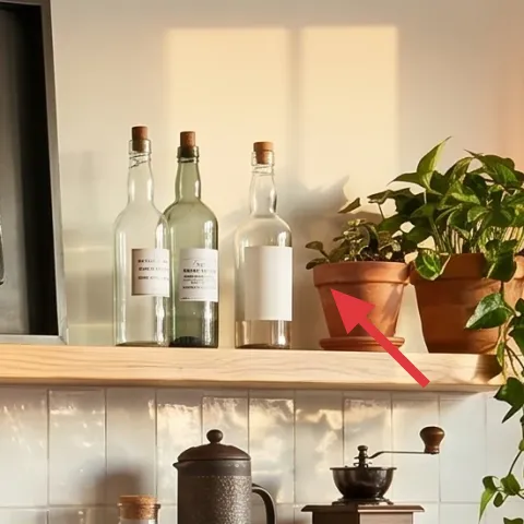
Layer 4 — terracotta planters on shelves ($80) Makes the shelf styling feel natural, not staged
Terracotta planters do the heavy lifting here because they look lived-in and they blend with the copper bowl tones. In the hero photo, multiple pots create a small “plant family” that adds height variation above the wood shelf line. That’s important because the backsplash grid can feel flat at countertop height—plants add organic movement where you’d otherwise see only ceramics and bottles. The trade-off is upkeep: rotate pots toward light and wipe dust off leaves occasionally. Still, it’s far easier than replacing fixtures, and you can pack each planter separately without any damage.
Group pots in odd numbers
An odd cluster reads more natural on open shelves than perfectly symmetrical pairs.
Layer 5 — copper bowl with citrus ($25) Adds color where you want a daily focal point
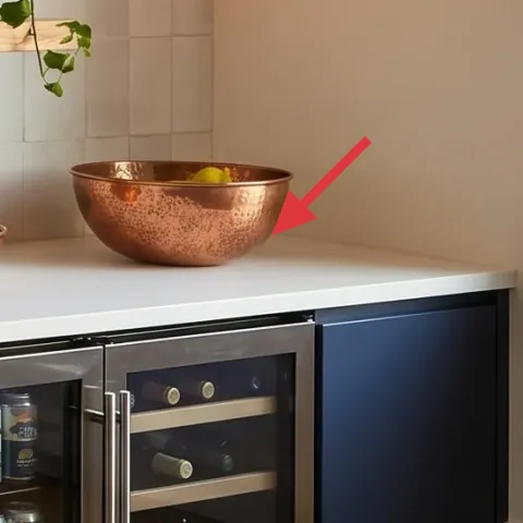
The copper bowl with citrus is a small styling move that changes the whole vibe. It sits on the right side of the countertop and turns an otherwise neutral stretch of wood-and-tile into something warm and practical—fruit stays visible, and the bowl gives you a color pop without repainting. The trade-off is that bowls like this show fingerprints and condensation if you store produce for long periods, so it’s best treated as a refresh item. A ceramic bowl in plain white could blend in, but it wouldn’t create the same “metal + clay” harmony with the terracotta planters.
Choose a bowl that can live on the counter
If it’s heavy or hard to clean, the style won’t last past the first busy week.
Layer 6 — stacked black ceramic bowls ($30) Tucks visual weight into the shelf zone
These stacked black ceramic bowls add depth on the lower shelf line, right where your eye drops after looking at the coffee setup. The matte ceramic surface looks grounded against the shiny white tile and balances the warm planters up top. The trade-off is that black pieces can feel “busy” if you add too many other dark items nearby, so keep the stack tight and let the bowls be the only concentrated black mass. Going with lighter ceramics would brighten the shelf, but it would also blend into the tile. Here, the black gives contrast without competing with the lamp glow.
Keep stacks low and grouped
Low ceramic groupings make shelves look styled; tall stacks can start to feel cluttered fast.
Layer 7 — apothecary-style jar labels (on glass bottles) ($45) Gives the shelf a cohesive, curated story
Make it instead of buying it
Swap the printed look on the glass bottles’ existing labels with DIY apothecary-style labels so the whole shelf reads like one set.
Materials
- Printable label sheets (laser or inkjet) — 1 pack — craft store — $8
- White cardstock backing (optional) — 1 sheet — craft store — $6
- Mod podge-style clear seal (matte) — small bottle — craft store — $10
- Fine-tip black permanent marker — 1 — office store — $7
- Scissors + ruler — 1 kit (if needed) — dollar store — $4
Steps
- Measure each bottle label area and note the width and height in centimeters or inches.
- Design label text in a simple apothecary layout (name line, small descriptor, and date if you want it).
- Print the labels on the label sheet and cut clean edges using a ruler.
- Seal the printed labels with a thin matte clear coat for less smearing (let it dry fully).
- Clean bottle surfaces so labels stick smoothly without bubbles.
- Apply each label, press down for a full seal, and let the bottles sit flat so the adhesive sets.
- Use the fine-tip marker to touch up any small alignment issues.
- Wipe around the bottle neck if any label edges lifted.
Total DIY cost: $35 — saves about $10 over buying.
When shelf items look like a “set,” the whole coffee corner reads intentional—even in a rental where you can’t change the tile or cabinet layout. In the hero photo, the glass bottles already give you shape variety, but the labels are what make the visual rhythm consistent across heights. DIY labels are cheaper than buying a coordinated label kit, and you can tailor the wording to your actual coffee workflow. The only trade-off is time: you’ll need to measure and cut carefully so the typography looks balanced. The end result is that bottles stop looking like random containers and start looking like decor you chose on purpose.
Stick to matte finishes on labels
Matte labels photograph better next to glossy glass and don’t glare under warm lamp light.
The cost, layer by layer
| Layer | Item | Cost |
|---|---|---|
| 1 | Patterned area rug 5×7 | $80 |
| 2 | Framed abstract wall art 16×20 | $80 |
| 3 | Plug-in lantern pendant lamp (cord-ready) | $60 |
| 4 | Terracotta planters on shelves (set) | $80 |
| 5 | Copper bowl with citrus (decorative bowl) | $25 |
| 6 | Stacked black ceramic bowls (set) | $30 |
| 7 | Apothecary-style jar labels (DIY retail equivalent) | $45 |
| Total | $400 | |
If you want a cheaper variant, swap the framed abstract art for a smaller framed print (or a multipack of prints) and choose one planter instead of a larger set. Keeping the rug plus one warm lamp usually preserves the same cozy look for less money.
What worked, what didn't (across the whole room)
This look comes together because it repeats warm materials (terracotta, copper, black metal) and keeps the shelf styling grouped instead of scattered. The strongest “renter win” is how the lighting and labels add cohesion without touching fixtures or tile.
What worked
- The patterned area rug grounds the coffee corner so the white tile feels warmer and less echo-y.
- Centered framed art gives the shelf display structure, which makes open shelving look intentional.
- Terracotta planters add organic texture that balances the tile grid and keeps the scene from feeling flat.
- Black ceramic bowls add contrast while staying visually calm because the stack stays low.
- The copper-toned bowl turns a functional surface into a daily focal point you’ll actually use.
- DIY apothecary labels make the bottles look like a coordinated set instead of random containers.
What didn't
- If you add too many small objects to the shelves, the backsplash’s clean line gets visually crowded.
- Over-bright bulbs fight the warm terracotta palette; stick to warmer bulbs so the lamp glow matches.
- Labels that are too glossy can glare under lamp light and look uneven in photos.
- Planters that aren’t grouped (or are all the same height) read more like clutter than styling.
What we'd skip if we did it again
Skip adding more framed pieces around the shelves. One larger framed abstract wall art keeps the backsplash and shelf line feeling balanced; multiple small frames can start to compete with the plant cluster and label typography.
Skip swapping to all-neutral storage. Plain white bowls and a single boring plant make the shelf look flat against the tile grid, while the terracotta-and-copper mix is what gives the countertop coffee corner its warmth.
Skip glossy labels. Even if the font looks great on paper, glare under warm lamp light can make edges look messy—matte label finishes stay crisp and look more like a designed set.
Frequently asked
How long does this kind of kitchen refresh take for a renter?
Plan on 2–4 hours if you’re starting from a mostly empty shelf. The rug and shelf styling are the fastest parts. The only time sink is label measurement and cutting for the DIY apothecary-style labels—once the layout is set, you can batch a few labels at once.
Is this move-out friendly if I can’t change the tile or cabinets?
Yes—this look is built from add-on elements: a rug, a framed print, plug-in lantern-style lighting, portable planters, and tabletop ceramics. The backsplash and cabinet color stay as-is, but the warmth comes from your choices of materials and grouping. On move-out day, everything can be packed with no repairs.
What if my countertop is smaller or my shelf run is shorter?
Scale down the number of planters and keep the cluster in one zone rather than spreading it out. If the shelf is shorter, choose a slightly smaller framed abstract print and center it above the main grouping. The core idea stays the same: one vertical anchor, one plant cluster, and one copper/countertop focal bowl.
What if my room lighting is cooler or I don’t have a warm lamp spot?
Swap bulb color temperature in your plug-in lamp to keep the palette warm. If your lighting runs cool by default, add slightly warmer textiles—like an amber-toned patterned rug or ceramics with rust/terracotta tones. The goal is to keep the warm metals and clay colors from looking washed out.
Where should I shop for the most renter-friendly pieces?
Look for the rug and framed print at discount home sites, big-box retailers, or marketplace listings with easy returns. For terracotta planters and black ceramic bowls, garden centers and home decor aisles are usually cheaper than specialty boutiques. Plug-in lantern-style lamps are best purchased from stores that clearly list cord length and plug type.
Biggest mistake renters make with open-shelf coffee styling?
Overloading the shelves with too many separate heights and textures. The hero photo works because items are grouped: the terracotta planters cluster together, the black ceramic bowls stay stacked in one spot, and the bottles visually “match” thanks to cohesive labels. Fewer objects, better grouping, and one anchor piece read more expensive.
More in Kitchen & Dining

Under $400: warm terracotta kitchen countertop refresh
A kitchen countertop coffee corner gets a warm, modern farmhouse look using move-friendly swaps—rug, framed art, a plug-in lantern-style la…
Under $600: renter-friendly coffee nook refresh
A warm wood-and-tile coffee nook can look styled (not stuck together) with a $600 renter-friendly refresh. This plan uses a cozy rug, swap-…
Under $400: brass-and-cream kitchen sink wall refresh
A brass-and-cream kitchen sink wall refresh that looks styled but stays weekend-friendly. Swap in botanical peel-and-stick wallpaper, add a…