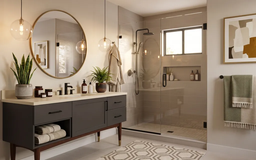
- Best for
- Warm, textured vanity styling
- Cost
- Under $350
- Time
- About a weekend afternoon
- Renter-safe
- Yes—no-drill swaps and removable decor
Why an olive-and-cream texture palette is the vanity-and-tile bath of 2026
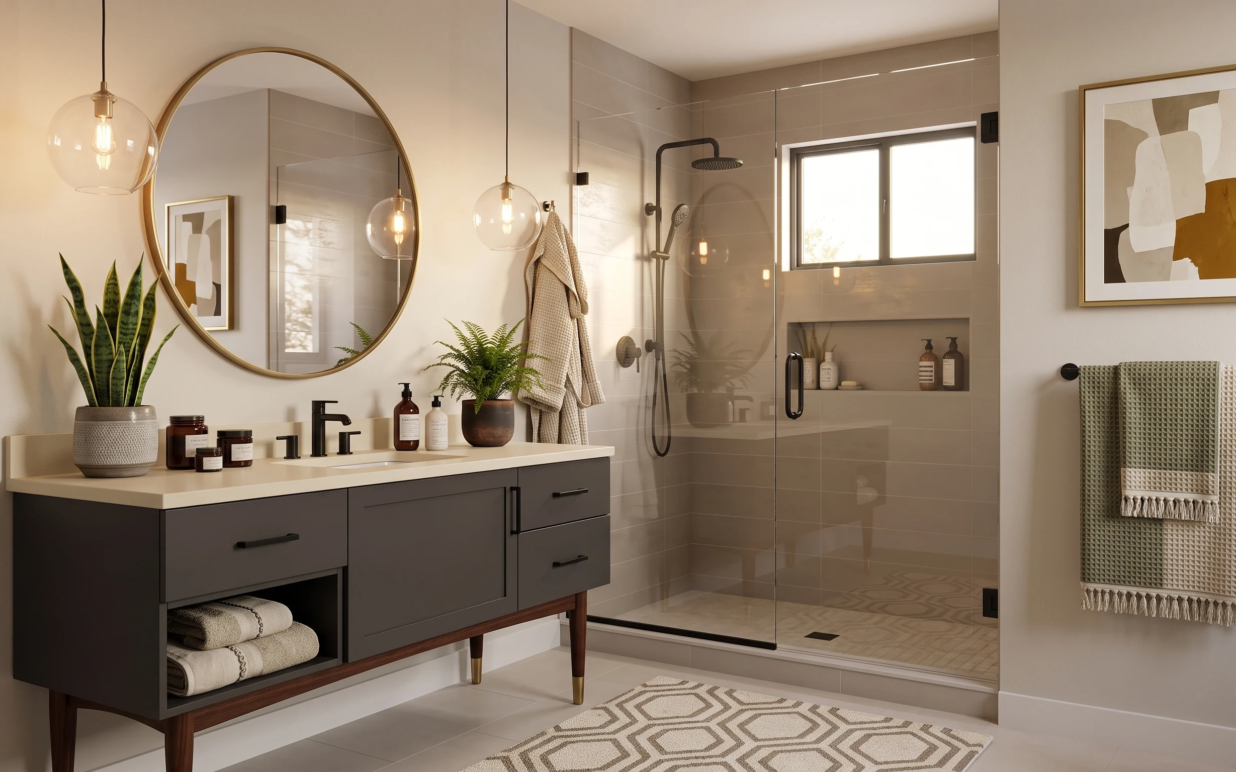
The starting point is already clean and bright: pale tile, a simple vanity silhouette, and a glass shower that keeps lines crisp. To give the space personality, the photo leans on three tactile anchors—waffle knit towels, a geometric patterned area rug, and matte ceramics on the countertop. The framed abstract art adds a warm, modern contrast, while the snake plant brings that lived-in green without feeling “decor-only.” This is achievable on a renter budget because every swap here is either removable wall decor, easy soft goods, or countertop styling.
I did the same thing in my own place six moves ago—hung “pretty” wall art first, then realized the bathroom still felt flat. My mistake was treating textiles like an afterthought; the moment I added one textured towel and a rug with a repeating pattern, the whole palette started to look intentional. Here, the play is pairing smooth tile with knit texture and grounding warm neutrals with plant color.
Layer 1 — geometric patterned area rug ($100) Underfoot grip with a repeating pattern
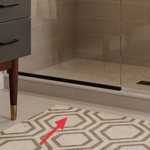
This geometric patterned area rug sits on the bathroom floor in the open zone outside the shower, and it’s doing more work than it looks like at first glance. The neutral gray-and-cream shapes echo the tile tones, while the pattern keeps small splashes from turning into a “spot-check” moment. Choosing a flat, washable style is the renter-friendly route because it’s easy to roll up and re-use elsewhere. If you went with plain solid rug instead, you’d lose the graphic rhythm that makes the vanity area feel designed. The trade-off: pattern rugs can show lint faster, so quick shake-out matters.
Stay dry on the first day
Lay a rug over a clean, dry floor so it lies flat right away and doesn’t curl at the edges.
Layer 2 — framed abstract wall art (left) ($60) warm neutrals that soften tile lines
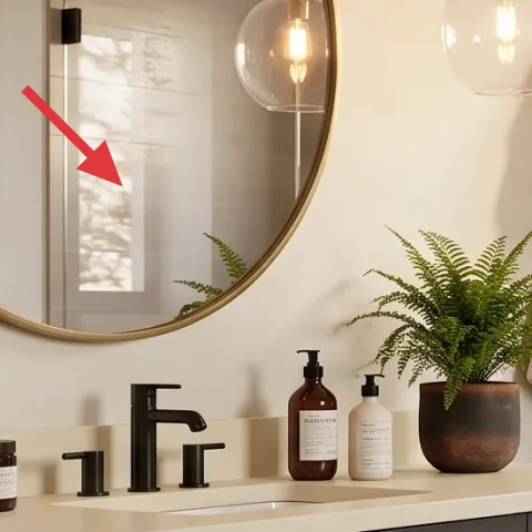
The left framed abstract art brings a creamy, tan-forward palette that reads warm against the bathroom’s cool tile and glass. It’s important that it’s framed and matte-ish rather than glossy—gloss highlights the room’s daylight glare and makes the print feel harsher. This is a renter-friendly layer because you can hang it with Command hooks or picture-rail hooks if that rail exists. The alternative would be a tiny print, but this scale keeps the wall from looking accidental. The trade-off is spacing: keep it level so it doesn’t compete with the oval mirror shape nearby.
Why framed matters
Framing creates a finished border that looks “built-in” even when the rest of the bathroom is strictly landlord-installed.
Layer 3 — framed abstract wall art (right) ($60) a second focal point without more clutter
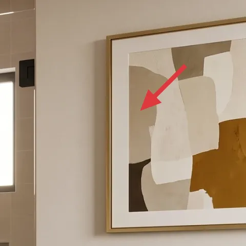
Adding the right framed abstract print gives the wall a balanced composition—two artworks create a visual “conversation” while keeping the bathroom from feeling empty. The off-white and warm tan blocks also tie back into the rug and countertop styling, so your eye moves smoothly instead of bouncing between mismatched colors. This is the swap I prefer over adding a shelf of small decor pieces; too many objects in a bathroom can feel crowded fast. The trade-off: two prints means you have to commit to matching frame color and keeping both at the same height rhythm. Once it’s right, it looks intentional even in a hurry.
Measure by eye, then verify with tape
Hold the frames in place with painter’s tape first; it’s the quickest way to avoid “too high” or “too low” regret.
Layer 4 — waffle knit bath towel ($20) texture that reads cozy next to tile
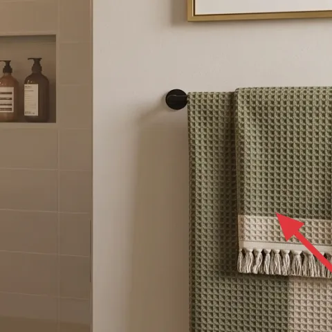
The waffle knit bath towel hanging on the bar adds the kind of texture tile can’t provide. The small raised pattern mirrors the rug’s interest, but in a softer, more absorbent material. This works particularly well when the towel color sits in the same neutral family as the countertop—here, cream tones make the whole palette feel calm instead of washed out. If you chose a smooth towel, you’d still get function, but the photo-like warmth disappears. Trade-off: waffle knit shows folds more clearly, so give it a quick straightening before photos or guests.
Avoid super-bright whites
Pure optical-white towels can look stark next to warm tile grout; choose an off-white or oatmeal tone instead.
Layer 5 — snake plant in ceramic pot ($30) vertical green that feels low-maintenance
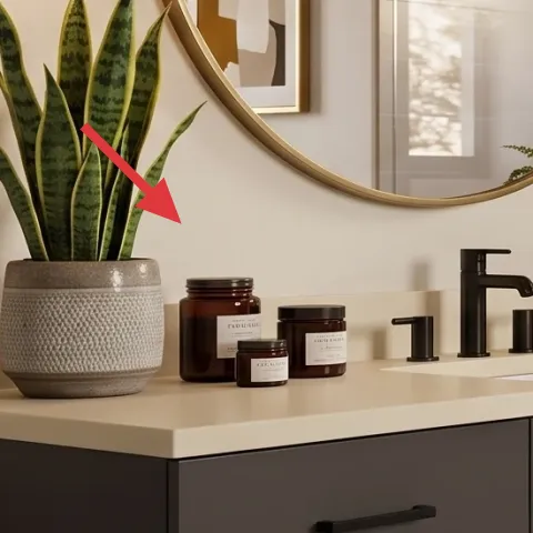
The snake plant in a ceramic pot is doing that “I live here” work without needing constant watering. Its upright leaves create vertical movement that balances the horizontal vanity shelf and countertop items. The ceramic pot’s muted texture and shape make it look like a designed vignette rather than a random plant plopped down. I’d skip a tall flowering plant here because bathrooms can be drafty and light levels vary; a snake plant is more forgiving. The trade-off is patience: it grows slowly, so the plant won’t fill the frame overnight—but it will keep the look steady.
Match the pot finish to your tray
Keeping ceramic tones consistent makes countertop styling feel cohesive, even with different product shapes.
Layer 6 — decorative tray on vanity ($15) order for bottles, candles, and small odds
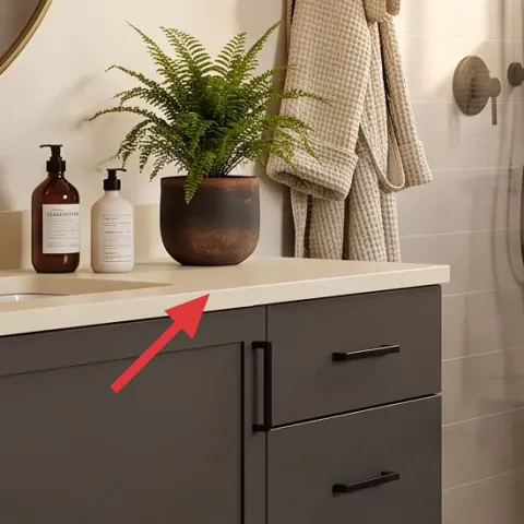
A decorative tray on the vanity is the unglamorous layer that makes everything look styled on purpose. In the photo, the tray groups small items into one “zone,” so your counter reads clean even when bottles or candles are visible. Choose a tray with a textured surface (like woven or matte) to echo the waffle towel, and keep it neutral so it doesn’t fight the framed art. If you tried to style each item individually without a tray, you’d end up with visual clutter fast. The trade-off: trays take up a little countertop space—pick one that fits your shelf without blocking the faucet area.
Do one-tray max per surface
Using a single tray per countertop keeps the bathroom from looking like a craft project.
Layer 7 — apothecary jar labels (DIY) ($35) custom typography on the countertop jars
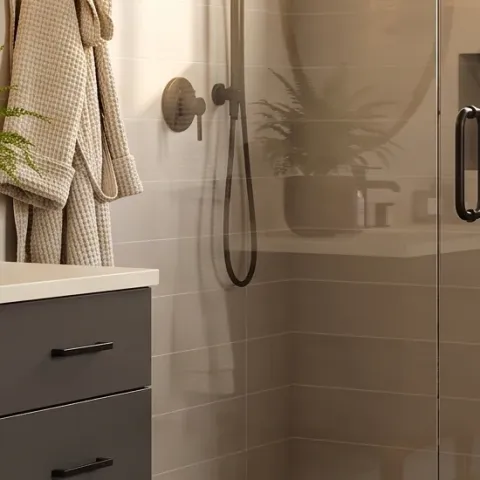
Make it instead of buying it
DIY apothecary jar labels so the bottles on the vanity match your bathroom’s cream-and-olive palette without replacing any of the containers.
Materials
- Printable label paper (letter) — 1 sheet set — print shop — $10
- Clear adhesive label sheets — 1 pack — office supply — $6
- Mini scissors or craft knife + blade — 1 set — craft store — $5
- Small ruler + fine-tip pen — 1 each — office supply — $4
- Alcohol wipes — small pack — pharmacy — $3
Steps
- Clean the jar surfaces with alcohol wipes so labels stick evenly.
- Design label text in a simple apothecary layout (product name + small ingredient line).
- Print on label paper, then cut the labels to a consistent rounded-rectangle shape.
- Apply clear adhesive label sheets (or laminate) for water-resistant handling in a bathroom.
- Position labels on the jars—aim for the same height on every container.
- Press firmly, then let the labels set for a few minutes before styling.
Total DIY cost: $28 — saves about $7 over buying.
The cost, layer by layer
| Layer | Item | Cost |
|---|---|---|
| 1 | Geometric area rug 5×7 (cream/gray) | $100 |
| 2 | Framed abstract wall art (left) | $60 |
| 3 | Framed abstract wall art (right) | $60 |
| 4 | Waffle knit bath towel | $20 |
| 5 | Snake plant in ceramic pot | $30 |
| 6 | Decorative tray on vanity | $15 |
| 7 | Apothecary jar labels (DIY equivalent) | $35 |
| Total | $320 | |
If you want a cheaper version, do one framed print instead of two, swap the rug for a smaller runner size, and choose a basic ceramic pot for the snake plant. Keep the tray and one waffle towel—those are what hold the “styled” look together.
What worked, what didn't (across the whole room)
The best wins were the texture layers: the waffle towel and geometric rug make the tile feel less clinical. The framed art also helped the vanity look curated instead of purely functional. The only part that requires attention is placement, because bathrooms punish clutter and misalignment faster than other rooms.
What worked
- The geometric area rug repeats the neutral palette and hides everyday splash marks.
- Two framed abstract prints create balance on a largely hard-surface wall.
- The waffle knit towel adds hand-feel texture that tile can’t replicate.
- The snake plant’s upright silhouette adds green without taking over the counter.
- A decorative tray creates a single “styled zone” for bottles and candle items.
- DIY jar labels make countertop decor feel coordinated with the art and rug colors.
What didn't
- Matching two frames is easy to mess up if heights differ by even a small margin.
- If the towel is too bright white, it can look harsh next to warm tile tones.
- Skipping the tray makes the countertop look busier, even when items are neatly placed.
- Too many small decor objects competing with the plant can crowd the vanity space.
- If a rug is too plush, it can collect moisture and feel awkward by the shower.
What we'd skip if we did it again
Skip adding a third wall piece. With two framed abstract prints already echoing the warm neutrals, extra art turns the bathroom wall into a “catch-all” instead of a calm focal area.
Skip smooth, low-texture towels. Waffle knit is doing real work here by playing nicely with the rug pattern and keeping the room from feeling sterile.
Skip counter styling without a tray. Even if every item is pretty, grouping them into one base area is what keeps the vanity looking intentional in a rental.
Frequently asked
How long does this bathroom refresh take?
Plan for about 3–5 hours total. Most of the time goes into hanging the two framed abstract prints level and arranging the vanity tray/vignette. The DIY jar labels are quick if you already have your text layout ready—plus a few minutes for the labels to set after pressing.
Will this work if my bathroom is smaller?
Yes—scale down the area rug to a smaller size and keep only one framed abstract print if wall space is tight. The texture priorities stay the same: one waffle towel, one textured rug, and a single tray grouping on the vanity. For the plant, choose the same pot shape but keep it to one container so the counter doesn’t feel crowded.
What if my bathroom gets less natural light?
The palette already helps because creams and off-whites read warm. Choose slightly brighter versions of the rug and towel so details don’t disappear at night. For the framed art, avoid ultra-glossy prints; matte or softly textured finishes keep the work looking calm even under warmer bulbs.
Where should I shop for the look without upgrading everything?
Start with soft goods and wall decor: framed prints, waffle towels, and an area rug can all be found at home stores and online marketplaces. For the vanity styling, grab neutral ceramic pots and a textured tray, then add the snake plant last so you can match color tones. The DIY labels can come from printable paper and simple clear overlays.
What’s the biggest mistake people make in renter bathrooms like this?
Overcrowding the vanity and forgetting that bathrooms have less wall real estate than living rooms. If the countertop is busy, the room ends up feeling chaotic even with pretty items. A tray + one plant + one towel is usually enough to make the whole space feel intentional without adding permanent changes.
More in Bathroom
Under $350: vanity-and-tile bath refresh with 7 renter swaps
A renter-friendly vanity-and-tile bath refresh that leans on texture: a geometric area rug, two framed abstract prints, and warm vanity sty…
Under $400: move-ready bathroom vanity-wall refresh
A renter-friendly bathroom vanity wall refresh that looks warm and mid-century without changing any fixed fixtures. This $400 plan uses sev…
Under $300: renter-friendly bathroom vanity refresh
A warm, spa-like bathroom vanity setup is achievable on a $300 renter-friendly budget. This refresh focuses on a soft area rug, layered tex…