- Best for
- Texture + framed-art refresh
- Cost
- Under $400
- Difficulty
- Weekend-friendly
- Time
- 2–3 hours total
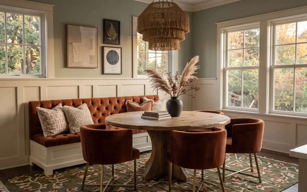
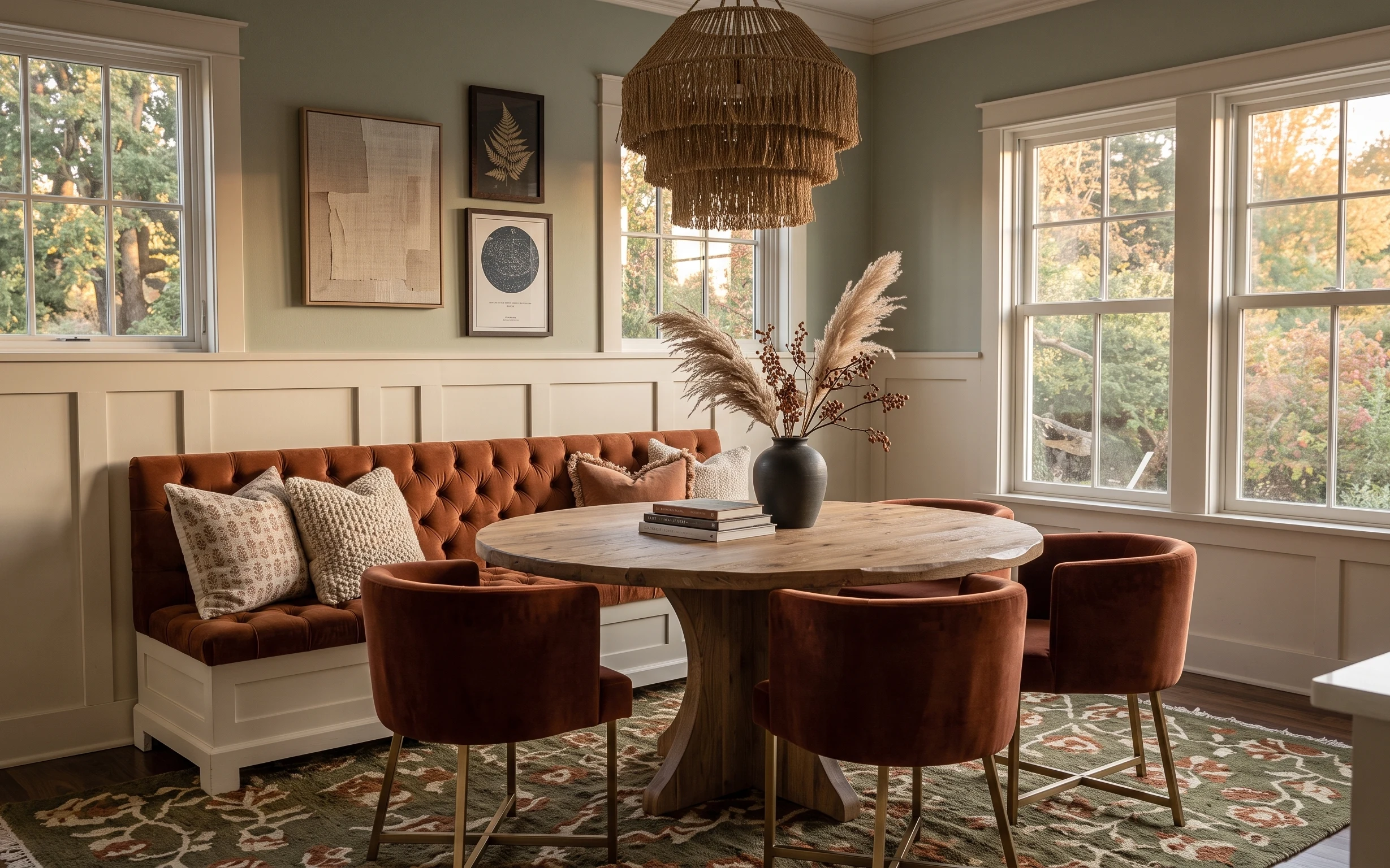
Why caramel sofa-and-woven-pendant styling is the living room of 2026
In this photo, the main magic comes from repeat materials: caramel tufting on the sofa, creamy wall color, and that olive-green pattern pulled through the rug. The room feels curated without looking precious, and the key is how the textures stack—tufted upholstery, woven lamp fibers, and the matte look of framed prints. For shared housing, that approach is doable because it relies on swaps you can carry: soft goods, framed art inserts, and small decorative objects.
I used to chase “perfect” matching sets, but every time I moved, I regretted the items that didn’t survive packing and unpacking. Once I focused on color families instead—brown, cream, and olive—I could swap one pillow cover or one framed print and keep the same vibe. The biggest change here is choosing pieces by texture and scale, not by whether they came from the same store.
Layer 1 — Patterned area rug ($80) Grounds the seating zone
A patterned area rug in an olive-and-warm-neutral palette is what makes the sofa-and-coffee-table grouping read as one “zone” instead of separate furniture pieces. In the hero, the rug pattern echoes the earth tones in the pillows and chairs, so it works with the existing caramel upholstery instead of competing. If you go too plain, the room starts to look flat; if you go too loud, the framed art has nowhere to breathe. The trade-off I accept with pattern: it’s harder to “hide” spills, so plan on quick spot-cleaning and rotating cushions for even wear.
Repeat one color from the rug in a small way
Bring the rug’s olive or terracotta tone into pillows, book spines, or the vase stems so the pattern looks intentional.
Layer 2 — Sofa throw pillows ($25) Adds softness without big furniture moves
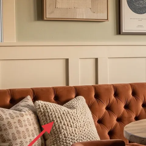
Throw pillows are the easiest high-impact swap because they change the look without changing the layout, and they fold down for the next move. The hero’s sofa has a tufted caramel shape, so the best pillow choice is texture-forward: woven or subtly nubby covers that contrast the buttoned upholstery. Aim for neutral bases with small pattern, since that mirrors what’s already happening in the rug and framed art. The trade-off is that you’ll need a little more washing discipline than with plain solids, but the payoff is a room that reads warmer and more lived-in.
Stick to fewer colors than you think
If the pillows pull from the rug (cream + olive + warm brown), the room stays cohesive even with multiple frames.
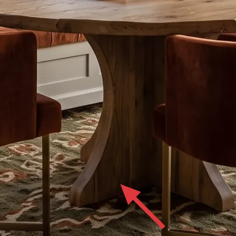
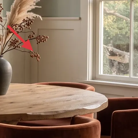
Layer 3 — Round wood coffee table ($60) Brings warmth at eye level
This round wood coffee table shape matters because it softens the corners created by the sofa and dining chairs. When you choose a similar diameter and light-wood tone, the whole room feels more open, and the table becomes a visual “bridge” between seating and the framed wall. If you went with a dark, heavy square table, the warmth would get trapped and the room would feel boxier—especially in shared spaces where circulation paths matter. The trade-off: round tables can be slightly less “organizing-friendly” for trays, so keep the styling simple and let the surface breathe.
Use a coaster-sized centerpiece to protect the top
Small protection keeps your next move hassle-free, since you won’t have to replace the table surface.
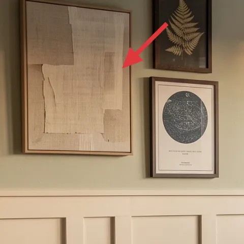
Layer 4 — Small framed black-and-beige artwork ($80) Makes the wall feel finished
This smaller framed piece is doing subtle work: it balances the larger abstract artwork and keeps the wall from feeling empty between the window bay and the centered medium frame. Because the hero’s palette leans creamy and warm, a black-and-beige print keeps contrast without introducing new colors the rug and pillows aren’t already carrying. For shared housing, framed art is also move-friendly—swap the print without touching the landlord-installed wall. The trade-off is that the “perfect match” isn’t necessary; what matters is scale and the same value range (light backgrounds, dark accents).
Make it instead of buying it
DIY a hand-painted abstract print on cardstock to replace the small framed artwork insert, so you get the same color story for much less money.
Materials
- Cardstock—4–6 sheets—office supply—$6
- Acrylic craft paint set—set of 6–12 colors—craft store—$15
- Fine black marker/liner—1 pen—office supply—$8
- Painter’s tape—1 roll—hardware store—$5
- Clear acrylic gloss/finisher (optional)—1 small bottle—craft store—$0
Steps
- Trim cardstock to the same aspect ratio as the frame opening.
- Tape simple rectangles/blocks on the paper to control edges.
- Paint a beige base wash, then layer small darker marks with a dry brush.
- Let the paint dry fully, then remove tape to reveal crisp borders.
- Add a few thin lines or dots with the black marker for contrast.
- Check the result from across the room, then add one final value layer if needed.
Total DIY cost: $34 — saves about $46 over buying.
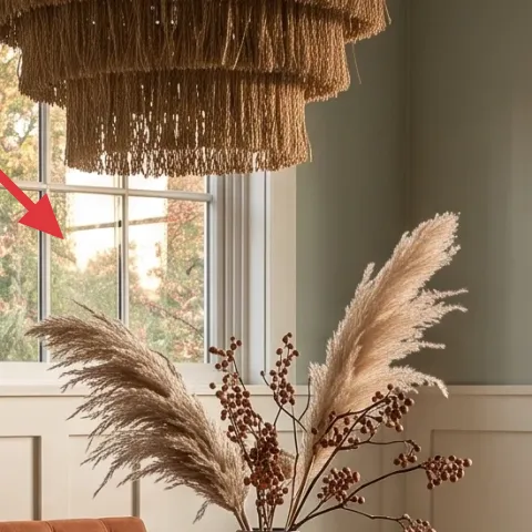
Layer 5 — Vase with pampas grass and berry stems ($35) Adds height without taking floor space
The vase-and-dried-stems moment is what pulls the room upward and makes it feel styled instead of “furniture-only.” In the hero, the pampas texture is airy, and the dark vase grounds it visually—so you get both movement (fluffy plumes) and stability (the ceramic shape). This works especially well in shared living rooms because dried florals don’t require weekly care, and the arrangement packs into a box with minimal mess. The trade-off is that dried stems shed a little, so store them in a container with tissue paper so you’re not dealing with stray fibers during moves.
Don’t pack stems loosely
Wrap plumes separately so they don’t break, and keep the berries contained to avoid crushed detail.
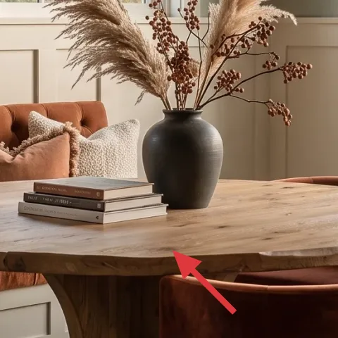
Layer 6 — Decorative book stack ($15) Creates a styled “resting spot”
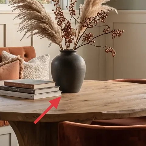
That little stack of books on the coffee table reads like intentional clutter, which is exactly what a shared living room needs. A book stack also gives you a base to anchor the rest of the tabletop styling: the vase can sit behind it, or the stack can sit in front while the centerpiece stays visible. Choose volumes with neutral spines or earthy tones, so they blend into the cream-and-brown palette instead of adding bright color noise. The trade-off: you’ll have to keep the stack from becoming a real mess, but it’s quick to reset.
Angle the spines toward the windows
Daylight makes book spines readable, but only when they aren’t stacked too flat.
Layer 7 — Large framed abstract artwork ($80) Sets the overall tone on the back wall
The large abstract frame is the room’s “color reference,” and it’s why everything else can stay simple. In the hero, the artwork’s beige and warm tones echo the sofa and the rug’s warm areas, so the wall looks cohesive even with multiple window openings. If the large piece were too cool-toned or too saturated, it would tug attention away from the seating and make the room feel mismatched. The trade-off is scale: large art can feel pricey, but in shared housing it’s worth it because you’ll reuse the same frame across moves—just swap the print when you get bored.
Choose art for values, not just colors
Look for a similar light/dark balance to the sofa, so the room stays calm even as trends shift.
The cost, layer by layer
| Layer | Item | Cost |
|---|---|---|
| 1a | 5×7 patterned area rug | $70 |
| 1b | Rug pad | $10 |
| 2 | Sofa throw pillows (2-pack) | $25 |
| 3 | Round wood coffee table | $60 |
| 4 | Small framed black-and-beige artwork (DIY insert in same frame) | $80 |
| 5 | Vase with pampas grass and berry stems | $35 |
| 6 | Decorative book stack | $15 |
| 7 | Large framed abstract artwork | $80 |
| Total | $375 | |
If the rug in this look feels out of reach, pick a similar color-scheme runner or smaller 5×7 rug first and upgrade only when the room layout forces you. The same trick applies to framed art—swap one print style at a time to stay within budget.
What worked, what didn't (across the whole room)
The overall verdict: the palette and texture layering already set the vibe, so the biggest wins come from soft goods and framed details you can pack. Small, repeatable choices—rug pattern, warm pillow textures, and a simpler print—made the room feel intentional without extra moving headaches.
What worked
- The patterned area rug anchors the sofa-and-table seating zone without permanent wall changes.
- Textured throw pillows keep the tufted sofa from reading flat, especially in warm daylight.
- Round wood at center height softens the geometry of dining chairs and windows.
- Framed black-and-beige art adds contrast while staying in the same value range as the room.
- The pampas-and-berries arrangement brings vertical height and movement without taking floor width.
- A compact book stack makes tabletop styling look purposeful instead of “just decor.”
What didn't
- Choosing pillows with too many bright colors made the rug and frames feel louder than the room needed.
- Over-styling the coffee table pushed the vase into the background instead of letting it lead.
- Art that didn’t match the beige value range pulled attention away from the warm upholstery.
- Dried stems packed loosely shed and bent, turning a neat look into a fussy reset.
What we'd skip if we did it again
Skip anything that requires drilling or permanent wall hardware. In shared housing, the best “high design” comes from freestanding items, framed art inserts, and textiles you can box without worrying about patching.
Skip buying a full furniture set just to match the coffee table and chairs. That approach usually traps you into a look you can’t reuse, and resale or move-up options get limited fast.
Skip buying wall art based only on color swatches. Using the same light/dark values as the sofa and rug keeps the room coherent, even when you swap one print for another later.
Frequently asked
How long does a refresh like this take in a shared living room?
Plan for about 2–3 hours. Rug and pillow swaps are fast, usually under an hour. Framed art is the swing: if you DIY the small print, factor in drying time. The dried-stems styling is quick—most of the time goes into getting the height and spacing right so the vase doesn’t overwhelm the coffee table.
Is this doable if I can’t paint or drill?
Yes. This look relies on textiles (rug, pillow covers), freestanding tabletop styling (books and vase), and framed art inserts. Framed pieces can be swapped without touching the walls’ fixed features. If your frames are already installed, focus the DIY effort on the artwork itself so packing stays simple.
What if my living room is smaller than the photo?
Downsize the rug first, then keep the same color palette. In tighter rooms, use the round coffee table as the anchor point and keep tabletop styling minimal—one book stack plus the vase is enough. For wall art, choose one large piece instead of two smaller ones if wall space is narrow.
Where should I shop differently to keep the budget under control?
Prioritize secondhand for the table and framed basics, then spend on textiles you can’t “collect” over time. Rug pads and pillow covers are often cheaper in multipacks, and dried-stems arrangements are easier to find at seasonal craft stores. If you DIY the small print insert, you get an upscale look without paying for another full frame.
What’s the biggest mistake people make with this kind of boho-earthy style?
Overloading the room with too many new colors at once. Stick to the same value range: warm creams, caramel browns, and one darker accent (black or deep brown). If a pillow or print adds a color that isn’t in the rug, it usually breaks the calm feel—even if the item looks great alone.
More in Living Room
Under $400: boho-earthy living room refresh with move-friendly swaps
A caramel sofa, a round wood table, and framed art already give this living room its vibe. This move-friendly refresh adds a patterned rug,…
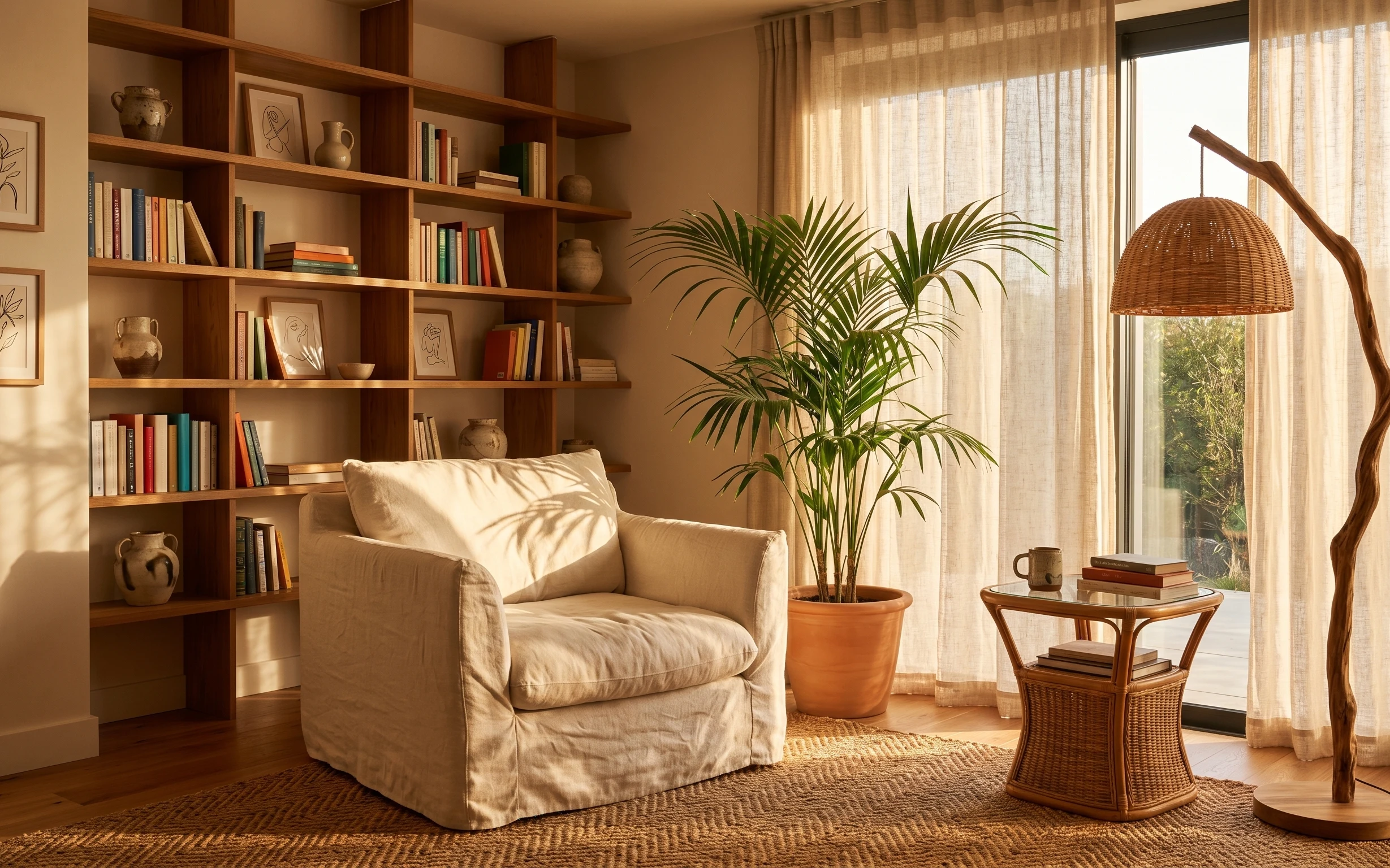
Under $600: boho reading corner refresh with move-ready swaps
A warm, boho reading corner is achievable on a renter budget using rug, pillows, a rattan floor lamp, two botanical prints, and a leafy pla…
Under $500: 7 move-friendly living room corner swaps
A warm olive-and-cream living room corner refresh for shared housing, built from move-with-you swaps that pack fast. This $500 plan focuses…