
- Best for
- Botanical accents + renter-safe swaps
- Cost
- $398 total
- Difficulty
- Easy (mostly soft goods)
- Time
- One weekend afternoon
Why cream-and-brass botanical notes are the living room seating area of 2026
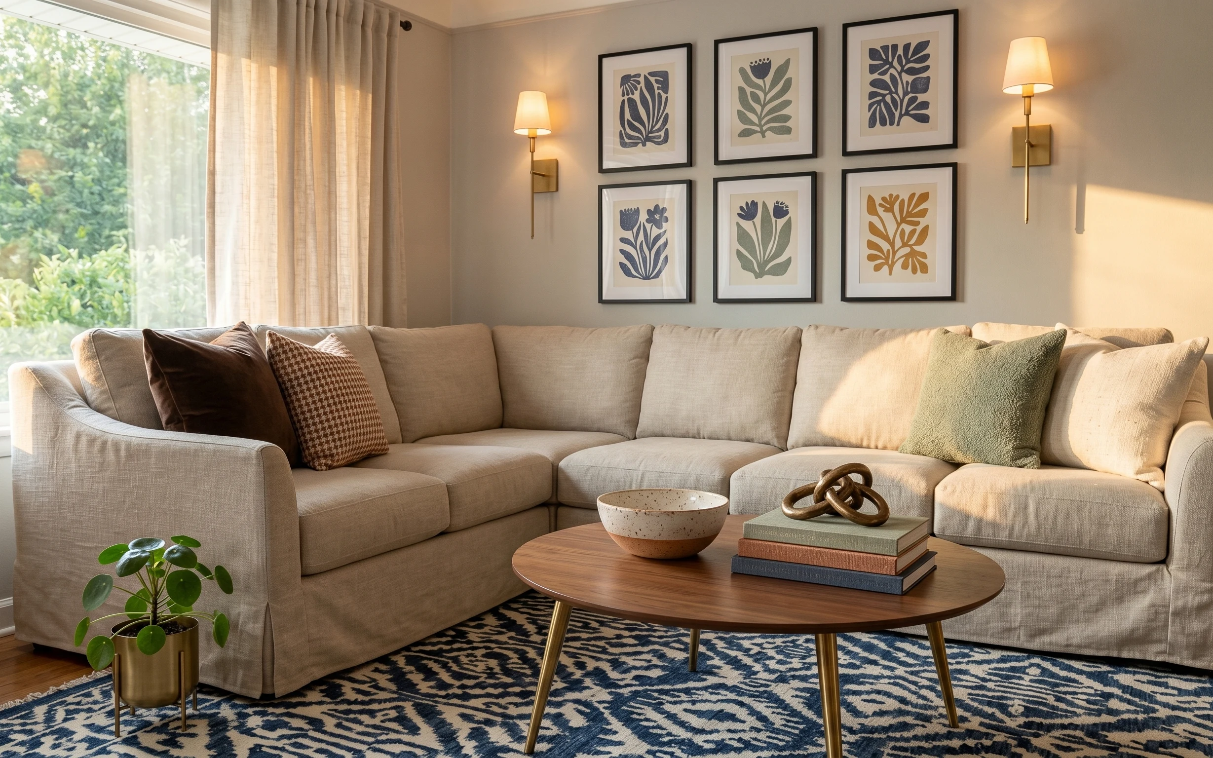
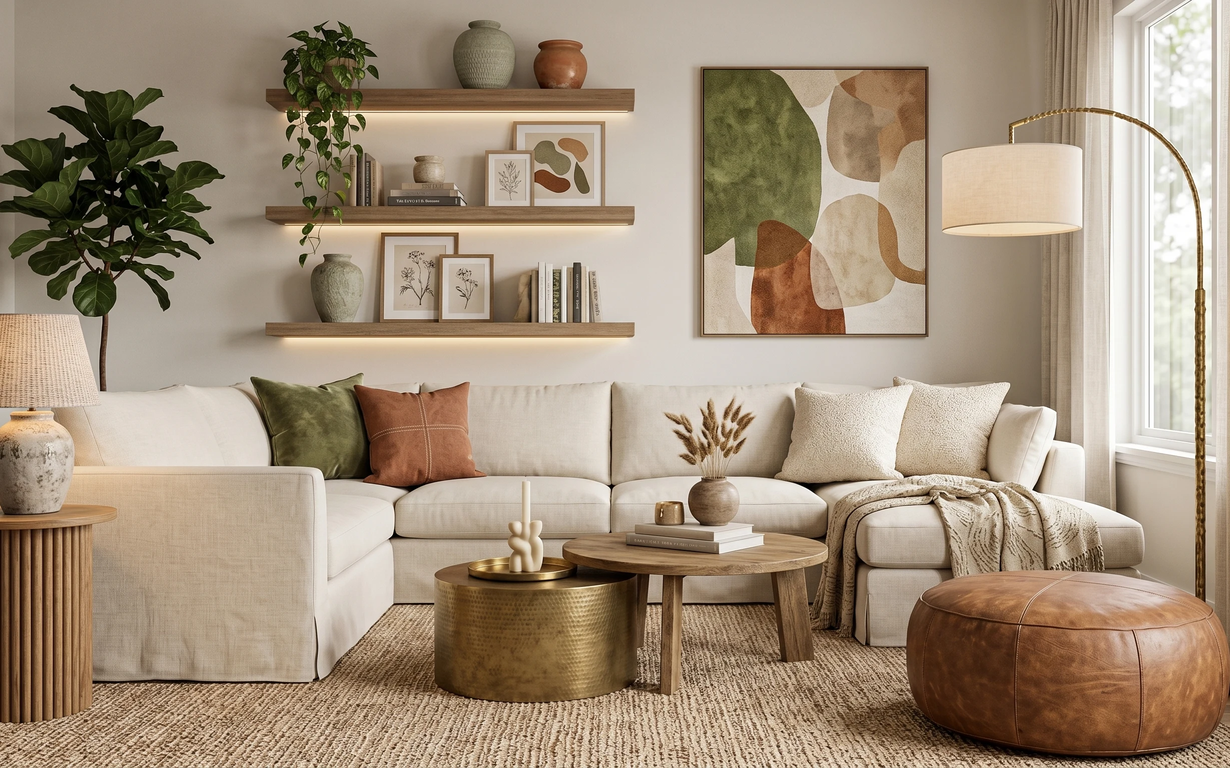
The photo already nails the warm, lived-in feeling: the cream sofa cushions read soft, the blue patterned area rug anchors the whole seating zone, and the brass lighting adds a gentle glow after dark. That “botanical modern” vibe also comes from the framed botanical prints on the wall and the green indoor plant in a brass pot. The nice part for shared housing is that none of this has to be permanent—most of the biggest visual changes happen with textiles, freestanding styling, and removable wall decor.
I used to overdo wall art in shared places. I’d try to “fix” a wall with permanent-looking decisions, then realize every frame had to be reboxed and re-hung by the next lease. This time, I decided to keep the impact but lower the commitment: switch to lighter, move-ready pieces that still look intentional when everything’s packed in the middle of a move. The result is the same finished look, with way less stress.
Layer 1 — blue patterned area rug (5×7) ($140) Grounds the seating zone with pattern
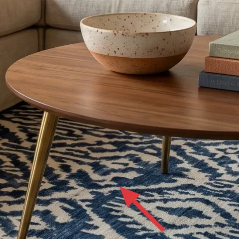
The blue patterned area rug is what makes the seating area feel “designed” instead of just furniture placed on hardwood. In a shared setup, rug choice does double duty: it covers scuffs, and it gives the room an immediate focal point that doesn’t depend on wall height or landlord changes. The pattern scale here matters—too busy and it fights the framed botanicals, too plain and it looks unfinished against the cream sofa cushions. Picking a 5×7 size keeps it practical and packable, especially if the next place’s living room is smaller or oddly shaped.
Anchor the rug first
With rentals, start by centering the rug under the front legs of the sofa so the whole layout visually “stays put” even when boxes get stacked.
Layer 2 — brown throw pillow ($18) Adds warm contrast to the cream sofa
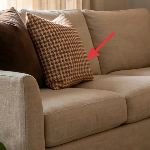
The brown throw pillow on the sofa is a small move that changes the color temperature of the whole seating area. Against cream sofa cushions, it brings in a grounded, earthy note that keeps the room from feeling flat or overly neutral. This is the kind of swap that’s easy to pack: pillow covers roll up, and a new cover can read completely different in the next place without replacing any fixed items. The trade-off is that it won’t “solve” storage or layout—this is purely a styling lever, so it works best paired with one bigger change like the rug.
Match undertones, not just color names
The pillow looks best when the brown has a similar warmth to the brass and lamp glow—cool brown can make the space feel harsher.
Layer 3 — cream curtain panel pair ($60) Softens daylight and frames the windows
Cream curtains add structure and softness in a way that’s hard to fake with decor alone. Here, the curtains help diffuse bright outdoor light and keep the seating area from looking “exposed” by the windows. They also tie visually into the cream sofa cushions so the room reads cohesive instead of a bunch of unrelated purchases. Choosing a panel pair is renter-friendly because you can swap, fold, and rehang with minimal hassle compared to anything fixed to the wall. The trade-off is that curtain length affects the whole look—too short can expose the window and make the room feel less finished.
Watch for clingy fabric
If the fabric is too sheer or too stiff, it can either weaken privacy or look wrinkly fast—choose something that drapes, not crunches.
Layer 4 — set of framed botanical prints on wall ($80) Brings botanical pattern without major installs
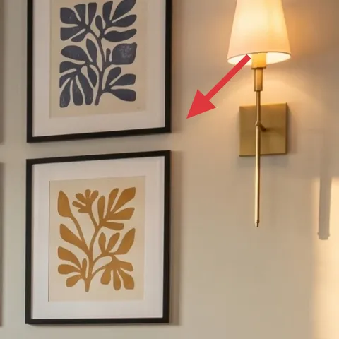
The framed botanical prints create that “botanical modern” rhythm across the wall, and they’re doing more than looking pretty. They add vertical balance behind the sofa and keep the wall from feeling empty next to the brass lighting. For shared housing, the trick is to keep the same visual role—botanical prints, repeated shapes, similar color tones—while choosing a version that packs and moves easily. That’s why a macramé wall hanging can replace the framed set here: it keeps an organic feel, adds texture, and doesn’t require matching frame hardware at the next address.
Make it instead of buying it
This macramé wall hanging recreates the wall’s botanical texture using rope and a dowel, so it reads warm and artsy while still packing into a couple of boxes for the next lease.
Materials
- Macramé cord — 1 roll — craft store — $20
- Wooden dowel (for hanging rod) — 1 piece — hardware store — $12
- Command hook (picture hook size) — 2 hooks — office aisle — $8
- Thin twine — 1 spool — craft store — $6
- Small tassel/fiber bundle (optional accents) — 1 pack — craft store — $10
Steps
- Cut cord strands to length, then group them into even sets for a balanced width.
- Attach cords to the dowel and secure the top spacing with a basic knot band.
- Create repeating knot sections down the length (keeping tension consistent for straight lines).
- Finish the bottom with a single trim pass so the ends hang evenly.
- Add optional accent tassels at the center if the wall needs a focal point.
- Hang with Command hooks using a short loop so the hanging stays level.
Total DIY cost: $56 — saves about $24 over buying.
Layer 5 — brass wall-mounted sconce lamps ($45) Adds warm light without extra floor clutter
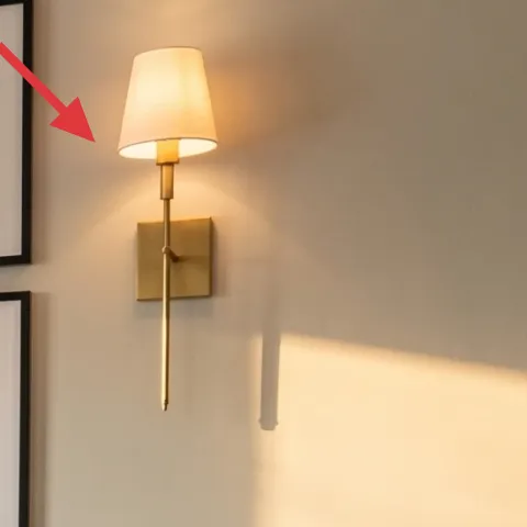
The brass wall-mounted sconce lamps pull in that warm, hotel-like glow, but they do it while keeping the coffee table and floor space clear. In shared housing, that matters because the room has to serve multiple needs across roommates and seasons. The brass tone also coordinates with the metal knot sculpture on the coffee table and the green indoor plant’s pot, which makes everything feel “collected” instead of random. If the wall lighting is already there, the easiest move is styling with bulbs or shade swaps that stay removable. The trade-off is that light placement affects shadows—aim for a warm bulb so the cream sofa cushions look smooth, not gray.
Use a warm bulb for cream upholstery
A warmer color temperature keeps the sofa fabric looking creamy and reduces the blue cast from the rug pattern.
Layer 6 — decorative ceramic bowl on coffee table ($20) Makes the coffee table feel styled, not empty
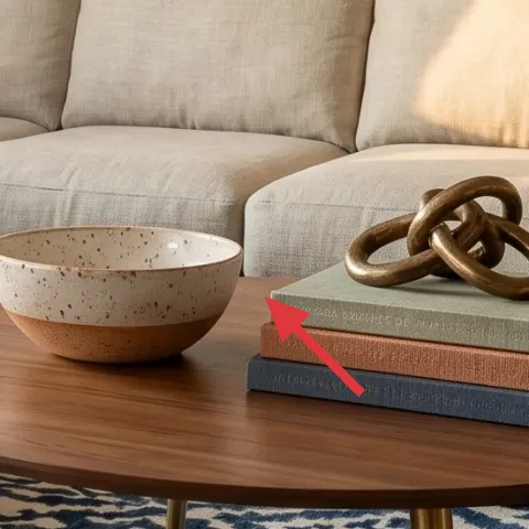
The decorative ceramic bowl on the coffee table adds a small “surface story” where the eye naturally lands—especially with the round wood coffee table shape. Its speckled texture plays nicely with the blue patterned area rug, and the neutral glaze echoes the cream sofa cushions so it doesn’t fight the botanicals. For a move-friendly refresh, tabletop styling is perfect: the bowl packs flat (or nestable) and doesn’t require any permanent installs. The trade-off is scale—if the bowl is too large, it competes with the knot sculpture and books; too small and it disappears behind larger decor.
Pick texture over height
On a coffee table, varied textures (speckle, matte ceramic, metal shine) create depth without stacking lots of items.
Layer 7 — green indoor plant in brass pot ($35) Adds freshness and repeats the brass tone
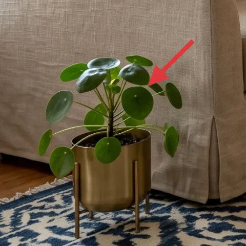
The green indoor plant in the brass pot is a simple way to keep the seating area from feeling purely “decorative.” It connects to the botanical wall theme and softens the room’s straight lines—sofa edges, curtain folds, and the framed grid all get a natural counterbalance. The brass pot also ties directly into the brass lighting hardware, which helps the room look intentionally styled instead of a mismatched set of purchases. This layer is easy to pack compared to heavier furniture, and it’s renter-safe because the pot is freestanding. The trade-off is placement: keep it away from high-traffic paths so leaves don’t get knocked.
Let the pot match one other brass element
Repeating brass once—through lighting or a metal object—is usually enough to make the whole palette click.
The cost, layer by layer
| Layer | Item | Cost |
|---|---|---|
| 1 | Area rug 5×7 (blue patterned) | $140 |
| 2 | Throw pillow cover (brown) | $18 |
| 3 | Curtain panel pair (cream, light-filtering) | $60 |
| 4 | Gallery set (5–7 framed botanical prints) | $80 |
| 5 | Brass plug-in wall sconce-style lamp | $45 |
| 6 | Decorative ceramic bowl | $20 |
| 7 | Indoor plant + medium planter pot (brass) | $35 |
| Total | $398 | |
A cheaper variant keeps the same layout logic—swap the area rug for a simpler pattern (or smaller 5×7), choose curtains in a plain weave, and use only one framed botanical print instead of the full set. That version keeps warmth and color while cutting most of the wall-art cost.
What worked, what didn't (across the whole room)
This combination of a patterned rug, cream curtains, and warm brass light created a cohesive seating area without relying on any permanent installs. The styling pieces—the brown throw pillow, the ceramic bowl, and the plant in the brass pot—made the room feel lived-in instead of staged.
What worked
- The blue patterned area rug anchored the sofa and made the seating zone feel intentional.
- Cream curtain panel pair added softness and made daylight look filtered rather than harsh.
- Warm brass lighting kept cream upholstery from reading gray at night.
- The brown throw pillow brought earthiness and prevented the palette from going too beige.
- The decorative ceramic bowl added texture close to the viewer’s eye on the coffee table.
- The plant in the brass pot repeated the brass tone and tied back to the botanical wall theme.
What didn't
- Skipping curtain panels can make the sofa feel floaty against bright windows.
- Going too matchy on wall pieces can make the wall feel flat instead of layered.
- Over-styling the round coffee table with multiple tall objects competes with the knot sculpture and books.
- Using a cool light bulb can make the cream sofa cushions look washed out against the blue rug.
What we'd skip if we did it again
Skip replacing the sofa or buying new bulky furniture. The photo proves the big visual impact can come from textiles, lighting, and removable wall decor—everything here packs easily for the next lease.
Skip curtain panels that are too short or too stiff. In a living room seating area, the curtain height and drape determine whether the windows look finished or oddly clipped.
Skip overbuying wall art duplicates. If the goal is botanical balance behind the sofa, one strong, repeatable wall idea (like the framed set or a macramé wall hanging) is enough.
Frequently asked
How long does this living room refresh usually take?
Most of the time goes to styling: getting the blue patterned area rug centered, swapping pillow covers, and arranging the decorative ceramic bowl, books, and the metal knot sculpture on the round wood coffee table. If curtain panels are already the right length, it’s mostly hanging and ironing a few wrinkles. Expect about 3–5 hours total, with macramé wall hanging taking the longest if it’s new.
What if this is a shared space and wall changes need to be minimal?
Pick move-ready changes that don’t alter fixed fixtures: textiles (curtain panel pair, throw pillow cover), freestanding styling (plant in brass pot, ceramic bowl), and removable wall decor. A macramé wall hanging can be hung with Command hooks and packed flat in a box. It keeps the room feeling intentional without committing to drilling or landlord-visible changes.
Will this work in a smaller living room?
Yes—just choose the smallest rug size that still sits under the front legs of the sofa, and keep decor to one main tabletop element plus one accessory. The ceramic bowl and books combo already reads “styled,” so adding extra height isn’t necessary. The framed botanical prints replacement (macramé wall hanging) also scales well because it depends on texture and vertical lines rather than needing a wide wall span.
What if the room gets brighter or darker than the photo?
For brighter rooms, cream curtains should be light-filtering so the daylight doesn’t overpower the seating area. For darker rooms, focus on warm brass lighting and keep the rug pattern bold enough to create contrast against the cream sofa cushions. The warm tone of the lamps matters most—cool bulbs can flatten the whole palette quickly.
Where can the move-friendly pieces be shopped differently than the framed set?
Look for the curtain panel pair and throw pillow covers in big-box or home textile sections for fast returns and easy sizing. For the rug, search by size first (5×7) and then by pattern scale so it doesn’t fight the framed botanicals. Table styling items like the decorative ceramic bowl, metal knot sculpture, and books are often easiest to find in home decor sections because there’s less sizing risk.
What’s the biggest mistake people make in this room type?
The most common miss is choosing one hero element but neglecting the supporting textures. A patterned area rug without curtain softness and pillow color usually looks temporary. Another frequent issue is lighting mismatch: if the brass lighting uses a cool bulb, the cream sofa cushions start looking washed out against the blue rug.
More in Living Room
Under $400: botanical living room swaps for shared housing
A botanical living room seating area already has great bones. This $400 refresh leans on renter-safe textiles, move-ready wall decor, and w…
Under $600: earthy living room refresh with 7 renter swaps
A renter-friendly living room refresh that leans earthy and bright—built from seven move-ready swaps. This look lands under $600 with one D…
Under $350: boho console table nook refresh with 7 layers
A warm beige boho console table nook on a $350 renter budget—built with seven swap-friendly layers like a arched mirror, a brass-base lamp,…