
- Best for
- Earthy living rooms with warm lighting
- Cost
- Under $600
- Difficulty
- Beginner-friendly
- Time
- 1–2 weekends
Why earthy neutrals are the living room style of 2026
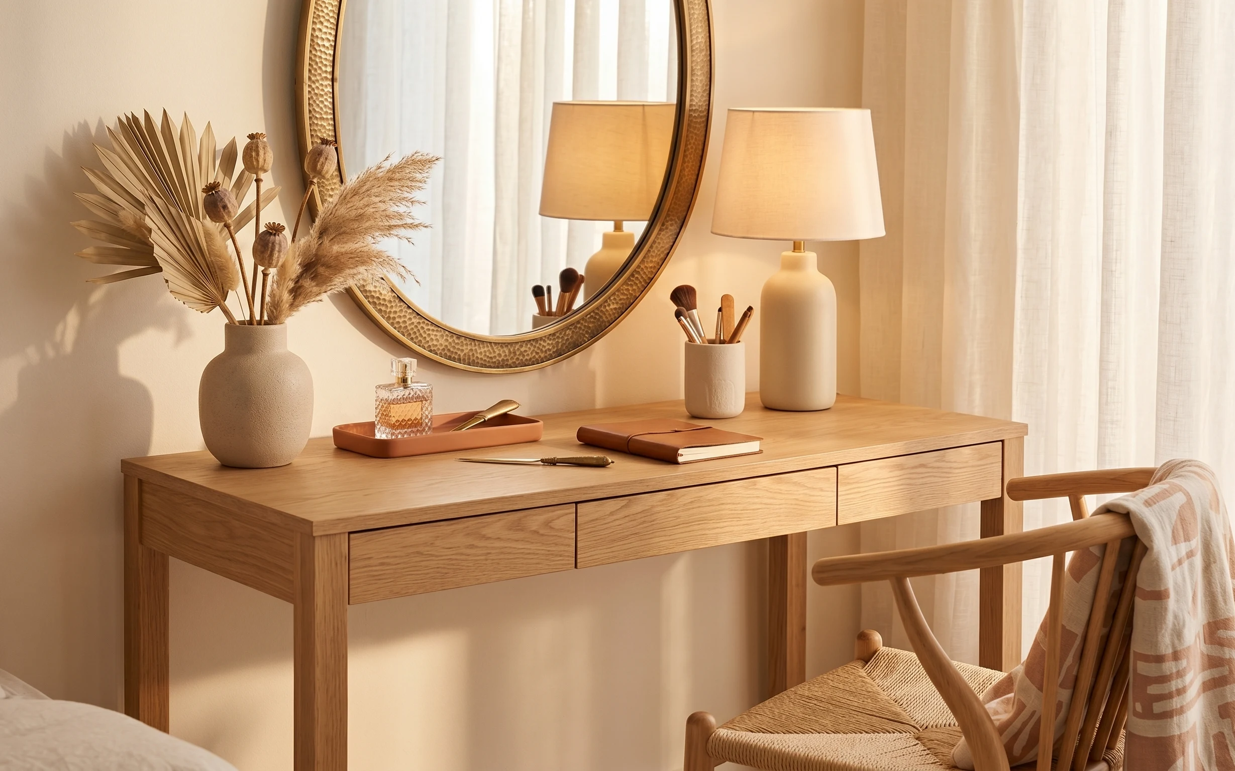
The photo mixes olive-green softness with warm brown accents and cream textiles, then repeats the same materials in small doses—ceramic vases, wood, and a woven rug texture. The big framed abstract print acts like the “color anchor,” while the plug-in floor lamp adds a steady warm tone near the seating. If you’re renting, that’s the win: you can’t change the walls, but you can change what the eye lands on. I also love how the throw blanket and pillow covers sit in the exact places you already touch every day.
I tried to copy this vibe once by buying matching matching pieces in the same finish, and it looked flat next to my real couch. What fixed it was swapping “all the same” for “the same family”: cream fabrics, wood tones, and a single olive pillow so everything ties without feeling themed. Don’t overdo it—one bold framed print and two soft textures beat five small nods to trend.
Layer 1 — area rug (5×7) with textured cream weave ($200) Grounded color under the sofa
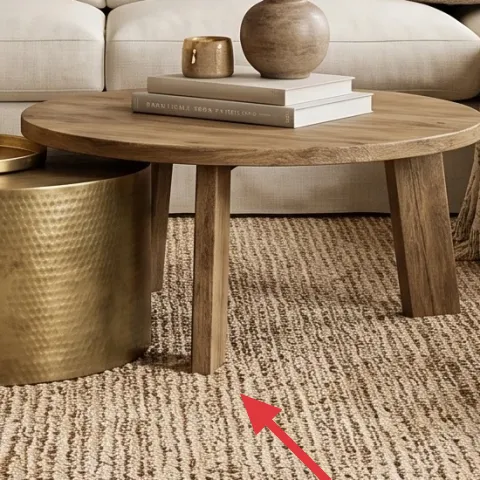
Start with the rug because it sets the whole palette. In the photo, the cream weave looks lightly structured—close enough to neutral to work with earthy greens and warm brown, but textured enough that it doesn’t read “flat.” A 5×7 size is also practical for renters: it defines your seating zone without forcing a wall-to-wall situation. The alternative is a thin, low-pile runner, but that usually shows every small stain and doesn’t give the same cozy foundation. This choice trades a little budget for scale and texture, which is exactly what your eye notices first.
Match your rug to your throw blanket, not your walls
Walls are paint; textiles are temporary—choose the rug that supports your cushion and throw colors.
Layer 2 — throw blanket draped over right sofa arm ($60) Adds movement in warm, lived-in layers
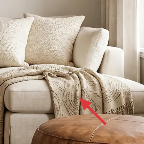
The draped throw is what makes the sofa feel styled instead of “just there.” This blanket sits over the right arm in a way that creates a soft diagonal and adds warmth against the lighter sofa fabric. Texturally, it looks like a woven or boucle-adjacent finish, which is why it plays nicely with the rug’s woven pattern. If you skip a throw and rely only on pillows, you’ll lose that mid-height texture that makes the room look composed from both near and far. The trade-off is coverage: draping a blanket takes a couple of minutes each day, but it’s also easy to fold and pack at move-out.
Keep the blanket edges irregular
A slightly messy drape reads more natural than a perfect fold line.
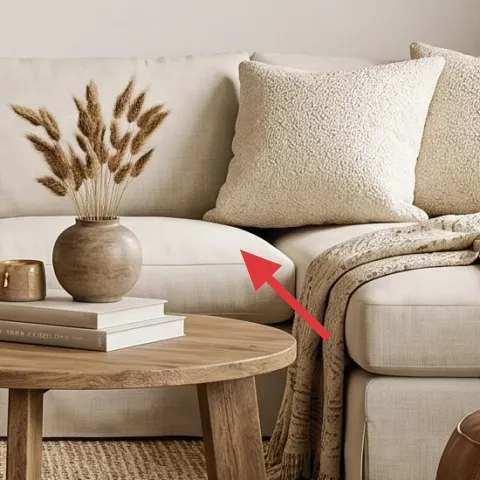
Layer 3 — olive green throw pillow ($30) Brings the room’s main color through your seating
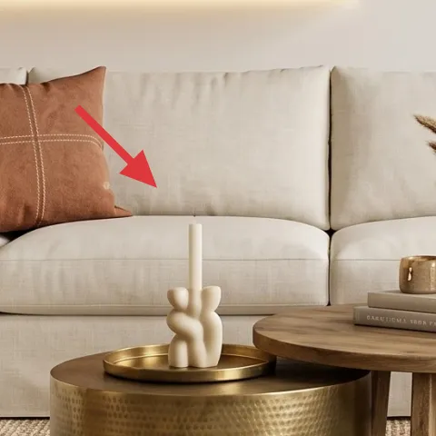
This olive-green pillow is doing heavy visual work without changing anything structural. It’s placed between other neutral cushions, so it becomes a color note that the framed art can “echo” without fighting the rest of the palette. The pillow cover looks smooth and matte, which keeps the room from turning shiny or overly boho. The obvious alternative is adding more patterned pillows, but that can crowd a neutral couch and make the framed art feel busy. This swap is a trade-off toward restraint: one strong color cushion plus a second neutral texture nearby looks intentional and easier to live with.
Don’t choose an olive that’s too yellow
If your olive leans chartreuse, it won’t harmonize with warm browns the way this one does.
Layer 4 — wood side table with fluted legs ($80) Gives you a wood + lamp moment on the left
The side table on the left is a small piece with outsized impact because it controls the height where lighting and decor meet. The fluted legs and warm wood tone repeat the room’s natural materials, and it creates a tidy landing spot for a lamp base so your eye has a clear “start” point near the sofa. If you choose a generic square end table, you’ll lose the sculptural rhythm that makes the space feel curated. This is also an easy renter win: it’s freestanding, moves with you, and you can style it with the same kind of ceramics at your next place.
Style with one tall object, one small one
On this kind of table, a leafy plant or vase plus a candle or small book stack keeps it from looking cluttered.
Layer 5 — plug-in floor lamp with cream drum shade ($120) Softens the room with warm, shadow-friendly light
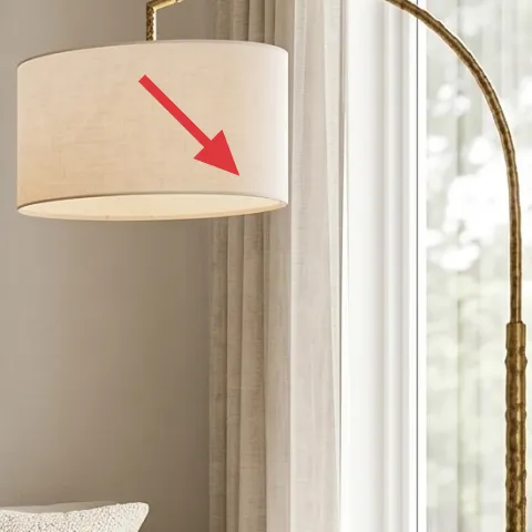
Lighting is the difference between “decorated” and “finished,” and the plug-in floor lamp makes the photo feel soft even with daylight. The cream drum shade diffuses light, which flatters the cream textiles and keeps the olive pillow from reading too harsh. Position matters: this lamp sits beside the window area, so it brightens the seating without requiring any hardwired work. The obvious alternative is a cheaper standing lamp with a bare bulb, but that throws sharper shadows and can make the room feel unfinished after dark. This choice costs a bit more, but it’s also fully moveable and works in every rental layout.
Use warm bulbs for shade + fabric combos
Warm bulbs keep the woven rug and textured throw from looking cool or gray.
Layer 6 — large framed abstract wall art (DIY hand-painted copy) ($80) Makes a renter wall feel intentional
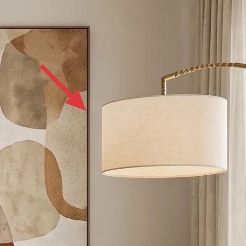
This large framed abstract print is the focal point that makes all the earthy colors look planned. Since you can’t paint walls, you’re borrowing the “statement wall” effect by adding one oversized piece—wood frame, big color blocks, and an organic mix of greens and warm browns. For a renter-friendly approach, make a DIY version that matches the palette instead of buying something that’s the wrong scale or tone. The trade-off is time: you’ll spend an afternoon painting, but you’ll end up with art you can pack, hang with Command strips or hooks, and swap later.
Make it instead of buying it
DIY a large abstract print on cardstock, then frame it to mimic the framed wall art in the photo and match the earthy green + warm brown palette.
Materials
- Cardstock (large sheet) — 1 pack — $4
- Acrylic craft paint (earthy green + warm brown set) — 1 set — $12
- Foam brushes — 3–4 — $6
- Painter’s tape — 1 roll — $10
- Poster frame (same approximate size) — 1 — $30
Steps
- Prime the cardstock with a thin acrylic base wash using long brush strokes.
- Let it dry fully, then tape off 3–5 organic shapes for your color blocks.
- Paint the first shape color, using a slightly uneven edge so it feels “printed,” not perfect.
- Peel the tape and add the next shapes in olive green and warm brown.
- Fill any gaps with lighter cream tones so the whole piece has breathing room.
- Once dry, insert the artwork into the frame and hang.
Total DIY cost: $72 — saves about $8 over buying.
Layer 7 — vase with dried stems on coffee table ($30) Adds a soft organic texture near the center
The small vase on the coffee table works because it’s both height and texture—those dried stems add visual rhythm in the middle of the seating, where plain tabletop would otherwise look empty. The vase itself looks like a matte, warm neutral ceramic that blends with the wood side table and rug tones. Choosing a dried arrangement (instead of fresh flowers) is renter-smart: it lasts longer, it doesn’t require water, and you can replace it easily when the colors shift. The trade-off is realism: dried stems can shed a little at first, so choose stems that arrive tied and handle them over a sheet of paper or tray.
Pick stems with mixed heights
Varying a few stem lengths gives the arrangement shape without looking bulky.
The cost, layer by layer
| Layer | Item | Cost |
|---|---|---|
| 1 | Area rug 5×7, cream textured weave | $200 |
| 2 | Throw blanket, neutral textured drape | $60 |
| 3 | Throw pillow cover, olive green | $30 |
| 4 | Wood side table with fluted legs | $80 |
| 5 | Plug-in floor lamp with cream drum shade | $120 |
| 6 | Large framed abstract art (DIY equivalent) | $80 |
| 7 | Vase with dried stems for coffee table | $30 |
| Total | $600 | |
A cheaper variant keeps the same shape language: pick a smaller framed abstract (around 24×24), use a lower-cost throw blanket, and choose a basic lamp instead of the sculptural shade. You’ll keep the rug + olive pillow combo, since those are the fastest visual cues for this earthy palette.
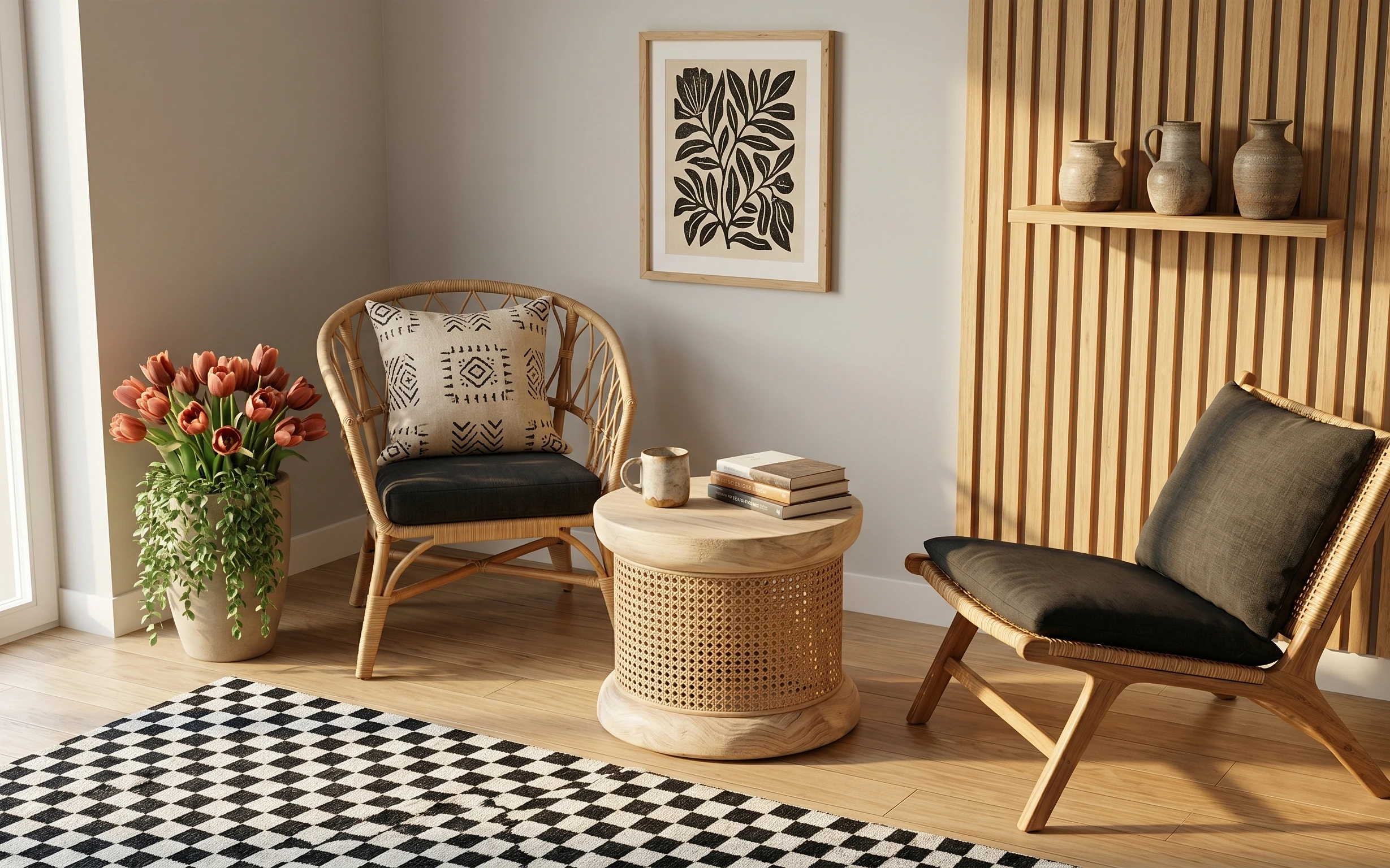
What worked, what didn't (across the whole room)
This set of swaps balances one bold focal point, repeating natural materials, and soft textile layering. The result looks styled without relying on hardwired changes.
What worked
- The cream textured rug anchors the seating and keeps olive accents from looking heavy.
- The throw blanket adds mid-height softness that makes the sofa feel lived-in, not staged.
- One olive pillow is enough color to echo the abstract wall art without overwhelming the neutrals.
- The fluted wood side table repeats the room’s warm material notes and supports styling.
- A plug-in floor lamp with a drum shade keeps shadows soft after dark.
- The DIY framed abstract is the easiest renter upgrade because it changes the “wall story” fast.
- The small vase with dried stems adds organic texture right where your eye lands at tabletop height.
What didn't
- Over-buying matching ceramics can make the palette look coordinated-but-flat instead of layered.
- If the olive pillow is too yellow-green, it clashes with warm brown accents.
- Skipping the throw blanket reduces the room’s texture range and makes the couch feel unfinished.
- Using a thin, low-pile rug makes stains and stray lint more noticeable.
- Choosing an over-bright lamp bulb makes the cream textiles look washed-out.
What we'd skip if we did it again
Skip swapping in a second big statement print unless it shares the same color family. When the wall has two loud artworks, the olive pillow and warm brown accents stop feeling intentional and start feeling accidental.
Skip cheap floor lamps with exposed bulbs. The drum shade is what keeps the room soft; without it, your shadows get sharp and the textured rug and throw can look cooler than they should.
Skip a “perfectly matched” styling approach. Instead of repeating identical vases and trays, use one repetition rule (wood tone, cream fabric, or earthy ceramic) and vary shape so the room still feels collected.
Frequently asked
How long does this living room refresh take?
Most of the time is styling and waiting for dry time on your DIY abstract. If you’re shopping first, plan 4–6 hours of setup day-one (rug, lamp placement, pillows, blanket, and tabletop). The DIY painting is the wildcard, but even with careful drying you can finish the art in a single afternoon plus frame assembly.
Will this work in a small apartment or open-plan space?
Yes—start with the rug size that covers the front legs of your sofa. If your living room is smaller, scale the framed print slightly down so it still feels like a focal point but doesn’t crowd the sofa height. Keep the same rule for color: one olive pillow and one earthy textile, then lots of cream to hold the room open.
What if my couch is a different color than the photo?
This palette is flexible because the rug and the abstract art bring the color family together. For lighter couches, lean olive a touch deeper and keep the throw blanket neutral. For darker couches, consider a cream rug and a warmer brown vase so the room doesn’t feel top-heavy or too moody.
Where should I shop for the renter-safe pieces?
Look for plug-in lamps and framed art at retailers that offer easy returns, since size matching matters. For the rug and pillow covers, focus on texture first—woven or boucle-like fabrics photograph best and hide small lived-in messes. For the DIY art, choose a frame you can swap without mounting drama.
What’s the biggest styling mistake people make with this look?
The most common miss is adding too many olive or too many patterns at once. This photo works because it repeats a few materials: cream textiles, warm wood, earthy ceramics, and one big abstract print. If you keep your color count to one main accent (olive) plus neutrals, the room stays cohesive.
More in Living Room
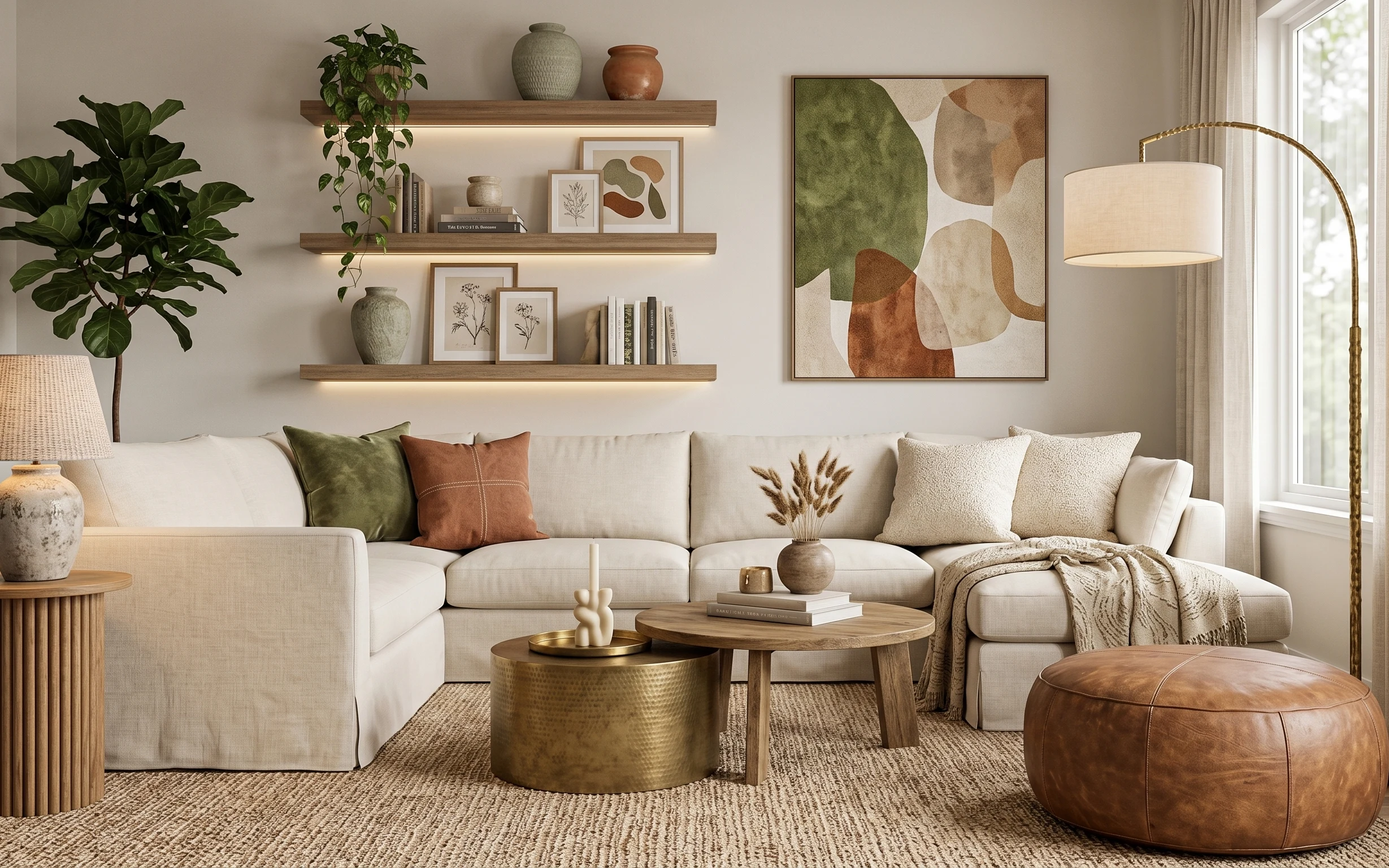
Under $600: earthy living room refresh with 7 renter swaps
A renter-friendly living room refresh that leans earthy and bright—built from seven move-ready swaps. This look lands under $600 with one D…
Under $350: boho console table nook refresh with 7 layers
A warm beige boho console table nook on a $350 renter budget—built with seven swap-friendly layers like a arched mirror, a brass-base lamp,…
Under $300: wicker seating corner refresh with 7 renter-safe swaps
A bright wicker seating corner gets a cleaner, more intentional look for under $300 using seven renter-safe, move-ready swaps. The biggest …