
- Best for
- high-visibility sink-zone upgrades
- Time
- one weekend (about 6–10 hours)
- Difficulty
- Confident DIY
- Cost
- under $400
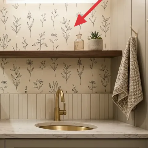
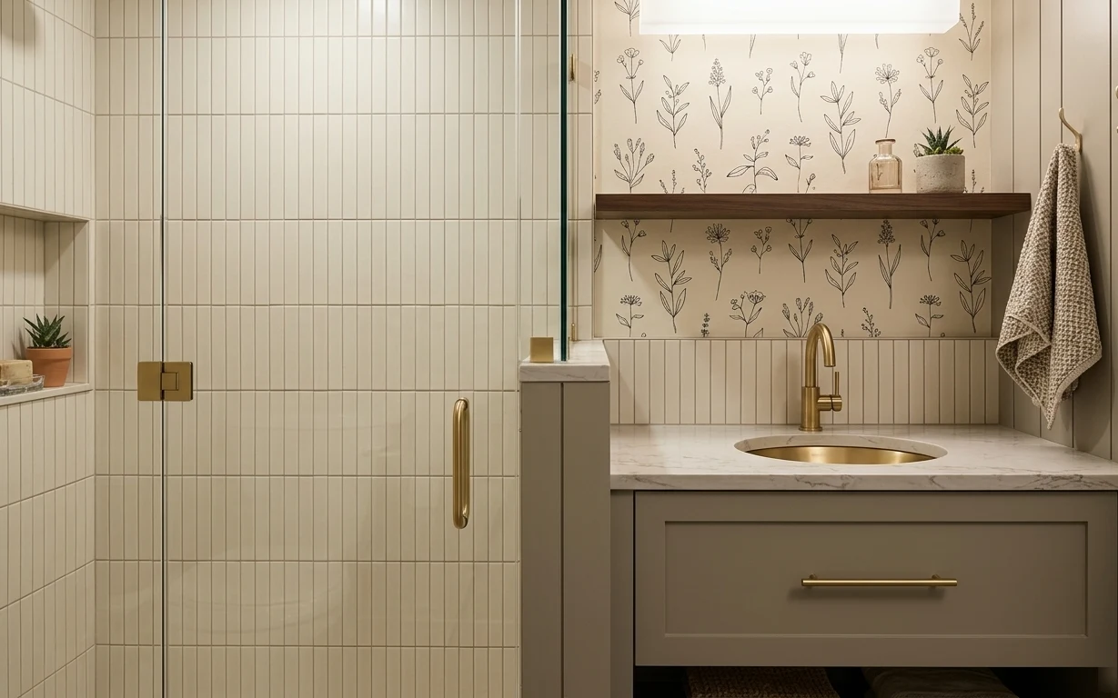
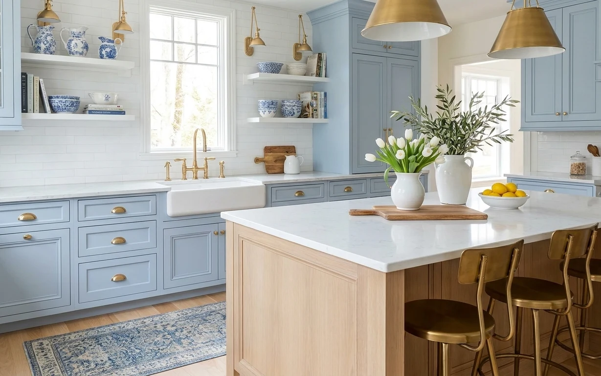
Why brass-and-cream backsplash $400 refresh is the kitchen sink wall of 2026
That warm cream tile and the brass faucet are doing a lot of the heavy lifting already, which is exactly why this refresh feels so doable. The hero moment is the botanical wallpaper band—its thin stems echo the grid grout lines without fighting them. On top of that, the white marble countertop gives you that crisp contrast, while the gray base cabinet keeps the whole zone calm. For a homeowner, it’s a smart weekend lane: pick changes with the biggest visual return and leave the plumbing and layout alone.
I almost went straight for “more decor” on day one—extra jars, extra greenery—then stopped. The backsplash was what needed the real anchor, not my impulse to style the counter harder. Once the botanical pattern was in place, the towel, plant, and shelf items stopped looking like random clutter and started reading like a set. That’s the shift: make one wall earn its keep first, then style to match.
Layer 1 — Peel-and-stick botanical backsplash wallpaper ($120) Frames the tile with a repeating pattern band
Peel-and-stick botanical wallpaper is the move here because it turns a plain backsplash zone into a focal band above the marble countertop. Choose a design with slim linework (like the twig-and-blossom pattern) so it doesn’t compete with the straight subway tile grid. The trade-off: peel-and-stick is best when your surface is clean and flat, so take a minute to wipe the wall and smooth every bubble. If you go with a bolder floral, it will feel busier next to the grid grout lines. This version keeps the look modern farmhouse without making the sink wall feel heavy.
Pattern scale matters
Thin, evenly spaced botanicals read cleaner beside tile grout lines than large flowers would.
Layer 2 — Brass kitchen faucet ($120) Swaps “builder basic” for warm metal continuity
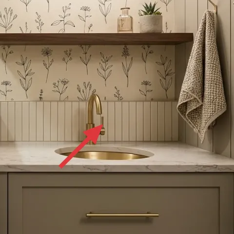
The brass kitchen faucet is the natural second anchor because it bridges the wall color (cream) and the rest of your hardware language. When warm metal repeats—especially in the same golden family as your hook—the backsplash pattern looks intentional instead of accidental. The important decision is finish continuity: if the faucet leans too yellow or too bright, it can clash with brass-toned accents. You’ll also notice the countertop’s veining pulls focus; a warm metal fixture helps that veining look like part of the palette rather than a random detail. Keeping the faucet brass also means your towel and shelf styling can stay neutral.
Match undertones, not just color
Look for brass that feels similar in warmth to the wall hook so the gold reads cohesive.
Layer 3 — Small potted plant on kitchen shelf ($30) Adds a living texture above the wallpaper band
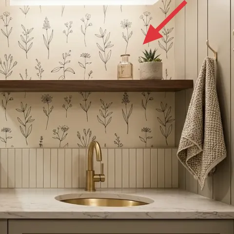
A small potted plant on the shelf keeps the sink wall from reading “too curated,” which is the usual risk with wallpaper. The leaves soften the straight lines of the tile and the horizontal shelf, and they also give the botanical print a real echo—green that isn’t just ink. Place it near the jar so the composition feels stacked: plant height on one side, glass sparkle on the other. The trade-off is maintenance: if the plant dries out, the look gets tired fast. Stick to a small variety that fits the shelf scale, not a tall plant that would crowd the faucet view.
Use plant height as styling, not clutter
Keep it small enough that you can still see the wallpaper pattern behind it.
Layer 4 — Decorative glass jar on wood floating shelf ($15) Gives the shelf a styled-but-practical moment
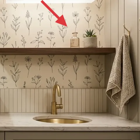
A glass jar on the wood floating shelf is a simple way to make the shelf look finished without adding more visual “noise.” Glass catches light and complements the white marble countertop, while the shape keeps the shelf from feeling flat. The best part is flexibility: the jar can hold cotton rounds, tea bags, or just stay decorative, so it won’t feel pointless a week later. The trade-off is that you’ll need to wipe fingerprints now and then, especially near the sink zone. If you’re tempted to add several jars, pick one and keep everything else smaller so the wallpaper remains the star.
Let glass do the work
When the backdrop has pattern, one glass piece is enough to add shine without cluttering.
Layer 5 — Beige waffle-weave kitchen towel on brass hook ($25) Pulls the neutral textile layer into the sink zone
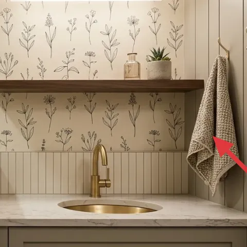
The beige waffle-weave towel hanging on the brass hook adds the one texture that wallpaper and tile can’t: soft, woven fabric. That matters because the wall has hard surfaces everywhere—tile, marble, and painted cabinet fronts—so the towel keeps the space from feeling cold. Choose a towel with visible texture (waffle weave is perfect) and keep the color in the same cream-to-tan range as the wallpaper and tile grout. The trade-off is letting the towel get too stained or dingy; a towel reads “fresh” only when it’s actually fresh. This also gives you an easy seasonal swap without redesigning the whole corner.
Don’t choose a bright pattern towel
If the towel has bold prints, it competes with the botanical wallpaper and makes the wall feel busy.
Layer 6 — Paint refresh for gray base cabinet ($40) Makes the sink wall feel cohesive at a distance
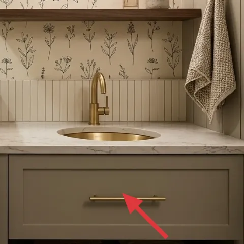
Refreshing the gray base cabinet with paint is what ties the whole sink wall together, because it updates the largest solid color block in the photo. In this setup, the wallpaper has detail, the faucet adds shine, and the marble countertop brings contrast—so the cabinet finish needs to look crisp and intentional, not slightly dull or uneven. The trade-off is prep time: cabinet paint shows imperfections, so sanding and careful cleaning matter. Going this route beats swapping cabinetry or rebuilding the space on a weekend. If the cabinet already has a similar tone, you’re just dialing in finish and coverage so the wall styling reads cleaner.
Make it instead of buying it
This weekend cabinet refresh is DIY using a bonding primer and cabinet paint so the gray base reads smoother next to the botanical wallpaper.
Materials
- Bonding primer — 1 quart — hardware store — $10
- Cabinet paint (gray) — 1 quart — hardware store — $12
- Sanding sponge — 1 pack (fine grit) — hardware store — $4
- Mini roller cover + tray liners — 1 set — hardware store — $5
- Painter’s tape — 1 roll — hardware store — $3
Steps
- Clean the cabinet doors and drawer fronts with a degreasing cleaner, then let dry fully.
- Lightly scuff-sand to dull the existing finish (no need to reach bare wood).
- Wipe away dust with a tack cloth or damp microfiber and let dry.
- Tape off the countertop edge and any gaps you don’t want painted.
- Apply bonding primer in thin, even coats.
- Let the primer dry until it feels smooth and fully set (follow the label for dry time).
- Roll and brush cabinet paint on the flat surfaces, working with the grain/edges.
- Let the first coat dry completely, then apply a second thin coat if coverage needs it.
- Recheck for drips, then remove tape once the paint is no longer tacky.
- Let everything cure undisturbed before using the drawer and doors normally (follow label cure time).
Total DIY cost: $34 — saves about $6 over buying.
Layer 7 — Wood plank floating shelf (bracketed ledger) ($10) Keeps the shelf line warm under the wallpaper
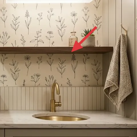
A simple wood plank shelf (the ledger that holds the decor) keeps this sink wall from feeling too “tile-and-metal.” Warm wood balances brass and cream, and it also gives you a place for the jar and plant without adding extra furniture. The trade-off is that the shelf needs to be installed securely for everyday use, so measure twice and level carefully. If you’re tempted to use a thinner, lighter wood, it can look flimsy next to the solid cabinet base. A single plank approach stays budget-friendly while still giving the visual structure that makes the wallpaper feel framed.
Keep the shelf depth modest
A shallow plank reads clean under wallpaper and won’t block the view of the faucet area.
The cost, layer by layer
| Layer | Item | Cost |
|---|---|---|
| 1 | Peel-and-stick botanical backsplash wallpaper | $120 |
| 2 | Brass kitchen faucet | $120 |
| 3 | Small potted plant on kitchen shelf | $30 |
| 4 | Decorative glass jar on wood floating shelf | $15 |
| 5 | Beige waffle-weave kitchen towel on brass hook | $25 |
| 6 | Paint refresh for gray base cabinet | $40 |
| 7 | Wood plank floating shelf (bracketed ledger) | $10 |
| Total | $360 | |
If you want a cheaper variant, skip one “gold” repeat and use only the towel and jar for styling. You can also choose a simpler tone-on-tone wallpaper design (fewer elements) so it still feels finished without upgrading every decorative piece.
What worked, what didn't (across the whole room)
The botanical wallpaper band and brass faucet were the biggest wins because they created a clear focal point that ties the tile and marble together. Painting the gray base cabinet made the styling read more intentional, not like add-ons. The decor pieces worked best when kept to one jar and one plant—stacked, not multiplied.
What worked
- The botanical wallpaper pattern made the backsplash feel like a design choice, not leftover tile.
- Brass faucet warmth matched the wall hook so gold accents looked cohesive.
- Wood shelf warmth softened the hard geometry of subway tile and marble.
- The beige waffle-weave towel added fabric texture near the sink zone.
- The plant brought “real green” that echoed the wallpaper without adding more printed detail.
- Cabinet paint refresh clarified the gray tone, which helped the wallpaper stand out cleanly.
What didn't
- Adding extra jars at first made the shelf look crowded next to the busy botanical pattern.
- Using a towel color that was too white made the gold faucet look warmer than it should.
- Skipping cabinet prep sanding would have left visible brush marks on the flat drawer fronts.
- Trying a wallpaper design with larger flowers felt too heavy beside the grout grid.
- Placing the plant too close to the faucet zone blocked the backsplash linework from view.
What we'd skip if we did it again
Skip adding multiple matching jars right away. In a patterned backsplash setup, one glass piece is enough—too many reads like clutter instead of styling, especially next to a brass faucet’s shine.
Skip a towel with a loud pattern. Waffle texture in a beige or cream range works because it adds softness without competing with the botanical print.
Skip rushing cabinet prep. Even with great wallpaper, a slightly uneven cabinet finish shows at this distance; a clean, scuffed surface makes the gray look smooth and intentional.
Frequently asked
How long does this kitchen sink wall refresh take?
Most of the time goes to prep and drying. Wallpaper can be a quick afternoon task if the wall is clean and flat. Cabinet painting is the slow part because primer and paint need full dry time before you add the next coat and before you use the drawer/doors normally. If everything goes smoothly, plan for about 6–10 total hours over a weekend.
Is peel-and-stick wallpaper okay for a real kitchen backsplash?
It can be, as long as the wall is clean and dry and you’re applying it on a surface that won’t get constant direct splatter. Keep the area around the sink wiped down so the paper stays crisp. For homeowners, choosing a removable peel style reduces risk if you ever want to change the pattern later.
What if my cabinet color is different from the gray in the photo?
The concept stays the same: paint the biggest solid color block so it supports the wallpaper and hardware. If your base is darker, a brighter warm gray tone will keep it from overpowering the botanicals. If it’s already close in tone, you may only need lighter sanding and a finish refresh rather than changing the color.
Can this work in a smaller kitchen or rental-style kitchenette?
Yes. This plan is actually built for compact sink zones because it focuses on vertical surfaces and the wall band. The wallpaper and towel create impact without needing large furniture changes. If you’re renting, focus on items you can take down later (like peel-and-stick and removable hooks), but your photo already shows homeowner-level flexibility.
Where should the plant and jar go so they don’t look random?
Keep the plant and jar on the wood floating shelf so they visually frame the faucet. Aim for “one plant, one glass container” so the shelf reads styled but not busy. If the shelf is long, place the plant near one end and the jar nearer the other so their shapes don’t overlap.
What’s the biggest mistake people make with this kind of backsplash makeover?
Over-styling before the wall is finished. When the wallpaper and cabinet finish aren’t locked in yet, it’s easy to choose towel colors and decor that end up clashing. Start with the backsplash anchor, then select the towel and small accessories in the closest cream and brass undertones.
More in Kitchen & Dining
Under $400: brass-and-cream kitchen sink wall refresh
A brass-and-cream kitchen sink wall refresh that looks styled but stays weekend-friendly. Swap in botanical peel-and-stick wallpaper, add a…
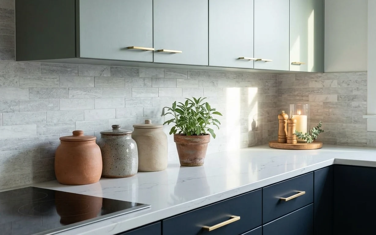
Under $250: terracotta-and-graphite kitchen counter refresh
This kitchen-counter refresh uses 7 move-ready swaps focused on ceramics, greenery, and candle styling. The look keeps a gray-and-black kit…
Under $350: coastal kitchen island refresh with move-ready swaps
A bright, coastal-leaning kitchen island setup starts with a blue patterned area rug and a few movable decor anchors—cutting board, lemons,…