- Square footage
- Great for tight corners (entryway nooks and landings)
- Cost
- Under $400 for 7 swaps
- Difficulty
- Easy (mostly swap-in decor)
- Renter-safe
- Yes (no-drill styling)
Why white-and-wood storage works in the entryway console nook of 2026
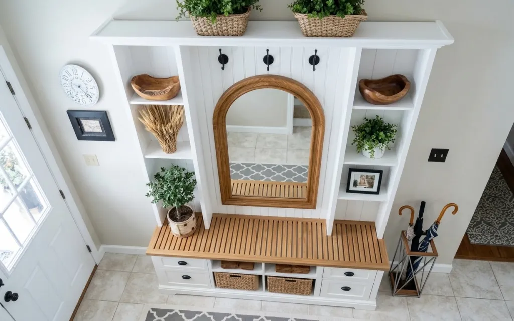
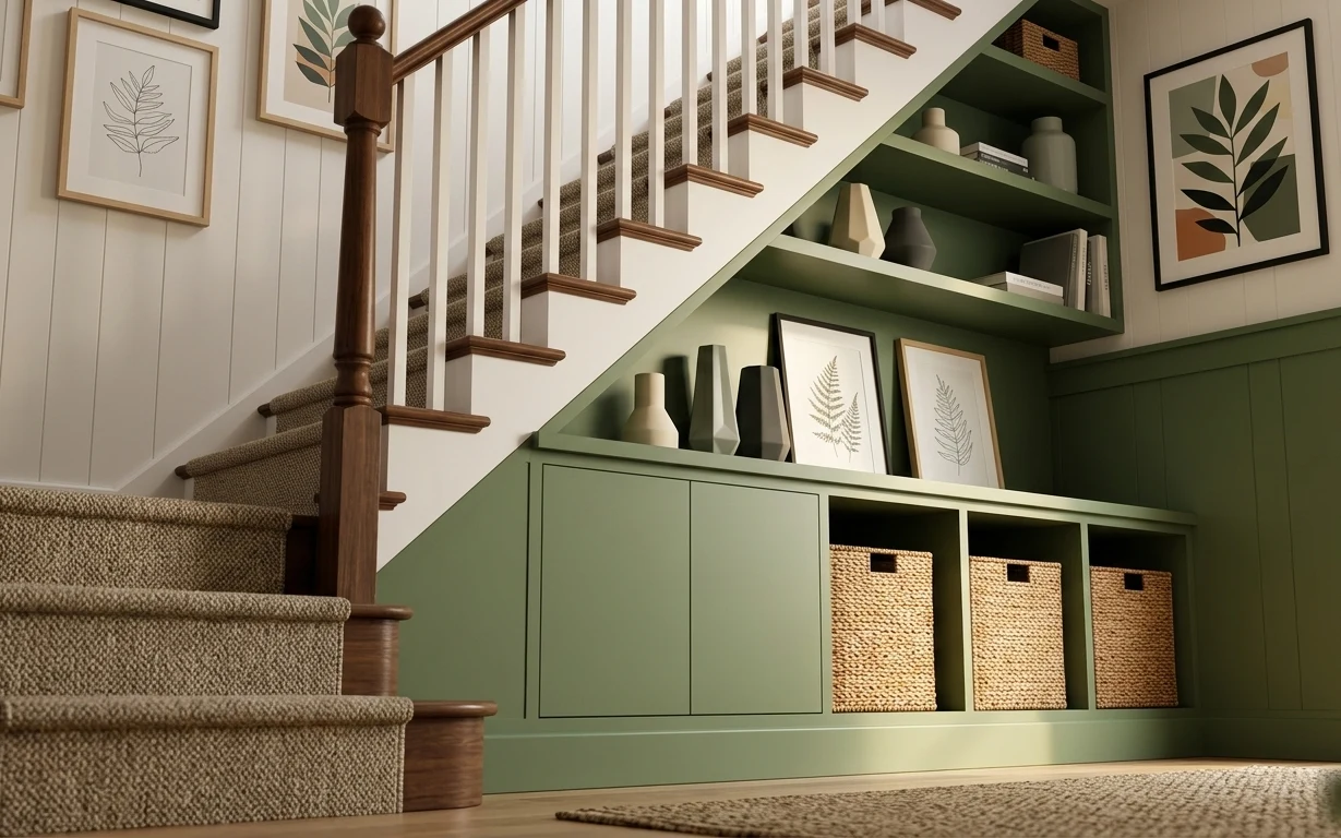
In this photo, the whole vibe comes from repeating materials: the arched wood mirror shape, the warm wood top, and the wicker textures from the planter baskets. The gray-and-white rug keeps the floor from feeling too plain, and the black-framed wall art plus clock add small contrast without breaking the neutral palette. It’s a layout that magazines love because it solves two entryway problems at once: keeping surfaces usable and making a tiny corner feel intentional. For renters, it’s especially doable because most of the impact lives in decor you can remove at move-out.
I kept trying to “theme” my old entry with random things, and it never looked tied together—too many different woods and too many mismatched textures. What finally clicked was choosing one repeating texture family (in this case, wicker plus warm wood) and then adding only a little contrast in small doses (gray pattern + black frames). That’s how this nook reads styled, not cluttered.
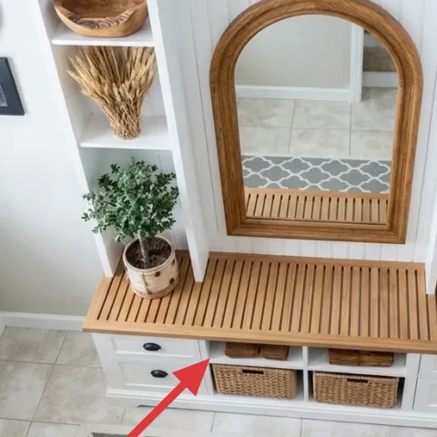
Layer 1 — gray-and-white patterned area rug ($80) Grounds the tile floor with soft pattern
A patterned rug is the fastest way to make a small entryway feel finished, and this gray-and-white design does the job without pulling focus from the mirror. It sits right in the high-traffic landing spot, so it also hides the little scuffs that happen when shoes and umbrellas come and go. I like choosing a pattern with enough contrast to read clearly from standing height, especially when the floor is light tile like in the photo. If you go with something too subtle, the entryway can look washed out under daylight. The trade-off: you’ll want a rug pad or careful smoothing to keep it from shifting on tile.
Pick a rug that frames your “landing zone”
In narrow entries, aim for a rug that covers where feet actually land—not the entire hallway—so the rest of the floor stays clean and visible.
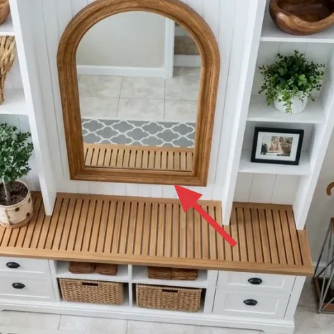
Layer 2 — arched wood-framed wall mirror ($120) Adds shape contrast and bounces light
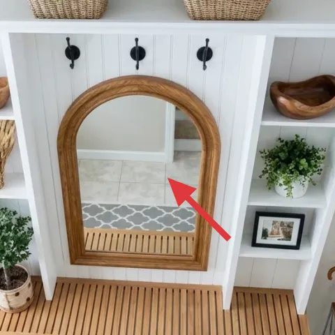
The arched wood-framed mirror is what turns a storage nook into a focal point. The warm wood echo matches the console’s top, while the arched silhouette adds softness against straight shelving lines. It also helps a bright entryway feel even brighter because the mirror reflects daylight back into the space. The alternative—skipping mirror impact for a small rectangular piece—usually makes the wall feel flatter and less styled. The trade-off is scale: go for an arched mirror that reads clearly at a glance from the door, not one so small you miss it while walking past.
Why the arch matters here
That gentle curve bridges the console’s slatted lines and the grid-like shelves behind, so the eye keeps moving instead of getting stuck.
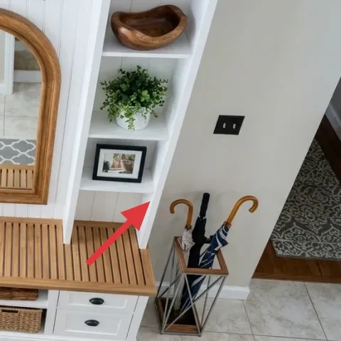
Layer 3 — wood-handled umbrella holder stand ($45) Keeps umbrellas looking neat beside the door
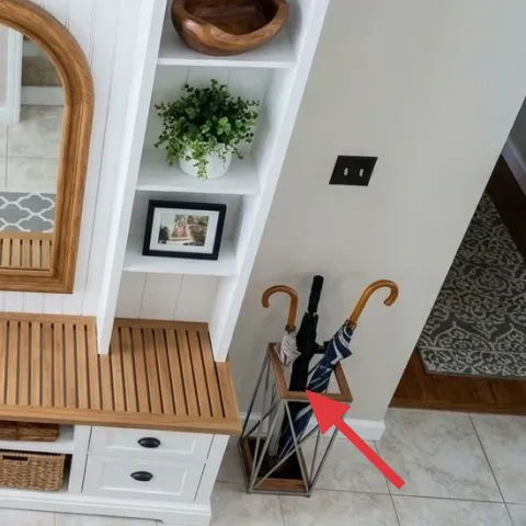
That wood-handled umbrella holder stand does double duty: it handles the practical mess and keeps visual clutter contained. In a small entry, open floor space can disappear fast once wet umbrellas or rain gear pile up, and this stand creates a designated drop zone. I’d never choose a bulky “storage cabinet” for this spot because it blocks the sightline to the mirror. Instead, a slim umbrella holder gives you function with a lighter footprint. The trade-off is that it works best when you keep only a couple items inside—overflow will make even a tidy holder look chaotic.
Don’t overfill it
When umbrellas and sticks start leaning outward, the stand stops reading intentional and starts reading messy.
Layer 4 — small black-framed wall art print ($30) Adds contrast without committing to a big gallery
The small black-framed wall art print balances all the white shelving and warms up the wall with a compact focal point. Black frames are doing a lot here: they echo the darker hardware on the shelf back and give the wall a clean punctuation mark next to the clock. The “move-friendly” advantage is that you can swap the print later while keeping the same frame size. The obvious alternative is adding a larger piece, but in an entryway nook that can crowd the mirror and fight for attention. This smaller scale keeps the wall curated, not busy.
Match frame color to one existing dark element
Look for black (or another dark tone) already in the space—like hardware or hooks—so the art doesn’t float.
Layer 5 — white clock with black hands ($35) Brings function and a lived-in rhythm
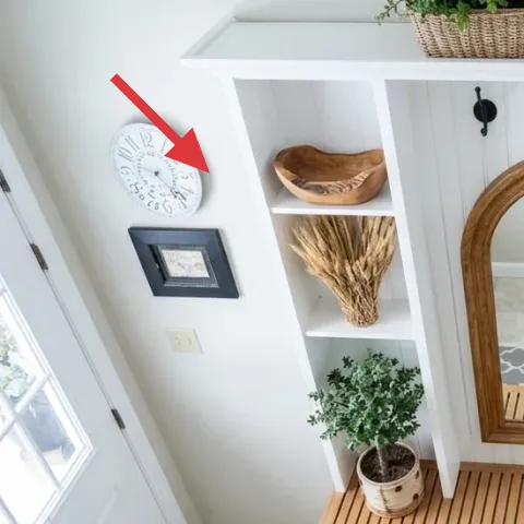
The white clock with black hands adds both utility and style, which matters in an entry where you’re always checking keys, bags, and timing. Its light face keeps it from feeling heavy beside the mirror, while the black hands and numbers create a subtle echo of the black frame art. I love clocks like this more than decorative signs because they look “necessary” even when you’re not thinking about decor. That’s why the space reads settled rather than staged. The trade-off is you need a clear line of sight from the spot where you usually pause at the door.
Keep it at eye level
In tight entries, eye-level placement makes the clock feel like part of the design instead of an afterthought.
Layer 6 — wicker planter on the floor ($20) Adds natural texture and soft volume
A wicker planter on the floor is one of the quickest ways to bring the outdoors in without adding extra furniture. The woven texture ties to the shelf baskets and bowls, so the whole vignette feels cohesive even with multiple small items. I’d pick wicker over a glossy ceramic for this spot because it reads warmer next to the wood mirror frame and console top. It also hides the “pot problem” by giving you one uniform look for a plant container. The trade-off: woven containers are more sensitive to spills, so it helps to use a removable inner liner if yours doesn’t already have one.
Repeat wicker in two places
One planter plus one shelf basket keeps the texture family present without making the nook feel overcrowded.
Layer 7 — brown wooden bowl on the right shelf ($25) Creates an organized styling surface
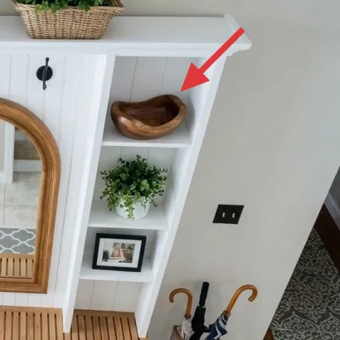
The brown wooden bowl on the right shelf gives the top tier a place to “land” visually. It’s a small, single-object styling move that makes the shelves look intentionally curated rather than empty. I’m a fan of bowls here because they’re easy to swap seasonally, but they still feel natural next to plants and wicker baskets. The alternative—using only plants and baskets—can make shelves read like storage, not decor. The trade-off is choosing one bowl that’s the right scale; too large and it competes with the framed art, too small and it disappears behind the shelf dividers.
Use it like a tray, not a catch-all
Keep the bowl mostly empty (or with one small item) so the shelf maintains a clean, airy rhythm.
The cost, layer by layer
| Layer | Item | Cost |
|---|---|---|
| 1 | Gray-and-white area rug | $80 |
| 2 | Arched wood-framed wall mirror | $120 |
| 3 | Wood-handled umbrella holder stand | $45 |
| 4 | Small black-framed wall art print | $30 |
| 5 | White wall clock with black hands | $35 |
| 6 | Wicker planter for a floor plant | $20 |
| 7 | Brown wooden bowl for shelf styling | $25 |
| Total | $355 | |
If you want a cheaper version, start with the rug and mirror, then pick one wall piece (clock or framed art) instead of both. Swap the umbrella holder for a smaller free-standing rack and choose one wicker planter rather than multiple woven textures.
What worked, what didn't (across the whole room)
Overall, this nook works because the textures repeat and the “dark accents” stay limited, so the wall feels styled without feeling cluttered. The biggest win is that every move supports a real entry routine—drop zones, a landing mat, and a mirror for quick checks before you go.
What worked
- The gray-and-white rug anchors the tile and makes shoe traffic look intentional.
- The arched wood mirror softens straight shelf lines while echoing the console top.
- Black frames and the clock create contrast that’s visible from the door.
- Wicker planters add warmth without adding extra bulky furniture.
- The umbrella holder stand keeps wet gear contained and off the floor.
What didn't
- A second large wall piece would compete with the mirror and make the wall feel crowded.
- Using only solid objects on shelves can read flat compared to the photo’s mix of textures.
- Overfilling the umbrella holder turns a neat entry trick into a visual mess.
- Choosing a rug with too little contrast can blend into light tile instead of framing the nook.
What we'd skip if we did it again
Skip adding a second “big” wall focal point. With an arched mirror already doing the heavy lifting, another large print usually steals attention and makes the entry feel smaller than it is.
Skip matching everything. It’s tempting to buy a full set of frames or planters, but the photo works because wicker, wood, and black show up in repeated doses—not because every object matches perfectly.
Skip overbuying decor for the shelves. One bowl for each shelf tier and one plant per main zone is enough; anything extra turns a curated look into visual storage.
Frequently asked
How long does this kind of entryway refresh take?
Plan for about 2–4 hours total. The “hard” part is only deciding placement for the mirror, rug, and the two wall pieces so everything balances visually. After that, it’s just styling plants and repeating one texture family (wicker/wood). If you shop thrift or swap prints, add extra time for browsing and returning.
What if I’m not allowed to change wall decor in my rental?
You can still get most of the look without touching the wall. Choose a freestanding or mirror-you-can-hang-with-permit approach, but if wall changes are restricted, prioritize the rug, the umbrella holder stand, and the floor planter basket. Swap the wall art for a framed print that’s placed on a shelf (if you have one) or use a removable frame on existing rail hardware.
Can I scale this down for a smaller entryway?
Yes—keep the same “repeat + contrast” logic. Use a smaller rug size that still covers the landing zone, choose a slightly smaller arched mirror, and pick only one wall accent (either the clock or the framed art). Keep shelf styling to one bowl plus one plant cluster so the nook doesn’t feel busy.
Can I scale it up if my entry is bigger?
Bigger spaces can handle more spacing. Consider a larger rug (still patterned to match the gray-and-white theme) and a taller plant for one corner. If you go bigger, keep contrast limited to the same black accents—one set of frames and one clock—so the palette stays cohesive.
Where should I shop for these items if I want the same vibe?
For budget-friendly mirrors, check home discount stores, marketplace listings, and discount furniture sites. Rugs and clocks are often best at big-box retailers for predictable sizing and return policies. Wicker planters and wooden bowls tend to show up at home goods stores and craft-focused retailers, and they’re easy to swap without committing to wall changes.
What’s the biggest mistake people make in small entryway nooks?
Overcrowding the shelves and under-sizing the rug. When the rug doesn’t cover the real foot-landing zone, the entryway feels awkward and unfinished. When shelves are filled with too many mixed textures, the space reads like storage instead of decor.
More in Small Spaces

Under $400: entryway console nook refresh with 7 move-ready swaps
A renter-friendly entryway console nook refresh using warm wood, white surfaces, and gray patterns—no drilling and everything packs away. T…
Under $300: 7 move-ready swaps for a stair landing console
A stair landing console gets the same airy, natural texture look using 7 move-ready swaps for under $300. Focus: woven baskets, a stoneware…
Under $600: stair landing shelf wall refresh with 7 weekend wins
A stair landing shelf wall can feel intentional instead of “builder beige” with an easy 7-layer refresh. This weekend project uses an updat…