- Best for
- texture-heavy neutral bedrooms
- Cost
- $349 total (under $400)
- Difficulty
- easy weekend refresh
- Renter-safe
- Yes—no-drill swaps and removable decor
Why olive-and-cream fabric choices are the bedroom of 2026
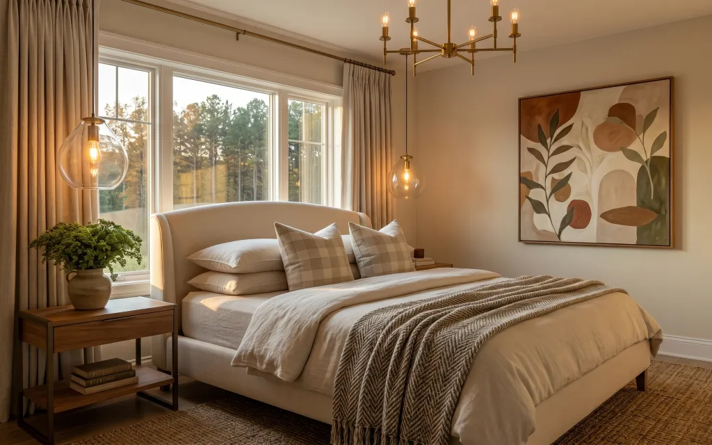
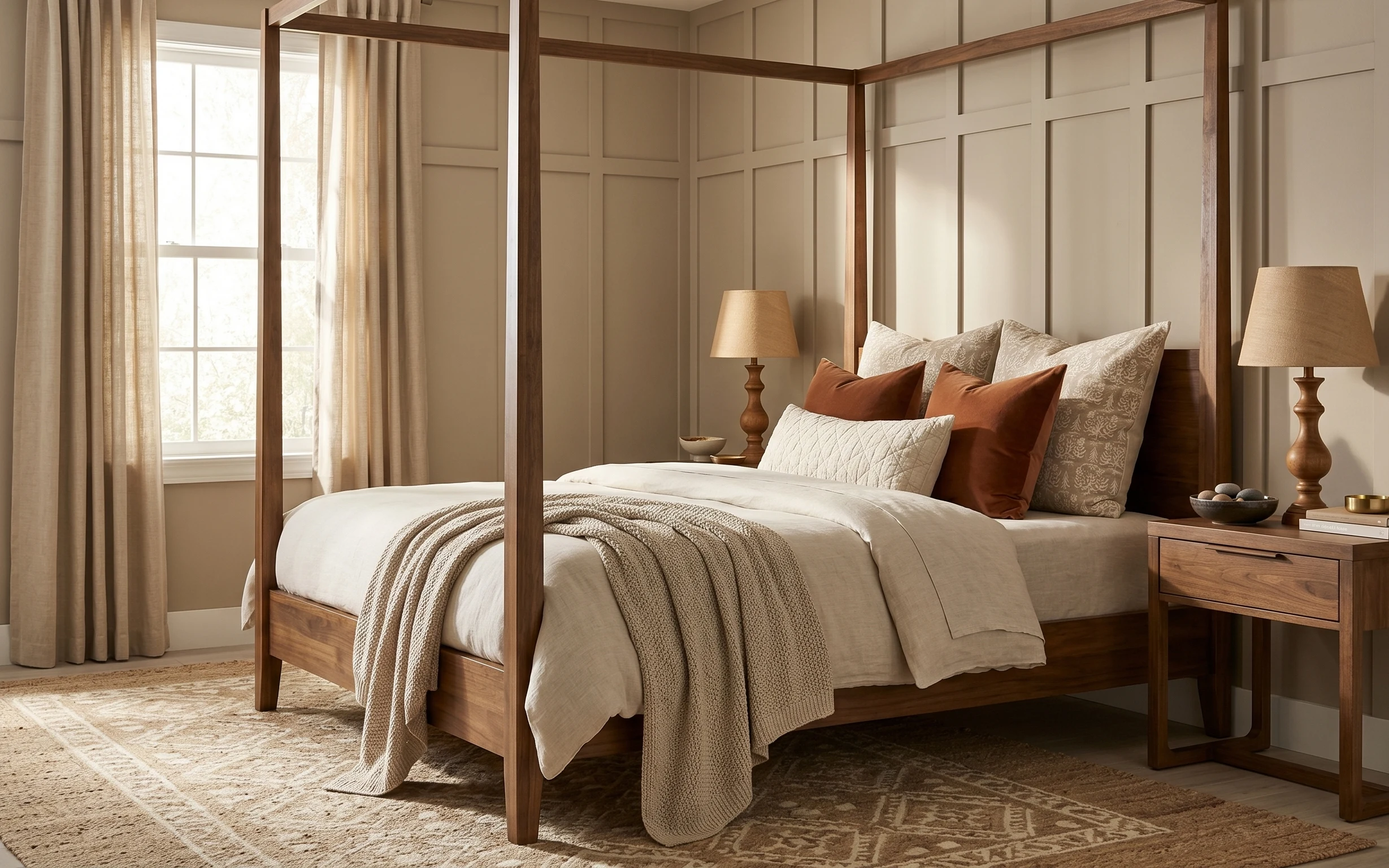
In this bedroom, the palette does most of the heavy lifting: cream textiles, taupe-beige curtains, and warm brown wood. The bed reads soft because the duvet cover and throw pillows keep everything in the same neutral family, while the woven blanket adds texture you can actually see in the afternoon light. A grounded area rug and a framed wall art print make the whole setup feel intentional instead of “picked up along the way.” For renters, this works because every swap is move-ready and comes down with zero wall damage.
I almost went too literal with the decor—my first instinct was to match every shade exactly, but that’s how bedrooms start to look flat. What changed my mind was noticing how this room mixes tones (cream, taupe, and warm brown) without switching style. The result is calmer than a high-contrast scheme and easier to repeat room to room.
Layer 1 — area rug ($120) anchors the bed’s footprint
A neutral area rug under the bed is the easiest way to stop a bedroom from feeling like “furniture on floor.” In the hero, the rug sits across the bottom edge, giving the bedframe and side-table zone a clear boundary. A runner-style rug would have looked skimpy here, and a too-dark rug would fight the cream duvet and taupe curtains. This $120 option keeps the warmth while still hiding everyday scuffs—especially important if your deposit is tight. The trade-off is that a lighter rug means regular vacuuming, but the softness underfoot is worth it.
Choose a texture, not just a color
A woven-looking rug surface hides lint and makes the room feel layered without adding more items.
Layer 2 — curtains in taupe-beige ($60) frame the windows with softness
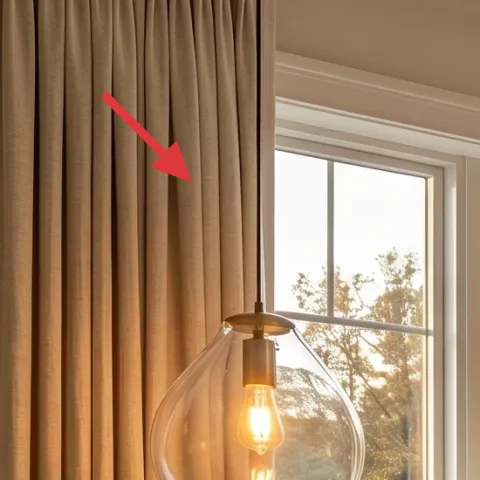
These taupe-beige curtains are what make the windows look taller and more finished. They fall in full-height panels and add that steady vertical rhythm that balances the bed’s horizontal lines. If the room only had the bed textiles, everything would feel “stacked”; the curtain height gives the eye a path upward. Picking a similar neutral tone is the trade-off—you’ll lose the drama of bold print, but you gain the calm, cohesive feel that works year-round. For renters, choose a set you can remove at move-out, and hang using tension-friendly, non-damaging methods your lease allows.
Why curtain length matters
Long panels visually stretch the space, so the bed doesn’t look wedged against the window.
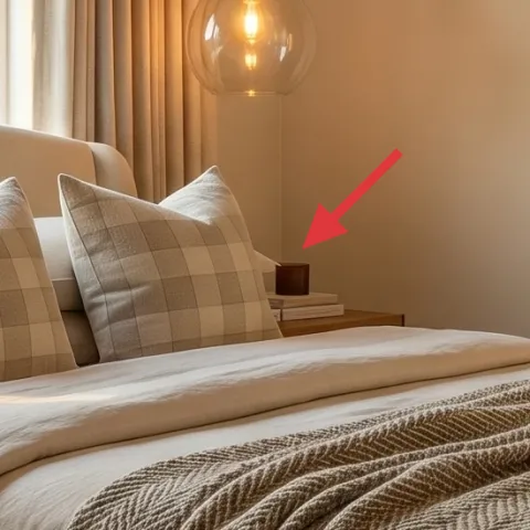
Layer 3 — side table ($50) gives you a landing spot for warm clutter
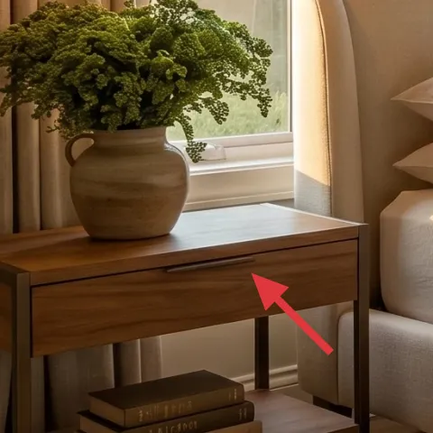
The side table is doing quiet work: it supports a potted tree and keeps styling at one comfortable height beside the bed. The hero’s table has warm brown wood tones and open space underneath, which prevents the corner from feeling bulky. The obvious alternative—using a taller dresser-style nightstand—would visually crowd the window wall. With a $50 side table, you get a warm surface for everyday items and a place to repeat the room’s natural tones (wood + green + cream). The trade-off is storage: this style is more display-forward than “grab a drawer and go,” so it’s best for a minimalist bedside routine.
Pick a table with a warm wood tone
When the wood matches your framing and decor, the room reads intentional even with simple objects.
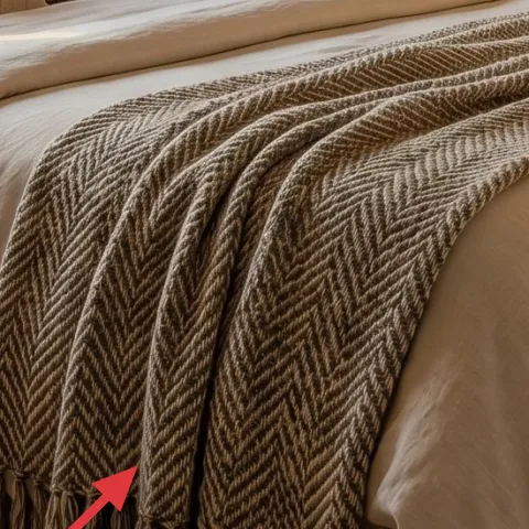
Layer 4 — woven blanket throw ($25) adds visible texture at the foot
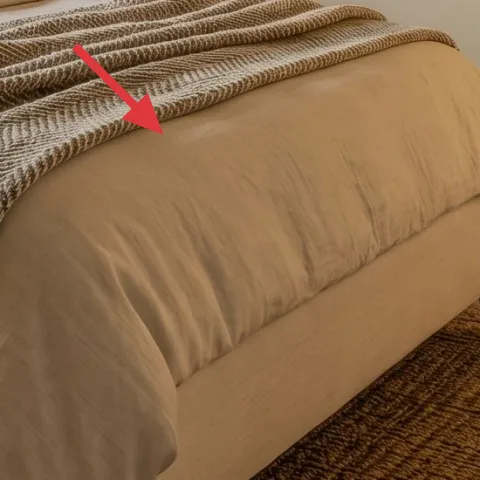
The woven blanket throw draped along the bed edge brings texture without adding color chaos. In the hero, it’s in a warm neutral that echoes the rug and wood, so it reads cohesive even though it’s a different material. A smooth throw would have blended too much with the duvet cover, while a patterned blanket could look busy beside the plaid-like pillow covers. This $25 option keeps the look layered: soft bedding up top, then that visible weave at the bottom. The trade-off is practical—woven throws snag a little more easily—so it’s smart to fold it back quickly if you’re moving around the room.
Watch for shed-prone weaves
If the blanket sheds, it will show on the rug fast, so test it near a washable area first.
Layer 5 — throw pillows ($24) brings gentle pattern without going loud
The throw pillows add both comfort and that subtle “designed” feel because they repeat the room’s neutral tones. The hero shows multiple pillows with a soft check pattern, which makes the bed look styled even when you’re not constantly rearranging. A single solid pillow would be too plain, and going for large-scale contrast patterns would fight the framed wall art. For $24, this is best approached as pillow covers you can mix and match—swap them later when you want a new mood while staying on the same color track. The trade-off is that patterned pillows look best when they’re fluffed consistently.
Match undertones, not exact shades
Cream and taupe don’t have to be identical—just warm enough to play nicely together.
Layer 6 — framed wall art print ($50) sets the whole color story
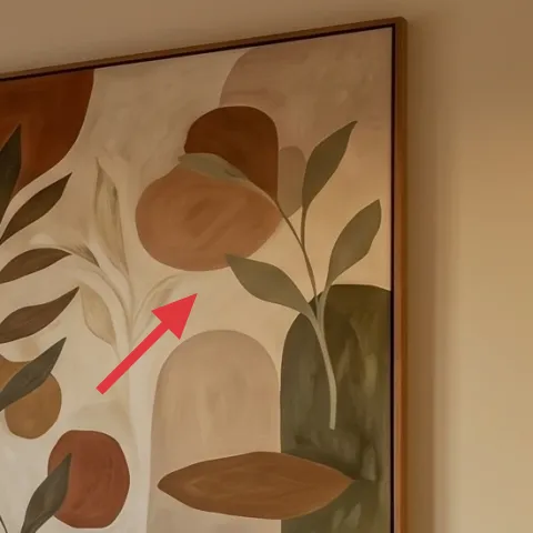
The framed wall art print is the visual anchor on the right side, pulling together the creams, greens, and warm browns. Because it’s framed and scaled to feel substantial, it helps the bed look intentional instead of “floating” in front of the wall. The alternative—small art—would get lost at this height and wouldn’t balance the curtains’ presence. This $50 layer keeps the same idea: a single, statement-sized print you can take down at move-out. The trade-off is that you’ll need good placement (eye level is key), but the framed format makes it straightforward.
Make it instead of buying it
This DIY makes a hand-painted abstract on cardstock to sit inside a simple frame, matching the hero’s earthy shapes for a lower cost.
Materials
- Cardstock sheets — 2 pieces — craft store — $6
- Acrylic craft paint (starter set) — 1 small set — craft store — $12
- Paintbrushes (thin + small flat) — set — craft store — $8
- Simple frame — 1 — thrift store — $10
- Painter’s tape — 1 roll — hardware aisle — $4
Steps
- Cut cardstock to fit the frame opening.
- Use painter’s tape to block off large soft shapes.
- Paint background layers in cream tones and let dry fully.
- Add olive and warm brown shapes with a thin brush for edges.
- Peel tape and touch up any clean lines with a small brush.
- Slide the finished cardstock into the frame and hang with removable mounting hardware.
Total DIY cost: $40 — saves about $10 over buying.
Layer 7 — potted tree and vase ($20) brings living color to the nightstand
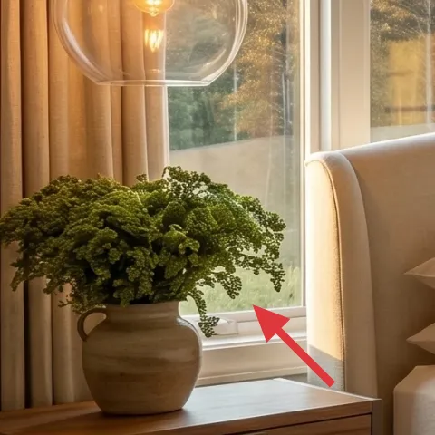
That potted tree and vase combination adds a grounded “real home” element right where you notice it every day—by the side table. The hero’s plant sits in a warm-toned vase, and the olive-green leaves tie directly back to the curtain-and-textile palette. A fake plant would have looked flat next to the woven throw and textured rug, so the trade-off for this $20 option is choosing something small enough to be moveable and low-maintenance. A tidy vase keeps the bedside moment from turning into clutter, and it works whether your style is minimalist or farmhouse-leaning. The best part is you can keep the setup consistent even if you swap other textiles.
Use the plant to repeat your color
If your room has a green accent, a small olive plant makes it feel intentional.
The cost, layer by layer
| Layer | Item | Cost |
|---|---|---|
| 1 | Area rug | $120 |
| 2 | Curtains in taupe-beige (panel pair) | $60 |
| 3 | Side table | $50 |
| 4 | Woven blanket throw | $25 |
| 5 | Throw pillow covers | $24 |
| 6 | Framed wall art print (DIY equivalent) | $50 |
| 7 | Potted tree in a vase | $20 |
| Total | $349 | |
If you want it cheaper, keep the rug and curtains and swap the framed print for a printed canvas at a big-box sale. Use a single pillow cover set instead of multiple covers, and choose a smaller potted tree in a simpler vase.
What worked, what didn't (across the whole room)
The biggest win is how the neutrals stay consistent while textures do the variation—rug weave, curtain drape, and the woven blanket. The second win is the “one anchor per wall/zone” approach: framed art plus a single bedside styling cluster. The main miss would be overdoing patterns—if the pillows and art get too busy, the calm look collapses.
What worked
- The area rug defines the bed zone so the room feels styled instead of randomly furnished.
- Taupe-beige curtains add height and soften the window wall without changing the lease setup.
- The side table creates a functional styling spot for the potted tree and keeps the corner tidy.
- The woven throw adds texture that reads even from across the room.
- Neutral pillow covers keep pattern subtle and make the bed look made without constant fuss.
- The framed wall art print ties the olive and cream tones together in one focal point.
What didn't
- If pillow patterns are too high-contrast, they fight the framed art’s earthy shapes.
- Using a short curtain panel can make the window look smaller and the bed feel crowded.
- A very dark rug would reduce the warm, airy balance of the cream textiles.
- If the framed art is too small for the wall space, it won’t anchor the bedroom.
- A decorative vase without a plant feels “incomplete” next to the textured textiles.
What we'd skip if we did it again
Skip swapping the biggest items first if you’re working with a limited budget. In this room, the rug and curtains do the heavy visual work, so spending there creates the foundation; everything else is easier to layer on top.
Skip buying a matching full nightstand set. The hero works because the side table feels purposeful but not overly coordinated—one warm wood piece with a plant and one small stack reads more lived-in.
Skip a tiny wall print. The framed wall art print needs scale to balance the window wall and the height of the curtains, or it will look like an afterthought instead of a focal anchor.
Frequently asked
How long does this bedroom refresh usually take?
Most of the time goes to measuring and picking the right curtain length, then making sure the framed wall art sits at a comfortable height. If your rug and pillow covers are already on hand, the styling part is quick—usually 2 to 3 hours total. For the DIY art, plan for a relaxed painting session and drying time, then add framing. Overall, it’s a one-weekend project for most renters.
What if I can’t change anything on the walls?
This plan avoids needing wall paint or replacement fixtures. For the framed wall art print, use renter-safe hanging methods that don’t require drilling, like removable hardware the landlord isn’t altering. If your lease is extra strict, swap the art for a freestanding leaning frame on a console or shelf instead—keeping the same scale and neutral palette that makes this look work.
Can I make this work in a smaller bedroom?
Yes—start by scaling down only the rug size and curtain fullness, not the overall color approach. In a small room, choose a rug that still sits under the bed’s front edge and keep curtain panels as long as possible for the vertical effect. For the bed styling, use fewer pillow covers (two instead of three) and keep the woven throw draped rather than spread out. The olive plant can stay smaller to avoid visual clutter.
What if my bedroom gets more daylight or feels darker?
If your room is very sunny, lean slightly more taupe and cream so the neutrals don’t look washed out; keep the rug texture visible. If your room is darker, you can brighten the art and pillows within the same palette—more cream highlights and slightly lighter framed print tones. The key is to preserve texture contrast: rug weave, curtain drape, and woven throw all matter more than adding new colors.
Where should I shop to keep costs under control?
For a budget-friendly version, prioritize sales and thrift for the frame and side table, since those are often the easiest to find without brand pressure. Curtains and rugs usually deliver the biggest visual impact, so look for reputable store options on discount racks or during clearance. Pillow covers and the woven throw are the easiest to swap later, so they’re great for experimenting while you lock in the foundation pieces.
What’s the biggest mistake people make with this style?
The most common issue is choosing too many competing patterns—like bold pillows plus a high-contrast art print plus a patterned rug. In this look, the patterns are controlled: gentle checks on the throw pillows and earthy shapes in the framed wall art print, with texture doing the rest. If you keep the palette consistent and limit patterns to one or two elements, the room stays calm and intentional.
More in Bedroom

Under $400: olive-and-cream bedroom refresh with 7 renter swaps
A renter-friendly bedroom refresh built around soft taupe curtains, a grounded area rug, and warm framed art. This look uses 7 move-friendl…
Under $700: warm-taupe bedroom refresh with 7 budget swaps
A warm-taupe bedroom refresh on a $700 weekend budget: update the beige rug, curtains, throw layers, and bedside lighting for a calm, lived…

Under $400: move-ready bedroom refresh with 7 easy swaps
A move-friendly bedroom refresh that leans into olive-and-cream textures and warm light, built for renters and shared housing. This plan us…