
- Best for
- Textile upgrades that read expensive
- Cost
- Under $400
- Difficulty
- Easy (no-drill swaps)
- Time
- 1 weekend
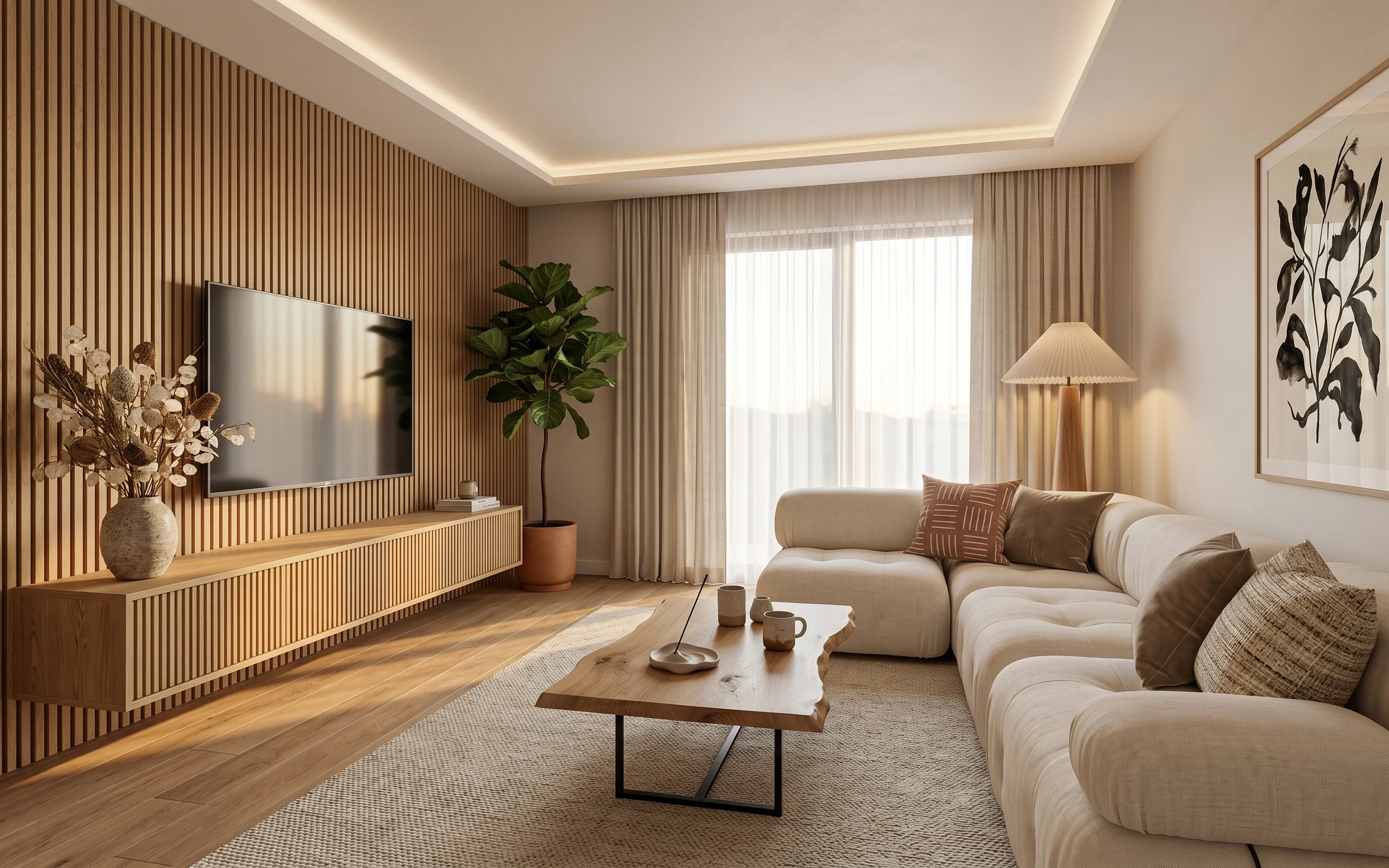
Why olive-and-rattan seating palette is the living room of 2026
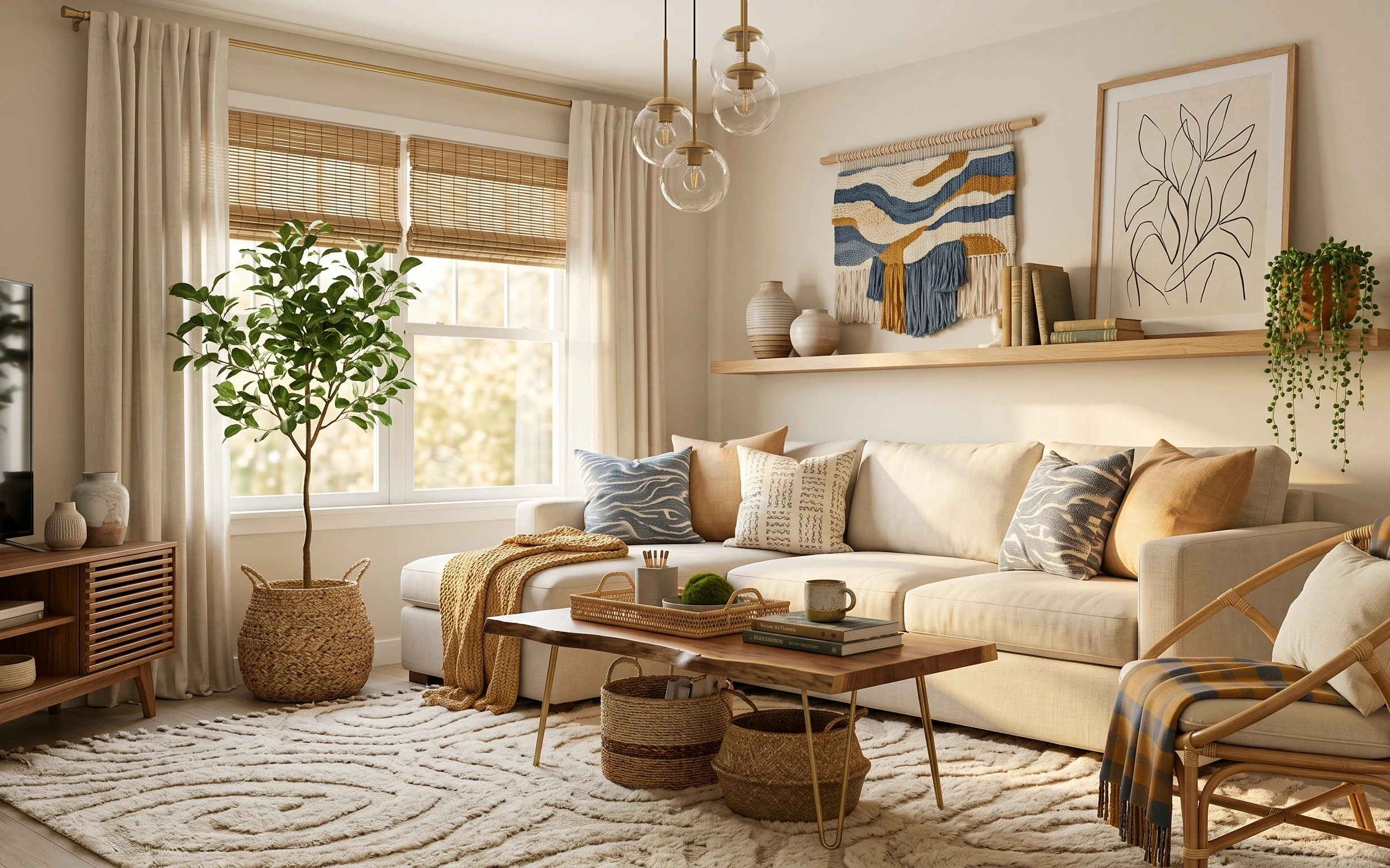
In the photo, the visual anchor is the cream rug under everything, then the beige curtains soften the window and make the whole space feel taller. On the wall, the layered botanical print and macramé add texture without committing to permanent art hanging systems. The coffee table styling (that tray and ceramic jar) keeps the room from looking “staged,” while woven baskets handle everyday clutter. This is achievable for shared housing because each move-friendly piece packs flat or dismantles quickly.
I used to think “texture” meant buying more and more small things. My first shared-house apartment ended up looking like a craft store exploded—pretty, but messy. What changed my mind was noticing how the best versions repeat materials: woven + linen + wood. When those textures echo across rug, curtains, and wall art, the room looks intentional even when you’re swapping roommates (and moving again) fast.
Layer 1 — cream area rug ($140) Softens the whole seating zone
Start with the cream area rug, because it’s the item that visually “grounds” the sofa and coffee table all at once. In the hero, the rug’s low, fuzzy pile reads cozy without looking too shaggy, and the warm cream tone keeps everything feeling airy against the light walls. If you skip a rug in a rental, furniture edges can look like they’re floating. A 5×7 style also helps define a living zone in open layouts, but the trade-off is you’ll want a rug pad to prevent shifting when you move it between rooms.
Rug size check before checkout
Choose a size where the front legs of the sofa sit on the rug—then you won’t fight “almost fits” when the next lease starts.
Layer 2 — beige curtains ($70) Makes windows look taller
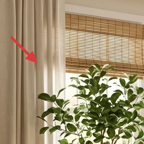
Beige curtains are the fastest way to soften a rental without changing anything permanent. In the photo, the curtain panels frame the window with a relaxed, drapey fall, which makes the room feel warmer and less echo-y. The color also works like a neutral “bridge” between the olive green plants and the warm wood furniture. The trade-off: curtains need a good hem length and consistent hang height, so plan where the rod sits and aim for a full, even look across both panels.
Window view stays bright
Sheer-to-medium curtains keep daytime light bouncing while still adding privacy and texture.
Layer 3 — macramé wall hanging ($45) Adds fiber texture without drilling
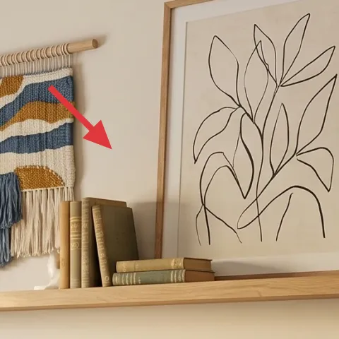
The macramé wall hanging adds exactly the kind of “handmade” texture that makes rentals feel lived-in. In the hero, it sits above the sofa’s back wall area, and the neutral fibers plus the woven pattern echo the rug and baskets. This choice beats an oversized framed piece because fiber texture hides small installation differences and looks good even if you take it down later. Trade-off: macramé can tangle in transit, so roll or fold carefully and keep it in a flat garment bag for the next move.
Skip anything that needs hardware you can’t remove
For shared housing, avoid mounting methods that pull up wall material when removed.
Layer 4 — framed botanical line art print ($25) Brings contrast to the warm neutrals
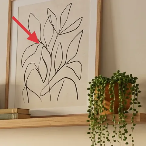
A framed botanical line art print gives you clean graphic contrast against all the fiber and soft surfaces. In the hero, the artwork sits on the right wall, and the thin-line black strokes help the olive plant feel sharper without competing with the macramé’s texture. This is an easy win compared to larger statement paintings because it still looks intentional at smaller scale—and frames are simple to pack. The trade-off is that line art is less forgiving if it’s slightly crooked, so take a second to align it before walking away.
Pack frames flat or protected
Wrap the frame in paper and tape it closed to stop corners from getting crushed during moves.
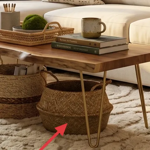
Layer 5 — woven baskets (floor storage) ($20) Hides the everyday mess
Woven baskets do double duty: they look decorative and they catch the small stuff that always accumulates in shared spaces. In the hero, the basket silhouettes match the plant’s woven container and the room’s overall earthy materials, so they don’t feel like random storage bins. This approach beats buying a matching set of plastic organizers because baskets look warmer next to wood and textiles. The trade-off: baskets have more texture, which means you’ll dust them more often—but you also won’t notice small scuffs as much.
Use them where clutter forms
Put baskets by the sofa and coffee table, not in a distant closet, so they actually get used.
Layer 6 — decorative tray on coffee table ($15) Keeps styling from looking scattered
A decorative tray is the difference between “pretty objects” and “styled coffee table.” In the hero, the tray sits centered and organizes the small items into one visual grouping, which makes the table feel tidy even when you’re mid-life (and mid-semester). Choose wood or woven trays so they echo the room’s warm furniture and keep the palette consistent. The trade-off is that trays don’t add storage capacity—you’re optimizing for appearance and quick cleanup, not extra space.
Style in odd numbers
Use a cluster of 3 objects on the tray, then stop—more pieces usually reads busy, not curated.
Layer 7 — decorative ceramic jar on coffee table ($15) Makes the table look “finished”
That decorative ceramic jar adds color and material interest right where your eyes land when you’re sitting on the sofa. In the photo, it works because it’s the same warm, neutral family as the rug and baskets, so it doesn’t fight the olive plant or the beige textiles. This swap is more reliable than a single tall centerpiece because jars sit low and feel natural even in rentals with smaller surfaces. Trade-off: ceramics are easy to chip, so pack them with paper and keep them from sliding around inside a box.
Don’t overstuff the jar
A small amount of stems, cotton, or a single utensil grouping looks intentional and stays move-ready.
The cost, layer by layer
| Layer | Item | Cost |
|---|---|---|
| 1 | Cream area rug (5×7) | $140 |
| 2 | Beige curtain panel pair | $70 |
| 3 | Macramé wall hanging | $45 |
| 4 | Framed botanical line art print 16×20 | $25 |
| 5 | Woven basket (floor storage) | $20 |
| 6 | Decorative tray | $15 |
| 7 | Decorative ceramic jar | $15 |
| Total | $330 | |
If you need a cheaper version, downsize the print to a smaller frame or skip the tray upgrade and just use a single jar plus a small stack of books. The rug and curtains still do the heavy lifting for this look.
What worked, what didn't (across the whole room)
These swaps work because they repeat the same material language: cream textiles, warm wood, and woven fibers. The result stays cohesive even in shared housing where you’re likely to change layouts over time. The only place the look can go off-track is when objects pile up without a grouping system.
What worked
- The cream rug makes the sofa-and-coffee-table grouping feel intentional, even with a simple setup.
- Beige curtains add vertical softness and keep daylight feeling bright instead of harsh.
- Macramé on the wall introduces fiber texture without requiring permanent installations.
- The framed botanical print sharpens contrast so the room doesn’t read flat.
- Woven baskets reduce visual clutter while matching the plant’s woven container.
- A tray prevents small items from spreading across the tabletop like “stuff corners.”
What didn't
- If the curtains aren’t hung evenly, the window framing looks lopsided fast.
- Too many wall objects compete with the macramé texture and start feeling busy.
- A coffee table without a tray can look chaotic, especially in shared living rooms.
- Over-stuffed baskets can look messy instead of curated, even when they’re “for storage.”
What we'd skip if we did it again
Skip a high-contrast wall color or anything that requires painting. In shared housing, the walls are the one thing you can’t fully control—so changing fabric, rugs, and movable wall decor gives the same impact with far less risk.
Skip “one-off” decor that doesn’t repeat the room’s materials. If the basket, rug, and curtain aren’t in the same warm-cream or woven language, the objects start looking like random additions instead of a system.
Skip oversized wall art that forces exact placement. Smaller framed prints and fiber pieces tolerate minor alignment differences and pack more easily, which matters when you’re moving again within a year or two.
Frequently asked
How long does a refresh like this usually take?
Most of the work is swapping textiles and styling. If the rug is already in the right room, it’s mostly curtains, wall decor placement, and coffee-table grouping. A realistic timeline for shared housing is 4–6 hours total across one weekend, plus an extra 10–15 minutes for final alignment and packing supplies for the move.
What if I’m renting and can’t change the lighting?
This setup doesn’t depend on changing any fixed fixtures. The pendants are already doing ambient work, while the rug, curtains, macramé, and framed print supply the rest of the “finished” look. Even with the existing overhead light, the warm neutrals and fiber textures make the room read cohesive after dark.
Can I do this if my living room is smaller?
Yes. Use the same material rules, but scale down one item: choose a smaller framed print or a rug that fits the sofa footprint so front legs still land on it. Keep curtains proportional to the window width, and avoid adding extra small objects to the coffee table—grouping matters more in smaller rooms.
What if my living room is larger with more wall space?
Lean into spacing rather than clutter. Keep the rug as the anchor, then add one larger fiber texture (like an extra macramé panel or a bigger framed print) instead of filling every surface. For the coffee table, add height via one object, but keep the tray as the organizing center so it doesn’t sprawl.
Where should I shop for these pieces on a budget?
For rugs and curtains, look for mid-range basics on home sites plus resale or thrift for matching neutrals. For wall decor, prioritize frames and fiber pieces that are ready to hang without heavy hardware. Baskets and trays are often the easiest “cheap but believable” finds in home goods aisles and secondhand stores.
What’s the biggest mistake people make in a shared living room refresh?
Buying lots of small, unrelated items without repeating materials. It’s better to pick one or two dominant textures—woven + cream textile, for example—and then repeat them across rug, baskets, and wall decor. The room looks intentional faster, and everything still packs up neatly when it’s time to move.
More in Living Room
Under $400: olive-and-rattan living room refresh with 7 move-friendly swaps
A bright olive-and-rattan living room refresh built from 7 renter-safe, move-ready swaps. Total build cost stays under $400, with the bigge…
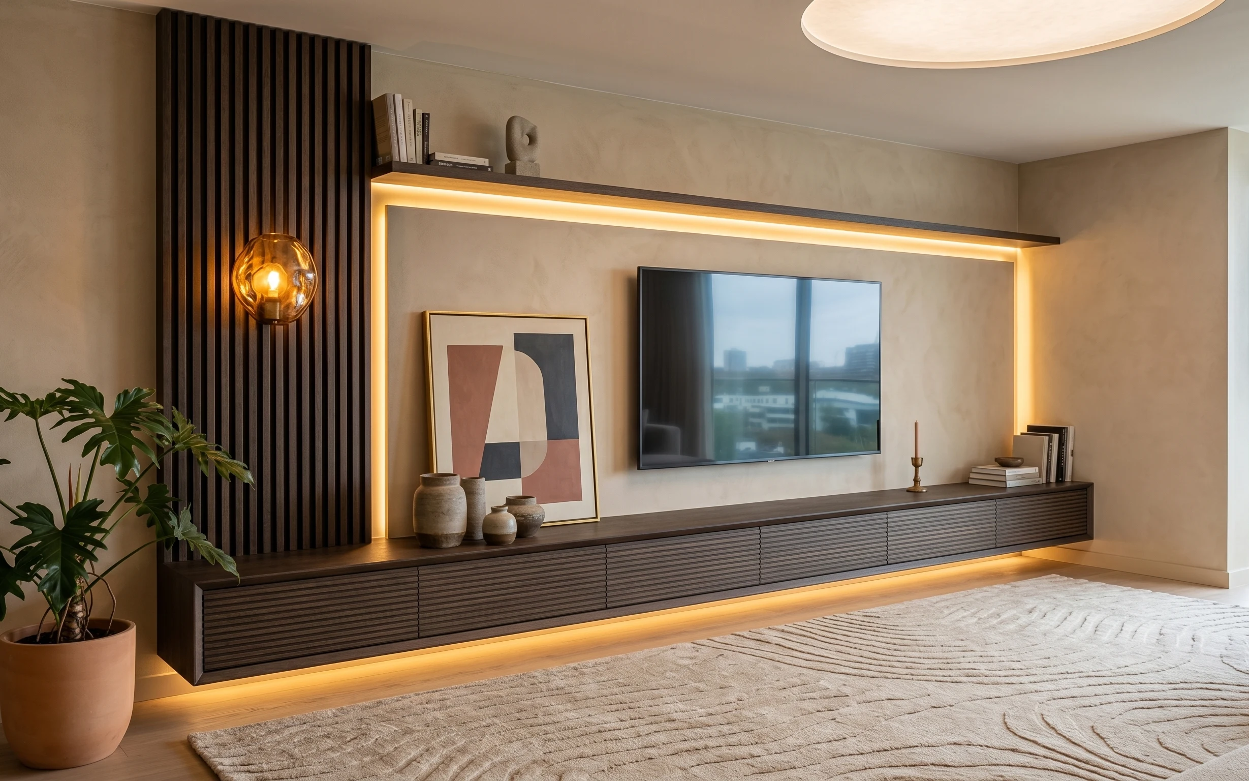
Under $400: media wall corner refresh with move-ready swaps
A warm, modern media wall corner refresh that’s easy to pack for shared housing: rug, framed art, plant styling, and a globe lamp glow. All…
Under $700: japandi beige sofa corner refresh with 7 layers
A beige sofa corner in warm oak and cream is surprisingly easy to recreate for under $700. This weekend refresh uses 7 targeted buys: rug, …