- Best for
- open-concept living area styling
- Cost
- under $400
- Difficulty
- easy (mostly textiles and freestanding decor)
- Time
- about a weekend
Why olive-and-rust palette is the open-concept living area of 2026
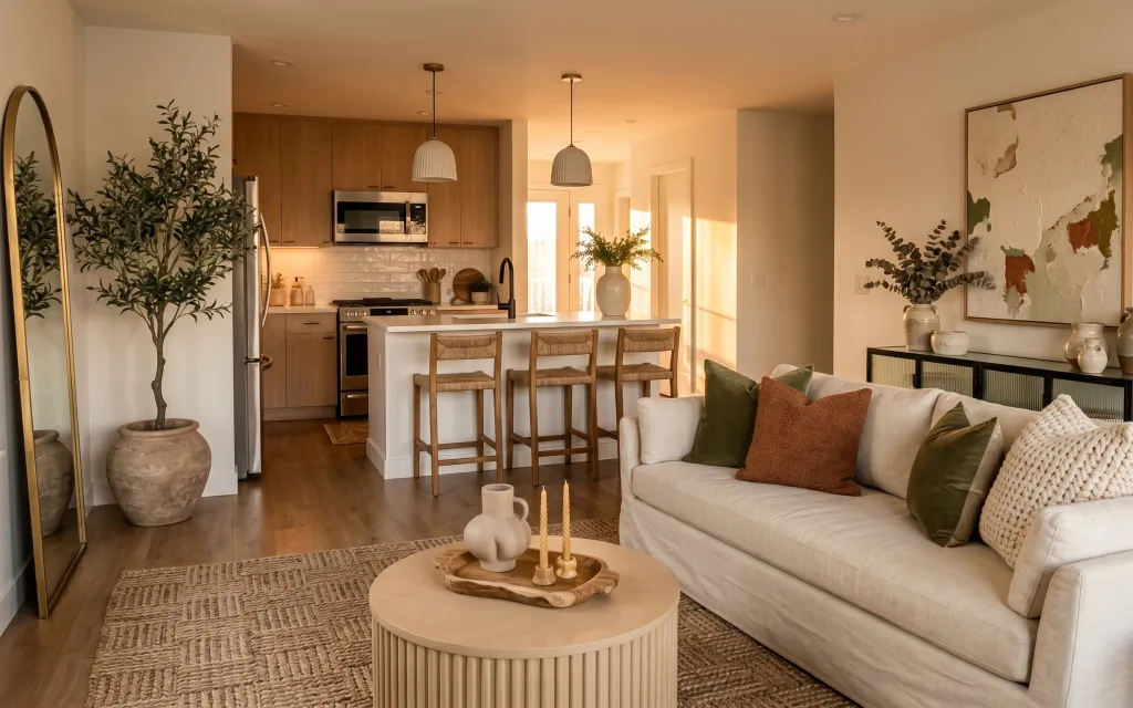
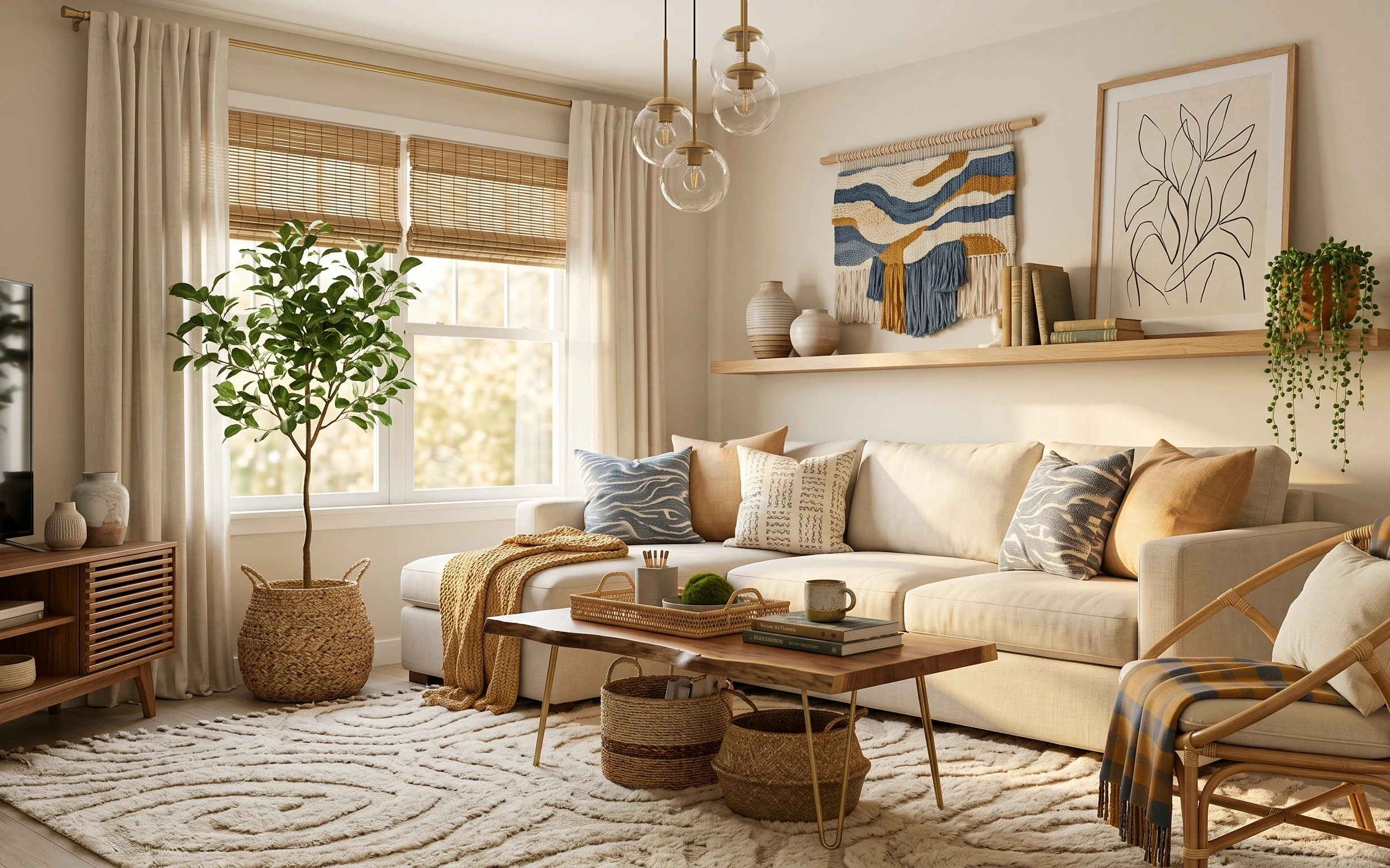
Warm modern rooms always read a little richer when you repeat the same color family across different textures. Here, the look comes from a large braided rug under a white sofa, a cream knit throw draped over the right arm, and olive green and rust-brown pillows for contrast. The tall floor mirror bounces daylight back toward the kitchen side, while the framed map-like wall art adds a graphic focal point. For renters, this is achievable because the swaps are all textiles, freestanding decor, and removable wall styling—nothing requires wall repair.
I caught myself wanting to “match” everything perfectly at first—same color, same shape, same vibe. Then I remembered that my rentals always look best when I mix one structured element (the framed print) with softer pieces (the braided rug and knit throw). Once I stopped chasing symmetry and focused on repeating olive, warm neutrals, and terracotta, the whole space suddenly felt collected instead of cluttered.
Layer 1 — large braided area rug ($150) Grounds the seating with texture
Swap in a large braided area rug with that warm, natural-beige look to anchor the seating area the way the hero does. The braided texture is the key texture here: it keeps the white sofa from looking flat and gives the coffee table and pillows something tactile to “hold onto.” Going for a 5×7 or 8×10 in the braided style matters more than chasing an exact pattern. The trade-off is some shedding for the first few weeks, but it’s easy to manage and it hides everyday foot traffic scuffs better than sleek rugs.
Rug anchor, not rug decor
Choose a size where the front sofa legs sit on the rug—better proportion instantly than a too-small runner.
Layer 2 — cream knit throw blanket ($25) Adds a casual, lived-in edge
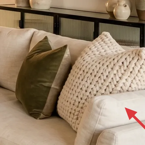
A cream knit throw draped over the sofa arm is one of the quickest ways to make a rented living space feel intentional. In the photo, the throw’s chunky texture breaks up the smooth upholstery and adds visual warmth near the coffee table. It also gives you a “styling move” without rearranging furniture: just fold it at a shallow angle so it looks like it belongs. The main trade-off is practical—knits catch lint—so it’s best to keep a lint roller nearby and rotate the fold when it starts looking worn.
Folds read better than perfect stacks
Lightly twist the throw before draping; it looks softer and more natural than straight lines.
Layer 3 — olive green throw pillow ($12) Creates the room’s color repeat
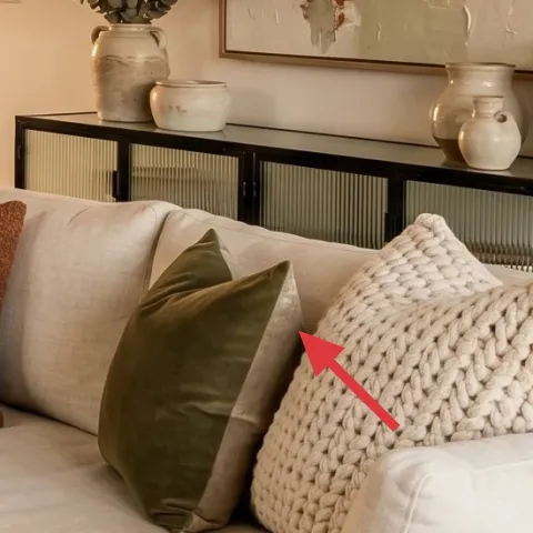
Use an olive green throw pillow to echo the plant’s color and keep the palette cohesive. The hero shows the olive tone popping against the white sofa, while the brown pillow and the knit throw keep everything from feeling too green. This layer is an easy renter win because pillow covers are a straight swap, and you can take them with you when the lease ends. The trade-off is that olive can skew either gray or warm depending on the fabric dye—if you’re unsure, pick a pillow cover with a muted, earthy finish rather than a shiny one.
Match tone, not brand
Bring the pillow color closer to the plant’s muted green instead of a bright “forest” shade.
Layer 4 — framed map-like wall art ($50) Adds a focal point without shrinking the room
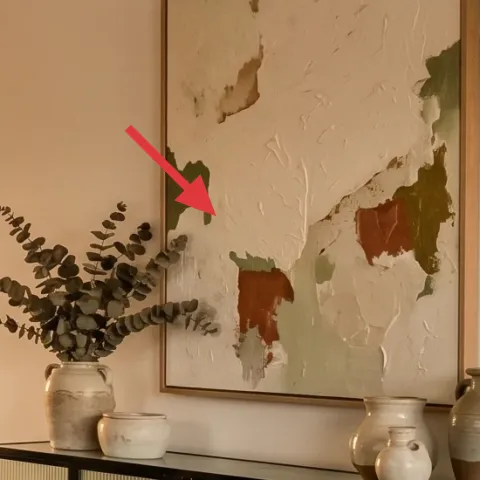
The framed map-like wall art is what pulls the eye upward and gives the room a clear direction on the right side. The print’s off-white background works with the warm walls, and the muted earth tones keep it from looking like a vacation poster. Instead of a large wall-collage (which can feel heavy in open-concept rooms), one framed piece keeps the layout calm. The trade-off is placement: you’ll want it at eye level for reading distance and use removable hardware so the frame feels secure without drilling.
Watch for glare
Because the space is bright, position the frame so window reflections don’t wash out the print.
Layer 5 — tall floor mirror ($80) Reflects light toward the kitchen side
A tall floor mirror helps this open-concept living area feel larger by reflecting daylight down the seating-and-kitchen corridor. In the hero, the mirror’s vertical shape balances the sofa’s width and adds depth near the plant, making the left side feel finished. A freestanding mirror is also the most renter-friendly “big impact” item here—you don’t have to alter anything permanent, and you can move it to a new layout later. The trade-off is footprint: pick a placement where it won’t block a walking path, especially in the narrowest part of the room.
Use it to bounce light, not just for vanity
Angle the mirror so it reflects an interior light source or window, not a blank wall.
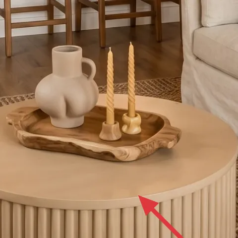
Layer 6 — wooden tray with candleholders ($20) Styling that looks curated on a budget
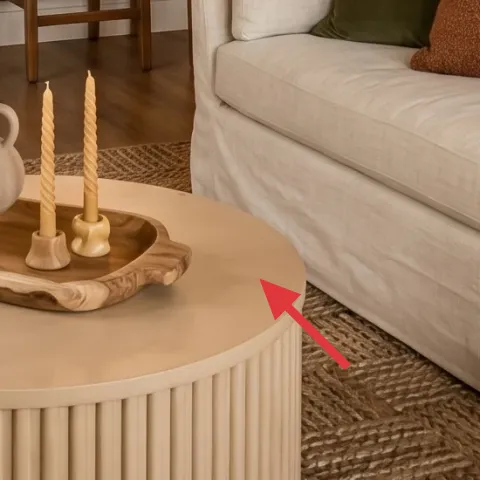
The wooden tray groups small objects on the round coffee table so the surface reads styled rather than cluttered. In the photo, the tray holds white candleholder/candlestick pieces, which add height and rhythm without taking up extra visual space. This is a smart alternative to adding more furniture because it makes the table feel “done” even when you only have a few items. The trade-off is keeping it from becoming a catchall—tray styling works best when every object has a purpose (height, texture, or color repeat) and you don’t keep random odds and ends in it.
Build height with one stack
Keep one item taller than the rest so the tray has a focal point.
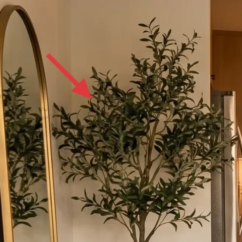
Layer 7 — terracotta potted olive tree ($30) Repeats the warm-earth tone
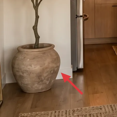
The terracotta pot is doing more work than it looks like—it ties together the warm beige walls, the rust-brown pillow, and the olive green plant leaves. If you can’t find this exact planter, painting a simple terracotta pot (or refreshing one you already have) gets you very close to the same earthy tone. This DIY keeps the “grown-in” feel while staying move-friendly because the pot and tree are freestanding. The trade-off is that painted terracotta needs a gentle approach at first—avoid scrubbing or harsh cleaners so the surface keeps its soft, lived-in finish.
Make it instead of buying it
DIY a painted terracotta planter for the olive tree so the pot matches the room’s warm earth tones without paying for a styled specialty planter.
Materials
- Basic terracotta pot (one large pot) — 1 — garden center — $12
- Acrylic paint in warm clay tone — 2–3 oz — craft store — $6
- Small foam brush — 1 — craft store — $2
Steps
- Wipe the pot clean and let it fully dry.
- Apply a thin first coat of acrylic paint, working in small sections.
- Add a second thin coat only where terracotta still shows through.
- Use the foam brush to dab lightly for an even, matte finish.
- Let the paint dry between coats and after the final coat.
- Place the tree once the surface feels dry to the touch.
Total DIY cost: $20 — saves about $10 over buying.
The cost, layer by layer
| Layer | Item | Cost |
|---|---|---|
| 1 | Large braided area rug | $150 |
| 2 | Cream knit throw blanket | $25 |
| 3 | Olive green throw pillow cover | $12 |
| 4 | Framed map-like wall art | $50 |
| 5 | Tall floor mirror (freestanding) | $80 |
| 6 | Wooden tray with candleholders | $20 |
| 7 | Terracotta potted olive tree (DIY-painted planter) | $30 |
| Total | $367 | |
If you want a cheaper variant, drop the mirror cost by choosing a smaller-width freestanding option and size the rug closer to 5×7 instead of 8×10. Keep the framed print and the olive pillow so the palette still reads cohesive, even with fewer pieces.
What worked, what didn't (across the whole room)
This setup works because it repeats three tones—warm beige, olive green, and terracotta—across rug, textiles, and decor. The layering feels intentional without adding clutter, which is the biggest win in an open-concept layout.
What worked
- The braided rug texture makes the white sofa feel warmer and more grounded during the day.
- The cream knit throw brings a soft, casual element that contrasts the sofa’s smooth upholstery.
- Olive green on the pillow repeats the plant color so the room looks styled, not accidental.
- The framed map-like print gives a vertical focal point on the right wall.
- The tall floor mirror adds depth and reflects daylight toward the kitchen side.
- A wooden tray on the coffee table prevents small objects from looking scattered.
What didn't
- If the rug is too small, the seating area separates from the coffee table and feels unfinished.
- Too-bright olive pillows can look neon against warm beige, throwing off the earthy palette.
- A floor mirror placed too straight can cause glare on the framed print depending on sun angle.
- Forgetting to keep the tray edited turns the coffee table into a drop zone.
What we'd skip if we did it again
Skip adding extra small furniture just to fill gaps. In an open-concept living area, the braided rug plus one framed print already creates the structure—everything else should be textiles or freestanding decor.
Skip buying multiple matching pillow covers in the same shade. One olive green pillow plus one warm neutral pillow gives enough contrast without making the sofa feel themed.
Skip overdoing wall decor. One framed map-like piece and a tall floor mirror keep the room balanced and let the plant and terracotta tones do the “warm” work.
Frequently asked
How long does it take to recreate this look?
Plan for about a weekend. The rug and pillow swaps are fast, and setting a frame and mirror with renter-safe hardware is usually a single afternoon. The only part that takes longer is styling—placing the floor mirror angle, arranging the tray objects on the coffee table, and adjusting the throw so it falls naturally.
Is this renter-safe if I’m not allowed to drill?
Yes—this approach is built around renter-safe swaps: textiles (rug, throw, pillow covers), freestanding items (floor mirror, coffee table styling), and framed wall art placed using removable hanging methods. Nothing permanent is required, and all the pieces can pack away neatly when the lease ends.
What if my open-concept living area is smaller than this photo?
Use a smaller rug size as long as you still fit the front sofa legs on top. Swap in a slightly smaller floor mirror width so it doesn’t feel like it dominates the entry path. Keep the same color repeat—warm beige plus olive green—so the palette still reads cohesive.
Where should I shop for the rug and framed map-like art?
For the rug, look for braided jute-style options in warm beige tones and pay attention to size availability. For the framed print, search for map-like or vintage-style wall art with an off-white background and muted earth tones. Thrift stores can also be a great source for frames if the print fits the palette.
What’s the biggest mistake people make with this earthy-neutrals style?
The biggest misstep is going too matchy. If every pillow, decor object, and frame is the exact same tone, the room starts to look flat. Instead, repeat the same color families—olive, warm beige, terracotta—while varying texture (braided rug, knit throw, smooth ceramics).
Can I change the olive color direction if I hate green?
Yes. Keep the same strategy: choose one accent pillow color that echoes the plant, then use warm beige textiles as the base. You can swap olive for a muted rust-brown or clay green-brown tone, and still rely on the terracotta pot and framed earth-toned print to unify the room.
More in Living Room

Under $400: olive-and-rust open-concept living area refresh
A renter-friendly, move-ready open-concept living area refresh under $400. Copy the warm beige, olive green, and terracotta look with a bra…
Under $400: olive-and-rattan living room refresh with 7 move-friendly swaps
A bright olive-and-rattan living room refresh built from 7 renter-safe, move-ready swaps. Total build cost stays under $400, with the bigge…
Under $400: media wall corner refresh with move-ready swaps
A warm, modern media wall corner refresh that’s easy to pack for shared housing: rug, framed art, plant styling, and a globe lamp glow. All…