- Best for
- Countertop styling + renter-safe shelf refresh
- Cost
- Under $400 for seven swaps
- Time
- Plan 1 hour, style 30 minutes
- Renter-safe
- Yes—no drilling, no paint, no permanent fixtures
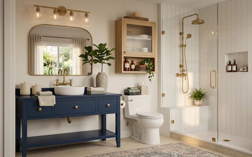
Why brass-and-navy details are the bathroom vanity nook of 2026
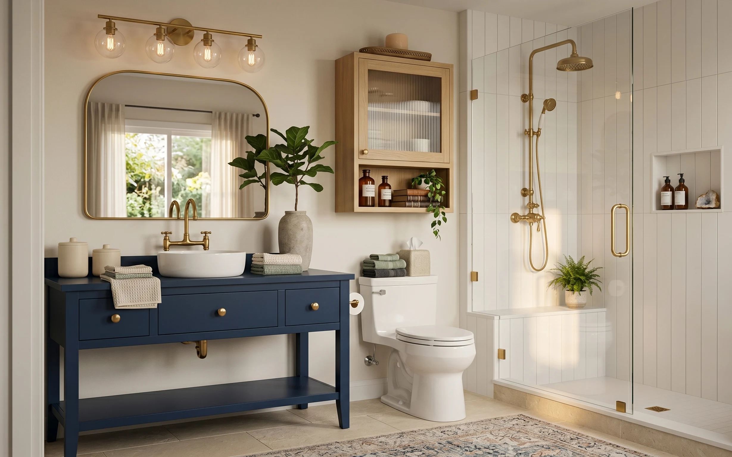
Start with what’s already there: a white tiled bathroom with a dark blue vanity and warm brass fixtures. The trick is to add softness and visual rhythm right where your eyes land—on the rug, the folded textiles, and the countertop styling. The hero materials here are plush towel texture, a woven area rug, and smooth ceramics/glass that play nicely with the brass tones. This look works on a renter budget because everything in the recipe can be removed at lease end with no wall damage.
I used to think the “decor part” meant buying more frames and more wall art. In this kind of bathroom, that’s usually what I overdo and then regret. Switching to countertop organization—trays, labeled bottles, and a plant that stays put—made the space feel intentional without fighting the tile or the fixed fixtures.
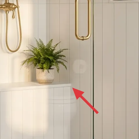
Layer 1 — area rug ($80) anchors the navy vanity
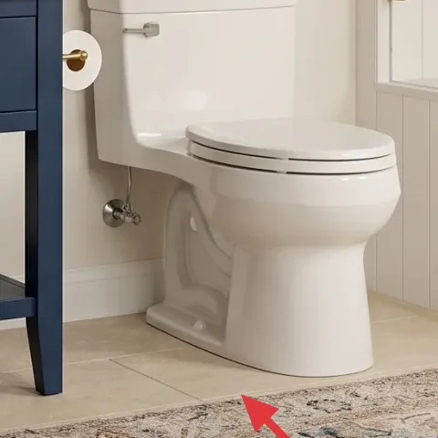
A rug is the fastest way to keep a bathroom from feeling like all hard surfaces. In the photo, the neutral patterned rug sits right in front of the vanity area, where feet naturally pause. Choose a 5×7 style that’s low pile enough to vacuum around (and still soft underfoot) and that has warm-beige tones to echo the brass. The trade-off: rugs need a quick shake or vacuum routine, but the payoff is that everything—towels, plants, and countertop styling—looks calmer when the floor isn’t visually “busy.”
Go neutral, not bright
If your tiles are bold (or your vanity is), pick a rug that borrows only one or two colors—so your accessories don’t compete.
Layer 2 — rolled light gray towels ($30) adds spa-like texture
Rolled towels bring an easy, repeatable shape to bathroom styling. Here, light gray towels sit folded and rolled on the vanity side, creating a tidy block that contrasts the dark blue base and reads “intentional” even without changing any fixtures. I like gray because it keeps the palette earthy and doesn’t clash with warm brass hardware. The trade-off is that towels look best when they’re not too bulky—aim for a cotton or waffle-like texture that rolls neatly and stays flat.
Match the towel weight to your storage
If you don’t have much counter space, choose thinner towels so the rolls don’t crowd the soap and plant area.
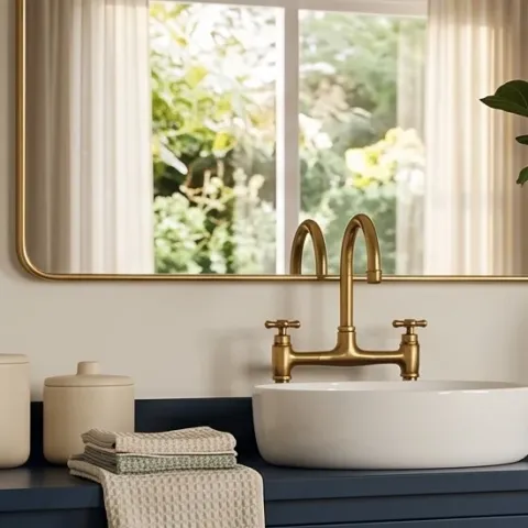
Layer 3 — brass-framed mirror ($120) repeats the hardware warmth
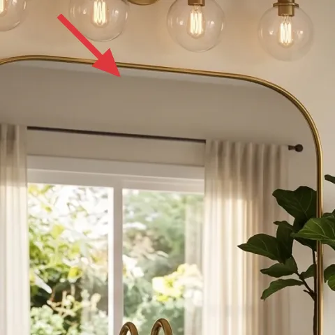
A brass-framed mirror is what ties the countertop world to the fixed brass fixtures. In the photo, that large warm-toned frame gives you a “metal thread” that runs through the space—no repainting required. Pick a mirror with a similar finish family (brass, champagne, or warm gold) and an easy-to-clean frame edge. The trade-off: mirrors are eye-level focal points, so choose a size that feels proportional—too small and the room reads unfinished; too large and it overwhelms the vanity.
Keep the frame width believable
If your vanity is narrow, look for a frame that doesn’t look chunky compared with the faucet and soap dispensers.
Layer 4 — potted plant in large vase ($35) softens the hard lines
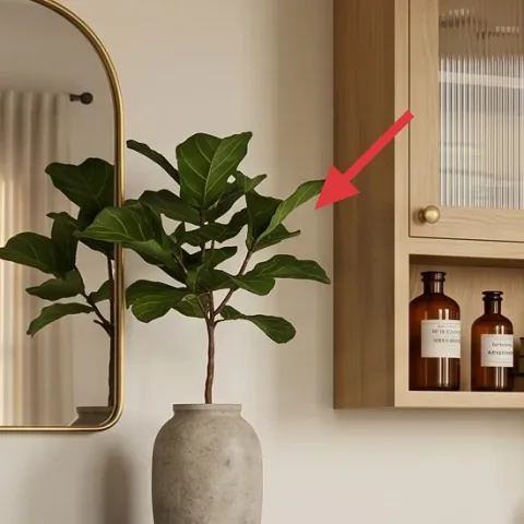
A plant in a large vase is the “breathing room” element that keeps tile-heavy bathrooms from feeling sterile. Here, the greenery sits on the vanity, with the textured vase adding an organic, stone-like note. Choose leaves that read full from a few feet away—glossy or matte doesn’t matter as much as volume and shape. The trade-off: live plants need light and water, while faux plants need dusting—either way, pick something you’ll realistically maintain weekly so it doesn’t look droopy.
Let the pot texture do half the styling
If your leaves are simple, a slightly speckled or matte vase makes the whole vignette look richer.
Layer 5 — small green potted plant in ceramic pot ($25) adds a second height level
One plant can read flat in a bathroom; two plants create depth. The small ceramic pot plant in the niche area adds that second height level without taking up counter space, which matters when you’re sharing a bathroom with everyday routines. I’d keep this plant smaller than the main vase plant so the “topline” stays cohesive. The trade-off: niche shelves can trap dust, so use a pot that’s easy to wipe and keep the leaves reachable for quick cleaning.
Repeat the green, not the exact pot
Different pot textures (ceramic vs. stoneware) look intentional as long as the leaf color stays consistent.
Layer 6 — apothecary-style jar labels on glass bottles ($40) makes the shelves look curated
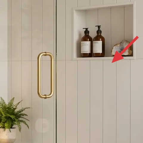
Those labeled glass bottles on the built-in shelf are doing more visual work than they seem—they give you matching typography and a “mini brand” that makes the whole wall nook look styled. Instead of buying new bottles, you can refresh the look by changing labels only, which is renter-safe and low-commitment. The trade-off: you’ll need to be neat when applying labels so edges look clean, but you won’t have to mess with the fixtures, plumbing, or anything that’s hard to remove.
Make it instead of buying it
DIY apothecary-style jar labels for the existing glass bottles so they match the same color family and font vibe.
Materials
- Printable label sheet (inkjet/laser) — 1 pack — office supply — $6
- Waterproof label laminate film — 1 roll/sheet set — craft store — $7
- Small scissors or label trimmer — 1 tool — craft store — $5
- Alcohol wipes — 1 pack — pharmacy — $6
- Ruler and small pencil — 1 set — office supply — $4
Steps
- Measure each bottle’s label area and write the width/height in a notes list.
- Design labels in a simple template with one font and one ink color family.
- Print the labels and let the ink fully dry.
- Trim to shape with even margins so text stays centered.
- Wipe bottle glass with alcohol, then let it dry.
- Apply the label, then cover with laminate film for water-splatter protection.
Total DIY cost: $28 — saves about $12 over buying.
Don’t rely on paper-only labels in steam
Bathrooms get humid fast—if labels can’t handle splash/steam, they’ll curl. Add waterproof laminate and smooth edges flat.
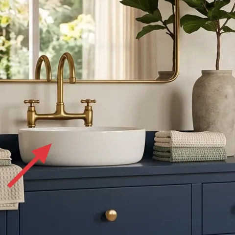
Layer 7 — decorative tray with ceramic soap dispensers ($15) keeps the counter from looking random
A tray is the “organization piece” that makes scattered bathroom items look intentional. In the photo, the ceramic soap dispensers sit together in a cohesive arrangement that’s easy to wipe down and easy to rearrange when you restock. Choose a tray in a finish that matches your metal cues—warm wood, brass-look, or a simple neutral ceramic. The trade-off: you’ll want to keep the tray surface clear enough that it still feels like a styled moment, not a catch-all. Reset it in under two minutes after every deep clean.
Pick a tray size you can reach
If you can’t comfortably pick it up or wipe under it, it will stay messy even if it looks good in photos.
The cost, layer by layer
| Layer | Item | Cost |
|---|---|---|
| 1 | Area rug 5×7 | $80 |
| 2 | Rolled light gray towels | $30 |
| 3 | Brass-framed mirror | $120 |
| 4 | Potted plant in large vase | $35 |
| 5 | Small green potted plant in ceramic pot | $25 |
| 6 | Apothecary-style jar labels on glass bottles (retail-equivalent) | $40 |
| 7 | Decorative tray with ceramic soap dispensers | $15 |
| Total | $395 | |
If you want a cheaper version, swap the brass-framed mirror for a similar-size framed mirror with a simpler finish, and choose a cotton towel set in a single shade. Keep the rug pattern neutral and spend the savings on waterproofing your DIY labels.
What worked, what didn't (across the whole room)
This bathroom nook reads polished because the soft textiles and repeated warm-metal details give the eye something to land on. The plant styling adds life without fighting the tile, and the tray keeps daily products from turning into clutter. The main “miss” risk is humidity—small labeling and paper-based details must be protected.
What worked
- The neutral patterned rug made the vanity area feel grounded instead of stark against tile.
- Rolled towels created a repeatable height and color block that doesn’t require wall changes.
- The brass-framed mirror repeats the fixture warmth so the room feels cohesive.
- The large vase plant softens straight countertop lines and balances the strong geometry of tile.
- The small pot plant in the niche adds depth and makes empty shelf space look intentional.
- DIY-labeled bottles add matching visual “type,” making the shelf feel curated.
What didn't
- Paper-only labels start to curl near steam, so waterproof laminate matters.
- If towels are too bulky, the counter looks crowded fast and hides the tray.
- Going too cool-toned with accessories fights the warm brass hardware rather than blending.
- A mirror that’s too small makes the vanity feel unsupported, especially with a narrow counter.
- Plants that don’t stay full from one week to the next can make the whole vignette look tired.
What we'd skip if we did it again
Skip replacing fixed fixtures or trying to repaint the tiled wall. This photo’s look comes from styling choices that don’t fight what the landlord already built, and those same swaps are much easier to pack up when the lease ends.
Skip buying multiple matching “bathroom sets” (all the same towel shade, all the same containers). One repeat (gray towels and warm brass tones) reads intentional; too much matching starts to look like a store display.
Skip paper-based labels without protection. In humid bathrooms, steam and splashes win—use waterproof laminate for the DIY labels so the typography stays crisp long after the first day.
Frequently asked
How long does this bathroom vanity nook refresh take?
Plan around 1 hour for shopping and label printing, especially if you’re measuring the bottle label areas first. Styling usually takes about 30–45 minutes: set the tray, roll and place towels, arrange the two plants, then smooth rug positioning. The longest part is letting DIY labels dry and laminating them carefully before you stick them on.
What if my bathroom is smaller—can I still do this look?
Yes. For small bathrooms, keep the same palette but scale down the plant footprint and reduce how many items sit on the counter at once. Use the tray as your “rule” for what belongs there, and rely more on the niche shelf and a single rug section for texture rather than adding extra accessories.
What if my vanity counter is too narrow for a plant?
Swap the countertop plant for the niche plant and put your larger plant in a nearby zone that still feels connected to the vanity. The key visual in this look is height and softness, so one plant plus rolled towels can do the job even without both plants on the counter.
Is a brass-framed mirror actually renter-safe?
It’s renter-safe if you can hang it with removable methods your lease allows (like picture-rail hooks where available or other truly removable hanging hardware). The look matters more than the exact frame, so if hanging isn’t feasible, choose a similar warm metal tone with removable mounting options.
Where should I shop for the rug and towels on a budget?
Start with big-box home stores for towels and look for basic neutral rugs in the 5×7 size range. For faster savings, shop during sales but avoid buying a rug that feels too thin—thin rugs bunch and shift. For towels, choose textured cotton that rolls cleanly.
What’s the biggest mistake people make with bathroom styling?
Over-adding clutter. Bathrooms already have fixed visual elements—tile, fixtures, and built-ins. If the counter isn’t organized into a tray vignette and textiles aren’t neatly rolled or folded, the space quickly looks busy instead of styled. Keep the system simple: tray for products, towels for texture, labels for cohesion.
More in Bathroom
Under $400: renter-friendly bathroom vanity nook refresh
This bathroom vanity nook refresh leans on textiles, brass-friendly accessories, and move-safe swaps—no painting and no drilling. You can r…
Under $800: weekend bathroom vanity nook refresh with 7 layers
A bathroom vanity nook can feel brand new without a full remodel—just 7 focused swaps. This refresh leans warm wood, stone-gray textures, a…
Under $800: budget bathtub nook refresh with 7 layers
A weekend bathroom refresh that leans on sage-green upper-wall color, warm textiles, and a framed botanical print. This bathtub nook makeov…