
- Best for
- Renter-safe texture + lighting
- Time
- 1 weekend
- Total cost
- $328
- Renter-safe
- Yes (no-drill swaps)
Why warm rattan-and-linen is the bed nook of 2026
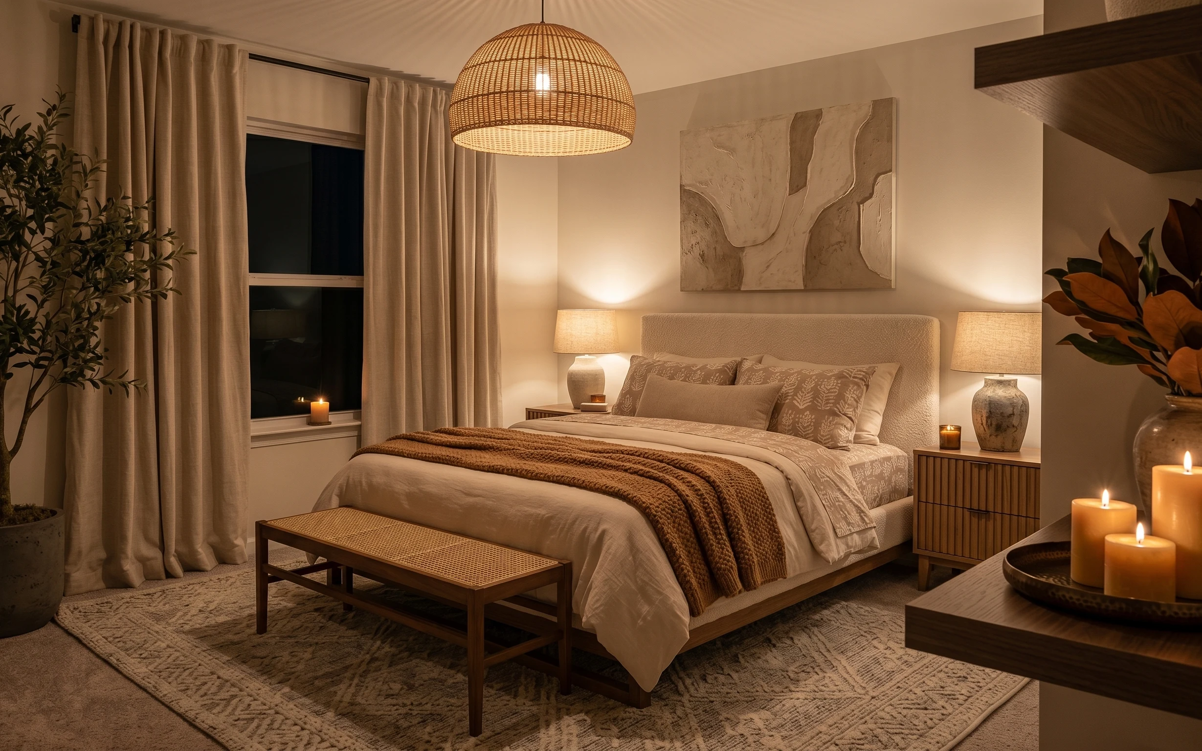
In the hero, everything already reads cohesive: warm beige curtains, a white bed cover, and two beige drum-shade table lamps that keep the whole corner softly lit. The rattan dome pendant adds texture overhead, while the brown knit throw and patterned throw pillows bring actual contrast. I’ve found this exact mix works well for shared housing because you can change the look without touching anything landlord-fixed. And because it’s mostly soft goods, it packs down into a few boxes instead of becoming “one more thing” to move next year.
My mistake in my early shared-house years: I kept trying to “fix” the room with decor that couldn’t travel. I once bought a heavy shelf and then realized it wouldn’t fit in the truck without taking off the back. What changed my habits is simple—if it can’t be boxed quickly, it doesn’t earn a spot. In this bed nook, the swaps are all high-impact and easy to dismantle: textiles come off, lamps stay freestanding, and the framed art lifts out with padding.
Layer 1 — brown knit throw blanket ($25) Adds texture you can see from the doorway
{{LAYER_1_FIGURE}}
A brown knit throw blanket folded over the front edge of the bed cover (like it is in the photo) is a small move that adds real texture. Knit reads “touchable,” even under warm light, and it visually anchors the bed so the white reads less stark. The trade-off I accepted with this look: you’re not going for a perfectly styled magazine fold—you’re going for a lived-in drape that still looks intentional from across the room. If you went with a smooth satin throw instead, you’d lose the cozy shadow texture the knit gives.
Texture beats more color
Choose one high-contrast textile (this throw) and keep the rest neutral, so the bed nook stays calm instead of crowded.
Layer 2 — patterned throw pillows ($18) Gives the white bed cover a repeating motif
{{LAYER_2_FIGURE}}
The patterned throw pillows in the hero do two jobs: they add detail without adding another color story, and they break up the large expanse of white. I like pillows like this for shared spaces because they’re easy to swap room-to-room—no measuring, no drilling, no “will this fit the next bed?” stress. The obvious alternative is adding another blanket, but that can tip the bed into looking heavy. Pillows are the lighter-weight fix that adds pattern where your eye lands first when you walk in at night.
Pattern size matters
Keep the pattern relatively small-to-medium at this scale so it doesn’t overwhelm your curtains and wall art.
Layer 3 — white bed cover ($80) Makes the corner feel crisp even under warm lamps
{{LAYER_3_FIGURE}}
Upgrading the white bed cover is the “reset button” for this whole corner. In the photo, that bright base makes every warm element—curtains, rattan texture, and lamp glow—look richer instead of muddy. This is the layer I’d pick if the room feels dull after moving in, because it changes how light bounces off the bed. The trade-off: white needs a bit more care (lint and sunscreen marks show), but it’s still renter-safe and fully packable. Go for a slightly textured weave if you can; totally flat white can look sterile.
Bring the warmth with texture, not paint
If you can’t change walls, a crisp cover plus a knit throw is the quickest way to keep the palette bright and warm.
Layer 4 — table lamps with beige drum shades ($60) Turns nighttime lighting into part of the decor
{{LAYER_4_FIGURE}}
Those beige drum-shade table lamps are doing quiet heavy lifting. Their warm color temp makes the bed nook feel calm instead of harsh, and the shade shape keeps the light spread flattering on the bed cover and pillows. A cheaper alternative would be one bright overhead bulb, but then the corner wouldn’t get that layered glow you see here. With table lamps, the trade-off is you’ll have to manage cords, but you can tuck them behind the nightstand and bring lamps with you on every move. I’d prioritize matching shade color before chasing the “perfect” lamp base.
Watch for shade color cast
If the shade is too gray or too cool-toned, the whole bed nook can start reading tired under warm bulbs.
Layer 5 — framed abstract wall art print ($80) Adds movement where the curtains don’t reach
{{LAYER_5_FIGURE}}
The framed abstract wall art print brings a focal point to the right side of the bed, balancing the soft curtain mass on the left. In this setup, it also adds a subtle organic shape language that complements the rattan pendant and the plants. If you skipped wall art, the corner would feel like “a bed + lighting,” but not a finished room. The trade-off is that framed art is one more item to pack, so choose a frame you can wrap tightly and that’s easy to carry. A smaller print also works, but keep the scale big enough to be readable from the doorway.
Use the bed as your scale guide
Pick a frame width that feels proportionate to the bed cover so it doesn’t look lost above pillows.
Layer 6 — decorative ceramic vase ($30) Pulls the palette into the foreground
{{LAYER_6_FIGURE}}
A decorative ceramic vase gives the bed nook a “foreground interest” moment, especially in warm evening light like the hero. In the photo, the vase works because its shape is rounded and its color story stays within the warm beige-brown family—so it doesn’t fight the curtains. The alternative is another candle or a second plant, but those can compete with the wall art and lamps. This is a lower-effort swap that still feels curated. Go for a vase that’s stable on the nightstand and easy to pack in a couple layers of paper or bubble wrap.
Match the vibe, not the exact color
Look for the same warmth level (not necessarily the same exact beige) so everything feels like one set.
Layer 7 — candles on a tray ($35) Adds soft glow without changing anything fixed
{{LAYER_7_FIGURE}}
Candles on a tray are the quickest way to make a shared bed nook feel special on ordinary nights. The hero shows them acting like “light styling”—they sit low, glow warm, and visually repeat the lamp glow without needing another fixture. The trade-off: you’re committing to safer candle habits and storage, and you’ll want to keep the tray in the same place each time so the setup looks consistent. This is also the easiest layer to pack: the tray stays in one piece and the candles go into their boxes. Skip anything scented too strongly; the cozy look comes from the flame and warm light, not from overpowering fragrance.
Keep it simple
Stick to a tight cluster (like the photo) so the tray looks styled, not cluttered.
The cost, layer by layer
| Layer | Item | Cost |
|---|---|---|
| 1 | Throw blanket | $25 |
| 2 | Throw pillow cover | $18 |
| 3 | Comforter/bed cover (queen) | $80 |
| 4 | Table lamp with beige drum shade | $60 |
| 5 | Framed abstract art print 16×20 | $80 |
| 6 | Decorative ceramic vase | $30 |
| 7 | Candles on tray | $35 |
| Total | $328 | |
If you want it cheaper, swap the framed art print for a smaller framed print and choose one table lamp instead of matching shades—still keep the knit throw and patterned pillows for texture.
What worked, what didn't (across the whole room)
This bed nook already has the best foundation: warm curtains, soft lamp lighting, and a neutral bed base. The biggest wins come from adding texture (knit throw), pattern (throw pillows), and one clear focal point on the wall. The parts that can fall flat are usually the ones that look “nice” up close but don’t hold up from across the room—like overly subtle textiles or under-scaled wall art.
What worked
- The brown knit throw blanket creates shadow texture that stays visible under warm lighting.
- Patterned throw pillows add detail near eye level without making the palette feel busy.
- A crisp white bed cover keeps the curtains and plants reading warm instead of dingy.
- Beige drum-shade table lamps make nighttime feel intentional, not just “lights on.”
- The framed abstract wall art print provides movement on the wall and balances the curtain mass.
- A decorative ceramic vase adds a foreground cue that makes the bed nook look styled, not empty.
- Candles on a tray repeat the warm glow from the lamps and tie the corner together visually.
What didn't
- Skipping texture in favor of smooth throws can make the bed look flat against the curtains.
- Too much matching decor (same material everywhere) can remove contrast and make the room feel one-note.
- Choosing a wall art print that’s too small makes the bed nook feel unfinished above the pillows.
- Cool-toned lamp shades can fight the warm curtain color and make everything look gray.
- Overcrowding the tray with candles and extra knickknacks can turn “cozy” into clutter.
What we'd skip if we did it again
Skip replacing anything fixed, like the hardwired ceiling lighting. The hero already uses warm overhead texture, and the quickest wins come from freestanding swaps that pack up: textiles, plug-in lamps, and a framed print.
Skip going “too matchy” with patterns. If the throw pillows are busy, keep the bed cover and throw blanket calmer—this is how the nook stays cohesive even when it’s styled fast.
Skip going big on heavy furniture changes in shared housing. A bench is fine when it stays, but the high-impact upgrades here are lightweight and move-ready, so the next lease doesn’t become a decluttering project.
Frequently asked
How long does this kind of bed nook refresh usually take?
Most of this look comes from textiles, lamps, and one framed print—so it’s a classic 1-weekend project. If the framed art is already on your list, plan for an hour of wrapping and a quick placement decision. The rest is mostly styling: throw placement, pillow order, and tray/candle grouping. Budget extra time if you need to compare lamp shade colors in person.
Is this renter-safe if I’m not allowed to drill or paint?
Yes. The layered changes are all movable: pillows, a knit throw, a bed cover, plug-in table lamps, a framed abstract print, and a decorative vase and tray. None of these rely on mounting hardware. You still want to protect surfaces when placing items on nightstands—use felt pads if the finish is delicate.
What if my bed is a different size—twin, full, or king?
The logic stays the same, just adjust scale. For smaller beds, use fewer pillows and slightly narrower throws so the bed doesn’t look crowded. For king beds, keep the same “fold over the front edge” placement but add a second pillow only if there’s space above the throw blanket fold. The framed art can also move up or down slightly to sit visually centered.
What if my room is smaller and the wall feels cramped?
In tighter bedrooms, keep the framed abstract print large enough to read from the doorway, but skip extra decor on the nightstands. Use the lamps to create warmth and let negative space breathe. The throw blanket and pillow pattern provide the “busy” part, so the wall doesn’t need more than one focal piece.
Where should I shop to keep it under budget?
Look for textiles at discount home stores or bedding sections for the bed cover and throw. For framed abstract art, shop online for framed prints or check thrift stores for frames you can match with an inexpensive print. Lamp shades are often the easiest upgrade—buy a plug-in table lamp with a beige drum shade to match the hero mood.
Biggest mistake to avoid in a warm neutral bed nook?
Avoid the “everything is beige” trap where every texture is smooth and every shade is the same warmth level. If it all looks similar, the bed nook won’t have depth. Add contrast through one knit throw and one patterned pillow, then keep the wall art as the single focal anchor.
More in Bedroom
Under $400: warm rattan-and-linen bed nook refresh
A warm, move-friendly bed nook refresh built from seven renter-safe swaps—mostly textiles and a framed print. The look leans rattan-and-lin…
Under $400: olive-and-cream bedroom refresh with 7 renter swaps
A renter-friendly bedroom refresh built around soft taupe curtains, a grounded area rug, and warm framed art. This look uses 7 move-friendl…
Under $700: warm-taupe bedroom refresh with 7 budget swaps
A warm-taupe bedroom refresh on a $700 weekend budget: update the beige rug, curtains, throw layers, and bedside lighting for a calm, lived…