- Best for
- renter-friendly coffee nook styling
- Time
- 2–4 hours total
- Difficulty
- Easy (no tools)
- Cost
- About $545
Why warm wood-and-stone counter styling is the coffee nook of 2026
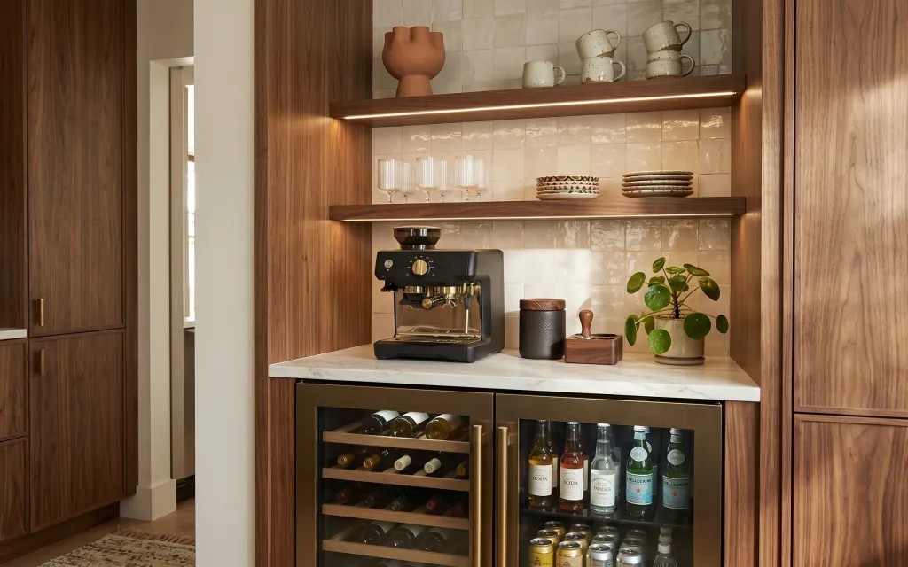
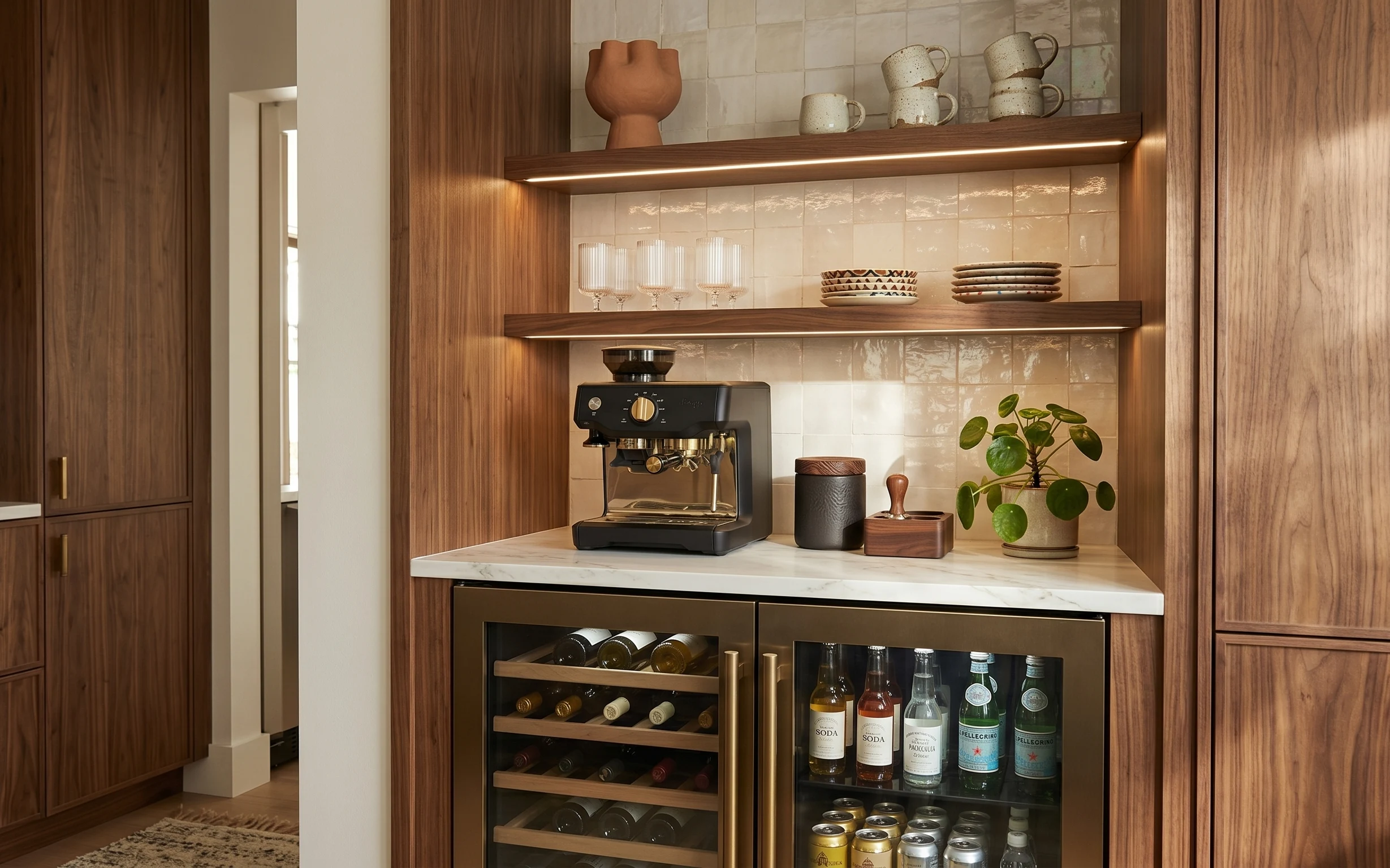
The first thing worth keeping is the material rhythm: warm wood paneling, creamy white tile, and that marble counter read “intentional” even when the shelves are simple. In photos, this kind of setup always looks better when the small items repeat one palette—earthy brown ceramics against the cream tile. A beige area rug also matters more than people think; it grounds the counter zone and makes the whole corner feel softer underfoot. All of these swaps work for renters because they’re stand-alone pieces that don’t touch walls.
I made the mistake, twice, of treating coffee-nook styling like it’s just “stuff everywhere.” The counter got crowded, the shelves looked busy, and nothing felt like it belonged together. This time I anchored the look with one grounding texture (the rug) and then repeated warm ceramic tones across the mug shelf and the counter canisters. It instantly felt calmer—like the objects were curated instead of accumulated.
Layer 1 — Beige area rug ($120) tames the hard counter zone
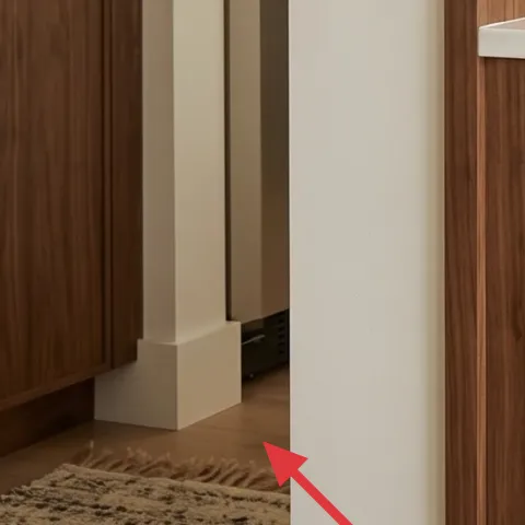
A beige area rug is the quickest way to soften a kitchen corner like this one, where wood and tile can otherwise feel a little echo-y. In the hero, the rug sits near the doorway edge, visually “catching” the counter area and giving your feet a calmer landing. I’d pick a low-pile or flatwoven style so it doesn’t snag shoes or kick around when you cook. The trade-off is that light neutrals can show crumbs, so this works best if the rug is easy to shake out and you’re okay with occasional spot cleaning.
Choose texture over fringe
When the rest of the space is glossy tile and smooth marble, a tightly woven pattern reads richer and wears better.
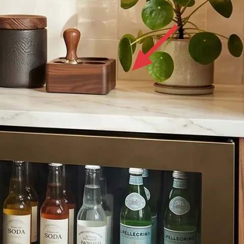
Layer 2 — Tabletop coffee machine on marble counter ($250) gives the zone a real focal point
A standalone coffee machine on the marble counter keeps this nook from looking like “decor storage.” It’s the functional centerpiece, so the styling around it feels purposeful: your mugs, canisters, and small bottles can all orbit one main object instead of competing with the backsplash. This also works better than adding extra wall pieces you can’t change in a rental, because the machine is a removable item. The trade-off is footprint—counter real estate is limited—so keep only a couple of accessories on the front edge and rely on the shelves for the rest.
Keep countertop items in one height band
In this setup, tall plant + mugs can work together, but the counter should stay mostly low and flat for a clean look.
Layer 3 — Apothecary-style bottle labels on wine bottles ($25) repeats the label color family
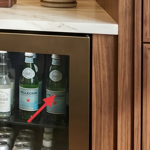
Even if you can’t change the built-in wine fridge hardware, you can still make the contents look styled. Bottle labels are already a visual element here, and matching them to one “apothecary” style is an easy way to make the fridge read curated instead of random. This is the kind of refresh that feels designer without requiring any drilling or replacements to the unit itself. The trade-off: labels need occasional upkeep when you restock, so you’ll want a simple design system you can recreate quickly.
Don’t over-style inside the fridge
If every bottle has a different vibe, the eye can’t rest. Stick to one font feel and one label color palette.
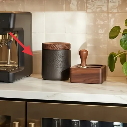
Layer 4 — Dark gray ceramic canister on counter ($25) adds grounded contrast
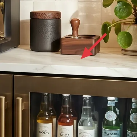
A dark gray ceramic canister gives you the contrast this nook needs against the cream tile and bright marble. In the photo, it sits near the coffee machine area, where your eye naturally lands first; the matte finish also keeps the surface from looking too glossy. I’d choose a canister with a simple shape (cylinder, squat lidded form, or rounded—nothing overly ornate) so it feels cohesive with the wood tones. The trade-off is that dark colors can look “heavy” if they’re the only strong tone, so balance it with one lighter wood piece and the green plant.
Match the canister’s finish to the rest of the ceramics
Matte gray next to warm stoneware reads intentional; shiny plastic-looking jars tend to break the mood.
Layer 5 — Wood-lidded canister on counter ($30) brings warmth without clutter
A wood-lidded canister keeps the counter styling connected to the room’s main material—warm wood paneling—without adding visual bulk. It’s also functional: it can hold coffee filters, sweeteners, or whatever your household reaches for daily, so it doesn’t feel like “decor you have to dust.” On a renter timeline, this kind of piece is nice because it moves with you and can be used again in a pantry, bathroom, or office. The trade-off is moisture exposure; keep the lid dry and wipe it down if steam builds up from the coffee machine.
Use the lid as a color anchor
If the lid matches the shelf wood tones, everything else can stay neutral and still look styled.
Layer 6 — Ceramic mugs on upper shelf ($60) turns storage into display
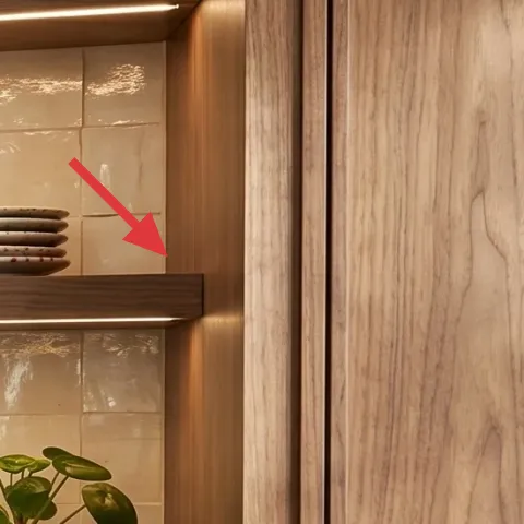
Keeping ceramic mugs on the upper shelf is a smart move because it stacks function (daily use) with display (visible texture and repetition). In the hero, the mugs sit in a line where they catch the warm indoor light, and their speckled/earthy glaze echoes the wood-and-tile palette. The best alternative to “hiding everything in cabinets” is showing a tight group—fewer mugs, more matching shapes—so the shelf doesn’t feel like a random dish collection. The trade-off is shelf dust; an easy wipe schedule helps, but the look is worth it if you’re already cooking every day.
Group mugs by shape, not just color
When handles and rims line up, the shelf reads clean even with different glazes.
Layer 7 — Ceramic bowls/plates stack on upper shelf ($35) adds pattern without a wall change
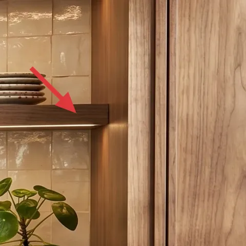
A stack of ceramic bowls or plates gives the upper shelf a visual “weight” that ties the mugs to the backsplash behind them. Here, the stacked forms sit on the shelf and echo the earthy tones you already have—so you don’t need any paint or peel-and-stick to get a finished look. This approach is renter-safe because bowls and plates are movable and easy to store at the end of a lease. The trade-off: keep the stack simple; too many pieces with wildly different patterns can make the shelf look cluttered instead of curated.
Angle the top piece slightly
A tiny tilt in the top plate makes the arrangement look styled rather than stacked for space.
The cost, layer by layer
| Layer | Item | Cost |
|---|---|---|
| 1 | Beige area rug (5×7) — low pile | $120 |
| 2 | Tabletop coffee machine | $250 |
| 3 | Apothecary-style bottle labels on wine bottles | $25 |
| 4 | Dark gray ceramic canister | $25 |
| 5 | Wood-lidded canister | $30 |
| 6 | Ceramic mug set (6–8 mugs) | $60 |
| 7 | Stack of ceramic bowls/plates (set) | $35 |
| Total | $545 | |
If you want to spend less, swap the ceramic set pieces for secondhand mismatched mugs and plates that share the same warm glaze family—then keep only one extra item on the counter besides the canisters.
What worked, what didn't (across the whole room)
This nook works because the styling follows one repeating palette: warm wood, creamy tile, and earthy ceramics. The biggest wins are the rug grounding the floor area and the shelf display making storage feel intentional. The look only breaks when too many counter objects compete at different heights.
What worked
- The beige area rug softens hard tile and creates a calmer landing zone near the counter.
- A single coffee machine focal point makes the counter accessories feel planned, not random.
- Matched ceramics on the upper shelf (mugs and bowls) repeat texture where the eye naturally travels.
- The gray canister adds contrast without fighting the warm wood tones.
- The wood-lidded canister keeps the styling connected to the room’s existing material palette.
- Label consistency in the fridge content makes the storage look curated from across the room.
What didn't
- Having too many small items on the front of the counter makes the nook feel cluttered fast.
- Mixing ceramics with very different finishes (glossy vs matte) can make shelves look disjointed.
- When bottle labels vary wildly in color and font, the fridge contents look like storage instead of a display.
- If the mug and plate stacks are uneven in size, the shelf reads top-heavy.
- Using a rug with high shedding or a delicate fringe near a doorway adds ongoing maintenance.
What we'd skip if we did it again
Skip buying lots of “standalone” decor pieces for the counter. In this type of wood-and-tile kitchen, the room already has visual structure—so a smaller, better-edited set of canisters and one focal appliance looks more finished.
Skip leaning on wall changes like peel-and-stick or art if the shelf zone can do the heavy lifting. The upper shelf already frames ceramics beautifully; use mugs and a stacked set to get pattern without touching the landlord’s finishes.
Skip mixing label styles inside the fridge. One label look (same font feel and warm neutral palette) makes the contents read intentionally styled, while mixed labels pull the eye in too many directions.
Frequently asked
How long does a refresh like this usually take?
Plan on about 2–4 hours total. The rug and counter items are quick placements, and shelf styling is the part that takes the most thinking—mugs first, then the bowls, then you adjust spacing until it feels balanced. If you’re coordinating bottle labels, give yourself extra time for measuring and testing placement on a couple of bottles before doing the full set.
Is this renter-safe if my lease ends soon?
Yes—everything in this plan is either free-standing or shelf-and-counter styling. The rug rolls or folds, canisters move easily, and mugs/plates pack flat. For anything like labels, you can remove and replace without affecting cabinets or the wine fridge itself, since the labels are content styling, not hardware changes.
What if my coffee nook is smaller or narrower?
Shrink the number of visible items. Keep one canister on the front counter edge, and move the extra “pretty” pieces to the shelf only. Use the same warm ceramics palette, but choose fewer mugs and one stack of plates so the shelf doesn’t crowd the backsplash visually in a tight kitchen.
What if my kitchen has darker walls or less natural light?
Go a touch lighter in your textiles and ceramics. A creamier rug tone and slightly brighter glaze mugs help reflect the warm indoor light already present in your space. Keep gray accents, but reduce them by swapping one canister for a lighter ceramic so the nook doesn’t feel top-heavy.
Where’s the best place to shop for the pieces here?
For the rug, look at department stores or big-box retailers that carry low-pile neutrals in 5×7 sizes. For the ceramics and canisters, browse home goods shops and thrift stores for warm glaze tones that match each other. If you want the label look without overthinking, printing services or label-design templates make it easy to keep fonts consistent.
Biggest mistake people make in coffee-nook styling?
Overfilling the counter and ignoring height. Even with great pieces, a crowded counter reads messy because the backsplash and wood paneling already have texture. Keep the front edge simple, let the mugs and plates do the patterned work upstairs, and repeat one neutral palette so your eye can rest.
More in Kitchen & Dining
Under $600: renter-friendly coffee nook refresh
A warm wood-and-tile coffee nook can look styled (not stuck together) with a $600 renter-friendly refresh. This plan uses a cozy rug, swap-…
Under $400: brass-and-cream kitchen sink wall refresh
A brass-and-cream kitchen sink wall refresh that looks styled but stays weekend-friendly. Swap in botanical peel-and-stick wallpaper, add a…
Under $250: terracotta-and-graphite kitchen counter refresh
This kitchen-counter refresh uses 7 move-ready swaps focused on ceramics, greenery, and candle styling. The look keeps a gray-and-black kit…